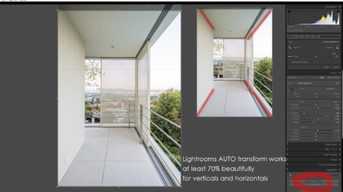
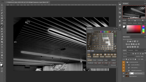
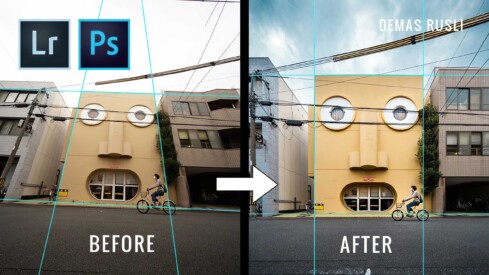
One of the biggest steps I made in speeding up my editing workflow was learning Photoshop’s shortcuts and keyboard commands inside and out. It took me a while to get to the level of muscle memory I’m at today, but once I did, the time savings were quite significant (which means less time in front of your computer and potentially more time relaxing by a pool somewhere.)
While it maybe wasn’t as great for backing up photos as it was for compressing them, Google Photos was a perfect platform to use as an easy-to-access online portfolio that was always in your pocket. I was using it extensively, not just for sharing the photos from photography trips with my friends, but also to send images to my clients for fast reviews before the final delivery.
The second installment of my recently created Story of an Image series takes us to the western Chinese city of Chongqing – a massive, uninhibited metropolis that most people outside China may not have even heard of. While my previous article took you through my thought process for a non-commissioned portfolio capture, this time we’re on the clock working for global design firm, Woods Bagot, tasked with photographing both the exterior as well as the interior public areas of their Guohua International Financial Center project.
It’s no news that we’ve all been subjected to various levels of lockdown thanks to COVID-19. Restrictions on routine activities have given many of us plenty of time to learn new skills and techniques.
APA reader Roy Engelbrecht used his spare time in the pandemic to try out exposure stacking to satisfy a particular client request.
How do I start this? The question has been haunting me for weeks now. First, I want to thank you for the many great responses to the previous chapter of this series. In my last article, you saw my process for achieving a large number of images for at least four different clients — taken care of all in the same shoot.
Are you having trouble finding consistency in color in a photo series? You are not alone! With the method explained in this blog post, you can overcome many difficulties that come when matching colors.
I love watching good Photoshop tutorials. It’s a bonus if it is targeted at us, architectural photographers, but often that is not the case.
Lately, I have been shooting corporate interiors. The projects are usually well lit common spaces or executive offices next to a window. The rest of the spaces are mostly lit with artificial light. Although I typically like shooting with natural light only, on these projects, I must turn on and feature the practical lighting as a design element.
Adobe has just announced a new feature called “Super Resolution” which is now available in Camera Raw 13.2 (that includes the Camera Raw filter in Photoshop) and will be coming soon to Lightroom and Lightroom Classic.
According to this blog post by Adobe, “The term ‘Super Resolution’ refers to the process of improving the quality of a photo by boosting its apparent resolution.
When I wrote the first part of this series, I intended to only talk about post-production, but the way I tend to photograph projects affects a lot of my post-production techniques. I’m the guy who likes to shoot as many angels as I found interesting enough to photograph, which ends up being a selection nightmare as I sit in front of the computer.
Ever since interviewing Peter Molick on APA, I have become very enamored with his work — specifically his workplace interiors projects and the post-production steps he takes to create very visually striking images. Even in Australia, I don’t think I have come across photographers photographing workplace interiors projects as Peter does.
As I continue to mature as a photographer, I am finding that I learn most from fellow peers who share a more in-depth analysis about a single image – taking us through their thought process in how they constructed the image and why they chose a certain composition or a particular way to light the scene.
Remember that time on Sex and the City when Carrie went to boot up her laptop and got Sad Mac? If you’ve never blown on a Nintendo cartridge or used a pencil to wind a tape cassette, you’re probably too young to remember Sad Mac (actually, you might also be too young to remember Sex and the City, in which case, thanks for making me feel ancient).
Let’s be honest. Many of us spend more computer time than we would like to admit. Having an efficient workflow in the office allows us to free up more time for sessions — plus your eyes and back will thank you for it! In this post, I share three apps that are essential in my in-office workflow.
For those of us living in California and the rest of the West Coast of the US, it’s been a crazy few months to say the least. Wildfire smoke has engulfed nearly every part of the region at some point over the past two months, turning skies grey and orange from Los Angeles to Seattle.
Sky replacements have long been standard practice in architectural photography. However, the existing tools to do so remain, in my opinion, somewhat haphazard. Some skies are an easy slam-dunk, capable of being replaced in a few clicks using something as simple as the Tragic Wand or Quick Selection tool.
Architectural photographers routinely work in environments with multiple competing (and sometimes unusual) light sources. We are then expected to produce final images that accurately and artistically depict the captured spaces. From there, we carefully export files that need to show well on a variety of electronic devices, as well as print destinations ranging from wide-gamut gicleé prints to magazines printed with an offset press. Our clients generally don’t understand much about what goes on behind the scenes during this complicated process—they just want everything to work.
Adobe has just updated its “photography plan” applications, Lightroom and Camera Raw with some great new features. Aside from the usual performance improvements, Adobe has (finally!) changed the user interface found on Adobe Camera Raw, integrating it seamlessly with Lightroom.
One of the cardinal rules for architectural photography is that vertical lines must remain vertical. It’s considered bad form in many instances to photograph a building and have it look like it’s falling backwards, or heavily distorted. Unfortunately, there may be times when it just isn’t possible to achieve this in camera and some post production is required.
Architectural photography started for me as a hobby, but from the very beginning of the ‘photographing my hometowns cityscape‘ stage, I called my photography Facebook page György Palkó Architectural Photographer. That name led me to my first contract.
For the first few years of my career as an architectural photographer, I swore by Adobe Lightroom. In my experience, Lightroom has been incredibly useful for going through a large batch of images, but it doesn’t quite keep up with Capture One’s refined controls, so I started looking at Capture One as an alternative.