Consistently Find The Right Color Across Your Photo Series With Photoshop
Are you having trouble finding consistency in color in a photo series? You are not alone! With the method explained in this blog post, you can overcome many difficulties that come when matching colors.
I love watching good Photoshop tutorials. It’s a bonus if it is targeted at us, architectural photographers, but often that is not the case. So the main question that I ask myself when watching is: could I translate that technique into my own workflow? There are a bunch of really good Photoshop teachers on the net (well, really good, not too many). One of them is Unmesh Dinda who runs the YouTube Channel PIXimperfect. Recently he showed a technique to match the color of two portraits. This is the tutorial:
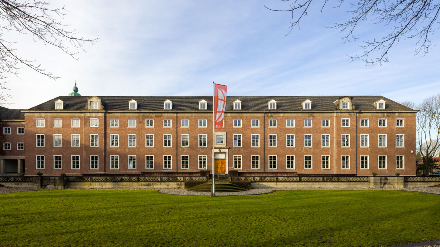
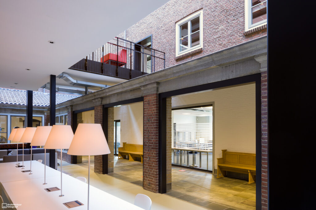
When can this method be handy? Let me give you an example from my own practice. I was commissioned to make a series of a university in my hometown Breda, Netherlands. It is a beautiful project to capture — an old monastery that is being reused. When working, the connection between old and modern elements of course did have my attention. You can see it clearly in this overview: a new space has been created in what used to be a courtyard.
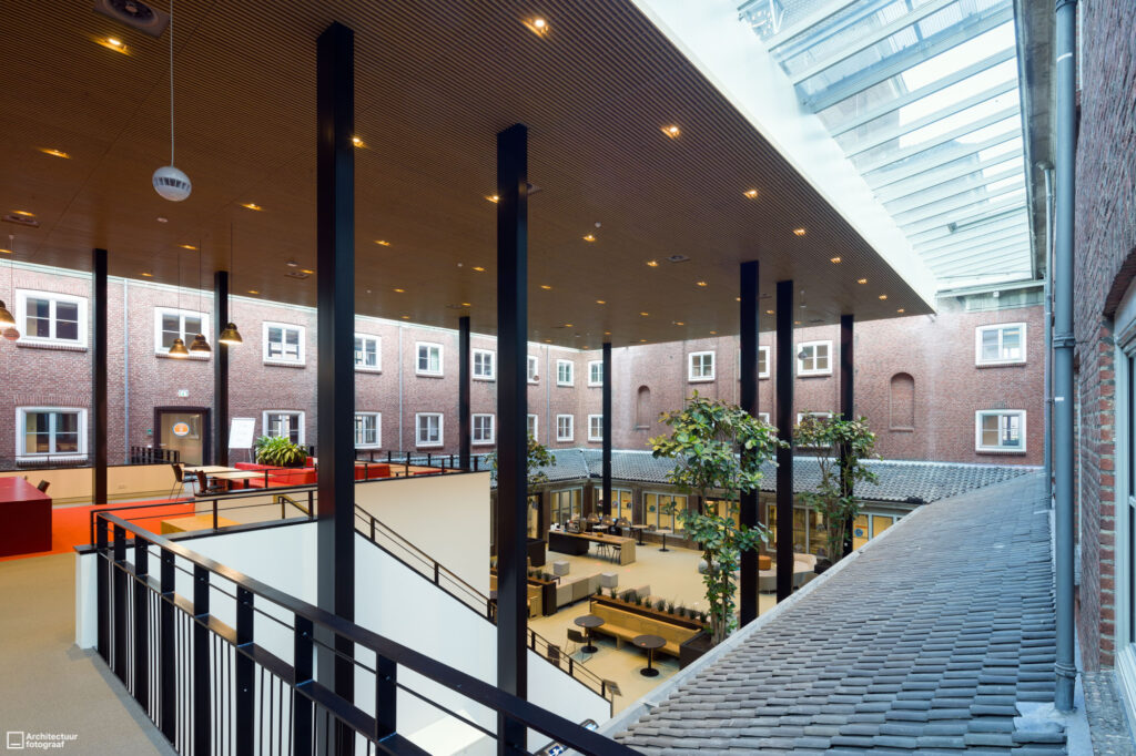
The complexity for us as photographers is evident — there are really all kinds of light in one image. Notice the warm bulb lights, but also the daylight that is coming in through a glass ceiling at the edges of the space. When you start to correct color, you have to do that locally as there is no way that you can have the right colors all over an image like this in one go. I strived for some consistency in the color of the old walls surrounding the new space (the old courtyard).
This is the second image, and you can clearly see the outer walls above are too blue. I would like them to be just as they appear in the first image.
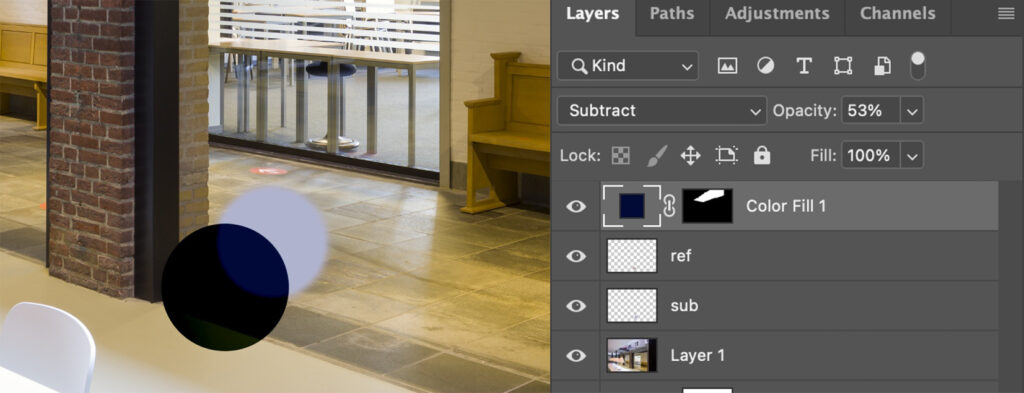
This is where the magic happens. Following the explanation of Unmesh in the video tutorial, I created new layers above the one in photo 2: one with the color of the subject (blending mode Normal), above the one with the reference color (blending mode Subtract), and then the color fill layer (also Subtract). This sounds like abacadabra, but hey, you have to watch the tutorial yourself. That’ll explain!
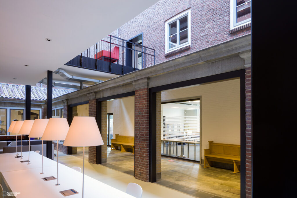
The result is the image below, nicely in line with the other ones in my series.
Try this color matching post-processing technique in your own work and let me know if it was helpful to you!