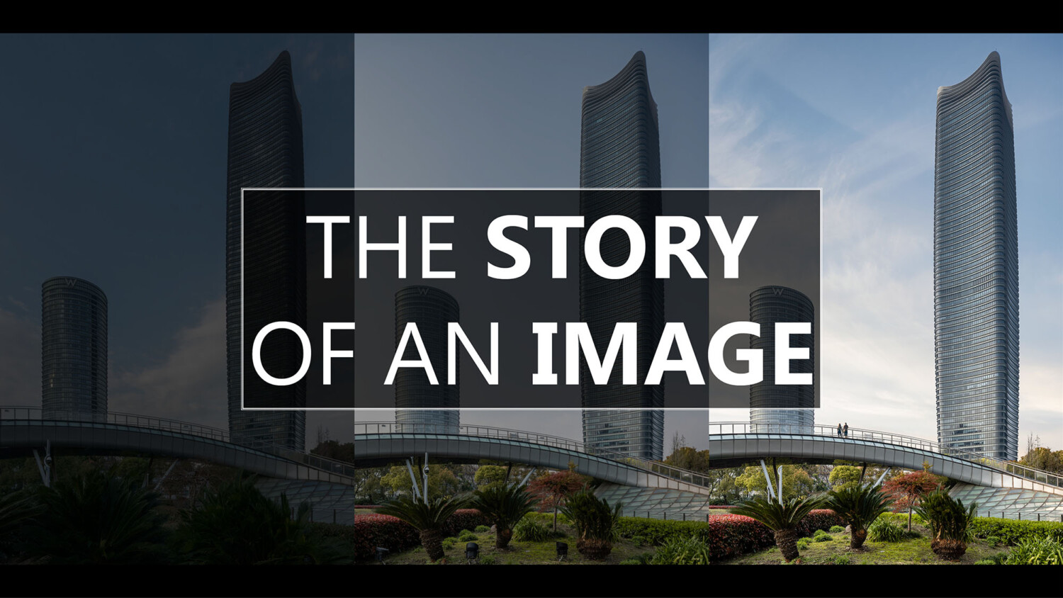
The Story of an Image – SOM’s Sinar Mas Plaza in Shanghai
As I continue to mature as a photographer, I am finding that I learn most from fellow peers who share a more in-depth analysis about a single image – taking us through their thought process in how they constructed the image and why they chose a certain composition or a particular way to light the scene. Everything from start to finish – their entire vision for the image, and how they methodically went about putting the pieces of the puzzle together to achieve that vision. With information as accessible as ever, as long as you’re willing to put in the time, it’s relatively easy to pick up the technical know-how that our profession requires. But to really get inside the head of another photographer, is something that can still be somewhat elusive.
Recently, I’ve really been enjoying how Peter Molick breaks down a single scene on his YouTube channel. Or similarly, how our very own Mike Kelley, in his new e-book, shares his thought process and how he approached several images in his portfolio. Once you have the fundamentals down, understanding WHY someone made a particular decision, is far more insightful and beneficial than HOW.
With that in mind, this is the first of what I hope will be a recurring series of how I myself go about capturing a single image – everything from the scout to the final edit. I hope this glimpse into how I approach different scenarios will be mutually beneficial both to our audience here at APAlmanac, but also to help me continue to grow as a professional – so please leave any insight or constructive criticism you may have in the comments section below.
The Building
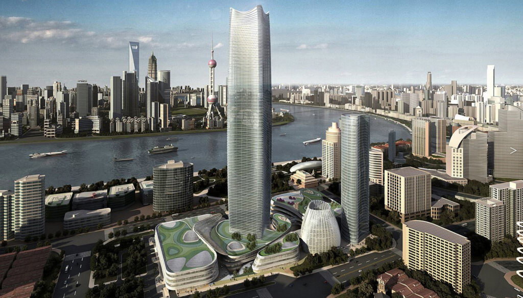
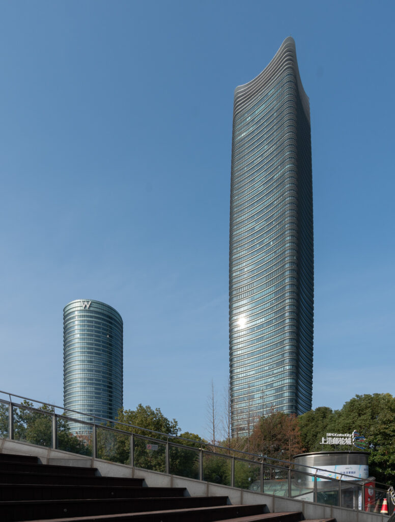
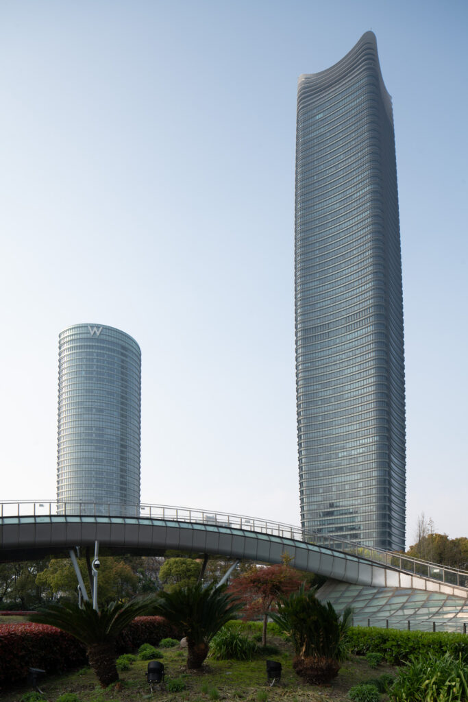
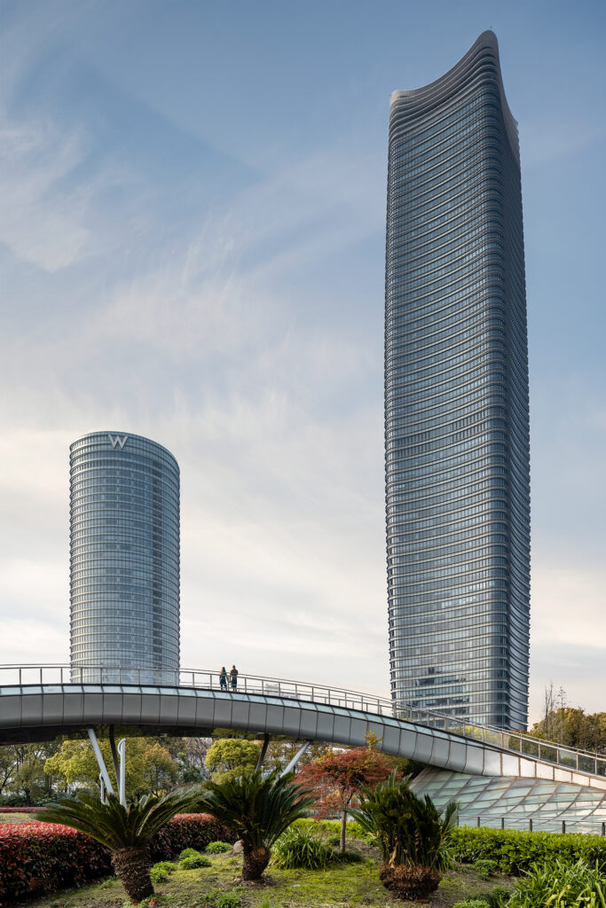
Sinar Mas Plaza (formerly known as White Magnolia Plaza) is a Skidmore, Owings & Merrill (SOM) designed mixed-use complex located on a prime site in the developing area of Shanghai’s Hongkou district. Anchored by a 320 meter (1,050ft) landmark office tower, the site is now home to the W Hotel along with a curvaceous, winding podium that houses an abundance of commercial retail and F&B functions. Connected to Shanghai’s underground metro, the building offers a sweeping vantage point from which to see the Huangpu River wind its way through the city.
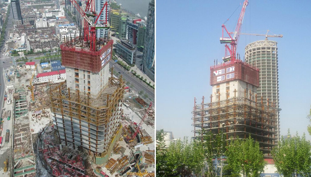
During its construction, the Shanghai chapter of the AIA (American Institute of Architects) had organized a tour of the building site which I eagerly joined. Since that visit, I followed the project’s progress, knowing that I’d want to photograph it once construction completed.
The Scout
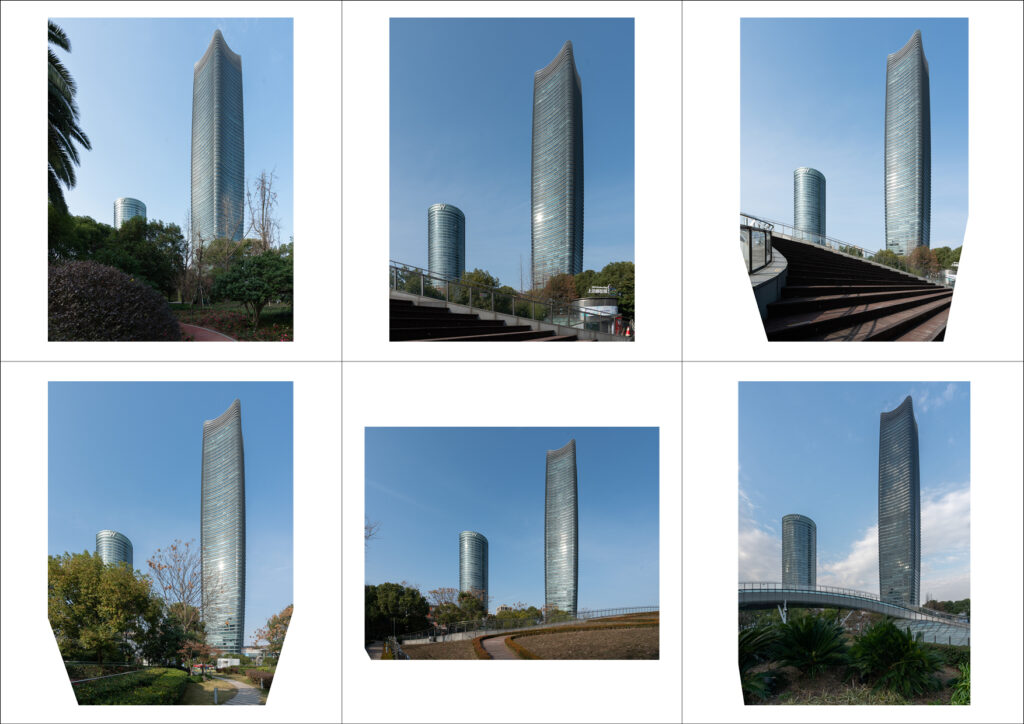
My goal was to get a handful of hero shots of the complex to help bolster my portfolio of large-scale projects. Sinar Mas Plaza is the centerpiece of a larger neighborhood redevelopment plan, and its connection to the riverfront park on an adjacent plot is one of the most important goals of the project. With that in mind, I set out to find a vantage point that showcased how the development’s two towers rise up and afford visual connections to and from the park. I decided to head out there one afternoon to take some scouting shots. Equipped just with a 16-35mm lens, I explored the park in hopes of finding that perfect composition. The results below:
SCOUT IMAGE 01
While I like the amount of greenery in the foreground in the scout image above, there are quite a few things that are not working in this test shot. First, the lower, W Hotel tower is too hidden behind the trees. Second, our vantage point is directly aligned with the corner of the taller landmark tower, which is not ideal. Finally, some of the trees in the foreground off to the right are not fully grown, which is not the look we’re after.
Let’s see what else we can find.
SCOUT IMAGE 02
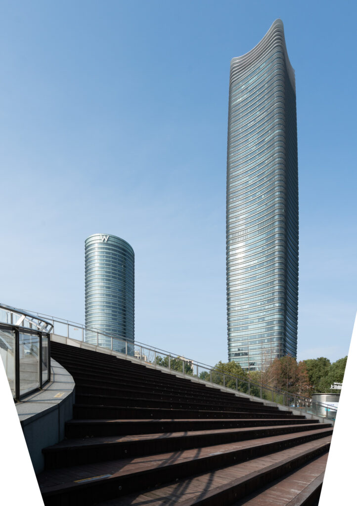
I quite like this composition – both towers’ soft geometry is shown in a flattering way. Compared to the first image, the landmark tower looks great, as we get more a frontal view, but still see a bit of the side elevation as well, which is important so that the viewer can see the concave floor plan shape that is the foundation for the building’s tapered massing The steps add a nice foreground element – especially if I could come back at a time when there were a few people sitting there.
Unfortunately, the ugly kiosk building on the bottom right of the image was a deal-breaker for me. With a lot of PS work, it could be cleaned up, but that’s not something I considered given that this shot is for my portfolio and not a paid assignment.
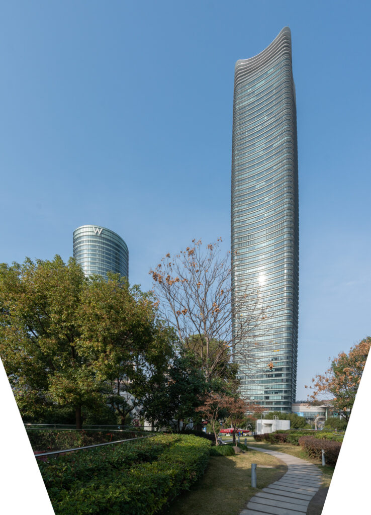
SCOUT IMAGE 03
For this third attempt, I backed away a bit to minimize the amount of post-work it would take to edit out the unsightly kiosk. I still think this is an interesting composition, but by backing up, the amount of greenery shown was reduced, so now we only get a hint of the park, which defeats our original purpose. Also, it was at this point that I was told by park security that for whatever reason, you’re not allowed to climb up on the steps – so no interesting foreground subjects either.
SCOUT IMAGE 04
I kept trying to find a view from which one of the park’s paved pathways would act as a winding leading line to guide viewers’ eyes through the frame and eventually to the towers. I was not successful.
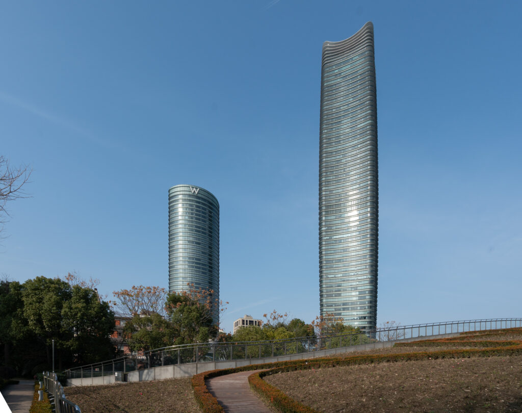
SCOUT IMAGE 05
This was as close as I came to finding a proper leading line foreground element. Unfortunately, the flower beds on either side of the pathway were empty and I had no idea when they might be filled. Also, I had moved too far to the left and the frontal view of the landmark tower was not doing its beautiful design justice.
SCOUT IMAGE 06
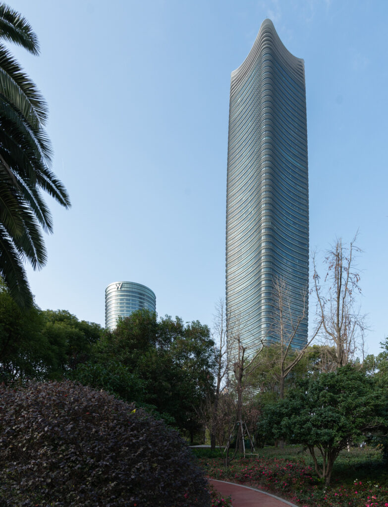
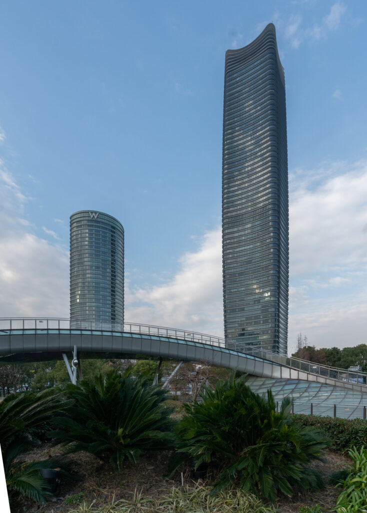
The final scout image, and the composition I ended up settling on, ticked all the boxes I was looking for in the shot. The angle from which we see the two towers accentuates their curvaceous geometry, we get some very nice greenery in the foreground, and finally, we showcase the park’s pedestrian bridge, which has a similar fluidity in its design and thus complements the towers in an interesting way. Here’s a compilation of all the scout views:
From the scout, I also decided that I would have to wait a couple of months until Spring arrived so that the park’s vegetation had started to bloom and hopefully get a bit of color in the scene as well. One important discovery was the way in which the sunlight hit the towers’ glass curtain wall facades. You may have noticed in the scout photos above that when the light hits from the left side (west), we start to get a nice gradient of light across the façade, something that I absolutely wanted to play up when I came back for the final shot.
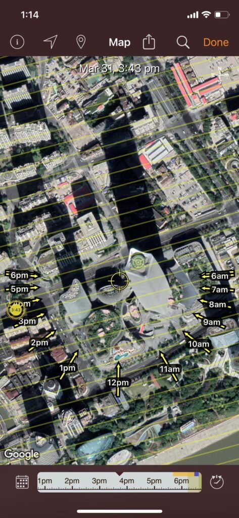
Using Sun Seeker on my iPhone, I decided that late March or early April would probably be the best time to capture the late afternoon sun as its light would hopefully wash over the two towers.
Armed with the information gained during the scout, I waited for Spring to arrive and as soon as an opening in my schedule came through, I headed over to the site to see what I could come away with.
The Lightroom Edit
Below is the raw, unedited base file I used to begin the editing phase. This was shot with the Canon 24mm tilt-shift lens, which luckily fit the building into the frame so that I didn’t have to play any stitching games, or break out the 17mm TS. I did need to tilt the camera up just slightly to get the right composition, so there is some minor keystoning that needed to be fixed straight away in Lightroom.
As you can see, we managed to get out to the site on a day with clear skies, and fortunately for us, the foreground vegetation had grown in and matured a bit, to give us that color we were hoping to capture.
Below are some basic edits that I made in Lightroom before bringing the image into Photoshop for the final touches. It would seem someone needs to clean his sensor more often!
The Photoshop Edit
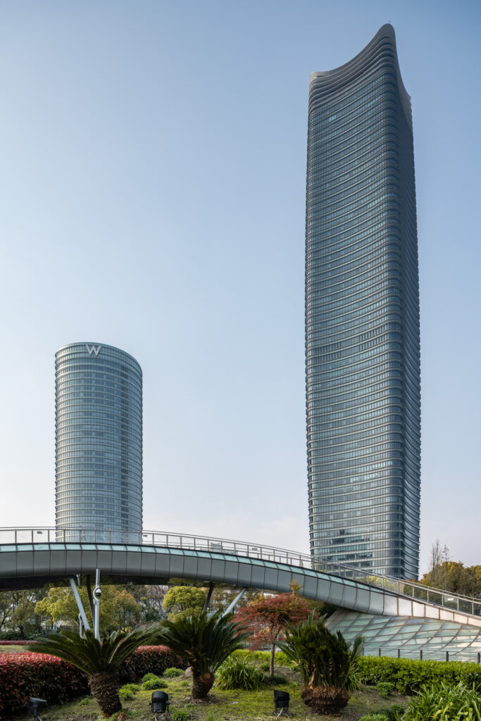
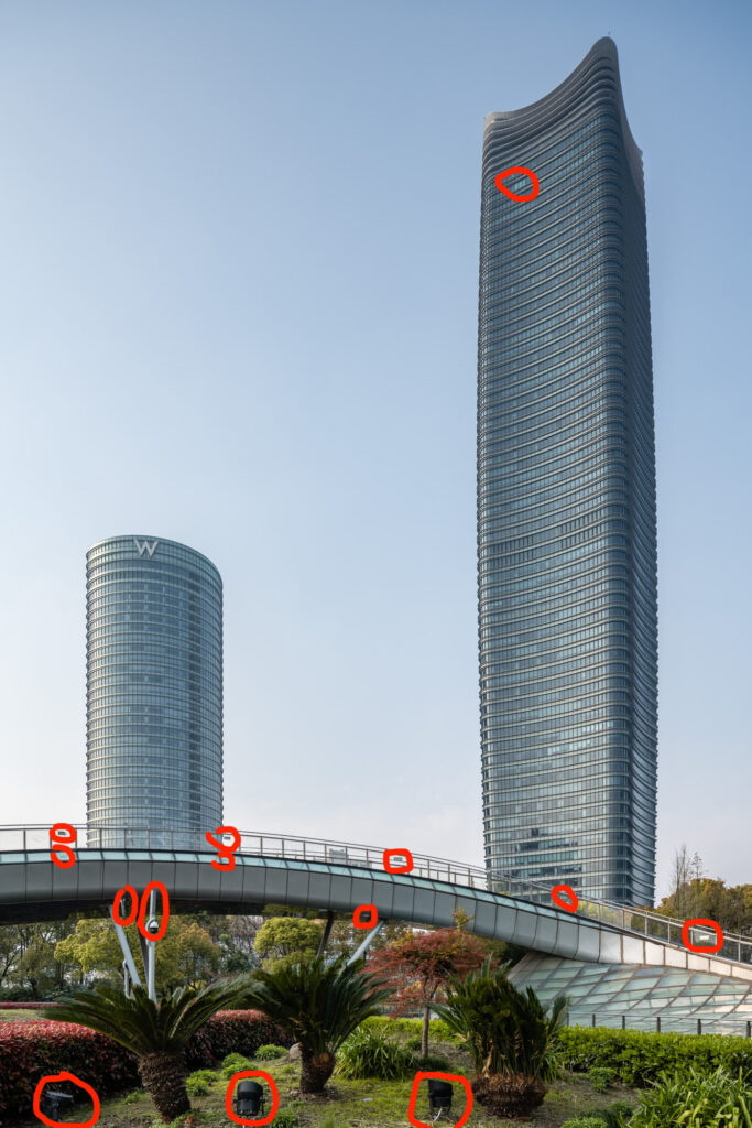
The image out of Lightroom, already looks quite good. In Photoshop, I first cleaned up a handful of distractions, of which there actually weren’t that many…
I did, however, make a couple of bigger adjustments in Photoshop. The purists may want to tune out right now – as I decided to replace the sky…I know I know, replacing a clear sky. Why would he do that? This guy lives in a place that is notorious for its hazy, sometimes polluted skies – he gets a pristine, clear day, and still decides to replace the sky. What’s the deal? Honestly, I’m not sure. At the time, I was not replacing many skies, and perhaps I wanted to hone the skill a little more. Or maybe I wanted to curry favor with Mike by purchasing his sky library + tutorial so I could hopefully land this writing gig here at APA. In any case, I did it…and I stand by it. Trash me all you want in the comments. Part of the joy of photographing for your own portfolio is that you’re in complete control.
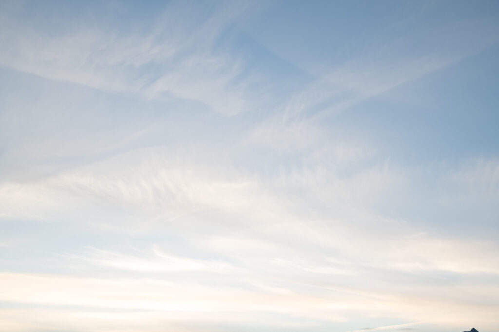
So yeah, sky replacement! I found a sky that had a similar look and feel as the original, made a few minor color adjustments, created a relatively simple-to-make channel mask, and luckily for me, found what I was looking for on the first try. The kids tell me that software like Skylum’s AI-powered sky replacement can now do this in one click. As Brandon wrote a few months ago, this sort of technology is now being fully integrated within Photoshop itself. Call me old-school, I guess. The goal of the sky replacement was to add a touch of texture behind the towers. This particular sky has some angled streaks that slice through the sky, which I think plays well with the dynamic bridge in the foreground of the image, as well as help the towers stand out even more.
Finally, I wanted to give the scene a sense of scale. As I mentioned, access to the pedestrian bridge was off-limits, so again, I had to make some magic happen in Photoshop. I grabbed an image I had of a couple taken from behind, and composed them into the scene – not only adding scale, but also a touch of romance, which is never a bad thing in my book.
Here’s a look at the final image:
So that’s the journey of this image. Of course, to properly tell the story of this building (or any building), its design, and the impact it has on the people that use it, many more images are required. This is but one piece of a bigger puzzle.
If this is well-received, I’ll be back in the new year to share another one. And if you know of any other photographers out there who are sharing this type of in-depth insight into their work, please let us know in the comments. Share the love people.