
Color Management in Architectural Photography
Architectural photographers routinely work in environments with multiple competing (and sometimes unusual) light sources. We are then expected to produce final images that accurately and artistically depict the captured spaces. From there, we carefully export files that need to show well on a variety of electronic devices, as well as print destinations ranging from wide-gamut gicleé prints to magazines printed with an offset press. Our clients generally don’t understand much about what goes on behind the scenes during this complicated process—they just want everything to work. Not only is achieving this Apple-inspired simplicity a better experience for our clients; it’s also vital in preventing potentially disastrous problems such as images coming out dull and muddy on a run of 10,000 brochures due to a problem with the files. That’s a client phone call I’d rather not receive.
As complicated as this topic can be, a bit of knowledge and careful planning will make all the difference in your workflow. The majority of us already tend to shoot with post-production in mind. We’re used to planning and making decisions for compositing and retouching purposes, such as making sure we have clean “plate” images to brush out a light stand or reflection. Color management is no different. It is a continuous flow of decisions that each affect subsequent stages in the process. There are virtually endless resources online that provide encyclopedic coverage of color management concepts (some of which I will reference at the end of this article). The purpose here is not to duplicate that information, but rather, to break down the process into manageable steps and hone in on how the concept applies to us as architectural photographers.
If all this seems daunting to you, or you don’t currently have the budget for the tools discussed here, don’t despair. I know photographers who have never profiled their camera and edit in 8-bit sRGB on an uncalibrated display in a mixed-lighting environment. Those same photographers end up with images that put my own work to shame. In my opinion, it is important to understand the choices we make, but it’s equally important not to let the more semantic details keep you up at night. I don’t want anyone reading this to think they can’t be a “professional” without an X-Rite calibrator.
That said, without at least a fundamental understanding of the “why” behind things like display profiles and file export settings, you’re likely to encounter some issues here and there that range from inconvenient to downright embarrassing and/or expensive if you can’t solve them. You might have encountered one or more of these issues, all of which can be prevented with proper color management:
- Colors render strangely even though the white balance is correct, requiring lengthy color corrections in post-production
- Images look dull and lifeless when exported for client delivery or when displayed online
- Your client’s printing company says there’s a problem with your artwork
- Multiple clients say your images look dark or tinted, but they look great on your own display
- Images look great when you edit them in the evening, but colors seem incorrect when you look at them again the next morning
Color Management During Capture
It All Starts With The Camera
Photographers love to compare camera brands based on their “color science.” We all come across (and sometimes participate in) heated discussions arguing that “X” camera brand is more color-accurate or “Y” brand gives more pleasing results. But most of us shoot images in raw, so does any of that matter for us as architectural photographers? Yes, it does matter, though it shouldn’t generally affect your choice of camera system. Exactly how much it matters will depend on your individual preferences and situation.
Digital cameras are not in fact designed to respond equally to all colors in the visible light spectrum. Some brands might emphasize reds or magentas; others might favor greens. Some brands strive to be the most “accurate,” which sometimes results in a less pleasing image directly out of the camera. Each manufacturer bakes these proprietary settings into every image captured on their cameras, even raw files. These settings are distinct from the user-selectable color profiles, which are creative settings that are applied only to JPEGs (and thumbnail previews). Be aware, though, that some cameras, such as legacy Sony models, also irrevocably apply user-selected profiles directly into the resulting raw file. It’s important to know how your camera handles this process as it will affect everything downstream.
Within the raw processor (e.g., Lightroom or Capture One), images are developed by translating the manufacturer’s proprietary raw sensor data, a process known as “debayering.” Manufacturers typically provide their own raw processing software, which can accurately duplicate the in-camera processing as if you’d shot the image in JPEG. When you use a third-party raw processor like Lightroom or Capture One, those applications use their own interpretation of the manufacturer’s raw format, which will still produce generally excellent results, but not necessarily exactly the way the camera manufacturer intended.
These unique characteristics mean that different manufacturers, camera models, or perhaps even different copies of the same camera model, will differently interpret colors in a given scene. For many assignments, that’s not a problem, as we tend to know our equipment well and are often seeking an artistically pleasing result rather than strict color accuracy. But if you have multiple cameras running during a shoot, you will want consistency between them. It’s also not uncommon for us as architectural photographers to capture projects that require clinically accurate color, such as matching a specific PANTONE a client selected for the walls of a conference room. Even though we can adjust and correct colors in post-production, that may not do much to comfort your client or an art director on set, and the closer we can get on set, the better our experience will be in post. There are ways to handle these differences (which we will cover shortly), but the takeaway here is that while it doesn’t really matter what camera you shoot with, you need to be aware of its color characteristics and settings that might possibly affect the final result.
Lighting Conditions Affect White Balance And Colors
When asked how to obtain accurate colors in a photo, most will recommend setting a custom white balance by using a white or gray balance card, or using something neutral in the scene. I’ve never been a fan of the latter because a white wall, white ceiling, white sink, and white light-switch plate in the same room can all produce dramatically different results when used to calibrate white balance. Some paint manufacturers offer over 150 versions of “white” that will each generate a unique white balance when sampled. A calibrated gray-balance card is a far superior option. With rare exception, I prefer to leave my camera in AWB and capture a gray-balance reference image to adjust in post-production. By the way, while gray-balance cards are often considered more effective than white-balance cards for digital photography, be aware that the trusty old “gray card” used for film photography was designed only to assist with metering exposure and will not work for digital color-balance applications.
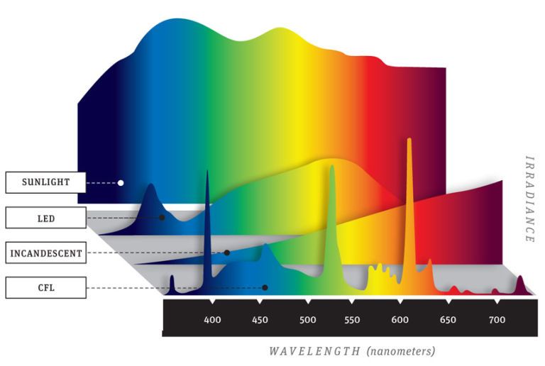
Obtaining consistent and desirable color results is about so much more than white balance, though. You can have a “correct” white balance and still end up with awful color reproduction. The single best example I can provide would be photographing in LED or CFL lighting. As homes and commercial buildings switch out from incandescent lighting to the more environmentally-friendly LEDs and CFLs, this presents a significant challenge for us as architectural photographers. The problem is that it’s not as simple as white-balancing the scene, as evidenced by graphs found in this article by Popular Mechanics. Traditional incandescent lighting is balanced around 2700 Kelvin and slopes off at both extremes of the visible spectrum. Notice that the shape of the curve is very similar to that of a 5500 K flash; the only major difference is where the peak is centered. That means you could produce virtually the same straight-out-of-camera colors from either light source just by adjusting the white balance (other light sources in the scene notwithstanding). Now look at the LED and CFL graphs. You will see areas of the spectrum where colors are almost entirely omitted, and others that have an irregular curve (LED) or sharp and narrow spikes (CFL). What this means is that when photographing scenes lit by LED or CFL, many colors will be underrepresented, and a few will be exaggerated (this differs between makes and models of bulbs). Combine this with your camera’s proprietary color settings, and you have a real mess to clean up.
How do we deal with this problem? Start with an X-Rite ColorChecker Classic or its more compact sibling, the ColorChecker Passport (go for the old version if you can—the new one is not much of an upgrade for the price). The ColorChecker swatches are produced from precisely mixed pigments that generate known RGB color values when scanned by a calibration device. This allows you to judge color accuracy based on the difference between the reference RGB values and what your eyedropper tool shows when you hover over the same swatch in post-production. For proof of concept, try taking a photo of a ColorChecker chart in front of one of those old mercury vapor street lights (or if you have any smart bulbs at home, set them to a color other than white) and then adjust the white balance. It will be “correct” but the colors will not be anywhere near accurate. Capturing a ColorChecker frame in each scene, or at least one scene in the event lighting conditions are consistent throughout, not only provides a white-balance reference for post-production; it provides you multiple ways of dealing with color issues in post-production, including the one I find most useful—the ability to create a DNG profile. Bear in mind that if you change the scene by adding flash, you will want to capture a ColorChecker frame that includes the flash—that makes two profiles you will be creating, so it will be up to you to judge how necessary this is based on the prevalence of each light source in the scene.
Color Management During Post-Production
DNG Profiles During Raw Processing
Just as a gray-balance card provides the basis for blue-yellow and green-magenta color balance by telling your software what “neutral” looks like, a DNG profile analyzes the 24 individual swatches in your reference image, comparing them to the desired reference RGB values. From there, the software is able to determine what automatic adjustments need to be made in order to standardize your camera’s interpretation of colors in a scene.
By profiling the scene, you are instructing your raw processor how to compensate for any irregularities in the light source, inclusive of your camera’s own color science. Since your raw processor will otherwise apply its own proprietary profile (e.g., Adobe Standard or Adobe Color), using a custom profile will generally give you more true-to-life colors regardless of the main light source. Creating a DNG profile requires only that you have a clear image of the ColorChecker chart placed in the lighting conditions you want to profile. The rest is done using a simple process in Lightroom (I believe Capture One recently added the ability to utilize DNG profiles as well, though the process may be a bit different). Usman Dawood details the steps to create a DNG profile in Lightroom in a recent video on his YouTube channel.
Calibrating Your Display
I recently observed someone mention the topic of display calibration on social media and the collective response was more heated than debating whether or not pineapple belongs on pizza (it doesn’t, but that doesn’t mean we can’t be friends). For some reason, this seems to be among the more contentious subjects among photographers. There are generally two schools of thought. One popular argument is that, at least in post-production, display calibration doesn’t really matter, because:
- Your clients and their viewers will not be using calibrated displays; they’ll be using a variety of monitors, tablets, and phones of varying quality
- Images will be viewed both on-screen and print in a wide range of lighting conditions
- Modern displays are accurate enough that they don’t need calibration
While those points are valid, I tend to subscribe to the more precise (though less convenient) “pro-calibration” school of thought, and would offer the following points in return:
- Your clients will likely not be using calibrated displays, but many potentially involved parties will be, and will also be the first to point out any color issues: graphic designers, pre-press operators, art directors, ad agencies, magazine editors, etc.
- Images will be displayed in a variety of lighting conditions, but some clients will heavily invest in proper lighting to show the work at its best.
- Modern displays are much more accurate than the old CRT displays, and you can probably get away with not profiling, but as displays age, they often lose their ability to accurately reproduce colors, and when a client says colors are incorrect, you have a leg to stand on in explaining that it’s their display, not yours.
The process to profile your display is quite simple. I recommend a device such as the i1 Display Pro (also by X-Rite). It’s basically a little hockey puck-size device that rests against your monitor and measures various color swatches that the software flashes across your screen. The software recommends (or makes) adjustments to your display settings and creates a profile that tells your operating system how to standardize colors as they are displayed on your monitor. This is a particularly useful process because the calibration device can warn you if your display starts to wear out.
One last note on display calibration while we’re on the subject—do what you can to control your editing environment. Since photographers should calibrate to the D65 standard, a neutral wall color and bulbs that can be daylight-balanced will best complement your display’s profiled color characteristics.
Color Settings When Editing And Exporting Files
This is where a lot of people get confused and serious problems can occur. Not surprisingly, it’s also another area that can spark heated debates about what’s correct and what’s necessary. Again, knowing the “why” behind these choices will help you determine the best solution for your particular situation.
sRGB vs. Adobe RGB vs. ProPhoto RGB
When I first started using Lightroom, circa 2006, I sent files to my local print lab in ProPhoto RGB color space. After all, it had “Pro” in the name, so it seemed the obvious choice. Unfortunately, that was not the correct way to go. The lab called and said all my prints were coming out muddy and generally unusable. After walking through my workflow, we realized that my color space was what was at issue. I re-uploaded in Adobe RGB and the resulting prints were beautiful. Why did this happen? In short, ProPhoto RGB is a color space designed for editing—not for delivery. Each color space is not “better” than the alternatives; they each have a specific purpose.

sRGB is the color space we use to display images on screen. The available colors in that space roughly match what most consumer displays are capable of accurately reproducing (though at the risk of being pedantic, many contemporary devices can display a wider gamut such as P3). Many people look down on sRGB as though using it will cause the image quality will inherently suffer. That’s not really true in most cases, and in fact, sRGB is the only color space most web browsers are capable of interpreting, meaning it’s the only one you should currently be using to upload your work for display online (though this may soon change due to improved display capabilities and the software needed to correctly interpret other color spaces). In fact, even for printing, many photo labs accept only sRGB files.
Adobe RGB expands on the capabilities of the sRGB space to offer access to more colors, most of which are observable in the greens and cyans. It also encompasses the entire CMYK gamut (see below), which makes it very suitable for printing. Though some specialty displays are capable of reproducing the entire Adobe RGB gamut, it is still not meant to be used for screen destinations (although as display capabilities improve, we might see this happen). Keep in mind that you won’t necessarily lose anything by saving images in sRGB instead of Adobe RGB. Just because Adobe RGB contains more colors doesn’t mean any of those colors even appear in your original photo. However, the possibility of losing any image fidelity whatsoever leads most photographers to prefer Adobe RGB for printing purposes (though as I mention below, I don’t necessarily recommend it for files delivered to clients).

ProPhoto RGB contains essentially all the colors the human eye is capable of perceiving, as well as some colors that are purely theoretical. ProPhoto RGB is the color space in which Adobe Lightroom operates behind-the-scenes and can be very useful as an editing color space. Additionally, as the capabilities of electronic displays and printers continue to improve, ProPhoto RGB preserves the greatest number of possible colors in the image, making it arguably the most “future-proof” color space for archival purposes. However, it’s not without its drawbacks. Because ProPhoto RGB includes colors that don’t actually exist in the real world (at least not to our eyes), it’s possible for some adjustments to produce unexpected results that wouldn’t have occurred when editing within the Adobe RGB space (and, in some cases, that your display is not capable of showing you).
CMYK (Cyan, Magenta, Yellow, blacK) is used only for printing purposes and is often brought up in the unfortunate context of a photographer being asked to supply images in CMYK, or assuming they need to do so for printing. Even though inkjet photo printers use ink colors that make CMYK seem like a good idea, they are designed to work with files in RGB. As for destinations such as an offset press that do require CMYK files, the designer’s page layout software (e.g., Adobe InDesign) should take care of this conversion. There is virtually no case where you should be asked to directly provide CMYK photos. InDesign Secrets covers this topic quite well and will provide you with talking points in the event you are asked to convert images to CMYK for a client or their designer.
I can already sense some of you getting ready to switch all your working color spaces over to ProPhoto RGB, expecting to unlock a mesmerizing array of rich, vibrant hues. Hold on there, partner. While it’s true that ProPhoto RGB contains the greatest number of potential colors, remember that to receive any benefit from those possibilities, the colors have to exist in your photo to begin with (or be added in post-production). Take another look at the boundaries of each color space. How many times do you expect to photograph super-saturated subjects that would fall outside the boundaries of sRGB or Adobe RGB? Because many of its colors cannot be displayed on existing displays or printers, and some colors are theoretical in the first place, ProPhoto RGB has arguably the greatest potential for error when adjustments are made that cannot currently be visually observed. I’m not saying you shouldn’t use it; just realize why you want to use it and ensure you actually have a need to do so (and understand the inherent consequences).
8-bit vs. 16-bit
I’d file this topic under quality issues more than color management, but since we’re discussing file settings, it’s an important topic to understand. As with the “Pro” in ProPhoto RGB, many people assume that in order to get the best quality, they need to work in 16-bit. That’s not entirely true. An 8-bit JPEG (all JPEGs are 8-bit) will generally produce a visually lossless result compared to a 16-bit TIFF. The issue is what you intend to subsequently do with the image. 16-bit is less about the range of colors an image contains, and more about the precision number of steps in between those colors. Based on that, it could be well argued that 16-bit is the optimal choice for those who want to make major curves and color adjustments in Photoshop, whereas 8-bit may be perfectly fine for those who perform most of their adjustments in the raw processor and use Photoshop mainly for compositing and retouching. I do tend to favor 16-bit simply to preserve the ability to make adjustments later without risking a loss in quality, but 16-bit will also take a toll on your file size and system resources, so take that into account when deciding what’s best for your workflow.
You can find a more comprehensive comparison between 8-bit and 16-bit images in the video below. When the author mentions “256 colors” for 8-bit files, that actually refers to 256 values per channel (red, green, blue).
Recommended Settings
The following are my own recommendations for most situations that the typical architectural photographer will encounter. This is more of a quick-reference guide and your circumstances may vary, so I encourage you to learn the underlying reasons for these settings using the resources linked at the end of the article.
| 8-bit vs. 16-bit | 16-bit for editing if you expect to make significant adjustments, 8-bit for delivery unless your client will be further editing the delivered photos |
| sRGB vs. Adobe RGB vs. ProPhoto RGB | Adobe RGB or ProPhoto RGB for editing and self-archiving, sRGB for client delivery, Adobe RGB if printing fine-art prints or specifically requested by the client (always use sRGB for files destined for on-screen use) |
| RGB vs. CMYK | RGB, always—page layout or printing software should perform the conversion to CMYK |
| TIFF vs. JPEG | TIFF for editing/archival, max-quality JPEG for delivery unless otherwise requested (keep in mind all JPEGs are 8-bit) |
| sRGB vs. Adobe RGB (camera setting) | Irrelevant when shooting in raw as it affects only JPEG files created by the camera |
Additional Resources
- dpBestFlow.org is one of the most comprehensive sources I’ve found for color management best practices across the entire photographic workflow.
- PHLEARN – Color Spaces Explained! on YouTube covers a great deal of what’s been discussed here, along with helpful visualizations of the various color spaces and demonstrations on how to configure Adobe CC to your desired settings.
- Color Management Guide by Arnaud Frich – I spent almost an hour looking for this just to add here as I’d forgotten to bookmark it. I stumbled onto this site a few years ago and consider it the single best comparison I’ve seen regarding potential use cases for each color space.
If you have any questions or would like to share your own preferred color management workflow, please feel free to leave a comment.