Photographing the Broad Museum: Making an Architectural Photography Book, Part Four
One of the most recognizable buildings I had the chance to photograph for my book New Architecture Los Angeles was the Broad Museum, a beautiful project in downtown LA designed by Diller Scofidio+Renfro. As it’s literally one of the most photographed subjects in the entire city, I wanted to make sure I created images that were actually different than everybody else’s. After all – if I’m going to take the same picture as someone else, I’m probably not going to waste the time.
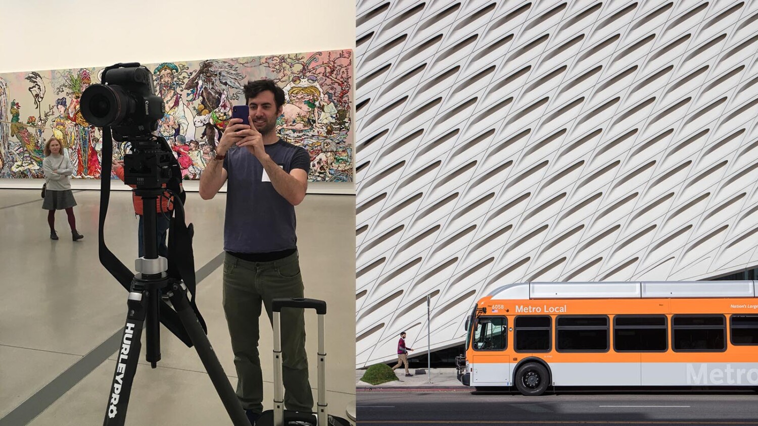
To tell you the truth, In’ve ever bothered heading downtown to take exterior images of the Broad, even though it’s so easily accessible. Like I said – it’s one of the most photographed buildings in the entire city, and I just didn’t feel like I could create a picture that would say something unique compared to the firehose of images that comes out of this building every day. In order for me to actually be able to create something worthwhile, I’d need some serious access and effort, and on my own I wasn’t going to muster up the energy to make it happen. What?! I’m lazy. Or you could say I know when to pick my battles!
Access
When I was approached to create this book, the opportunity presented itself to get access to some of these incredible buildings in Los Angeles without having to go through the herculean task of arranging access on my own, so it was a great opportunity to create actually unique pictures of these projects. With the help of the publisher, who also happened to have made a few books for the museum and the architect, access was actually a piece of cake compared to some other locations in the book. As usual, it’s all about who you know sometimes 😉
We were given a roughly six hour period in which to photograph the building: two hours while it was totally empty (omg, amazing, fainting now) and four hours while it was open to the public. I’d be allowed to use a tripod anywhere I wanted and pretty much had the entire place to myself. Something probably only one or two other photographers had the fortune to do in the last two-three years since the opening. Jackpot.
Like most projects being photographed for this book, I was tasked with photographing a few exteriors in varying light and enough interiors to tell the story of the project. I estimate this to be about ten photographs, but since I’m a photographer and I always push, I probably ended up creating 20 photos over a couple trips to complete the set.
The shot list
To start, I made a quick shot list using google images, and my memory of time spent in the area as a reference. I broke my shot list into two categories: must haves, and nice to haves; a technique I use on pretty much every shoot.
My must haves were:
Front hero exterior at twilight
Front exterior daytime
Exterior facade detail(s)
Main entry hall
Escalator up to galleries
2-3 main gallery images
1 staircase shot
From here, I can start to decide where I want to be and when. I’ve chosen three images to discuss for this article (and for the sake not putting everyone to sleep) The first shot of the day was going to be…
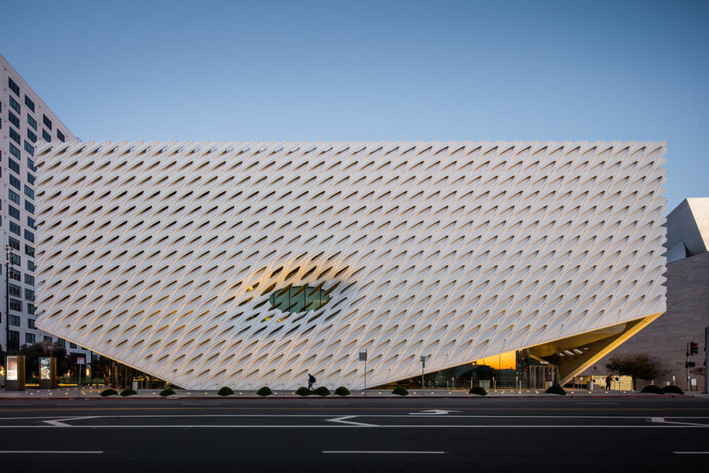
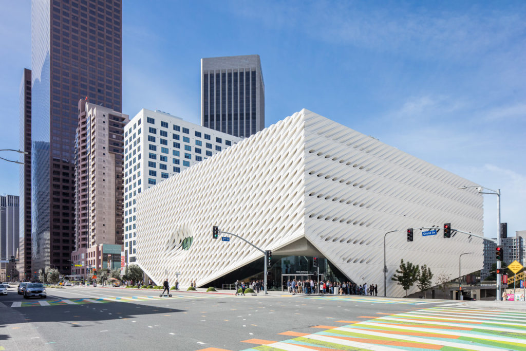
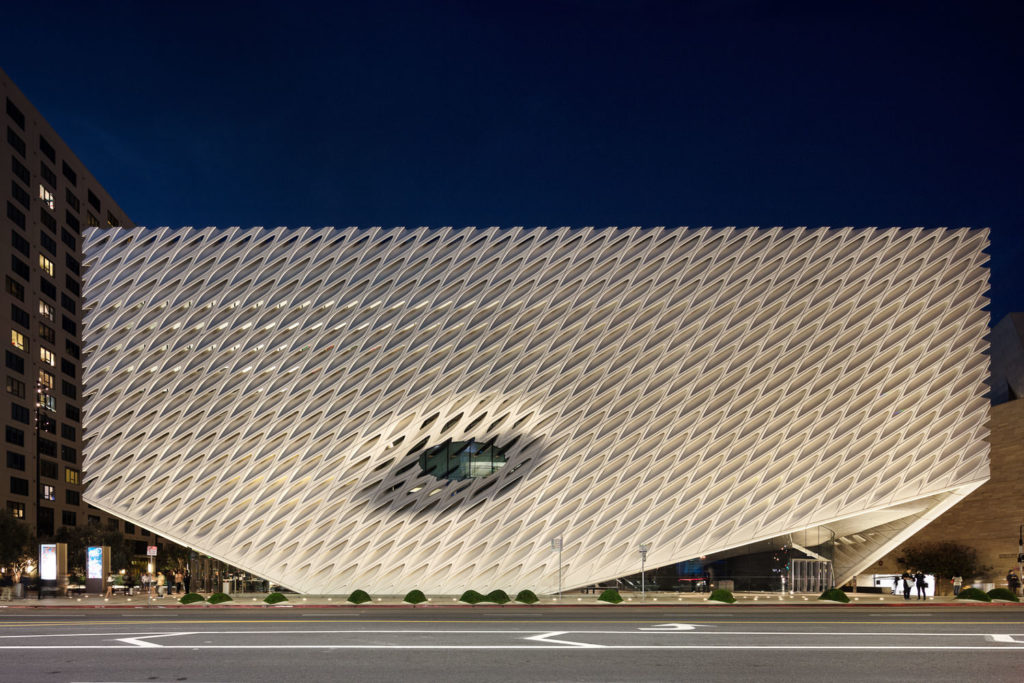
The exterior hero
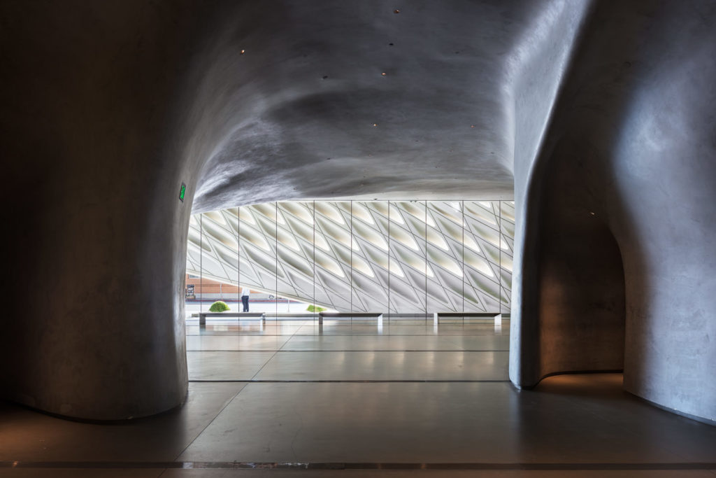
A shot that has been done many, many times. So how do we do something different? While photographing the adjacent Walt Disney Concert Hall a couple weeks prior, I noticed a pretty neat phenomenon that happens at sunrise. When standing across the street from the Broad, the morning sunlight on a cloudless day will rake across the front facade, pulling out texture on the white surface, while also reflecting itself in the windows of the entrance. This only happens on a few days each year, as there are numerous buildings that block the sun other days of the year or the sunrise position is incorrect for this phenomenon to happen.
I knew if I got there early and waited on a clear day, I’d have good luck if what my LightTrac app was telling me was accurate.
Luckily our permitting permission moved pretty quickly, and before I knew it we had a date for set for photographing the museum. I set my alarm and was up at 4:30AM to go take pictures of a building – the good life. Please note it takes some seriously freaking extenuating circumstances to get me out of bed that early, so I really hoped that this shot worked out. I must have chosen the coldest day of the year, because I was absolutely FREEZING but the conditions could not have been more perfect. Crisp, clear, and a little bit windy, but the sun rose as predicted and lit up the corner glazing beautifully, which accentuates the concept of the ‘veil’ as intended by the original architect. It is an angle oft-repeated, but in light seen only very rarely.
One lucky passerby happened to unintentionally pose for me, they add a nice bit of scale to show how big this museum really is.
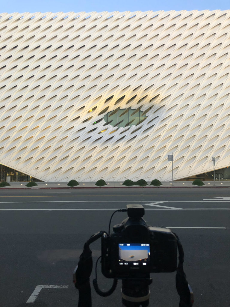
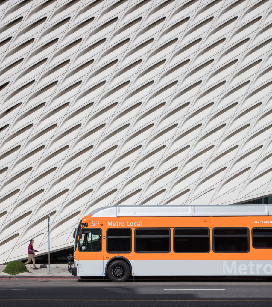
Exterior Facade Detail
Honestly – not the most difficult of images, and one created mostly with luck! After the morning twilight, this was just a matter of taking my tripod around to the steps of the Walt Disney Concert Hall and waiting for the sun to come up a little higher so that it raked across the textural concrete facade. I opted to only photograph the entry corner itself, carefully arranging the cantilever and entryway in a graphically interesting way. I wanted to make this image more about the texture and finish, rather than another overall hero shot. The repetitive slits in the veil make for a nice rhythmic element, and the sun (which at this point is maybe 10 degrees off the horizon to my left) makes sure to chisel that texture right out. Since I’m working with the light, there’s not much editing to be done. It was a matter of waiting for a few people to add scale so we know how big everything is, and bang – it was in the bag.
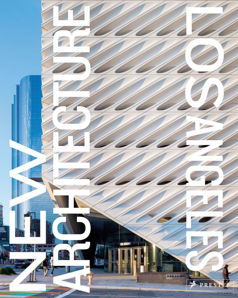
I’m jumping ahead of myself, but this image was chosen for the cover of the book which was a nice surprise. I think it works so well for a few reasons: the striking texture created by the veil as the sun washes over it is beautiful, and the composition, rather than focusing on showing THE WHOLE DAMN BUILDING focuses in on something far more interesting and graphic. The people are a nice touch to add some humanity which softens an otherwise angular and ‘stiff’ image.
Interior Gallery Space
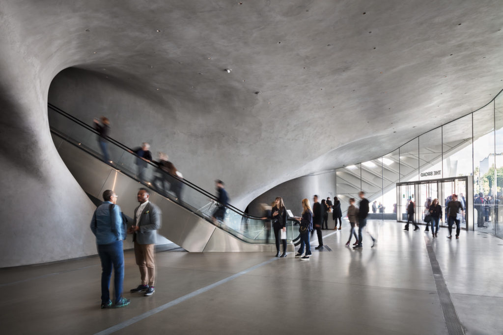
Upon arriving at the gallery level, it won’t take long before one of the most dramatic spaces of the entire museum reveals itself to you.
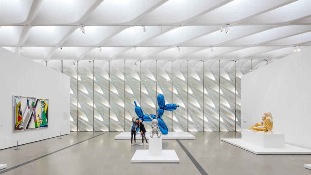
What can I say that isn’t insanely obvious here? Sometimes the one point perspective is just too strong to not photograph. It took me about 5 seconds to find this composition which is full of interesting stuff galore. Leading lines formed by the ventilation in the floor lead us straight to a Koons Balloon Dog, behind which sits the reverse view of the concrete street-facing facade. You can see how the ceiling, which adjusts periodically to transmit the appropriate amount of daylight into the museum, is a beautiful continuation of the complex facade on the exterior.
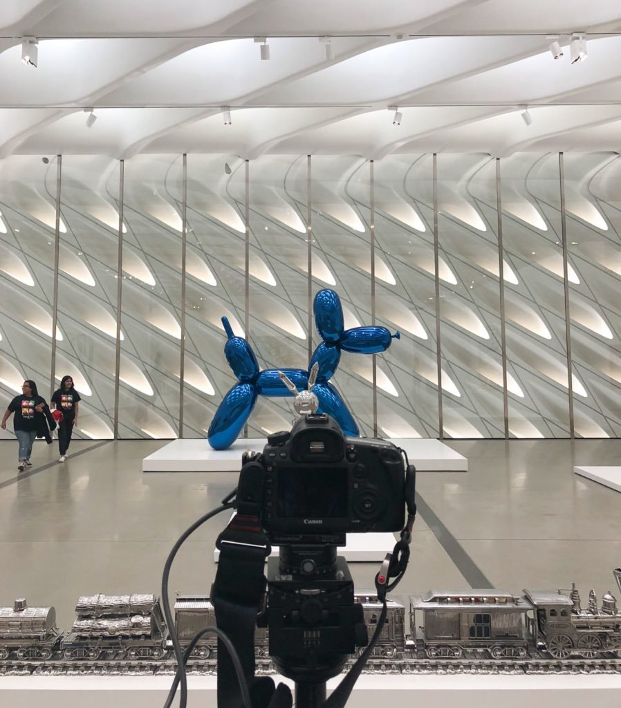
In addition to the obvious architectural elements working together here, I hit a bit of a serendipitous moment – our two (completely unposed!) figures taking a selfie in front of the Balloon Dog, which is probably the most visually heavy object in the whole scene. It sums up just about everything about the museum experience these days, and could not be more LA if I tried.
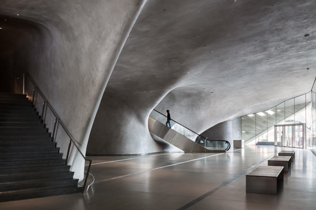
The reality of this image is that the interior of the museum was completely full of people milling around. I left the camera in one spot for about 15 minutes and let the scene unfold, taking a picture whenever something ‘interesting’ happened in front of me. Back at the computer I went through the ~45 raw images of different events transpiring and pulled out the selfie takers, which I remember as far and away the most interesting thing that happened in that image. Here’s an unedited capture that shows what was going on at pretty much any other time:
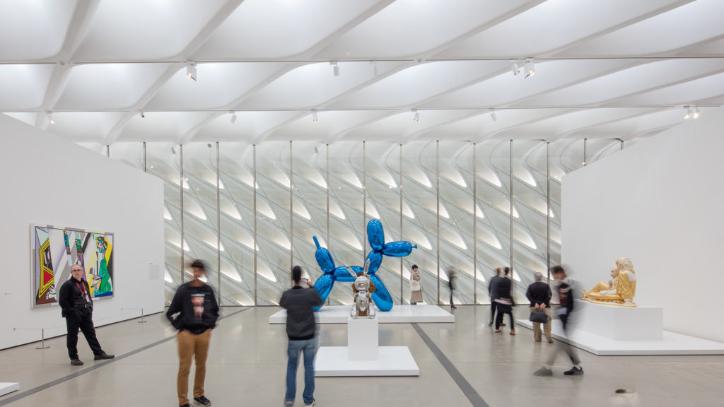
Do I think this is a ‘bad’ picture? Not at all – the composition is still the same, and there’s a lot more action, which depending on your style might be a good thing. I personally prefer a clean, near-empty scene with regards to people as I believe it focuses the attention on the important bits, though other photographers might prefer a little more action. I could go on a tangent about how personality is reflected in your photographs, yadda yadda yadda, but I think you follow – it’s a subjective call and I preferred the near-empty space focusing on one perfect moment.
As with most images in the book, these were pretty much straight out of camera with hardly any Photoshop involved. Interior lighting was near-perfect thanks to great architectural design, so what the heck am I gonna light? Not that I had the time, anyway! Onwards!
Covering the rest of the project
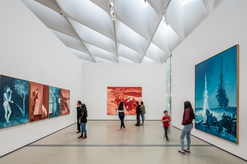
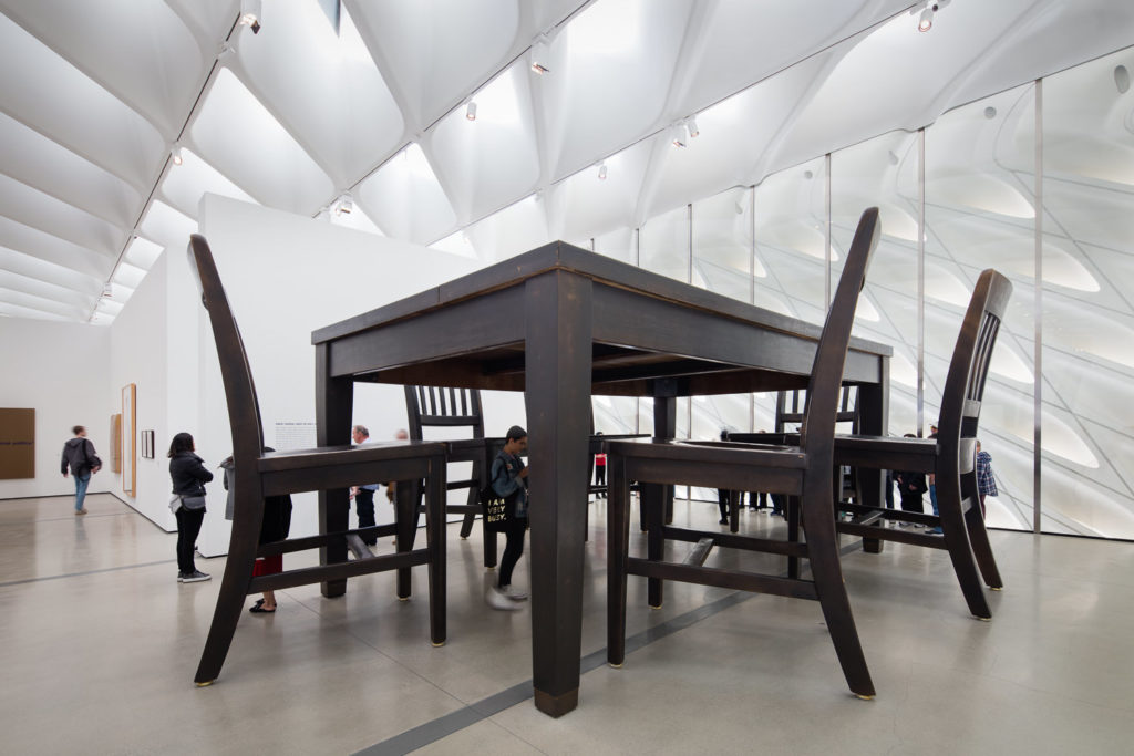
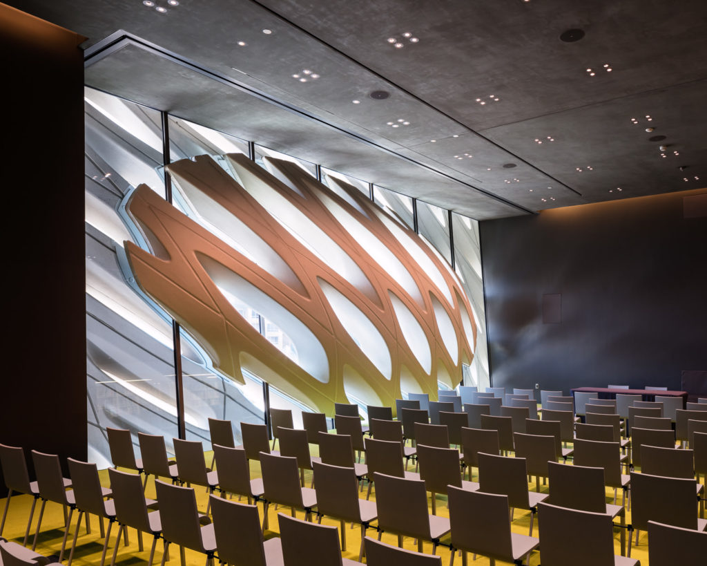
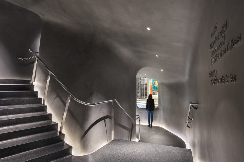
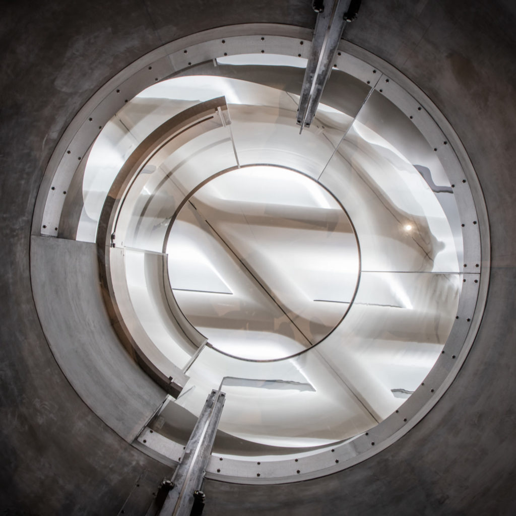
While the three images above are what I consider some of the most important at this location, here are the rest of the images from the set with some small commentary about my thought process.
The End Results
I was psyched with the pictures, the publisher was psyched with the pictures, and the museum was psyched with the pictures. So much so that they ended up buying most of them for annual reports, OOH ads, and website usage. Not a bad day out, all things considered – a book cover, some portfolio material, and additional licensing income as a result of pushing to get the best pictures possible thanks to some planning and an early morning.
New Architecture Los Angeles is available for order at many trusted booksellers. Pick it up to see the final product!
For the rest of the book saga, you can read the other parts here:
How To Create An Architecture Photography Book: Part One
How To Create An Architecture Photography Book: Part Two
How To Create An Architecture Photography Book: Part Three
How To Create An Architecture Photography Book: Part Four