Zupagrafika: The Studio Celebrating Modernist and Brutalist Architecture
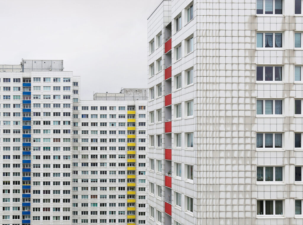
David Navarro and Martyna Sobecka are the founders of Zupagrafika, a creative studio based in Poland celebrating modernist architecture, design and photography in a unique and playful way. Since 2012 David and Martyna have been traveling, photographing and illustrating post-war modernist and brutalist architecture, especially in the former Eastern Bloc.
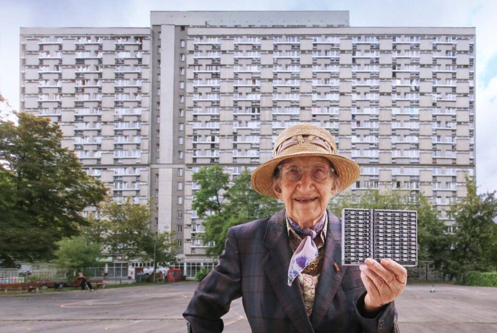
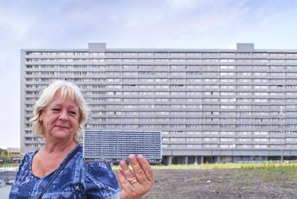
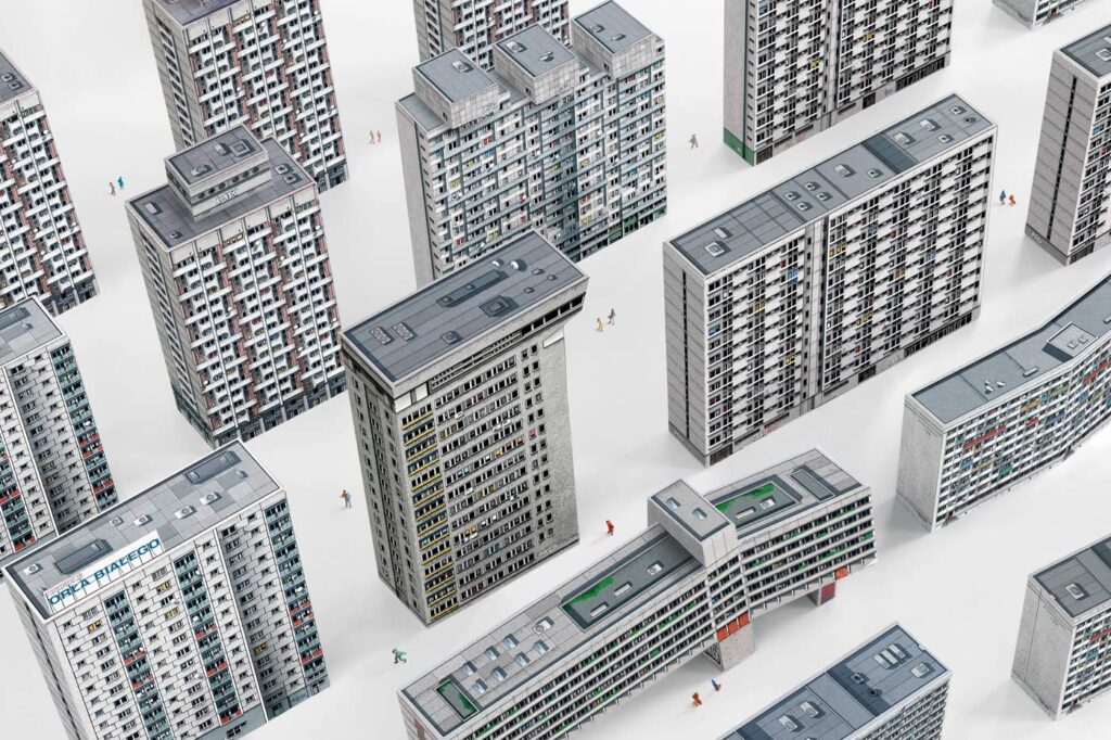
Their work depicts the main witnesses and actors of a controversial era: the architecture and its inhabitants. The fascinating architectural photographs are enriched with foldable paper models and contemporary daily life captures from the projects’ inhabitants. Zupagrafika’s work intends to help us better understand the actual situation of post-war Eastern Europe — and beyond — its dreams and utopias, failures and success.
Thank you Martyna and David for sharing with us at APAlmanac. Could you tell us more about Zupagrafika and your main line of work?
We founded Zupagrafika and started working together in 2012. It started out as a design studio specializing in editorial design and graphic design applied to architecture. Simultaneously we started to create and publish illustrated interactive books and kits on post-war modernist and brutalist architecture.
This type of architecture has undergone a rapid disappearance in Eastern Europe and beyond. It has been either demolished or thoughtlessly renovated. Our designs are a response to this situation, it is our way to preserve the original form and memory of those buildings. Our publications allow readers to explore and reconstruct the architecture of the former Eastern Bloc, including the GDR (German Democratic Republic), as well as the sadly gone brutalist constructions of Great Britain.
What draws you to brutalism and modernist architecture?
As a design studio, our love for brutalism has a big graphic background. We admire the composition and design of those buildings and the architects behind them and perceive them as peculiar pieces of art.
Since we live and work in Poland the architecture of the socialist era or PRL (The Polish People’s Republic) is still present in our everyday life. With our designs, we make an attempt at documenting modernist and brutalist architecture that is slowly disappearing from our urban landscapes.
How has your work changed throughout the years?
The studio has evolved and transformed a lot since we started. When we set up Zupagrafika we were regularly taking commissions for branding, poster, and editorial design. Throughout the years we started to take on fewer commissions and focused our efforts on the creation and publication of our own projects. It felt natural to do so.
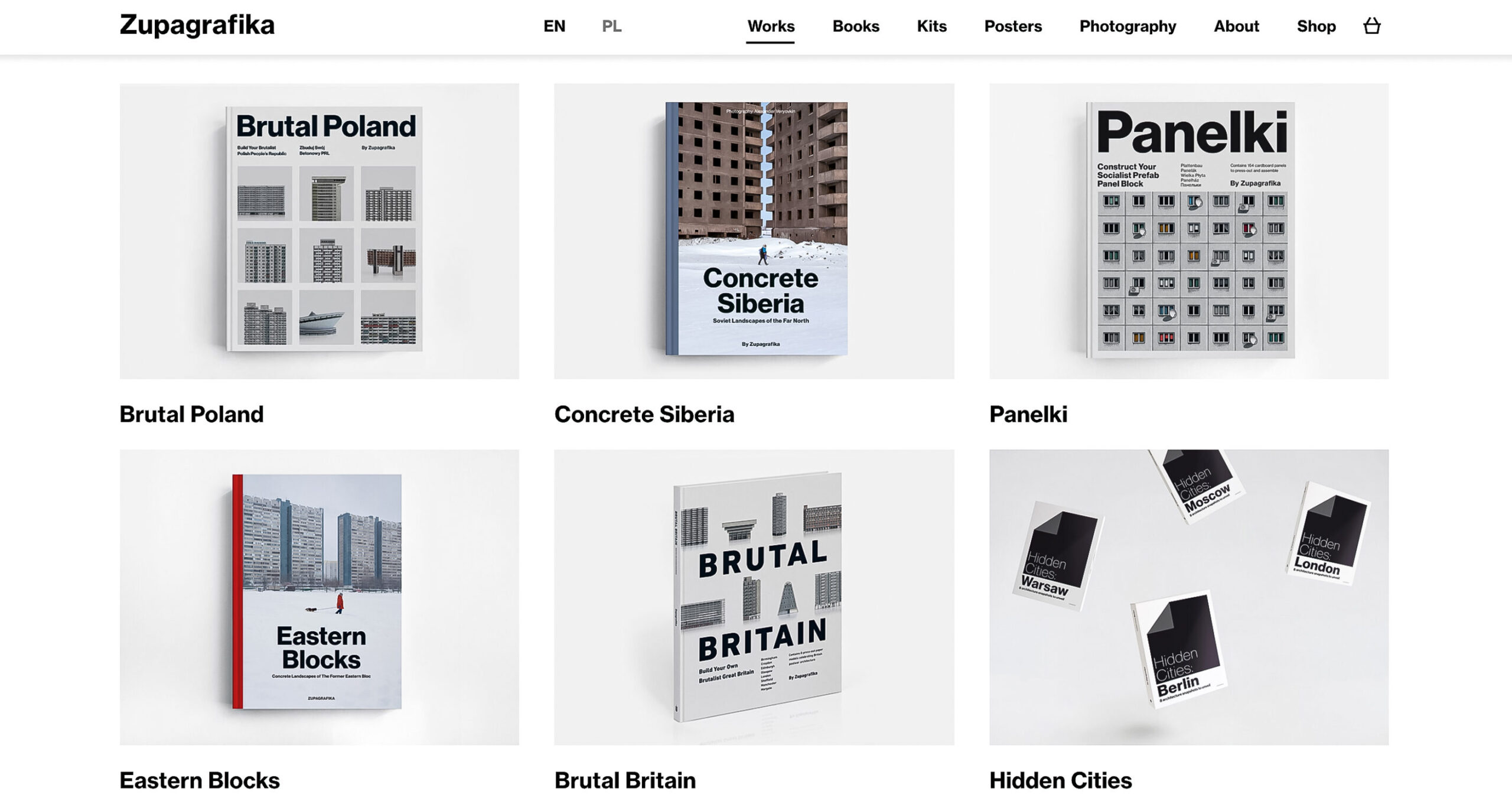
Today, Zupagrafika is mainly an independent publisher who initiates, designs, illustrates and publishes their own projects, with an eye on publishing books on architecture, photography and design by other authors too in the near future. We are happy about the change.
What is your approach for the creation of a book?
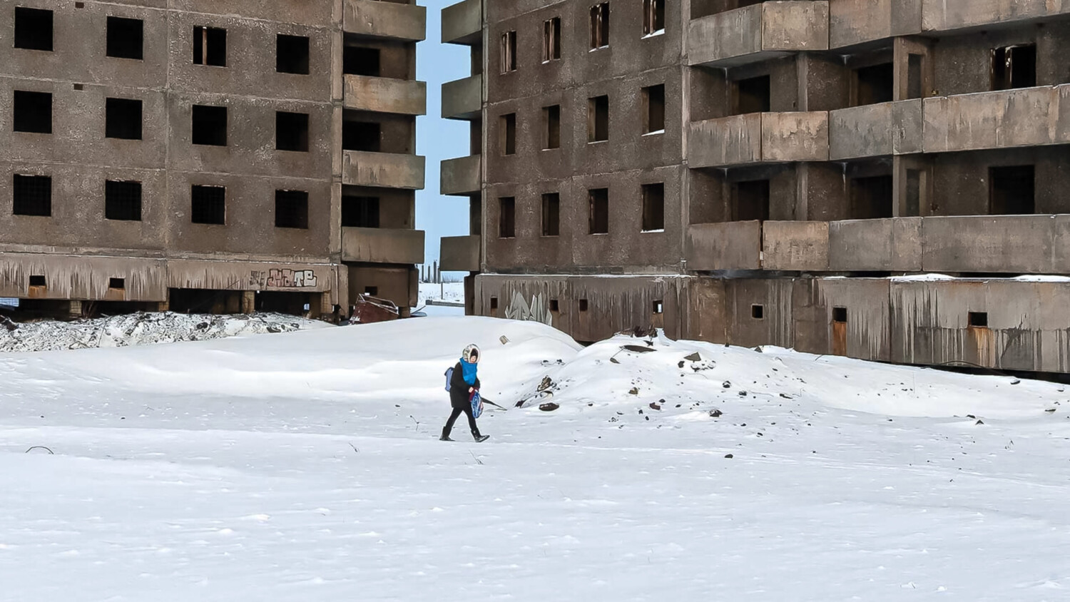
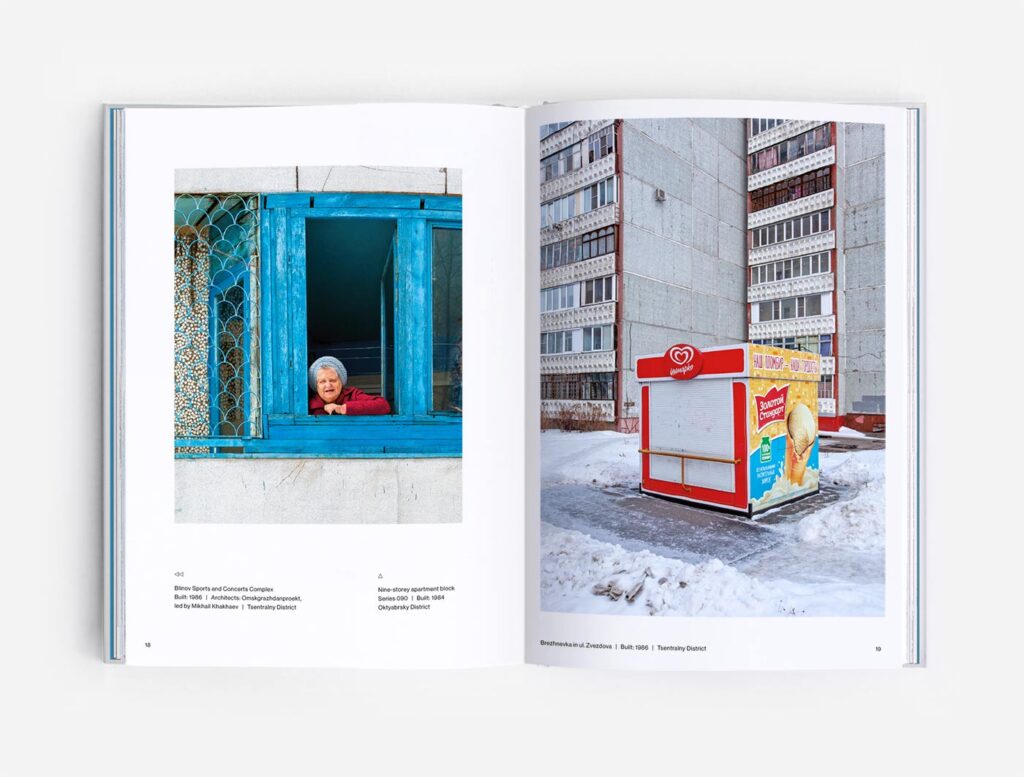
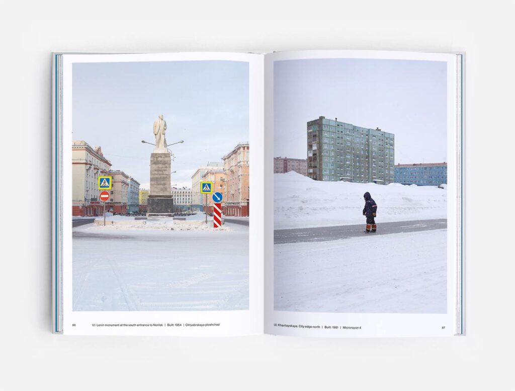
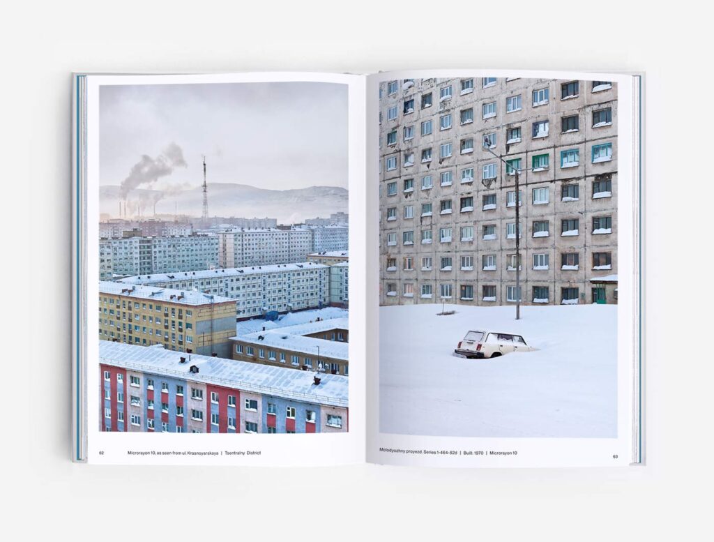
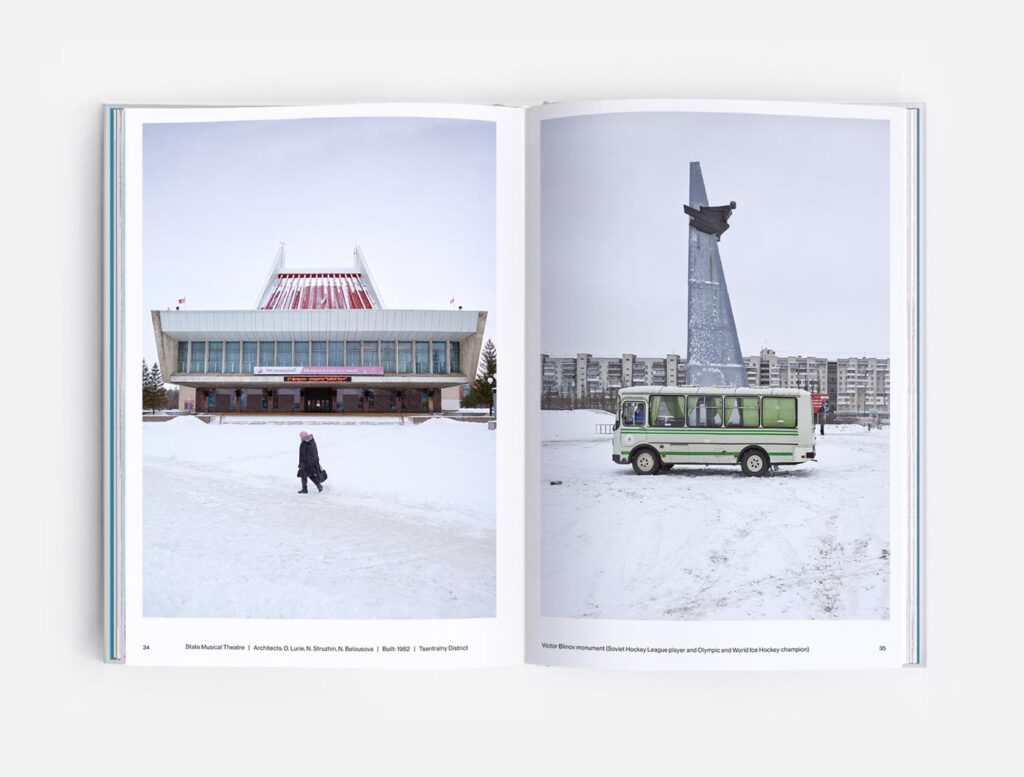
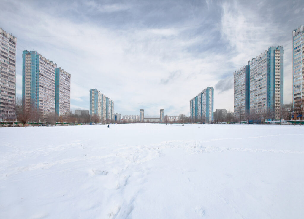
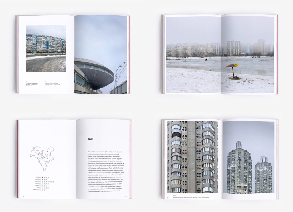
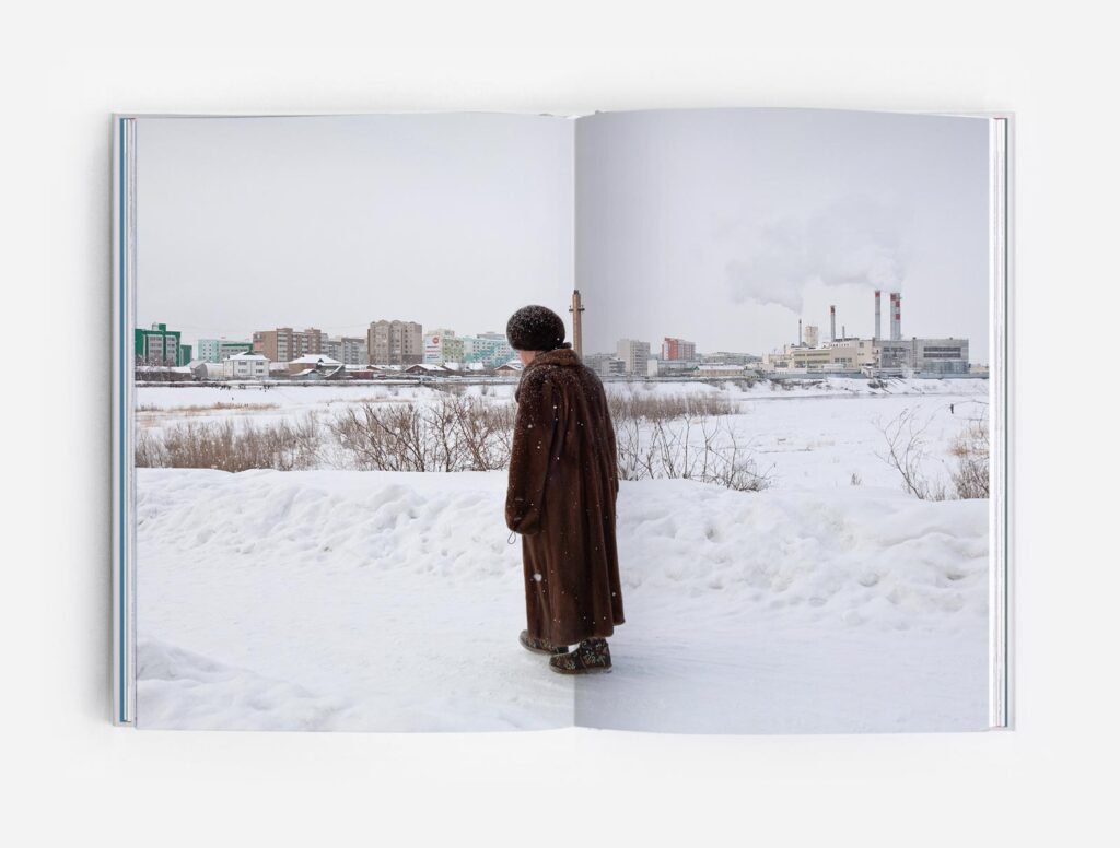
To understand a city, we choose to see it in a peculiar way: we start by getting lost on the peripheries, and then we slowly approach the city center, this is also the way we approach the book. The images selected for the book also place a special focus on the people who inhabit those buildings, we wanted to show a relation between the human and the concrete architecture surrounding them, finally, we chose winter as a conductive thread, building a dialogue between the pictures.

Please tell us more about Concrete Siberia, one of your latest books.
For this book we wanted to have a closer look at how the Soviet period influenced architecture and urban development in Siberia.
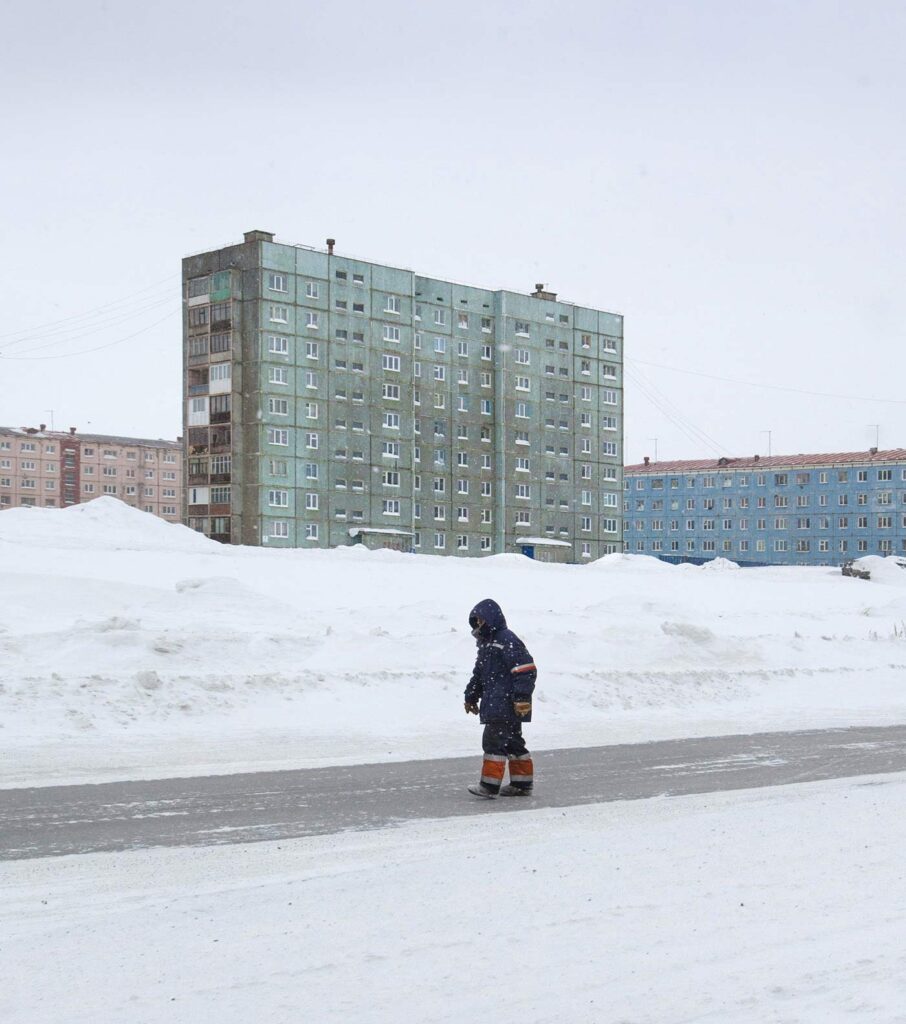
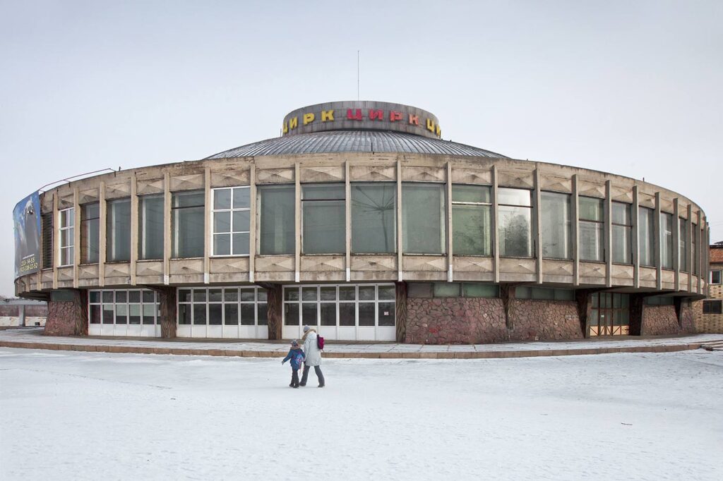
The typification did not occur in housing units, but also in public buildings. Most of the designs of the cosmic circuses, concrete theaters and opera houses were developed in Moscow and then copy-pasted into the urban tissues of Novosibirsk, Krasnoyarsk and other cities of the Far North. However, several local architects were bold enough to develop their own vision of modernist and brutalist architecture moulded to fit the newly developed urban landscapes and severe climate of the region. The book features two of the coldest cities on the planet, Yakutsk and Norilsk.
Through Concrete Siberia we are sharing the architecture which fascinates us and which we have been documenting in many ways – whether through illustration or photography – for the last decade. Many of the buildings photographed in the book have not been published in any form before. We believe that this book can be a tool to explore unknown places and constructions that shaped the cityscapes of Siberia and also, perhaps, to appreciate them as they are.
As a photographer myself I have to ask — do you take all the photographs for your books?
Specifically, Concrete Siberia was commissioned to the Russian photographer Alexander Veryovkin. As a side note the coldest city the photographer visited while shooting was Yakutsk, where the temperature reached -30° Celsius (-22°F). All the previous books and works were mainly photographed by us, except for a few commissions to local photographers.
Congratulations on the great captures and the collaborative work! To close off, are there any specific rules or equipment (e.g. tilt-shift lenses) while photographing for the projects?
We do not have a wide range of lenses, just a couple standards including a wide-angle lens. We usually correct angles and perspectives during post-production in Photoshop. We also try to avoid direct sun in the buildings, we are not keen on architecture with a sunny contrast. If we are working with other photographers we usually ask them to avoid direct sunlight too.
Thank you again Martyna and David for sharing your work and the creative process. I find their work and career inspiring for anyone interested in further developing personal photographic projects. You can learn more about Zupagrafika and their publications on their website zupagrafika.com or on their social media channels. Instagram @zupagrafika and Facebook.
