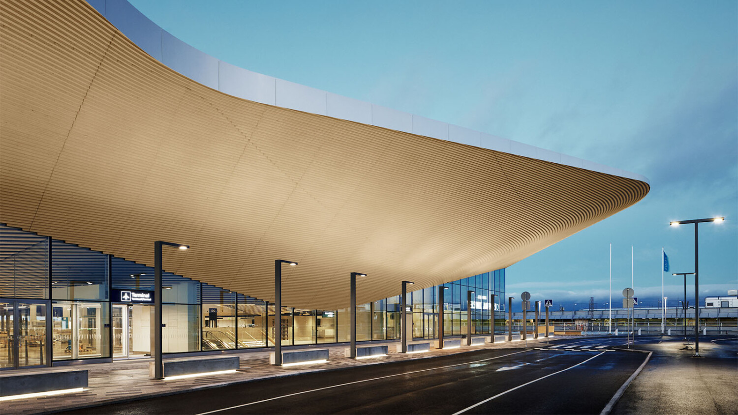
Tuomas Uusheimo is Back on Project of the Week With Stunning Photographs of Helsinki Airport’s Terminal 2 Expansion
We’re going back to Helsinki with past Project of the Week photographer Tuomas Uusheimo. Last time around, Tuomas showed us the Oodi Library, and today’s featured project shares a very similar shape and style. Like Oodi, the Terminal 2 building expansion of the Helsinki Airport is by ALA Architects. Let’s check it out!
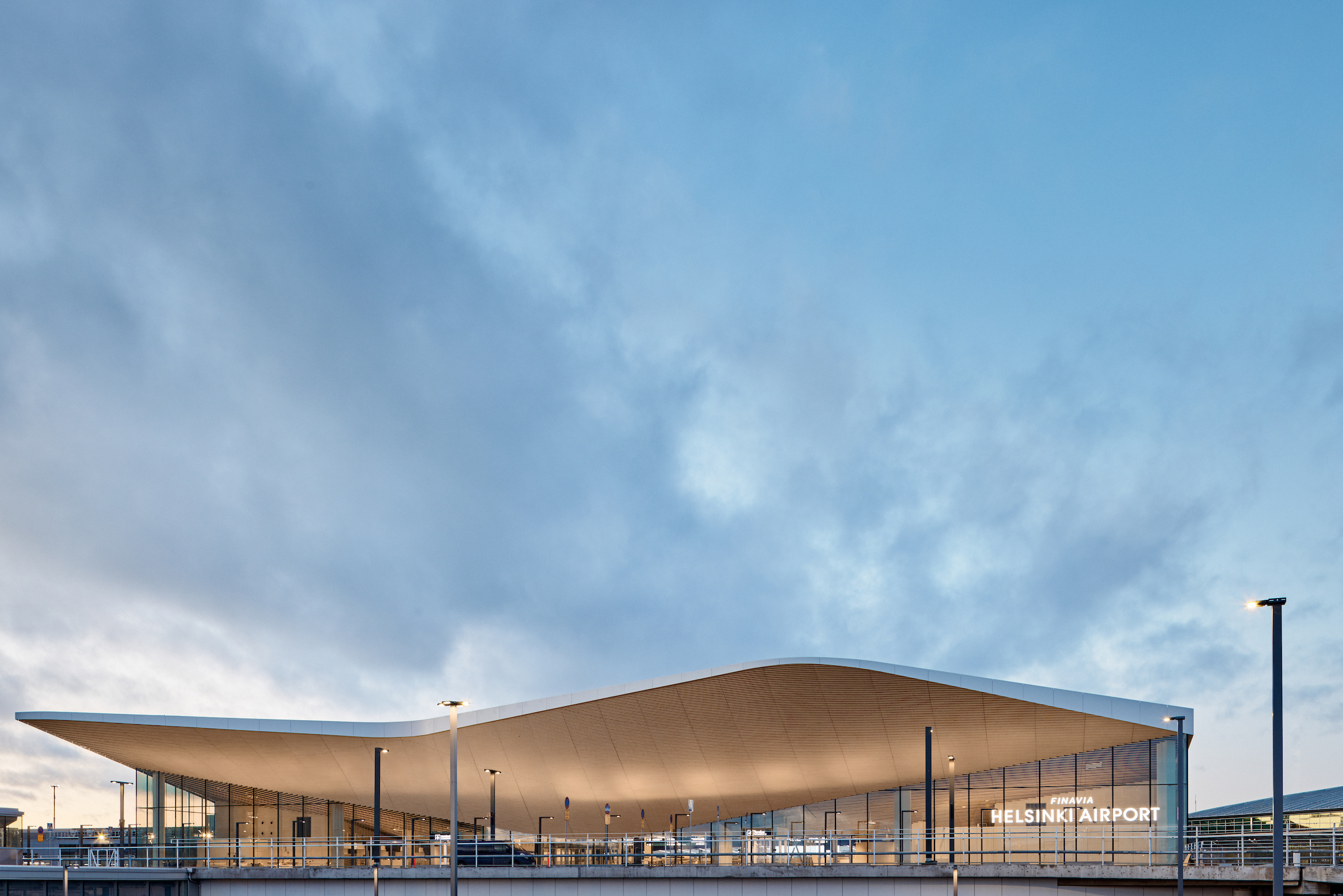
Tuomas’ exterior photographs of the terminal are incredible. The color palate is cinematic, with the warm wood and glowing interior set off against the moody blue sky. It’s all restrained though, and the colors, the clouds in the sky, and the interior lights are all perfectly subtle. No one element hits us over the head here, allowing our focus to rest on the shape and form of the terminal.
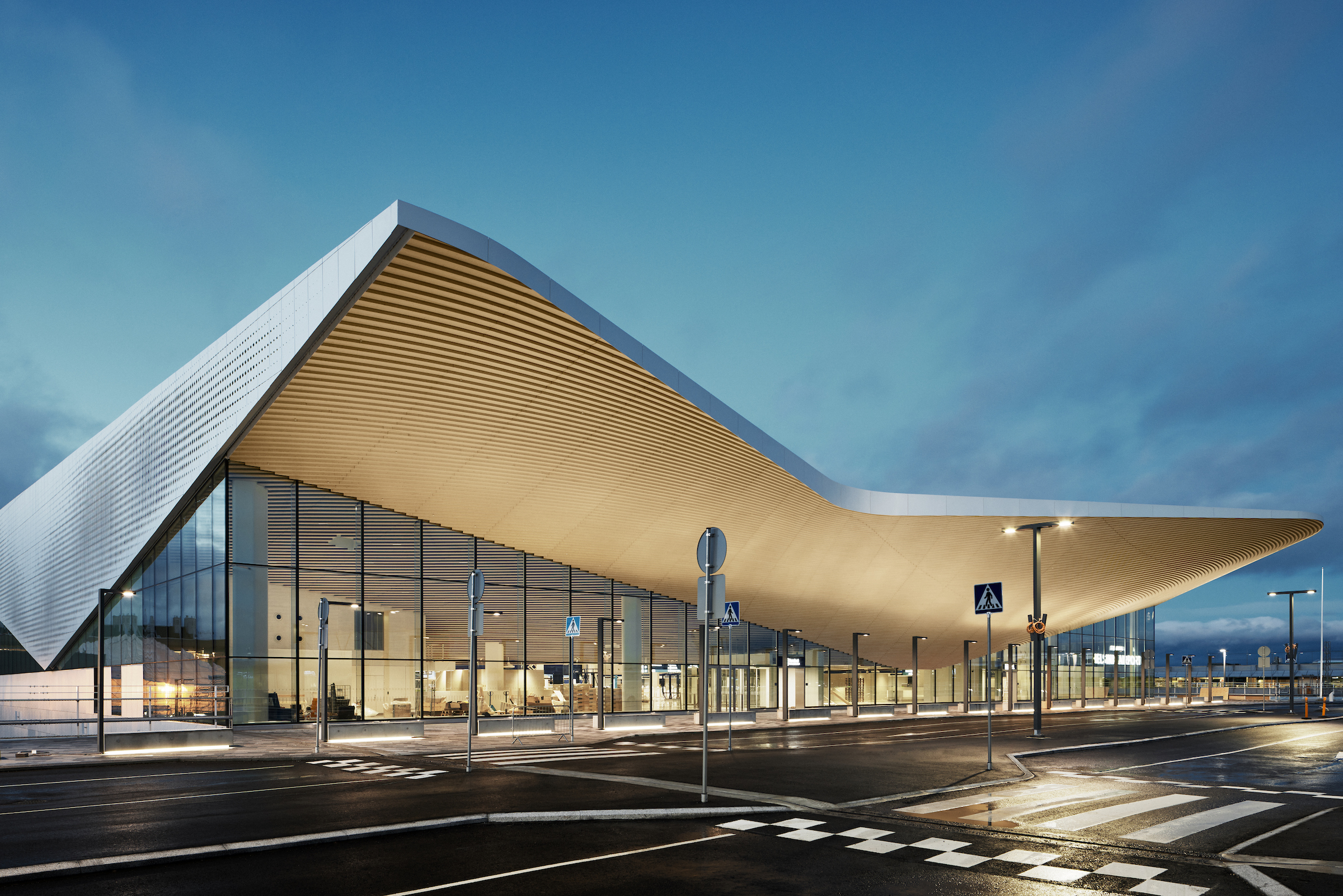
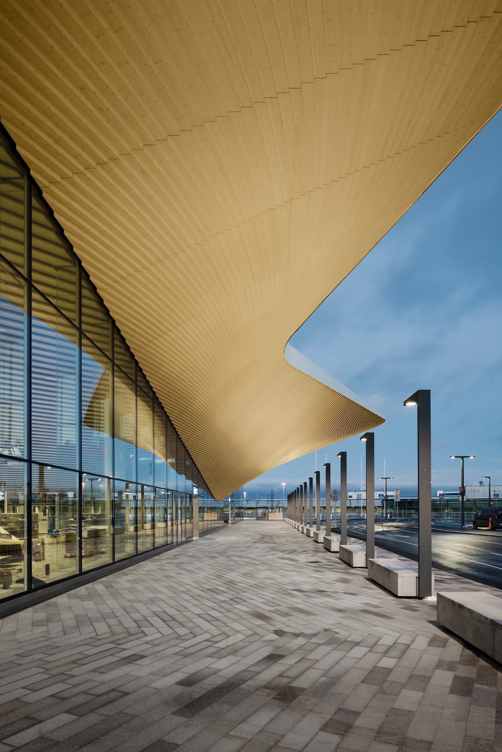
I love Tuomas’ composition here. He shows off the curvacious elements terminal and how it offsets the sharper, more angular lines created by the glazing. The street lamps echo the lines created by the building and add a nice rhythm that carries our eyes through the scene.
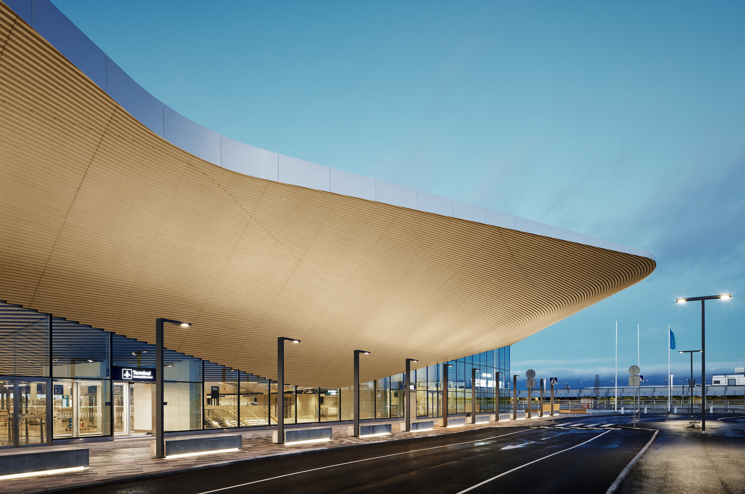
His perspective here allows us to feel sheltered by the overhang. We are able to note the complexities in its shape and feel as if we could just reach up and touch the boards. Tuomas does a beautiful job of giving each element in this image its own space and breathing room.
As we head inside, we see that the terminal’s ceiling echoes the patterns outside. The sweeping lines carry our eyes like waves.
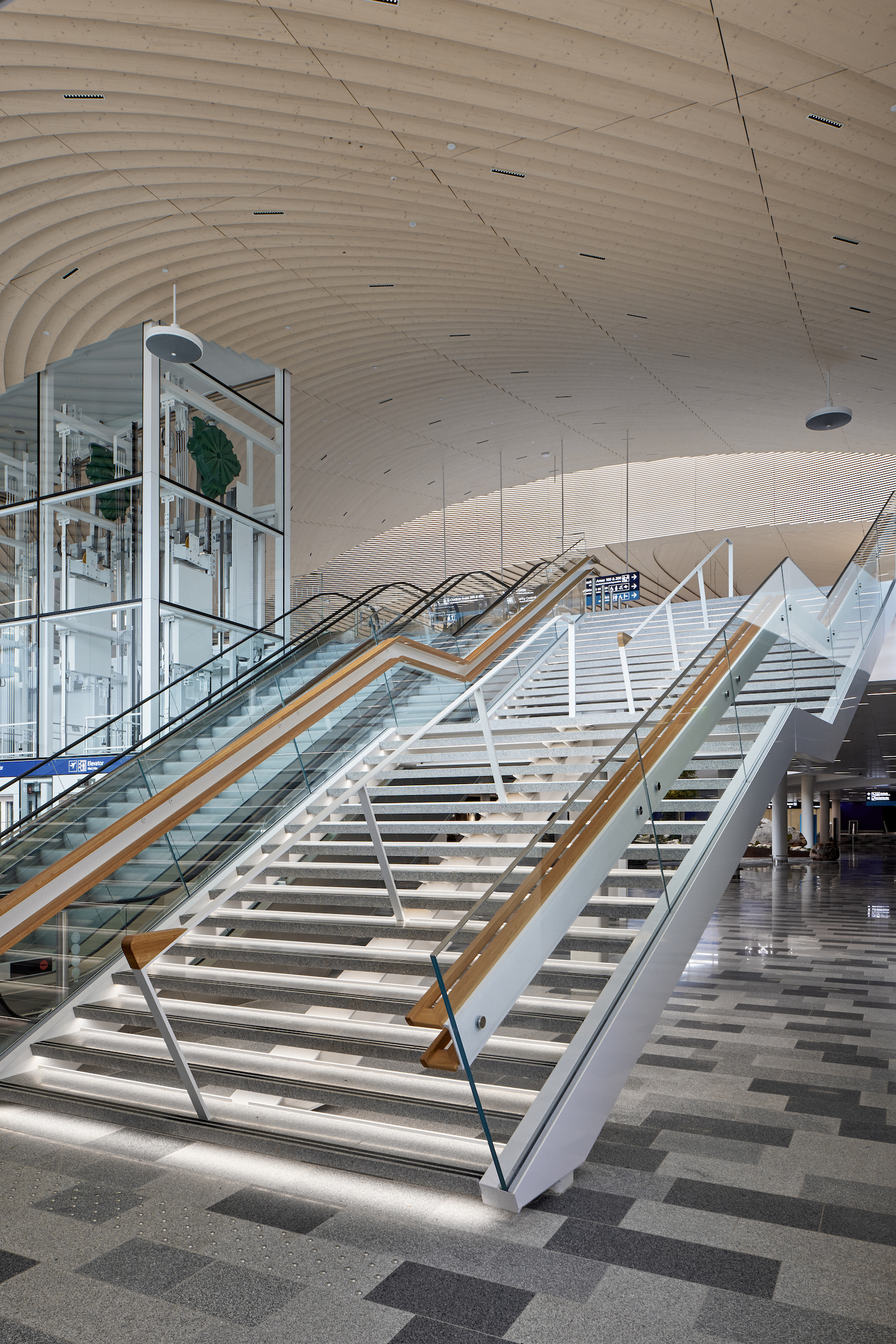
One of my favorite things about Tuomas’ work that was touched on in the past POTW article on the Oodi Library is his very natural, very reserved style. His post-processing is simple and natural. It feels true to real life and is void of distractions. There is a calmness and quietness about his work.
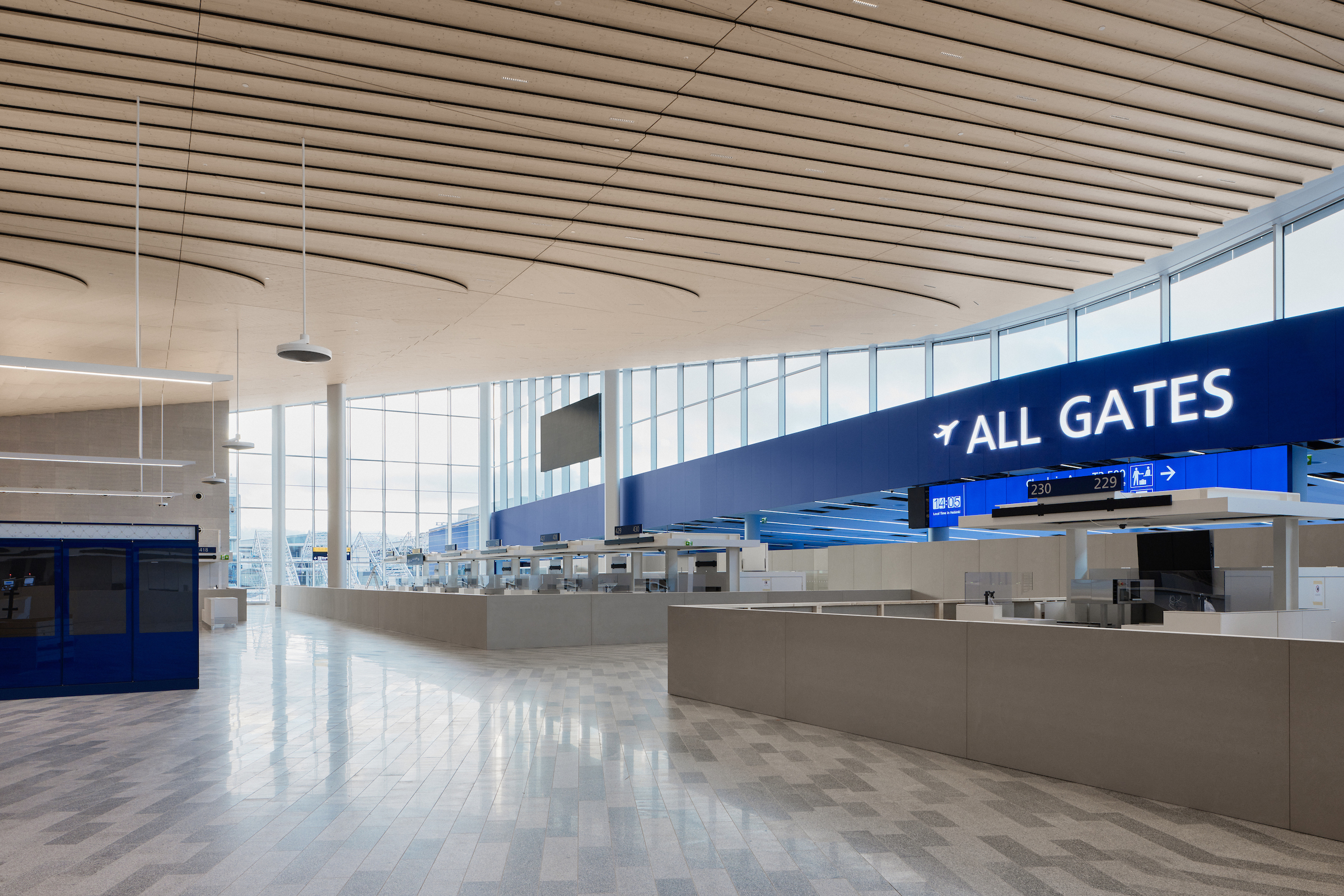
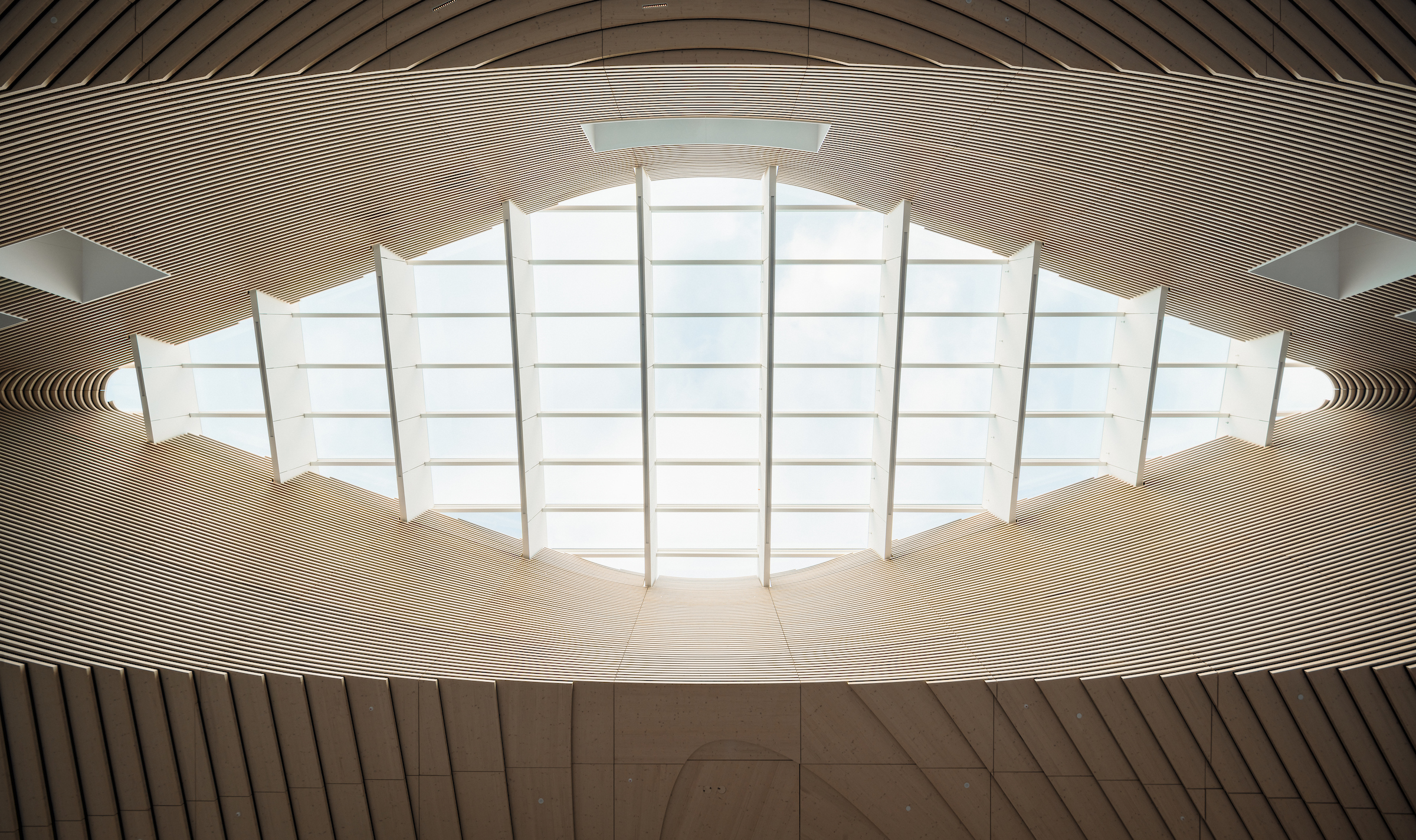
A wider, all-encompassing view shows us the grand scale of the terminal, and that beautiful skylight twisting above it all. It pulls our eyes toward the back of the image, allowing us to note how huge and open the space is.
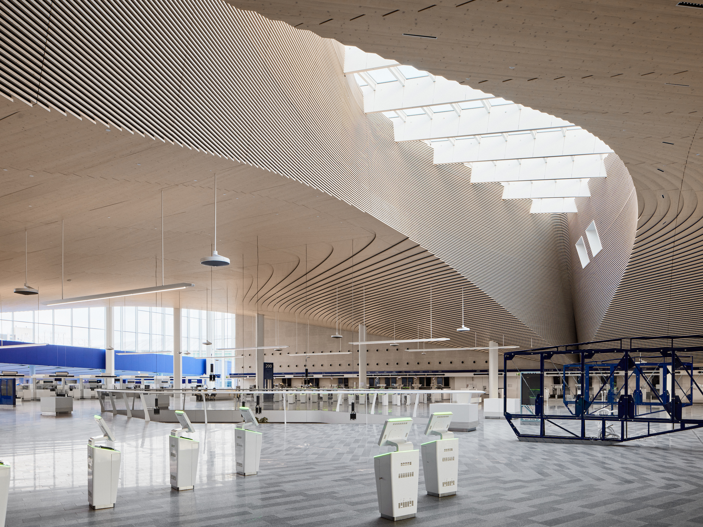
As Tuomas chunks down the skylight for us, he creates very graphic, texture heavy, simple images that showcase the architectural detail for us in all its splendor. The photographs feel abstract, and put all the emphasis on the form and line that are present.
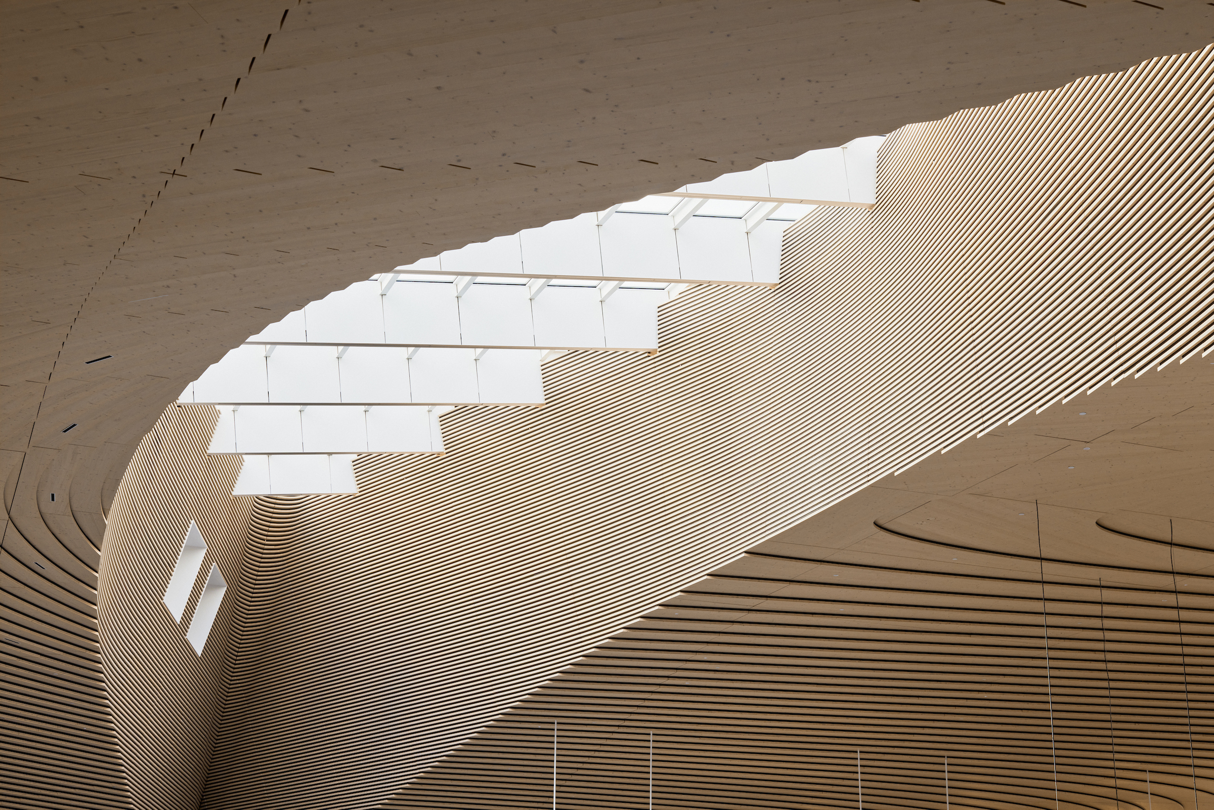
How outrageously cool is this?! What a powerful detail! Look at the gorgeous light streaming in, and how it accentuates each and every line that’s present. There is a beautiful cascading rhythm that gives life and movement to this shot.
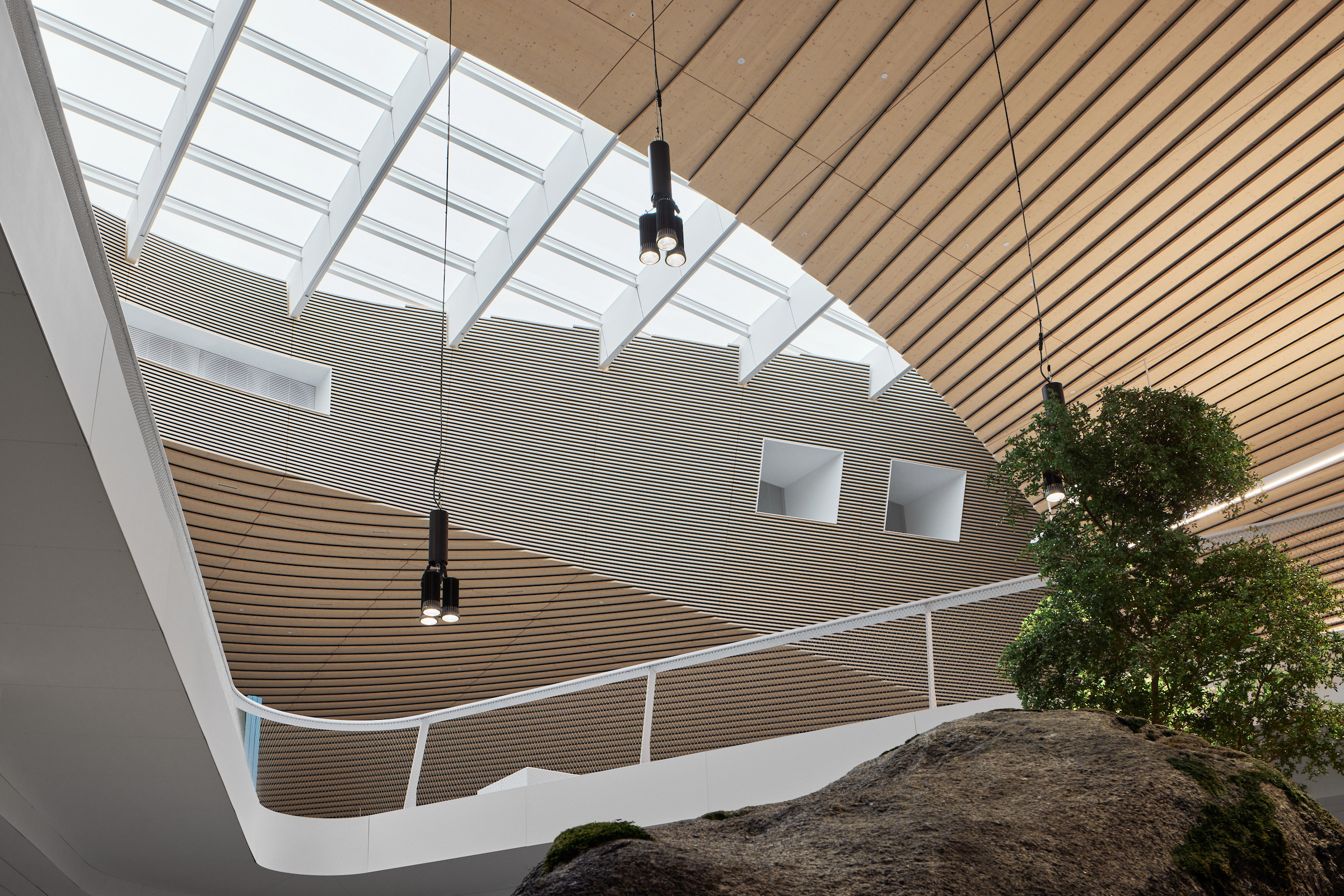
We’ll close out this Project of the week with a final graphic, shapely scene that Tuomas has created. Note the way the lines play together. Check out the contrast through color, as the smooth, white lines pop out from the warm wood. I love how Tuomas includes the rock and tree at the bottom, as their organic free-form shapes break up the man-made hard lines and textures.
Many thanks to Tuomas Uusheimo for sharing his project of the Terminal 2 expansion with us. You can see more of Tuomas’ work on his website www.uusheimo.com or his Instagram @onarchitecture.
If you have a project you’d like to be considered for Project of the Week, you can submit it here.
