Tuomas Uusheimo Photographs Helsinki’s Fun and Funky Oodi Library
Helsinki, Finland. A place riddled with funky architecture and rich design. Heck, there’s even a great band named — well — Architecture in Helsinki. This week we dive into a great piece of modern Nordic design by ALA Architects’. Enter, the Oodi Library. This relatively new yet iconic building has been the star of many photographs, but one architectural photographer, in particular, made me really fall in love with it. This week, we shine the spotlight on the work of Tuomas Uusheimo, who captured this great building.
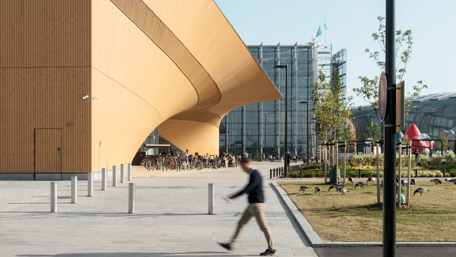
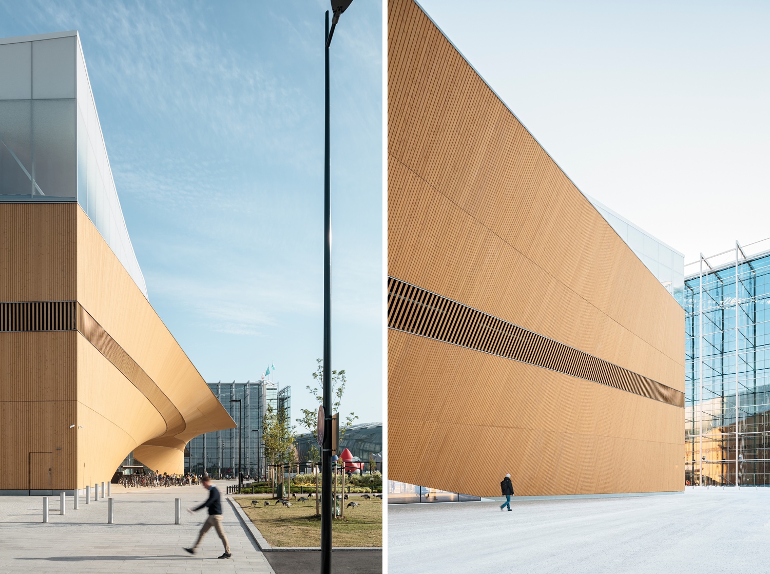
These two photographs are a great teaser for the things to come in this week’s featured project. Beautiful and bold lines, repetition throughout the design elements present, and great color work are all things that immediately catch my attention here. What is most noteworthy though, is the gorgeous quality of light highlighting the side of the library. Look at the way it pours across the facade and pulls out the texture of the wood. It’s a lovely start to a lovely project!
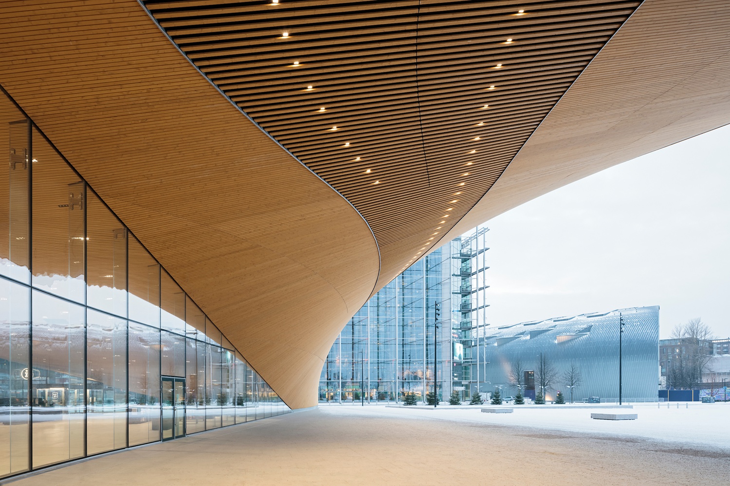
There are a handful of great elements at play in this photograph. Let’s start with the hard-to-ignore leading lines; On the left side of the scene, the black window casings fast track our eyes through to the back of the frame. Overhead, the swooping curves gently carry our eyes to the same converging point. There’s such a great contrast between the shape of the two, yet they achieve the same goal of leading our eyes through the frame. Speaking of contrast, look at the color play here! The warm wood and soft lights pouring down from the overhang are set apart from the cold blue architecture beyond. This creates a nice inviting feeling that beckons you to step over to Oodi. I never knew I could love the entryway of a library so much!
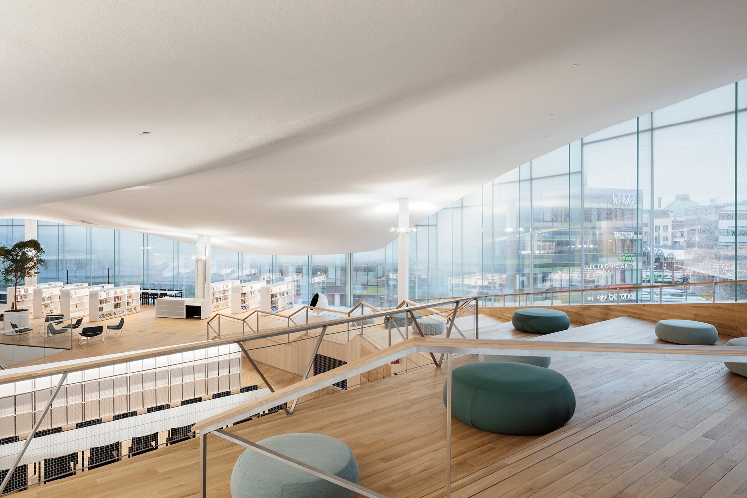
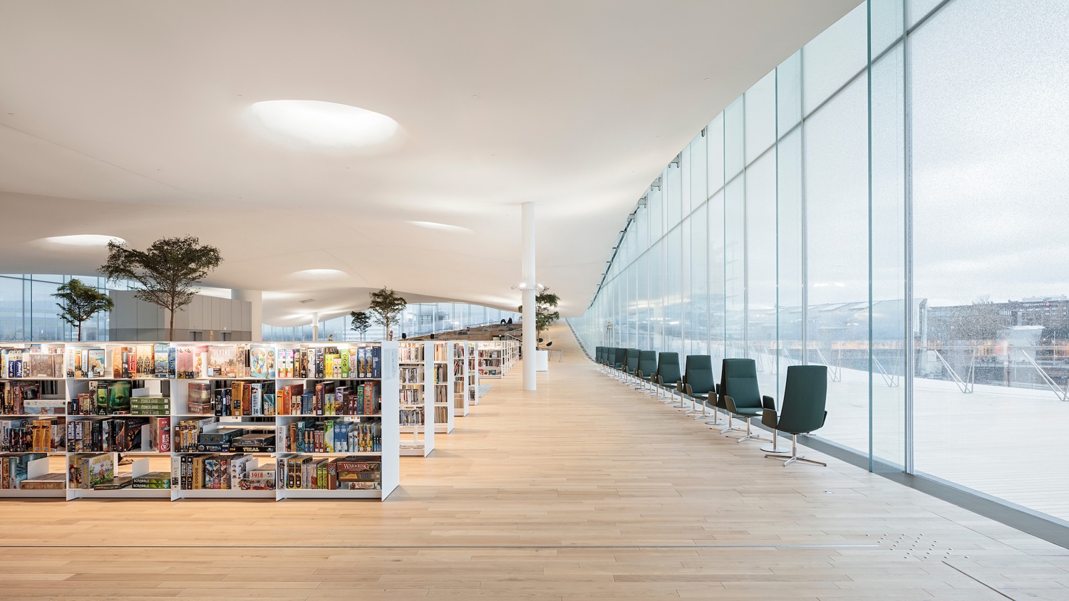
Inside Helsinki’s Central Library, that same warm inviting feeling is present. Tuomas gives us the lay of the land with a wide focal length that allows us to see down through the various areas of the library. This angle showcases the beautiful shape of Oodi’s ceiling and windows. It echoes the same feeling as the exterior, where soft rolling curves are contrasted by the hard lines found in the railings, bookshelves, and window casings. This is a recipe for a delightfully funky harmony that feels very Nordic in nature.
A strong one-point perspective emphasizes all of the design elements at play here on the main library floor. Look at the way the ends of the bookshelves cascade back — seemingly forever. Tuomas uses the repetition of the bookshelves to create rhythm and movement in the image, which in turn shows off the depth of the space. This perspective also highlights the trees popping up through the shelving, which adds a lovely organic component as our eyes scan upwards to meet the soft rolling ceiling.
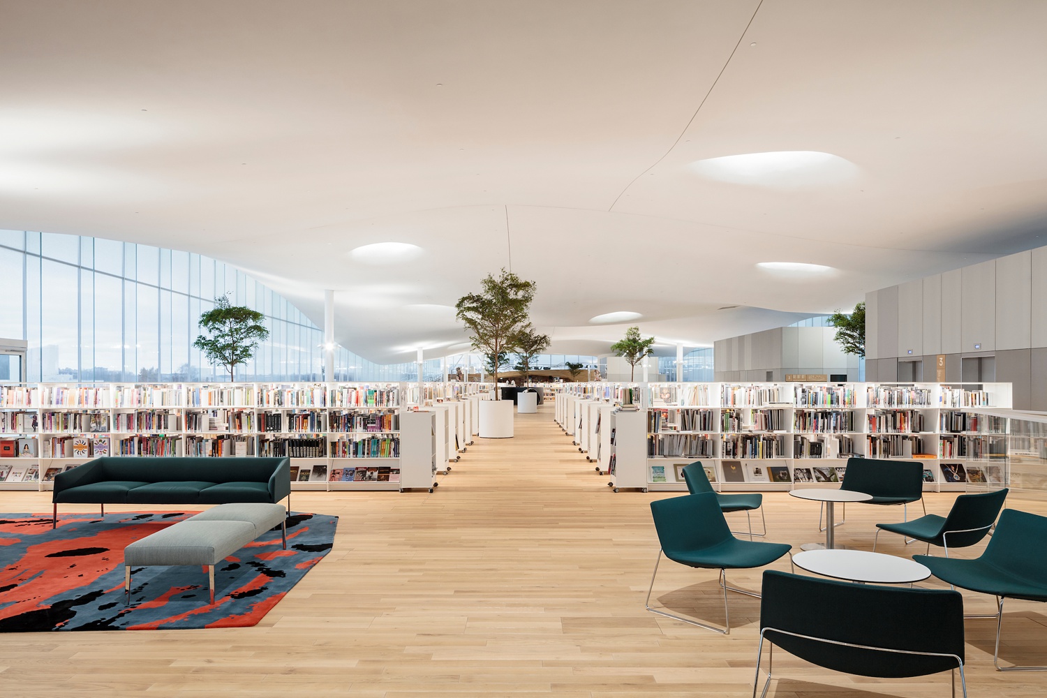
There is a very natural air to Tuomas’ images as well as his post-processing. Each frame feels gentle and real, as if you are truly standing in the Oodi Library, observing the space. Notice how the whites in the ceiling and shelves are warm and trend a bit dark. Look at the proper balance in exposure between the interior and the window view outside. Tuomas even keeps a slight color cast on the floor. This keeps the image from feeling like a sterile rendering, and while not everyone’s style — it definitely lends itself well to Tuomas’ work.
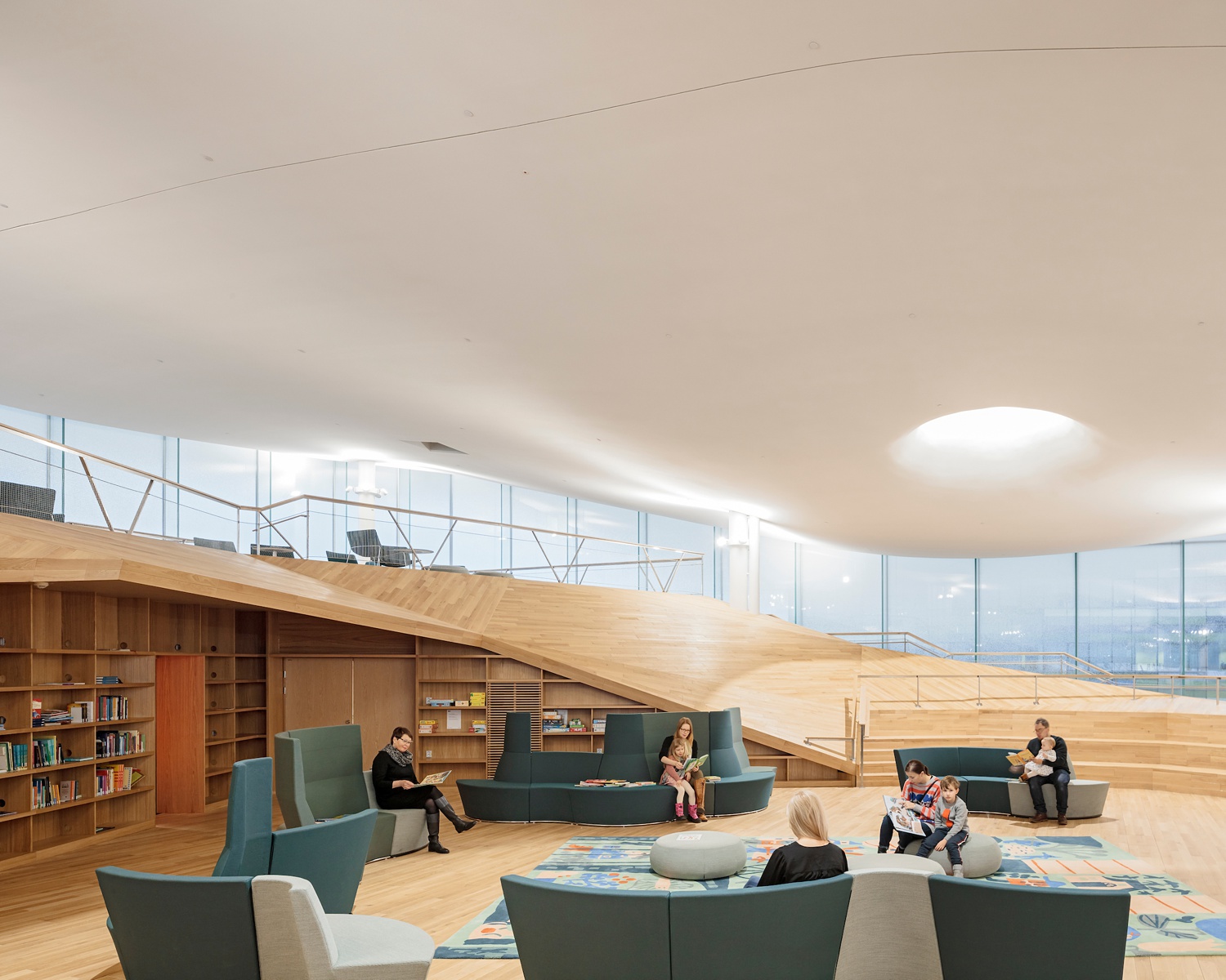
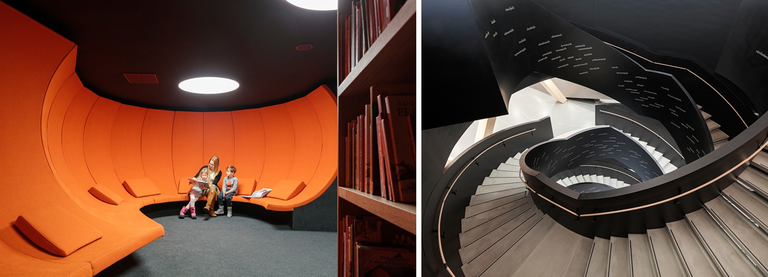
Maybe it’s the portrait artist in me, but I always love it when there is a human element present in architectural photography. Tuomas captures this reading nook with library-goers present. By including them, he is able to show the functionality of the space, as well as the scale. What I especially admire is how each person (or family) has lots of breathing room which keeps a very tidy and uncrowded image.
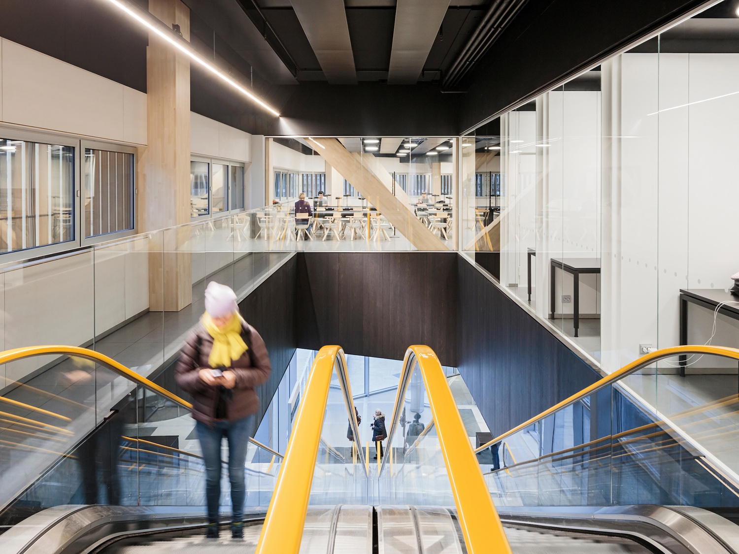
Tuomas moves on to capturing different spaces in Oodi to show that it isn’t just a library, but more of a cultural center. As we deconstruct this image, we notice all of the converging lines — from the beams and conduit overhead, to the railings on the escalator. As we explore through the scene, we notice that Tuomas is sure to include a peek of each desk in the rooms on the right, hinting at the usability of the spaces there. Beyond, in the nicely illuminated study area, we are able to see desks and people filing out the space. What I love most about this image is the vibrancy of the escalator railings and how they match with the scarf on our “model.” Whether that was planned, photoshopped, or perfect timing, it adds a lively flavor to the scene.
As we continue our journey through the depths of Helsinki’s Central Library, we come to these two ultra mod and funky scenes that play off each other in such a fun way. Tuomas captures both of these separate scenes in a similar manner, creating the same curvature and focal point. This adds a cohesive air throughout the project, and I admire when “supporting” images really feel like they go along with the meat of the project.
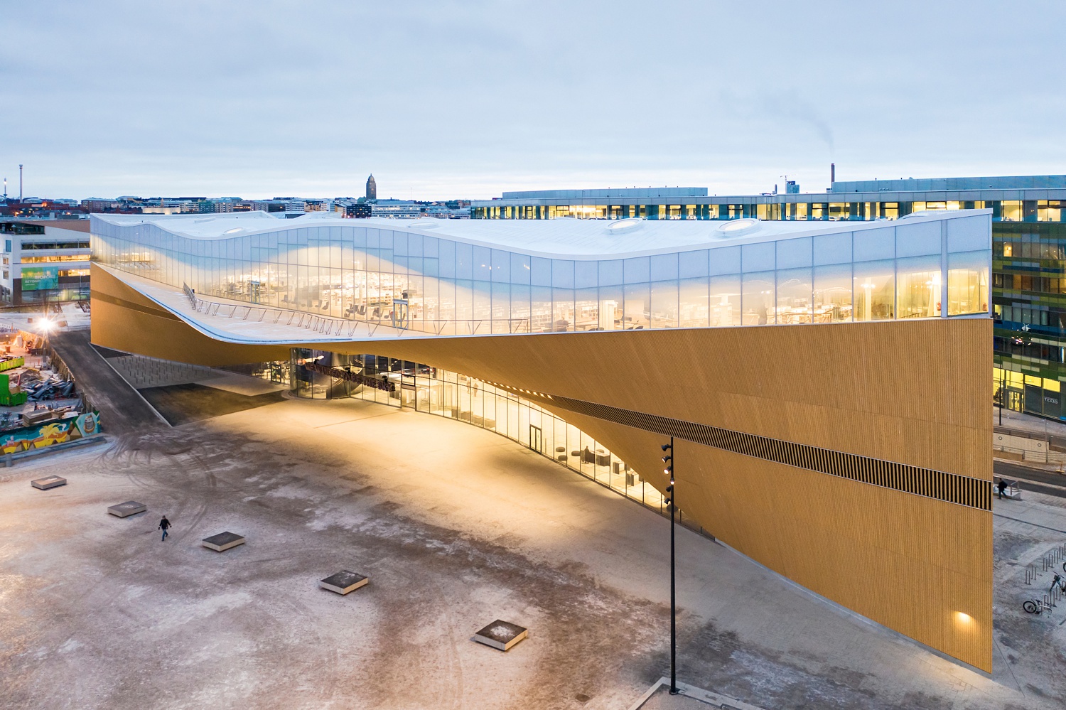
Back outside Oodi at twilight, we are better able to see the massing of the building and how it contrasts with its city surroundings. This perspective that Tuomas has chosen shows off the extreme length of the building, and how all of the arcs and curves come to a point at the end. Oodi looks a bit like a huge futuristic ship from this angle, and I don’t think it’s something you’d notice unless you saw it from this vantage point.
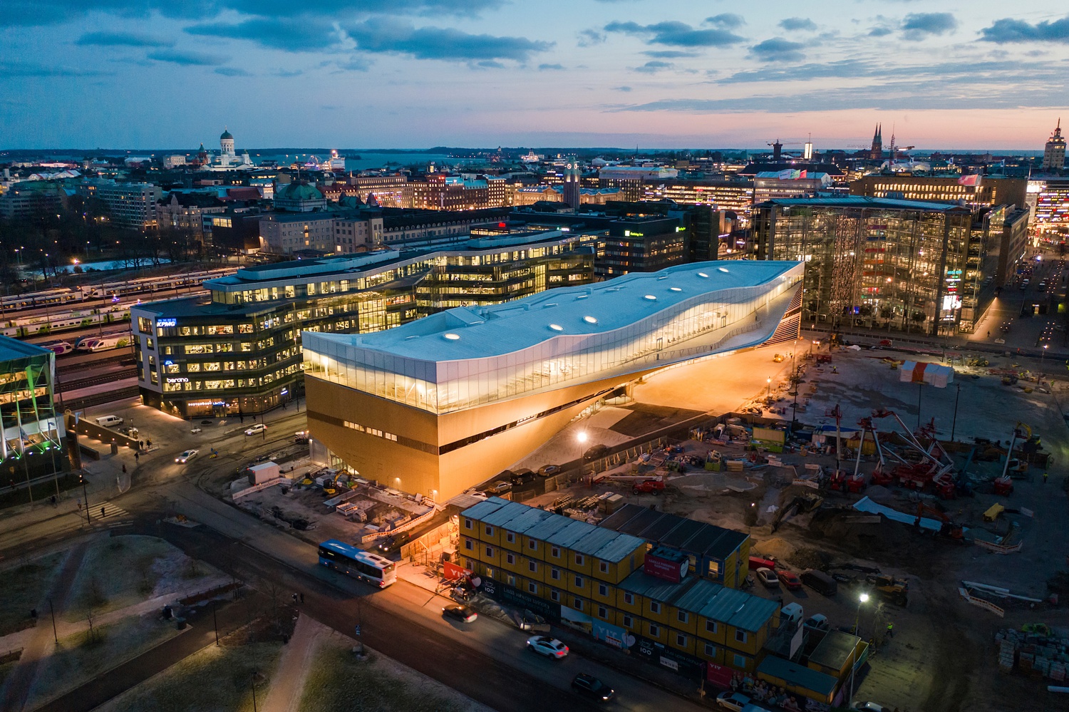
From the opposite side, and back across the city, we are able to see Oodi in its entirety. What I appreciate most about Tuomas’ work here is that he allows the rest of the city to be faintly illuminated, but allows Oodi to shine as the subject in the center. He also masterfully uses the present lighting to draw our attention away from the construction next door (an element that is always out of our control as photographers) and rests it firmly on the beacon of Helsinki, the Oodi library.
Many thanks to Tuomas Uusheimo for sharing his project of the Oodi library with us. You can view more of Tuomas’ great work on his website www.uusheimo.com or his Instagram @onarchitecture.
If you have a project you’d like to be considered for Project of the Week, you can submit it here.
