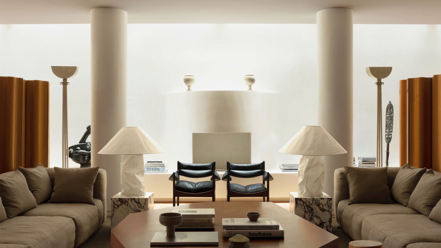
Felix Speller Photographs an Eclectic Saint Laurent Inspired Home in London
Felix Speller’s work has an undeniably distinct quality, where you can look at any of his photographs and think “Aha! This is a Felix Speller!” Felix is back for another Project of the Week with another beautiful space by Child Studio.
Just as with Felix’s past Project of the Week offering at Maido Sushi, you can expect to see a restrained color palate in these photographs, filled with gorgeous custom cabinetry, glass block, and just the prettiest lighting you’ve ever seen.
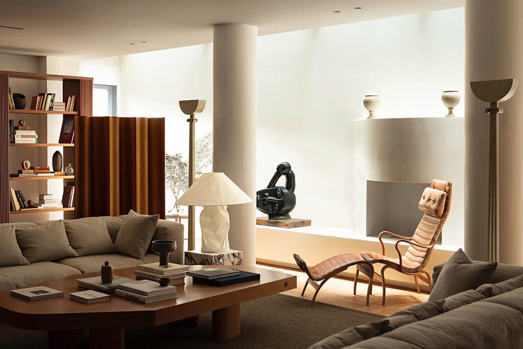
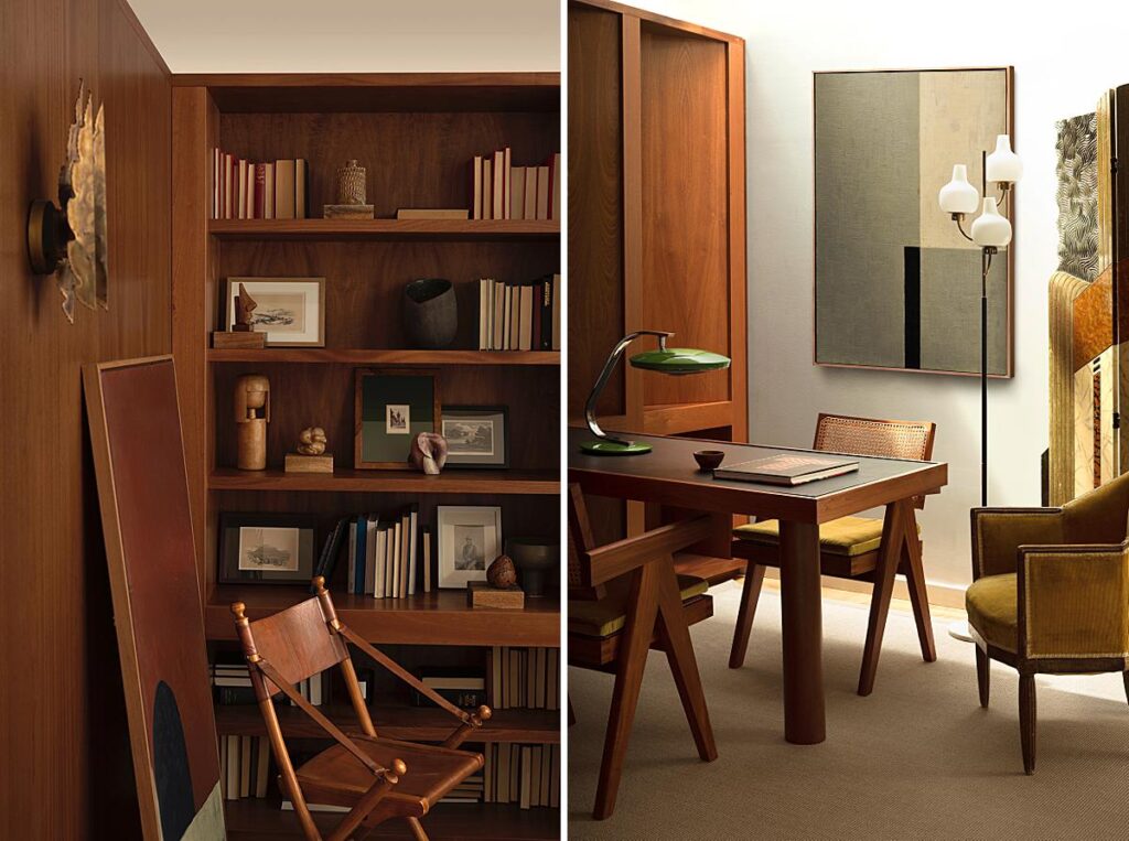
I appreciate how Felix hones in on The Mayfair Lounge’s thoughtful pieces of artwork, sculptures, and vintage furniture offerings. He delivers a real sense of what it is like to be standing in the Yves Saint Laurent inspired lounge, and communicates just how important these pieces are in complementing the design of the space.
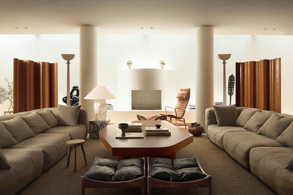
Mayfair Lounge is an eclectic space, and yet Felix’s photographs walk perfectly on the line between intimacy and giving enough space to allow us to make sense of each room. Here, our focus moves from the custom Child Studio-designed wooden table, back through the lounge layer by layer.
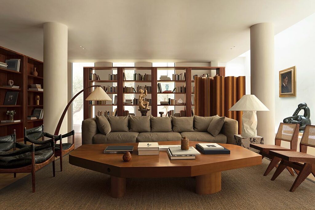
This thoughtful composition creates a lovely rhythm in the columns and conveys a deep, three-dimensional feeling.
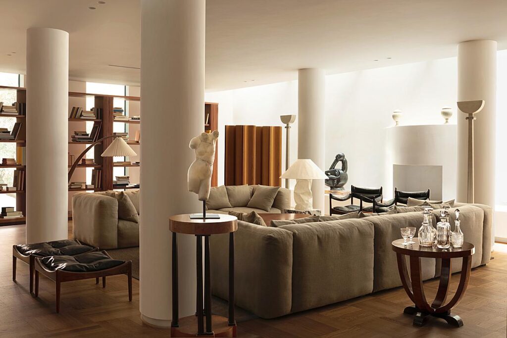
This fairly symmetrical one-point perspective tidily sends our focus through the lounge, and settles on the curved fireplace. I love how Felix was not afraid to create a wide dynamic range in this image, with the foreground full of shadow and the back wall awash with strong highlights from the skylight above. It gives tons of mood and drives our eyes through the frame.
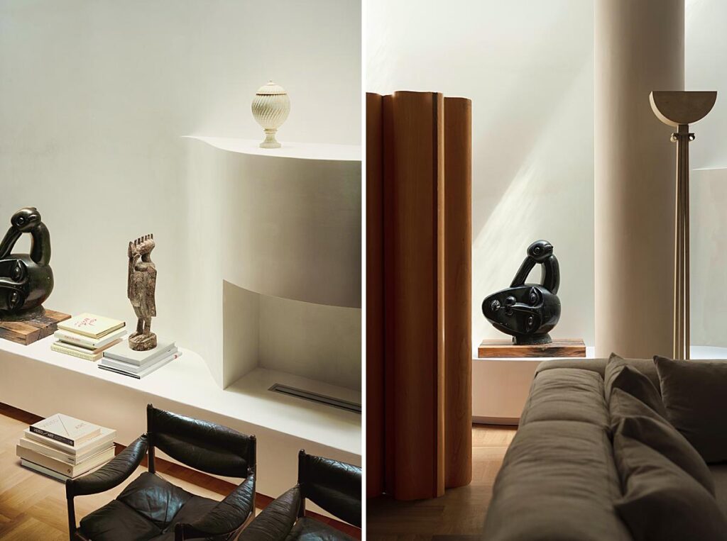
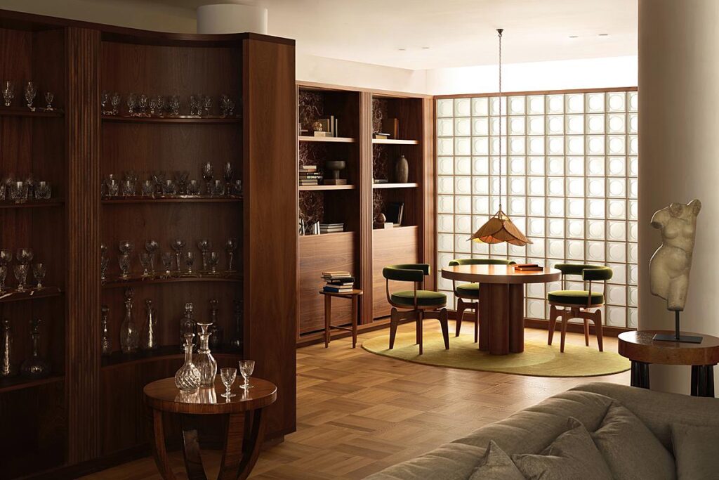
A glass brick wall spreads lovely directional light through the frame. Felix uses it to place our attention exactly where he wants it, but still allows us to pick up on information like the glassware shelving and sculpture along the way.
Again, sweeping directional light pulls out the texture in the custom cabinetry and the textiles in the scene. We feel as if we can reach out through our screens and feel the ridges on the shelving, or the pendant.
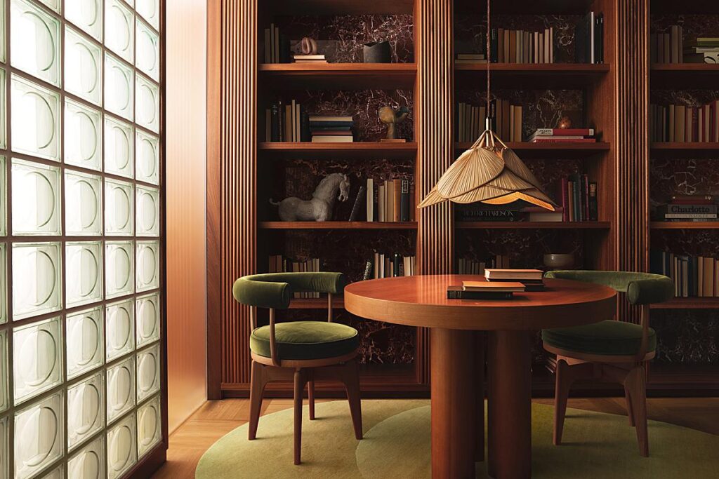
A view of the office offers the familiar bright highlights and deep shadows we saw in the other rooms. It has an incredible sense of place, and we feel as if we are at Mayfair Lounge in person.
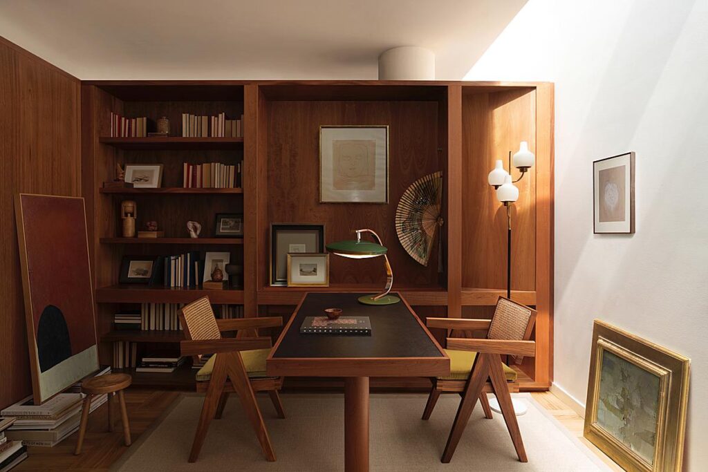
This lovely vignette offers plenty of bold shapes and juxtaposing textures — as with all of the wider more encompassing views of the home.
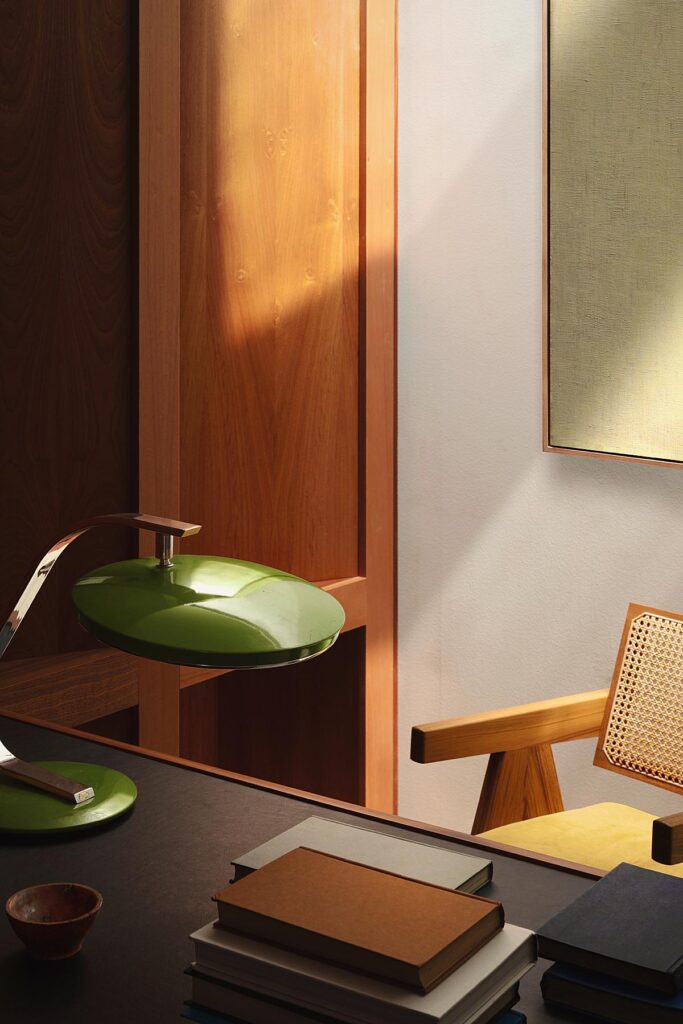
What a wonderful project. Felix, you knocked this one out of the park!
Many thanks to Felix Speller for submitting this project to us! Visit felixspeller.com and give a follow to @felixspeller to see more of his stunning work!
If you have a project you’d like to be considered for Project of the Week, you can submit it here.
