Pippa Drummond Shows Off The Quiet Charm of RTA Studio’s E-Type House
If you’ve ever paged through Dwell or looked at a Herman Miller catalog, you’re already familiar with the work of New York based photographer Pippa Drummond. Pippa’s work is riddled with thoughtful compositions and post-processed in a way that lets the spaces speak for themselves.
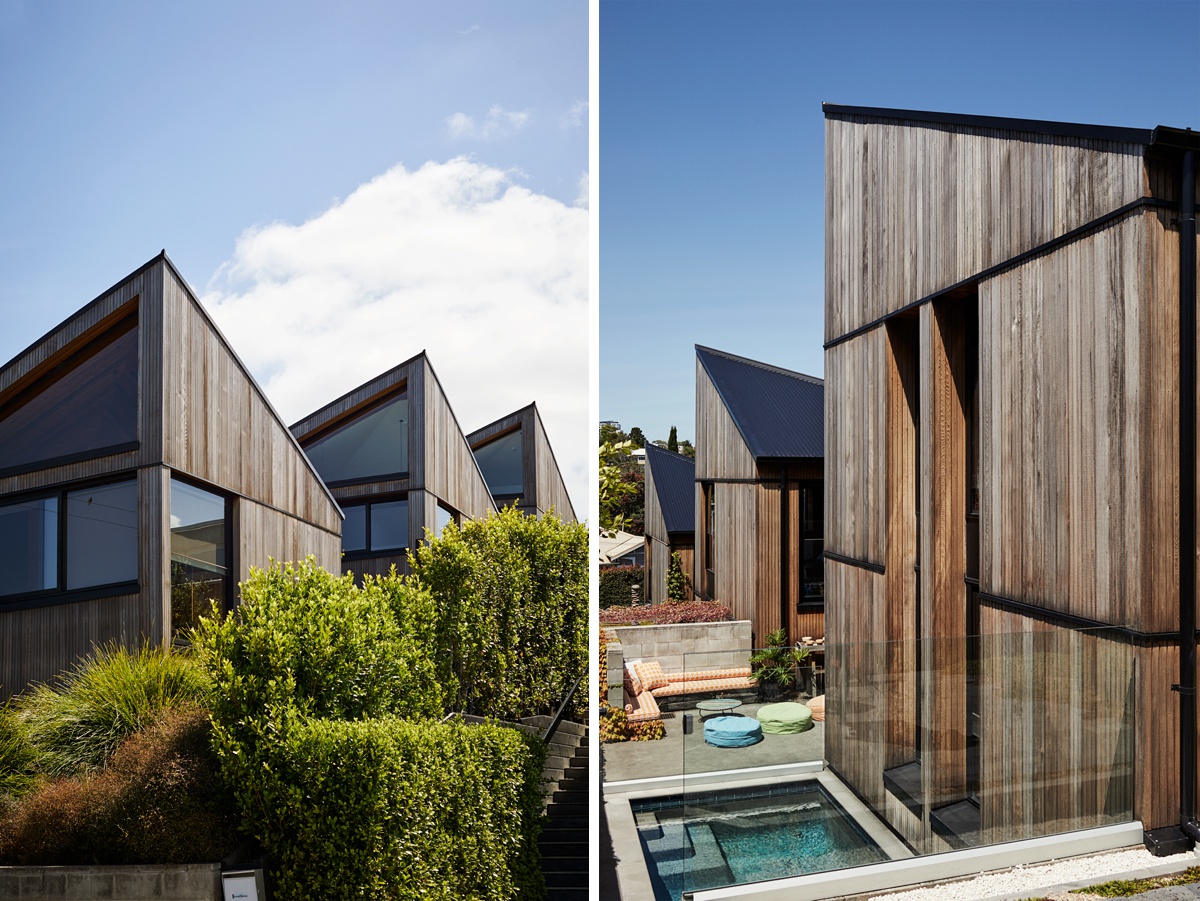
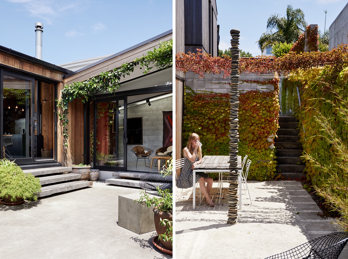
Pippa’s photographs of E-Type House by RTA Studio are some of my particular favorites. She kicks off our visual tour by telling “Dwell magazine commissioned me to shoot the E-type house designed by Rich Naish in Auckland, New Zealand. It consists of three two-story ‘huts’ that step up the hillside, and are spaced apart by two courtyards. The goal of the shoot was to show these unique design elements within their environment and the way that the family interacts and lives within the design.”
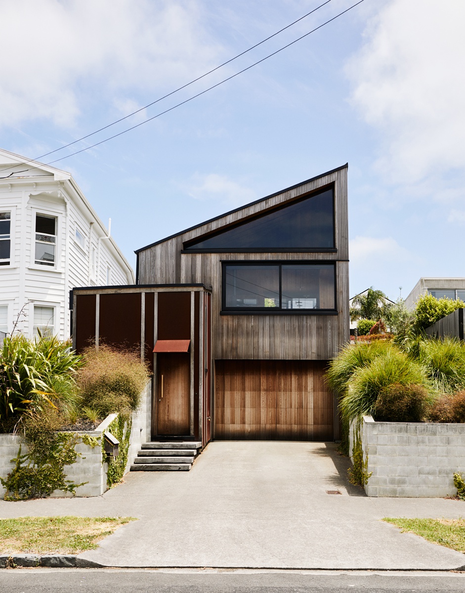
The escalating heights are apparent here as Pippa gives us a good view of the three “huts.” What I especially love is how the shadows cast into the windows on the right mirrors the roofline, creating a lovely rhythm and repetition. The hard angular light Pippa harnesses fits in perfectly with the feeling of E-Type House.
Pippa explains the main challenge she ran into was “that the space looked so good, I just wanted to keep shooting…and I had a tiny bit of jet lag since I had just arrived on a flight from NYC that morning.
One more challenge might be that due to the three ‘huts’ going up the hill, it was more difficult to get those typical big-room establishing shots. However on the flip side, because of that design, it offered beautiful layered moments that were lovely. “
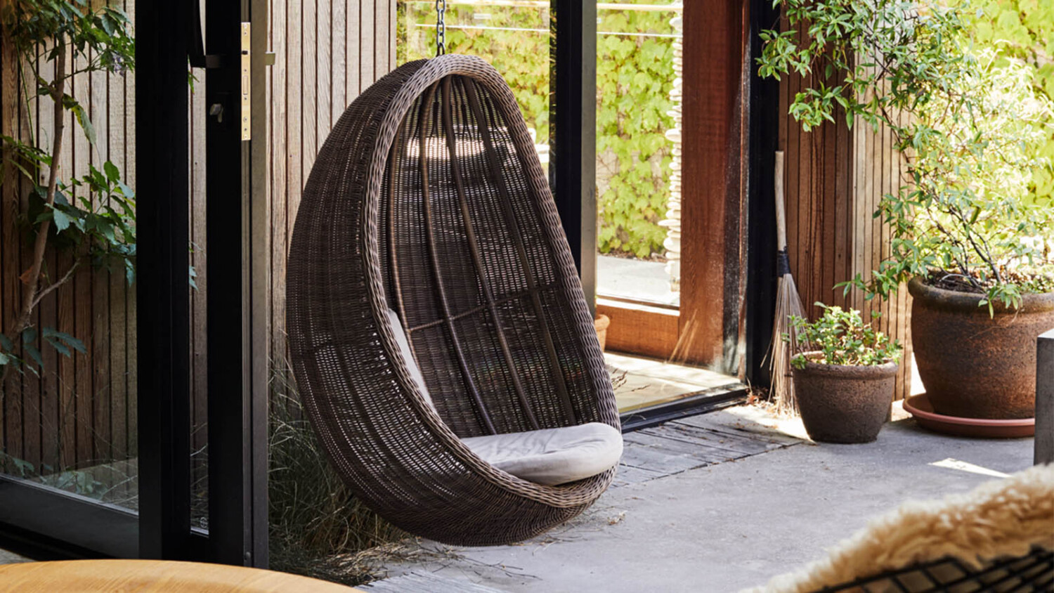
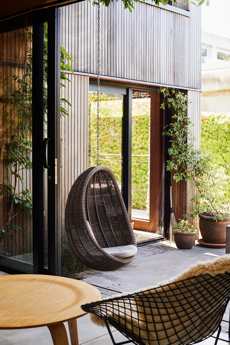
This next shot is comprised of a lovely mix of repetitive rectilinear shapes and soft curves brought in by the furniture. Pippa documents this well, giving a sense of balance here. I really enjoy how serene and inviting this scene feels.
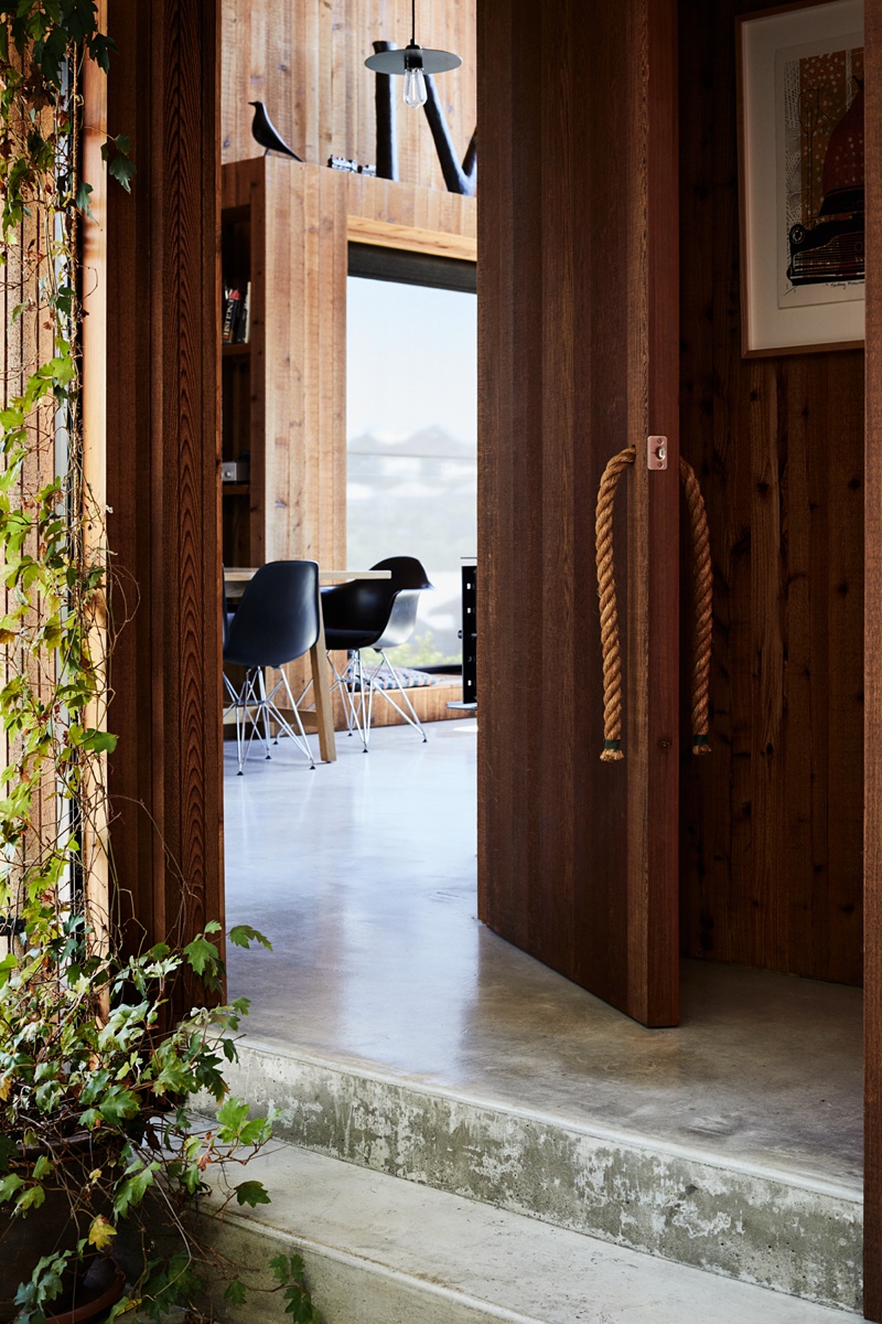
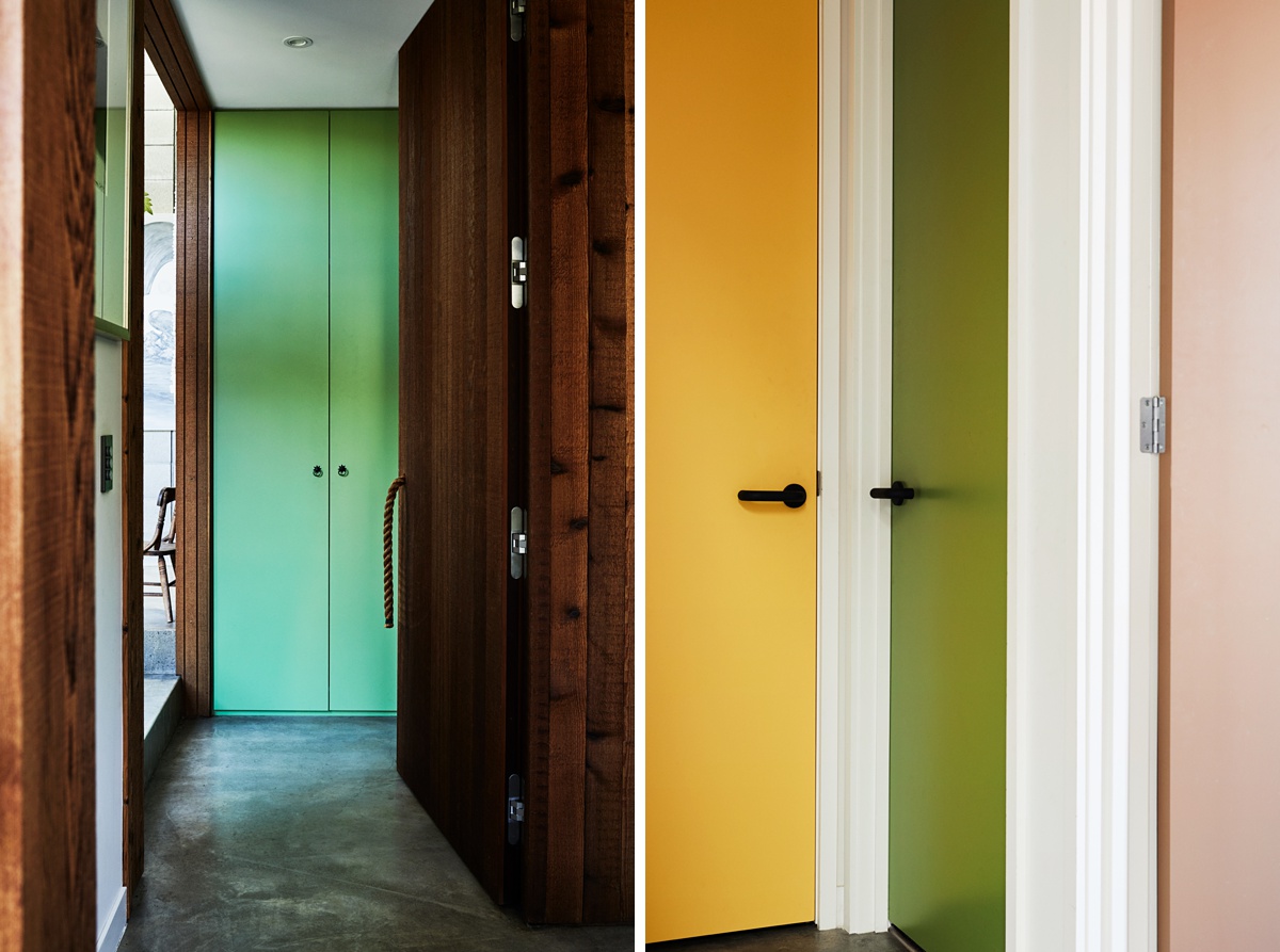
Pippa notes “I love the rope door handle, and for me, I get a strong sense of entering the space from this image. I think it might have even been one of the first shots I took on the shoot. I love that this house while being very modern, has a softness due to the use of materials and plants, which is very inviting. “
Pippa tells, “I’m trying to be better when retouching but I often spend a lot of time analyzing (over-thinking) and making small adjustments in post. In general, I prefer my images to look natural and not over-processed. My go-to moves are to add some grain and perhaps lightly brush in some highlight and shadow detail from bracket exposures. Everything else I pretty much eyeball shot-to-shot on what I think it needs retouching-wise.”
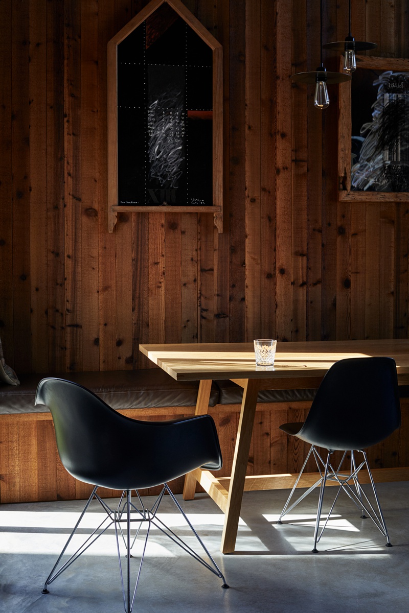
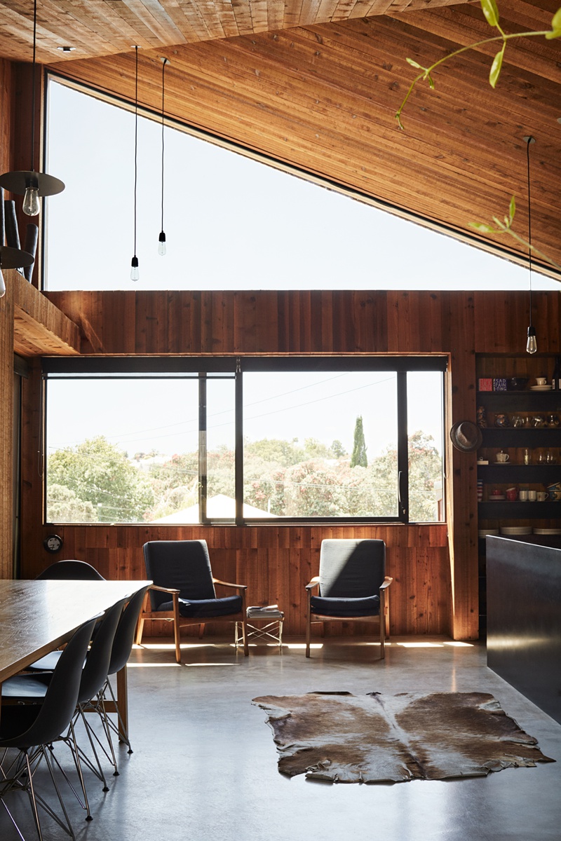
Her photographs feel very natural indeed. Here we get a good look at faint shadow detail in the walls and chairs, and a dash of highlights on the table and floor. Her restraint in post-processing creates big mood and a rich and dynamic set of photographs.
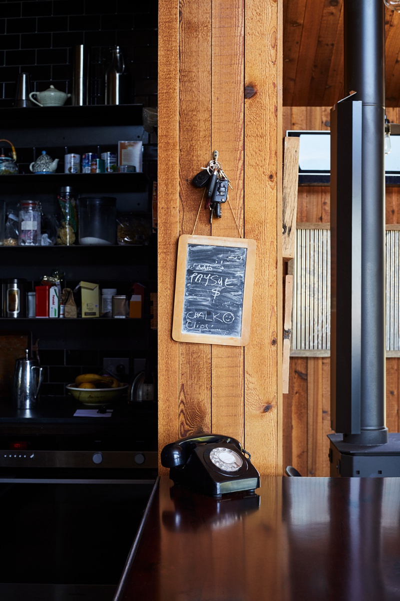
The vignettes that Pippa shoots evoke a casual but intimate feeling of home. The keys hanging above the askew chalk board, the items on the pantry, it’s all so un-stuffy and fleshes out the personality of this house.
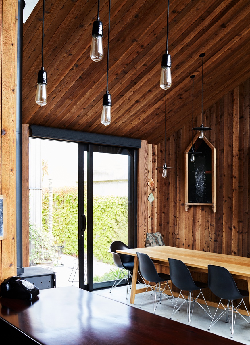
What a gorgeous image. The line and form cascading down this picture create movement and interest, as well as little compartments for our brains to pay attention to. The bulb pendants sit perfectly in the window. The greenery contrasts perfectly against the wood. The highlights and kiss of light on the chairs, floor, and island contribute to a sense of warmth and drama within this room.
Pippa’s compositions are layered in a way that gives complex dimensionality to each room she photographs. On composing, she explains “I am constantly playing around with compositions. I like shooting images that are different compositionally, but they still have to work as an image, so I often will do a few different options including some ‘safe’ ones, which ends up taking a bit of time.
When I am shooting this type of editorial – when I have quite a lot of creative freedom but a set amount of time to shoot – I try not to overthink the composition too much (which I have a tendency to do) and just shoot it so I have it as an option later, and so I have more time to experiment with different shots, or to revisit shots when the light is different.”
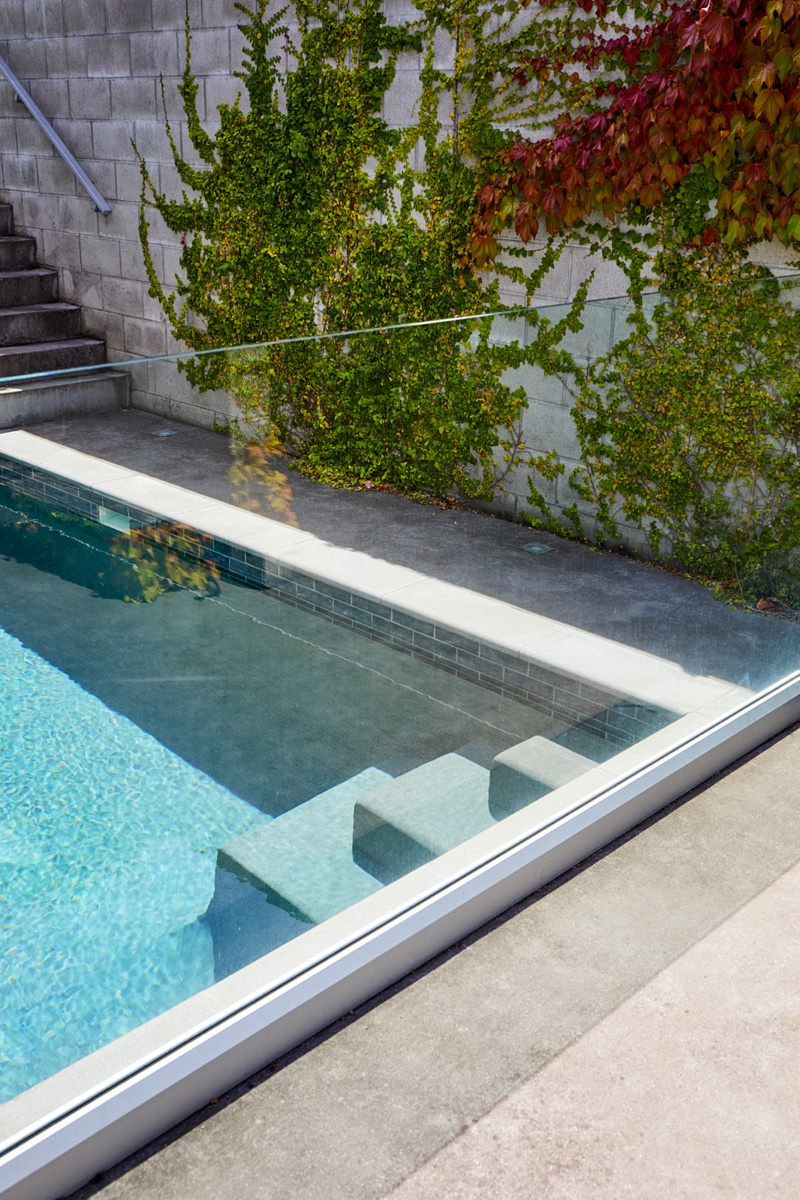
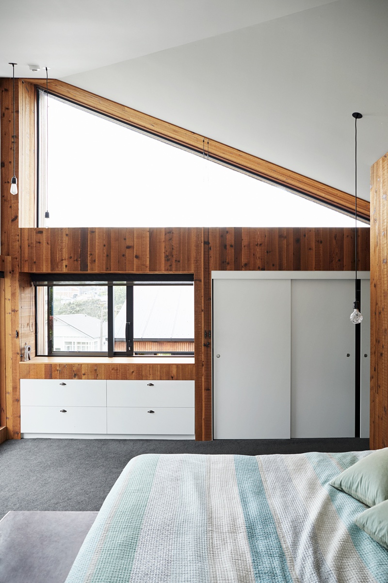
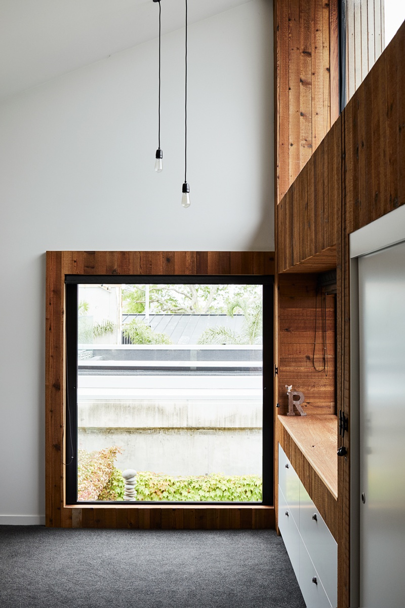
Throughout this project, there is a gorgeous mix of natural materials and more contemporary shapes. Pippa loves this juxtaposition, saying “we see the modern design elements along with some softness and depth.”
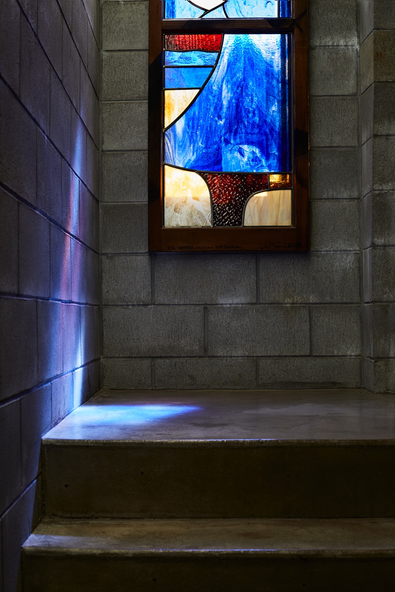
Pippa does a beautiful job of showing off the small details, the texture of materials, the carefully calculated angles and shapes, all while portraying the overall quiet yet inviting mood of of E-Type house.
A big thank you to Pippa for sharing this project with us! Pop over to her site at pippadrummond.com as well as her Instagram @pippa_drummond.
If you have a project you’d like to be considered for Project of the Week, you can submit it here.
