Peter Clarke Gets Dark and Moody in the Land Down Under
Welcome aboard this week’s featured project with photographer Peter Clarke and the incredible home, Casa X by Branch Studio. Peter and Casa X both reside in Australia, the land of great architecture, so you’re in for a treat! What is most noteworthy about this project though, is how Peter documented the space with such drama and mood while still observing the unspoken “rules” of architectural photography.
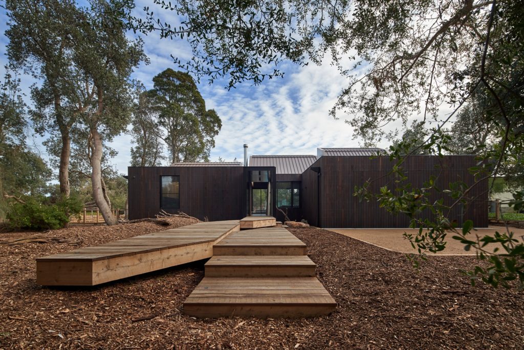
We’ll kick things off with an exterior view of Casa X to familiarize us with the building. I love the way the home is framed by the foliage, and how the stairs and decking suck our eyes in toward the doorway.
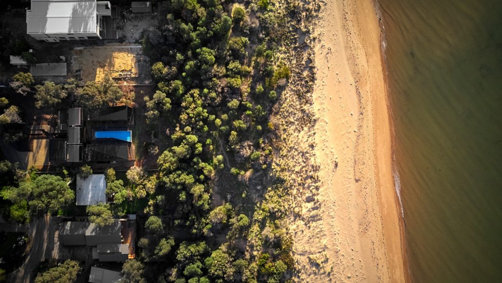
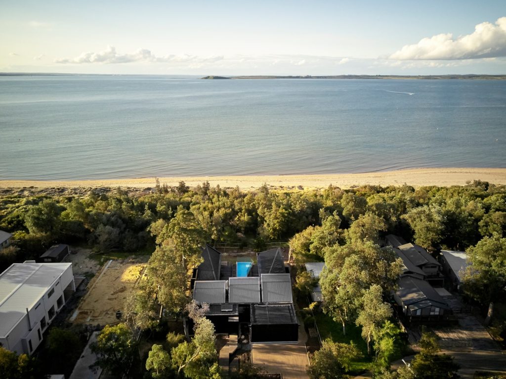
Peter further familiarizes us with the property by whipping up some high quality drone shots. Just as we discussed on POTW last week, the ingredients for good photography still apply when taking aerial photographs, and directional lighting is the secret sauce for a beautiful top-down view of a building and its surroundings.
This high perspective of Casa X allows us to note the massing of the house, it’s stair-step like roofline, and how it sits in relation to its neighbors and its environment. Plus just look at that gorgeous view of the coast. Showing off the home’s strong suits and defining features are crucial to fleshing out the project.
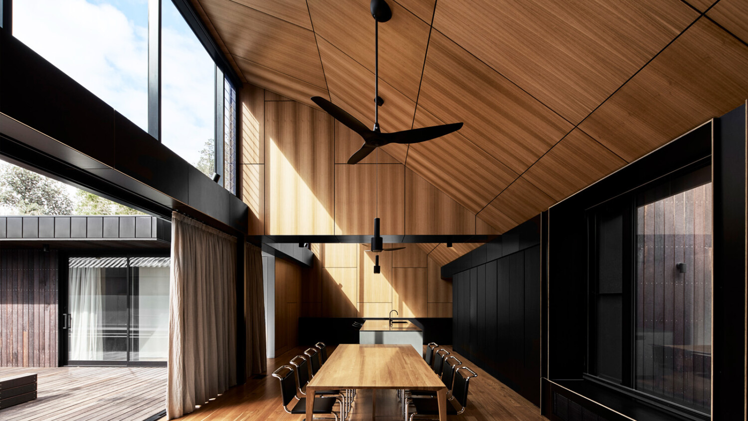
In the living room, Peter grabs our attention by photographing the space with an angular highlight that splices through the scene. Not only does this provide some lovely visual interest, and give a dash of heat and movement to the room, but it also shows the function of those massive windows that cross through the frame.
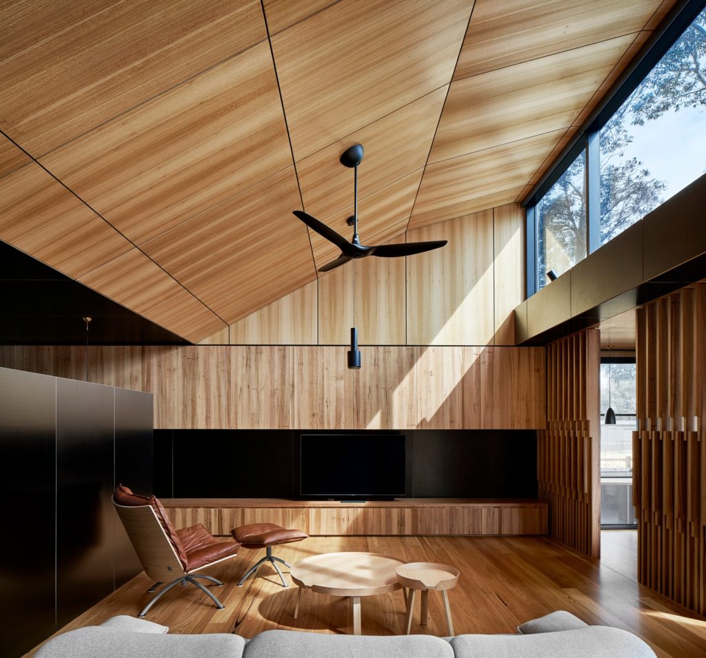
The uniform wood materials throughout this home is its defining feature. Peter photographs the wood in a way that keeps it relatively neutral feeling, but with just enough warmth to make it feel real. I love how he is able to pull out the grain and texture of the wood while allowing the dark black elements and shadows in the home to retain their depth and inklike coloration.
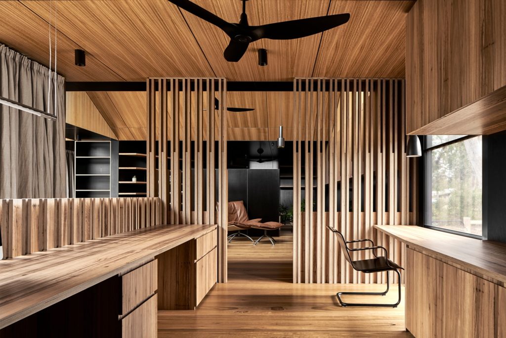
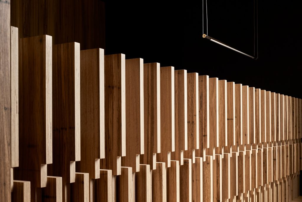
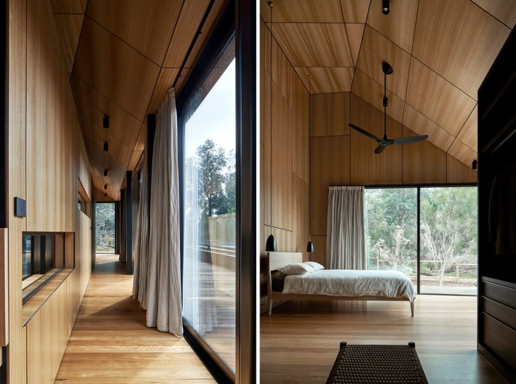
Peter’s photographs have such a graphic and contrasty taste because he includes a full histogram’s worth of tones in each image. Here we have everything from the brightest white cloud all the way to the deepest black in the cabinetry and beam over the doorway. The scene is rich and bold and suits the mood of this build perfectly. Aside from the tonality of this photograph, the composition is also excellent. Peter shows the functionality of the curtain and transition space between the indoors and outdoors. The converging lines draw our eyes into the back of the frame, picking up on the different architectural details along the way.
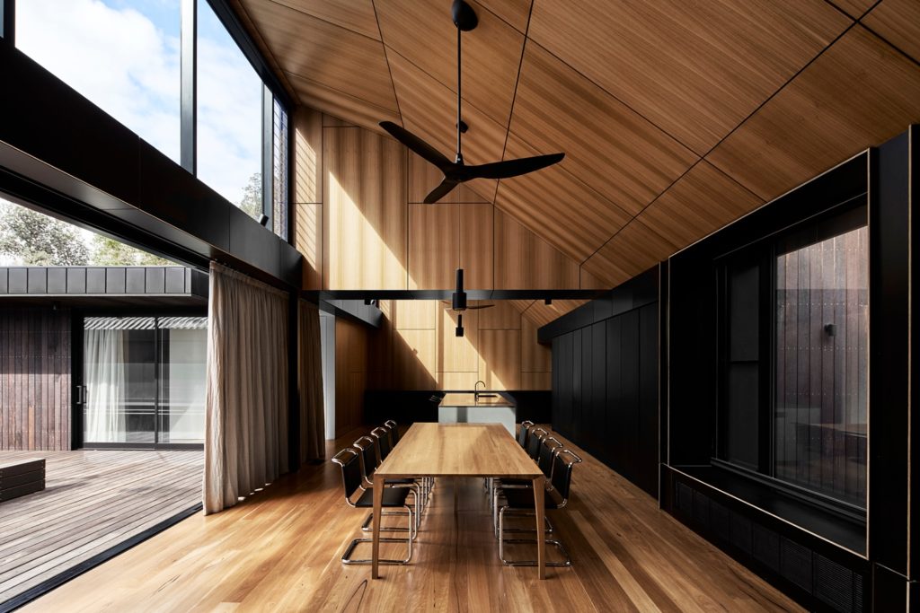
A tighter crop focuses our attention on the kitchen itself. The visual interest and movement from the sun streaming through the windows is still present, but now we can laser in on the texture of the wood, the tidy arrangement of the paneling, and the reflective nature of the jet black countertop.
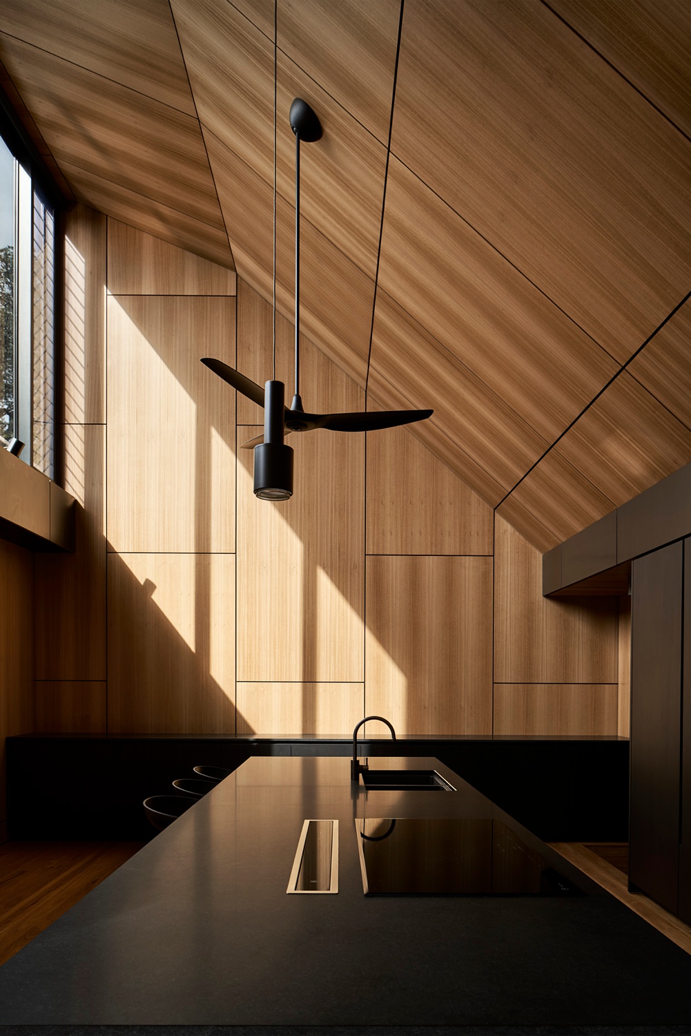
Peter shows off the intricate shape of the rooflines as well as the sheer height of Casa X with another set of vertically oriented photographs. Notice how even as he moves from room to room, each shot maintains a consistent balance in exposure and fits in perfectly with the rest of the series.
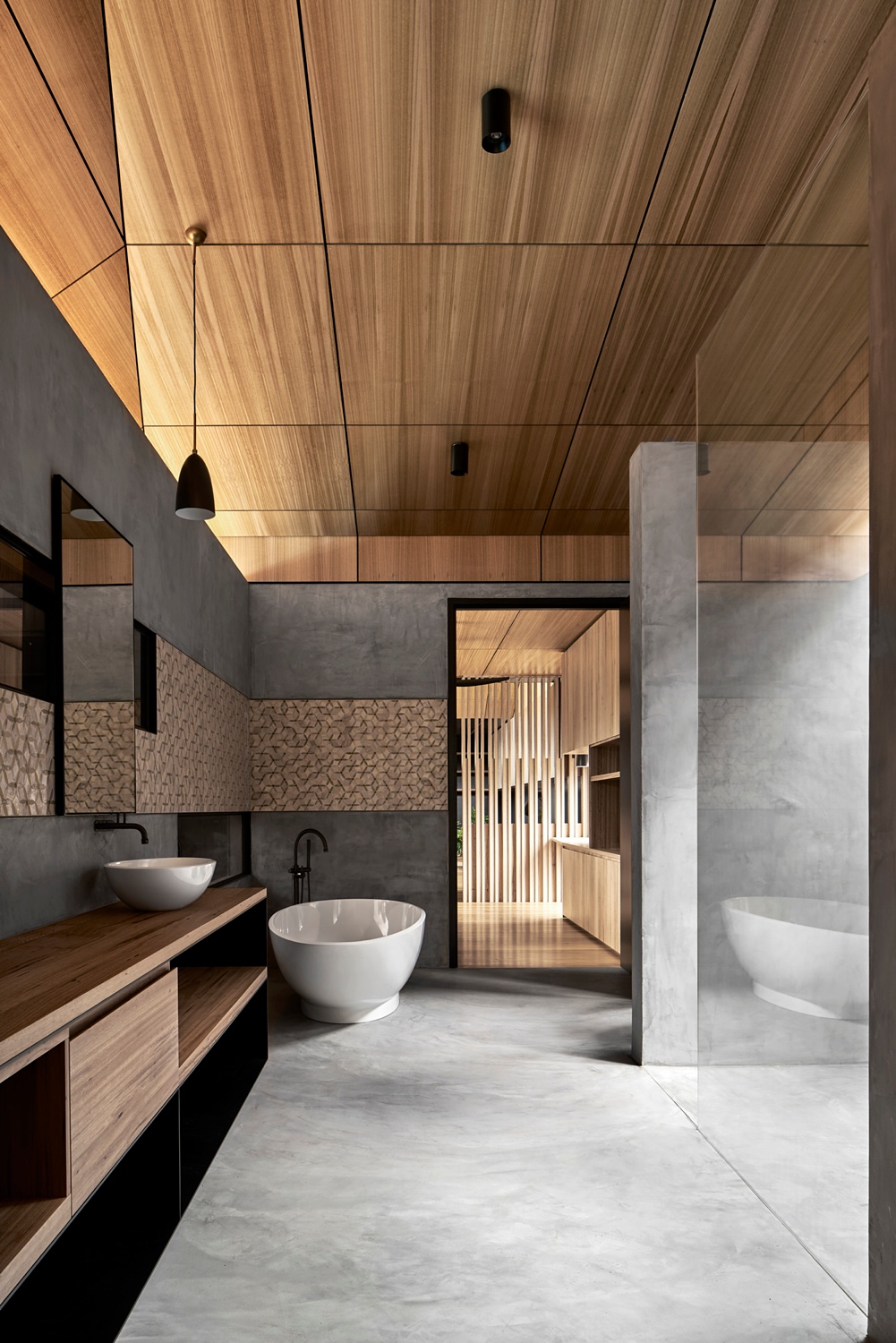
A one-point perspective in the bathroom heightens the sense of the linear design elements and in turn, the leading lines. Our eyes trace these lines and are pulled through the doorway, lengthening the space.
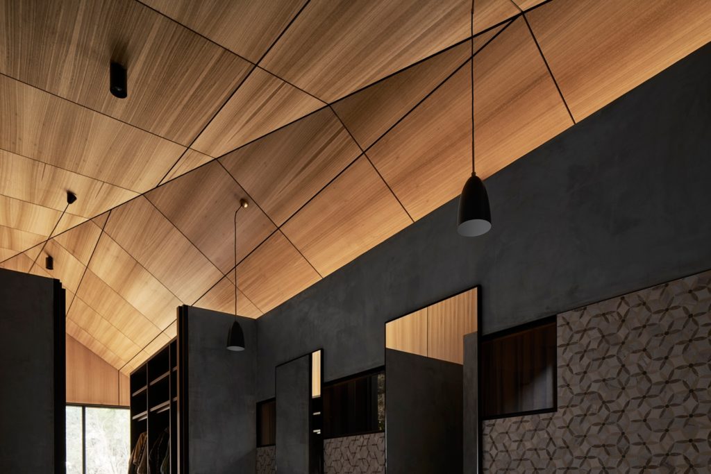
Closing out this Project of the Week, Peter lets the rest of the bathroom fall dark as he exposes for the ceiling, making it the subject of this shot. He pulls out the honey-like glow and gorgeous texture from each panel, while drawing our attention away from the harder and more rigid elements.
A big hearty thanks to Peter Clarke and the Latitude Group for sharing this project with us. You can see more of Peter’s stellar work on his site peterclarke.com.au as well as on his Instagram, @peterclarkephoto.
If you have a project you’d like to be considered for Project of the Week, you can submit it here.
