Shooting A Sustainable Shanghai Kitchen With Peter Dixie
Peter Dixie is a wonderful architectural and landscape photographer who calls Shanghai home, and operates under the name LOTAN Studio. This week we are exploring his photographs of The Zentral Kitchen by Lukstudio.
The Zentral Kitchen is the first location for Shikaku — which strives to lessen the environmental impact of dining and food delivery. You’ll find no plastic containers or single use objects here, rather sustainable design and, for our purposes, incredible architecture and architectural photographs. Let’s check it out.
Right off the bat, I love the mood and inky tones in Peter’s photographs. It’s rare these days to see dark interiors and the lights on, but this gives off a great sense of place and transports us right into the restaurant. Peter noted that his goal for this project was “to describe the space accurately and succinctly while giving a precise sense of its delicate and atmospheric aesthetic.”
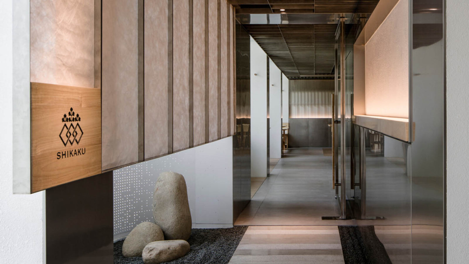
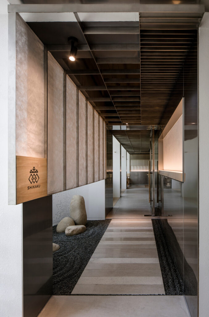
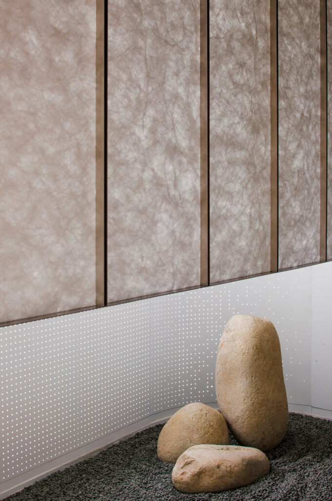
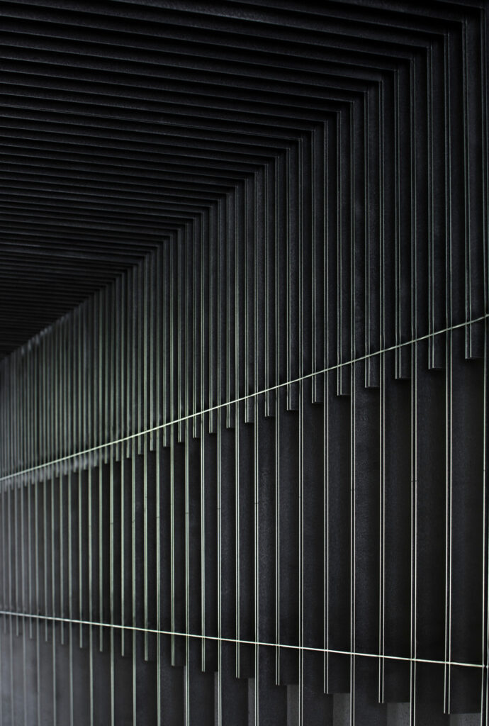
In a press release courtesy of V2, they relay: “The foyer design is a nod to the tradition of Japanese hospitality. A small zen garden, a light-softening shoji screen, and a stone path of different textures welcome guests into a curated version of nature. Instead of the common use of a wooden frame, the screen is a continuation of the stainless steel ceiling grille, a feature throughout the site signifying the industrial purpose of the place and giving a sense of order.”
Peter showcases the zen garden and shoji screens perfectly. A careful balance in exposure allows us to note the delicate texture of the paper screens, the brawny steel ceiling, and the polished stone pathway. We can pickup on all of these drastically different surfaces without compromising on the overall mood of this shoot.
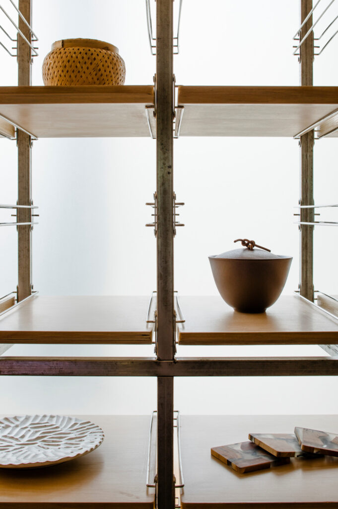
Tight vignettes flesh out the story of this restaurant. Curated bowls and accessories are backlit by light pouring through translucent glass. Peter shows us the display in a tidy composition. We get a closer look at the zen garden as soft, directional light sweeps across the scene as in a manner as delicate as the washi paper on the shoji screens.
Peter explains “We shot twice the project twice, with the bulk of the shoot on the first date, and then a return visit informed by the results of the first. [We were] adding to ideas developed in the first shoot, covering additional details, shooting better versions of existing images, filling out the image set to give more even coverage of the project with regard to selecting a final edit.”
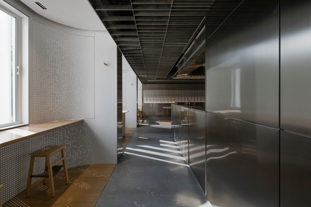
The powerful leading lines in this one-point perspective drive our eyes through the frame to the end of the restaurant. I love the juxtaposition between the soft curves and white walls on the left with the hard, reflective, square surfaces on the right.
When asked about the challenges of shooting this project, Peter relayed:
“The space had a great deal of contrast between the brightest highlights and the deepest shadows, so it took some delicate handling and careful exposure to get good results. A little extra time and patience, particularly with the RAW processing was able to resolve this.
Another challenge was trying to shoot quite a small space while avoiding the widest lenses at the request of the client. In this case it possible through careful camera positioning for some of the shots, and finding effective alternative shots to communicate the same ideas in others.”
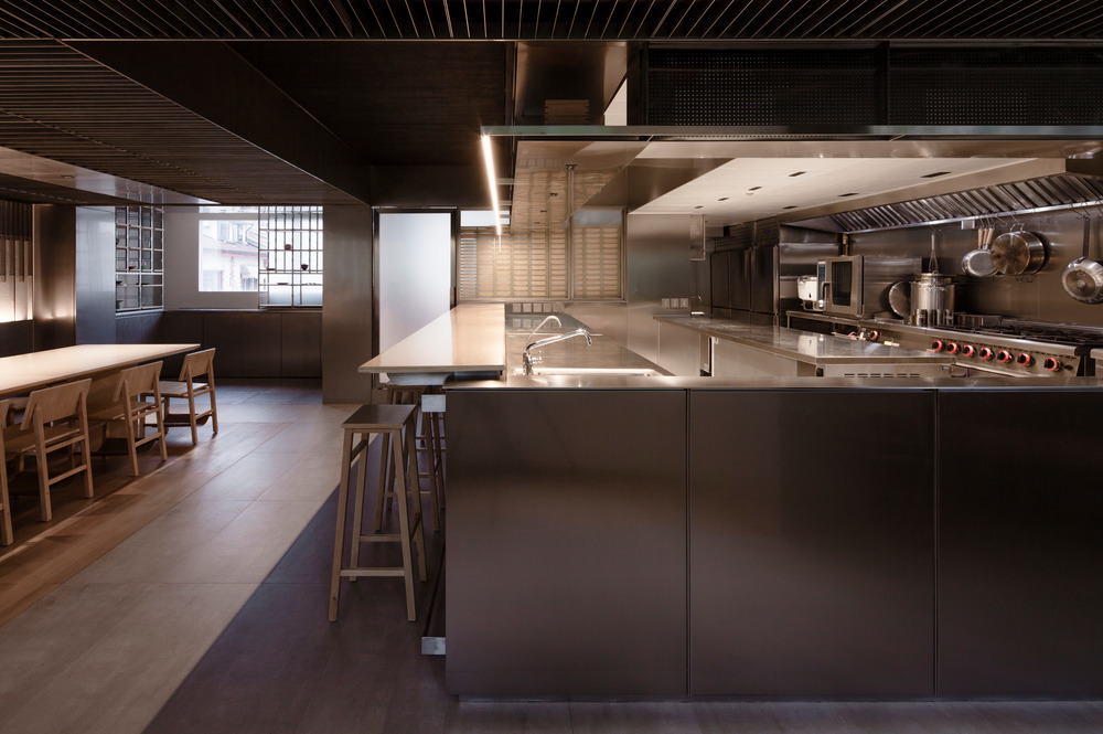
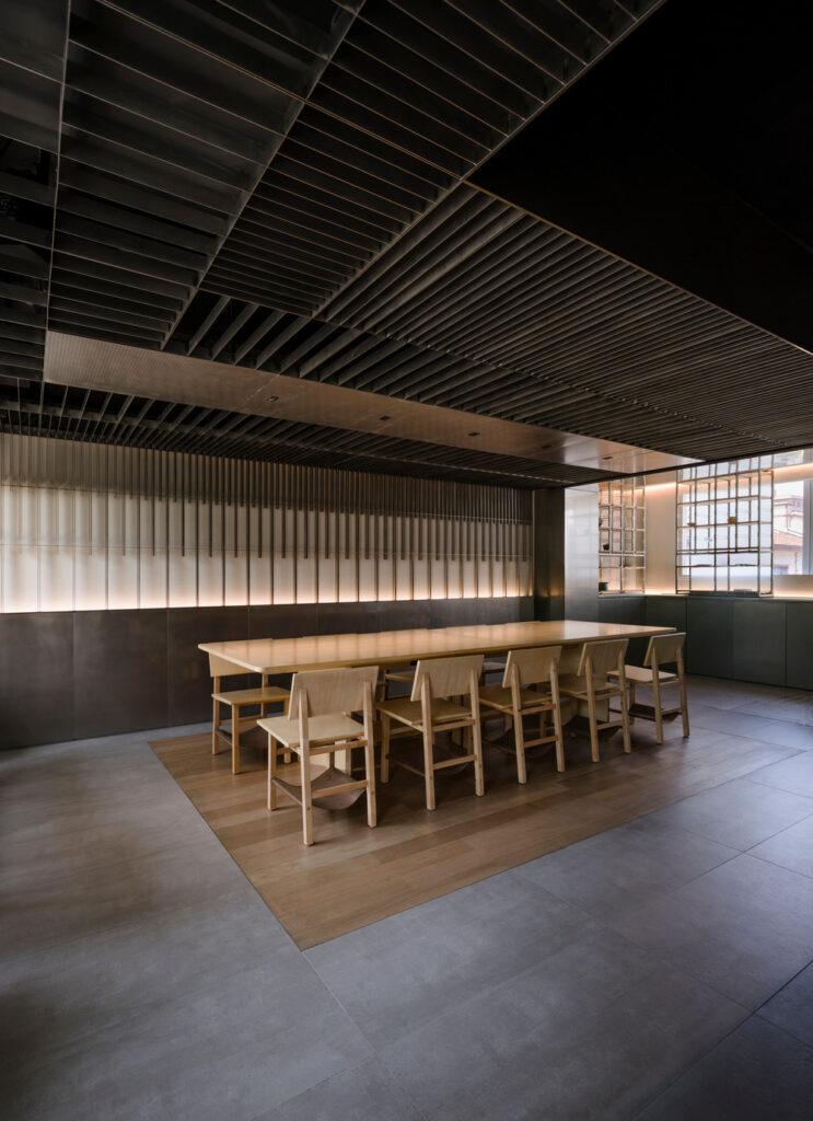
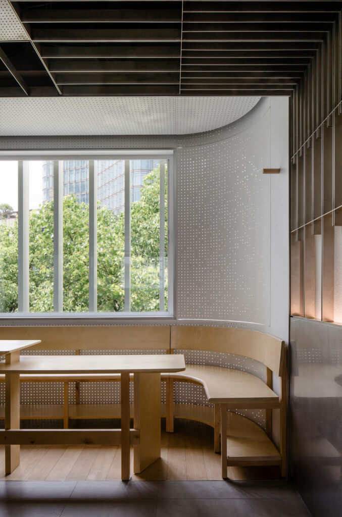
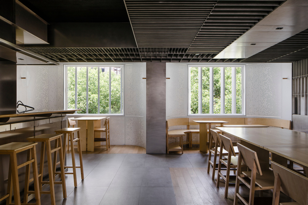
Peter gives us a better look at the layout of the dining area. Zentral Kitchen’s dining niches are inspired by bento boxes and create a partitioned, intimate area for different parties to dine. We are able to see the variety in seating areas, as well as the complex variety of building and design materials present in the restaurant.
I really enjoy Peter’s compositions, and asked him to tell me a bit more about his process. “Before shooting I have a short and precise list in my mind of the elements that I need to combine to make up the shot, too many or too few elements can both reduce the effectiveness of the image, once that is determined composition is more or less only a matter of finding a way to exclude everything else. Beyond that I try to produce calm or quiet images and avoid excessive drama in composition. I try to create images that can act as a space for reflection.”
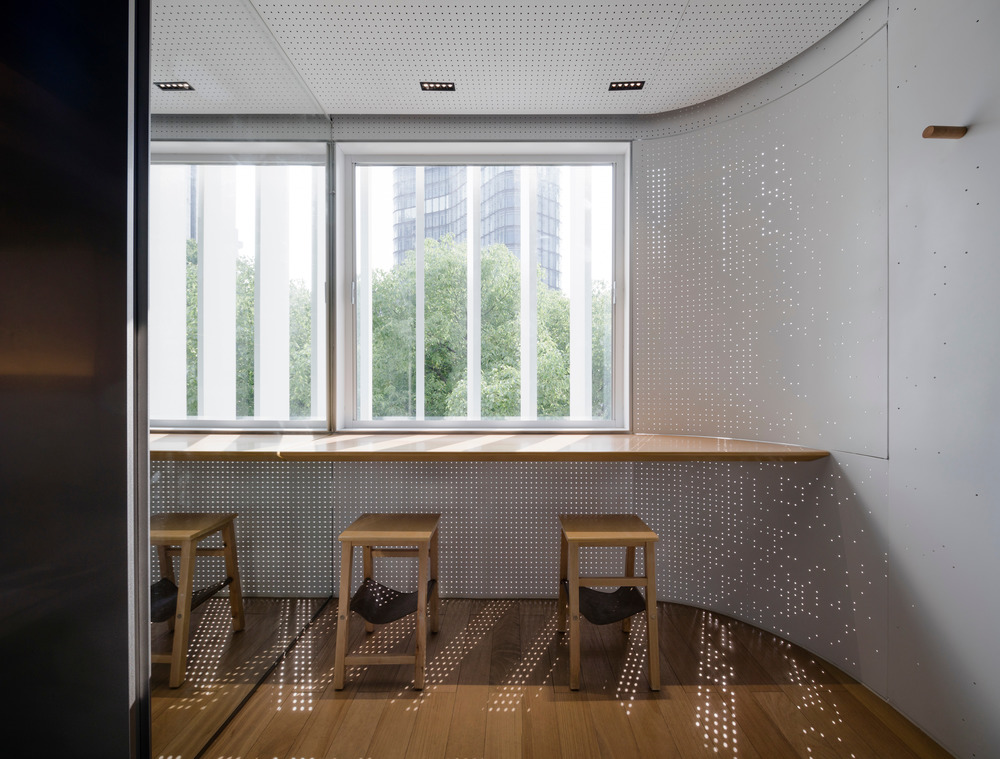
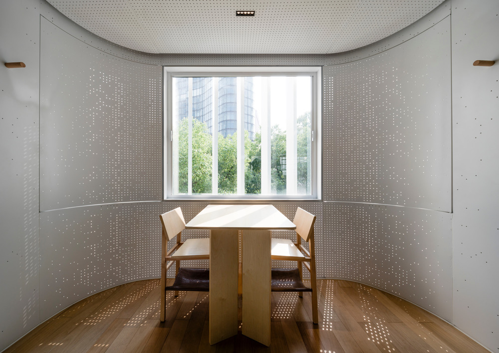
My favorite image of the series, Peter gives us a look at the brise-soleil and the perforated screens in the dining niches. I appreciate his timing here, as we are able to see the way light streams into this area and changes throughout the day.
“It is extremely rare that I use any additional lights on a project. It is common that I shoot multiple lighting set ups of a shot, but using the lights available in the space. In general I like diffused light, but this project is one where we deliberately shot versions of many shots with direct sunlight coming in to show the effect of the detailing around the window bays.”
The patterned light is probably my favorite feature of this space, and one that Peter documents so well. It’s simply gorgeous and makes me want to book a table here STAT!
A hearty thank you to Peter Dixie and LOTAN for sharing these lovely photographs with us!
You can view more of Peter’s work on LOTAN Architectural Photography’s site, lo-tan.com or Peter’s Instagram @peterdixie
If you have a project you’d like to be considered for Project of the Week, you can submit it here.
