Peter Marko Plays with Light, Shadow, and Color in the Australian Sun
Ahh, Victoria, Australia; that’s where we’ll find The Malvern Residence by Ari Alexander / Doherty Design Studio. The Malvern Residence is a gorgeous house, riddled with repetitive lines and simple but luxurious feeling finishes. Showing us around this beauty is photographer Peter Marko.
Peter specializes in architecture, interiors, and advertising. He brings his graphic advertisement style to his architectural work, creating clean and punchy images. That’s not to say that they are devoid of mood though, because in this particular set, there is plenty of it. Let’s check it out!
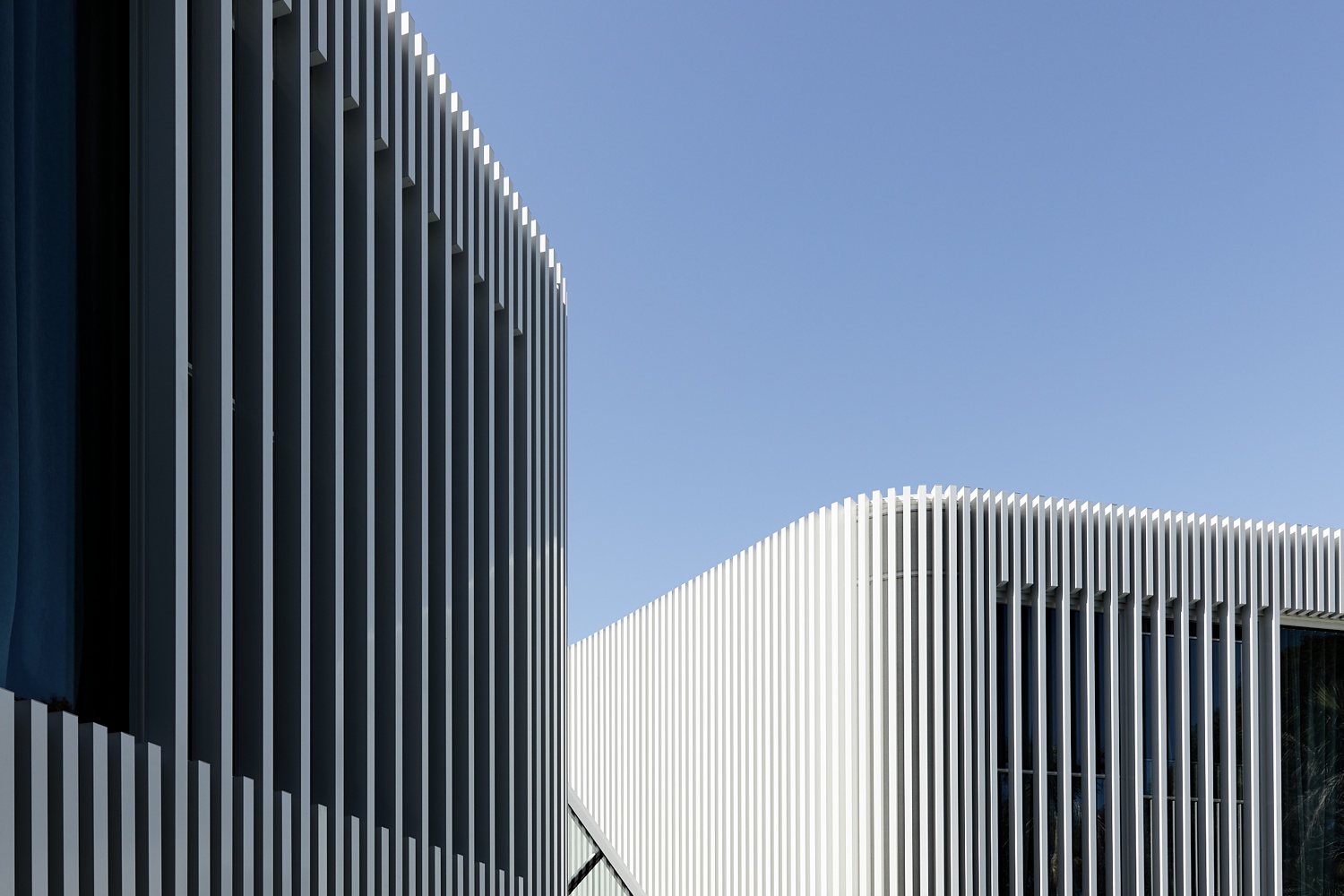
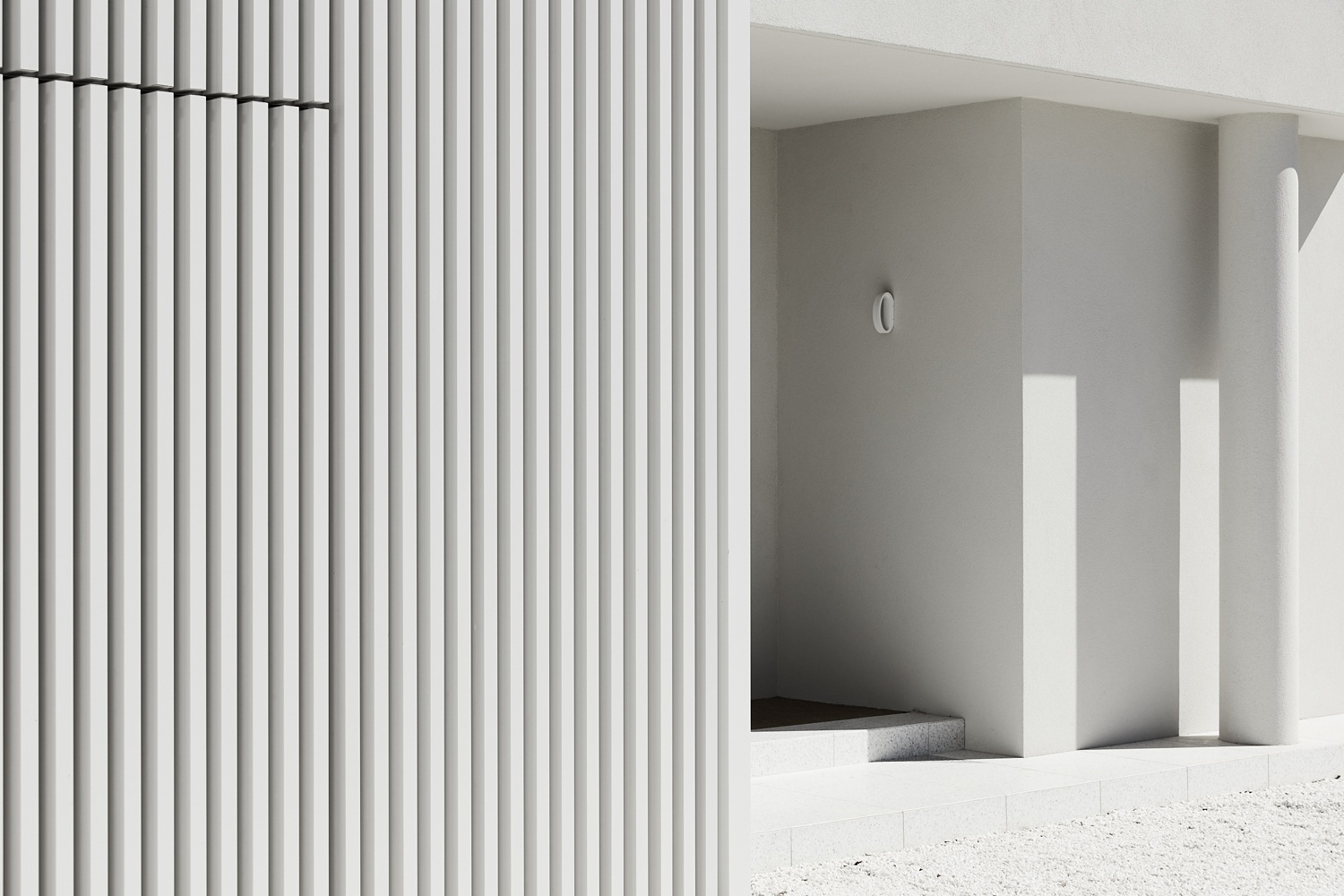
The exterior of The Malvern Residence is wrapped in a series of slats that curve around and encase the facade. Peter capitalizes on these leading lines to rhythmically pull our eyes through the frame. By shooting at the right time of day, the shadows and highlights create a level of dimension that accentuates all of the rectangles in this scene.
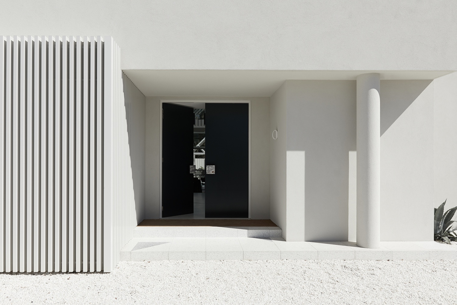
I love Peter’s styling decision here. The open door evokes a sense of motion and mystery, drawing our eyes from the bright facade and grounds, in toward the interior. The dynamic range Peter was able to capture from the dark door in shadow to the brightest highlights on the pea gravel, lends itself to the bold and graphic feel of this scene.
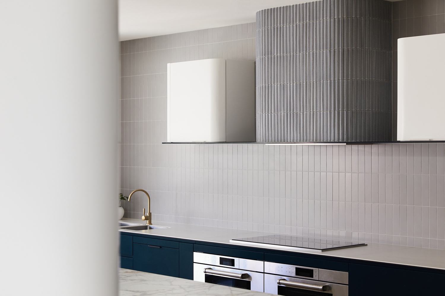
In the kitchen, we are met with more great texture and repetitive lines throughout the scene. This one-point perspective feels tidy and equally weighted from left to right as well as from top to bottom. Peter’s post-processing pulls out the delicate colors present in the room, and I love the subtle gradient that rakes across the back wall and cabinets.
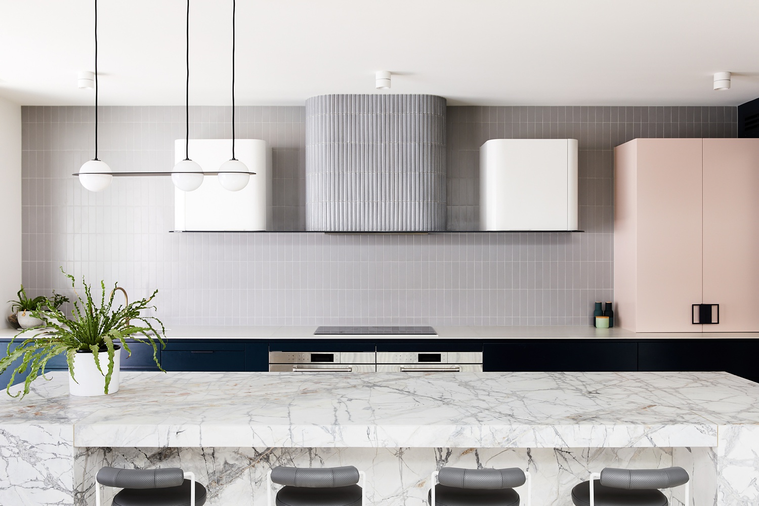
Just as with the photo of the slightly opened door, this well composed image also creates an air of mystery and motion. It feels like we are actually there, walking around the corner into the kitchen. Again, gorgeous side light rakes across the tiles and range hood, pulling out their texture and enhancing their shapes.
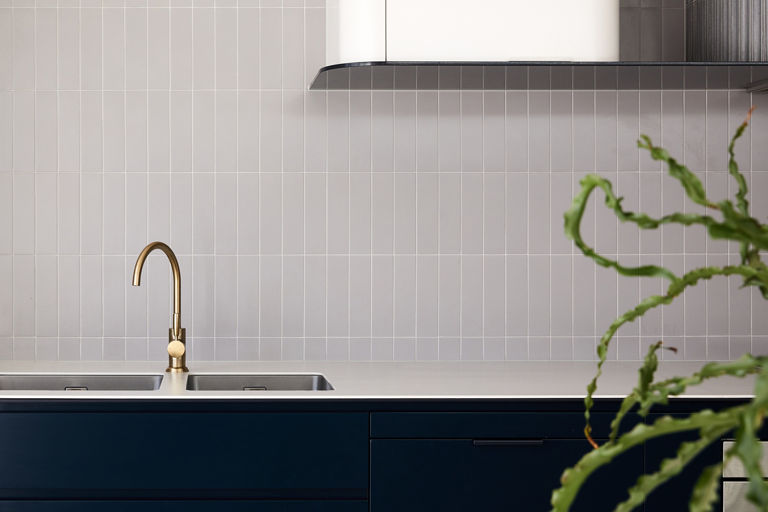
This frame has great contrast, both through light and color theory. The brass faucet and white cabinets look crisp paired with the deep blue lower cabinets. I actually really like the juxtaposition between the rigid lines and gleaming faucet compared with the organic feeling of the wiry plant peeking into the frame. What a cool accessory shot that helps flesh out the story of this home!
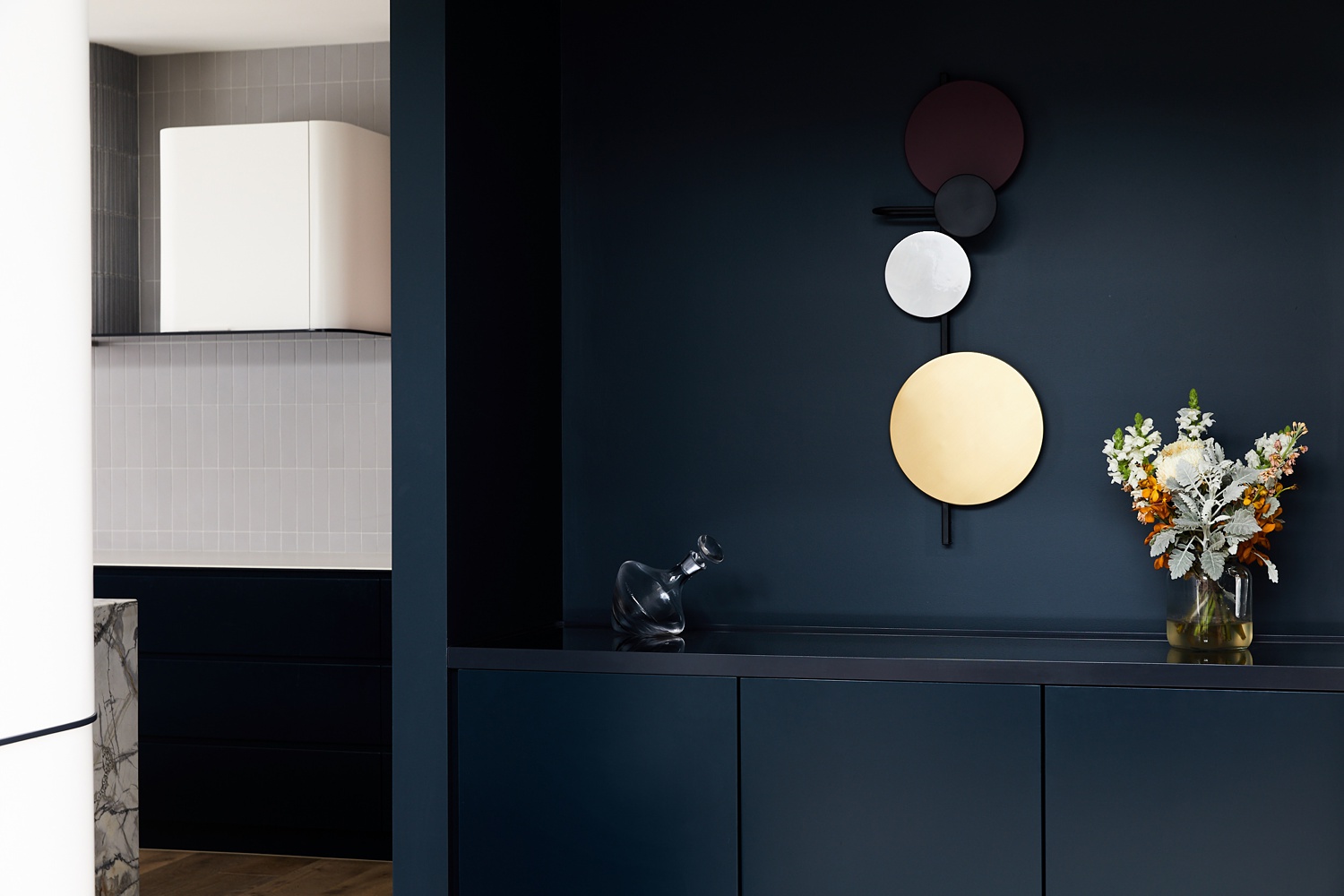
See what I mean about Peter’s immaculate light and color work? There is a rich inkiness he is able to pull out as he balances perfectly between a moody yet perfectly polished scene.
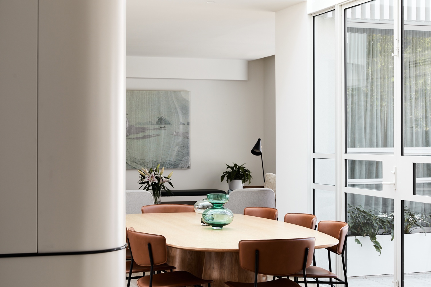
Peter shows the connection between the dining and living space here while angling himself in a way that anchors us in the space. His camera height feels natural and lets us visually walk through the space. The rooms are awash with a nice bright light from the windows to camera right. While a relatively bright scene, Peter still has a beautiful range of lights and darks here. Gradient of light on the left side of the frame.
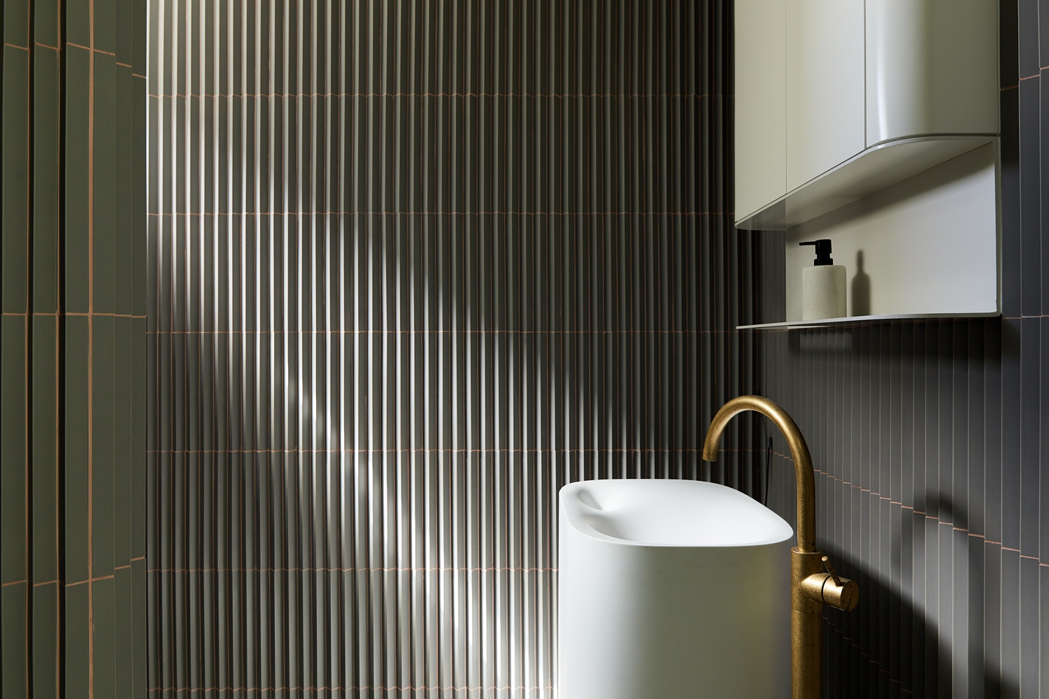
There’s no other way to put it; this light is sexy. That perfect tractor beam drives our eye right to the smooth basin and faucet. It also picks up the sheen in the tiles that perfectly matches the faucet. Notice how that same perfect ray of sun pulls out the fan like texture of the tile and creates shadows that make this a dramatic and opulent scene. This right here is the shining example (pun intended) of creating visual interest through light.
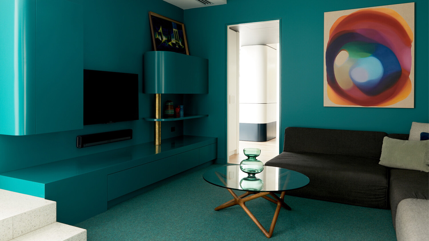
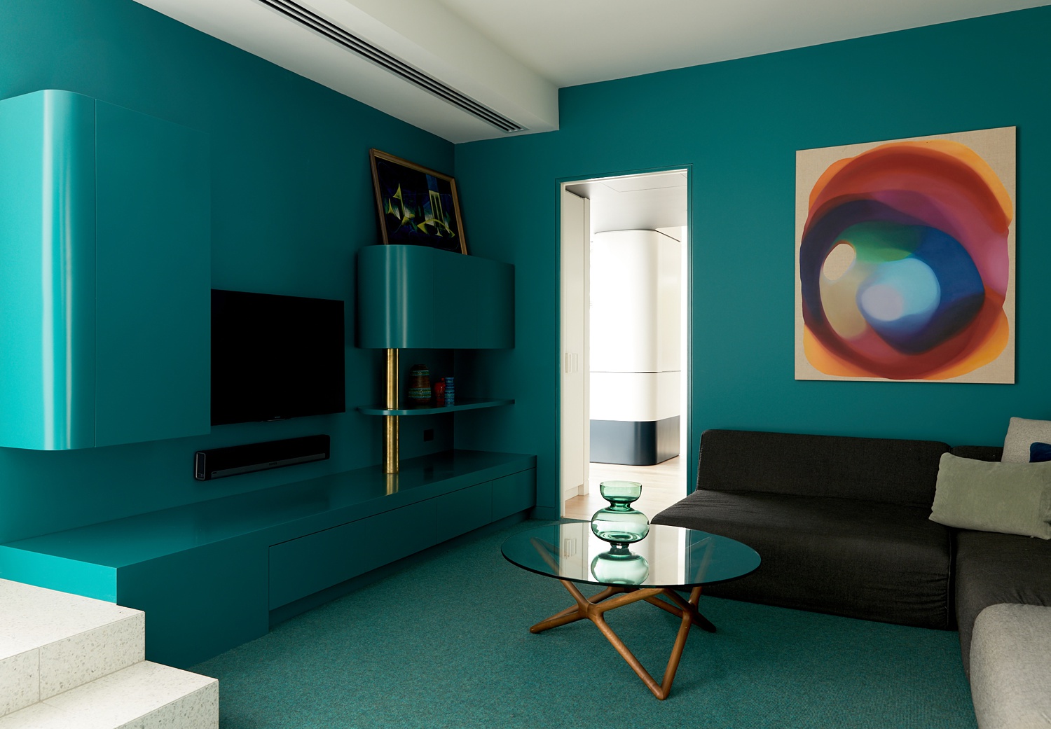
Speaking of opulence, check out the color work in this room. I’d imagine this blue was tricky to get right, and it must have bled on to the white ceiling and artwork. Peter cleans this up though, and keeps this bold color from being too overpowering. Notice though the ever so faint reflection of blue on the ceiling just by the edges where the wall meets it. This restraint keeps the photograph feeling real, but it’s ever so slight, so it doesn’t distract from the neat and tidy theme of the project.
Many thanks to Peter for submitting in his work! You can check out more of his projects on his site petermarko.com as well as his Instagram @petermarkophoto.
If you have a project you’d like to be considered for Project of the Week, you can submit it here.