How And Why We Curate Project of the Week
Project of the Week has been a staple of Architectural Photography Almanac since the beginning, so we thought it was time to let you in on the process. How do we choose the projects to share with you? Where do we find them? Why does any of this even matter?
In short; the internet is overflowing with content. Not all of it is good. In fact, most of it is mediocre, and for some reason, that’s often what is popular. However, in small corners of the web lie masterful and though-provoking images by photographers who we could all learn a thing or two from. The world of architectural photography isn’t as small as you would think, and there are sub-niches and personal projects that are generating press, money and lifelong legacies for many photographers.

What Makes Good Architectural Photography?
What makes a good series when it comes to architectural photography? The answer is somewhat subjective…yet…somewhat objective as well. After looking through our past Project of the Weeks, they all have most of the following in common:
- Images are made with intention; rather than a “shoot everything and sort it out later” mentality.
- Images clearly convey the design intent of the client.
- Technical mastery; exposures are correct, images are in focus, lines are straight when appropriate.
- Are the photographs actually adding something to the conversation, or is it just an interesting building?
- Perspectives that tell the story of the space and contribute to the project as a whole.
- A good balance in exposure between the exterior and interior.
- Accurate color in the foliage & skies. Nothing is too “Disney” nor destroyed by filmy Lightroom presets. Just as nature intended.
- Lighting that creates mood, shows texture, and provides visual interest.
- They showcasing how the structure interacts with the landscape or urban environment.
- Cohesion throughout the project. Is it a consistently good project, or just one great photograph supplemented by a bunch of fluff?
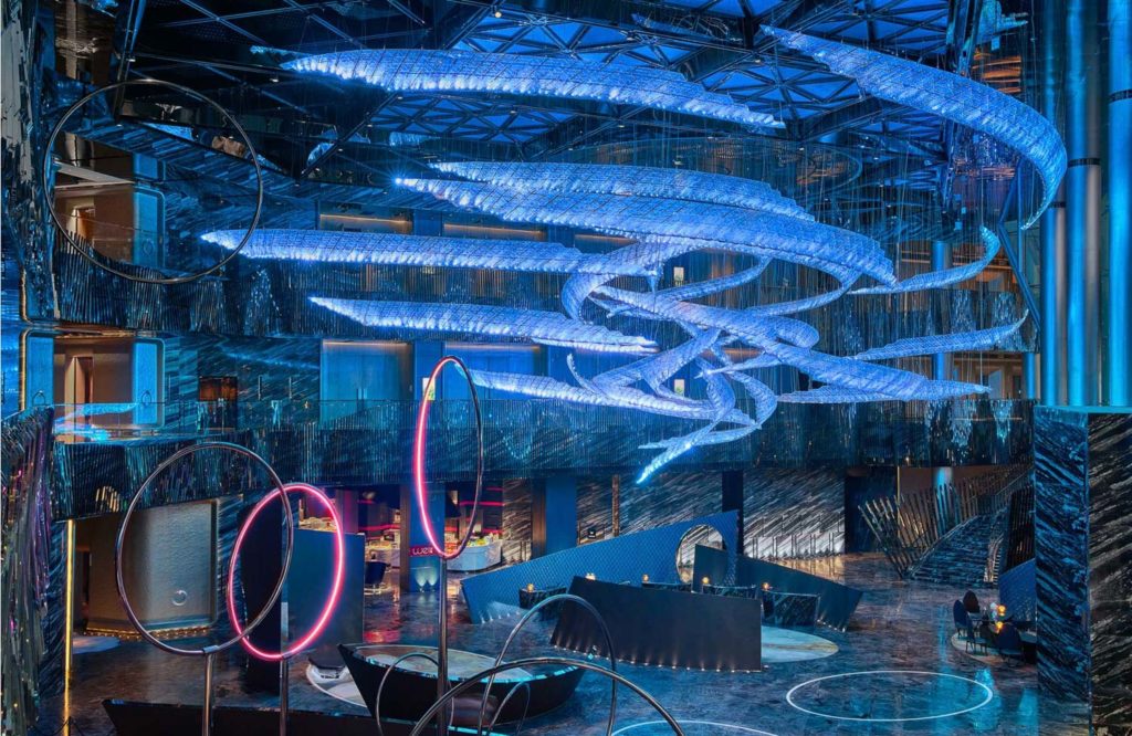
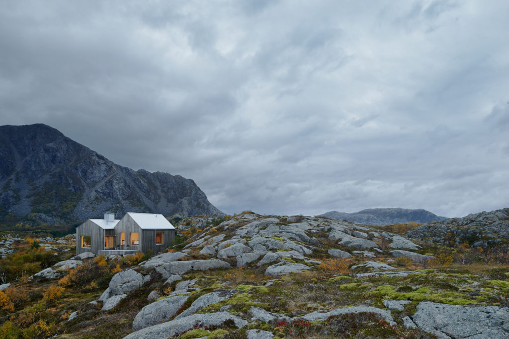
- A je nes sais quoi quality that sets it apart from the crowd. For example, in Åke Lineman’s images of Vega Cottage, he used the weather and time of day to his advantage to create a stark feeling of the cottage alone in that incredible landscape. Montse Zamorano put emphasis on color to make a gas station look sexy. Owen Raggett took a full hotel with mind-melting lighting conditions and made it look like a Tron/Avatar mashup by night, yet the worlds most tranquil and hospitable place by day.

Scavenging the Web for Outstanding Work
Recently, someone asked us where we find candidates for Project of the Week. Truthfully, I block out about two hours a week to just look through the Wild West of the internet. Usually, I begin at ArchDaily or Dwell. I also subscribe to AD, Fine Homebuilding, and a myriad of other publications that showcase (and teach) construction, design, and architecture. I note the projects that catch my attention. That leads me to the architect’s page. From there, I try to track down their photographer’s website.
Side note: most architectural photographers have horrendous websites. Look for a future post on this, or take note of sites by the big boys like Mike Kelley, Seth Parker, or Adam Letch. And for the love of all that is holy, leave your website music player in 2004 where it belongs!
Usually, the project that led me to their website is not the project that is selected for POTW.
The other path for finding great projects is Instagram. Constantly tricked by renderings, hub accounts that give no photographer credit, and folks who don’t link to their website, it’s a savage place, but one full of interesting and fresh content.
We always ask for permission when it comes to featuring these projects on the blog. After all, the APALMANAC gang is constantly screaming from the rooftops that images should be shared consensually & properly. The beautiful thing about the POTW process is getting to talk to incredible photographers about their greatest shoots and pick their brains. We also make it a goal to feature photographers from all around the globe, which sheds light on great work and great architecture in places you would least expect.

Do Your Homework
So what’s the benefit of reading through Project of the Week, or writing it for that matter? I’m very much a visual learner, but to make something stick in my brain, I have to write it down. The process lassos up the circus of thoughts in my head and transfers them into intelligible concepts. As I explain what makes each of these photographer’s images great to you, it really starts to make sense to me.
I encourage you to do this exercise: Every time you’re scrolling through The ‘Gram and a photo of architecture catches your attention, stop, look it over, and explain to yourself why it registered on your radar. What do you think the photographer did a great job on? What would you have changed if you were making that image? Bonus points if you do this in some kind of visual diary. Then, next time you shoot, you have both inspiration and a bible of ideas from your own making.
I promise you’ll be better for it.
Remember, it doesn’t just have to be your work that you submit in for project of the week. If you see someone making great things in our niche of photograph, submit them to be featured!
