Project of the Week: Owen Raggett / W Xian by AB Concept
I saw this project by Singapore-based photographer Owen Raggett and immediately raised an eyebrow and mouthed “holy shi—“. It’s kind of mind-blowing from both an architecture and photography standpoint, and I couldn’t resist sharing Owen’s exemplary photographs of the project.
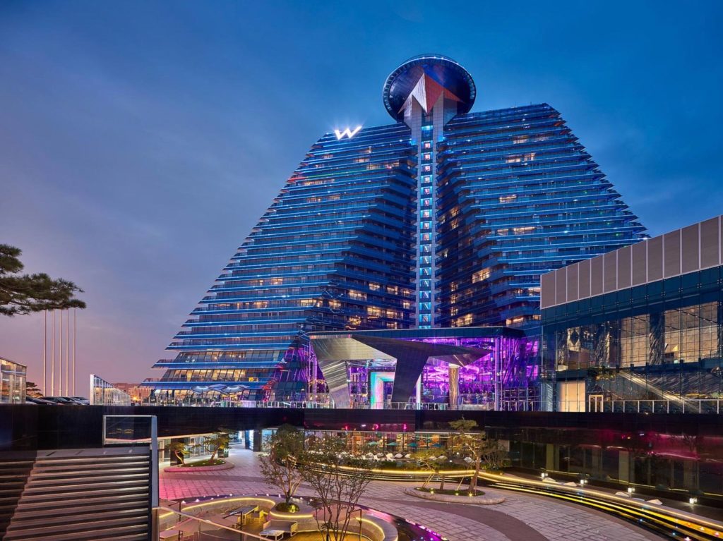
W Xian, located in, Xian, China and designed by Hong Kong firm AB Concept looks utterly otherworldly. The architecture won’t be to everyone’s taste but it is, if nothing else, unique! Owen had to deal with incredibly challenging conditions; having to shoot only at night as the hotel was booked at nearly 100% capacity for the entire duration of the shoot. I can attest that this is some kind of personal hell, as difficulty is amplified by lack of sleep and wandering guests who don’t know that they’ve been sitting in your field of view for ten minutes straight with no hope of leaving.
Anyway, on to the photos, which will explain more of those challenges far better than I could.
The shot of the front entry and porte cochere gives a hint of what is to come – but uh, yeah, just a hint.
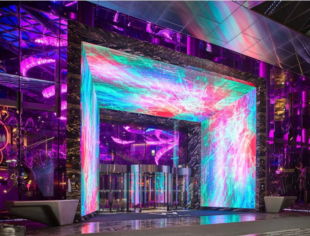
Um, what? I said just a hint, damnit! Buckle up because this is getting crazy. How do you even light this thing? I don’t think you do. How do you know what color is accurate? I am at a loss. Insane. Let’s go inside!
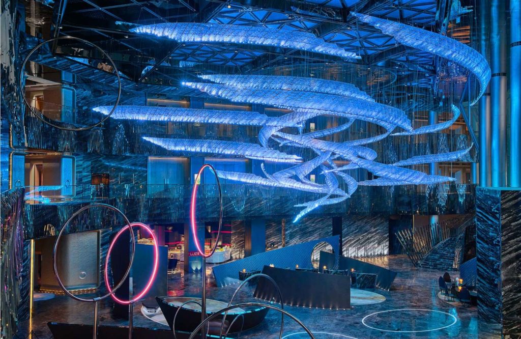
The main lobby is lit predominantly by these neon blue LEDs. While striking, they present one hell of a challenge to overcome – what is the true color of this space? Blue, yes, but what blue? Owen did a fantastic job of keeping things realistic while letting the overwhelming seascape of blue LEDs dominate the scene in the best possible way. When asked for specifics, Owen says:
And the blue in the lobby… if everything is blue then is anything actually a colour? I mean, where’s the reference point? Editing that so that there’s a focus is hard. Also, it moved through dark blue-light blue-red-green-yellow, but the dark blue had the most depth, so you have to wait for 5 minutes until the colour cycles round again.
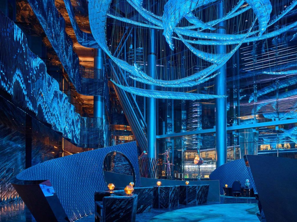
The above composition is busy yet also very understandable, a challenge given the monochromatic interior lighting which is offset only by a bit of tungsten for some contrast. The leading line of the room divider works nicely to bring us into the space and show us around the lobby. As soon as I saw this shot it just grabbed me – something that happens very rarely given that I spend way too much time looking at architecture images every day.
Owen keeps the space dark and moody yet also entirely natural and realistic feeling. Can you imagine trying to light this place? Not happening!
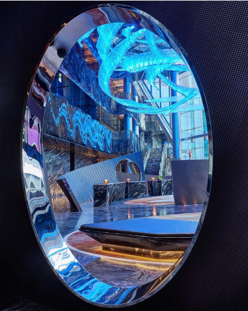
An unexpected composition shot with a longer focal length breaks the space down into easily digestible and understandable parts. No need to go to 24 or 17mm when you’ve got this much to contend with. The simple shape of the oval helps frame the view and guide the eye to what’s important.
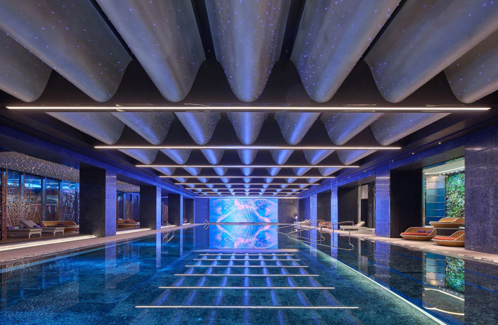
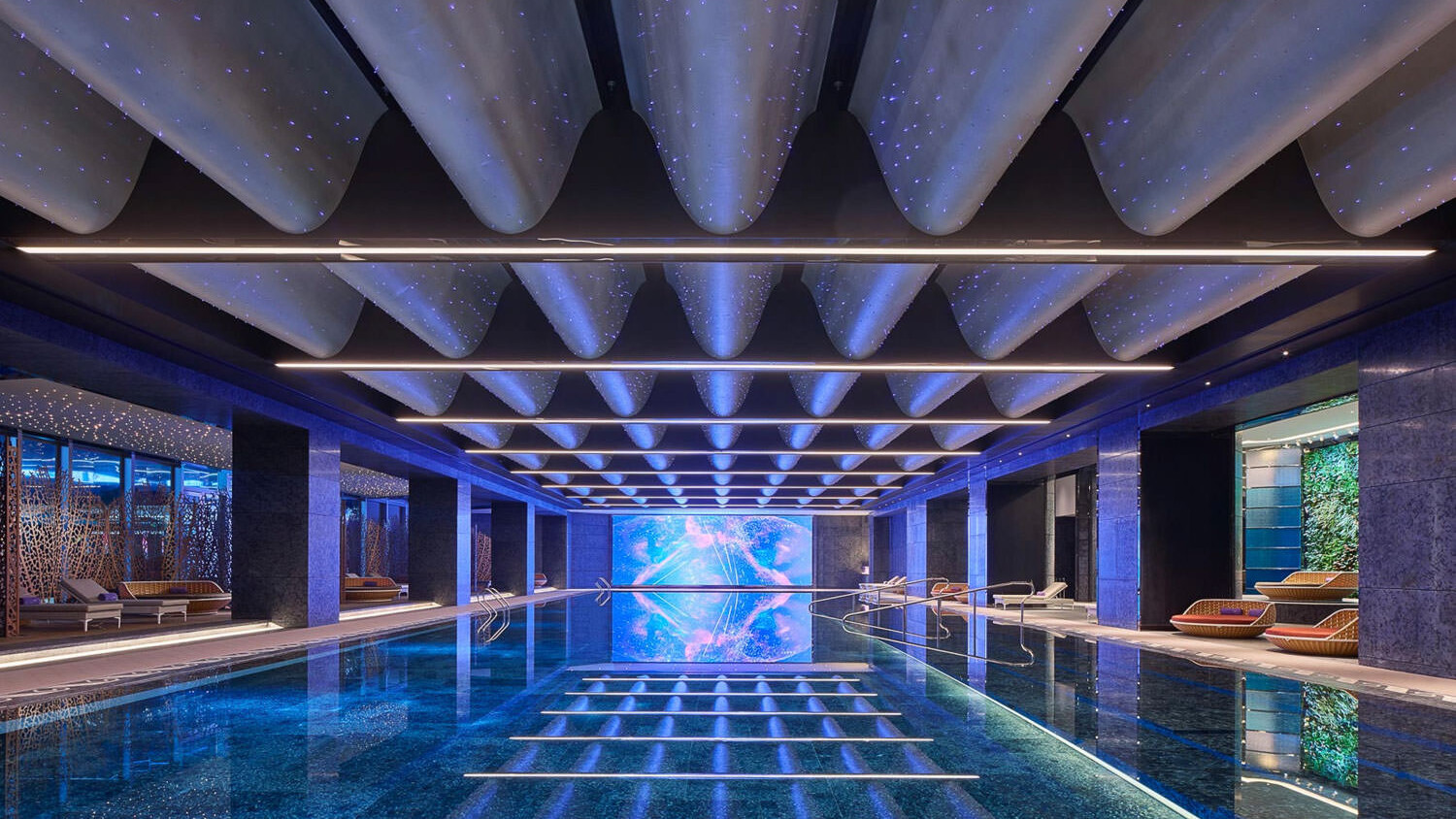
The pool – incredible. Just pure geometry – no fluff, no getting cute. I can’t imagine finding a stronger composition in here. Did George Lucas use this as inspo for A New Hope’s trench run? I mean it’s perfect, what else is there to say?
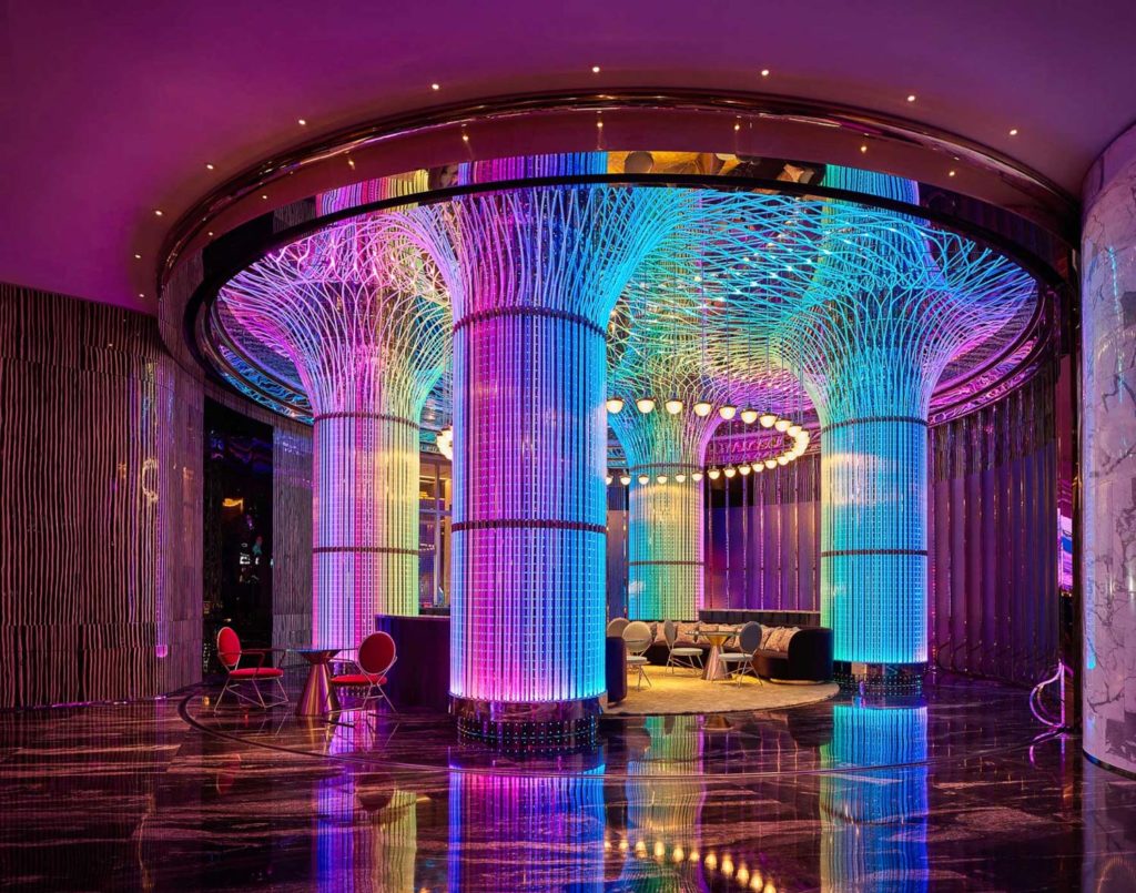
Another insanely challenging space to shoot – with perfectly controlled color, mood, and composition. I love how dark and sexy these images are while at the same time being completely understandable – I haven’t been to this space but I have a feeling that he nailed it. The tungsten mixed with the rainbow LED hues in the vertical columns is so, so well done.
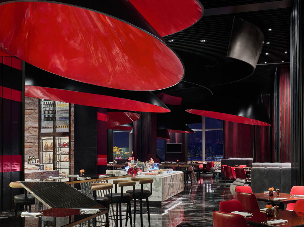
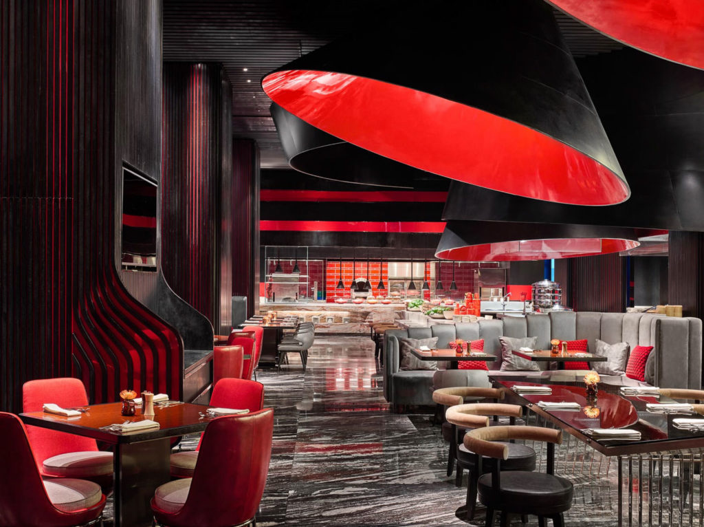
Moving on, the restaurant continues with the color wash theme of the lobby – this time in red. Everyone knows how much digital cameras struggle with red and keeping them punchy and crisp without clipping or pushing them to magenta is a nice touch. I am not sure if Owen lit this space but the lighting on the chairs is sublime and perfectly color balanced.
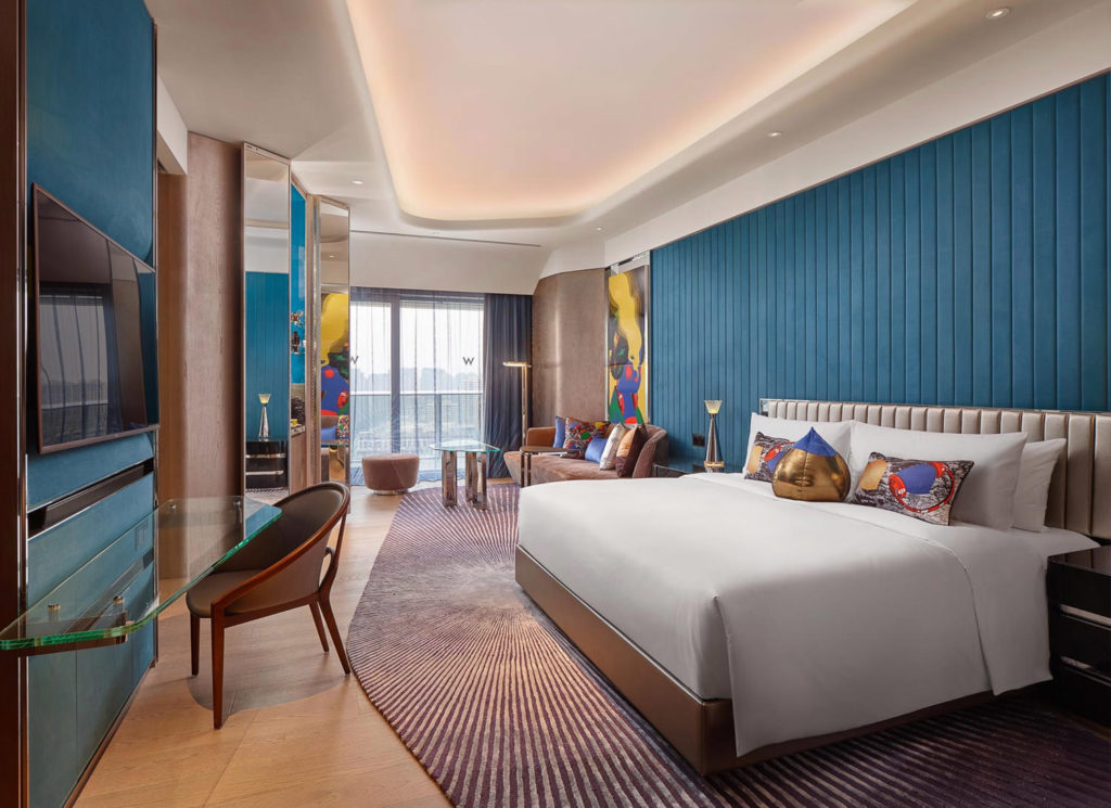
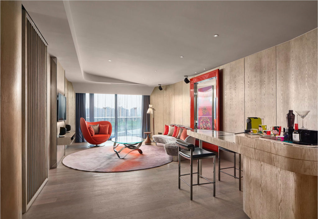
From a design standpoint, the rooms show more restraint and these images are about as perfect as they get for hospitality usage. Showing everything, but not comically wide… Wide – but not too wide, if you catch me. I feel like I have a realistic expectation of what I’d get if I were to stay here for a few nights.
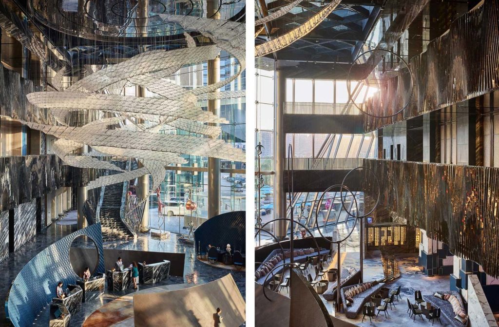
Rounding off the set are some daylight images of the lobby space – what an incredible transformation that the lobby undergoes from daylight to darkness. This is a great example – okay – probably THE MOST EXTREME example – of how much a project can change from daytime to night-time, so choose your time of day wisely! Both times of day have their merits, and part of me loves the over-the-top blue of the night time images, but the subtle warm glow of the space when the sun is low on the horizon has a brilliant soft quality to it that you don’t often see in hotel lobbies with their low ceilings and depressing “red carpet” welcome rugs for diamond elite platinum cardholders. Airy and bright, and dark and moody – so freakin’ cool. Well done on a very, very difficult project, Owen!
More of Owen’s beautiful work can be seen on his website and his instagram. If you have a project you’d like to be considered for Project of the Week, you can submit it here.
