Project of the Week | Montse Zamorano / Malka+Portús Arquitectos
Gas stations are a mundane necessity for travel. They don’t typically conjure up the term “great design,” and I’ve never heard one be called beautiful. However, in this Project of the Week, photographer Montse Zamorano makes a gas station look – dare I say – sexy! The flagship CEPSA fueling station by Malka + Portús Arquitectos and the team at Saffron Brand Consultants in Spain is a sight to behold.
Montse did a perfect job of conveying the station’s beautiful design overhaul, focusing on the new tech, usability, and the focal point of the entire project, that incredible canopy. I’ve never wanted to plan a pilgrimage to a gas pump so badly as I do after seeing these images, so hats off to you Montse on a job well done!
The tones, colors, and movement in this series are what initially grabbed my interest. Montse captured the CEPSA Station in a way that conveys the endless flow of customers and commerce while also depicting it as a red glowing mecca against the blue sky.
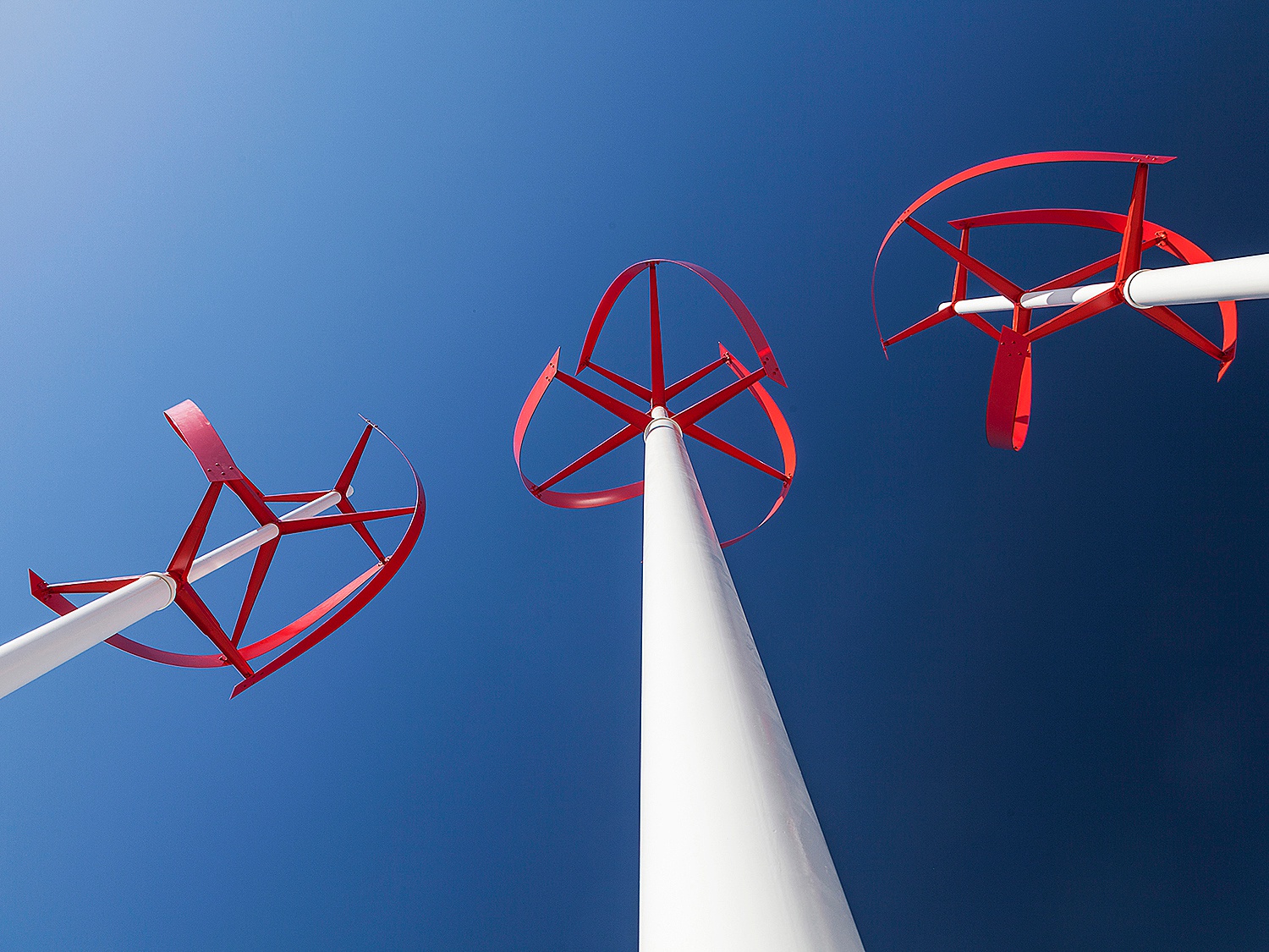
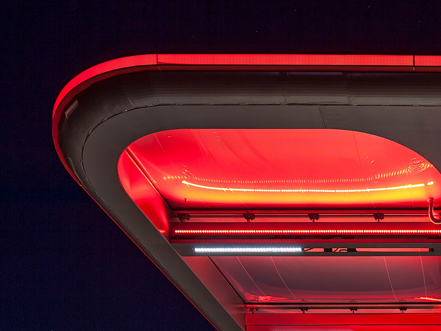
Details are sometimes overlooked as photographers focus on showing off the main structure, however, Montse showcased the accessory structures and branding elements throughout this project. I love the abstract and looming angle of these turbines. The red and the white popping out from the sky feels powerful, and the leading lines that drive our eyes to the center of the photograph are strong. She put a great deal of compositional thought into this shoot, even in the supplemental images. Each one is consistent and contributes to the story of the station and its branding.
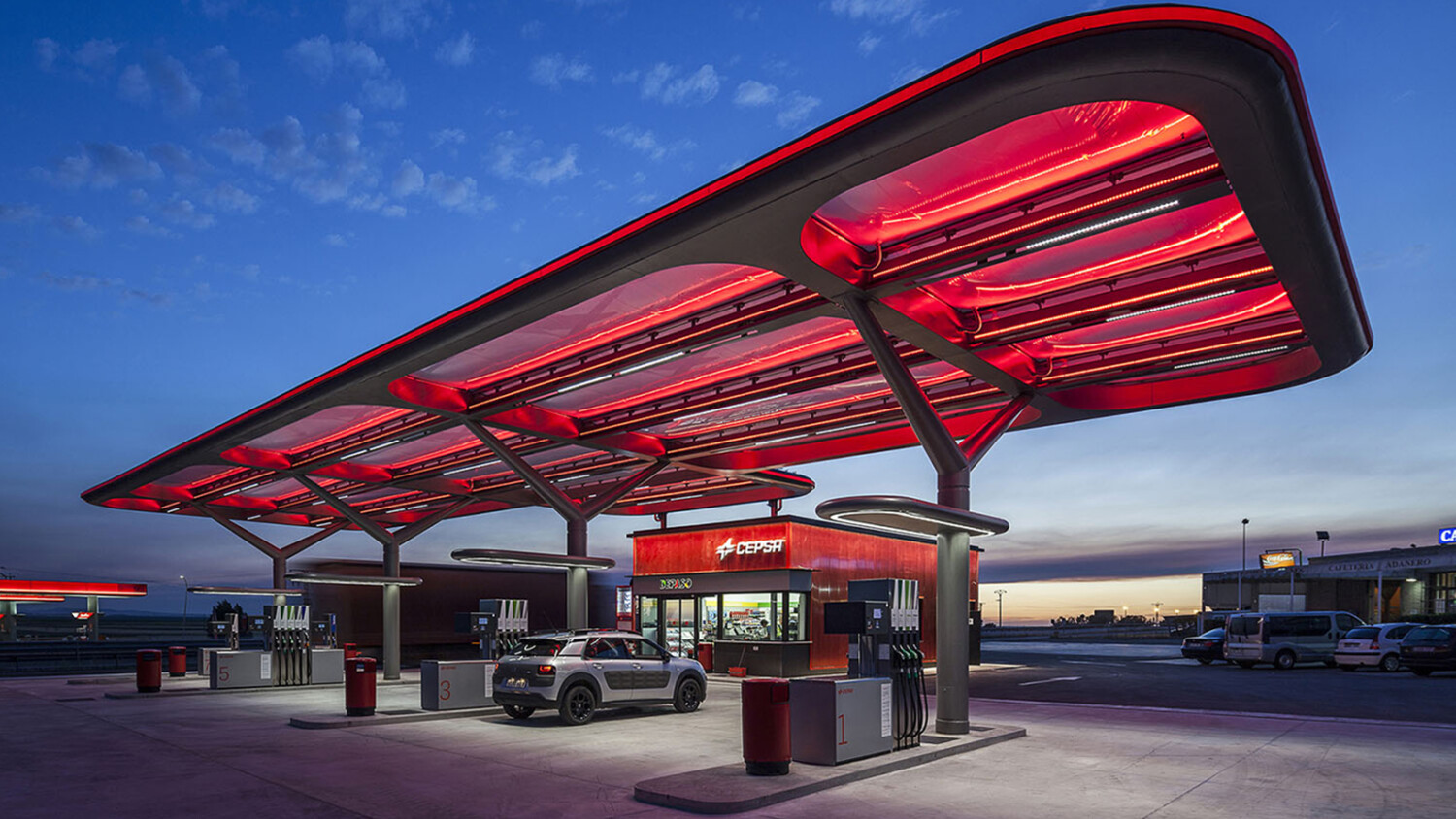
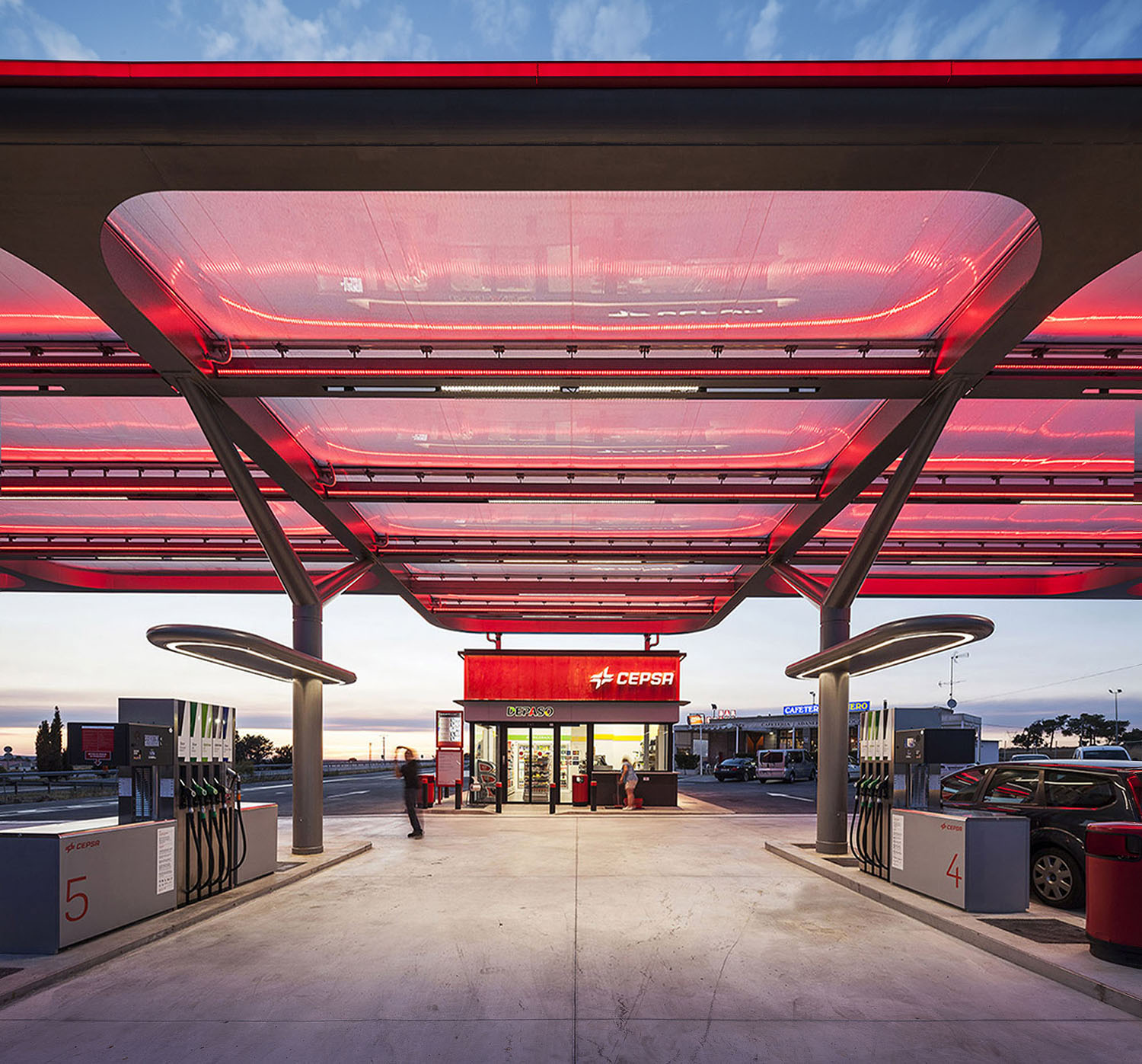
The symmetry and one point perspective here is great and plays off of the thoughtful design of this station. The repetition of the panels in the canopy moves our eyes toward the store. The crop of this image is also thoughtful and contributes to the symmetrical feel.
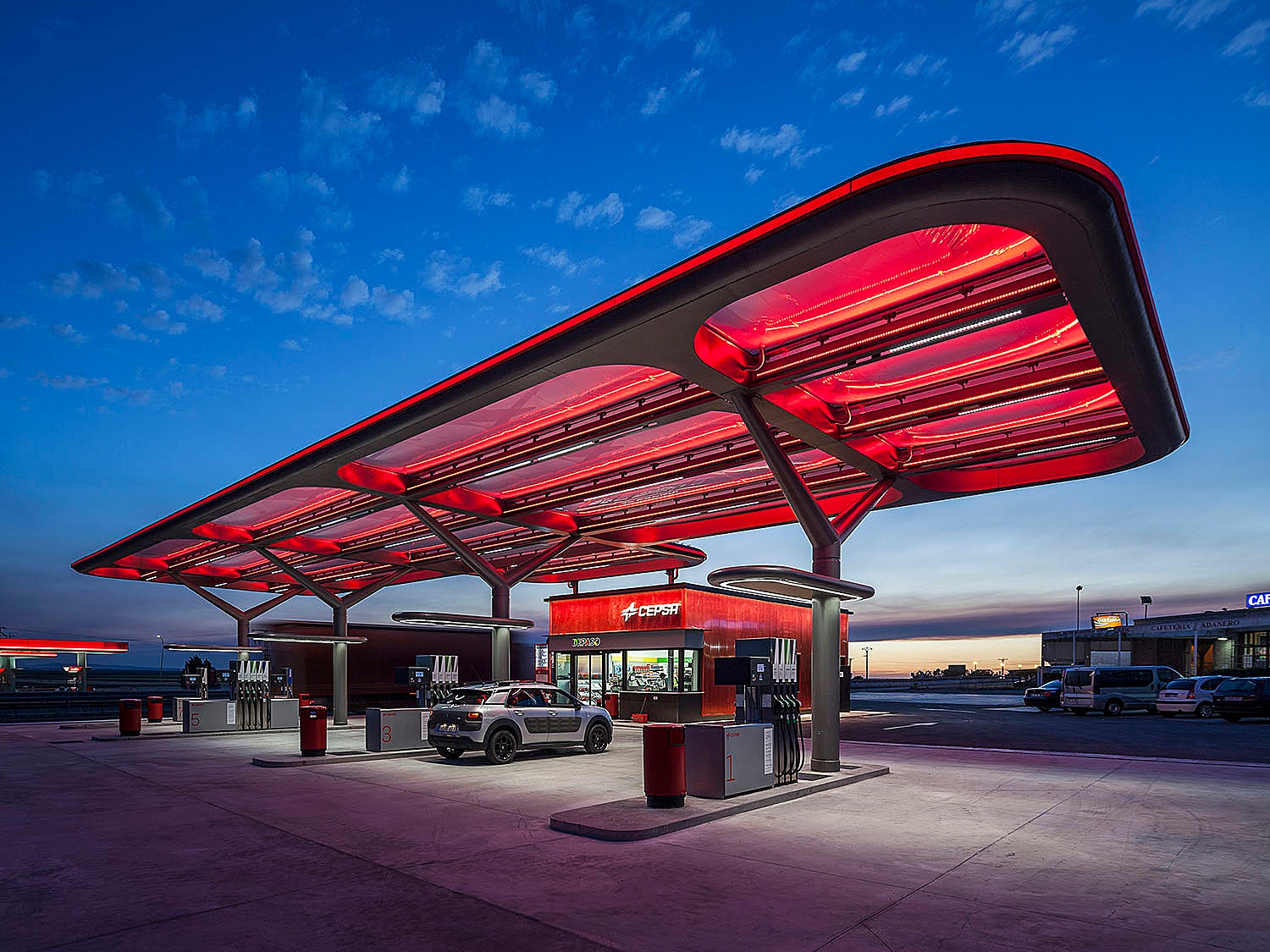
The canopy over the CEPSA station is clearly the design element that everything else orbits around. It’s impossible to ignore a glowing red swatch against an evening sky. I would imagine it draws in customers just like it draws in my eye. I appreciate Montse’s judgment and restraint in how she post-processed this particular image. The glowing red lights designed by AUREOLIGHTING are attention-grabbing but not so nuclearly saturated that they distract from the other elements in the photograph. It feels true to life and accurately represented.
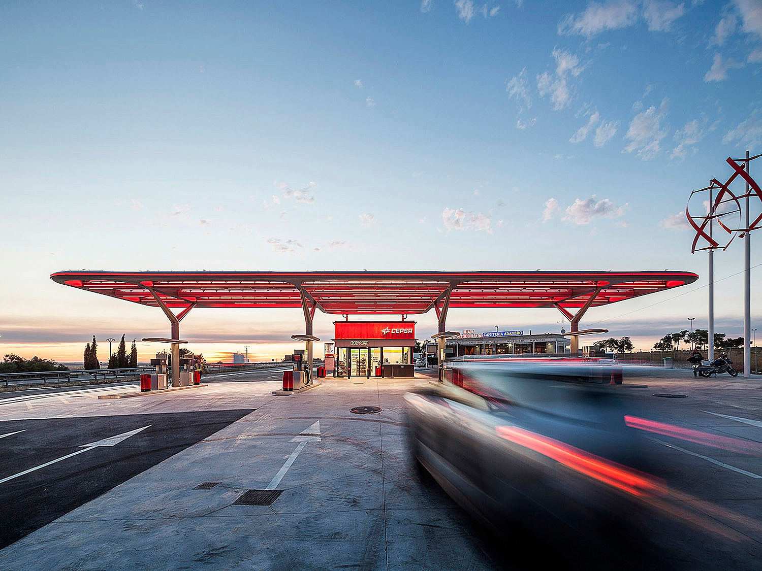
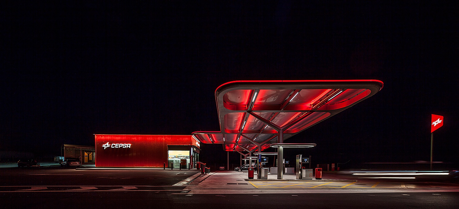
We’ve all been fueled up our cars at this time of night. This image feels familiar, but better. I love the careful exposure and mood of this photo. The composition is weighted well, and shows the dimension of the station.
What I love most about this entire project is the reminder that architectural photography has so many purposes and encompasses all of architecture. From homes and hotels to boats and gas stations, it’s one heck of a versatile niche of photography. A big thanks to Montse Zamorano for contributing to this week’s POTW. If you have a project you’d like to be considered for Project of the Week, you can submit it here.