Story of an Image – Tian An 1000 Trees by Heatherwick Studio
This edition of Story of an Image keeps us here in Shanghai and takes a look at a building that people seem to either love or hate: Tian An 1000 Trees designed by London-based Heatherwick Studio. This is the story of an image that was actually taken while on assignment to film the project.
Last year we were commissioned by the owner, Tian An China, to create a short film of the project to be released in conjunction with the building’s grand opening later that year. Because we were not under any significant time constraints, and because the building is quite close to where we live, we were able to visit the site multiple times under pristine weather conditions (always a nice luxury to have). Our final film included quite a few timelapse clips, and while those were being shot, we were also able to capture still imagery under the same perfect weather conditions. That extra effort led to additional licensing opportunities – always a good thing.
The Site
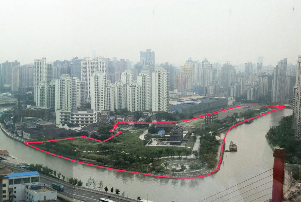
Tian An 1000 Trees is located in a dense residential neighborhood in Shanghai’s northwestern district of Putuo. The site includes a handful of historic buildings/structures to be preserved and is also adjacent to the city’s popular M50 arts district, both of which sit alongside the winding Suzhou Creek.
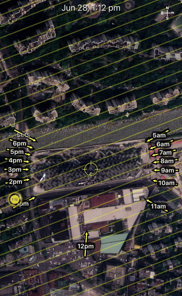
One challenge we ran into trying to capture this building is that its iconic tree-covered façade and green terraces face entirely to the north. Luckily, we were able to start filming the project during Summer, when early morning and late afternoon sunlight washes over the dynamic roofscape.
The Building
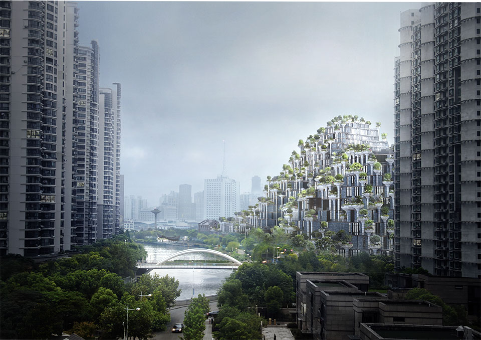
Phase one of the project opened in December of 2021 and is a nine-story commercial retail building reminiscent of a green covered mountain.
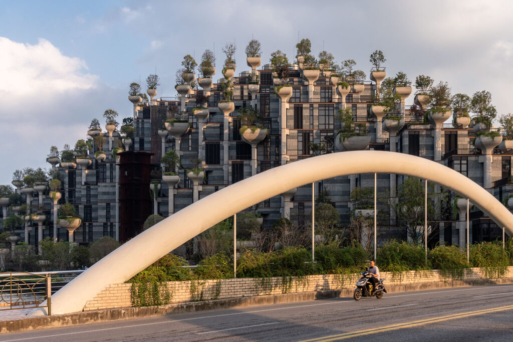
The building’s most notable feature is its structural grid of columns that are rotated 45 degrees from the nearby canal. Each of these columns is topped with a green planter containing a mix of deciduous and evergreen trees, as well as shrubs and hanging plants. The architect’s goal was to integrate this vegetation into the building as an extension of the nearby park, transforming an ex-industrial site into a new destination exploring the powerful relationship between art, landscape and architecture.
The Shot
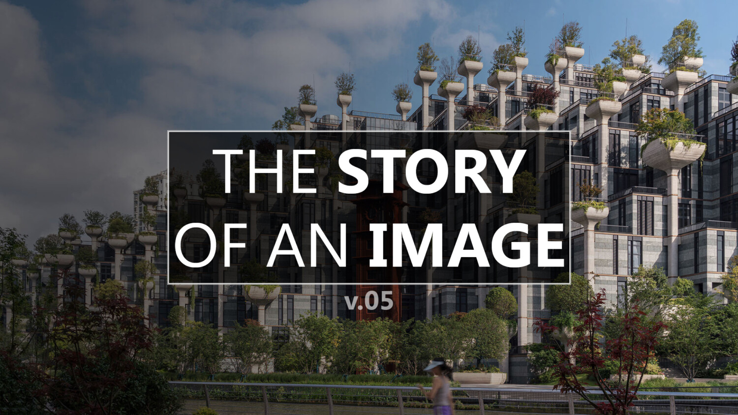
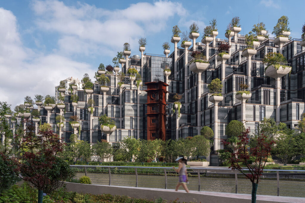
With this particular image, we wanted to showcase the eye level perspective of what it’s like to walk along the landscape promenade on the opposite side of Suzhou Creek. At the time, this canalside landscape public amenity had just finished, so we were one of the lucky ones to be able to access it early on.
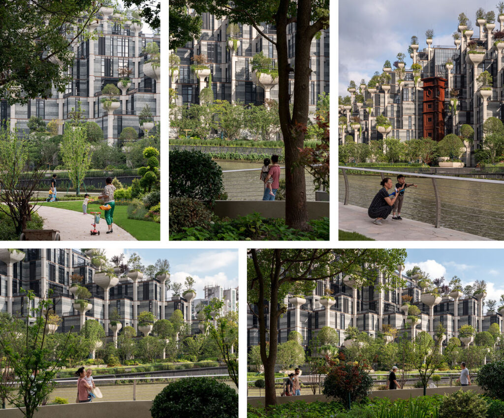
In addition to showcasing the surrounding context from a human scale, we wanted to frame the shot in a way that highlighted the building’s sloping roof and the way it gently cascades down towards the arts district and park to the east. And of course, we needed to show the building’s iconic tree covered structure in the most flattering way, which we believed was when Shanghai’s late afternoon sun draped over it from the southwest. We ended up settling on a view with a thin sliver of the promenade and canal to ground the image in the foreground, but having the bulk of the shot devoted to the building and partly cloudy sky beyond.
The Edit
In terms of post-production, it was relatively straightforward.
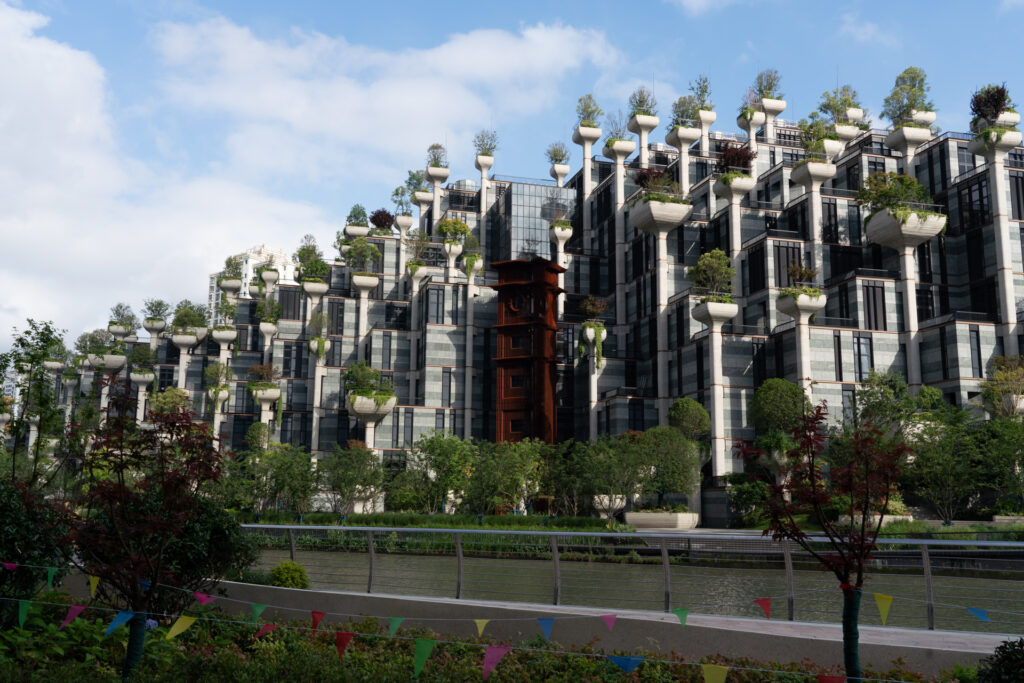
Because I was on site for video purposes originally, the gear I had for that day did not include any of my tilt-shift lenses, so we had to make do with our 24-150mm and correct the keystoning in Lightroom (kind of felt nostalgic in a way). That coupled with some basic exposure adjustments, and we were off to Photoshop for some final touch-ups.
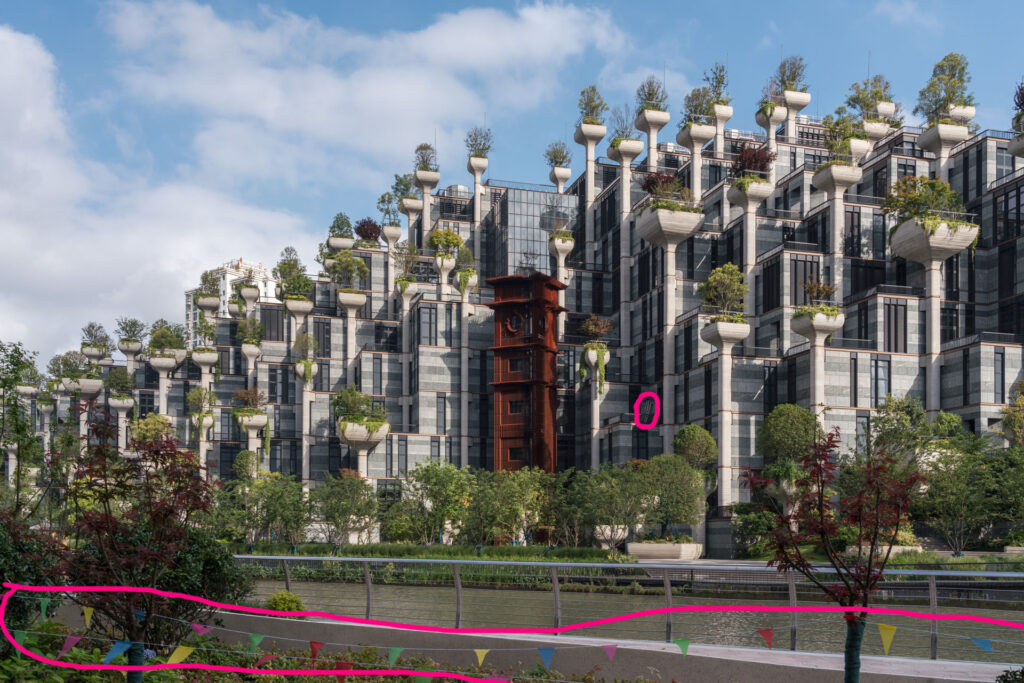
The only major cleanup necessary was to get rid of the flagged ropes along the landscaped area. Unfortunately, when we tried to take these down for the shot, we were reprimanded twice and sadly accepted that a bit of post work would be required.
As usual, we took a handful of additional frames from the same location with pedestrians in the frame to give us options on where to locate them compositionally in the shot. We ended up keeping it simple with just a single figure in athletic gear feeling like the right choice.

After the figure was brushed in, all that was left was adding some subtle warmth and there we have it, our final image.
Fairly straightforward in its execution, I think this image’s story highlights how we can sometimes find ways to multitask on site, and how that extra effort can lead to more opportunities to sell our work and put more money into our pockets.
