Architecture and Chill: The Built Space in Films
I must confess that I have never pressed the record button on my camera. Lately, the growing number of video platforms and the demand for architectural video has made me think twice about dabbling in video. Watching or re-watching films paying special attention to the role of architecture is a powerful tool and source of inspiration available to anyone interested in both architectural photography and video.
In a film, there is no element placed by mistake or to fill in the space. Each setting is meticulously planned by the team behind (director, production, photography, sound and music, etc) the ideas, then converge into a story able to communicate emotions through atmospheres. Films are a masterclass of lighting, staging, and composition.
Below is a list of my personal favorites (non-documentary) with annotations and facts that I find relevant in terms of architecture and photography.
2001: A Space Odyssey (1968) – Stanley Kubrick
2001: A Space Odyssey is a groundbreaking cult movie with a stellar set production that explores the relationship between mankind and the universe. A black monolith is the central element that ties space and time. The narrative is divided into sections: The dawn of man, the moon landing, and finally deep space exploration assisted by the supercomputer Hal 9000 in a quest to find answers to fundamental questions.
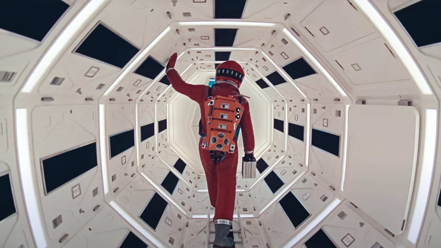
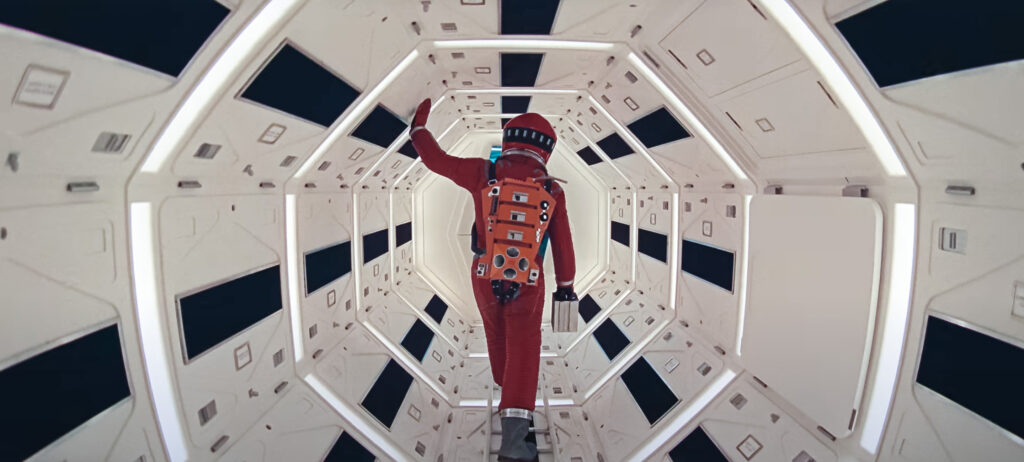
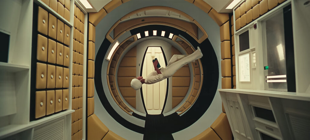
Short of dialogue, the movie focuses on visuals. Kubrick’s trademark symmetric one-point perspective in combination with the carefully designed sets, bold colors and music effectively draws the viewer’s attention. The research and level of detail for the space locations is remarkable. An entire rotating movie set was built in order to simulate gravity force and rotating parts of the space station.
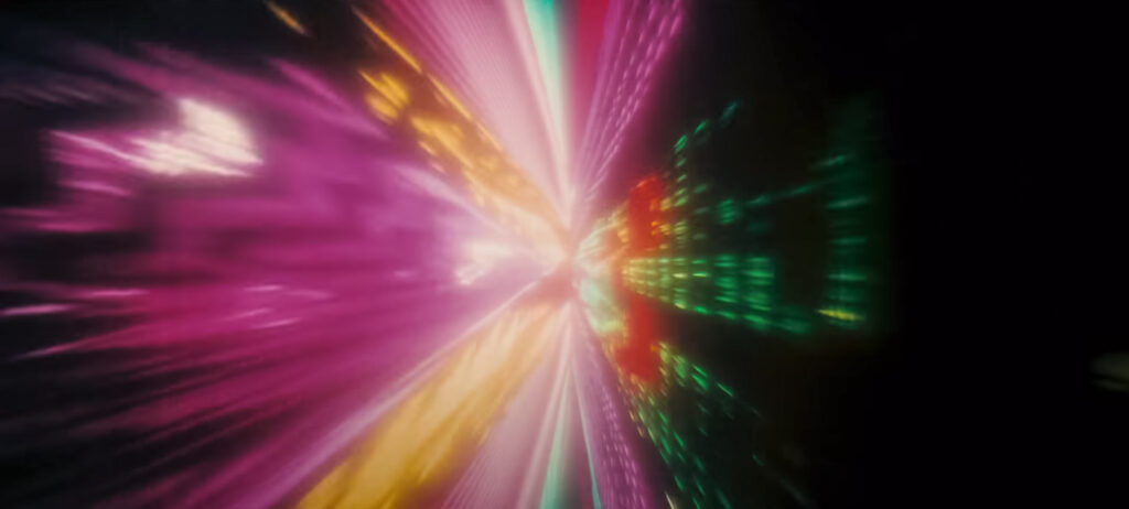
Besides the futuristic sets, the movie also managed to create an abstract concept of space. The “star gate” sequence was achieved through slit scan photography, an innovative technique at the time. The result is an immersive tunnel never seen before in cinema.
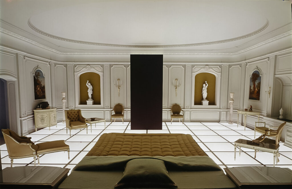
Then comes the white room — An eclectic room with retro-illuminated floor grid, classical furniture, and renaissance paintings where the last part of the movie unfolds.
1: White Room. 2: Spacecraft Interiors. 3: Star Gate Sequence. 4: The Gravity Zero Effect
Kubrick’s later film A Clockwork Orange has a lower budget but is equally interesting in terms of architecture. It uses real-life locations with various architectural styles that range from a classic revival theater, brutalist buildings to a disturbing milk bar and modernist houses.
Blade Runner (1982) – Ridley Scott
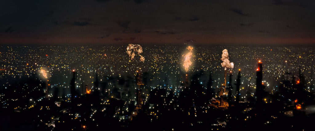
The opening scene shows an alternate reality of Los Angeles in 2019. A mega-city with no sunlight, industrial chimneys breathing fire, and flying cars. The perfect setting for a police unit known as the Blade Runner to hunt down outlawed replicants – genetically engineered humanoids.
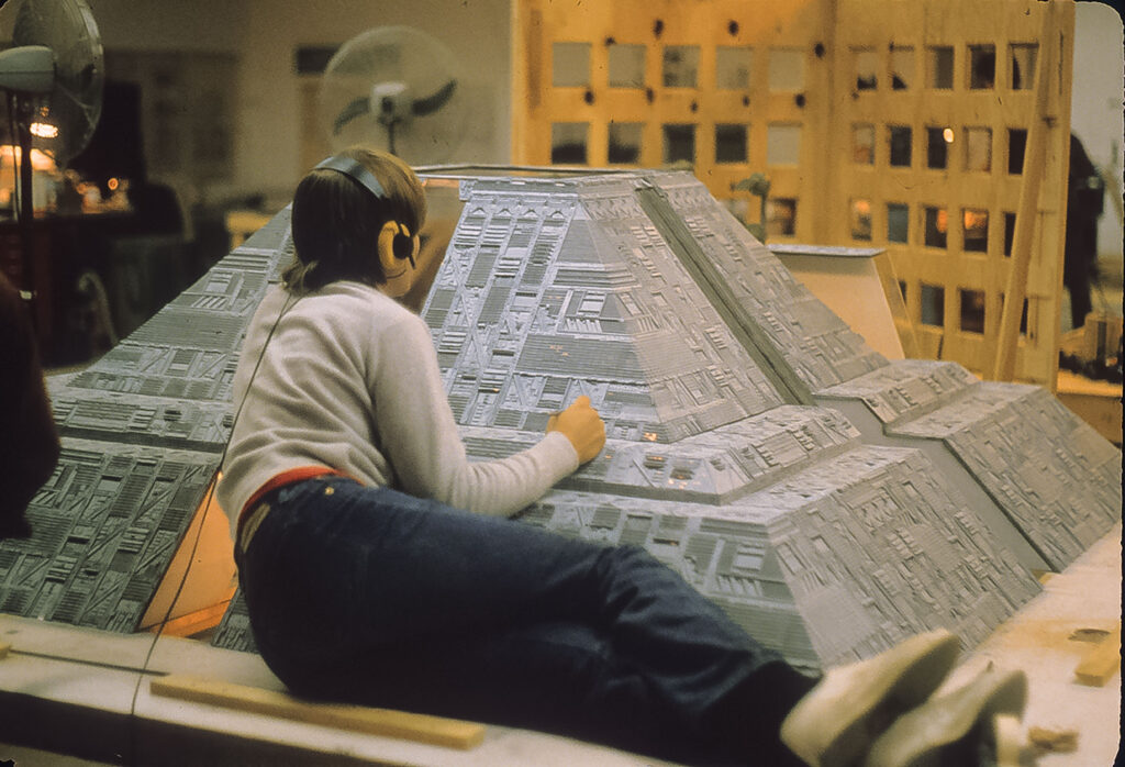
The film uses architecture to demonstrate hierarchy in social classes. In addition to height and scale, the buildings employ classical forms to represent power: pyramids and cylinders rise like temples above the lower city layers. As a fact, most of the futuristic buildings in the film are actually highly detailed scale models.
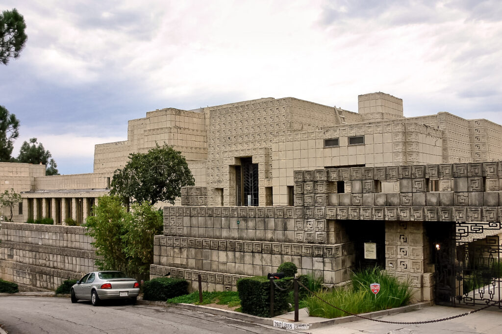
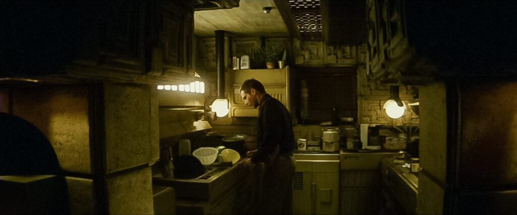
There are two iconic real-life locations that ground the story giving it a sense of realism. The first one being the Bradbury Building in downtown Los Angeles. The second one is the Ennis House, one of Frank Lloyd Wright’s Mayan revival houses that has become a favorite location for movies and series alike. (Find out more about FLLW architecture in Los Angeles in this documentary previously shared by Veeral Palladino.)
Image 2: Blade Runner, Ennis House on the film – Still Imagesl © Warner Bros. Entertainment.
Image 4: Blade Runner, Skyline – Movie Still © Warner Bros. Entertainment.
Blade Runner 2049 continues with the legacy of the original film. The dystopian future, importance of architecture, scale models, and the atmospheres are all there. Plus that orange haze that engulfed San Francisco last week.
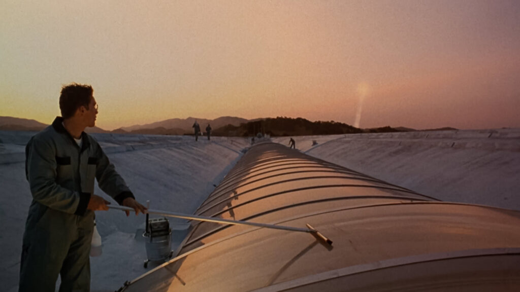
Gattaca (1997) – Andrew Niccol
Don’t get fooled by the questionable 90’s trailer. Think about Gattaca as a proto-episode of Black Mirror.
In the not too distant future, parents have the option to genetically modify their children at the time of birth. Society then classifies and divides individuals according to their genetic value, someone not modified will be segregated and will only have access to minor jobs. The protagonist Vincent, a genetically inferior individual, impersonates a genetically valid person in order to achieve his lifelong dream: joining the space program.
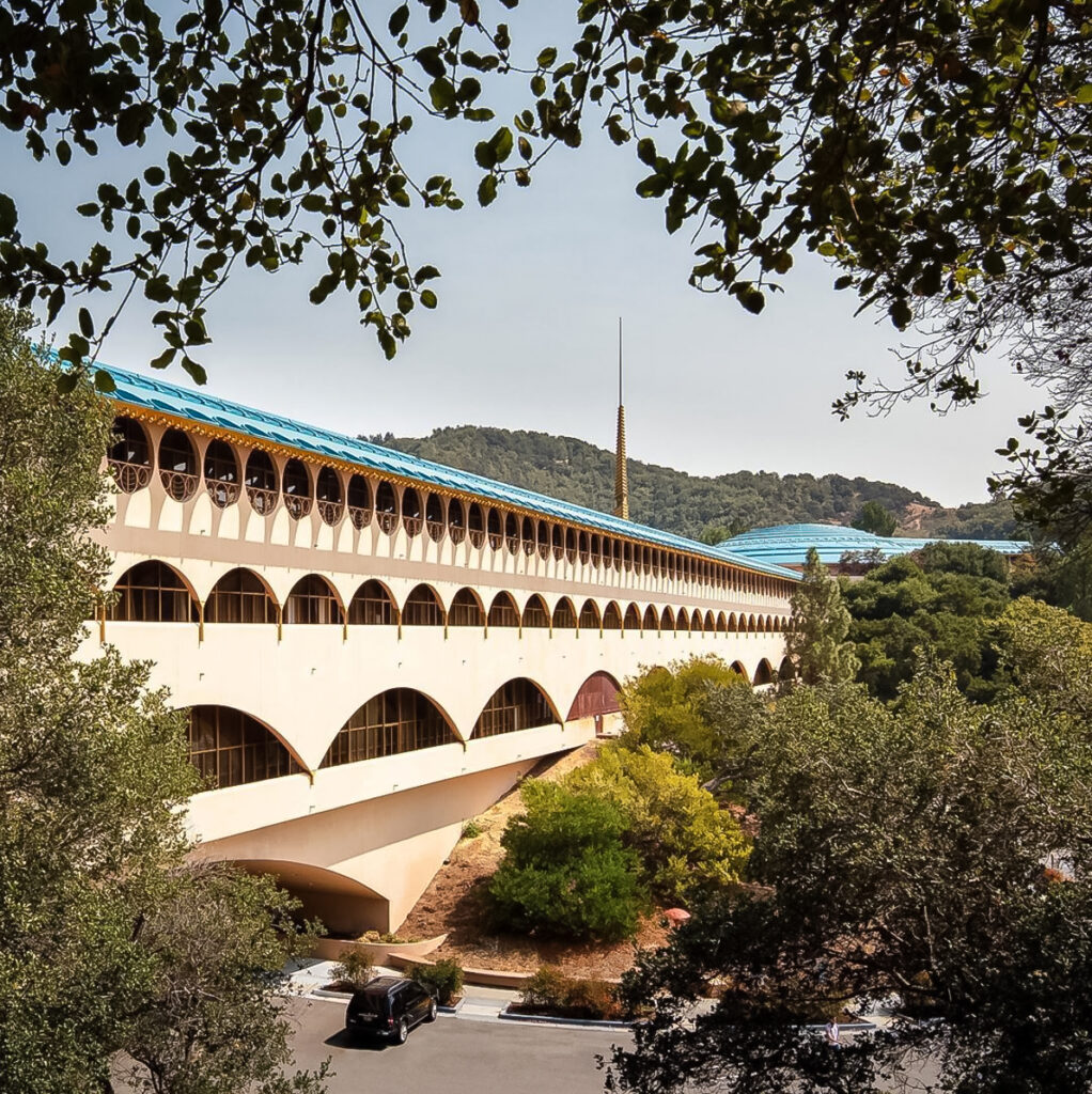
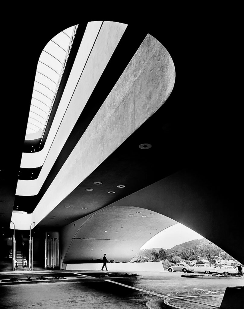
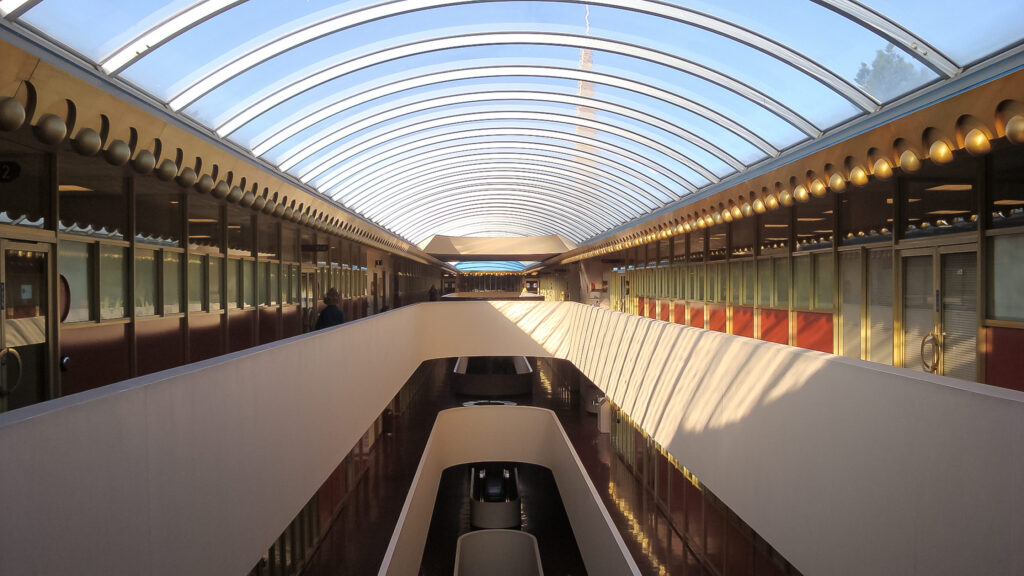
The real-life building used for the space program headquarters is the Marin County Civic Centre. designed by the late Frank Lloyd Wright and completed after his death in 1962. The arch openings along the impossibly long facade, the dome, the skylights, and the spire tower all fit the mood of the story perfectly. A design ahead of its time. Perhaps you recognize the building in question as photographed by Ezra Stoller.
Image 2: Marin Civic Center © Ezra Stoller. Esto and Yossi Milo Gallery
Image 3: Marin Civic Center Interior from Wikicommons
Image 4: Gattaca – Still Image © Sony Pictures Movies & Shows
Grand Budapest Hotel (2014) – Wes Anderson
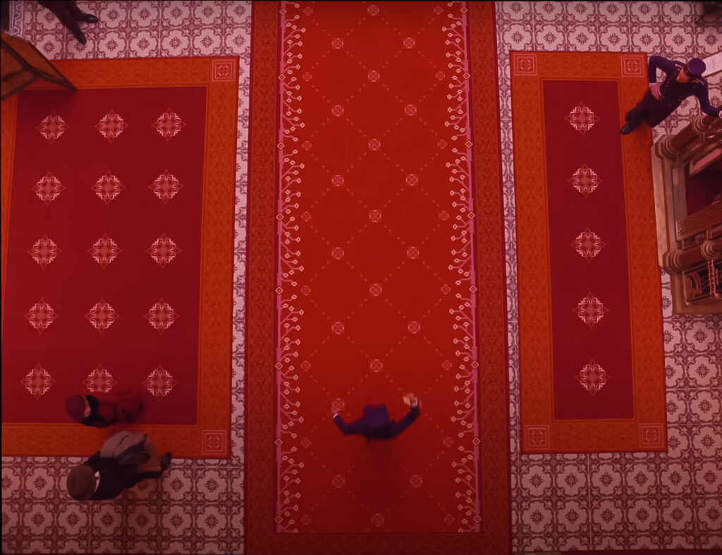
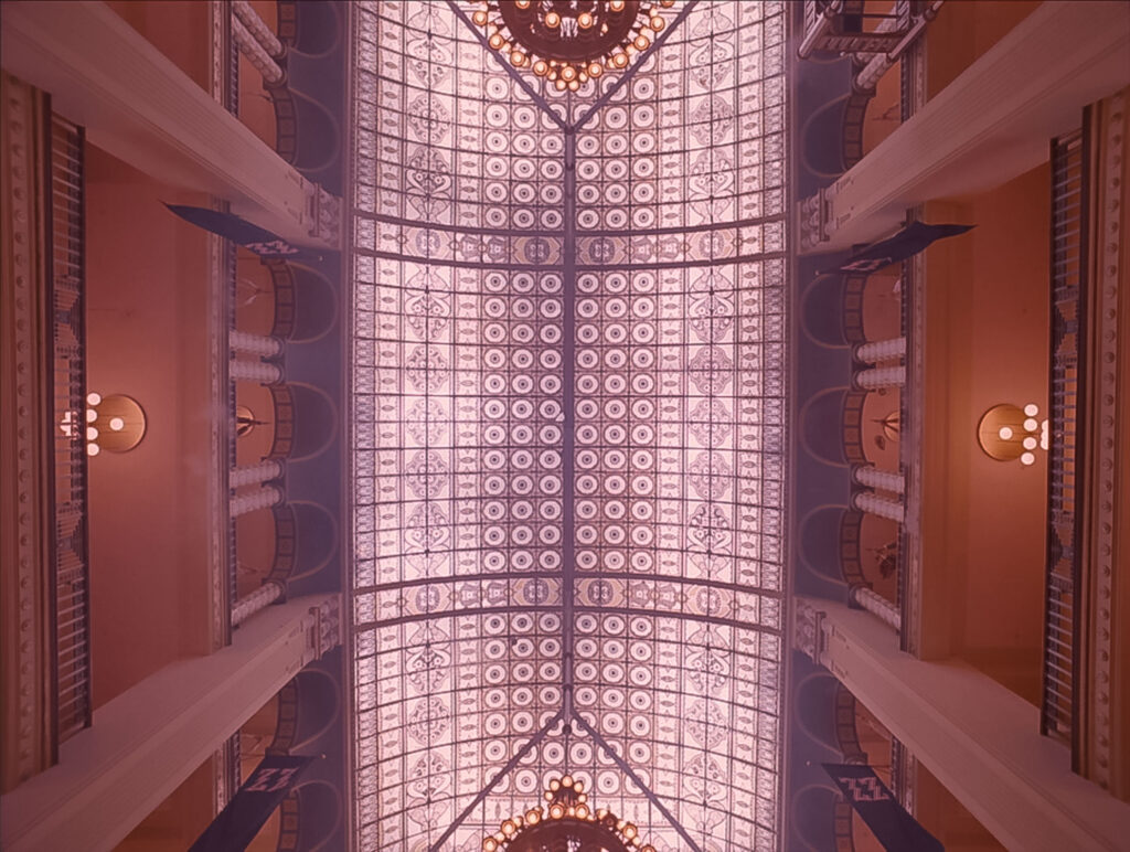
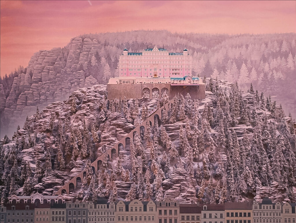
Pastel colors, deliberate use of scale models on screen, and a very comical sense of humour characterize the film. It narrates the adventures and friendship of concierge Gustave H. and Zero Moustafa, the new lobby boy of the Grand Hotel Budapest situated in the imaginary European Republic of Zubrowka.
The film — and Wes Anderson’s work — has characteristic frames and camera movements that reveal the entire space in all of its dimensions. My favorite movement is when the camera quickly rotates 90 or 180 degrees to show another part of the scenery. It is something done a lot in architectural photography to take opposite views of the same space to explain it better.
One point perspective compositions are the most common in the film. Frontal elevations that resemble architectural facade drawings often shot with a wide-angle lens to showcase small spaces. In addition, complementary shots from above and below complete the understanding of the space in its three dimensions.
Something special about the film is that it uses three different aspect ratios in accordance to the years portrayed in the story. These aspect ratios range from almost square to widescreen. In terms of photography, it is amazing how different crops can accentuate or change the reading of an image.
The scale models used in the film are inspired by almost identical real-life architecture. As a bonus, I would like to point out the work of Accidentally Wes Anderson, a couple dedicated to collect photographs of real-life locations perfectly suited for the next Wes Anderson film.
Parasite (2019)- Bong Joon-ho
The film is about how the Kim family — who live from day to day — ends up involved working for the Park family. Greed, dependence, and the complexity of class struggle are major topics within the movie always accompanied with a touch of dark humour.
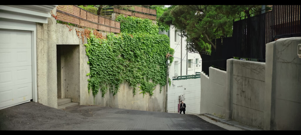
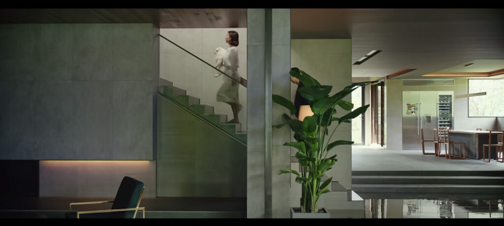
Parasite is also a story of two houses: one upper class and one lower class. The houses themselves were designed, built, and staged specifically for the film. They are so detailed that they do not look like movie sets at all. Besides its inhabitants, the film gradually reveals the character, virtues, and secrets of the houses as if they were another protagonist. And they are.
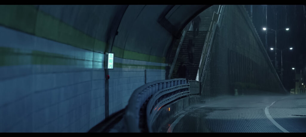
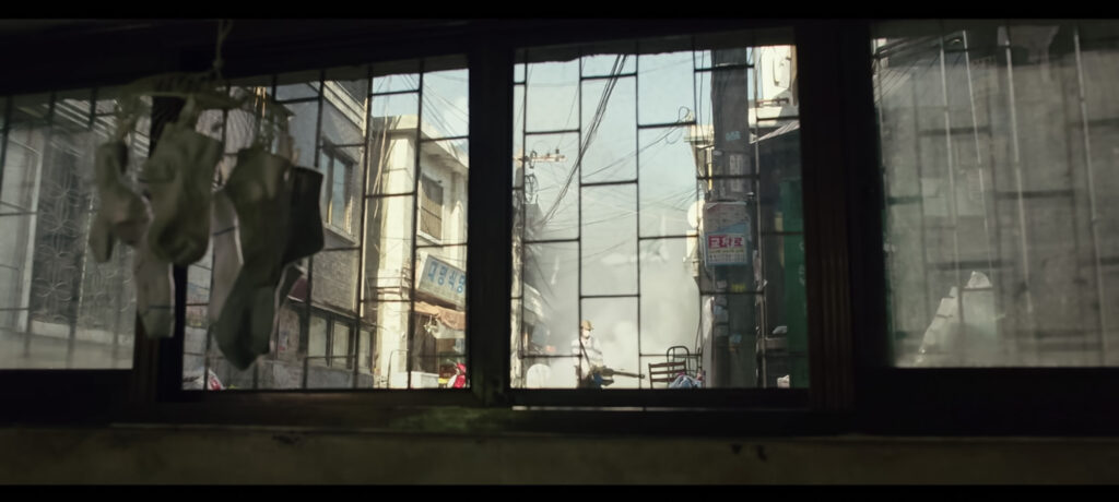
Bong Joon-ho uses architecture as the media to illustrate the difference in social status between the two families. The rich family house is located on a hill, one must go up the stairs to enter and the camera is consciously tilted upwards. In contrast, in order to reach their house, the Kim family must descend several staircases through the city until reaching the semi-basement.
In the same fashion direct sunlight only touches the Park’s family house while dirt and flooding are a constant at the Kim’s family place. Another interesting aspect is that both houses feature elongated windows that match the screen’s aspect ratio; as if they were in some sort of dialog. However, one overlooks a beautiful private garden while the other only sees a part of the lower-class neighborhood.
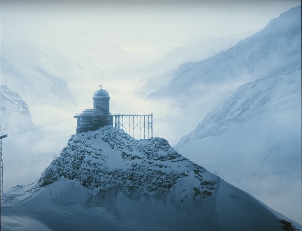
Do not miss out on Jooh-ho’s previous film Snowpiercer. The class struggle develops horizontally on board of a train on an eternal loop over Earth’s frozen surface.
I certainly enjoy the architecture and locations of films. Call it scale models, real-life locations, CGI, or animation.
As of architectural video: I believe that the combination of moving images and music positions video as a compelling media to tell stories and showcase architecture, it adds an entire new dimension which I look forward to exploring. On the other hand, photography requires you to synthesize an entire architectural project into a few frames. That is the beauty and challenge of it.
There are many other films I would like to discuss (Playtime, Ex-Machina, Akira or La Grande Belleza).
Let us grow the list together. Which films would you add to an architectural film list?
