Step Inside Westridge Residence With Austin, TX Based Architectural Photographer Andrea Calo
Andrea Calo is an architectural photographer in Austin, Texas. Ever since I laid eyes on her work in the 2021 APALMANAC Project of the Year award submissions, I have loved Andrea’s photographs immensely.
These images of Westridge Residence by Joseph Design Build are the perfect introduction to her work. They are chock full of warm, beautiful light, bold lines, and the perfect addition of a human element. Andrea has graciously shared a bit about her shoot day and her process in general, and I’m so excited to share it with you all.
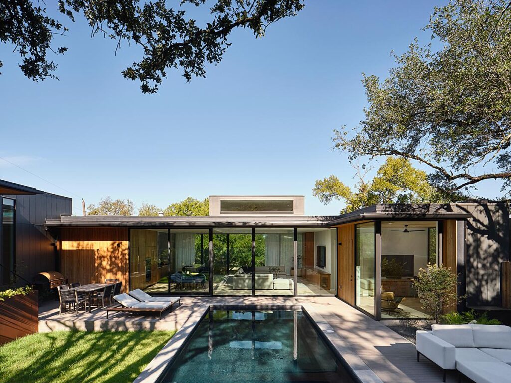
Andrea starts, “This project was for a longtime client of mine, Joseph Design Build. I believe they initially found me through Instagram about four years ago and I’ve photographed a bunch of their projects since then. A lot of their portfolio is comprised of speculative projects, but they do commissioned work as well. This project happens to be the personal home of one of the founders. The overall goal was to document the project in its entirety for their portfolio, and to include some photographs with the family in the space, which we don’t always do. This was a one-day shoot where I spent most of the day there from early morning when the sun was on the backyard through dusk.”
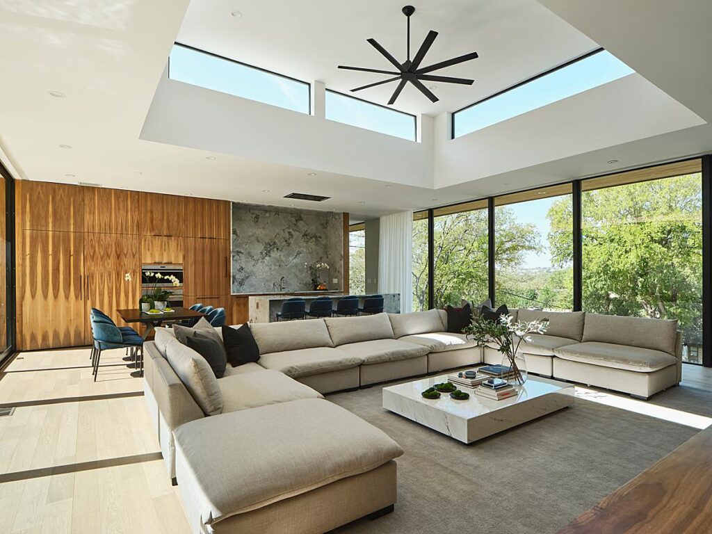
She gives us a look into her process, telling “I’m just out there following the sun! At the very least I like to check out the project address in advance of shoot day so I have an idea of what the sun is going to be doing, then do a quick walk-through upon arrival to check things out and make a rough plan.
As I move around the house I like to just keep an eye out for what’s happening lighting-wise, like in this house as I moved between the common area and the main bedroom/bathroom I kept passing the stairwell with the skylight and just waited for that slit of light to get longer and longer. Overall I’m shooting tethered so I can check on styling details and more, occasionally using strobes, oftentimes reducing/shaping light and blocking reflections with black cloth.”
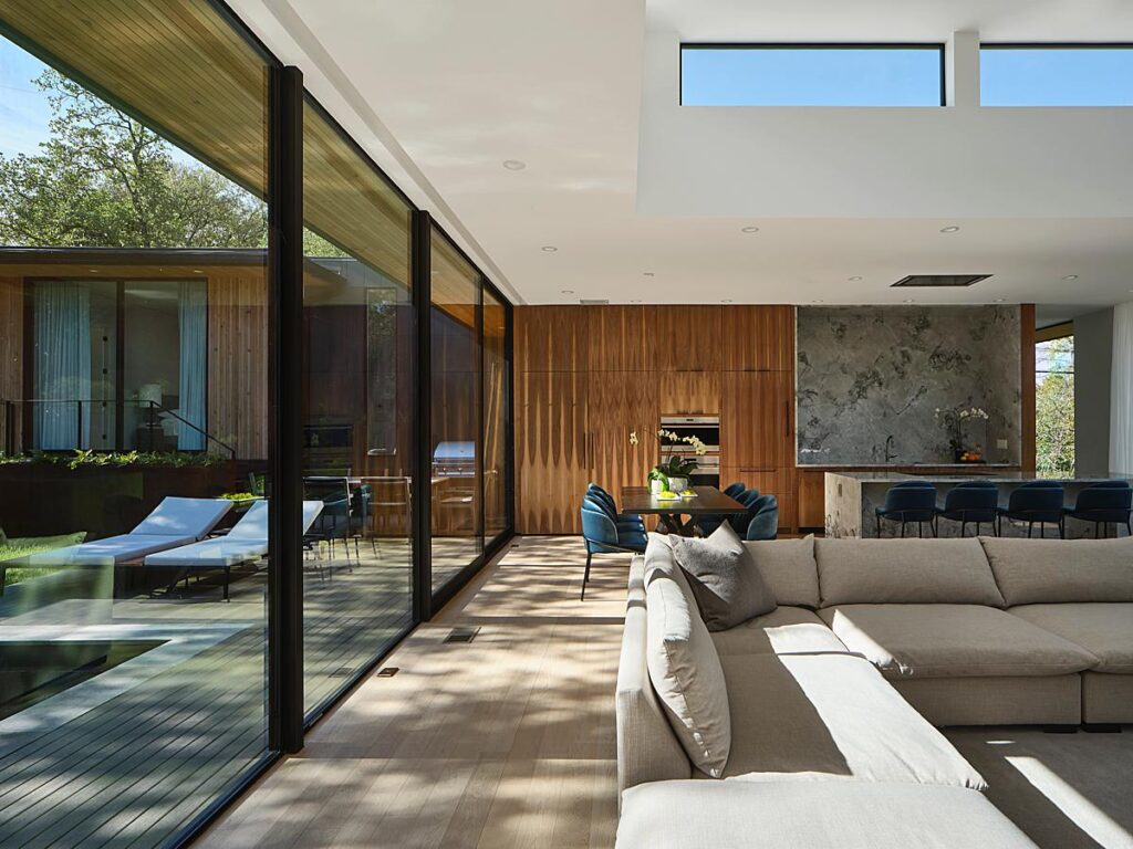
“Most of my shoots are with a client on-site, collaborating on each shot and working together on styling accessories, etc.” She explains. “With this client, they typically just set me free and let me do my thing. It’s awesome to have that kind of trust built-in, and their projects are usually super buttoned up and ready to roll, so there’s not much needed when it comes to styling.”
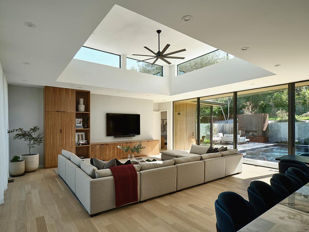
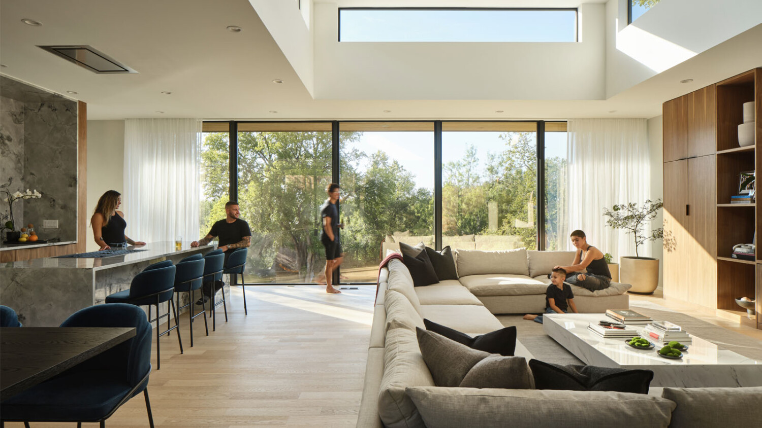
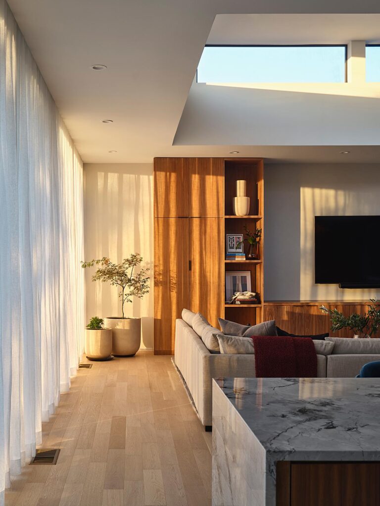
I particularly find myself drawn to the tone of Andrea’s photographs. The balance in exposure between the interior and exterior feels true to life. She doesn’t feel the need to push this photo to be light and bright, which adds a layer of mood and gives us an understanding for what it feels like to actually be there.
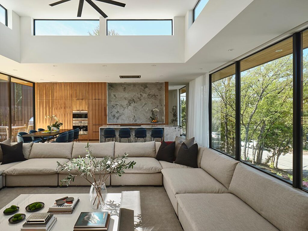
Andrea says, “This was a really seamless day where I got to just be in the zone and find the right time for each angle. I knew the sun would be streaming through the front windows late in the day, so I asked the family to be there for a short bit of time when the whole main space would be glowing. Ideally, I like to have a few angles in mind before people are in the actual room with me. I find it tough to get people feeling comfortable with a camera around when you’ve got a short time together, but luckily this group was super at ease so I just got to do my favorite thing which is to say ‘pretend I’m not here’ and then run around for 15 minutes collecting exposures.”
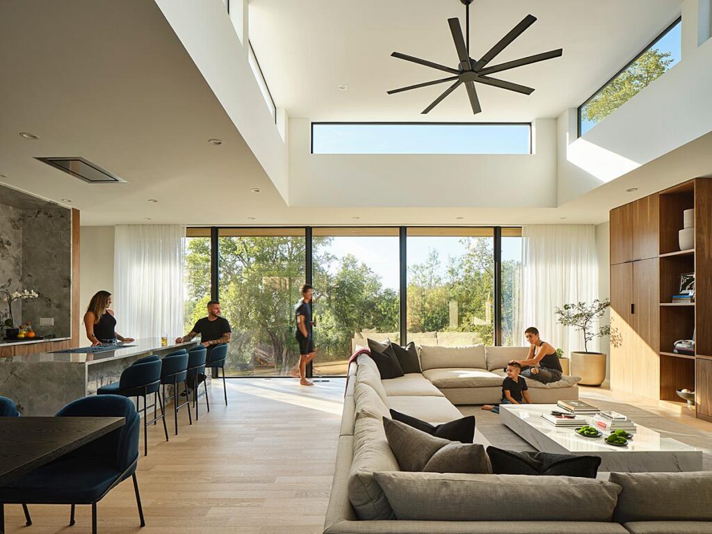
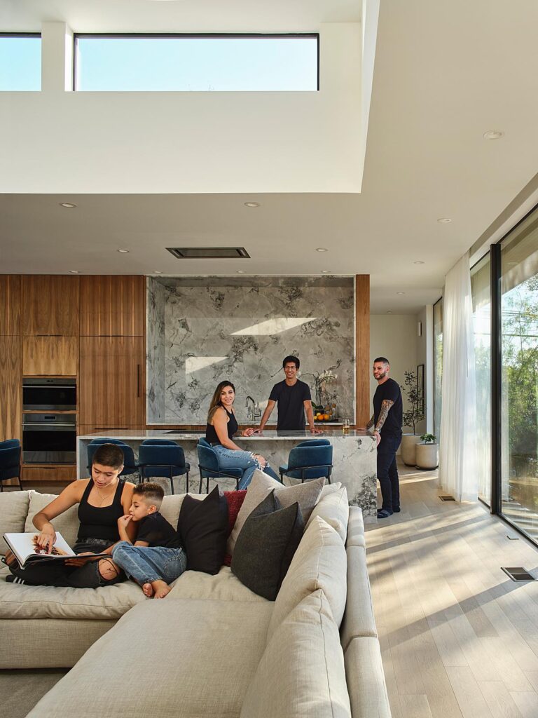
As it gets late in the day, we see gorgeous sunlight streaming in through the curtains, throwing a warm dappled light into the room. We immediately understand what time it is, can get the gist for the weather, and place ourselves in the scene.
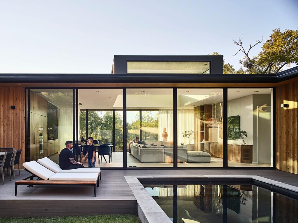
Andrea breaks down how she made her favorite image from the set. She shares “One of the last images of the day from the backyard looking through the house is my favorite. I knew I was running out of time with the family there but really wanted to make something that would express the indoor-outdoor connection of the house.
Whenever I make these kinds of images I like to have some transparency through the glass but I still like it to look and feel real, so oftentimes I will use strobes to help cut some of the glare. I had a strobe in the frame over by the TV to help reduce glare where the teenager is on the sofa. I kept it in the frame when the family was in the space and once I had what I needed from them I hid the strobe and made some exposures without it to composite after the fact.”
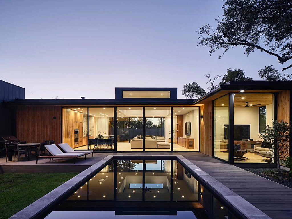
I’ve enjoyed seeing this view of the house throughout various times of day. We feel as if Andrea has show this perspective to us in its entirety and we can really understand how the design of the house works.
A giant thank you to Andrea Calo for sharing this project and a bit about her shoot day with us!
Get to know more of Andrea’s work on andreacalo.com, as well as on Instagram @andreacalo.
If you have a project you’d like to be considered for Project of the Week, you can submit it here.
