Shooting Luxe Dark Interiors With Barry MacKenzie
Barry MacKenzie is a tour de force player in the Architectural Photography / Interiors game. Chances are, you’ve seen him on the PROEDU tutorials, at his workshops with Tony Roslund, or heard him lately in his role as co-founder and host of our favorite new podcast, BAAM.
All of Barry’s work is incredible, and there could be a POTW on each project of his, but I’m pretty taken by a short and sweet shoot he did for Hedgeford and Berkley. This simple shoot that focuses primarily on the kitchen and bathrooms of this home (where we all spend most of our time anyhow) was published in Design Et Al and won a handful of awards in Europe. Brevity is the soul of wit, eh? Plus let’s be honest, you’re probably reading this while standing in line to wreak havoc on some Black Friday deals, so let’s hop right on into the thick of it!
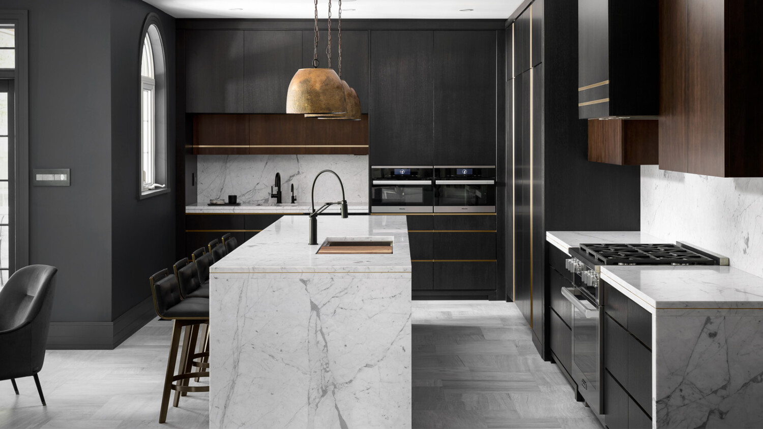
In the one-point perspective hero shot that Barry has crafted, there are so many great things happening. The angle emphasizes the squareness of the cabinets, island, and appliances. Look at those perfect verticles, void of distortion despite the fairly wide-angled view that we have. I love how on the left, the chair peeks into the frame along with a slice of the french door. It implies that there is more to the scene, and shows how the kitchen connects to what we can imagine is the dining room. Barry is super talented at subtly displaying how spaces connect in all of his work, and this is a great example of that concept. What I think we can all agree is the strongest part of this image though, is the quality of light Barry harnesses. Look how clean and rich this photograph is! It’s very graphic and seemingly perfect yet doesn’t look fake. He keeps little details like faint shadows on the ceiling and highlights from the windows on the cabinetry, which give the photo a measure of realism and keeps it from looking render-ish.
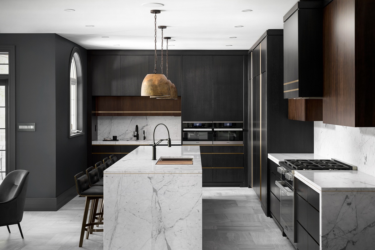
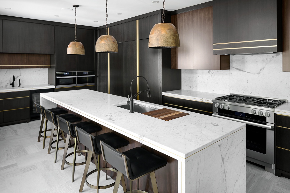
By changing up the perspective, Barry is able to showcase the length of the island and ultimately the size of the kitchen. The light pouring in pulls texture and detail out of the wood grain as well as the countertops and light fixtures. We are able to better see the brass inlay in the marble countertops, and how they tie into those on the cabinets, bar, and range hood. I’m most impressed with how in both this image and the one above, the exposure is fairly bright, but there still feels like there is a lot of mood present. The dark walls, cabinetry, and design elements definitely contribute to this, and Barry has mentioned that they were pretty challenging to shoot and retouch.
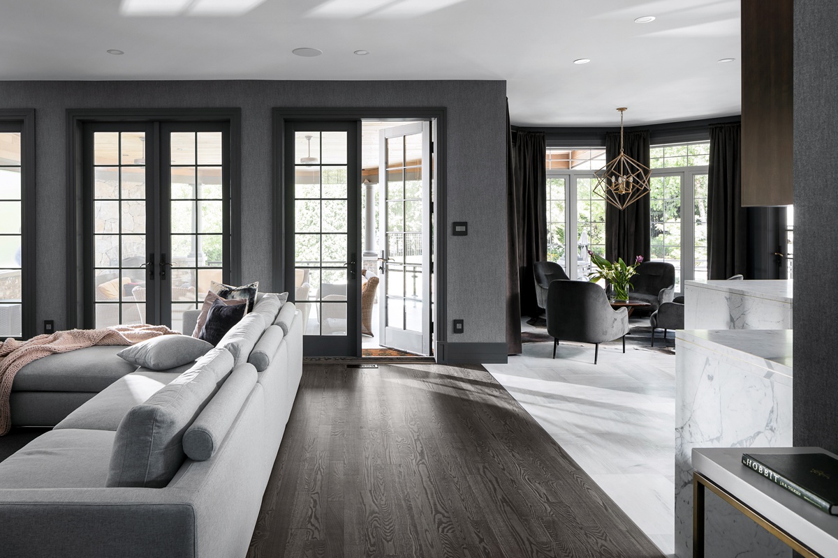
Next up is a scene that allows us to see how the hallway flows into the living room, which flows into the kitchen and dining room. There are a few great factors at play here, including the exposure of the view out the windows is just dark enough to imply what’s happening in the patio area, but bright enough to feel real. The light streams across the floor, highlighting (pun intended) the change in flooring materials between the two rooms. I love how this shot is styled. The casually disheveled pillow and blanket on the couch, the open door to the patio, and the flowers on the table all help soften this otherwise hard, angular, and dark feeling design.
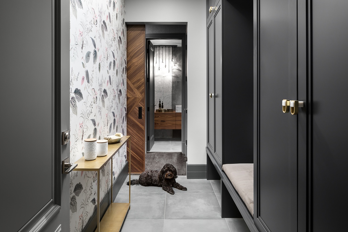
Barry shoots through the home’s mudroom and gives us the lay of the land, noting how a few different spaces connect and lead to a beautiful bathroom. Again, clean lines and clean light heighten the luxurious and modern feel of this home, and the scene looks true to life, as if I was really standing there — dog and all!
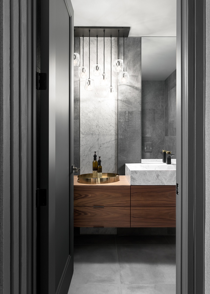
We’ll close out this short and sweet Project of the Week with a lovely shot of the bathroom. By shooting vertically, Barry is able to frame the shot through the doorway without leaving too much dead space on the sides, or chopping off important elements like the very glam light fixture. Additionally, this framing gives an intimate feel to the image while still showing us everything we’d want to see. Beautiful wooden cabinets? Check. Luxe marble sink that ties in with the kitchen design? Check. The clean and monolithic feeling tile work? Also check. What a beautifully made series of images!
Big thanks to you Barry!
There are a few corners of the web that you can find Mr. MacKenzie on. You can drool over his project highlights on his website barrymackphoto.com, follow along on Instagram @swizzler (Barry answers questions live every week on his story — as well as eats an absurd amount of pizza). I wholeheartedly recommend that you tune into the BAAM podcast with Barry and photographer Andy Macpherson.
Barry pops into our comments section from time to time, so if you have a question or warm wishes, be sure to drop him a line below!
As always, if you have a project you’d like to be considered for Project of the Week, you can submit it here.
