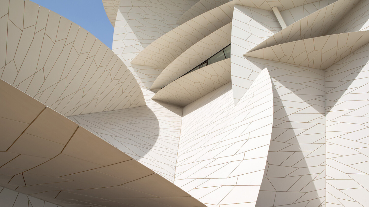
Project of the Week: Danica O. Kus / NMOQ / Ateliers Jean Nouvel
Feast your eyes on the National Museum of Qatar, a structure masterfully designed by Ateliers Jean Nouvel, and documented in equal mastery by Slovenian photographer Danica O. Kus.
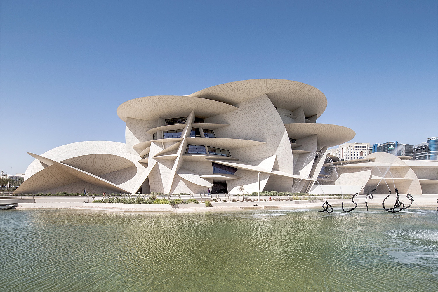
The museum is an enormous sprawling building that looks out onto the Persian Gulf. A union of various “disks,” the museum is subject to such interesting highlights and shadows thrown by the harsh Qatar sun. The time of day Danica chose to photograph the exterior shows off the dimensionality of the building nicely. This shot, taken across the canal, does a great job of setting the scene for what’s to come.
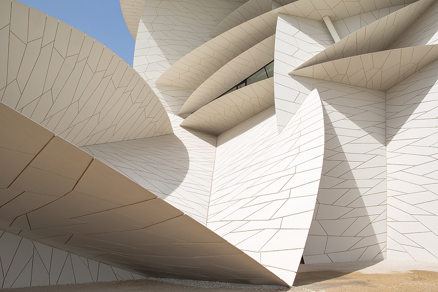
This is my favorite image from the series. It feels equal parts abstract art and architecture photograph. I love the warm yet neutral color of the facade against the sky (which is a perfectly tasteful share of blue by the way). The calm complementary colors here offset the chaos of the various angles and patterns in the facade.
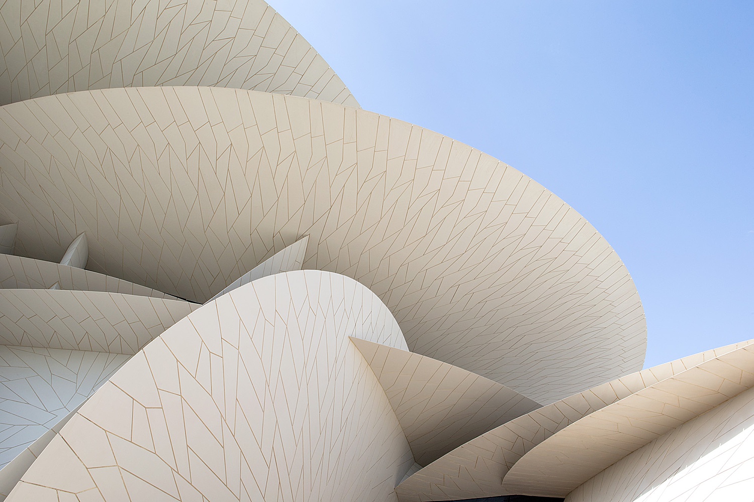
The height of Danica’s images are perfect. Nothing is distorted. In this – and really all of her photographs – tactful framing keeps the scene interesting while still drawing our focus to the intended parts of the subject.
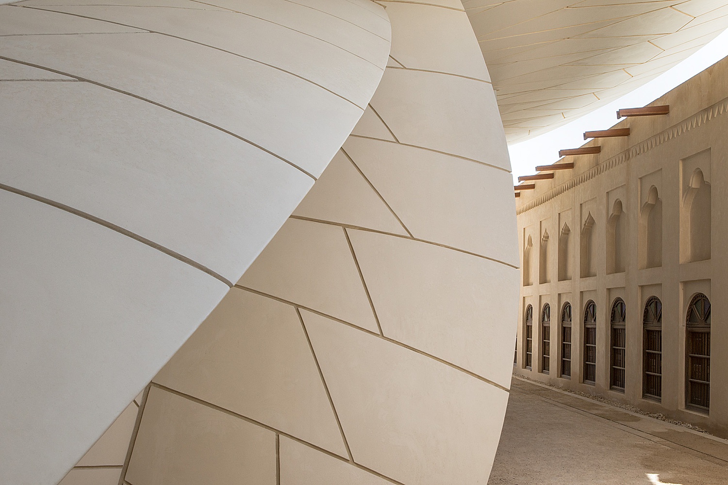
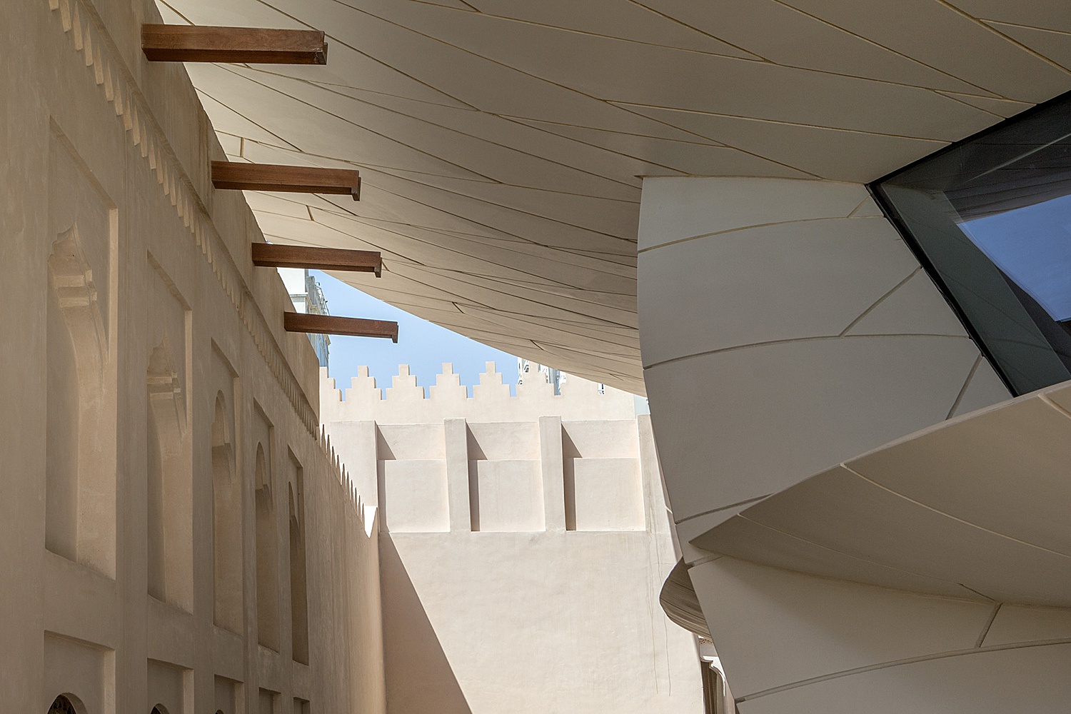
If there is one thing Danica’s series on the Museum of Qatar has, it’s beautiful leading lines. Our eyes are carried through this image, noting first the shapes of the museum, then the tones and textures. Again, I love the contrast of the sky against the building. It allows me to feel the shade cast by this enclave on the side of the museum.
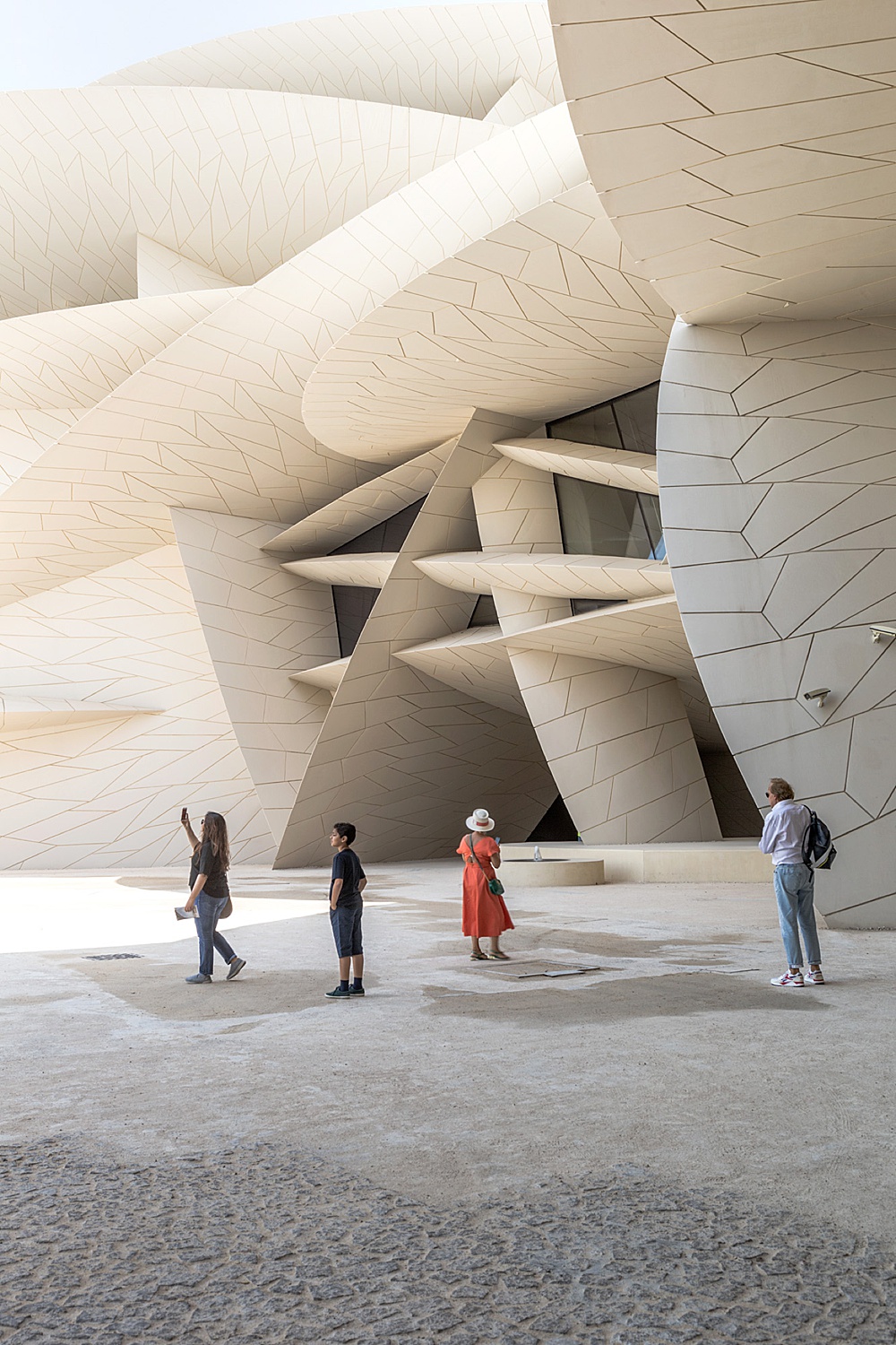
Danica’s use of figures in this frame is masterful. I feel like I’m there, walking past this scene of museum patrons on a sunny day. They lend themselves to showing the scale of the architecture without distracting from the true subject of the photo. I really appreciate their placement and spacing. It keeps the photograph from looking crowded. But wait, there’s more! The gradient in exposure from the sky down to the ground looks true to life. It allows our eyes to float down the frame, settling last on the texture of the ground.
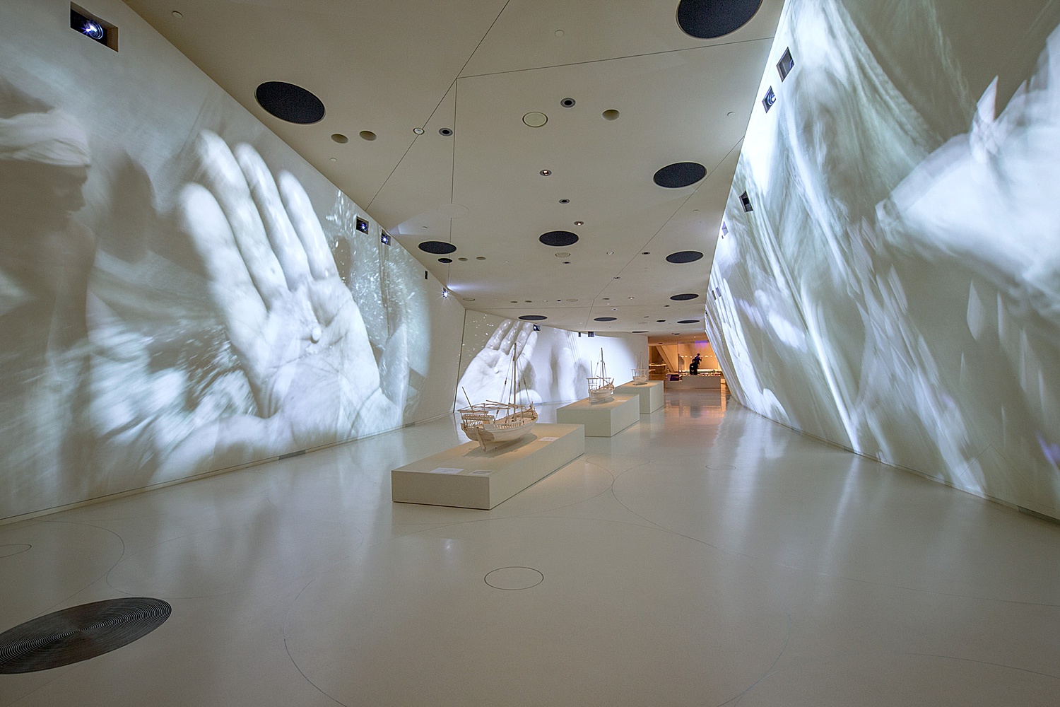
The inside of the museum echoes the same feelings of movement that the outside displays. Danica delivers another neutral feeling image that seems true to place. Projectors can be a nightmare of color casts and glares, so hats off to her for creating a sublime and quiet feeling frame despite the chaos of what’s going on on the walls.
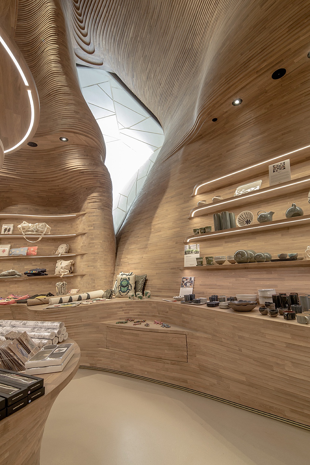
In the museum’s gift shop, designed by Koichi Takada Architects, Danica creates a photograph that feels intimate while showing off the far-reaching design elements on the ceiling. It reminds me of a topographical map, and I love that she chose to show it off. Danica’s restraint in the coloring and exposure of this room is also apparent and is a skill she nails again and again.
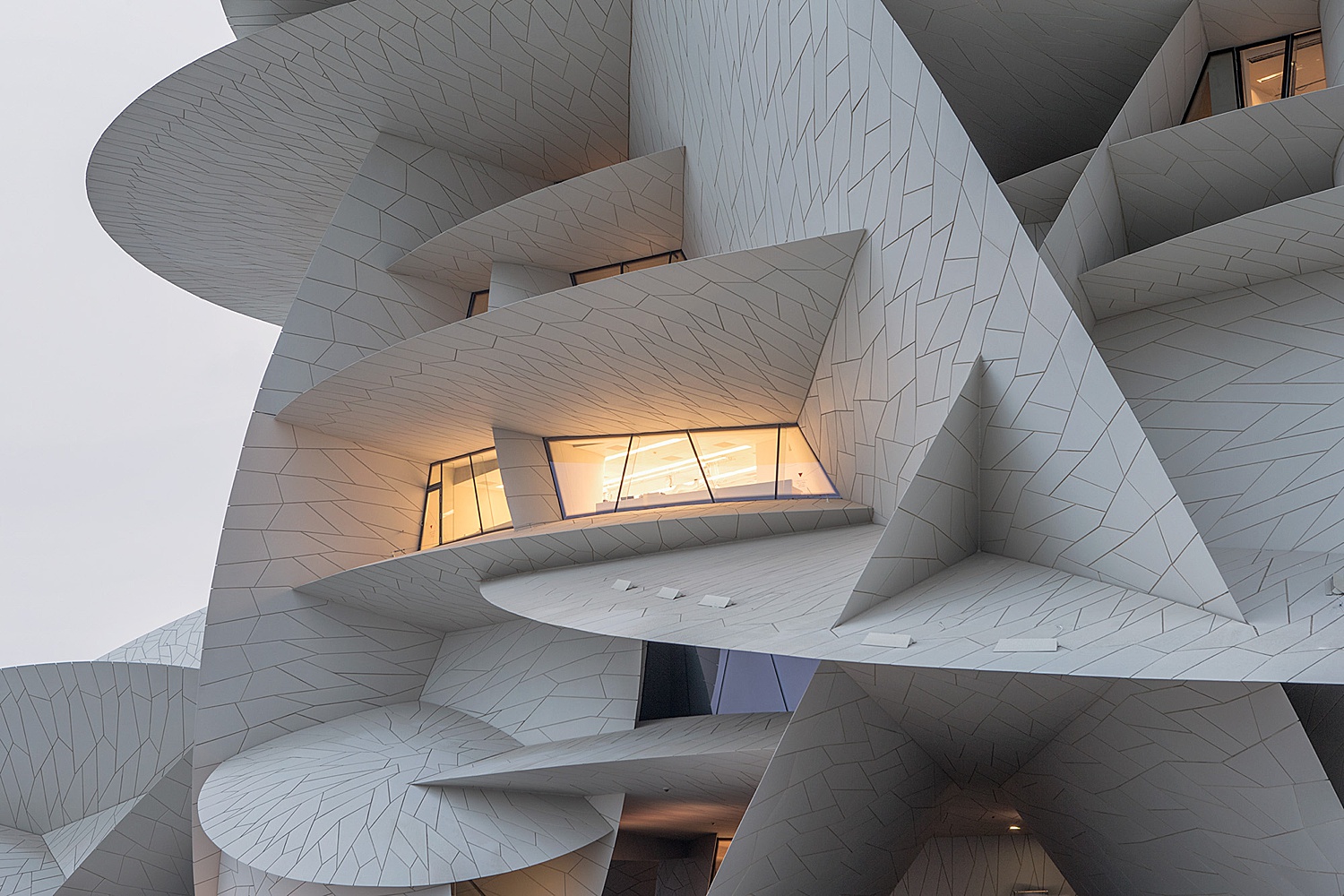
Danica’s work is a lesson in tastefulness and accuracy. She is able to display mood without going overboard. This scene at dusk perfectly conveys what the National Museum of Qatar looks like in the evenings when its lights come on, while still accurately communicating the color of the building’s facade. There are no far-reaching and contaminating color casts. The color temperature of the lights is a nice, accurate, warm glow that is neither too magenta nor gross neon green. You know the shade.
APA is grateful to Danica O. Kus for taking part in Project of the Week. Danica’s quiver of work contains one great project after another, so if you’re hungry to see more of her architectural photographs, you can find them on her website, Instagram, and follow along on twitter. She also will have an exhibit at the 2019 London Festival of Architecture, so if you’re local, be sure to check it out!
If you have a project you’d like to be considered for Project of the Week, you can submit it here.
