Photographing a Paradisaic Ocean-Front Club With Mike Schwartz
Warning: This Project of the Week may induce strong yearnings for a beach vacation. Up on this week’s featured project docket is The Surf Club, photographed by architectural and interiors photographer Mike Schwartz.
What I love about this project is the clear progression of time throughout the shoot. Mike documented The Surf Club in various lighting conditions, times of day, and from a plethora of vantage points. It must have been a grueling amount of work, but it definitely serves his clients at Richard Meier & Partners Architects well and teleports us to our own visual vacation.
The Surf Club is nestled on 9 oceanfront acres in Surfside Florida. The Atlantic Ocean makes some gorgeous sunrises, and we know this set of buildings is being lit by that lovely morning sun here. Fortunately for Mike, this means the beach is empty, the sand is freshly raked, and the white facade of the club is being kissed by a glowy peach light, making it feel very tropical indeed.
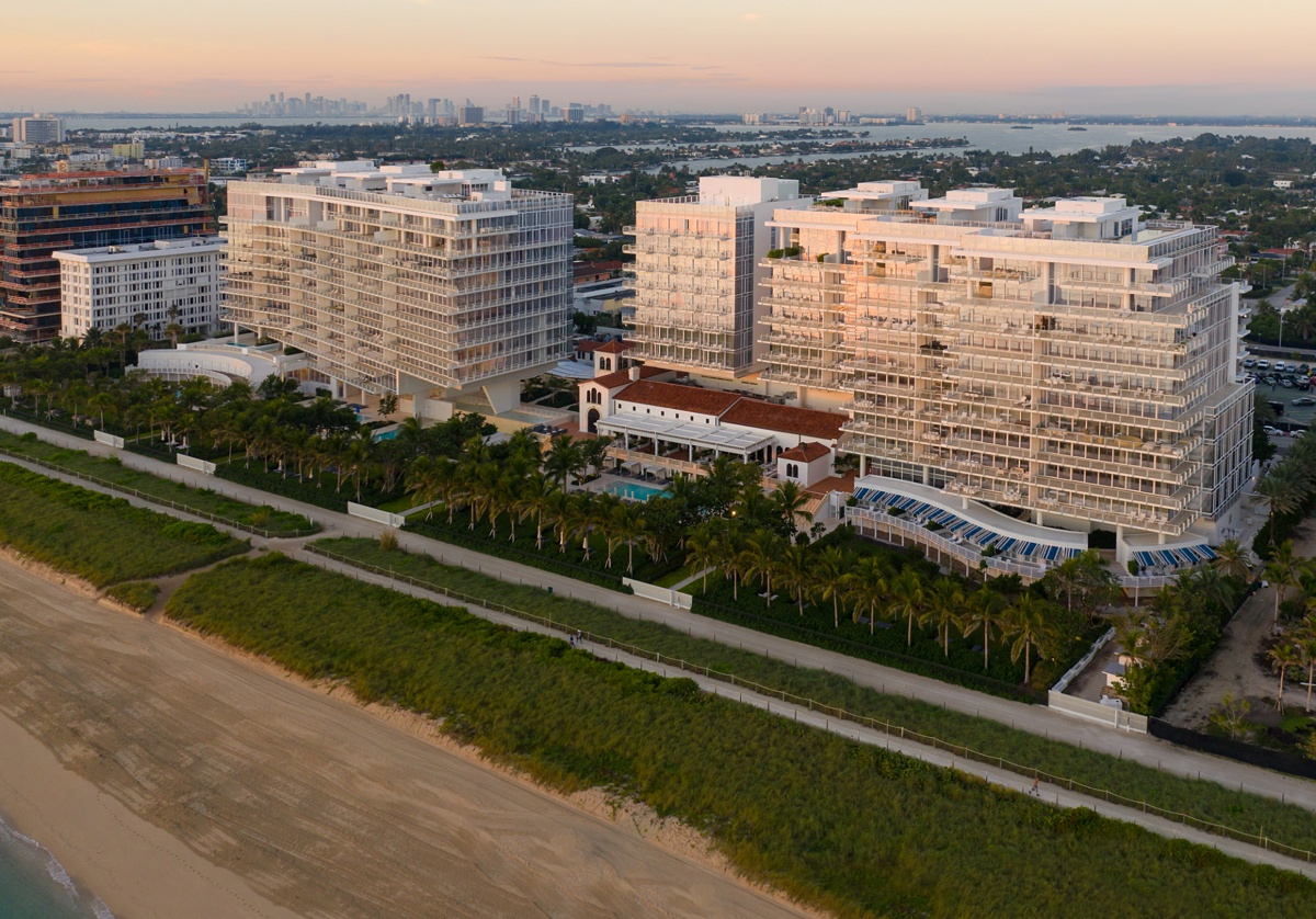
Now that we’ve got our bearings, a tighter one-point perspective places us in one of the many courtyards of the club. Again, Mike harnesses that beautiful sunrise to set a warm, pleasant tone for this scene. I appreciate that the sky is subtle and looks lovely without going too overboard and distracting from the buildings. Speaking of the structures, this perspective is a great way for us to note how the separate towers sit in relation to one another. Mike frames this up for us while giving an intimate feel, courtesy of the closer crop.
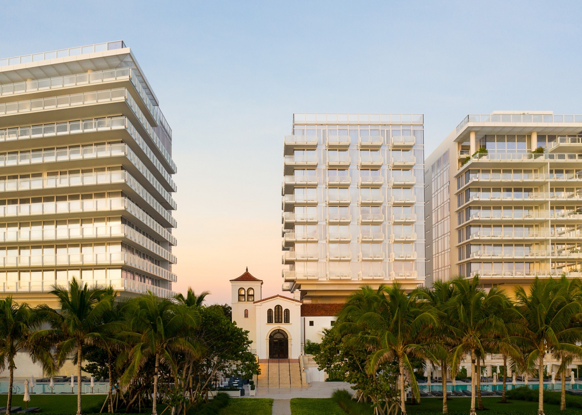
On the flip side, a higher vantage point later in the day really brings the Floridian vacation vibes. The light and location of the camera here gives us a good look at the terracotta tiles and how their rustic mission revival theme contrasts with the modern, clean lines of the newer towers. Perhaps the best thing about this scene though, is the way our eye is driven right through the image out to the ocean. The color is accurate, the horizon perfectly straight (Hallelujah), and it places us right in the shot, as if we’re standing on a balcony looking out at the grounds.
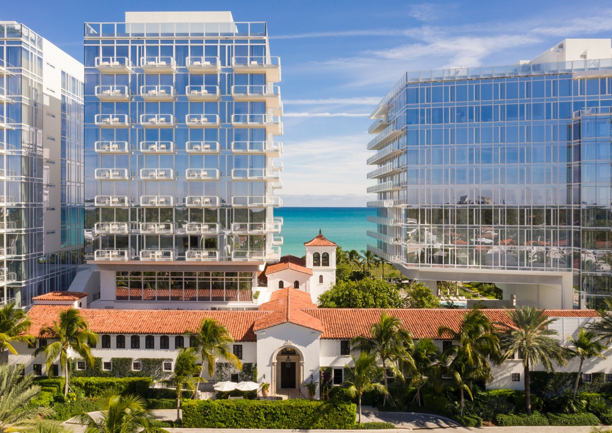
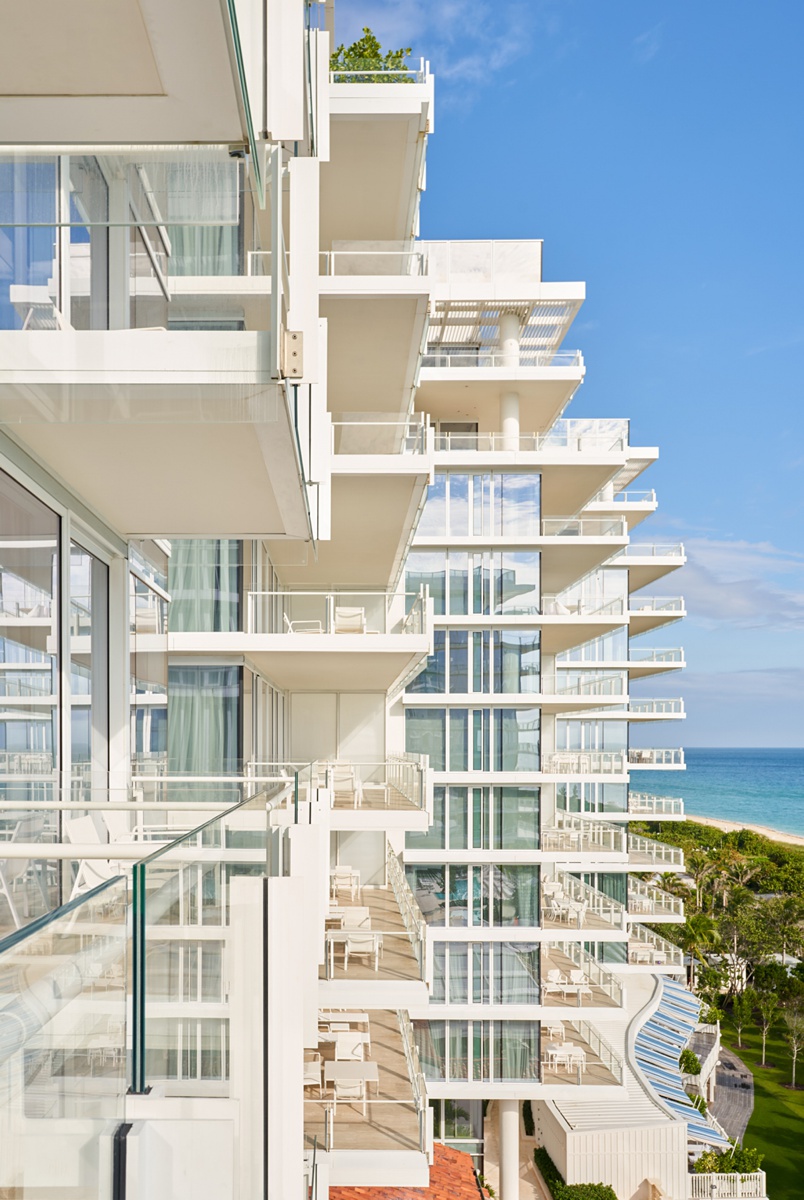
I love the perspective Mike uses here on the balcony. There is a nice orderly chaos that creates repetition and movement throughout all of the rectilinear elements here. The great mix of vertical and horizontal leading lines carries our eyes through the scene like little tracks. On the right side of the frame, the blue ocean pops out nicely, while the trees bring some organic life to an otherwise hard and rigid image. The same lines and linear repetition can be found in the following two photographs, with our eyes being carried out to the horizon in each image.
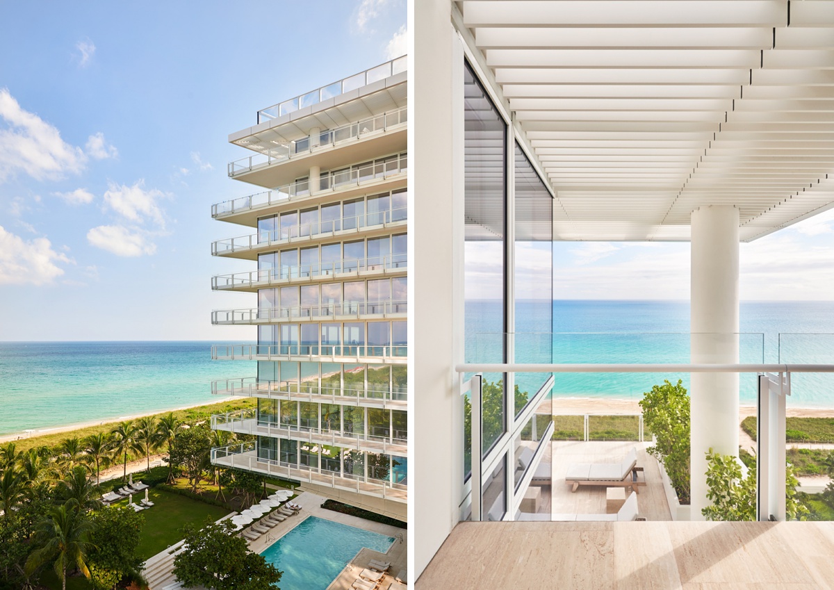
The view from inside The Surf Club carries the same mod, square feel. Again, our eyes are lifted up by the group of vertical lines created by the window casings, and pushed outward by the slats in the awning, settling our attention on the great views that each Surf Club room provides.
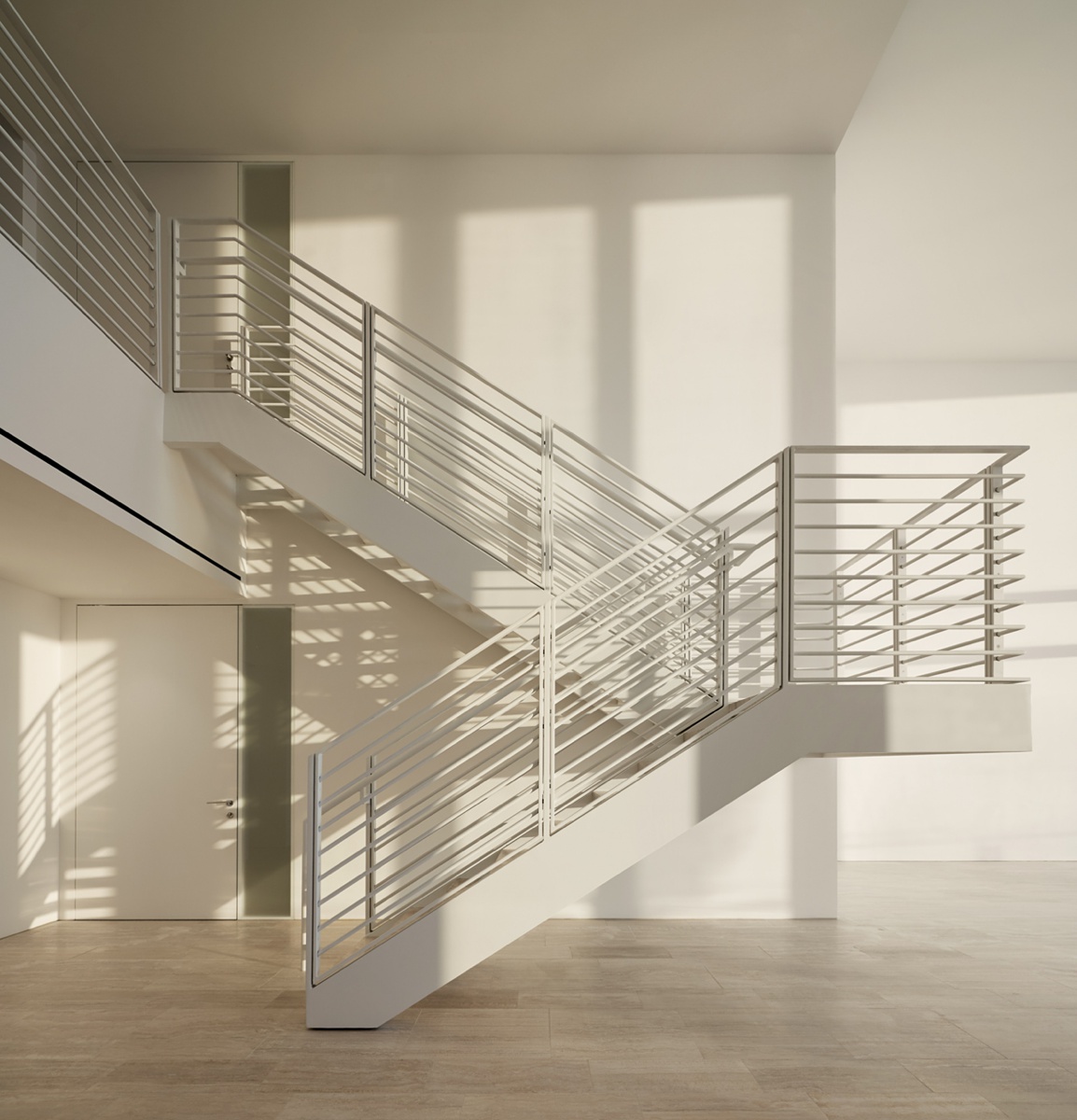
As Mike continues our visual exploration inside the club, we are met with some great light and shadows pouring over the otherwise stark interior. I love the simple and monochromatic look here. The simplicity of the shot allows the light to literally shine, giving visual interest, texture, and a dynamic quality to the interior of The Surf Club.
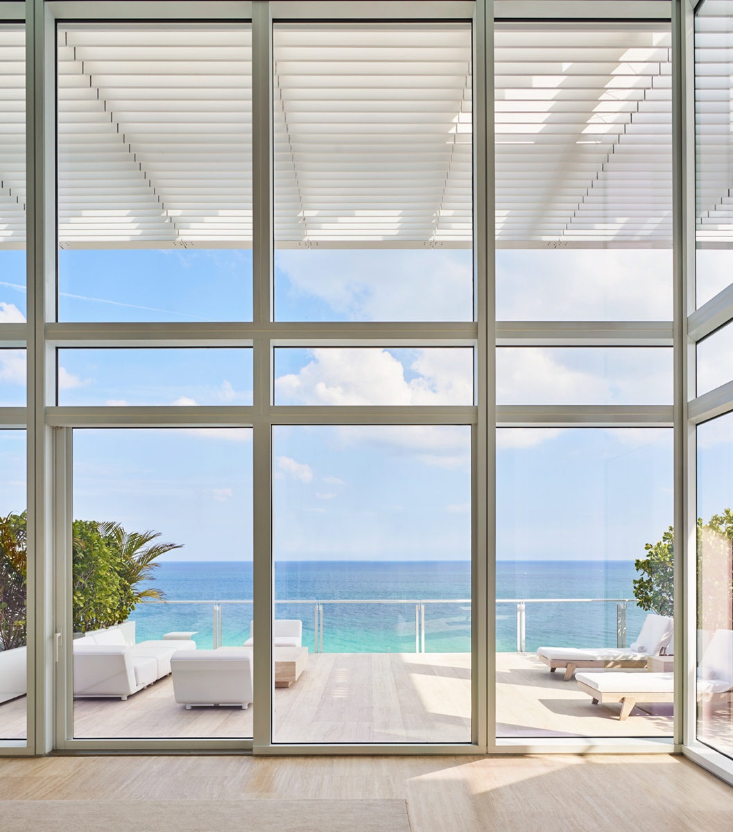
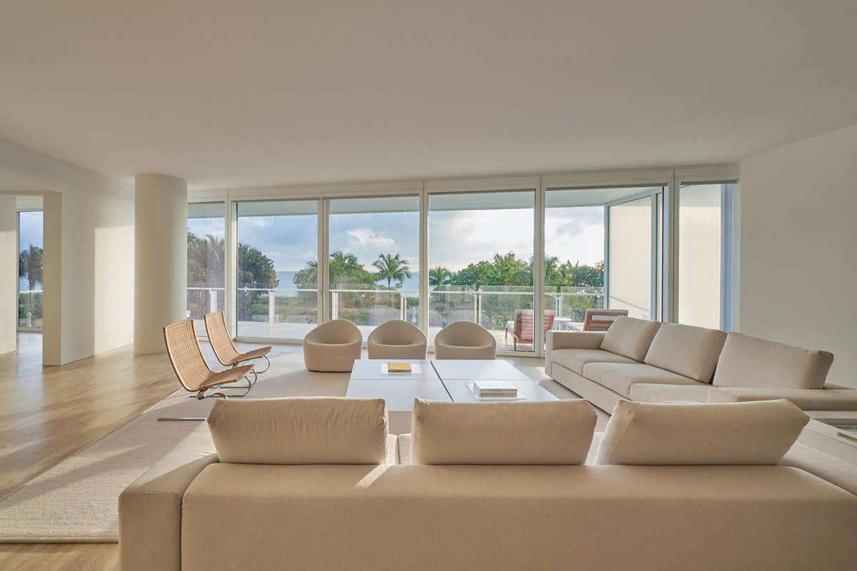
Keeping in line with The Surf Club’s modern and minimal feel, Mike shows us what the living space inside one of the towers is like. I appreciate how he lets the view hold our attention here. Those massive windows are definitely a feature of interest in this room, and in this shot, at this time of day, we are able to see the great quality of light they let in, indicated by the long shadows spread out throughout the room.
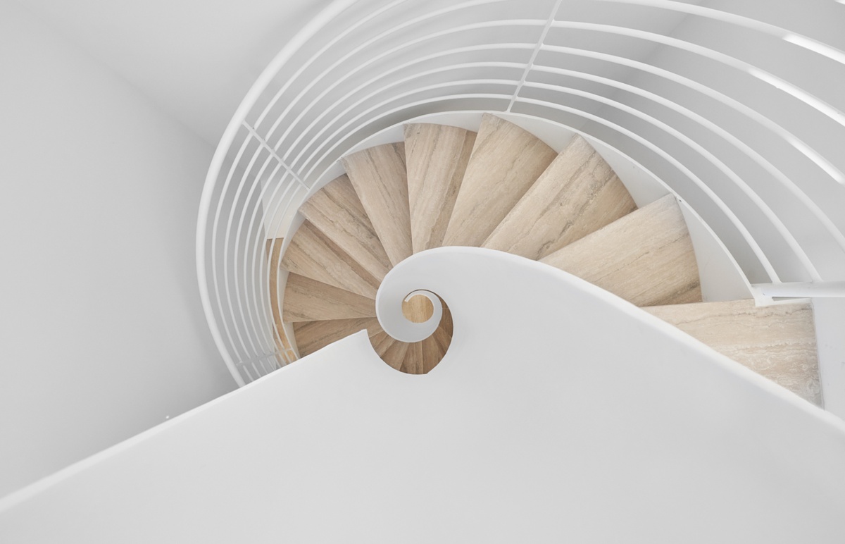
A birds-eye view of the spiral stairs shows us not only their depth, but also subtly ties in their wave-like design to the minimal surf/beach theme that the club emits.
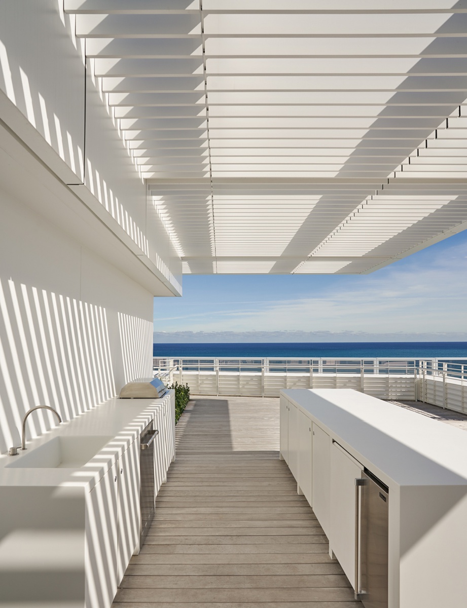
As the day presses on, the sun overhead streams through the slats in the overhang, creating lively diagonal highlights and shadows across the outdoor kitchen. This gives us a sense of place and time, transporting us right into the scene.
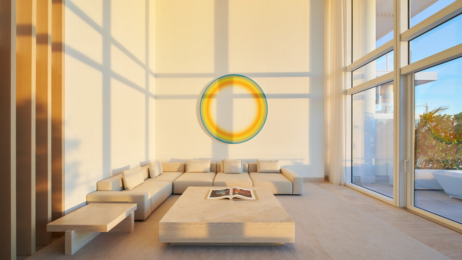
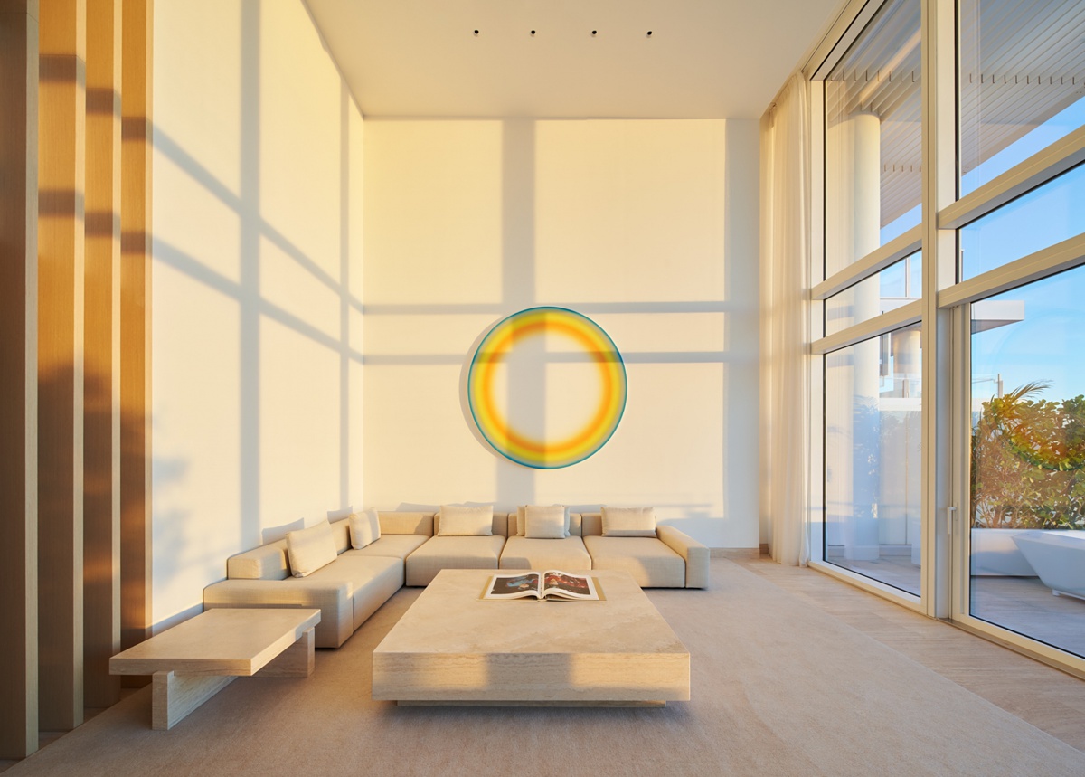
This is hands down my favorite image from Mike’s set of The Surf Club. A strong one-point perspective allows us to see nice crisp shadows created by the window casings. These linear elements contrast nicely with the circular wall art, giving off a fun, balanced feeling. I love the warm highlights washing over the room, and how they too create contrast in the scene compared with the faint blue sky outside. There’s something about this image that just feels soothing and content.
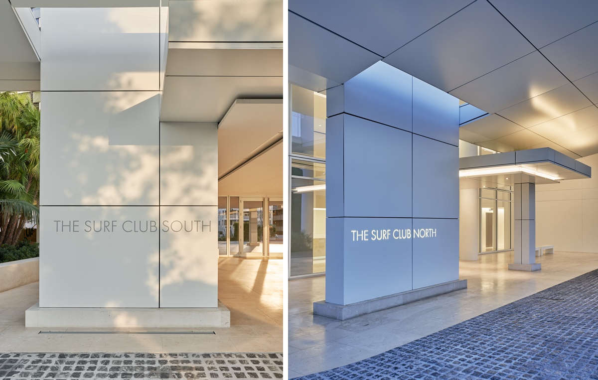
Back outside we have a nice juxtaposition between the two sets of signage for the separate towers. Warm dappled light spreads across The Surf Club South pillar, and in the background, there is lovely golden specular light streaming in. On the pillar for the North tower, there is still that warm feeling that ties the project together thanks to the artificial light, but now that the sun has started to set, cool tones begin to take over the image. This creates a harmonious color palette that fits in well with the rest of the project.
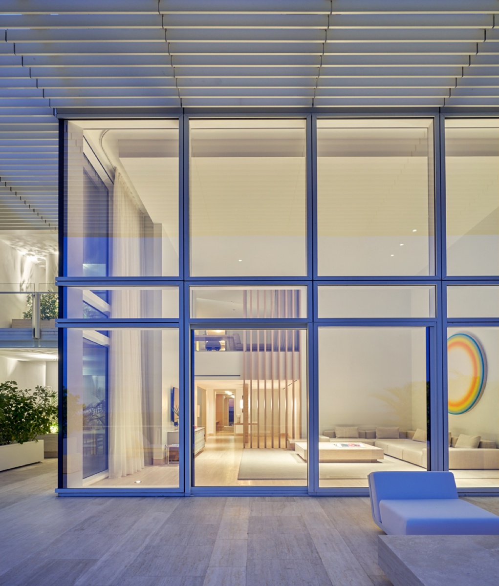
Looking into a familiar room, Mike crafts a nice balance both in exposure between the interior and exterior light, but also with the tonality of the image. Again, the blue/yellow coloration gives off a calming and inviting air that indicates the time of day here. Hats off to Mike for his restraint in post-processing. The image feels clean and the color of the light inside isn’t nuclear green or orange. It seems true and perfect!
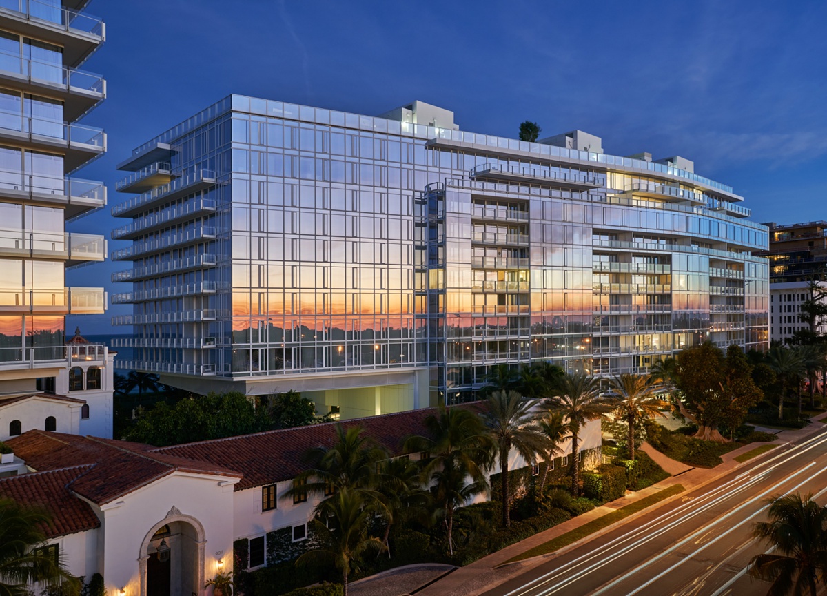
Closing out this project, we see The Surf Club from the street side. Check out that epic sunset reflecting in the windows, grabbing our attention and creating contrast in the building against the dark blue sky. I love Mike’s vantage point here, his control of the saturation and vibrancy of this scene in his post-processing, and the equal parts magic and realistic mood that he has created here!
A big ‘thank you’ to Mike Schwartz for sharing his photographs of The Surf Club with us here at APA. If you love thoughtful, bold, architectural photographs and/or incredible automotive photography (here’s looking at you, Ford GT photos) I usher you to Mike’s website mikeschwartzphoto.com as well as his Instagram @mikeyschwartz.
If you have a project you’d like to be considered for Project of the Week, you can submit it here.
