Making ‘Naturally Refined’ Images With Victoria Based Photographer Mike Baker
Aussie photographer Mike Baker is known for his incredibly bold and lively product, advertising, and corporate photo work. He brings a dash of this punch and cleanliness to his architectural work, but does it in a more subdued way. His images of Courtyard House for Life Spaces group is a great example of his approach to architecture and interiors, so let’s check it out!
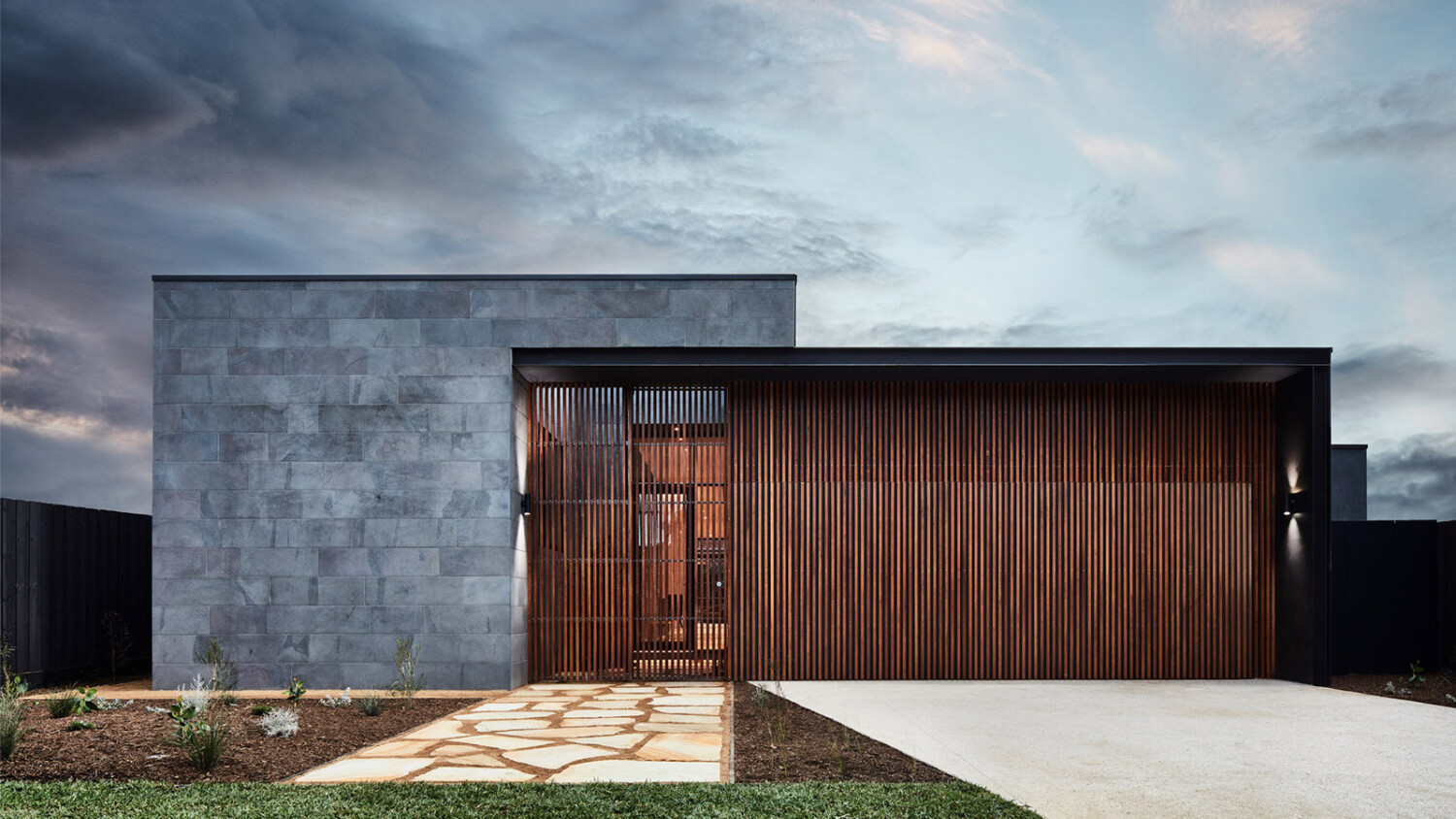
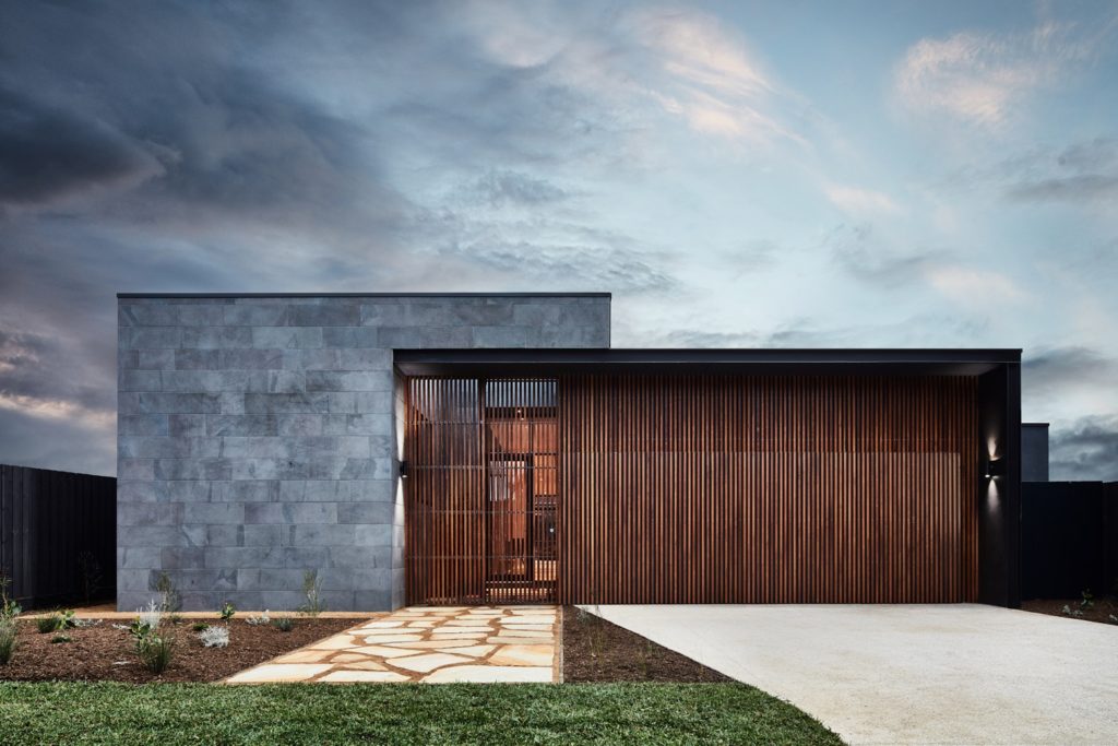
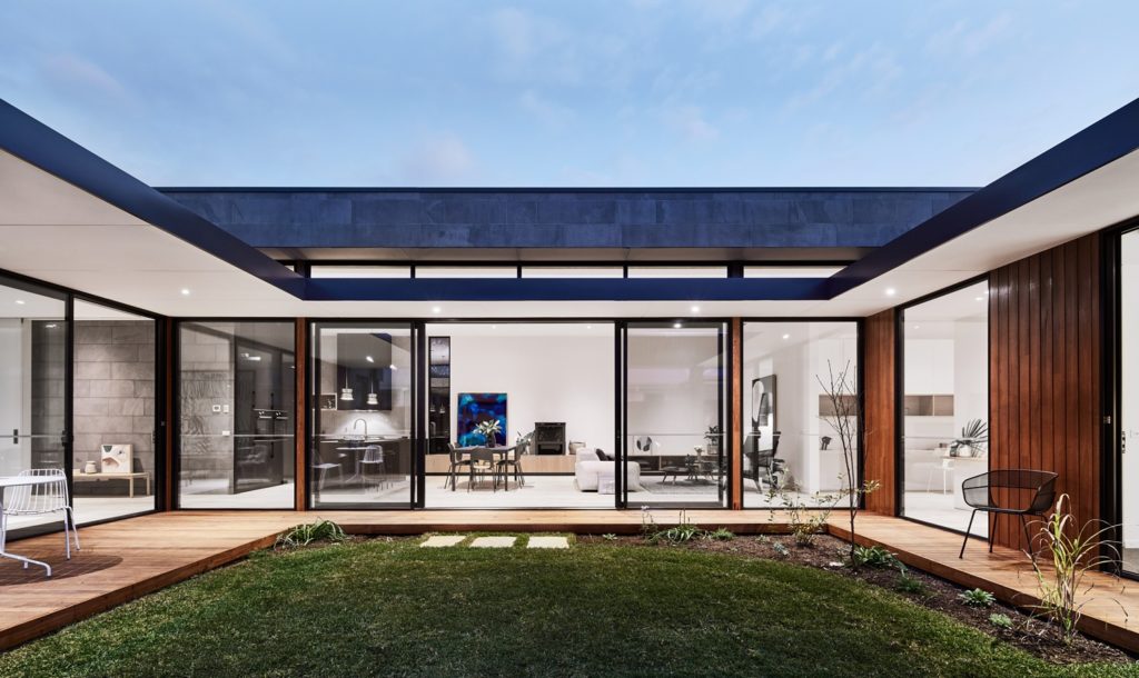
I love the drama here. The sky is very cool and ads some mood to this image without being too “Disney” or overtly distracting. The subtle vignette draws our eyes into the center of the frame where we are greeted by the convergence of building materials and textures. This frame feels very geometric, and a one-point perspective was a solid choice on Mike’s part, as it plays off the leading lines and rectangular shapes in the architecture.
Mike’s post-processing style for his architecture work is very restrained and gentle. The images are tidy and feel crisp, but he doesn’t suck out all of the color casts or squeeze out all of the highlight and shadow data. As in the photograph below, the images he makes throughout this series feel natural yet refined.
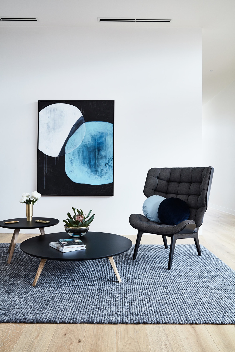
Mike fleshes out the project with a detail of the sitting area. The styling of the tables and chairs gives this scene depth while keeping in line with the minimal nature of the home. The camera height here allows us to observe the mix of textures in the building materials and design features, as our eye trickles down from the ceiling, down to the wood floor.
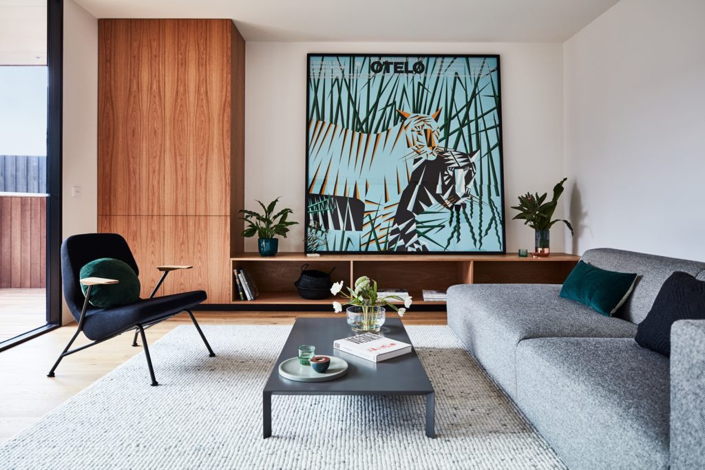
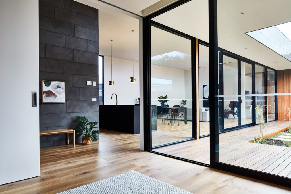
A wider view helps us connect the spaces in this rambling house. By allowing the massive sliding doors to fill most of the frame, we are able to denote their importance as well as see how Courtyard House got its name. Mike gives us a great sense of space here and we can almost feel the open air / open concept vibe of this home.
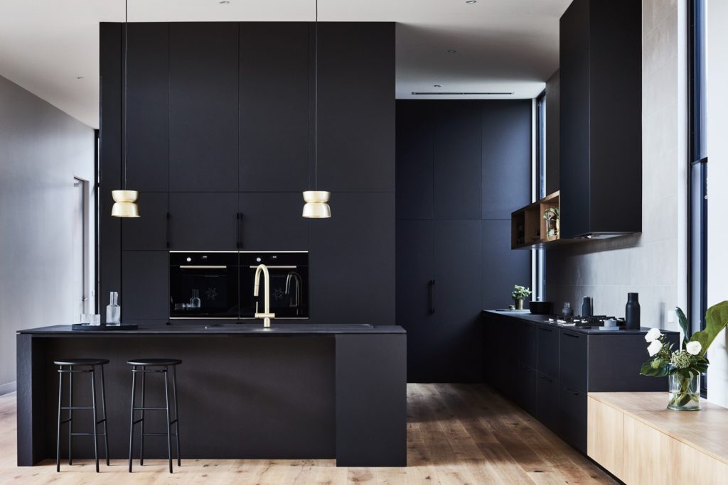
What initially drew me into this project was the dark kitchen and how Mike masterfully documented it. If you look around the frame, there are spots that are pure black, and plenty of shadows to give this photo some depth. It’s not void of detail though, and we are able to discern more of the granular aspects like the drawer pulls and the textures of the cabinetry.
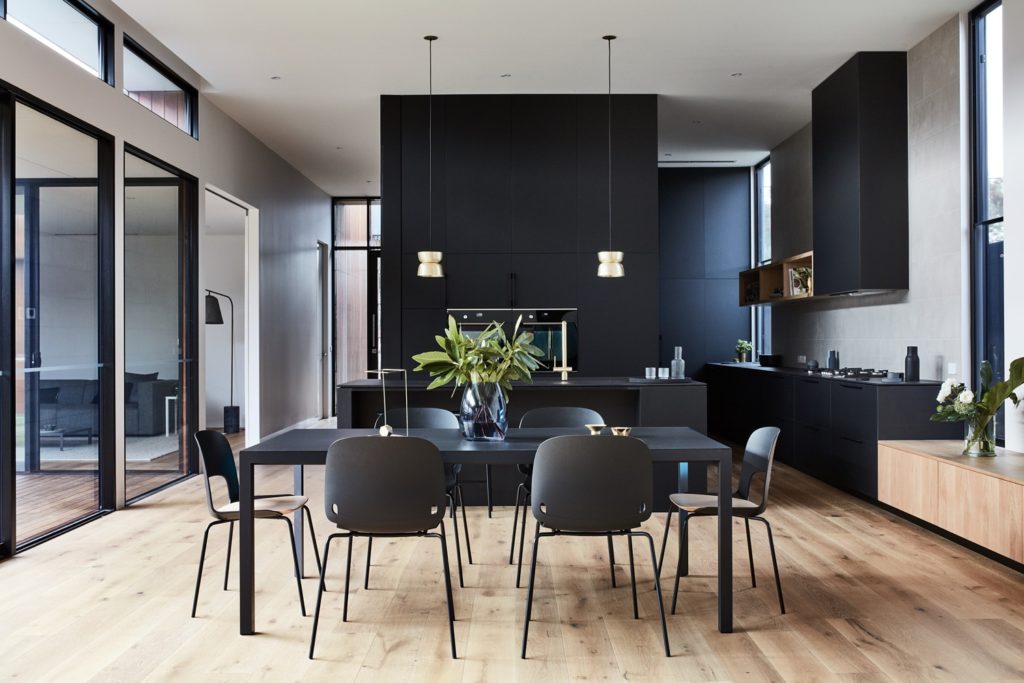
Pulling back a bit, our eyes are still sucked through the image, courtesy of the leading lines that pull our eyes through the frame, past the monolithic kitchen and into the rooms beyond. Another thing I love about this image is the directionality of the light. It really pulls out the texture in the floor and produces a beautiful gradient of light across the chair backs in the foreground.
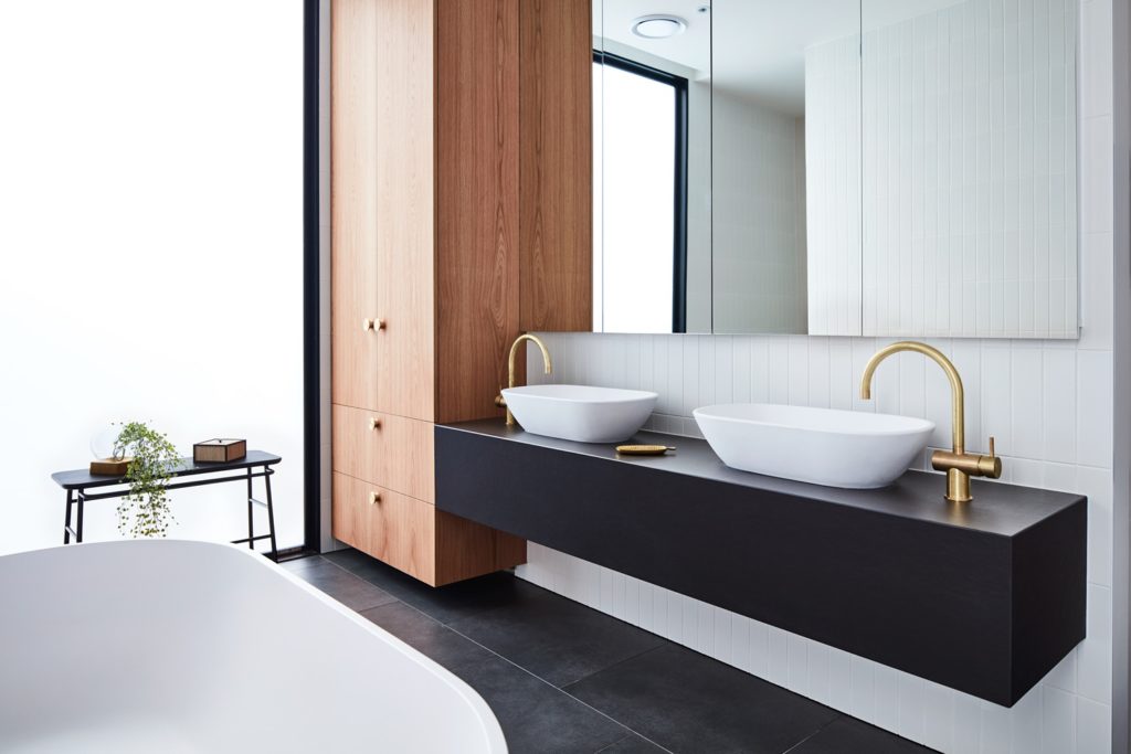
In the master bath, Mike’s chosen perspective conveys all of the main elements in this room, including the soaking tub, while managing to give us a lane to visually walk through. I’d imagine this was pretty tricky to compose since shooting directly into that bright and massive window would be rough. He handles it well though, and I really like that the rest of the space in the bathroom is implied by its reflection in the mirror over the vanity.
We’ll wrap up this project of the week with a stellar one point perspective from the courtyard. We are able to see how the house wraps around this central lawn space. It feels very symmetrical and tidy. I love the faint appearance of the light spilling out from the house onto the decking and grass. The leading lines from the overhangs pull our eye to the center of the frame where we pick up on the living and dining area. Mike’s color grading of the interior is nice and clean, giving a slight feeling of warmth without trending super orange or muddy. It’s a perfect summary of his shooting and processing style, as well Courtyard House’s great design!
A big ole thank you to Mike Baker for sharing his project with us! I would 10/10 recommend popping by Mike’s website mikebaker.com.au as well as his Instagram @mikebakerphotographer.
If you have a project you’d like to be considered for Project of the Week, you can submit it here.
