Photographing A Natural Dutch Beauty With Peter Tijhuis
Today we’re taking a little trip to the Netherlands with the ever so wonderful Amsterdam based photographer Peter Tijhuis. Peter will be walking us through his shoot of The Hietland designed by La-Di-Da Architects who are based out of The Hague Area of the Netherlands. Peter has so much great insight for us, I’ll just let him take it away!
“I was approached by the designers of the project, Laura van Santen and Diederik de Koning, who together have a relatively small design company called La-Di-Da. I always like to talk with the architects or designers before documenting a project. I think it is essential to get an idea of what the project is about for them and to have some knowledge about the process. Clearly you are hired mainly because of what you can bring to a shoot in terms of the way you look as a photographer, but together with the input from the architects, you are able to make a more complete story.
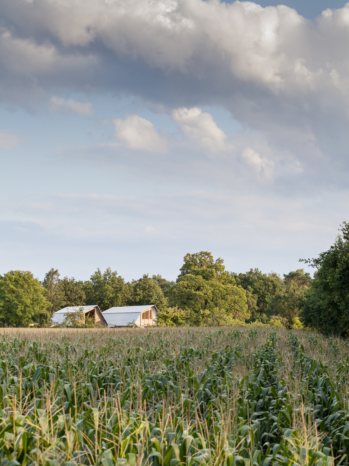
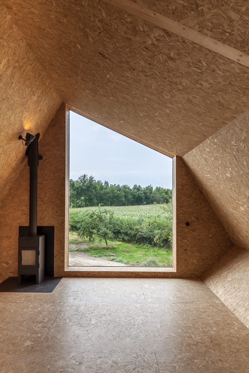
I learned that the house was designed with an outdoorsy lifestyle of the owners in mind. Even though the landscaping had not been finished yet, I knew I had to somehow incorporate ‘the outside’ in the images. Another important element is the use of wood. The house is almost completely finished with a variety of pine wood. Showing the used materials in a natural way was vital. The location is quite far removed (for Dutch standards) from my hometown Amsterdam and I remember getting up quite early and spending a large part of the day photographing in and around the house. In these cases, you have to be there for at least the early morning light or the fading light of the early evening. In the summertime, it is almost impossible to have both, unless you make it a marathon day.”
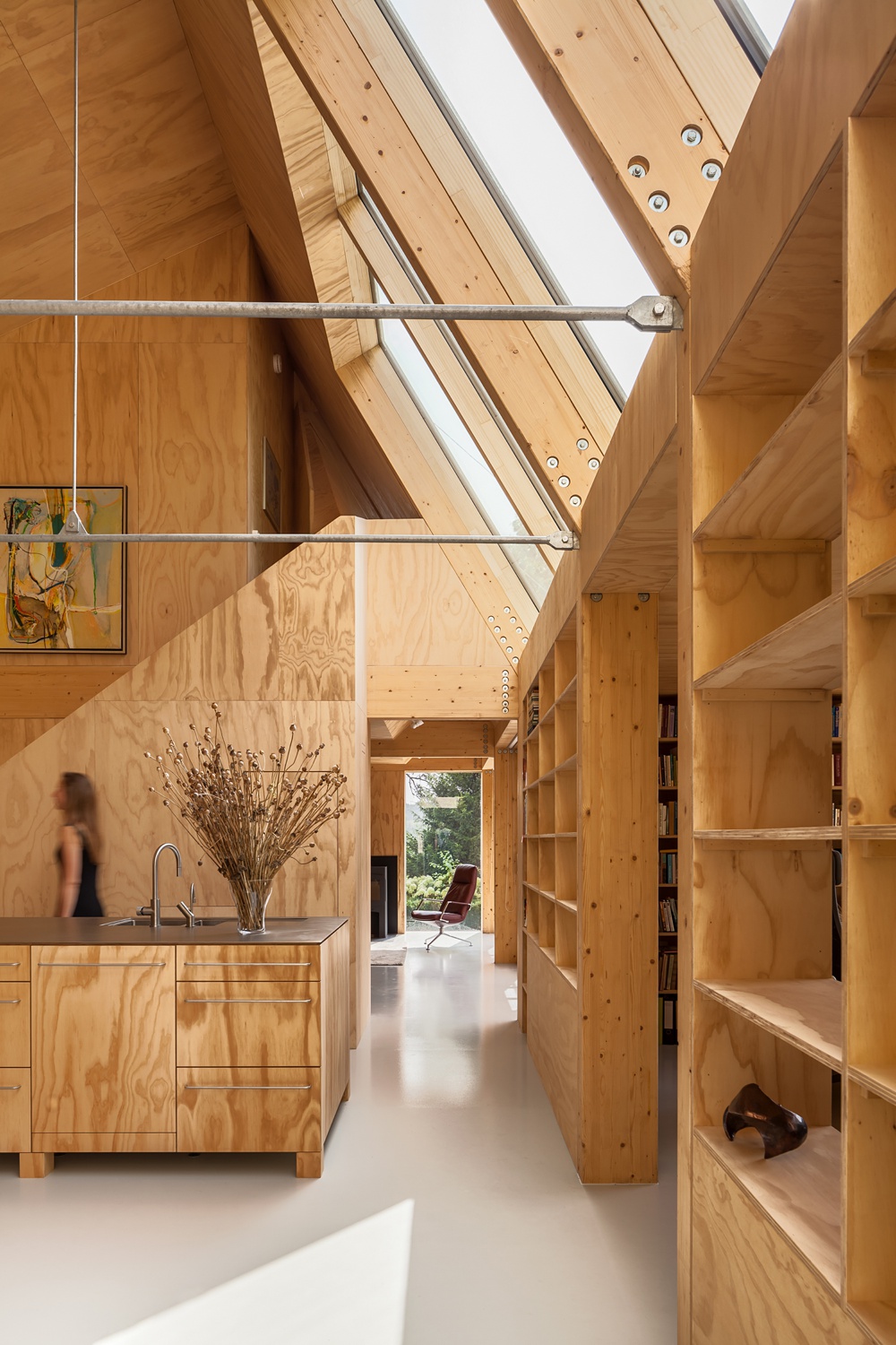
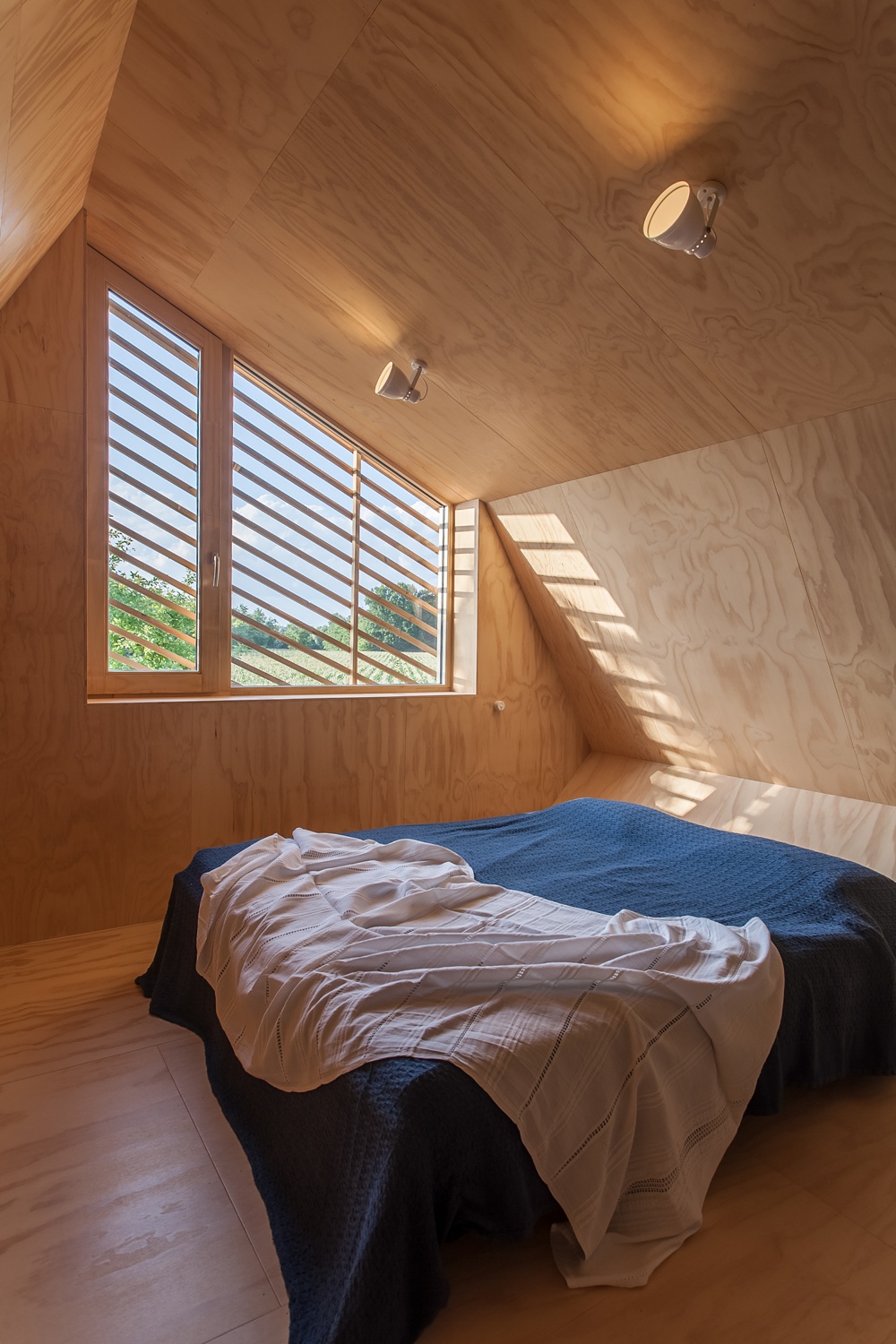
This shot is what made me fall in love with Peter’s work and Hietland house as a whole. Check out the beautiful quality of light, the shadow play, and how dang angular everything is! It’s beautiful. Another thing I appreciate is how Peter doesn’t let the wood tones overwhelm the photograph in terms of colorcast. We still get the importance and the feel of the wood, but the image is very clean and crisp!
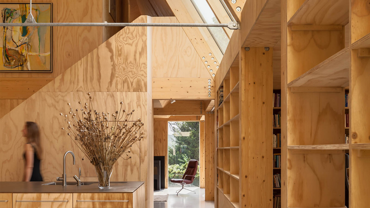
Peter’s favorite image is the one to follow: “I really like the image where Laura (one of the architects) walks out of the frame. It shows how light the space is, it shows the dimensions really well, there is stuff happening in the foreground but the large window showing trees also draws you into the frame towards the sitting area. There is even the hint of the study on the left. The wood looks amazing and you can even see the metal frame and the massive bolts that were used.”
Peter’s compositions show the meat of each space while also conveying smaller details and nuances, often hinting to a room or feature just out of frame. I love that about his work. He explains his process
“One of the things I always try and bring into a shot is some form of layering, like showing elements close to the camera and also further away. This immediately makes an image more dynamic and interesting to look at.
During the initial walkthrough, I make some quick snapshots to see what could work, so when I make the actual composition later, I’ve already looked at the scene. I’m a bit of a late adopter when it comes to technology but I remember how great it was when I started using an additional screen like a laptop or tablet during a shoot. Instead of just using the tiny screen on your camera, you get a much better idea of the end result and you let the image sink in and see if actually is as interesting as you thought it was.
Being rushed on a shoot is terrible. You need to take time to compose carefully. The first thing I do on-site is tell the people there that the shoot will take a lot longer than they might expect. In the case of this particular project, I specifically looked for compositions where trees and greenery were visible. I also have a preference for straight shots. They aren’t always the easiest shots technically but [visually] they work so well. Apart from overviews I also like to shoot more close up images where different materials join or overlap in interesting ways. They’re always a nice addition to a series.”
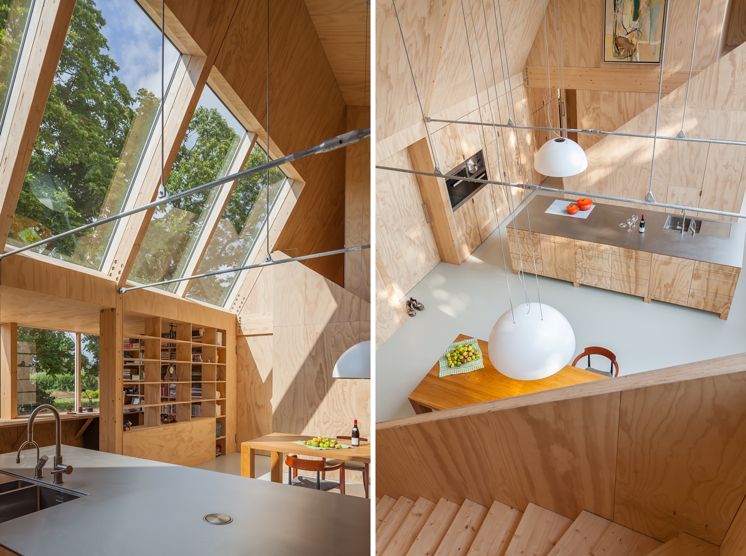
Departing from his preferred one-point perspective, Peter crafts an image that brings a lot to this project. We can see the beautiful shapeliness and linear qualities designed by La-Di-Da as well as the gorgeous dappled light the massive windows let in. As Peter mentioned before, as we look through the layers, we find more fun and story-telling elements that flesh out this project. Note the depth of the bookshelves, the dimensionality of the staircase, and the seating area outside in use! This photograph has great mood!
Peter goes on to explain to us “I hardly ever use additional lights during a shoot. The very first thing I do when I arrive on location is to check the lighting situation. I tour the premises and decide where to start photographing based on where the light enters the house or building and I move with the light. In fact, this process already starts before I even arrive on site. Days before the shoot, I check the forecast and again the evening before. I sometimes change the time of arrival based on the weather. I usually also find out beforehand how the object to be photographed is situated in terms of North, South, East, and West.”
“There is another factor in play here. In general, you can say that clients in (Northern) Europe tend to appreciate a quite natural look in the way they present their projects in the media. They tend to not really mind if the surrounding area of the house or building is not in absolute pristine shape. I guess you could call this a slightly more documentary style of approach. In the Americas, I feel that an object needs to be presented in the absolute best way imaginable. If that means that you need to add additional lights during a shoot, then this will be done, and perhaps expected. In the case of the Heitland project, I was lucky with beautiful light which makes a shoot so much easier.”
I asked Peter a bit about his post processing technique and he was happy to share. “In terms of post processing I use Lightroom and Photoshop. No surprises there. Probably 90% LR and Photoshop only for the remaining annoyances like exit signs or weird spots etc. I do use the HDR (High Dynamic Range) technique quite a bit when the light is too harsh or when the contrast between inside and outside is too big to make it look natural. It sounds weird to use a post processing technique to make a scene look natural but there you go! The idea is to make it look like no software was used so restrain yourself while applying HDR. If used too much, your images will start to look otherworldly. That’s usually not a good thing. “
And Peter’s photographs look perfectly natural, as if we were standing in Hietland ourselves!
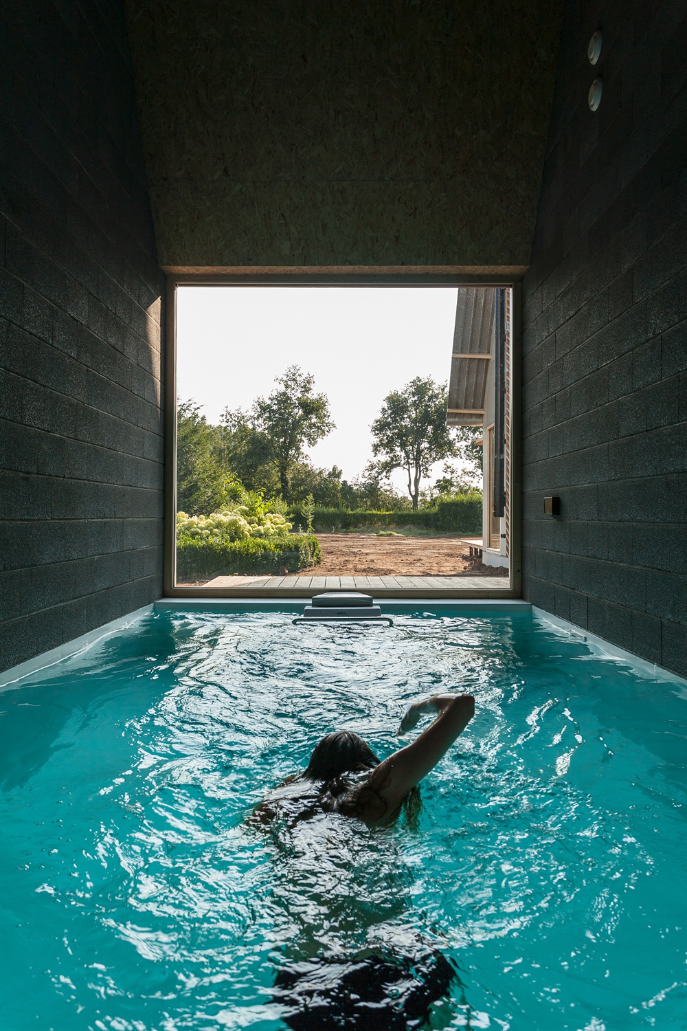
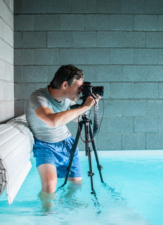
This last shot ended up being the most challenging one to shoot. Peter recounts “The house has a very small indoor pool with a jet stream. I think it’s called an endless pool. There is literally no space around the pool, just walls. From the outside, it was also impossible to get a decent shot. Eventually, I realized that the only way to get a shot would be to get into the pool myself, gear and all. I ended up borrowing shorts from the homeowner and I used a back-up tripod in the pool to get the shot. The things you do.”
It was definetly well worth the dip! The motion and human element bring so much to this photograph, and Peter’s perspective is just perfect. The leading lines created by the blocks and the body of the swimmer drive our eyes right on out to that wonderful context providing view!
Looking good Peter! You gotta do what you gotta do!
A big heaping Thank You to Peter Tijhuis for sharing this project and his wealth of knowledge with us! Be sure to pop over to his site, petertijhuis.com!
If you have a project you’d like to be considered for Project of the Week, you can submit it here.
