Perfect Compositions and Clean Edits and With Lisa Petrole
Working a desk job doesn’t sound so bad if it’s at the Campari Group’s Canadian office. With Emil Teleki’s minimal fresh designs, this ain’t your daddy’s office. Photographed by the one and only Lisa Petrole, you’re in for clean colors, perfect compositions, and beautiful light. We’ve got one heck of a Project of the Week here for you, so let’s jump in.
Campari Group is an Italian beverage company, so what could be more fitting than entering their office and being toe to toe with a gorgeous bar. Lisa’s perspective here does a few great things. First of all, look at the way it elongates the space, emphasizing the shape and size of the bar without any distracting distortion. I love the repetition that echoes through this scene in the wooden window frames, the bottles, pendant lights, and the bar stools. Not a single thing is out of place, and Lisa’s attention to detail really shines through here.
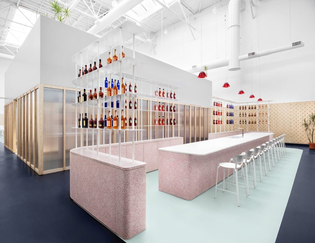
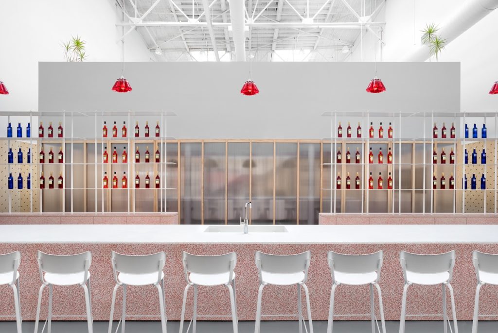
A perfect one-point perspective shooting straight into the bar accentuates the symmetry of this scene. You could basically fold this photograph in half and it would match up seamlessly. For me, this sparks joy! If you’re going to do symmetrical, do symmetrical, am I right? All in all, this image is a perfect example of the properly tidy and minimalistic theme in this space.
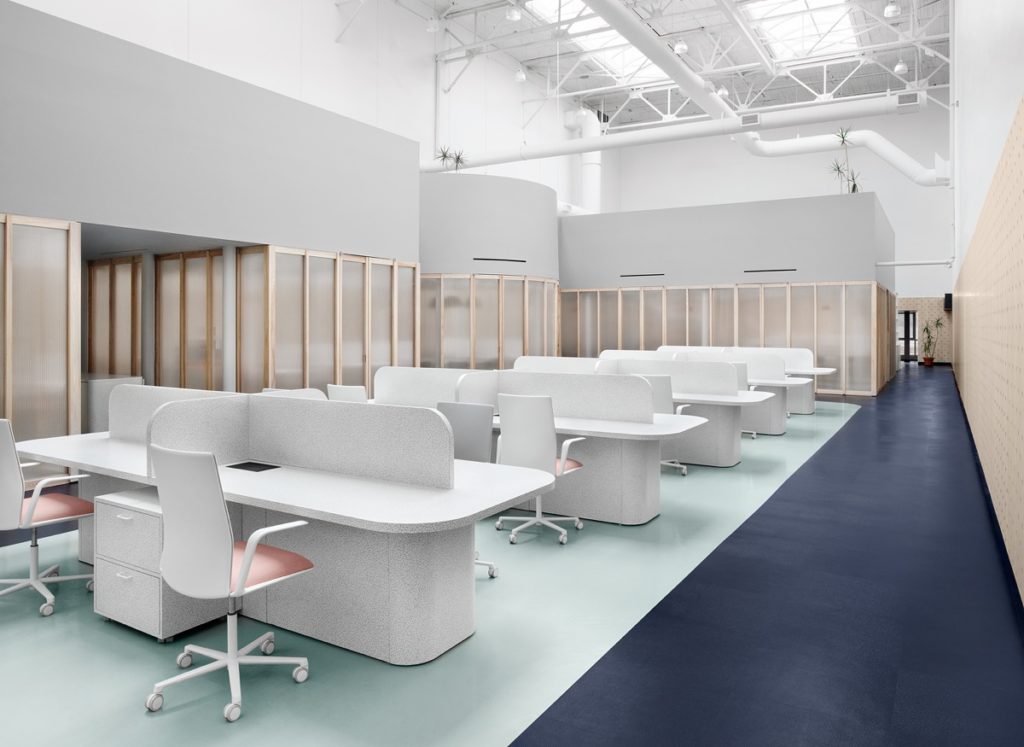
Lisa’s graphic style, combined with Emil’s minimal and vibrant designs, creates an almost surreal feeling throughout this entire project. It’s as if we’re looking at a workplace right out of a dream sequence. Notice the beautiful and rhythmic way the desks cascade along the line of the floor. This allows our eyes to be pulled through the entire scene, not once being disrupted.
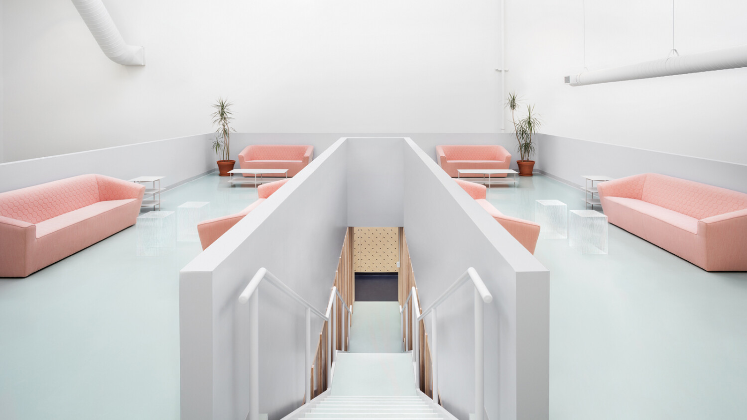
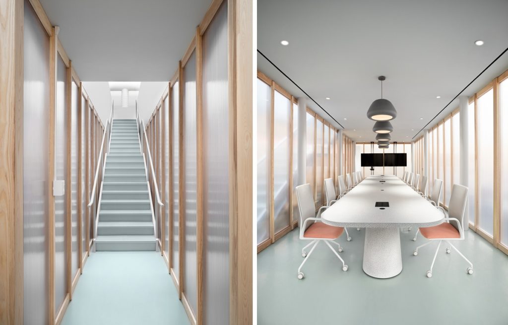
As we head into the heart of the Campari office, we are met with two richly geometric photographs. Again, Lisa nails the symmetry and crisp patina. On the left, I’m drawn to the subtle gradients of light leading up the stairs. On the right, I love the way Lisa brings some mood into the photograph by letting the room fall a tad dark. This lets us faintly see through the glass and observe the way the stairs run along the conference room.
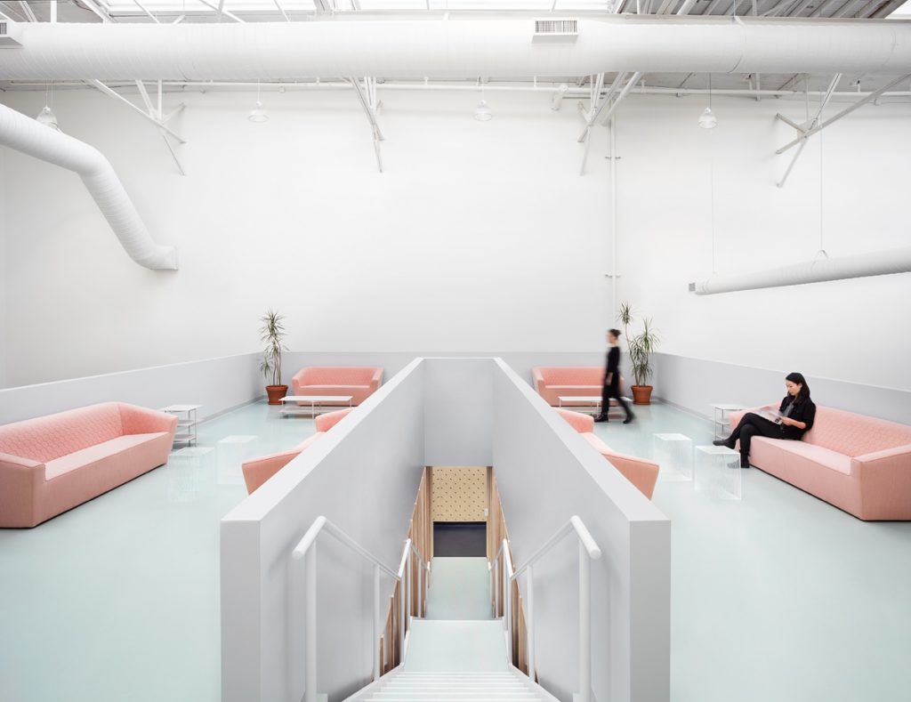
Upstairs, Lisa adds a dash of life to the scene by incorporating models. This is a great way to show the function and intent of the space. It gives context to the sitting area’s furniture and showcases cool design features like the opaque ottomans. There is a very Wes Anderson-esque air to this scene, and I adore it.
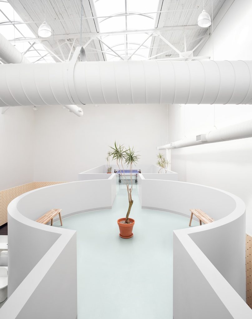
Lisa is masterful at so many technical and artistic things, but one of my favorite aspects of her work is her compositions. The way she frames up this next shot gives us a great sense of place, like we’re standing there in that little corridor. Our eyes are pushed right through the scene to the ping-pong table beyond. This angle helps imply the open, massive height of the space from floor to ceiling. The ductwork brings an air of industrialism and also adds to the whimsy of the space. It provides another layer that gives this scene dimension and character.
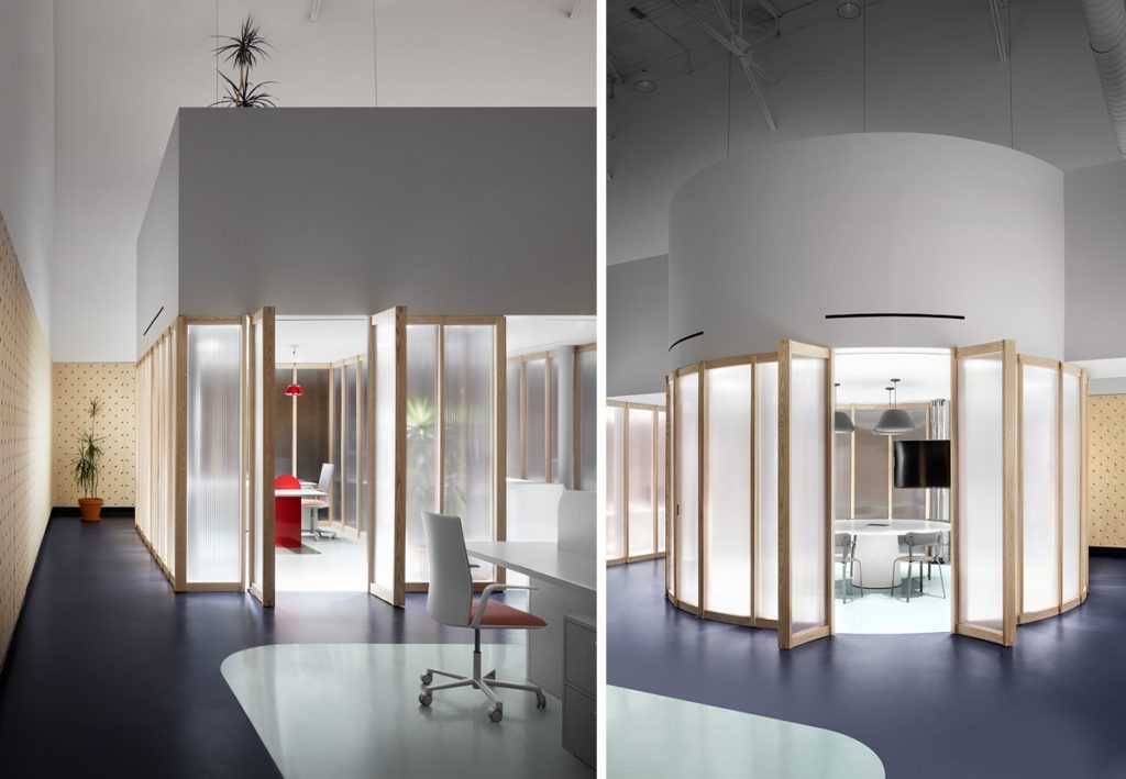
Our parting shots for this week’s featured project bring in some darker tonality and mood. Lighting these offices up from the inside helps us better see the frosted glass and features inside each room. It also pulls our eyes into the rooms, past the foreground of each scene. Despite the change to a darker foreground in these two particular images, the clean flavor and the crisp light inside the spaces fits perfectly with the rest of the project.
Infinite Thank You’s to Lisa for sharing her photographs of Gruppo Campari with us. What an awesome series!
If you aren’t familiar with Lisa Petrole and her work, it’s time to change that! Each one of her projects is just as outstanding as the last. You can see more of Lisa’s work on her website lisapetrole.com or her Instagram @lisapetrole.
As always, if you have a project you’d like to be considered for Project of the Week, you can submit it here.
