Overcoming a Series of Hurdles, Ruksana Hussain Crafts Gorgeous Photographs of the Abu Dhabi Edition
Meet my new friend Ruksana Hussain, a Dubai based architectural photographer who makes some immensely beautiful images, always complete with interesting light patterns and fantastic form. Today, we’ll be pouring over Ruksana’s time spent photographing The Abu Dhabi Edition.
What is unique about this project as opposed to other POTW’s is that Ruksana photographed this for a luxury magazine as opposed to the architect. What I love about that though, is that her photos feel like a perfect marriage between general architectural photographs and lifestyle-esque, laid-back editorial photographs. Ruksana is trained as an architectural and interiors photographer, so this specific commission was unique for her too, and I think she nailed it. Ruksana has so much great intel to share, so I’ll let her take it away!
Ruksana introduces us to the project by sharing “The Abu Dhabi Edition is a boutique hotel – part of the Edition Hotels, designed by Ian Schrager and a collaboration with Marriott International. The aim of Edition Hotels is usually to create luxury spaces that act as microcosms of the world’s top cities: New York, Miami, London, Barcelona, Shanghai, Bodrum, and as of late 2018, Abu Dhabi.
It was a pretty surreal experience to shoot there, I have to say. The overarching goals of the project were to highlight the design elements of the hotel, in order to reflect the design ethos that consequently set the tone of the new hospitality landscape in Abu Dhabi (with the introduction of the first Edition Hotel in the Middle East). Since the commissioning client was a luxury magazine focused on travel, style, and design, it was a little different than my usual shoots of interior spaces for interior designers or architects.”
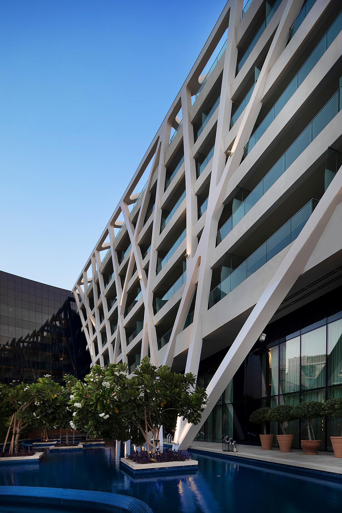
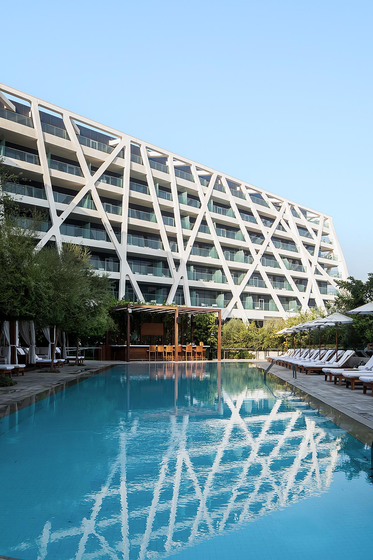
“My process is always to research the property online, be it the designer or existing images via Google images, as well as sun and location mapping with the apps. A recee a few days before the shoot is standard, to see what kind of light is usually around the space. When it comes to shooting large spaces such as this, especially one where the architecture of the space is a focal point, I prefer to shoot with available and directional light. When I got to the recee though, I was hugely disappointed to notice that there was massive construction happening on the outside of the hotel, as well as around the marina of the hotel where the yachts and boats were berthed, which smashed any dreams of getting a sunrise shot of the very unique hotel facade on its own. I suppose that narrowed down my options even more, and made me focus more on the available geometric shapes,” Ruksana recounts.
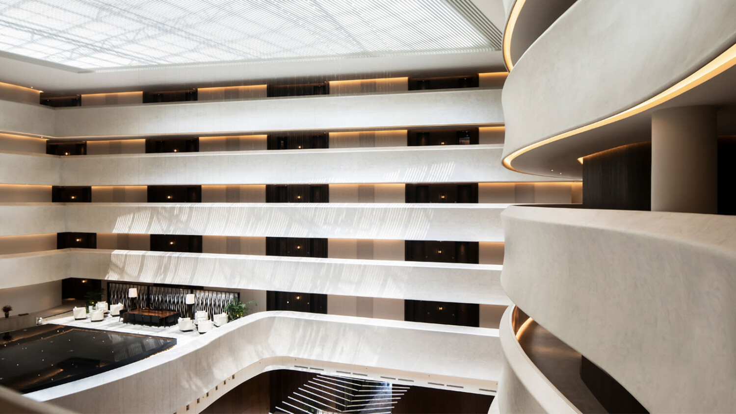
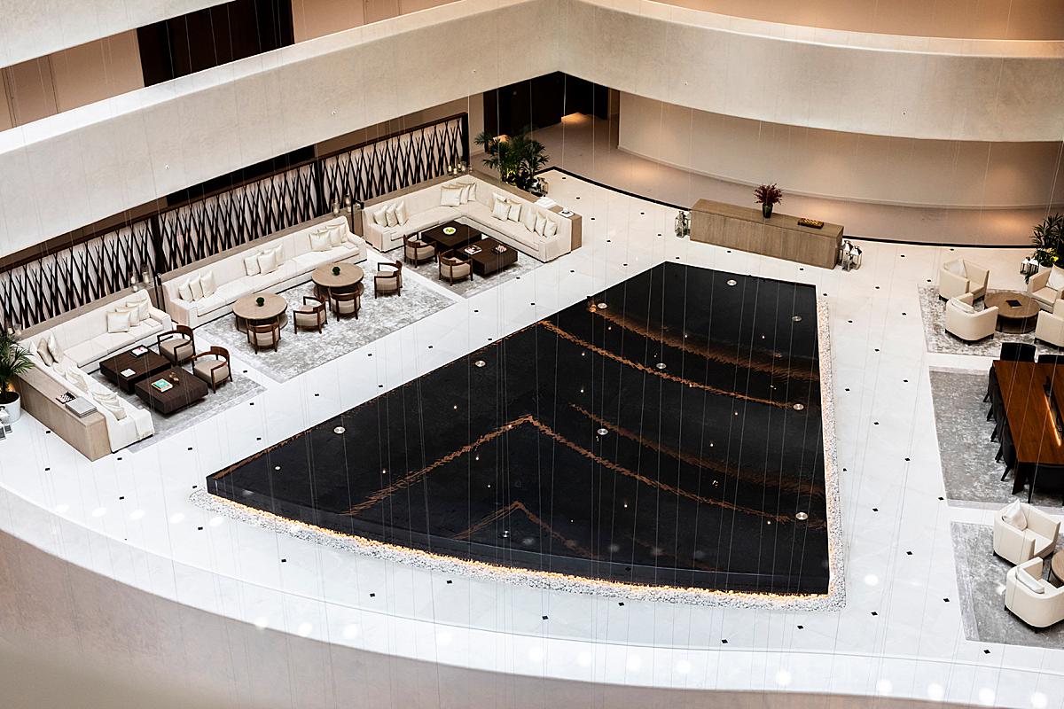
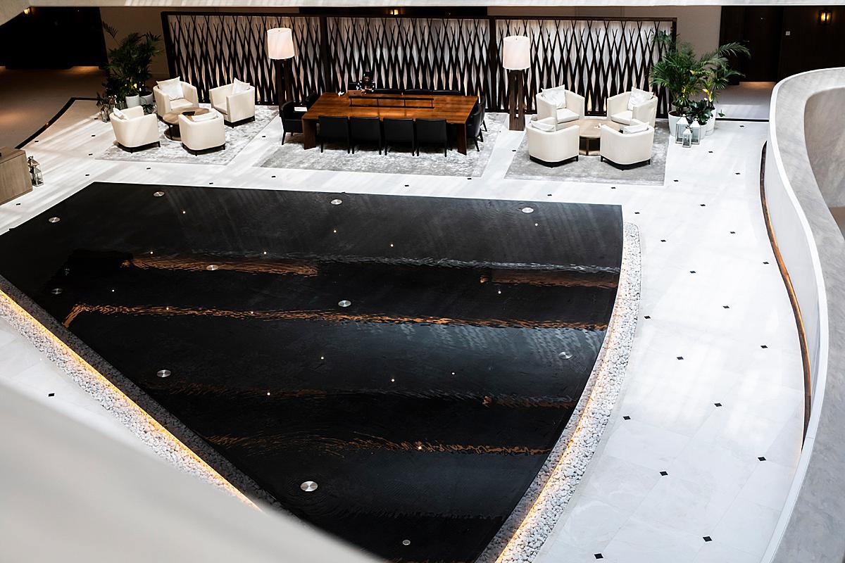
Despite the hiccup with construction that limited the exterior photos she could make, as we move inside, you’ll see that the lobby is a work of art on its own. Flush with interesting shapes, light, and texture, she made a myriad of gorgeous images here.
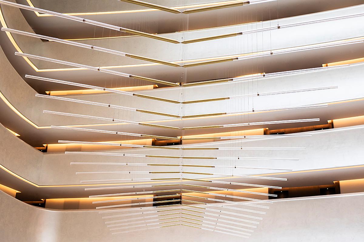
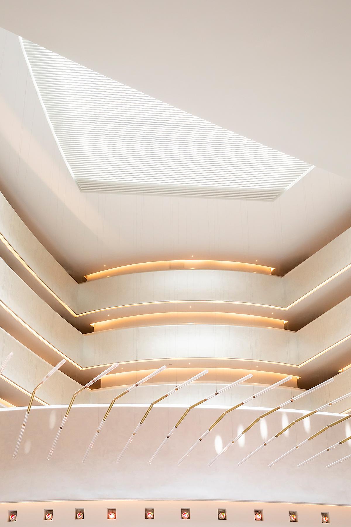
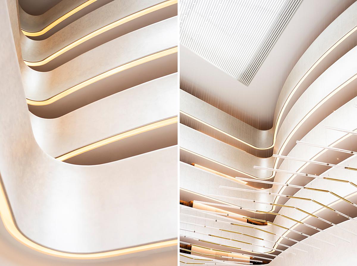
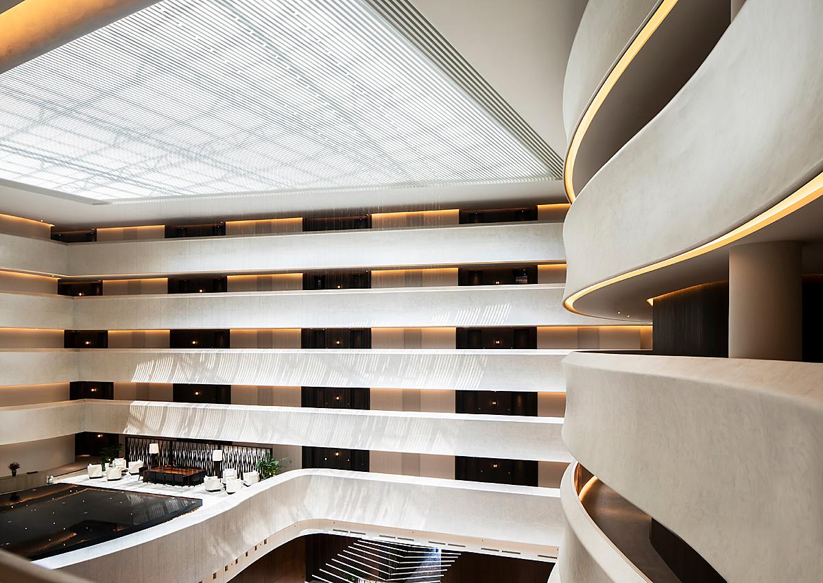
She recounts that her favorite image is “definitely the angular, sinuous geometric atrium and lobby, even if it was a challenge!” I agree as this beauty was what initially sparked my interest in this project. What’s not to love though? With the angular shapes and leading lines mixed in with the curves and layers, this photograph is a treat!
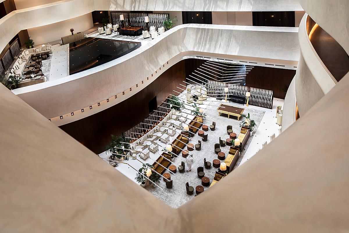
Ruksana goes on, “I was given total creative freedom on that, unlike the other places such as the restaurant or facade. I spent time studying and following the ever-changing, dappled light that seeped through the slats on the ceiling, how the piece de resistance in the atrium ( ie. the large-scale kinetic installation by Studio Drift) was affecting or being influenced by the surrounding light and breeze. If they didn’t stop me, I would have spent half the day getting as many unique perspectives of the cavernous and curved five-story atrium because the possibilities are endless with that one.”
Look at the gorgeous light washing over the lobby area in these photographs. The way it pulls out the color and texture is just dreamy. It makes it feel as if you could reach out and touch the silky walls and smooth curves. Just awesome!
Timed nicely, Ruksana includes the patterned light that streams in from the massive glass roof over the lobby. The shapes it creates adds warmth and interest. We are given a sense of place and time.
“When I set up a shot, I am always looking to see where the light is coming from, as all photographers do, but also how I can get a more unique shot than what’s available out there that speaks to me from my vantage point. I may look to get that by adding supplemental lights (when available light is not enough), or to make a more dramatic composition with the supplemental lights,” she explains.
“I also like to change it up a bit, especially with my editorial clients such as this who want a more voyeuristic/lived-in feel to the images by using other lens that are not standard interiors lens such as my other prime lenses (eg a 35 or even a 50). Lately, I have been trying to see how I could make the shots more dynamic, be it with a pop of colour, movement, or adding a unique element to the picture without overwhelming the overall space.”
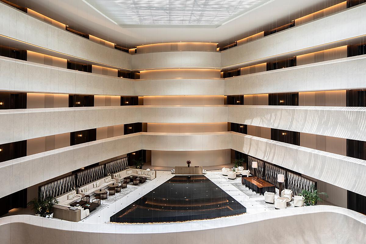
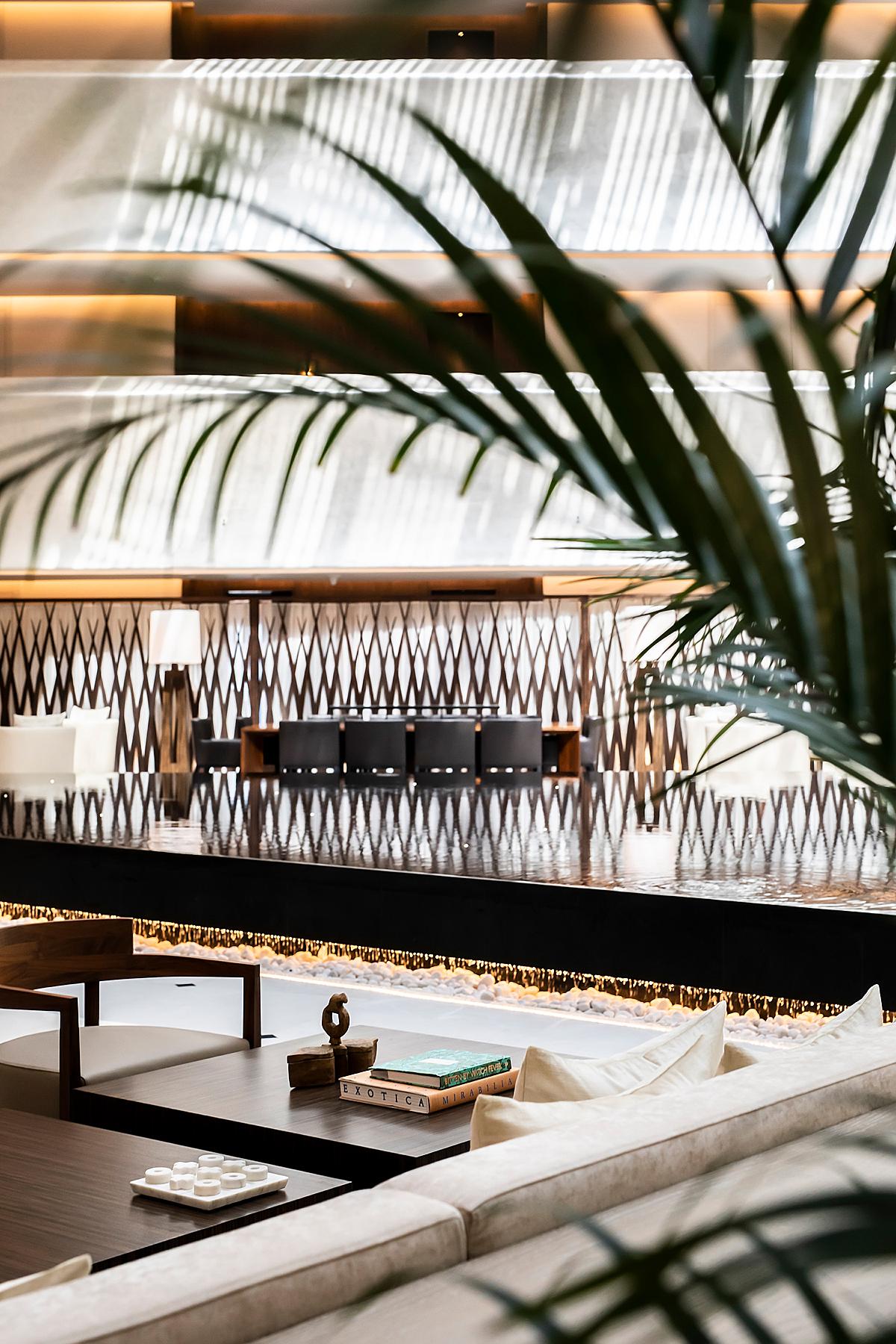
One of my other favorite images from this series is this gem. We get to see the best of everything here. I love the repetition of the lines across the glass roof, and the pattern of light they create streaming down the lobby. These shapes contrast nicely with the rolling curve on the right, which creates a subtle movement that draws our eyes in and moves them through the scene.
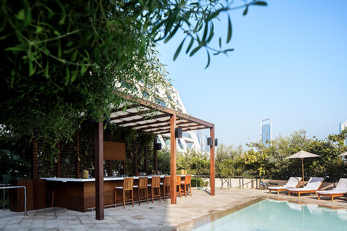
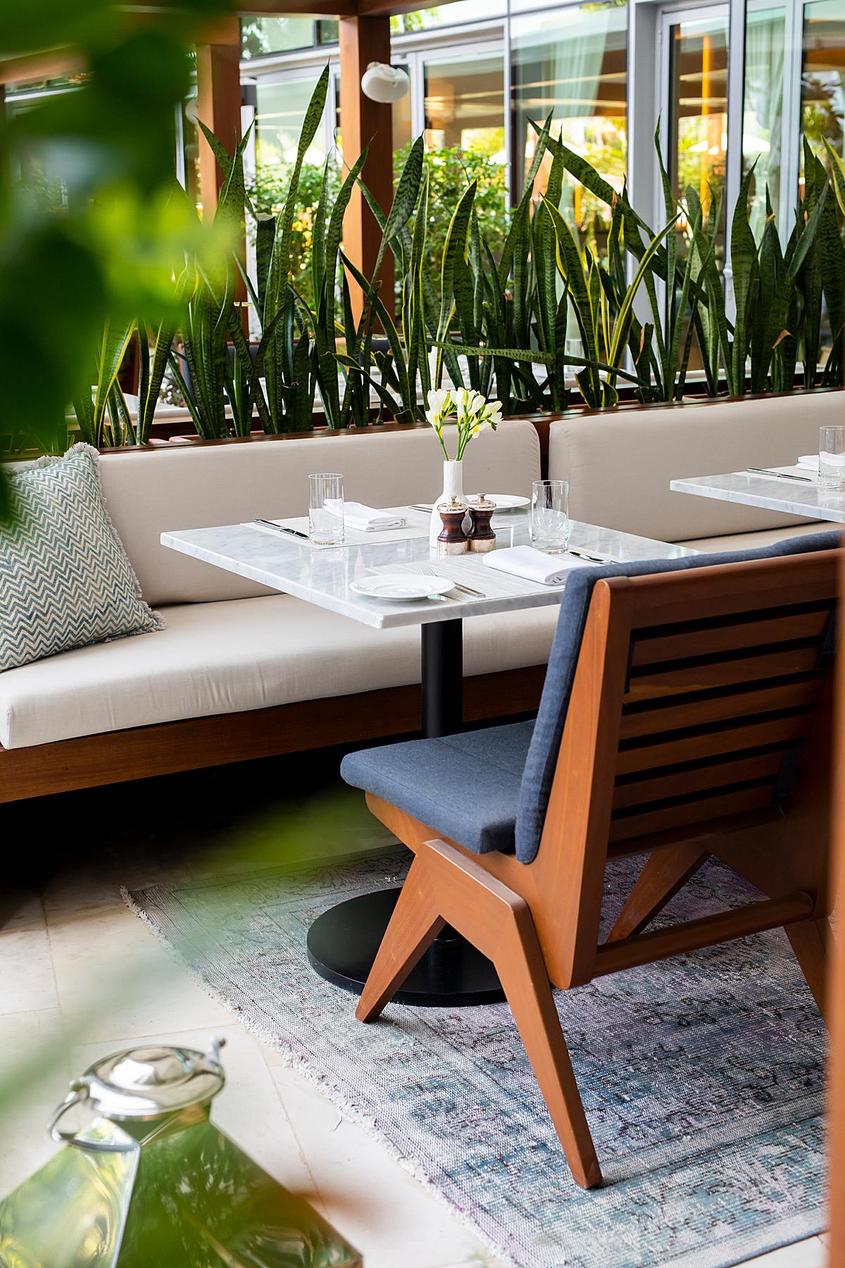
Playing to the lifestyle photography needs of her clients, you’ll notice that Ruksana’s series here has a bit more foreground layering, framing, and shallower depth of field, especially in the vignettes, then you might see in her other projects. In this particular shot, it gives the effect of walking through the balconies of The Edition and peering over the ledge into the lobby. This offers an interesting perspective and helps us get a good scale of the place.
The biggest obstacle Ruksana ran in to on this shoot was timing. She relays “My assistant and I had one day to shoot the spaces of the hotel, with the client in tow during the shoot. We arrived early, but as it is with most large hotel spaces (at least for me), security was not aware of the shoot, restaurants that we were supposed to shoot were closed, the spaces we wanted to shoot was not cordoned off from the public, so we spent a lot of time not being productive, which is such a waste of time. I had a producer who was on a strict timeline and who didn’t care so much for the creativity that the shoot entailed, but to get specific images done despite the challenges we had, which affects the end-product.
Photographically, the challenge was how to take pictures of the angular, sinuous curved atrium and lobby without letting my OCD get in the way, as interiors and architectural photography requires one to get the verticals and horizontals perfectly accurate/straight. It was also imperative that the images taken had to show the ambiance of the hotel as a lived-in, comfortable place where one is a guest, so a more intimate look was required. I had to overcome by not shooting everything in F11 as I usually do with interiors, and I wasn’t allowed to add people to the images to add a sense of lifestyle and design to it.”
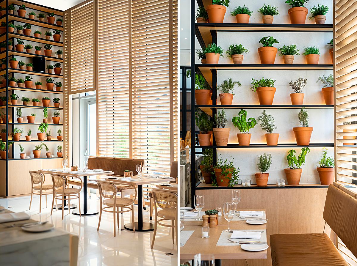
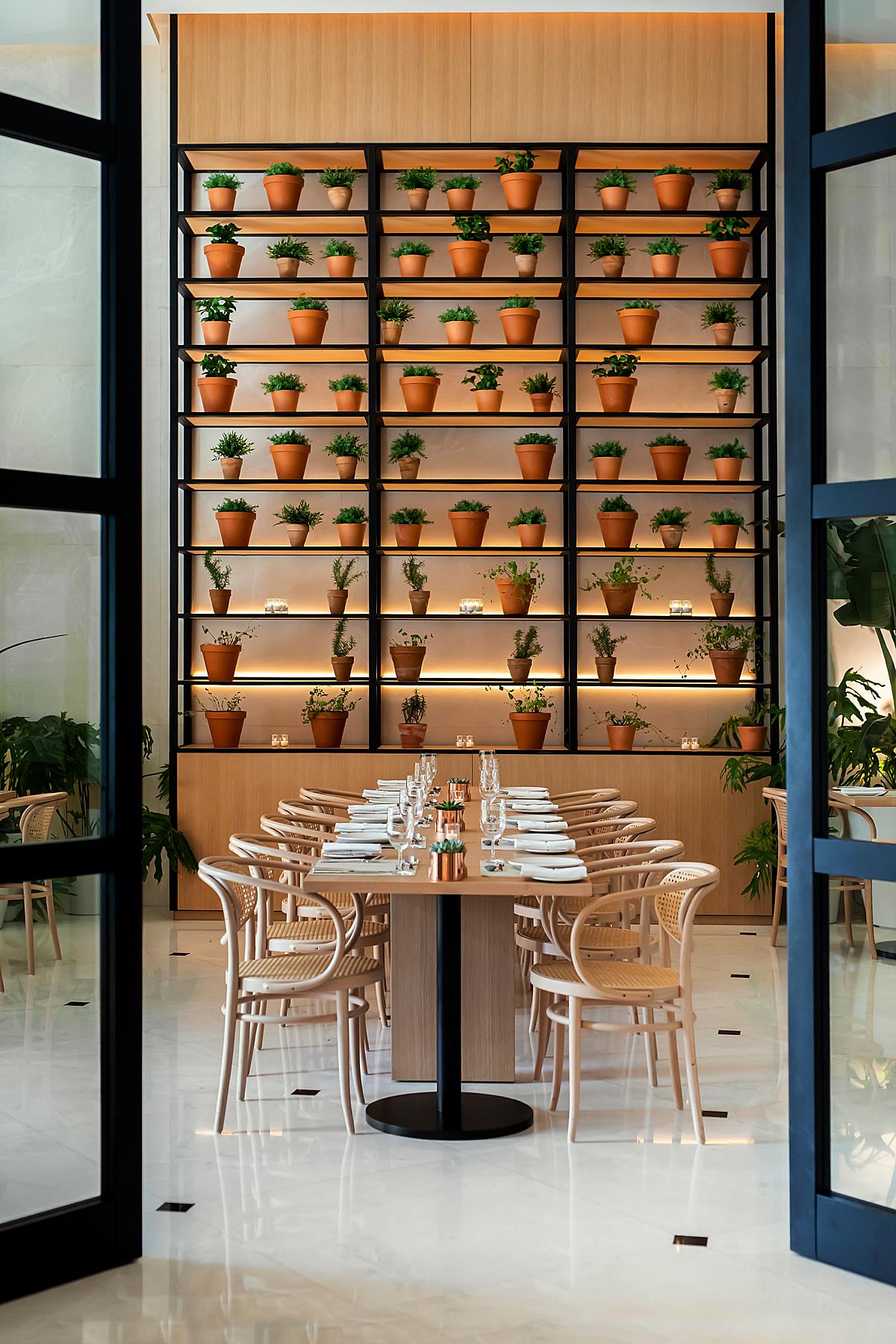
In these restaurant photos, I love the way the directional light makes its way through the scene, carving out a nice depth and dynamism with the furnishing. Another thing I appreciate (throughout this whole project, really) is the careful way Ruksana manages the color casts and balance between the natural sunlight and the warm glow of the strip lights. It feels true to real life and there isn’t a hint of muddiness or a loss of control of that light/color anywhere. *Chefs kiss*
“My editing workflow is to get as much done in camera, as I really do not enjoy sitting in front of a computer and editing for long hours,” she shares. “I usually shoot tethered to Capture One, do a quick style set during the shoot, which sets the tone for the rest of the images. When I am ready to edit, its a matter of choosing my selects for Photoshop and edit/compositing my life away! Tricks I’ve learnt are Actions in Photoshop, which I make for colour grading. I’ve also just learnt about Image Processing via Scripts to resize my images for web and socials. Lifesaver when I go back to re-editing months after the shoot and don’t want to open a Catalog all over again.”
In regards to gear, Ruksana shares “My camera bag has a canon 5DSR, and the usual suspects are the 17 and 24 tilt shift lenses. I just got a 1.5x extender which has been a game changer for me. This project was shot though with a Canon 5Dmk4, and it was just as well because it’s a much faster camera than the 5DSR. In fairness, 5DSR has allowed me to actually slow down and spend more time composing it right than rushing through the job.”
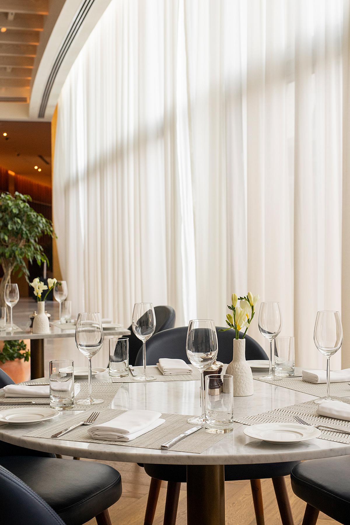
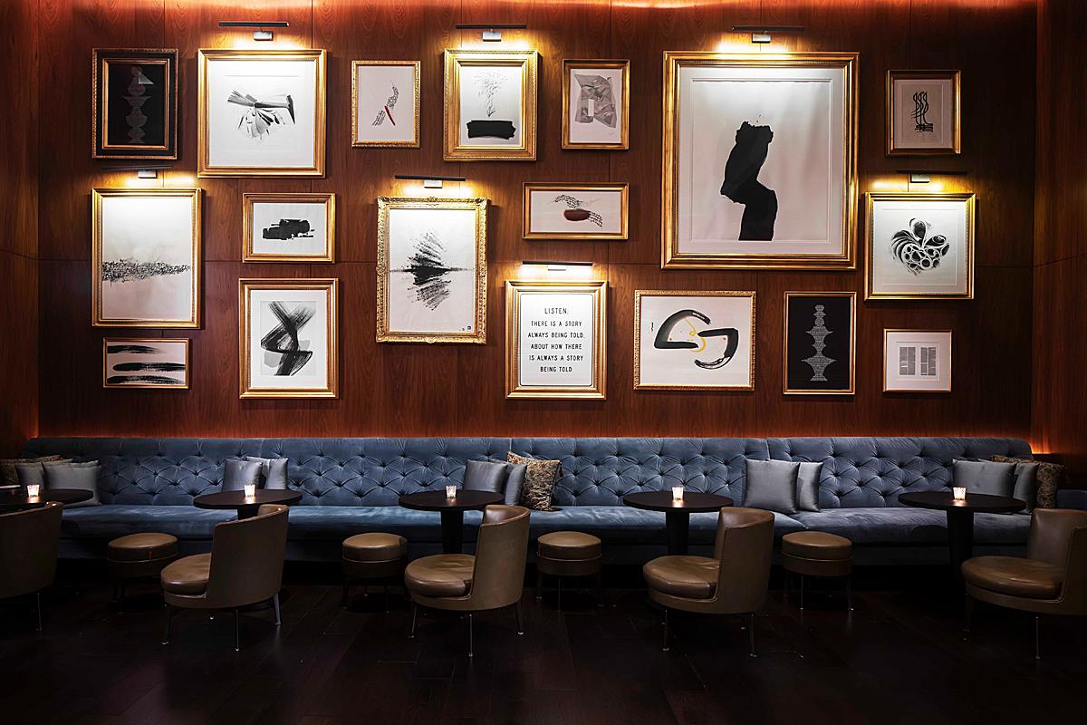
A departure from the light and airy feel of the lobby and sunlit dining areas, Ruksana shows her aptitude while shooting this dim yet luxurious dining area. She does a great job pulling out the texture in the fabric and walls to add a little pizzaz. Well done!
A giant Thanks to Ruksana for sharing this project with us here at APA! Head on over to Ruksana’s website ruksanah.com or check out her Instagram @ruksanah_photo to see more of her amazing work!
If you have a project you’d like to be considered for Project of the Week, you can submit it here.
