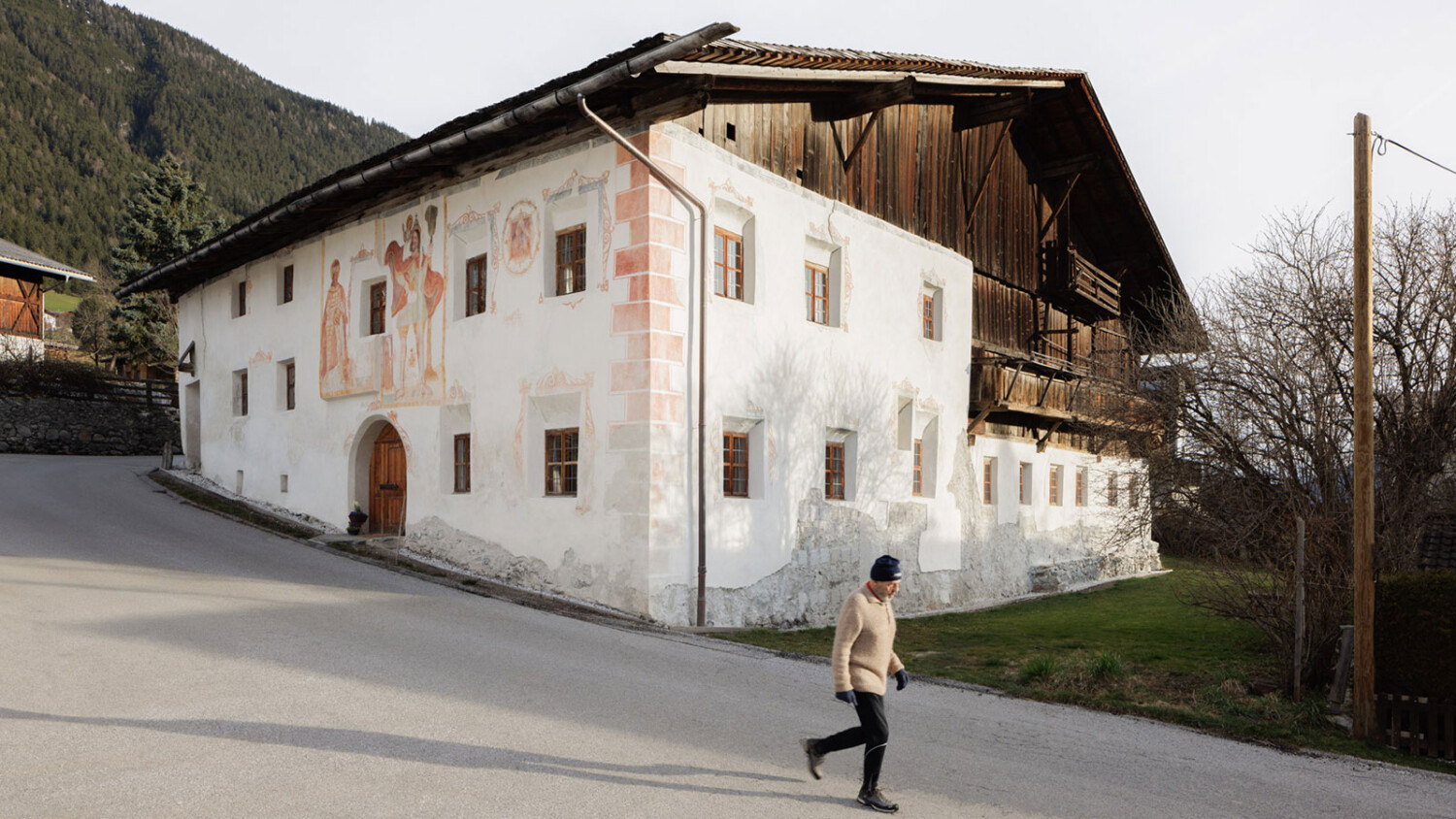
“No Right Angles” – Moritz Orgler Photographs an Early 16th Century Administrative Building in Austria
A departure from fresh, sleek, modern structures and residences, today we’re taking a visual trip with Austrian photographer Moritz Orgler to an early 16th-century building – Moarhof.
Wavy lines, smooth curves, textures, and imperfections are all what make Moarhof literally one of a kind. Moritz’s photographs tell the story of this…well, storied…administrative building in Telfes im Stubaital, Austria.
Moritz has kindly shared his experience photographing this “unique handmade, grown, soulful, smooth aesthetics” piece of architecture, so I’ll let him take it away.
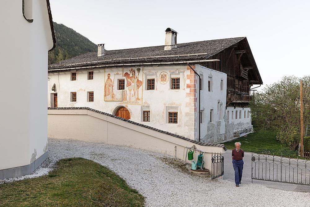
Moritz starts, “It was very fulfilling to not be limited to any timescale like on a commissioned job. 400 years of existence and 14 years of restoration deserve to be treated in the same elaborate way by the photographer.”
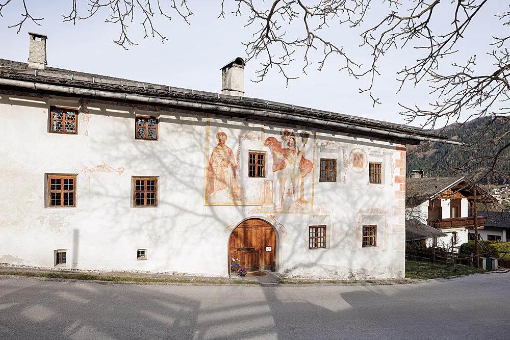
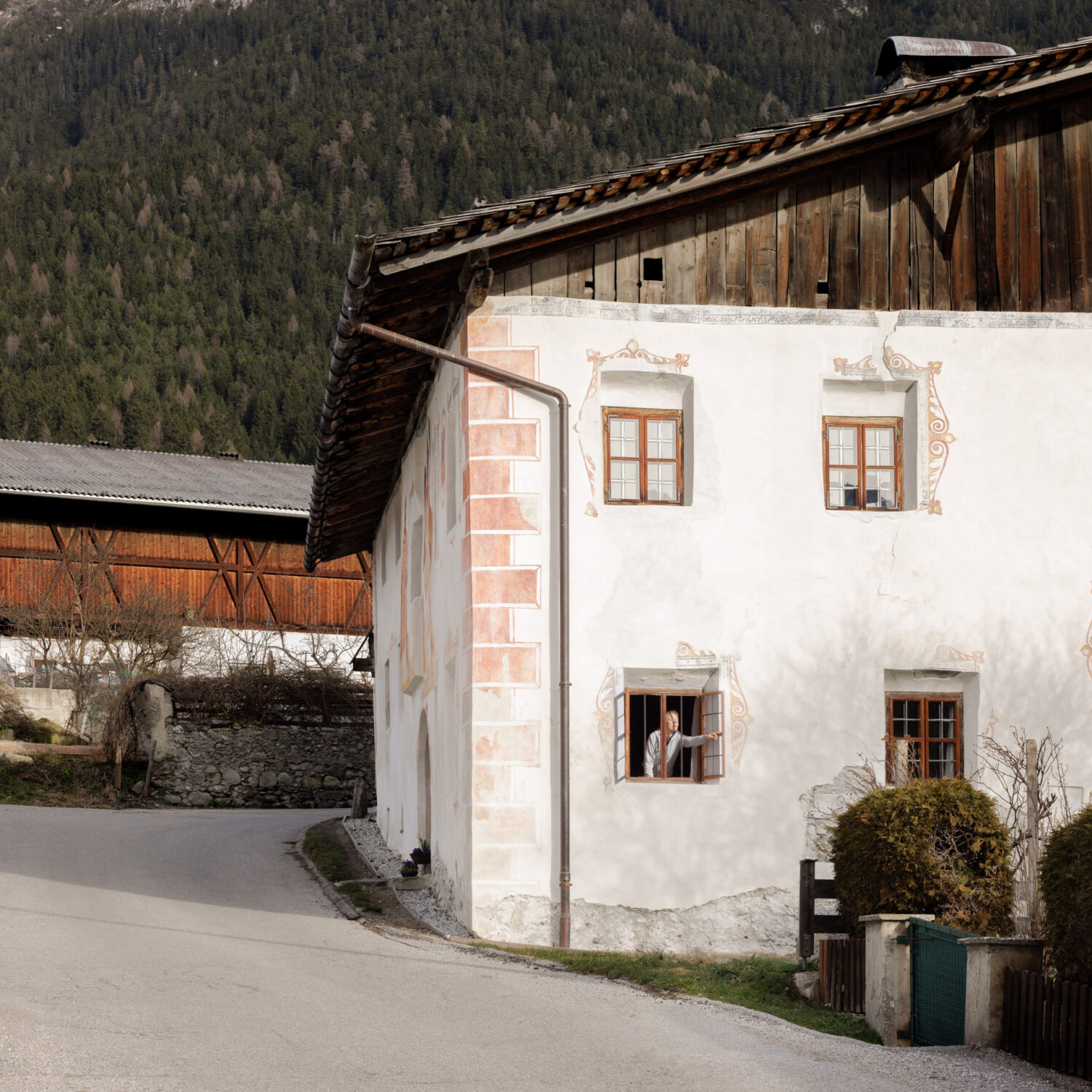
“My main focus was to translate the naturality, softness, and humanity which this architecture radiates and that distinguishes it so much from most builds nowadays. Therefore I was looking out for a slightly overcast sky, clouds texture-less but enough to soften the light. Or I waited for the sun to set, to then capture the images just in the minutes after, where defined but soft shadows characterize the mood,” he shares before continuing,
“Locations in Alpine valleys rarely enjoy such a flat light as in the lowlands. By doing so I could prevent structure on the surfaces while avoiding too hard shadows.”
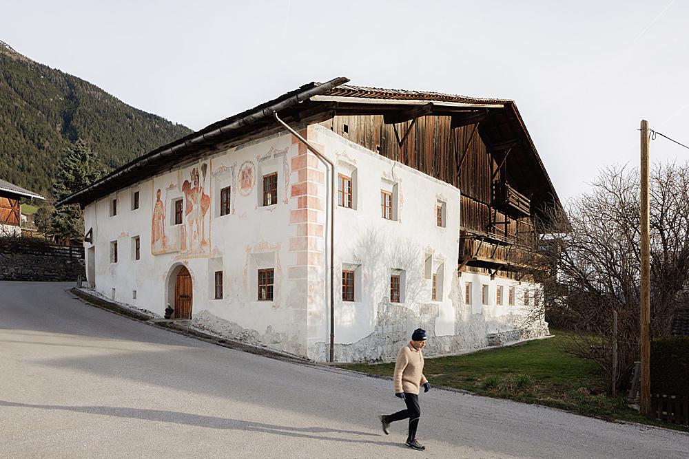
“Adjusting the colors was challenging, I had to find a balance between color correctness on the frescoes of the façade dated in 1597 and still maintaining a natural mood. I captured a ColorChecker closeup to at least know what‘s objectively correct. Maybe I’m going to capture a real reproduction in the shade technically perfect without any aesthetic purposes at a later stage.”
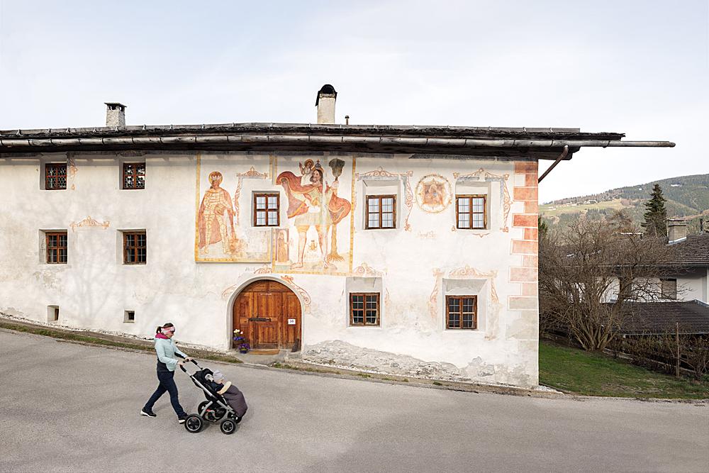
“I made an effort to bring a lively character to the series, as the building stood empty for decades. Bringing it back to life again should also be visualized,” he tells.
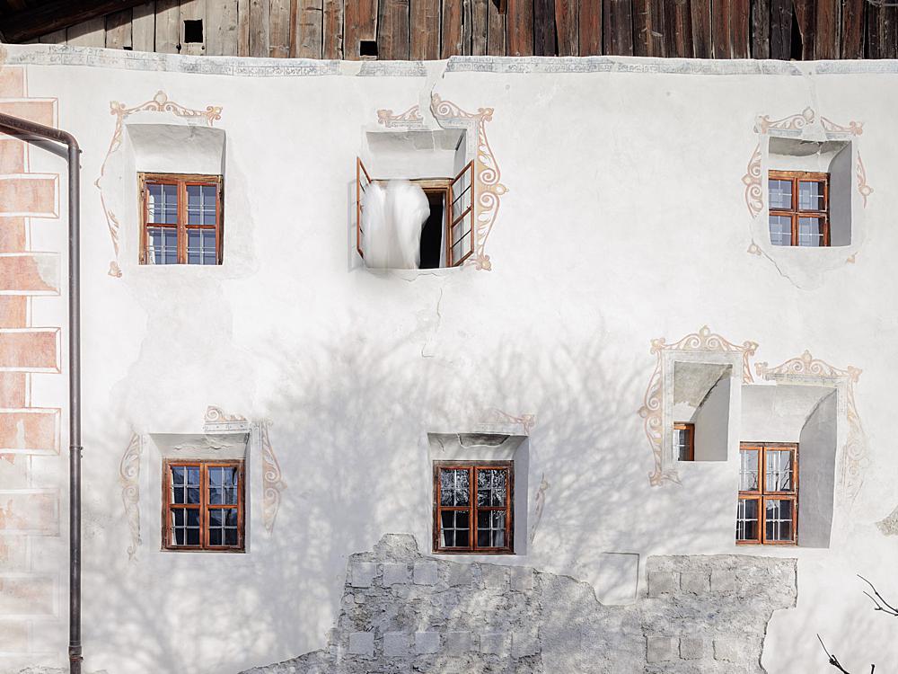
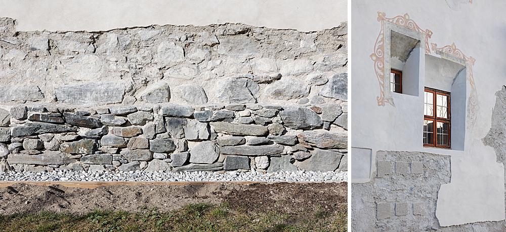
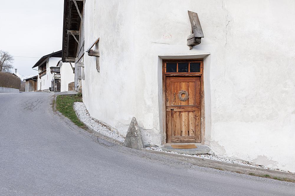
“I love the haptics of the building, the natural materials whitewashed walls, the tailored windows and all that, as well as the work in the process like shown below, where the lower part of the masonry still needs to dry for some more years, providing so many insights.”
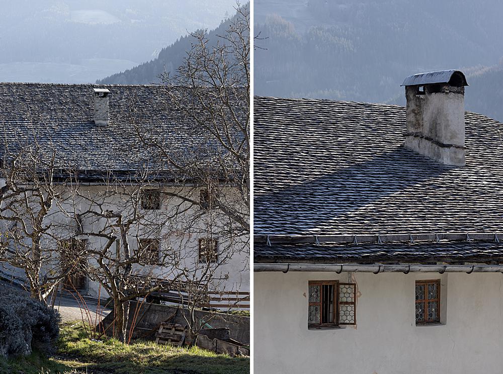
He says, “The roof is covered with handmade shingles, whose texture only comes into its own in an early morning backlight situation. Normally I try to keep surroundings as clean as possible, but on this one, I enjoy the mess with the trees in the foreground a lot. It gives the observer the mood of the environment and information on the rural context.”
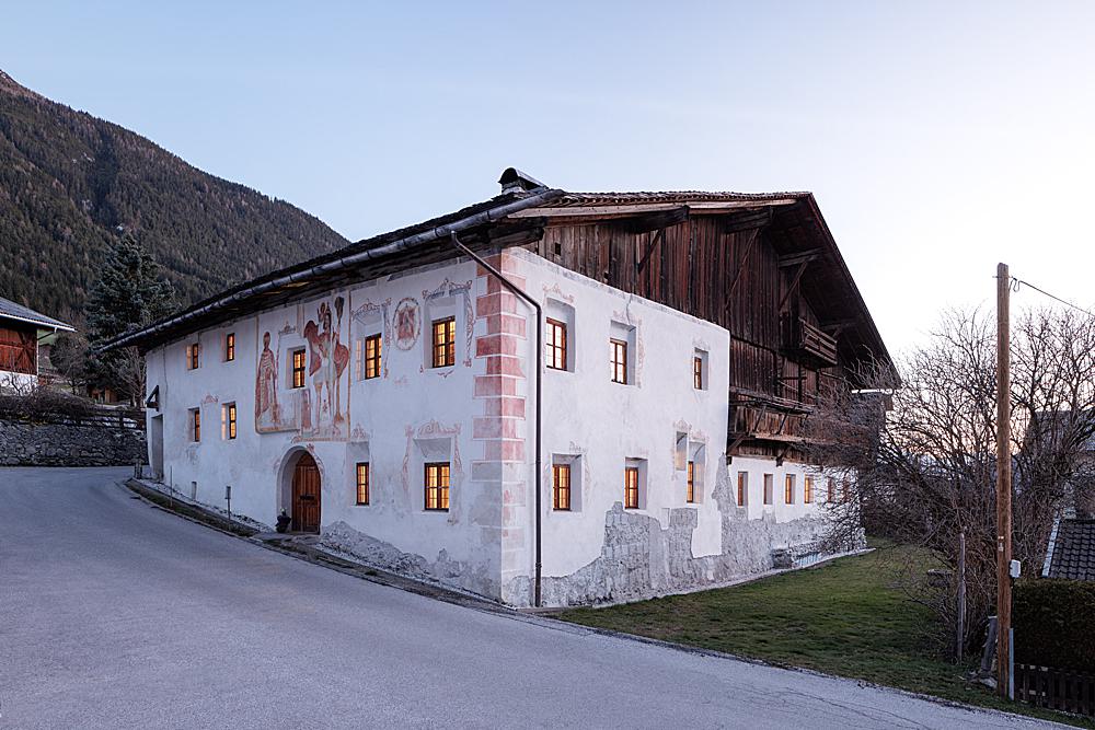
Moritz shares “Organic forms, and smooth textures shortly after sunset:”
“Capturing those dusk blue hour shots was especially demanding, the interior ceilings are often paneled with wood, therefore it starts to glow out of the windows only in conditions where the outside is already critically dark. Working with multishot techniques to overcome this issue is quite exhausting as you‘d only get one shot with one camera for all the morning/evening. On the shown image I moreover managed to turn off the streetlighting for a cleaner look.”
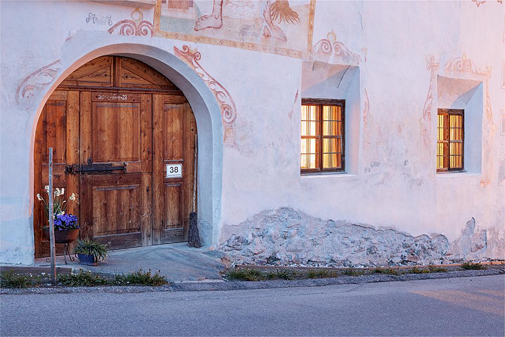
“I had the same preferences for the quality of light in the interior, soft natural but defined. The centuries-old wood was very special for reproducing its colors in a way that felt right in the end, probably also due to the merging of the extreme range of light and shadow.”
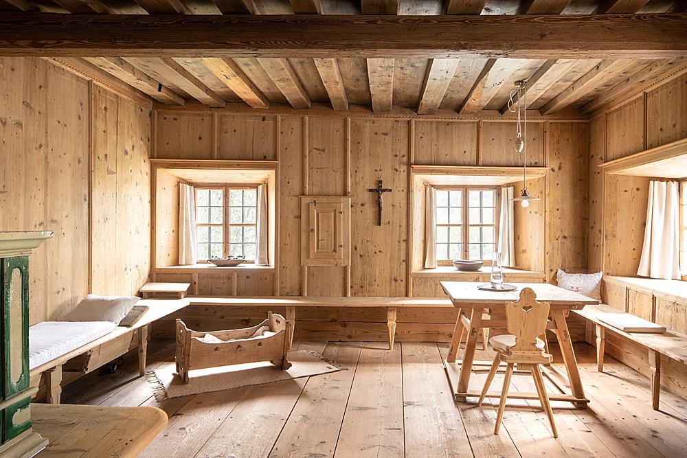
He says, “For such an inward-looking piece of architecture and because of the enormous dynamic range I decided to blow out the windows in some cases, at the expense of information but in favor of naturalness, also I captured all brightness values.”
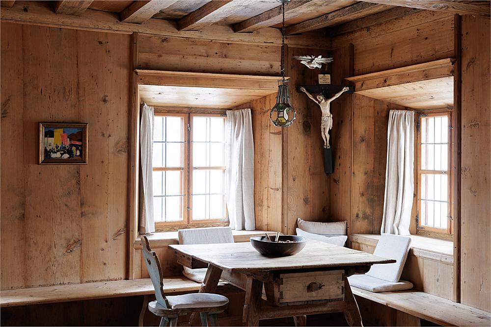
He goes on, “Working with daylight as well as artificial lighting was a conscious decision. It just matches more to reality, as some parts of the inside have little natural lighting, although I normally enjoy a clean light with equal color temperature.
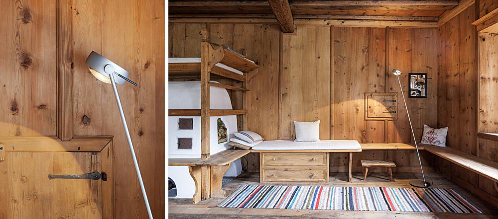
As all modern lighting is by Occhio I decided to integrate some mixture of design style shots, hoping to sell the images and have the project released on their website.”
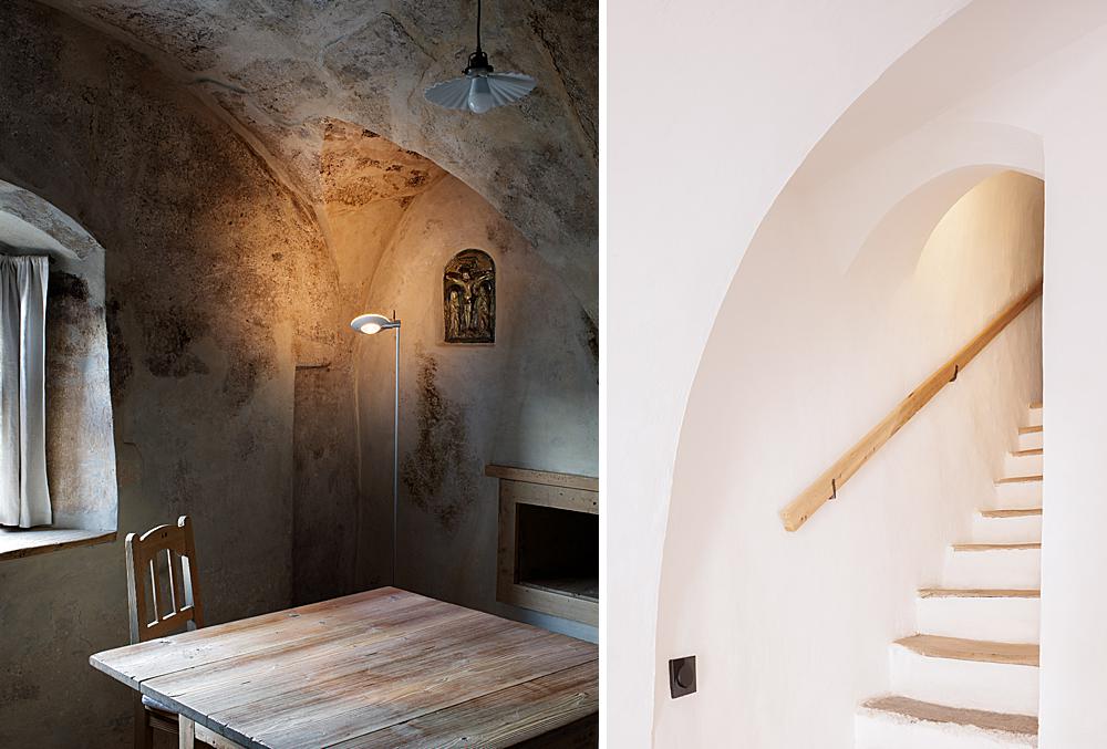
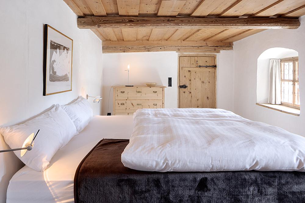
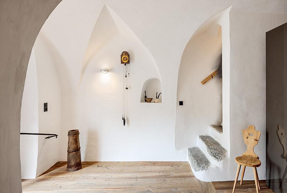
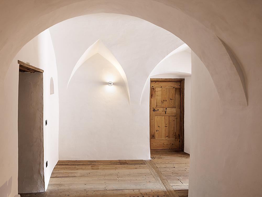
“Even though historic, the split levels and missing right angles relate to the unusualness of modern experimental architecture,” Moritz muses.
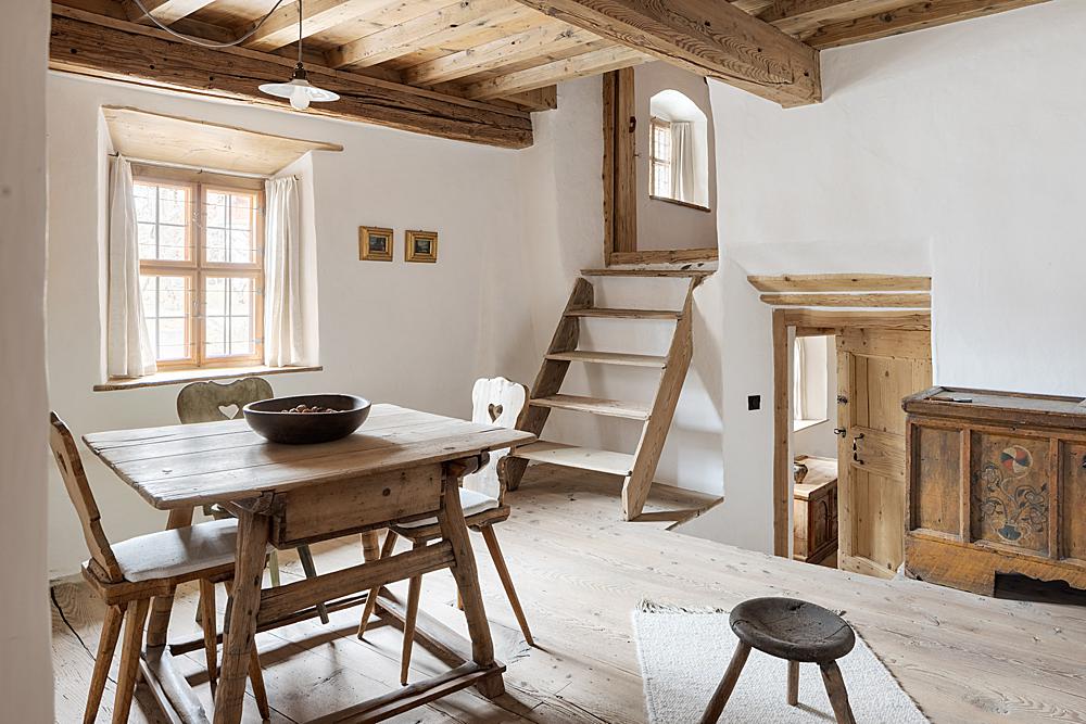
“There is a flowing sense of space.”
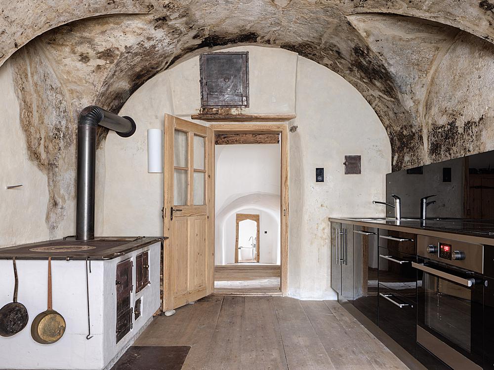
In regards to the modern amenities added to Moarhof, Moritz says, “In addition to capturing these images, I was also involved in the designing process, so I knew exactly what I wanted to show – a bit like an ancient scholar who did not limit himself to one discipline. The general idea of all modern facilities is that it is mobiliar. They are heterogenous from the building, not touching the walls, separated from the building’s core.”
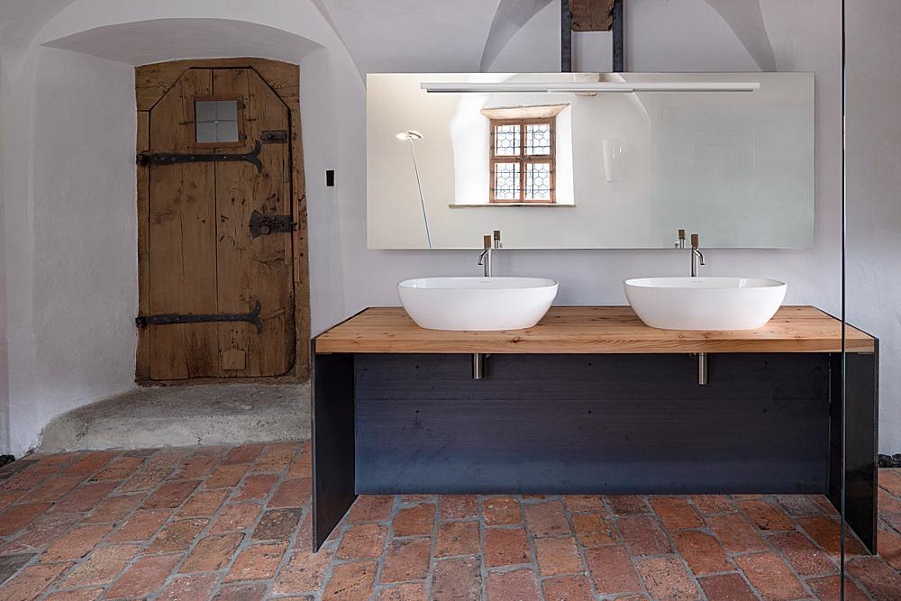
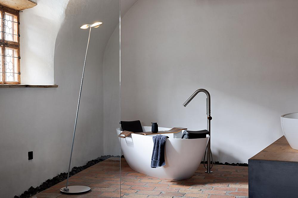
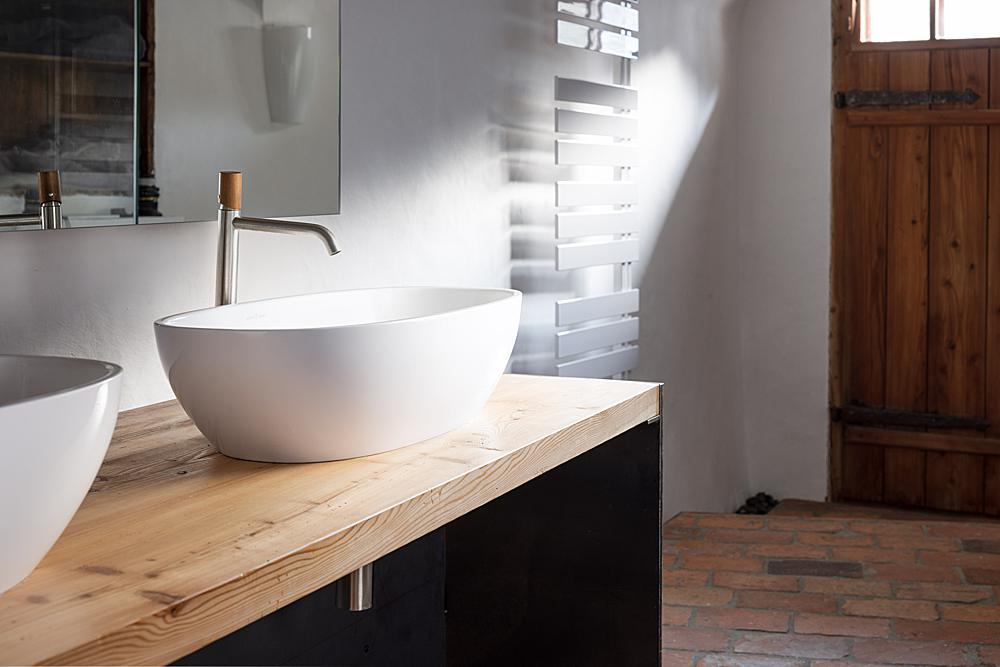
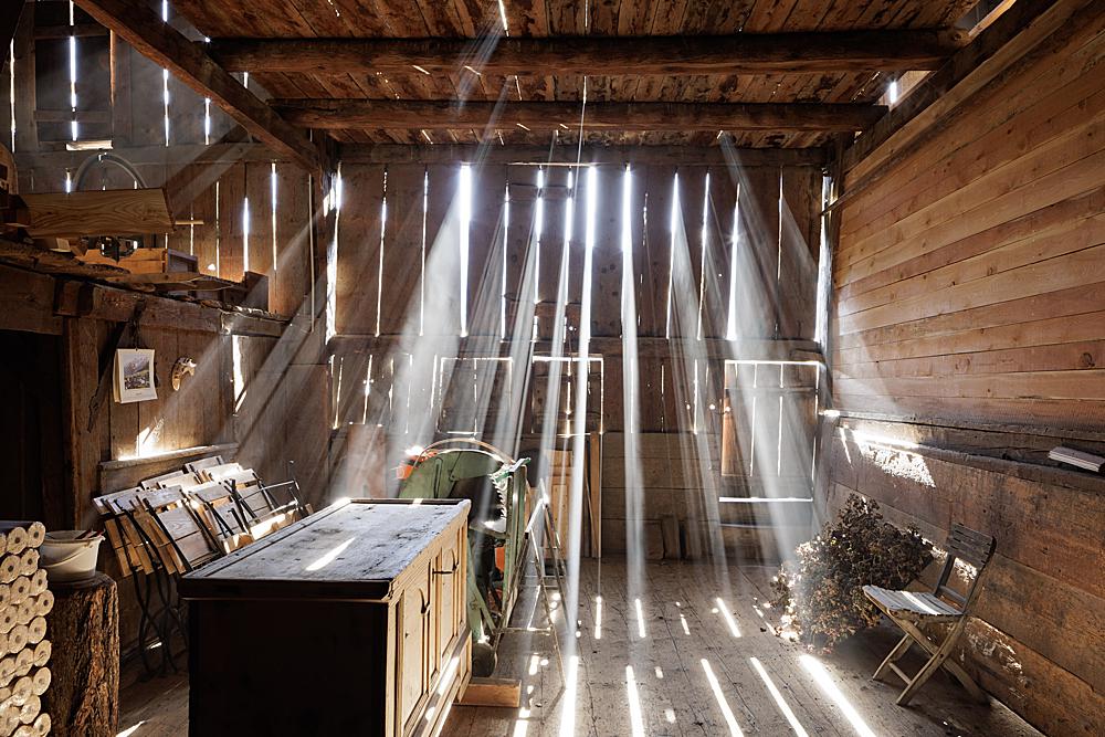
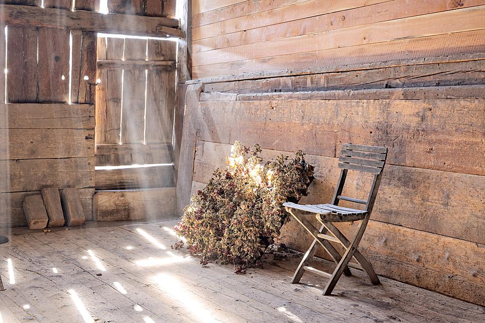
He wraps up this project by sharing this last tidbit, saying, “The barn attached to the house has extraordinary spatial qualities, flooded with light rays in the morning hours and its undefined use today, it radiates generosity, just being space for heart and soul.”
Absolutely awesome! A giant thank you to Moritz for sharing this project with us and going in depth about the building itself, as well as his photographic process. Find Moritz online at moritzorgler.at and on Instagram @moritzorgler.
If you have a project you’d like to be considered for Project of the Week, you can submit it here.
