Stepping Under South Korea’s Golden Curtain With Ossip van Duivenbode
Steeped in golden paint and graphic textures, behold, one of my favorite architectural projects ever!
MVRDV’s The Imprint is a pair of buildings in the Paradise City entertainment complex of Incheon, South Korea. Crafted with the purpose of art-entertainment in mind, MVRDV was able to incorporate fresh and eccentric features in this project, deeming The Imprint a work of art itself.
Speaking of works of art, our photographer for this week’s featured project is none other than Ossip van Duivenbode. Ossip hails from The Netherlands, and has mastered bringing a playful humanistic quality to large scale civic, cultural, and corporate, architecture projects.
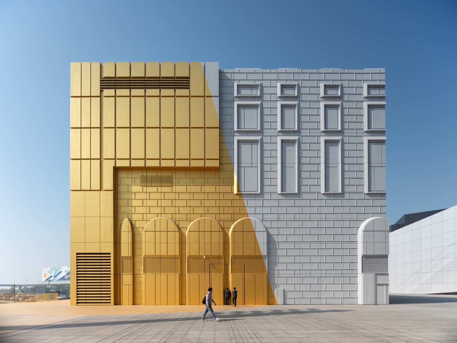
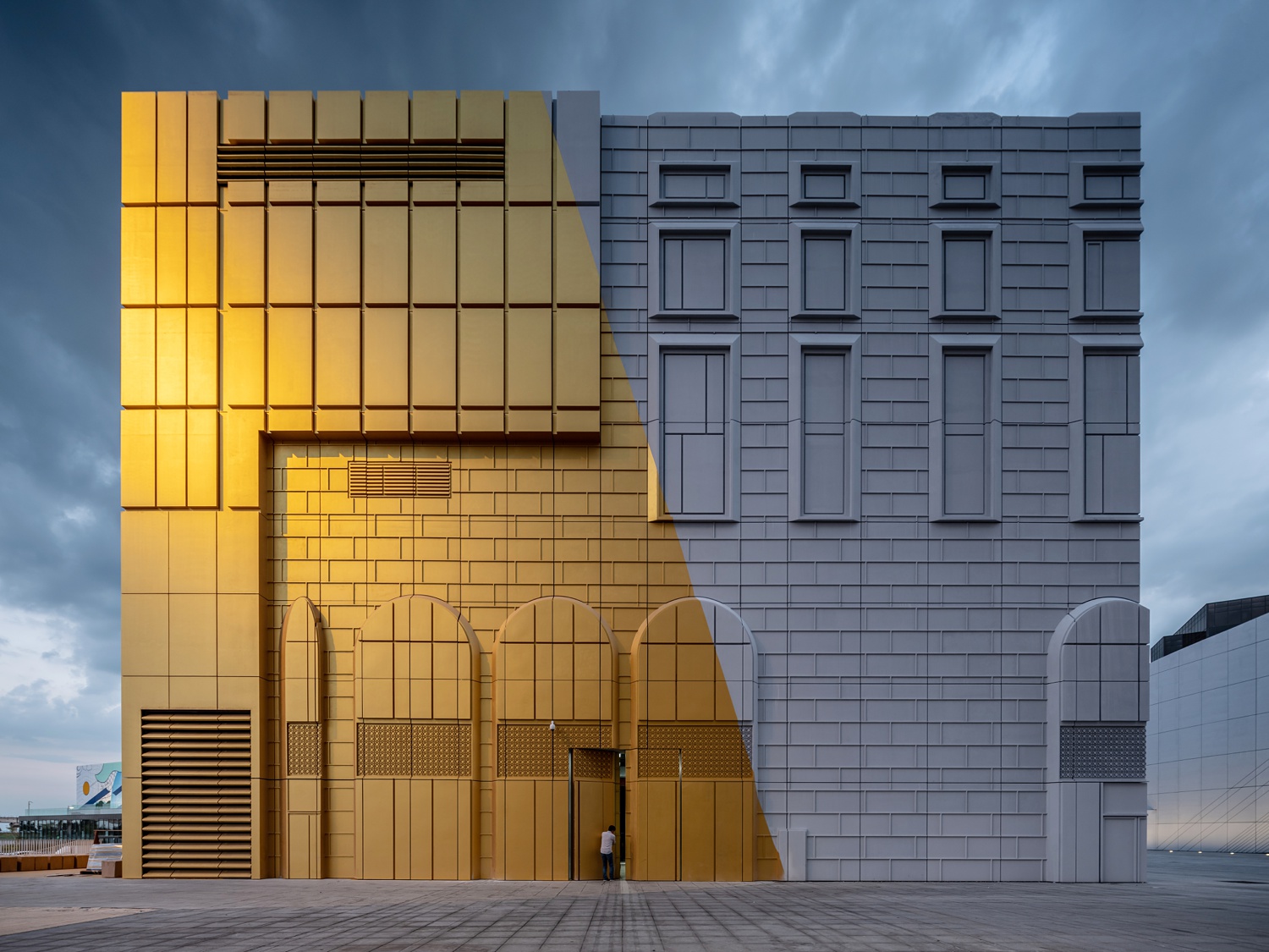
Windowless, an imprinted facade helps The Imprint (now you get it) blend in with the surrounding buildings in Incheon. The facade looks like a sketch — almost an illusion, maybe — and radiates a fun spirit that Ossip captures nicely. I love Ossip’s choice in timing and perspective here. Long shadows highlight the texture as well as give dimensionality to the facade. The sunlight raking in from the side pulls the metallic sheen out of the gold paint, which is the true showstopper here.
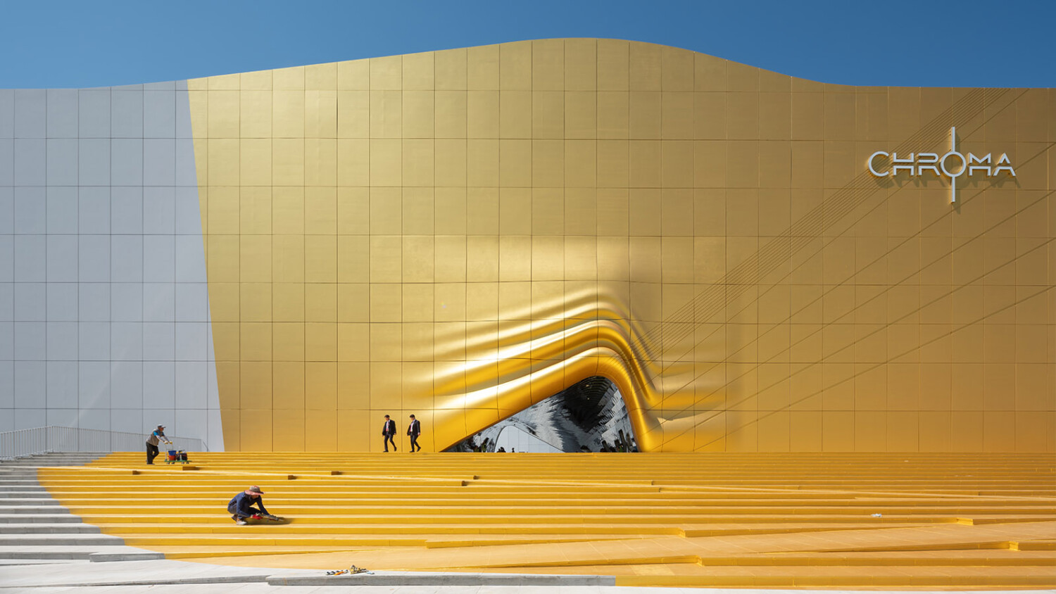
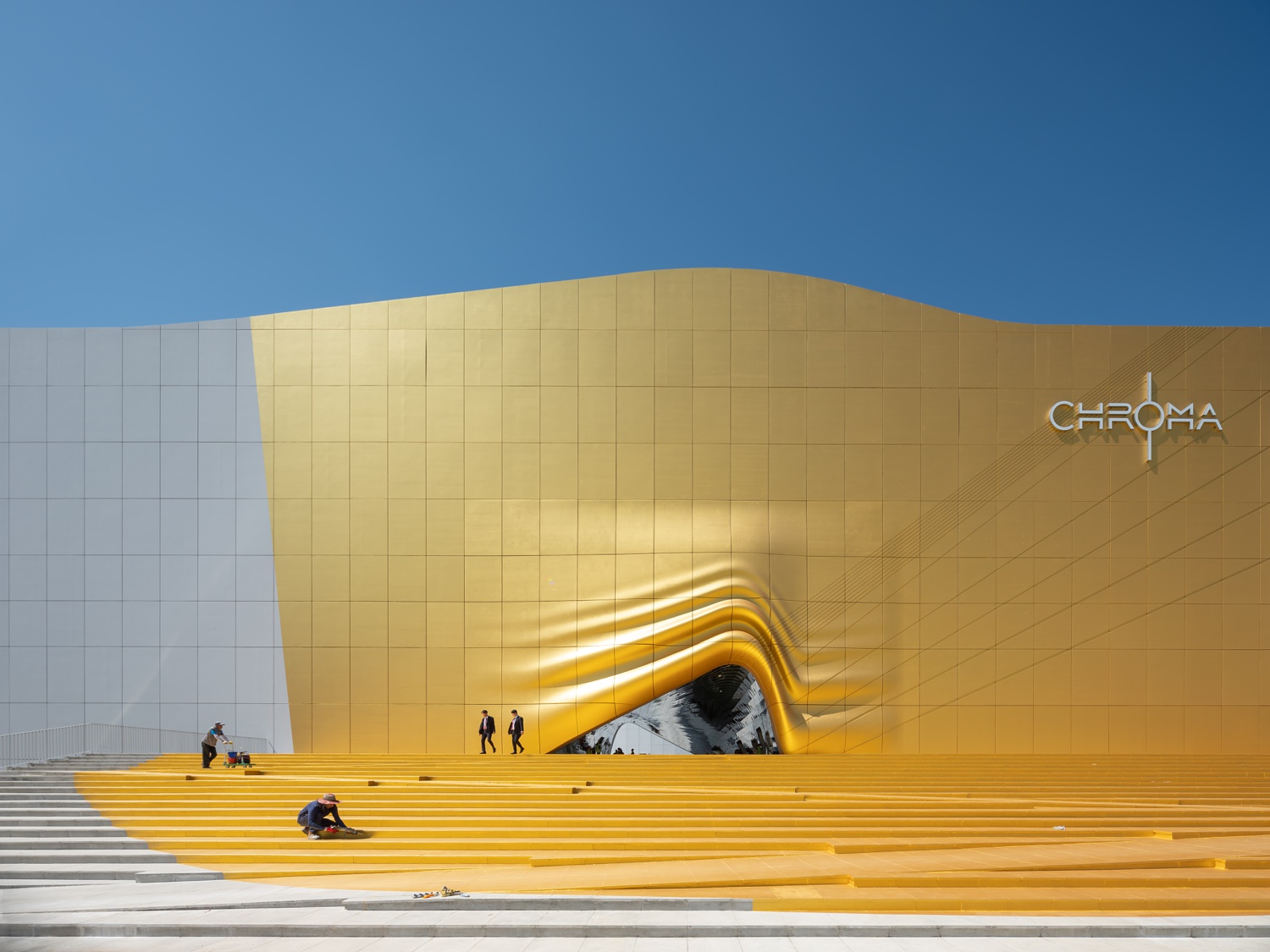
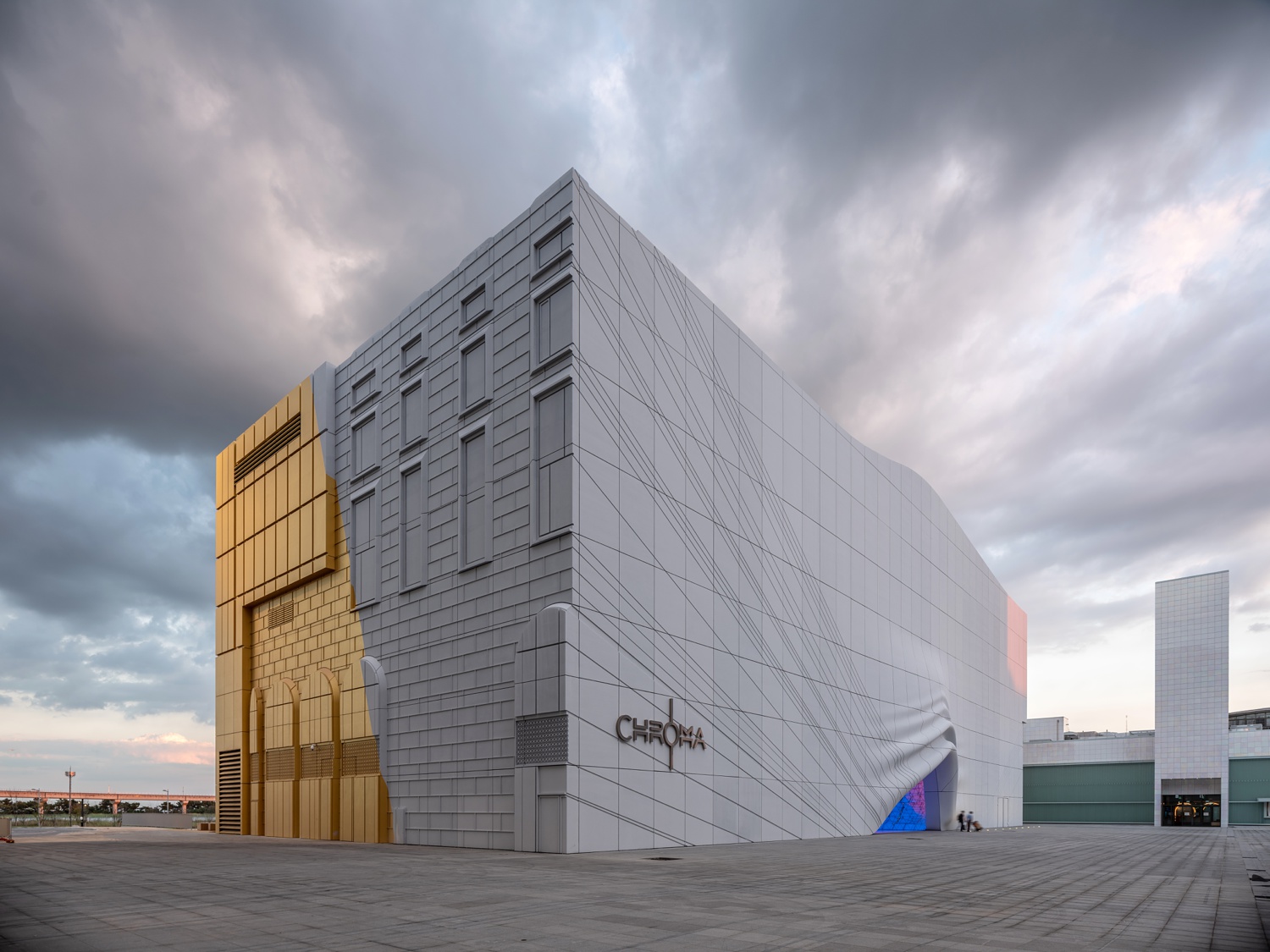
Around the other side, we see the same building materials and color palette, but there is a smooth and silky feeling here. A high, overhead sun pours highlights onto the sculptural entrance into the Chroma night club. Ossip captures figures walking from the abstract curtain-like corridor, giving scale to the entryway. Including figures also helps echo the feeling of movement given off in this scene by the lines in the stairs, and those on the facade.
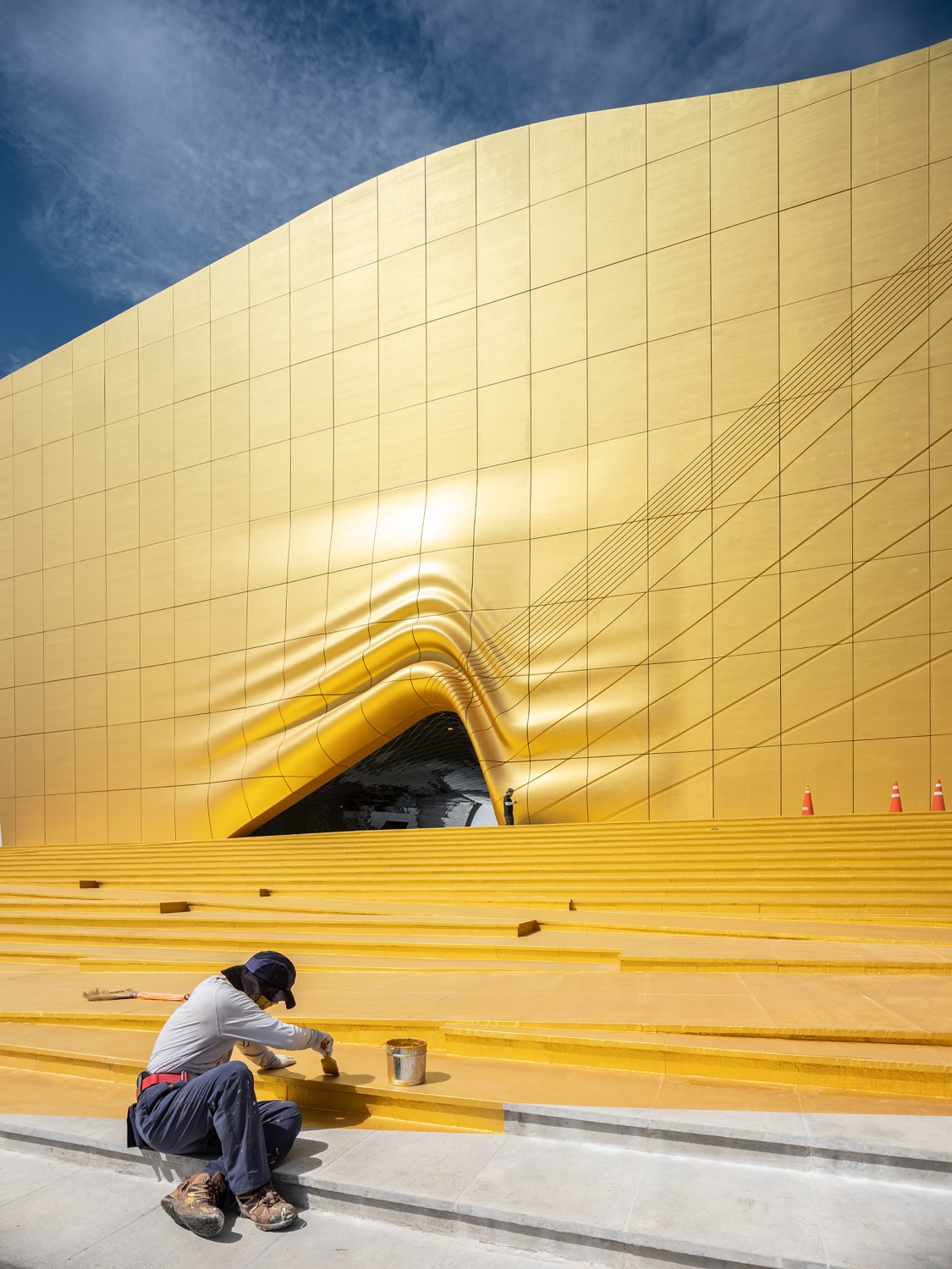
Not only is this a great architectural image, but it shows off the construction and finishing process as well. The Imprint’s shimmering exterior isn’t a special material, but rather, a hand-painted design that gives the appearance of a dripping splash of paint. There’s a nice rhythm in this photo thanks to the repetition in the leading lines. The contrast between the dark blue sky and the rich gold paint is beautiful, and gives the building a warm and inviting quality. There is a graphic air about this image and I love it as a supporting photo in this series.
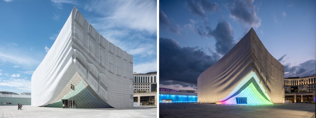
Home of the “Wonderbox” indoor amusement park, the corner of this building appears to be a drape being lifted off, revealing the entrance into the park. Ossip photographs this incredibly cool side of The Imprint at two different times of day. We are able to see the way the architects designed this exterior to have that magical drapey look, no matter if it is night or day. We see the same gorgeous shadows produced by the relief in the concrete panels, one a product of the sun, and the other man-made. Throughout the entire project, but especially here, Ossip’s photographs showcase the depth of these buildings, as well as their sculpture-like designs.
As the day gets later and the atmosphere darker, we are able to see the way the interior lights inside The Imprint serve as a beacon, inviting you to step under the curtain. On the other side, Ossip portrays how the golden paint “lights up” the corner of the structure, even though it’s beginning to get dark out.
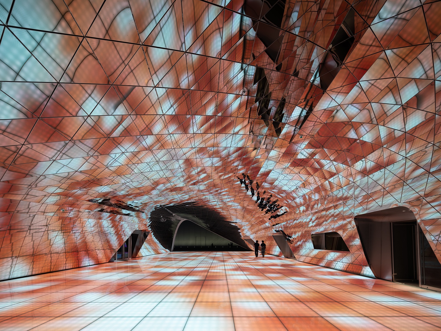
Glass media floors and mirrored ceilings await inside the building, serving as the entrance into the club. Again, Ossip uses a human element to give us some reference for scale and add a dash of movement to the scene. I believe the floor is constantly changing, so I would imagine doing any type of long exposure to capture this space was pretty tricky. He did a nice job though, and this image conveys the exciting and interactive feeling found throughout all of The Imprint.
Ossip’s closing shot leaves us with The Imprint at dusk. We see the same facade as when we started, yet this time, the gilt paint gives the illusion that a giant street light is casting a golden splash of light down the building. I love the play between the cool background and the glowy orange hues. By including a man walking into The Imprint, the doorway hidden in the busy facade is revealed to us, and makes us want to step into the building as well.
A big thanks to Ossip van Duivenbode for sharing his photographs of The Imprint complex with us! You can follow along with Ossip’s work on his website ossip.nl or his Instagram @ossipvanduivenbode
If you have a project you’d like to be considered for Project of the Week, you can submit it here.
