Making The Best of Auckland’s Fickle Weather At The Franklin Road House With David Straight
Today’s Project of the Week is a moody beauty coming at you from architectural photographer David Straight based out of Auckland, New Zealand. The Franklin Road House was designed by Jack Mckinney Architects with interiors by Katie Lockhart Studio and is a sublime space. David has a boatload of great insight into this project and the way he documented it, so I’ll let him take it away!
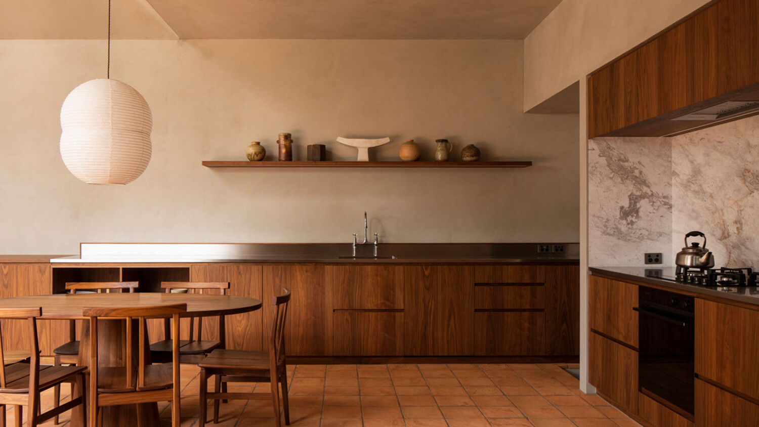
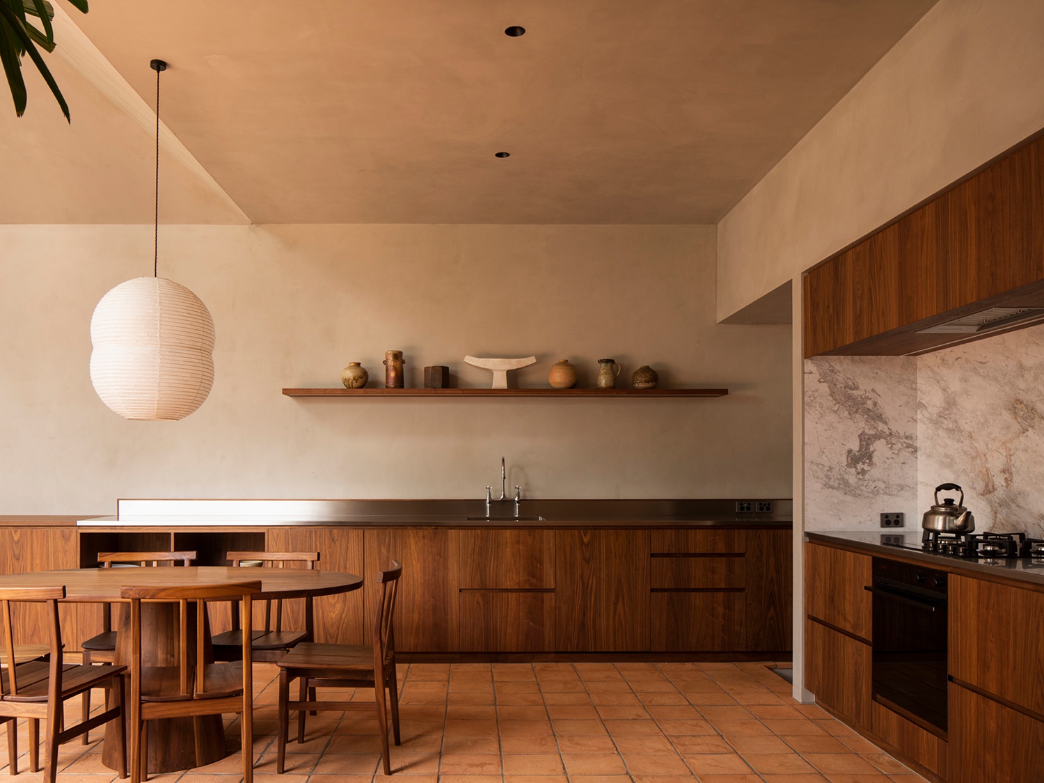
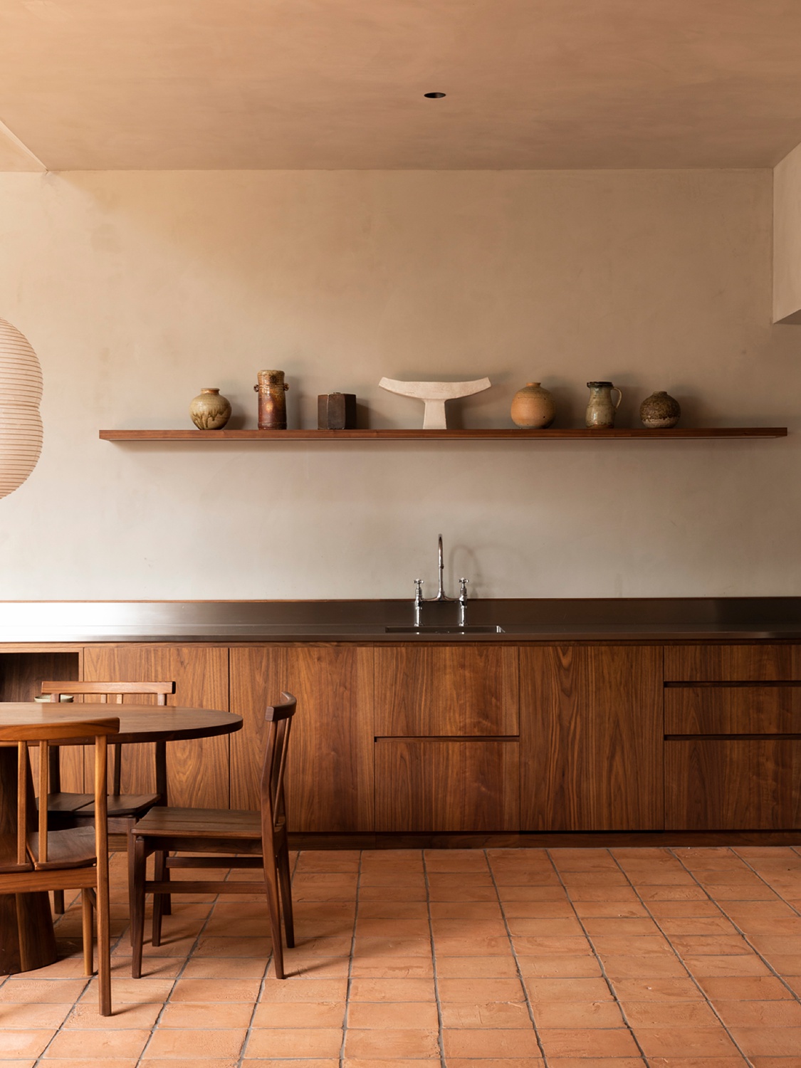
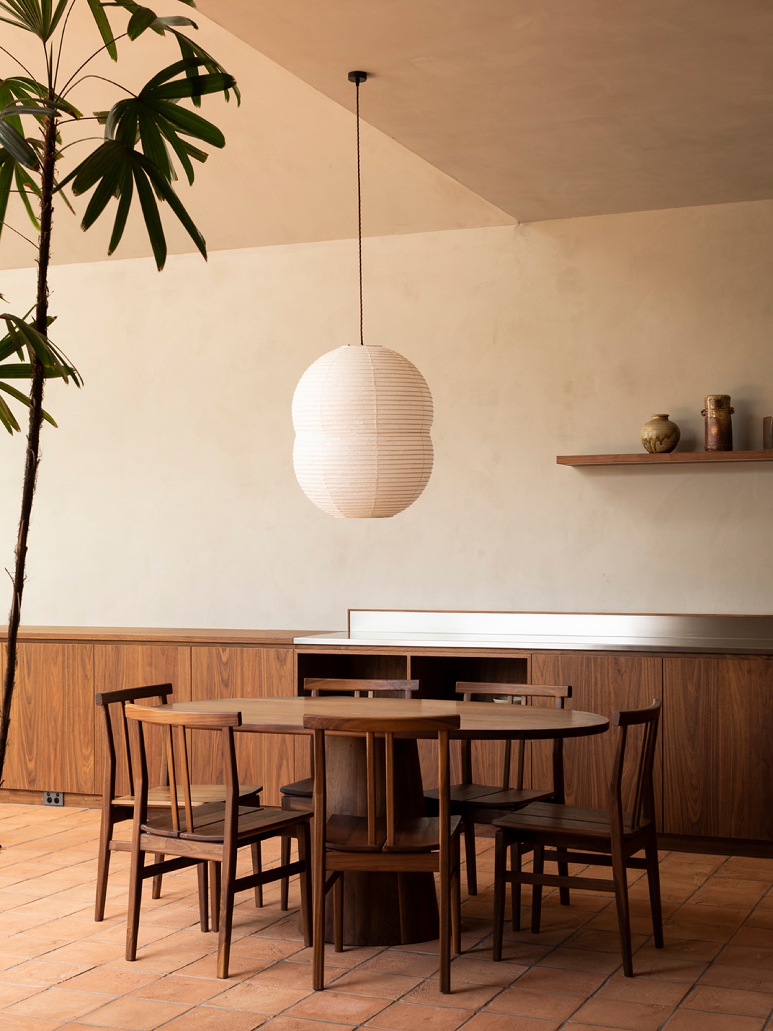
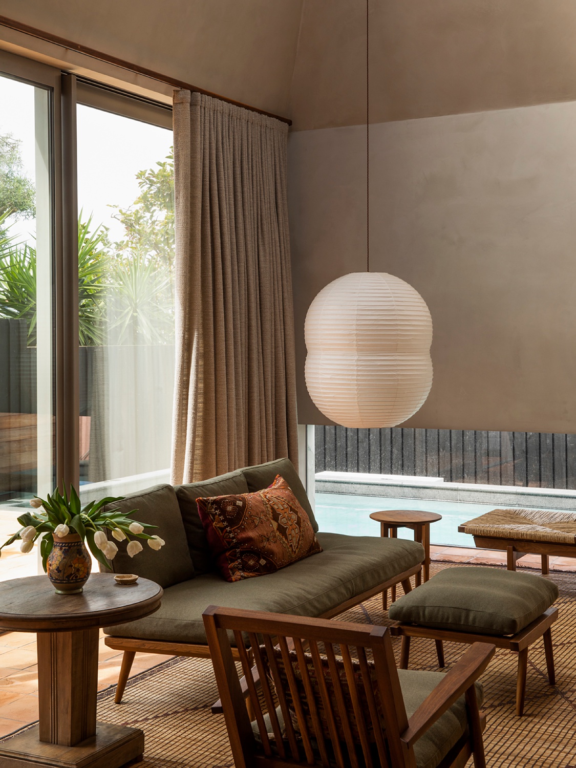
“The project is, essentially, an addition to an existing Edwardian Villa in the Auckland suburb of Ponsonby by architect Jack McKinney with interiors by Katie Lockhart. The addition is a small, pared back yet voluminous pavilion that sits at the back of the original house. For me, it felt like a singular sculptural piece of architecture and an exercise in space, form, and light. All incredibly alluring ideas for a photographer. The materials are stripped back; plaster walls, terracotta tiles and bespoke wooden cabinetry and furniture. The clients had recently visited Sri Lanka so there is definitely a nod towards Geoffery Bawa in there which was great. There is a softness and elegance that suffuses everything.”
“In an ideal world we always want a good amount of time to shoot projects; to move around, work things over, watch the light etc. But these are not ideal times. This project was shot in mid March and we could sense lockdown coming. Not knowing what the future would hold, interior designer Katie Lockhart decided we should get it shot. We shot on a Friday. A few days later New Zealand entered stage four lockdown.”
“In total I think I only spent a couple of hours in the house, and as is often the case in Auckland, the weather was sketchy; raining one minute, strong sun the next. I think I was lucky to get what I did in this shoot. I’m happy with the images I made but frustratingly I know there are better pictures to be found here. My process is slow and I often repeat myself over the course of a shoot, it’s sort of a relentless prodding of what I think might be a good picture, a constant refinement of an idea. Sometimes there just isn’t enough time.”
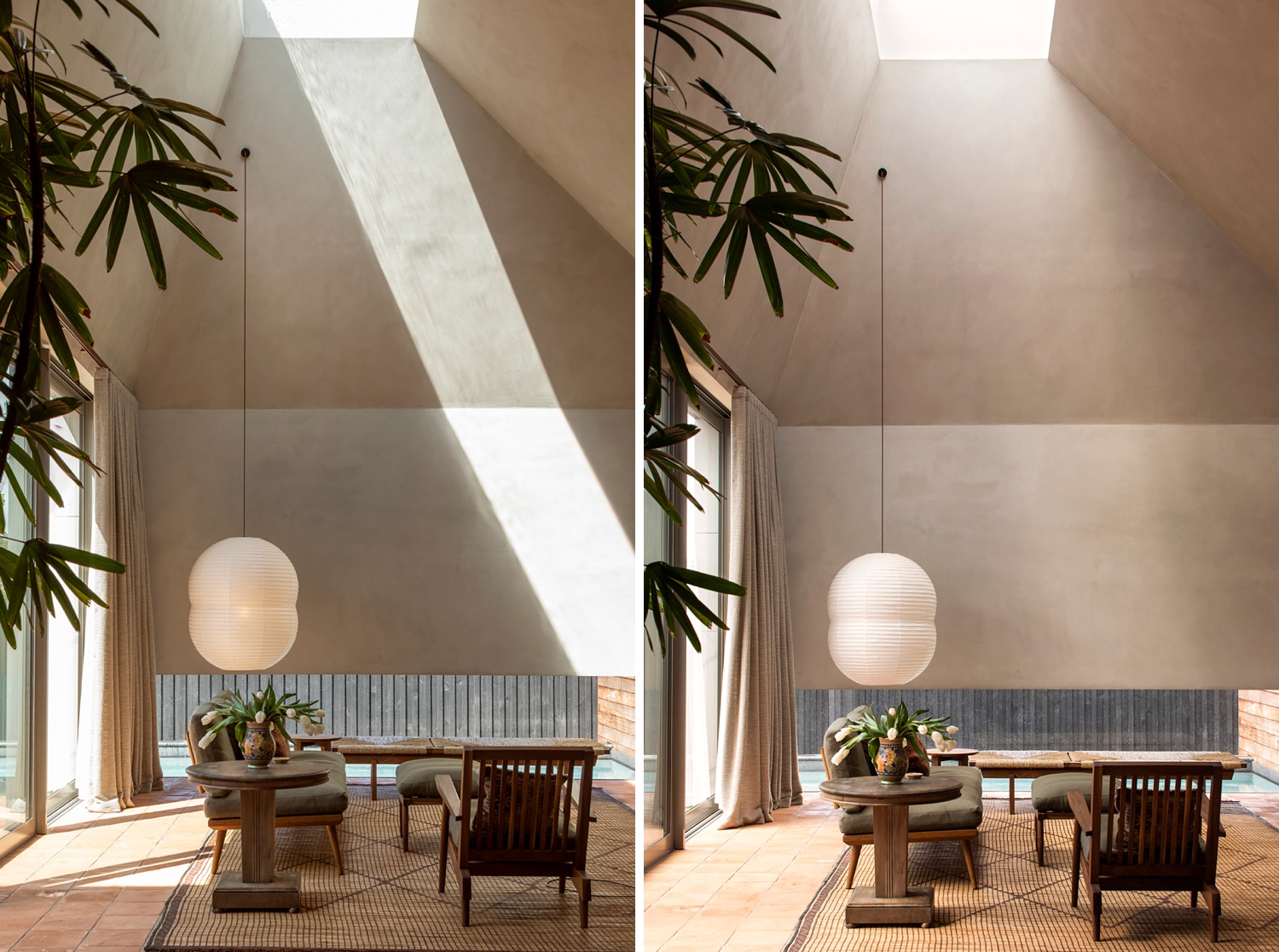
The product of that sketchy weather though, is a gorgeous differing quality of light that shows the functionality of the windows and skylites in the home’s design, and the way that the light interacts with the interior across different weather conditions.
I personally am a huge fan of hard, angular light — the kind you see in the frame on the left. I love the way it tractor beams down into the scene, giving our eyes a pathway to travel down. The linear shape of the highlight heightens the other sharp lines and rectangular features of the room. This side-by-side set of images perfectly shows the difference that light makes though. On the right, a gorgeous gradient of light sweeps down into the room. The softness is divine. Now we are paying attention to other qualities of the space, like the texture on the walls, the interior design elements, furniture, and styling. Both have their place, and both are wonderful in this instance. David, I’m so happy the weather was giving you a fit!
“As impressive as the project is, there is a quiet simplicity to it. It’s not trying to overwhelm, rather it allows those qualities; light, volume and interior materials, to form a harmonious whole. Like any project I think we’re trying to honestly capture those essential qualities of the space and not get in the way of the pictures.”
“I’m not an overly technical photographer, for me it is more important to capture an emotional sense of a building, to try and convey what the building feels like rather than just what it looks like.”
David is masterful at embedding mood into his photographs. There is a realism and lack of over-processing that some architectural photographs carry today. The balance in exposure feels proper and true. There is a healthy mix of shadows and highlights that gives depth and dimension to each image. We can pick up on the textures and patterns and other subtleties that teleport us right into this space.
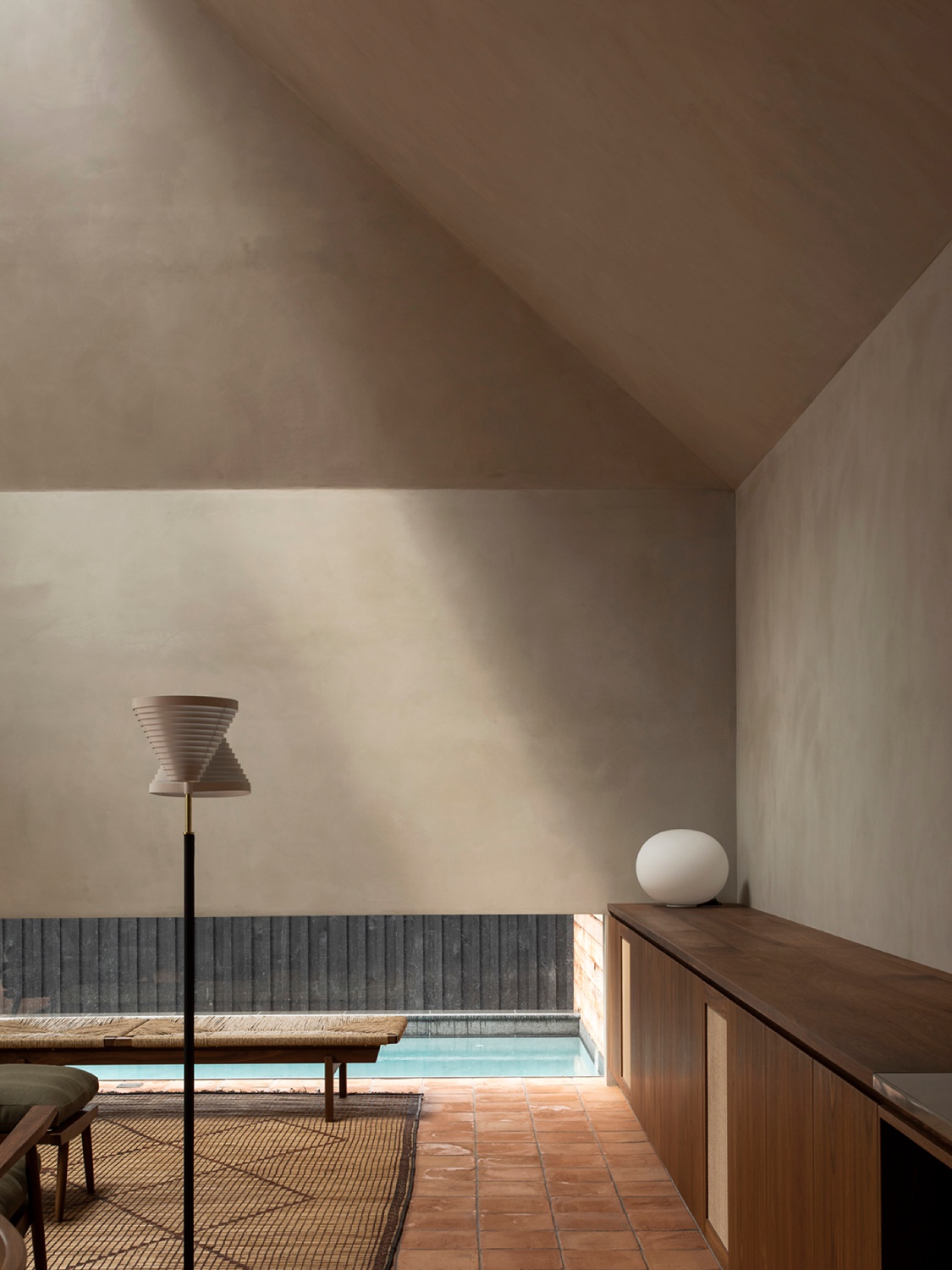
“The image that I like best in that regard is the image of the light falling across the back wall. There are only a few elements in the image, but to me it invites the viewer to look and think about what’s outside the frame. The image feels true to the architecture. You can almost feel the light on the plaster wall. It’s a subtle, soft light too, not overpowering. Good architecture should involve all the senses, I think this one does it perfectly.”
A big Thank You to David Straight for sharing his images and insight with us! David’s work is incredibly wonderful, so hop on over to his website davidstraight.net, or to his Instagram @david_._straight
If you have a project you’d like to be considered for Project of the Week, you can submit it here.