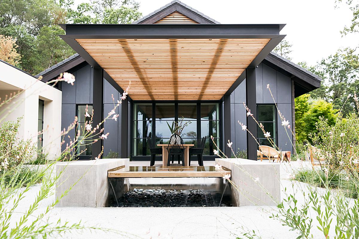
A Visual Wine Tasting in Napa With Photographer Aubrie Pick
Today’s featured project takes us to dreamy St Helena, California where photographer Aubrie Pick will be showing us a beautiful Napa gem — Sinegal Winery.
Aubrie is a real photographic tour de force, and a quick scroll down her site will showcase her flexibility and prowess at her craft. This particular project is a bit less punchy than her advertising and portraiture work, but that departure is what showcases her discretion. The Sinegal Winery project has such a peaceful, tranquil air about it, while still coming across as dynamic and moody. You’ll see what I mean! Let’s check it out!
Aubrie shares “Sinegal is a new winery on a historic estate in Napa Valley. Sinegal’s ownership worked on building out the new winery with interior designer Katie Martinez and Signum Architecture, who brought me on board to photograph the public spaces once the project was complete. I’d worked with Katie before and had a good sense of her aesthetic – well-considered, laid-back, bold and contemporary – and I aimed to let that come through in the photography.”
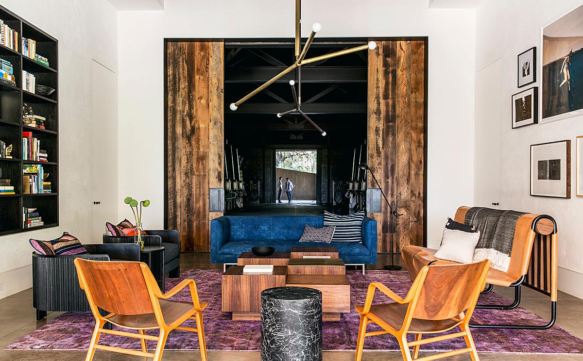
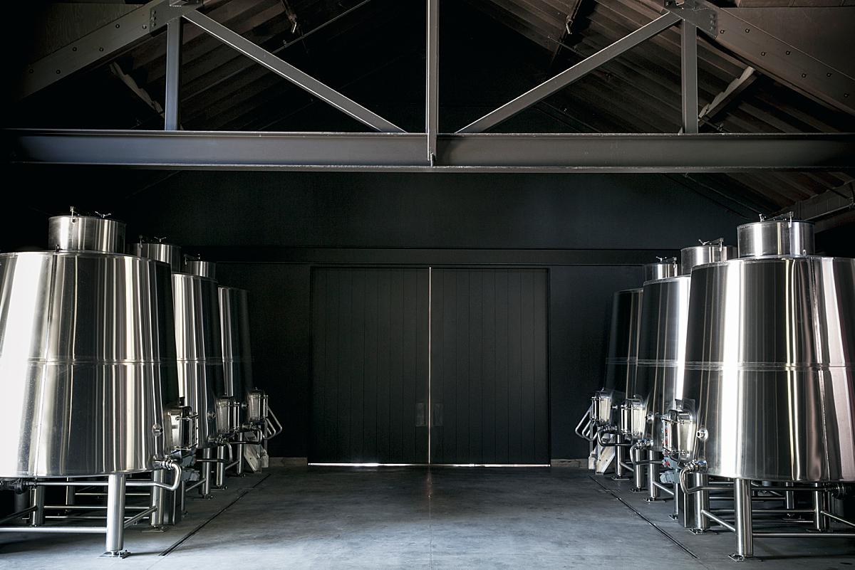
She creates a gorgeous series of layers in this next image which carries our eyes throughout the space. We are able to note the dual faceted purpose of the winery — for relaxing and tasting, and for production — in this photograph where we can see the sitting area, the vat room, and out to the vineyard itself. I love the inclusion of the figures standing just outside. They pull our attention to the middle of the frame, and also add a sense of scale and life here.
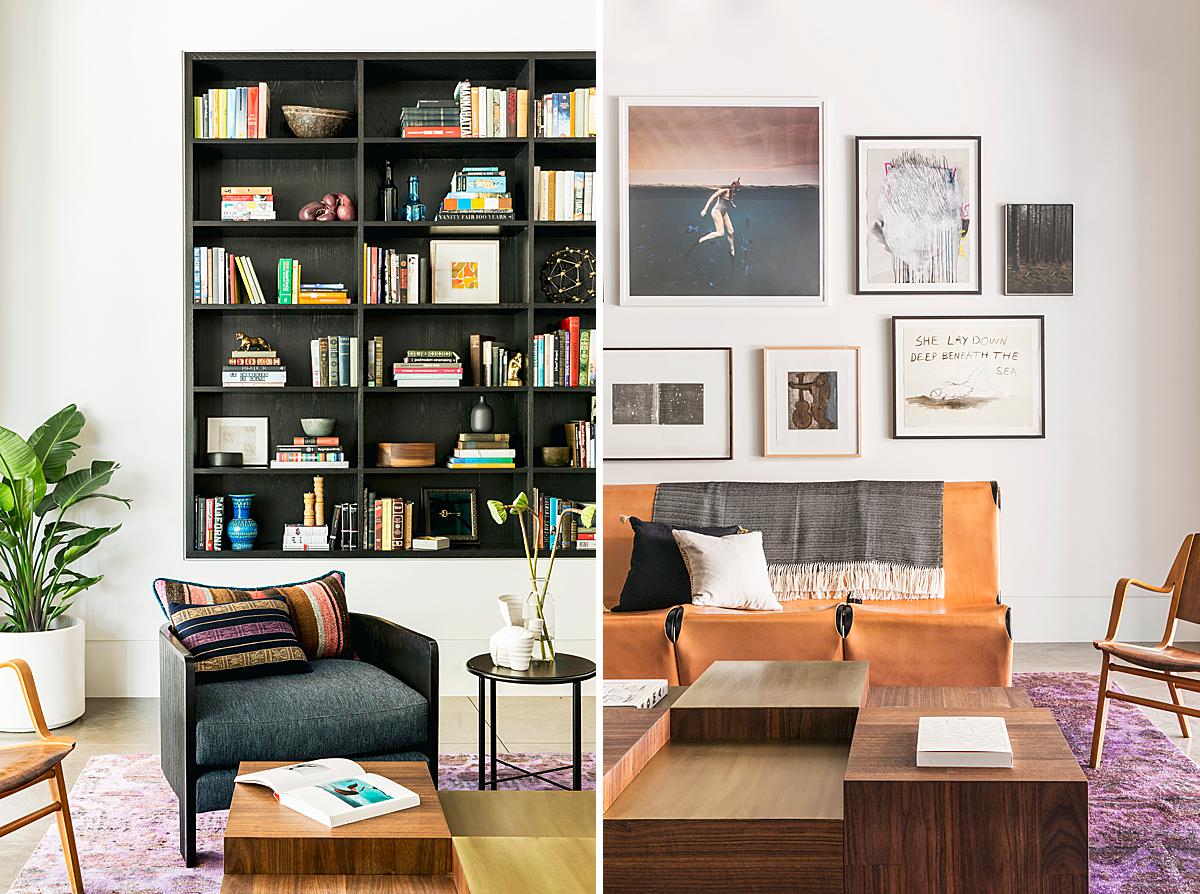
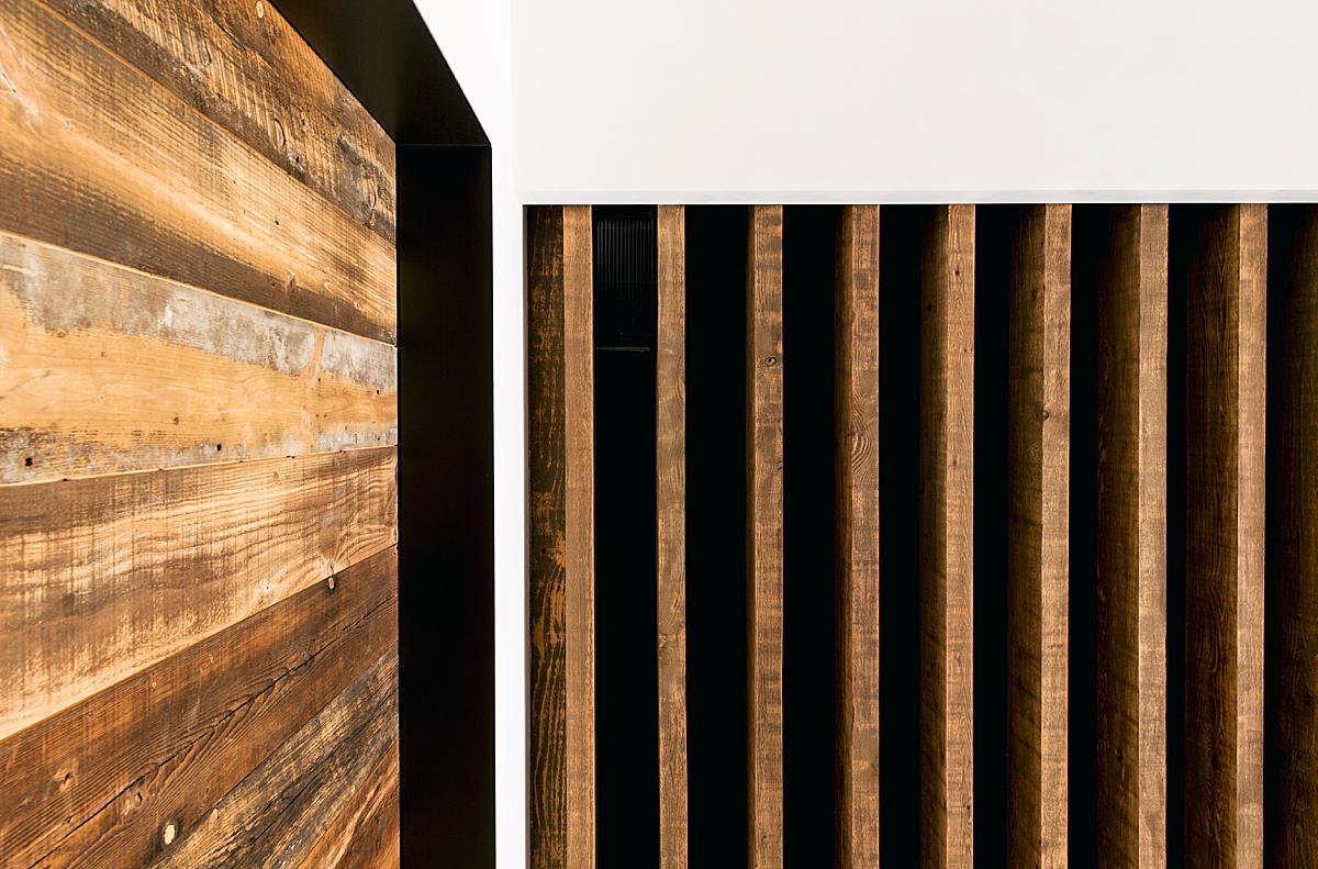
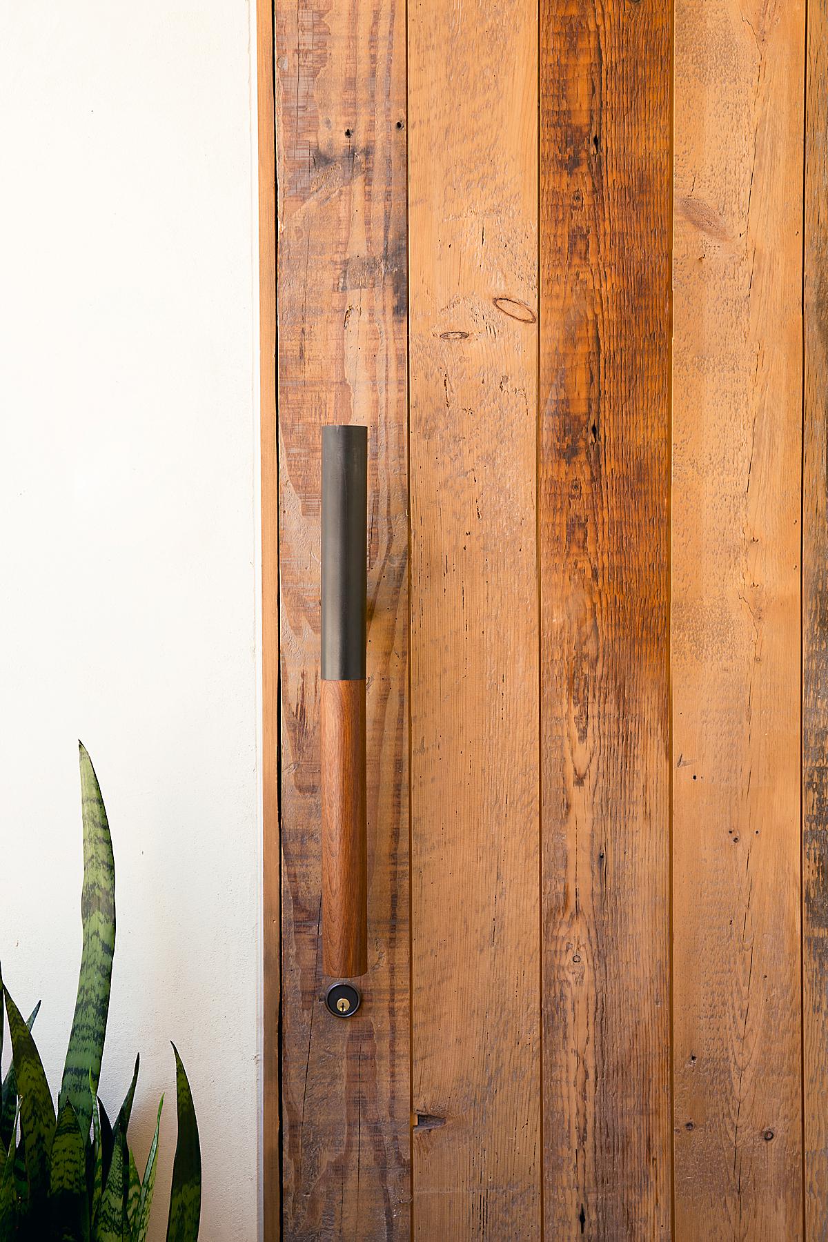
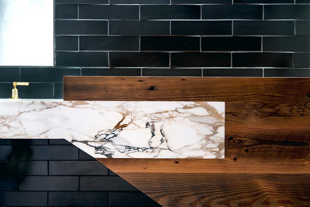
Aubrie includes a series of abstract vignettes that help translate the thoughtful textures and color palette found throughout the winery. These help flesh out the project and give us a better sense of place.
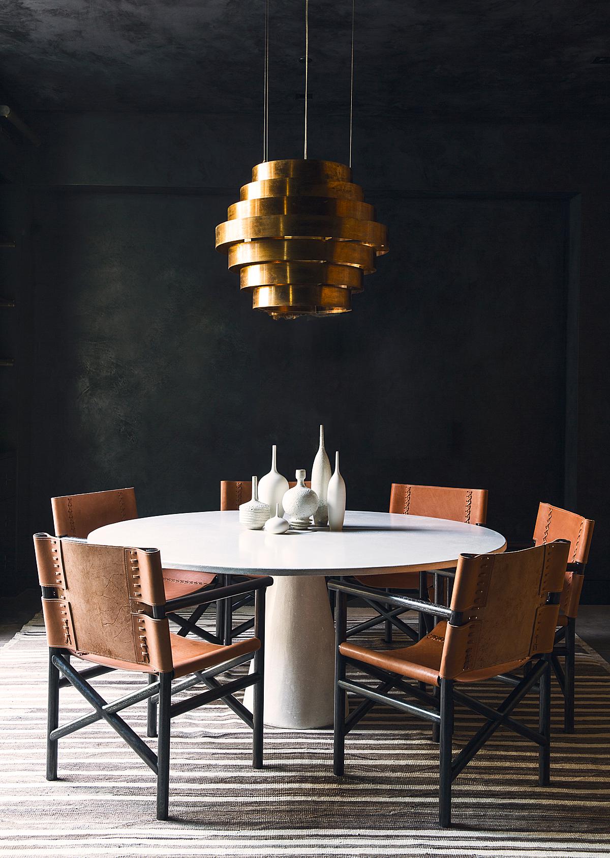
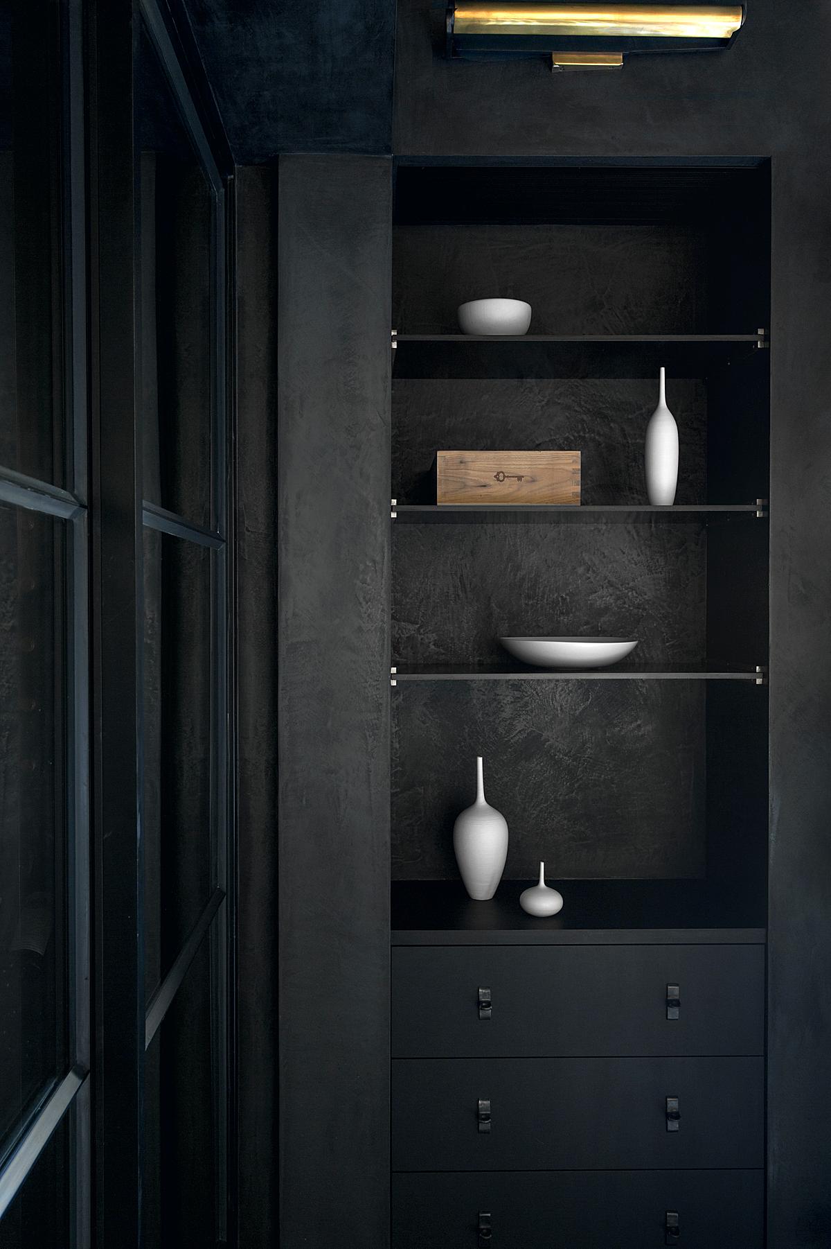
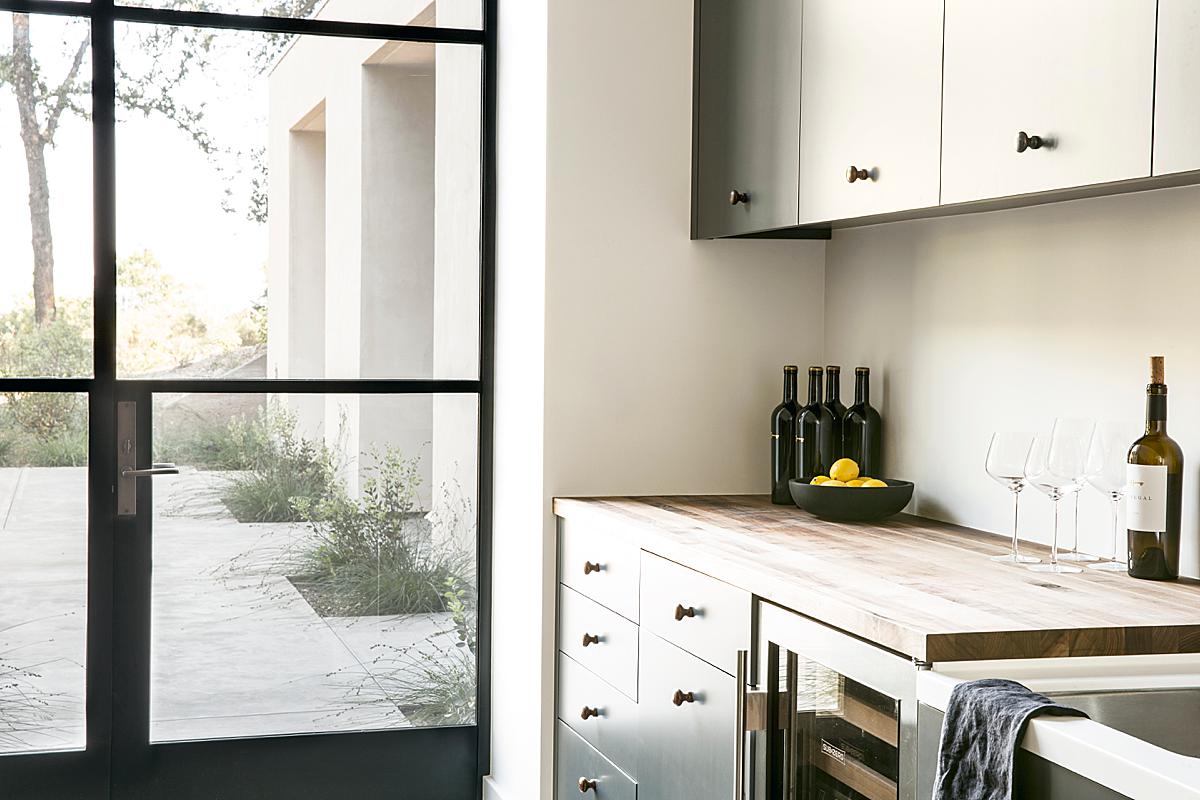
Directional lighting in these next two frames creates long sweeping shadows and beautiful gradients across the objects in these rooms. This lends itself to photographs with a painterly feel about them, making them appear as rich still life scenes.
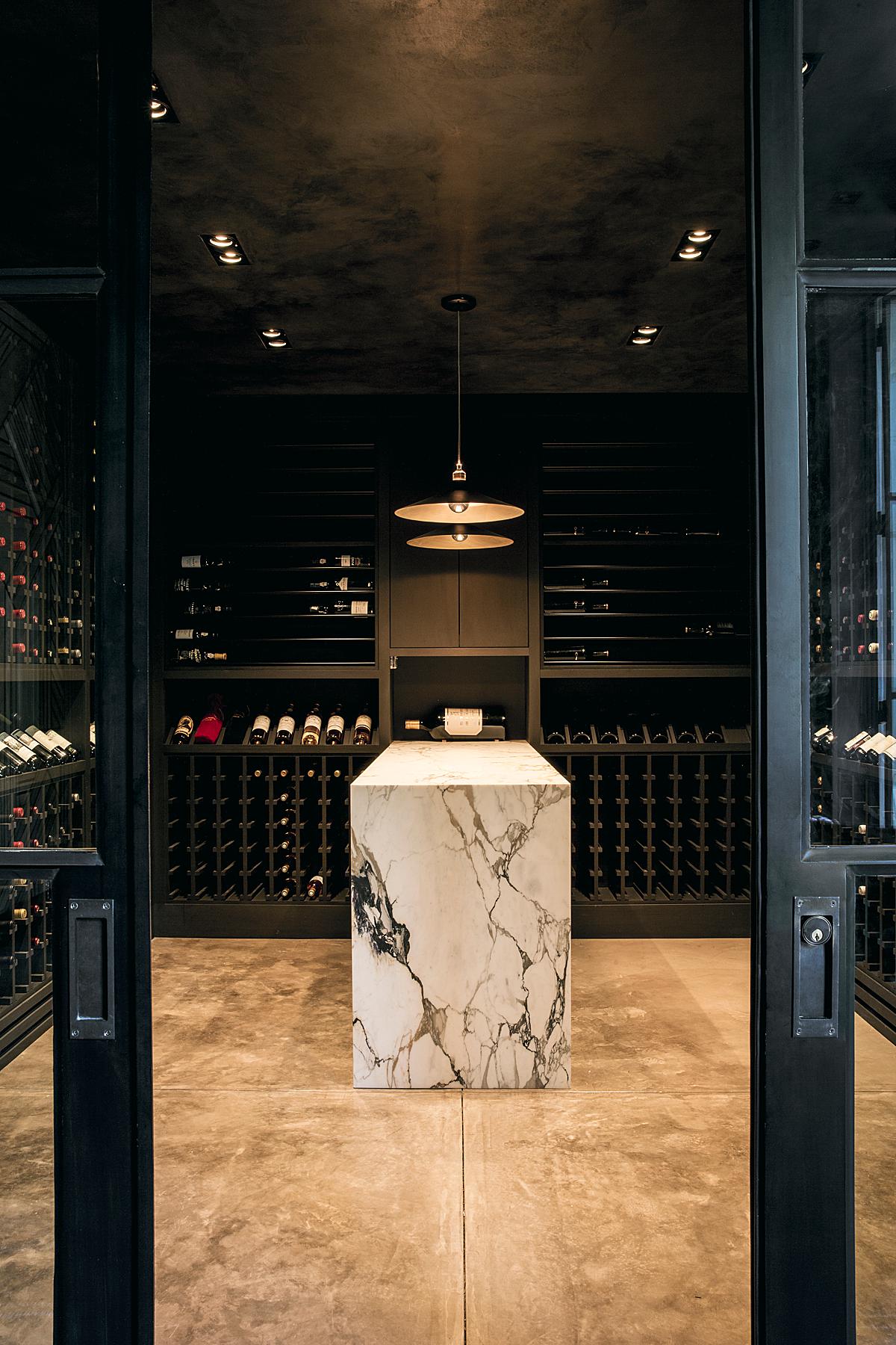
Aubrie and I both agree that this image is our favorite. She says “It’s just such a vibe and really sums up the attitude of the space.”
“This project was really a dream to photograph. There is a simplicity and drama to the design that made for really great moments and vignettes. I’m always considering how light moves through a space and want to give a sense of what it’s really like being in the space, in that light. I loved the use of rich charcoal blacks and warm woods in the design, how they add such depth but don’t make the spaces feel dark. I wanted to convey that contrast, and in doing that, highlight the texture and nuance in the materials,” shares Aubrie.
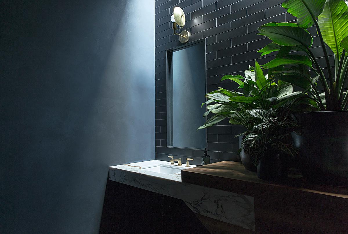
I adore this stream of light pouring in from a source just out of frame. That, paired with the deep contrast and dark tones in this scene creates a sense of intrigue. The illumination of this sink draws our attention right in and then is allowed to linger outwards as we scan the image.
Aubrie notes that her biggest challenge on this project was “making sure that the interiors — both white and black — hung together with the exteriors to make a coherent set of images.” I think she knocked it out of the park. This whole series has a sense of tranquil cohesion that translates how it’s all the same place, taken at the same time.
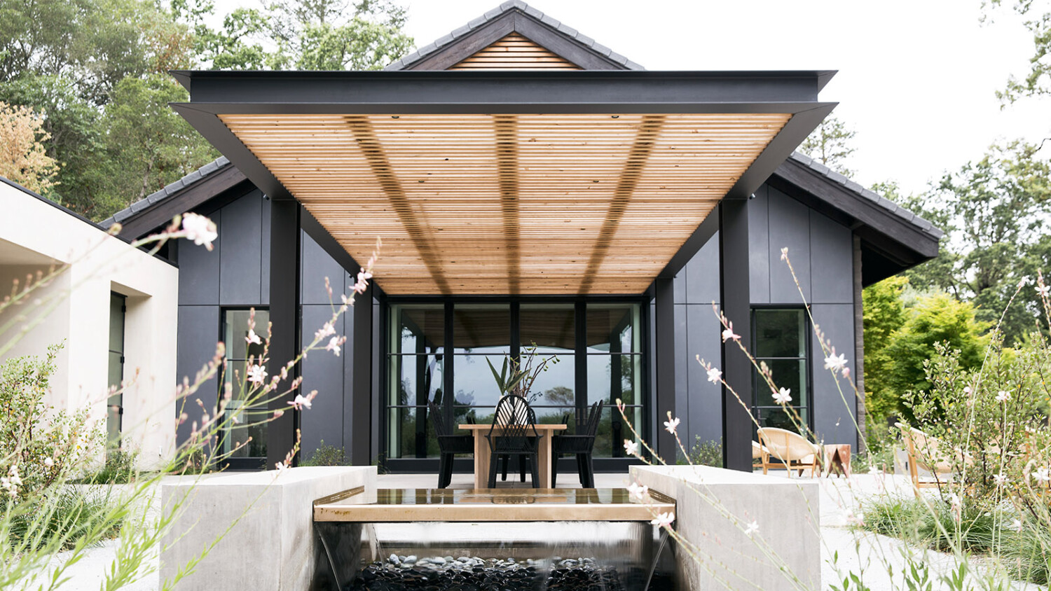
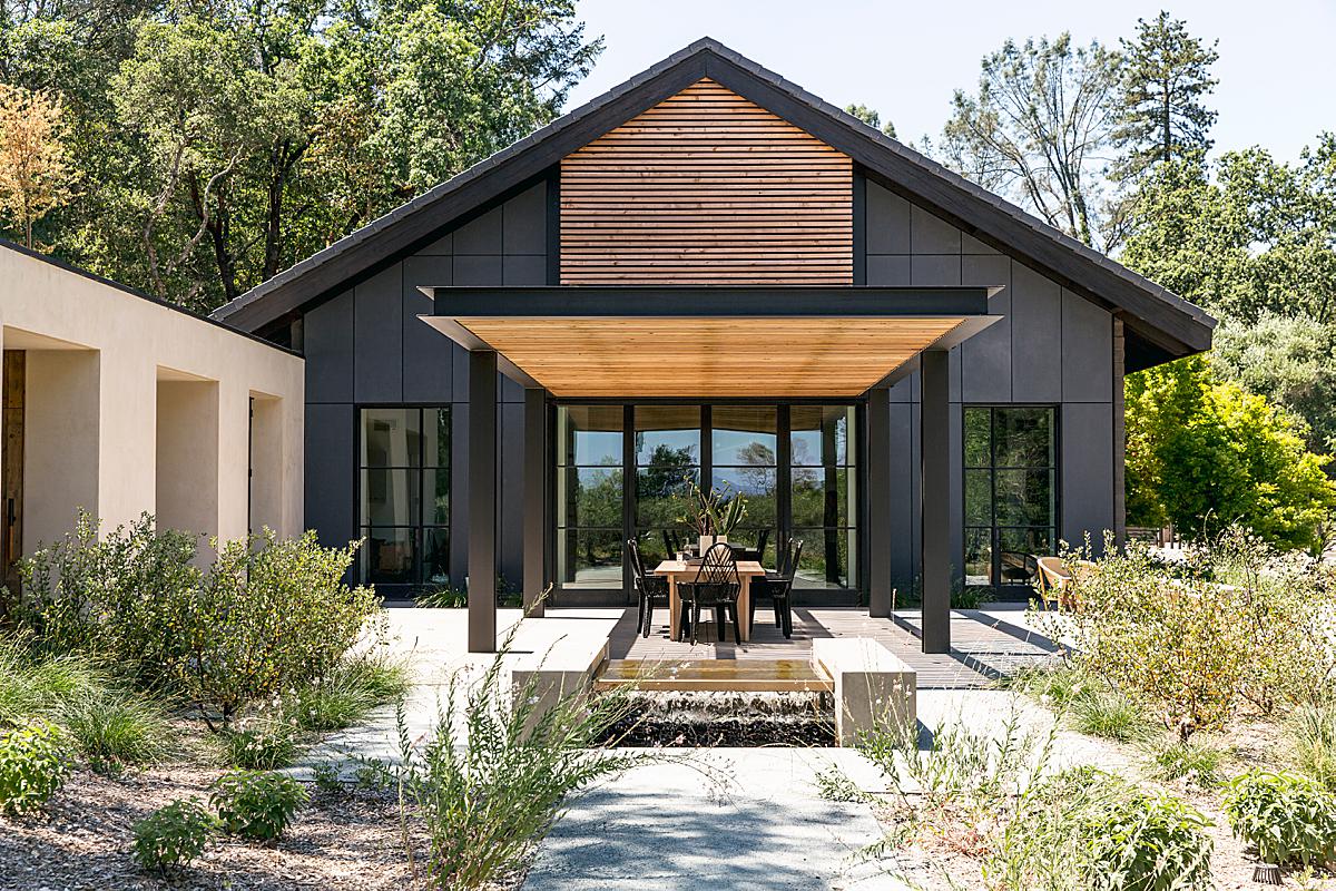
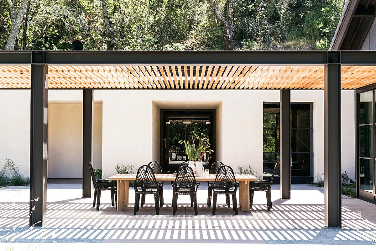
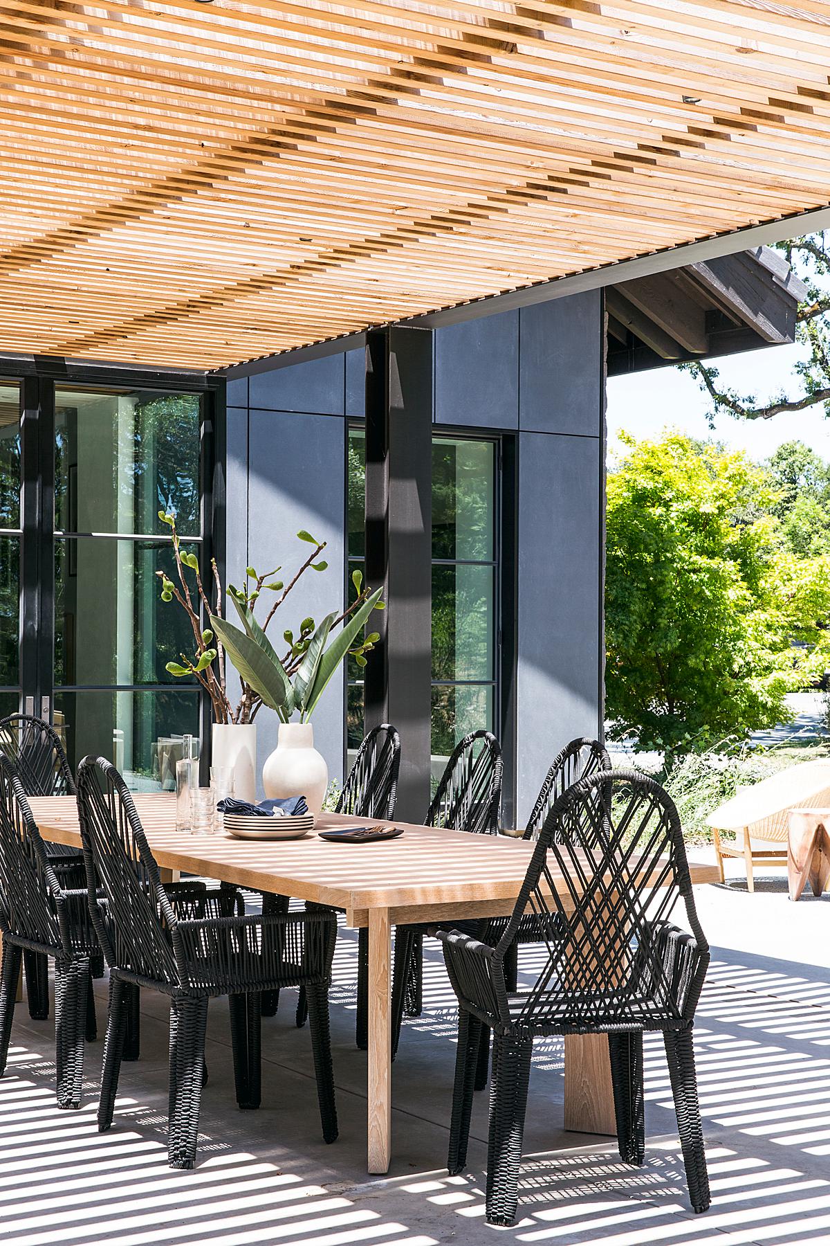
Back outside we revisit the patio area. Aubrie creates a lovely composition chock full of leading lines that craft a sense of repetition and movement in this scene.
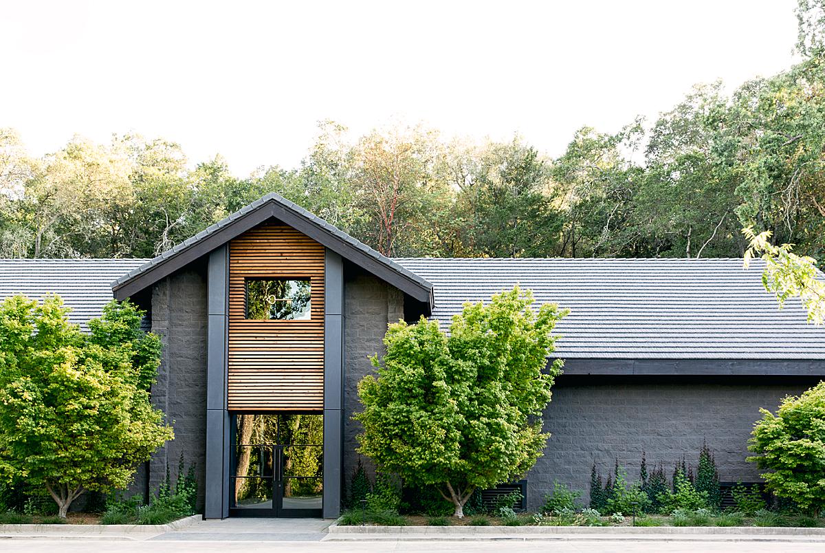
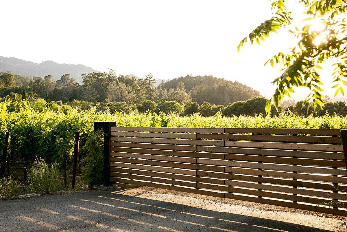
Here Aubrie gives us the context of the winery. We are able to see the sprawling vineyard and I love the way the sun streams in through the leaves of the tree and casts long defined shadows of the gate. It gives us a good sense of place and transports us to the scene.
In regards to post-processing, she shares, “I work hard on location to make sure that I’m getting as much in camera as possible so as to minimize post-processing, especially with interiors. I shoot tethered to capture one, and generally apply a smidge of contrast and clarity to images as they come in from the camera. I bracket in case I need more information in my shadows or highlights, but try to keep compositing to a minimum whenever possible. I’m also dogged about making sure that my lines are straight when photographing interiors and architecture; I throw vertical and horizontal guides on the screen when I’m framing shots to make sure there are no swings or tilts happening that will end up distorting architectural details.” And there you have it folks!
A massive thanks to Aubrie for sharing these images and experiences with us. Hop over to her site aubriepick.com as well as @aubriepick on Instagram to see more of her gorgeous work. Thanks Aubrie!
If you have a project you’d like to be considered for Project of the Week, you can submit it here.
