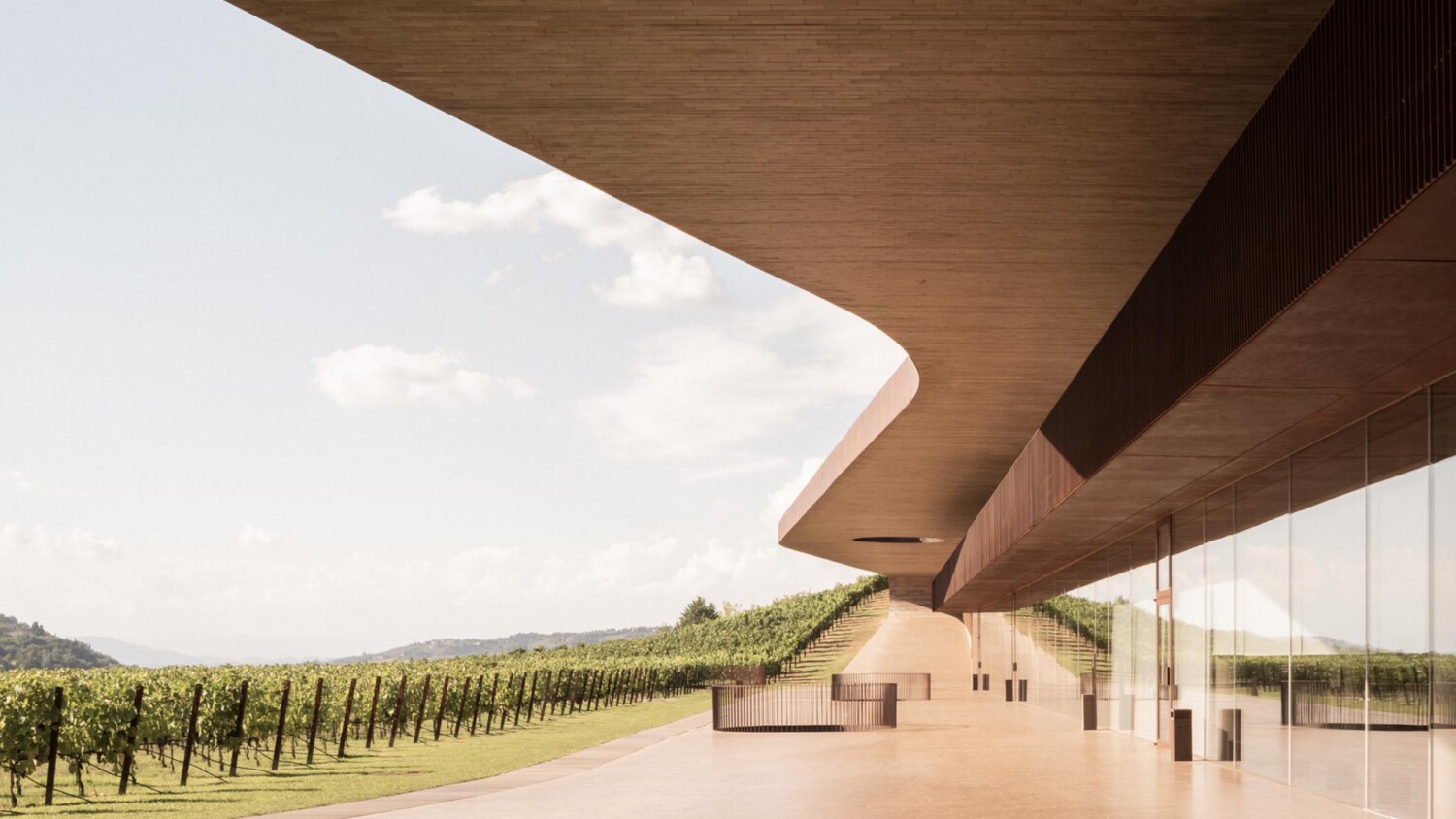
Lorenzo Zandri Takes a Distilled and Sublime Approach to Photographing the Antinori Winery
A week or so ago here on APA, I gushed about the Unsent Postcard project which was cofounded by architect-turned-photographer Lorenzo Zandri. Not only is that project (and Lorenzo’s other very cool personal projects) wonderful, but his architectural photography is just out of this world. In my humble opinion, it is so different from the majority of the work I see today. This project, Cantina Antinori by Archea Associati that Lorenzo photographed, is an exceptional beauty. Lorenzo’s unfussy and anti-technical approach lends itself perfectly to the essence of good architectural photography. That’s why here, you’ll find very dynamic images steeped in good light, showing off good form, and giving a good sense of place.
Lorenzo introduces us to the series by explaining “I visited the Antinori Winery last summer on a sunny afternoon. I have perceived this continuous shape following the hills’ shapes while I was passing by the highway, so I decided to stop. I have felt in love with those curvy and winding forms at the first sight. Those hours I spent there have been — for me — a deep moment to catch this warm light, trying to embody this shifting sensation between nature and architecture.”
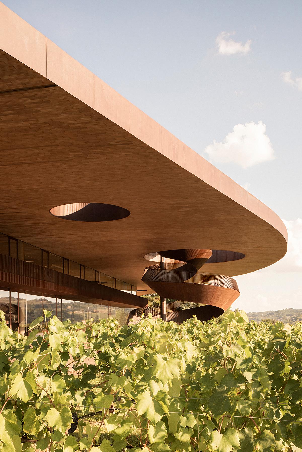
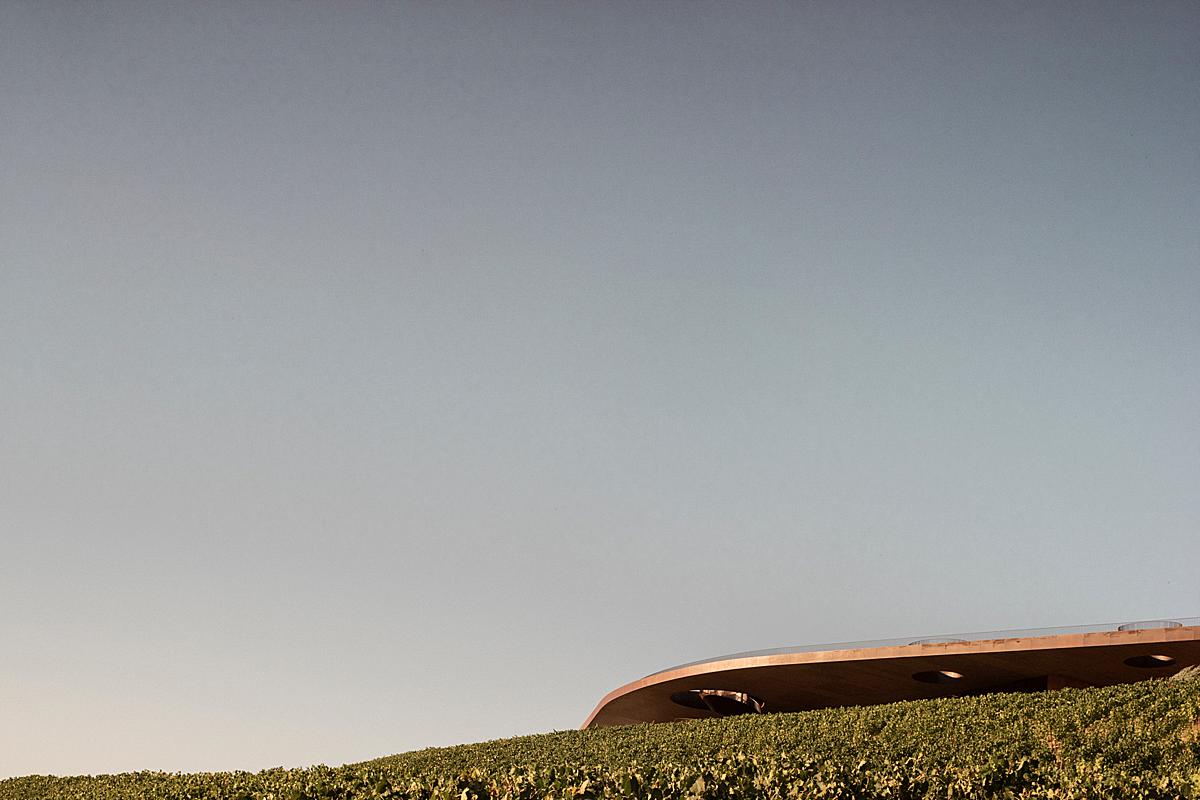
I asked Lorenzo what he looked for when composing his images. He relays, “I decided to look at the place from the context to the detail, but I always [seek] out what was the privileged point on the subject. For example, one of these images is actually taken from the grapevine hills, immersing me in the green field.”
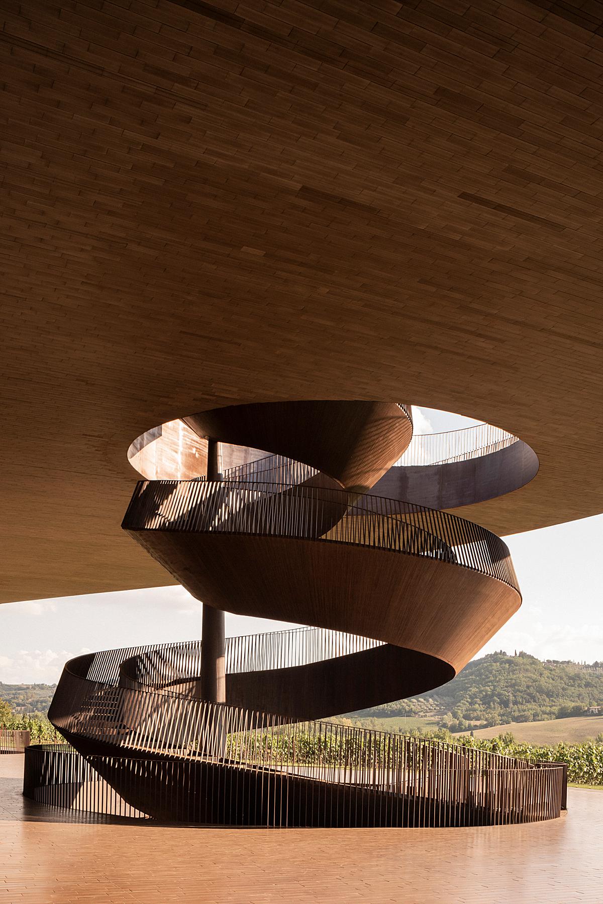
I just love this scene and the sense of scale it gives. With the sprawling grapevines in the foreground and the massive roofline and grand staircase jutting out into the vast sky, this image feels colossal and exciting and makes me want to know more about the Antinori winery!
“The hardest challenge [with this project] was to find a key to the narration” Lorenzo explains. “I spent a bit of the time understanding the role of the architecture in relation to nature, or which were the topics of the project. In some of these moments, I tried to look at these focal points with rigor accuracy; in other ones, I have just embraced the sense of dynamism and loss.”
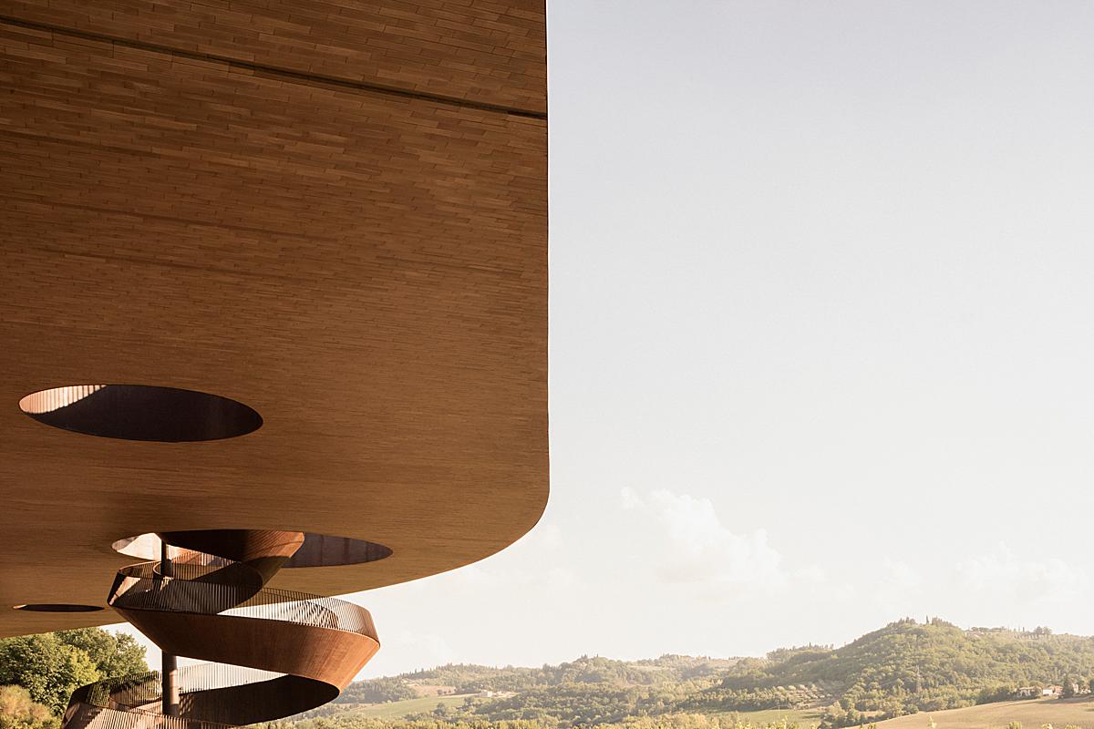
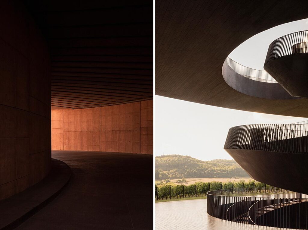
Look at the gorgeous way the gradient of light wraps up the spiral of the staircase. It creates depth and dimensionality while pulling our eyes through the scene and into the curvature of the structure. There is such a sublime air about this photograph — and really this series as a whole.
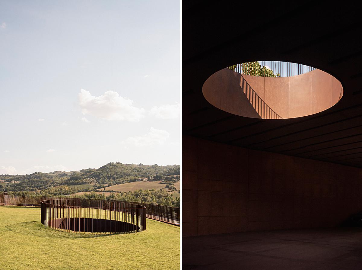
Here we get a look at what Lorenzo was saying when he described embracing the “sense of dynamism and loss,” especially in the image on the right. There’s a lot of contrast and dynamic range here and that’s what makes it special. Letting the shadows fall dark in this series brings drama and mystery and it works very well throughout this dreamlike space.
“I am not obsessed with the post-processing phase of the process. I just try to recall what I have felt during the photo-shooting through the colour correction,” Lorenzo explains. “Since I work both digital and analog for personal and commissioned series, this process I have said is given by the sensibility of the film. In that case, choosing the right film for a specific project or place is a kind of a priori process for me, but it’s interesting because it could be just processed by the film itself.”
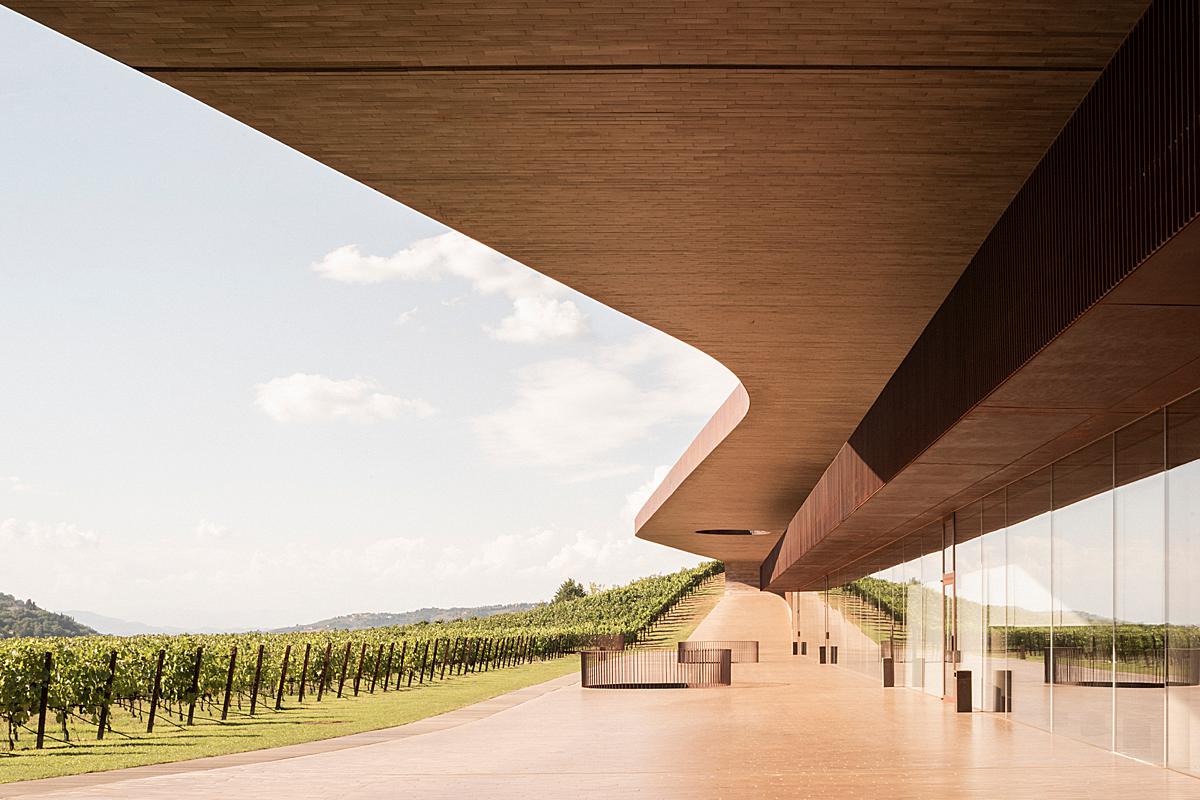
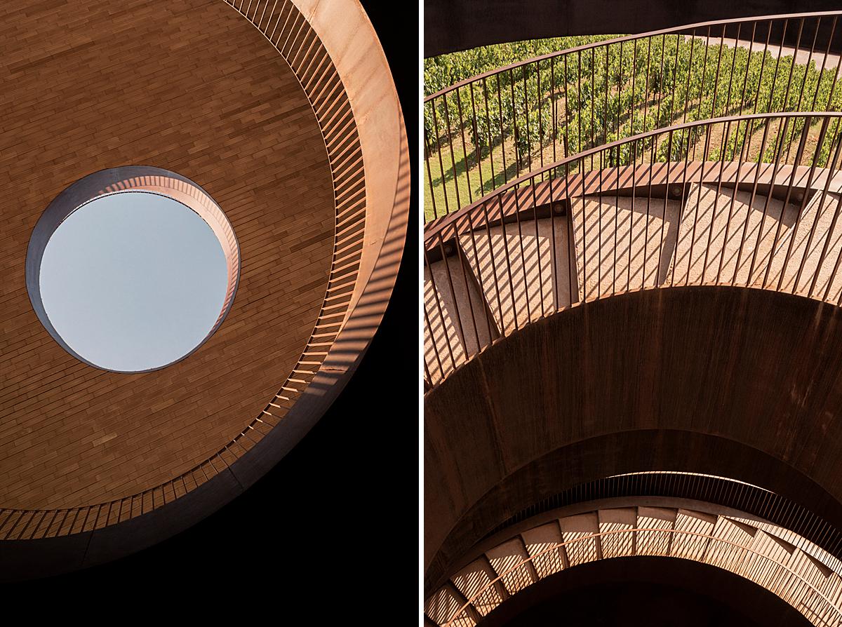
Lorenzo shares his two favorite photos with us. “My favourite images of the series are the path to the entrance and the cut-out of the staircases. I like them because they both give a sense of glimpse of the project without revealing the whole part.
Especially looking at the second one, I still can perceive the presence of the staircases going up and deep down, the sun coming from the right, see the hills…and, if you go deeper, I could even probably smell the taste of the wine!”
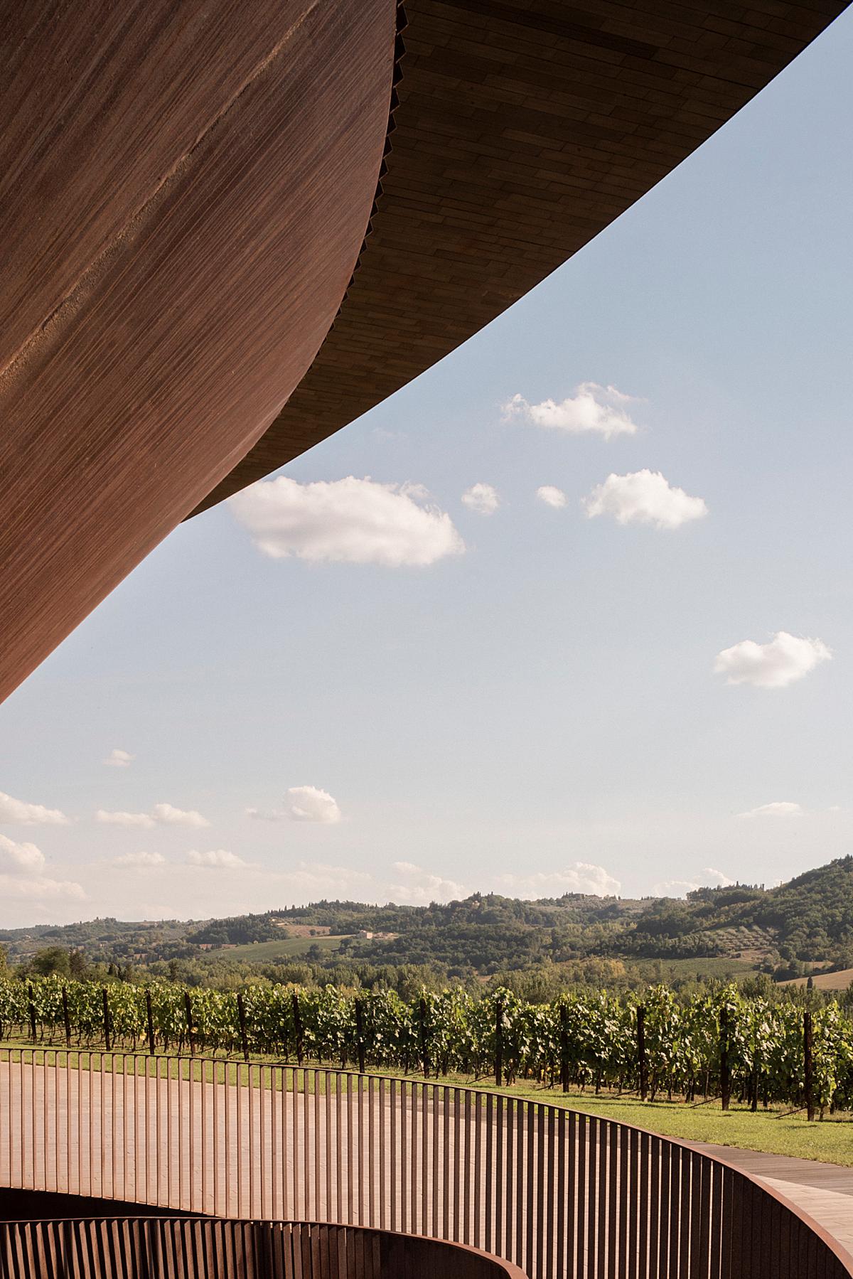
If his goal was to show the play between the architecture and its surroundings here, Lorenzo knocked it out of the park. We are able to see how the vineyard and surrounding hills look from the winery in a very graphic and beautiful manner.
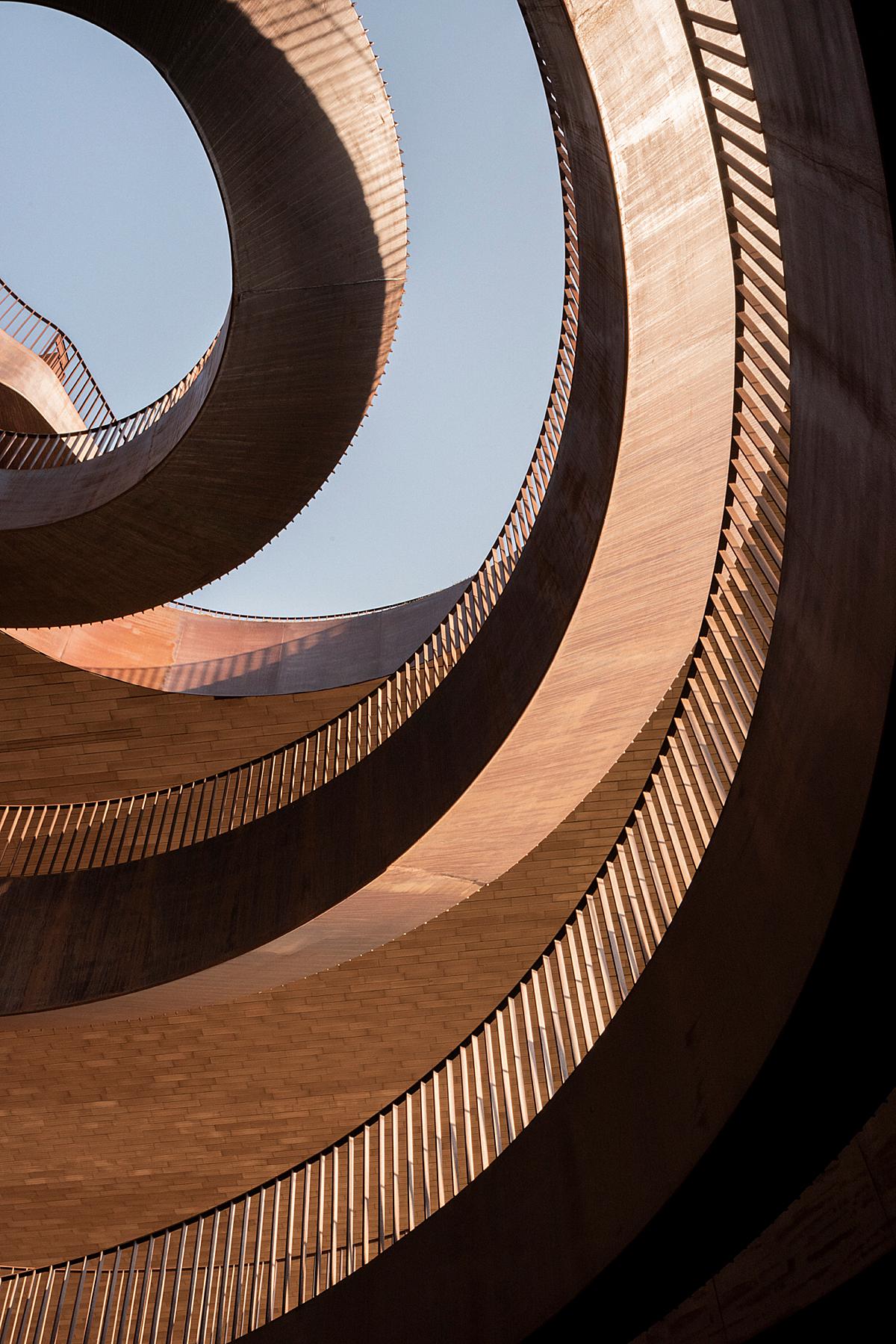
Lorenzo gives us abstract photographs of the winery as well. These showing off the artistry in the form of the building and present the nuances of its shape that may be overlooked in a busier and more encompassing composition. Note the way the curvature of the roofline echoes the shape of the grapevine covered hills.
“I love shift lenses” Lorenzo starts, “but I also am addicted to old cameras and curious accessories. By the way, I am not an ultra-tech photographer, but more a naif one. A camera is always a tool, my image is the final aim.”
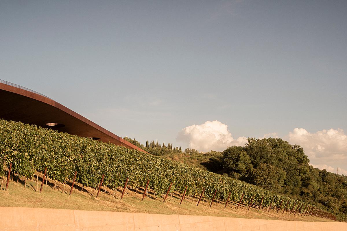
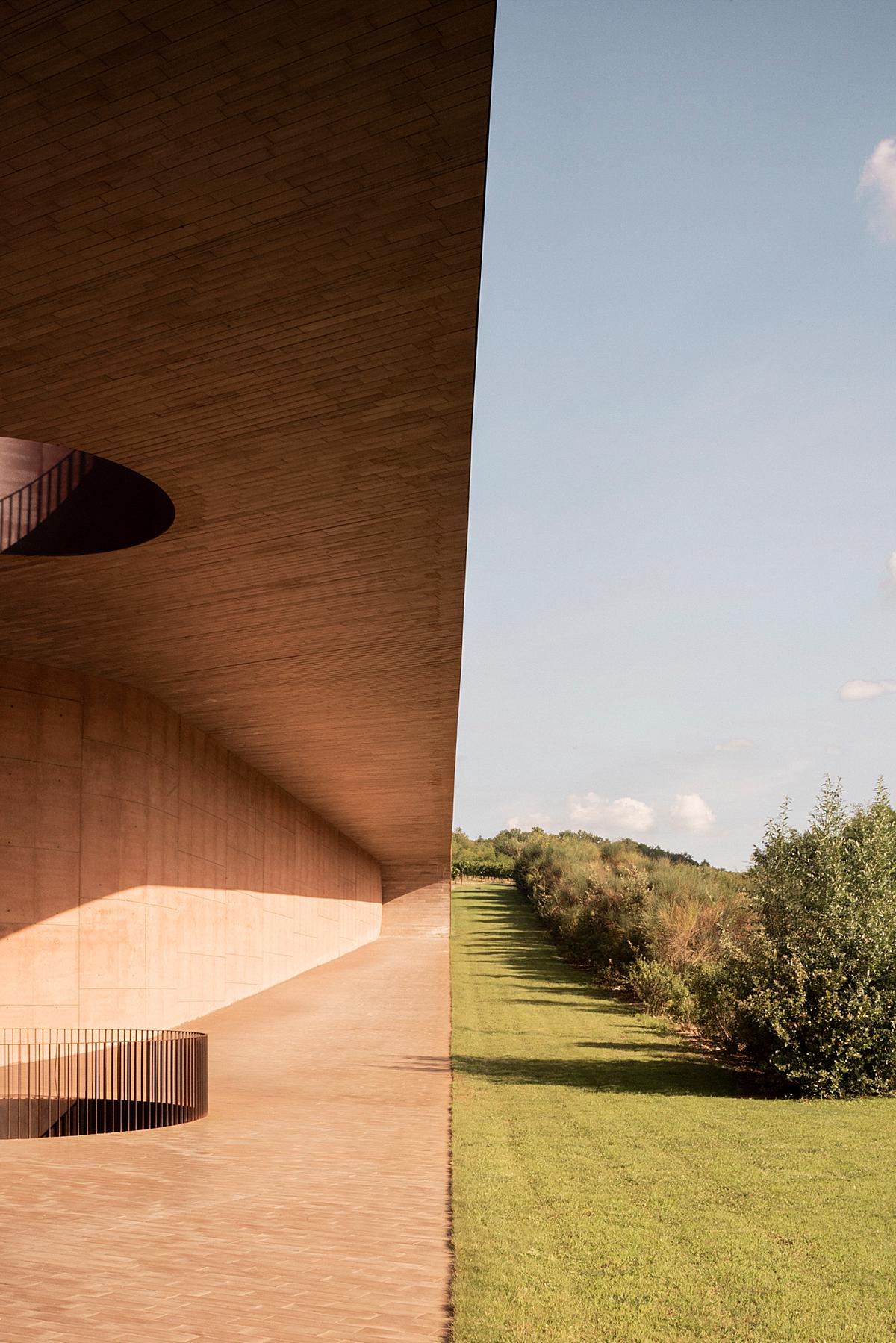
We’ll close out this Project of the Week with my personal favorite image. There are so many good things about it! I love the split screen feeling it gives off. It is a fun and graphic image. I love the subtle warmth and heat of the day it emanates. I love the color theory at play between the oranges, greens, and blues. Then there is the long shadows and sharp highlights…it is simply beautiful!
Many thanks to Lorenzo Zandri for sharing this gorgeous work with us. You can learn more about Lorenzo via his website lorenzozandri.com and by popping over to his Instagram @lorenzozandri.
If you have a project you’d like to be considered for Project of the Week, you can submit it here.
