Learn About Komorebi, The Berlin Wall, and Time Management With Photographer Josh Bustos
Today’s very cool project is by Californian architectural photographer Josh Bustos. The architecture of Canyon Canopy House itself is classic Californian – full of clerestory windows, texture, vaulted ceilings, and yet a quiet simplicity. The house is a lovely backdrop for an incredible selection of art – including bits of the Berlin Wall! Josh’s photographs are infused with a great sense of place, dreamy light, and thoughtful compositions. Let’s check it out!
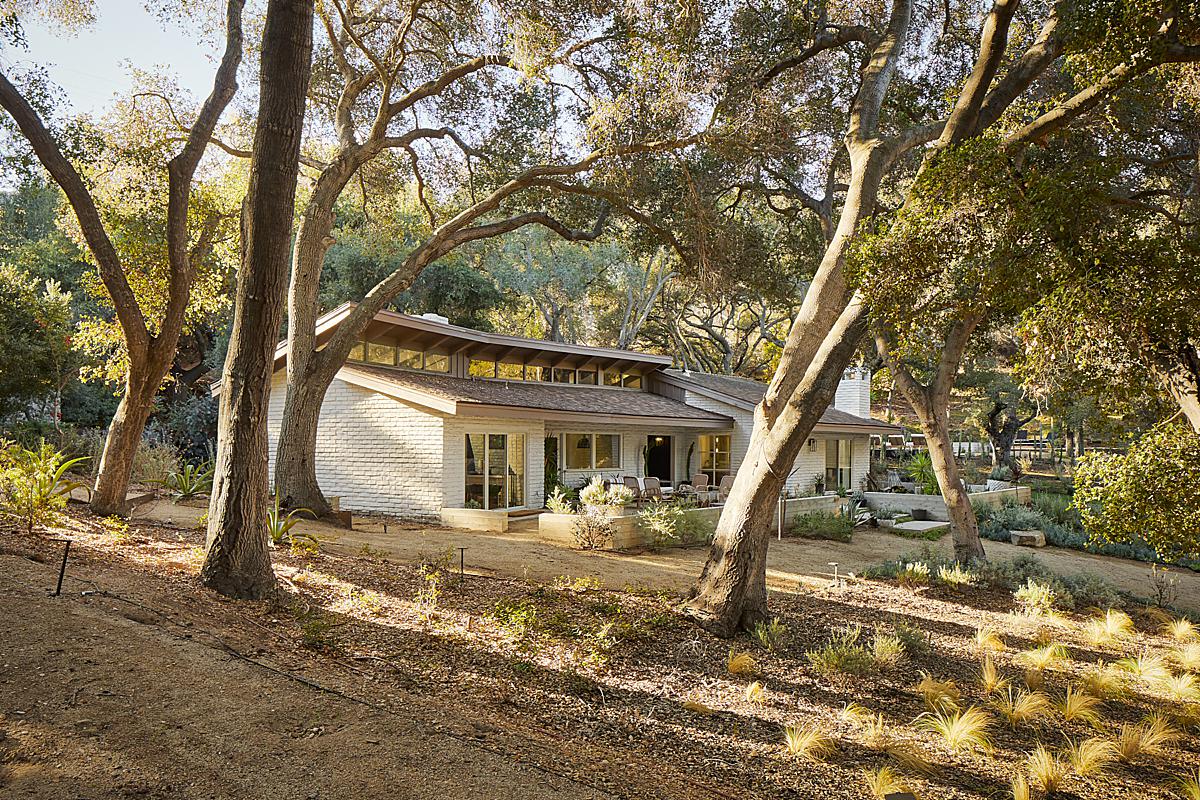
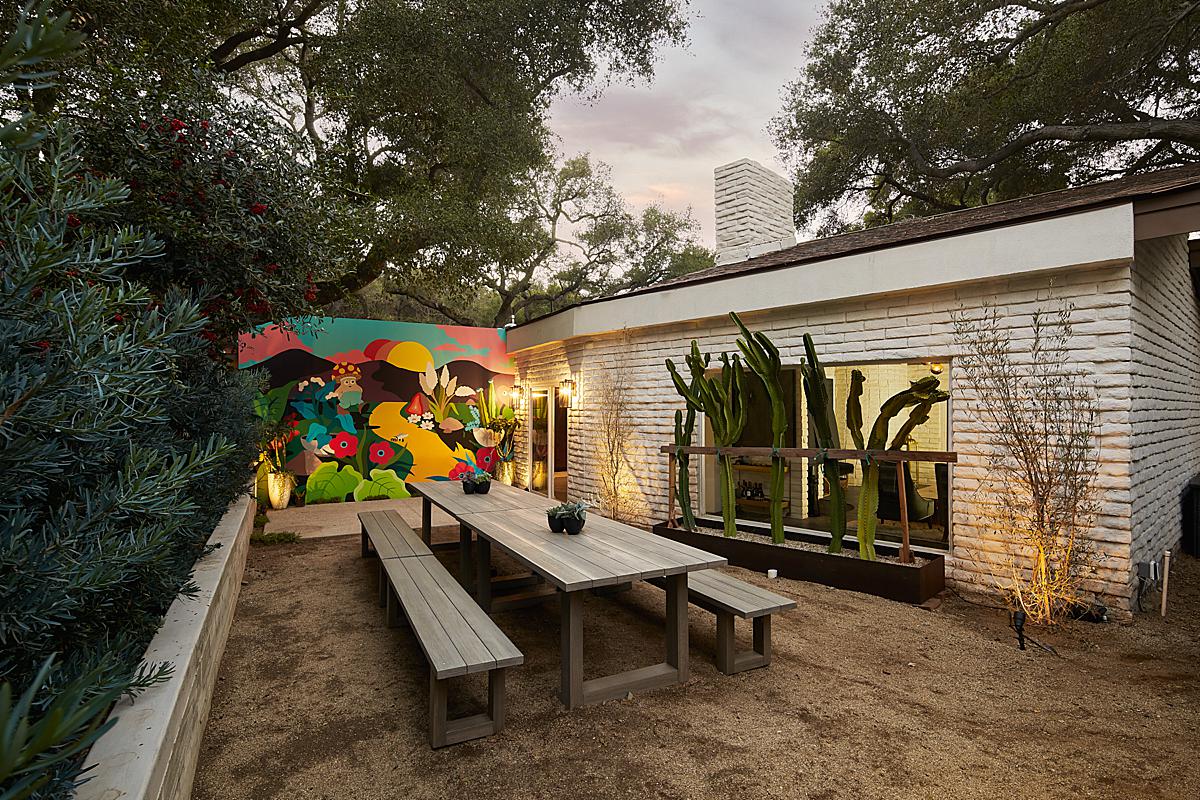
Josh introduces us to the project by sharing “I was hired by the owners and construction firm to photograph this property. Our main goal was to show the stunning location, the immense size of the property, and overall spaces. The original house was built in 1956 and the original structure and bones are still there, with extensive updates inside and out, so it was also very important to feature the incredible renovation details and art they’ve curated and had commissioned on-site by prominent LA artists.”
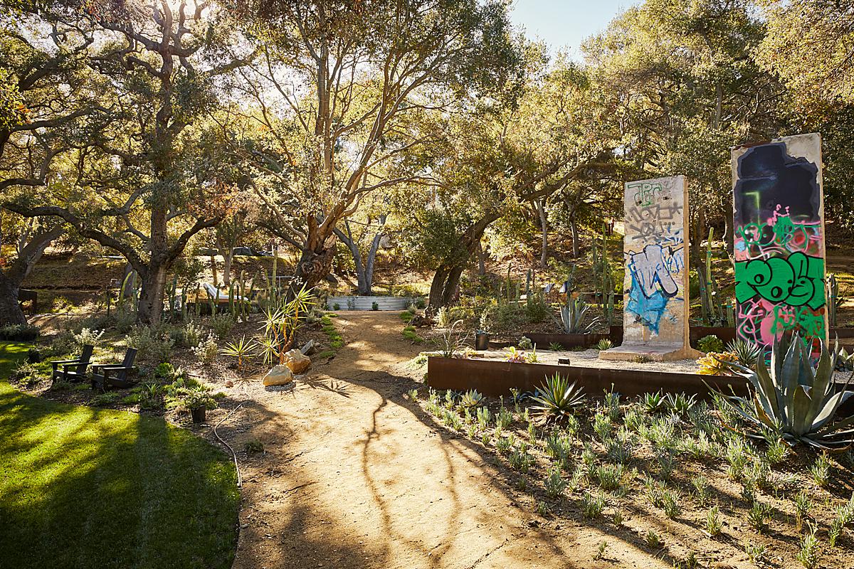
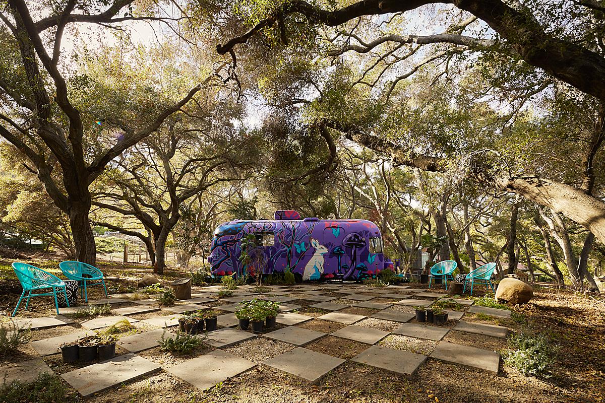
Here we get a nice look at the landscaping, the Berlin Wall, and in the distance, a stock tank pool. The golden light washing over the scene offers a sense of time and a bit of atmosphere that helps us place ourselves in the scene.
“We don’t have an English word for that beautiful sunlight streaming through the trees but the Japanese call it Komorebi. There’s your random fact for today,” says Josh.
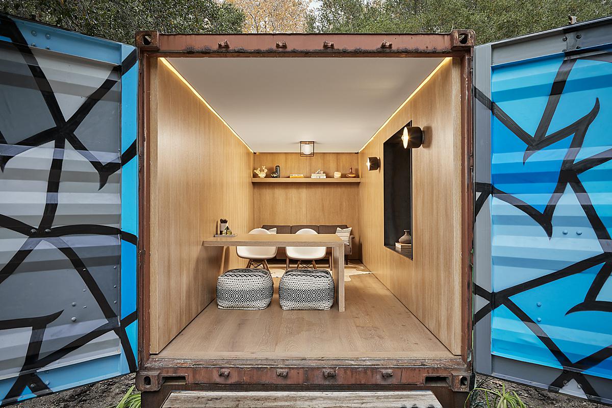
Canyon Canopy House sits on a pretty extensive piece of property and includes many outbuildings and peripheral areas, including this cargo container which doubles as an office. Pretty cool eh? Josh puts the same TLC into these smaller structures as he does into photographing the main house, which we’ll get to later!
With so many structures to photograph, I was curious to know how Josh managed his time. He was happy to explain “I didn’t have the opportunity to scout this property beforehand like I usually would on a sizable project like this, so I set a 7 a.m. start time and hoped for the best.
I arrived before my client or assistant, and when I saw the morning light backlighting the house I knew it was time to chug the rest of my coffee and go for it. I focused on nailing as many exteriors as I could with that morning light streaming through the trees, and by the time I was done with the exteriors, my client was there. While my assistant unloaded the rest of my gear, we then walked the house and talked about our goals and potential angles and details. I used my trusty sun app to roughly determine when we should photograph each space. Fortunately, I had 1 1/2 days to cover this property so I prioritized the exteriors and main interior areas that were time of day dependent. All of these small planning elements set us up for a successful photo shoot.”
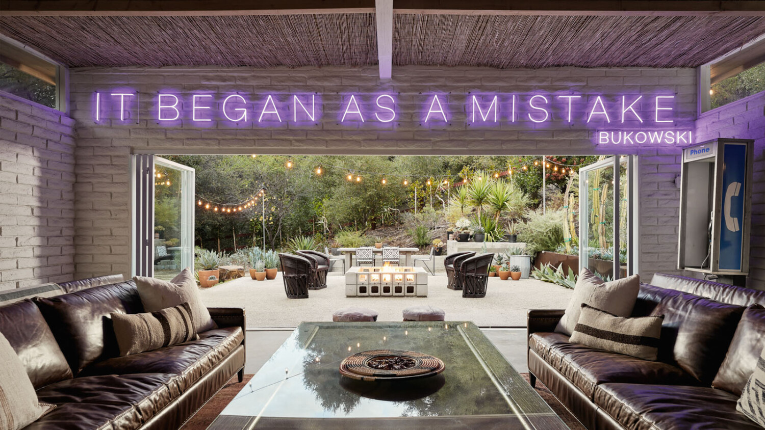
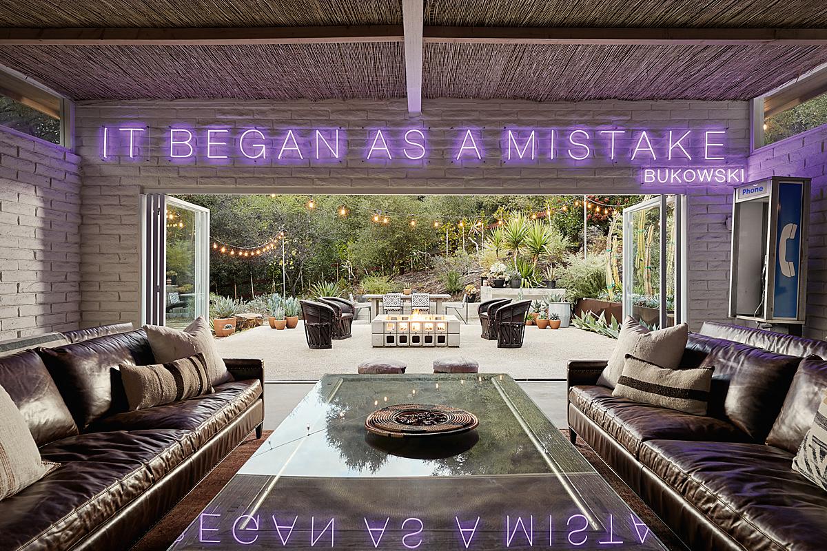
As we venture inside, we see just how fun Canyon Canopy House is. I love how Josh sets up a one-point perspective to show off this sitting room/bar area. Our eyes are immediately attracted to the neon sign – which I love seeing reflected in the table. There is a sense of symmetry here and an overall cool factor that is hard to ignore.
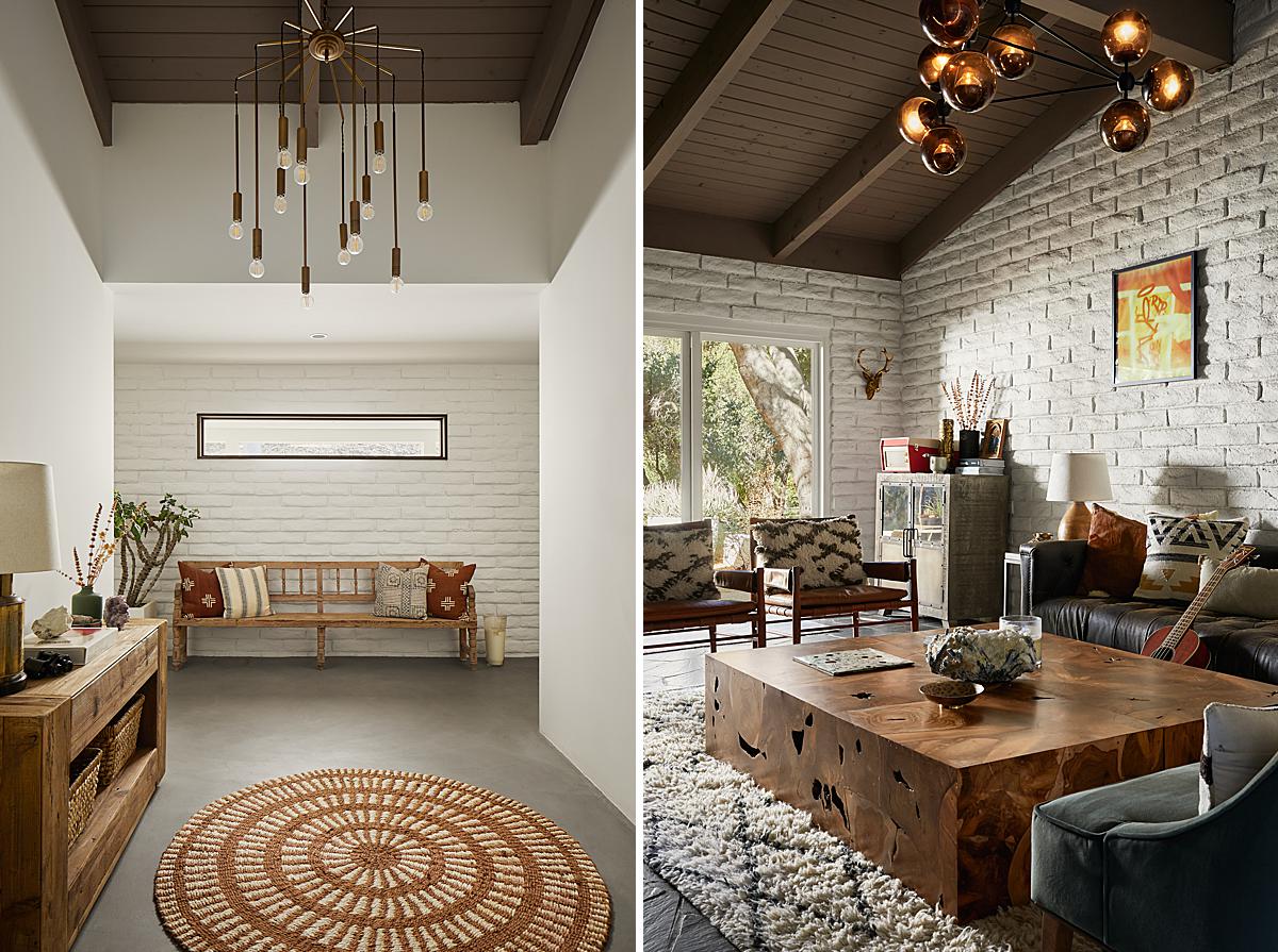
As we enter the primary living areas of Canopy Canyon House, we are greeted by soft directional light that Josh uses to carve out the elements in each scene. Josh speaks a little bit on the light at the shoot by sharing “The biggest challenge on this shoot was time, despite starting fairly early in the morning. I’m generally very detail-oriented and tedious when shooting, and I photographed this property in the last weeks of Fall, so the days were already short and the sun was relatively low throughout the day. This left a short window of bright daylight. The lack of daylight was emphasized by the home being tucked in the mountains, as well as surrounded by a canopy of trees that provided a lot of shade, especially mid-afternoon and around sunset.”
I love Josh’s use of layering here. We can imagine that with everything going on in this room, it’s pretty tight. Josh allows us to see a glimpse of the chairs in the foreground and then drives our eyes through the frame. There is a lot to look at, but his composition and careful styling allow each object and area of the room to have its own space.
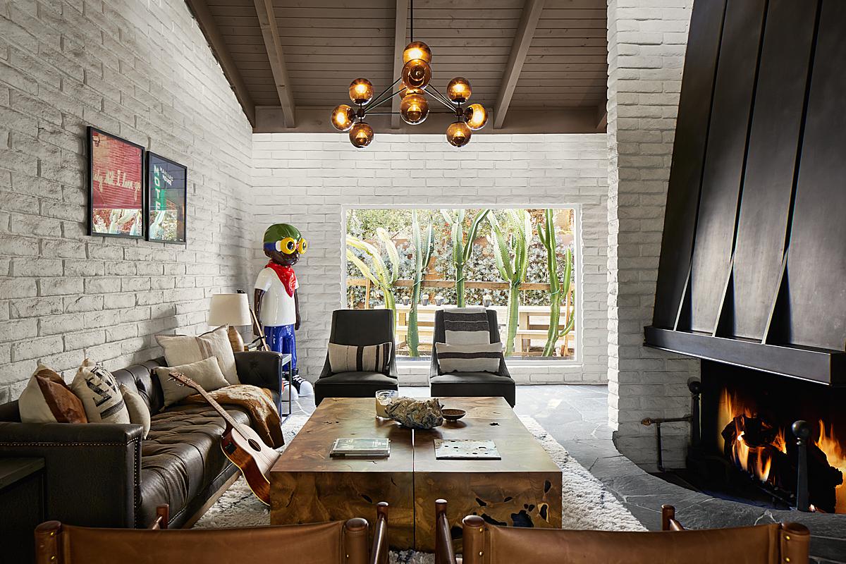
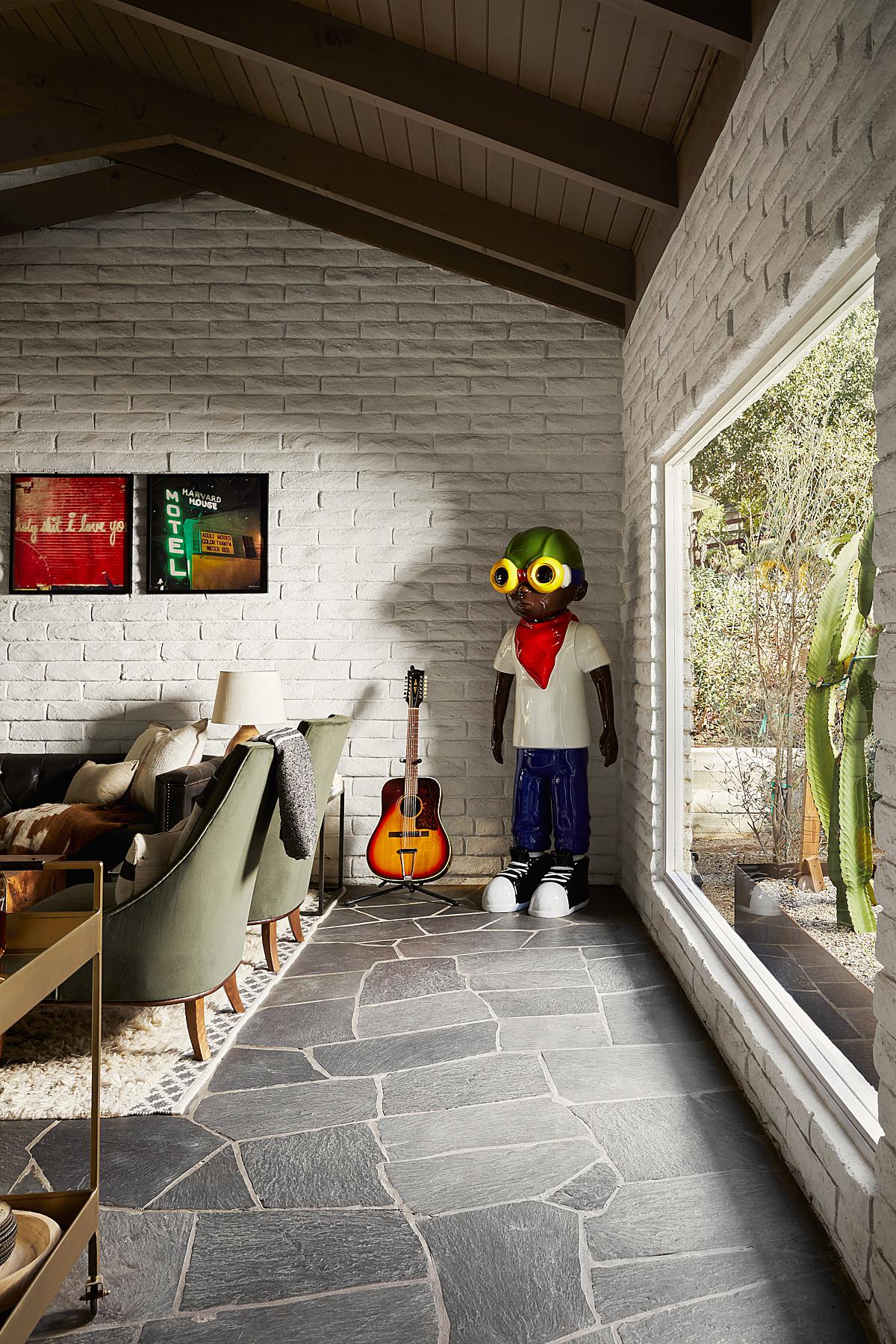
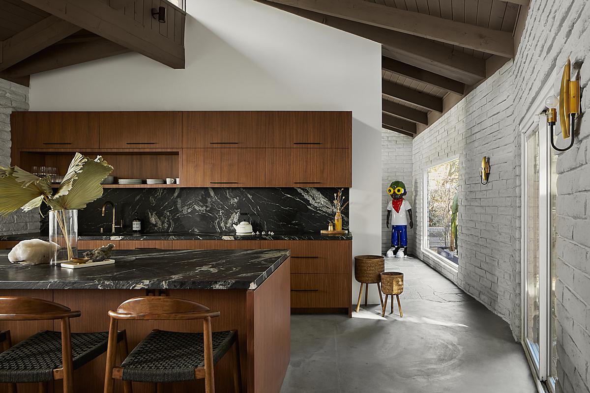
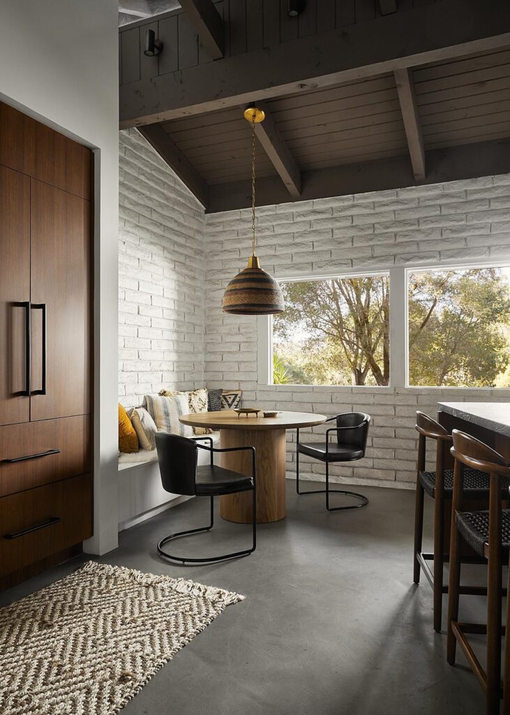
Josh gives us the rundown about his favorite photo from this project, noting “It’s hard to choose a favorite here because I love so many of the spaces here that range from clean and minimal to eclectic, but I think I have to go with the straight kitchen shot.
I typically favor a one-point perspective, and I love the key light all coming in from the left. I think this single photo tells a lot of story about this home. It shows the renovated kitchen with gorgeous materials, the home’s original white brick wall and wood ceiling, and we see the living room sculpture that helps tie together these two main areas. This photo was achieved using the Canon 24mm TSE, and for lighting I used a combination of natural light, a single powerful diffused strobe coming in through the left windows, as well as a diffused strobe indoors pointed from the left towards the island chairs for some detail there.”
Josh brings big mood into these kitchen shots. He lets them fall just dark enough to feel natural while harnessing that beautiful directional light to pull out the texture from the cabinetry and cast shadows that add dimensionality to the scene. Our eyes move over the dim foreground and right to the light sweeping over the sink area.
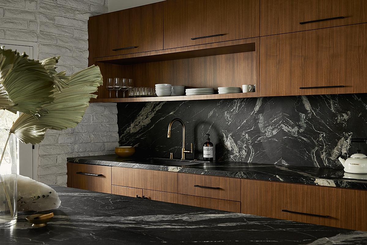
I really appreciate Josh’s restraint in his lighting, the balance of his exposures, and his post-processing. Nothing feels overdone or over-processed. There is enough detail in the highlights and shadows, to allow us to understand what’s happening here, but it all feels and looks real as if we were actually there and experiencing the architecture itself. Hats off to you Josh!
A huge thanks to Josh for sharing these with us. Check out his work on Instagram @joshbustosphoto as well as www.JoshBustosPhoto.com to see more awesome work!
If you have a project you’d like to be considered for Project of the Week, you can submit it here.
