Explore This Cedar-Clad Californian Beauty With Photographer Tim Melideo
Happy Friday and welcome to sunny Solana Beach! Today, we’re checking out the work of California based photographer Tim Melideo. Tim has been gracious enough to share a heap of insight into this project, so I’ll let him take it away!
Tim kicks things off by explaining “Seaside Reef was a project by my architect friend Alec Petros of Alec Petros Studio. I love working with Alec because he more-or-less gives me free rein at shooting and doesn’t really try and tell me what to shoot; he just gives me a list of what he wants and then I get those shots and more. He trusts my eye.”
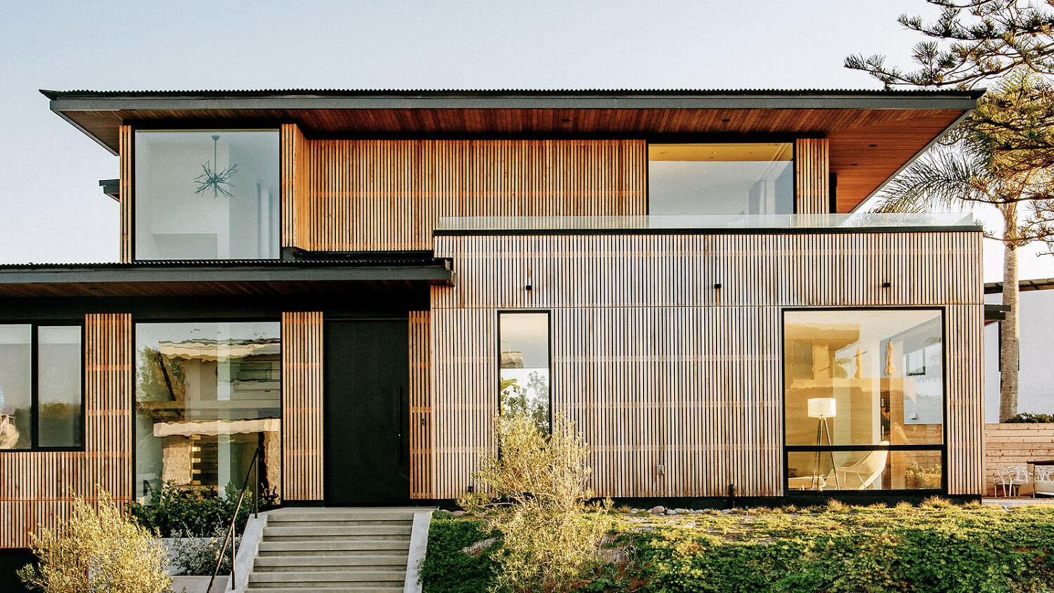
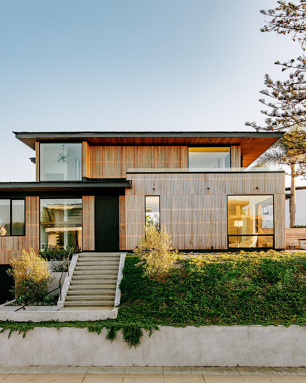
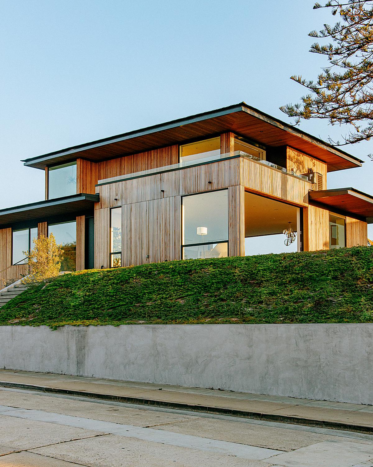
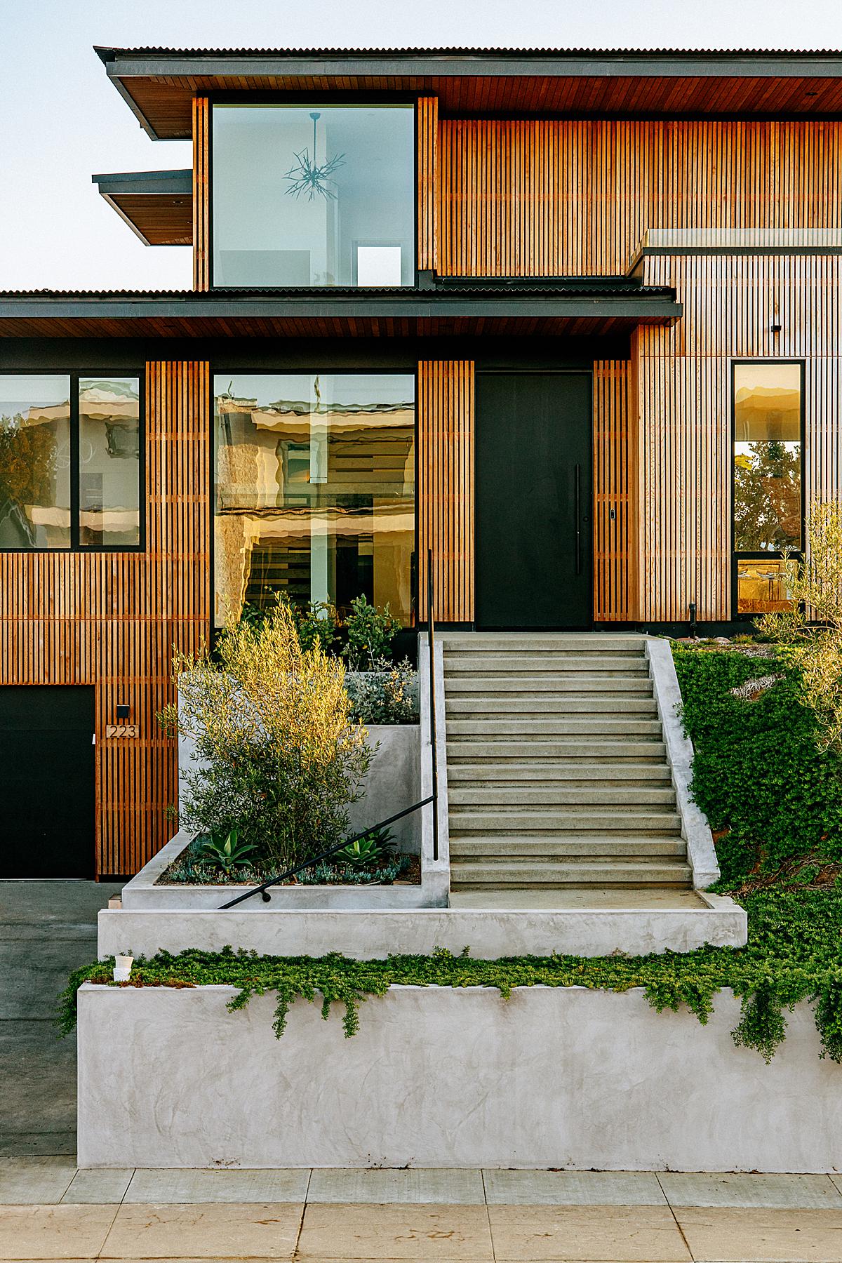
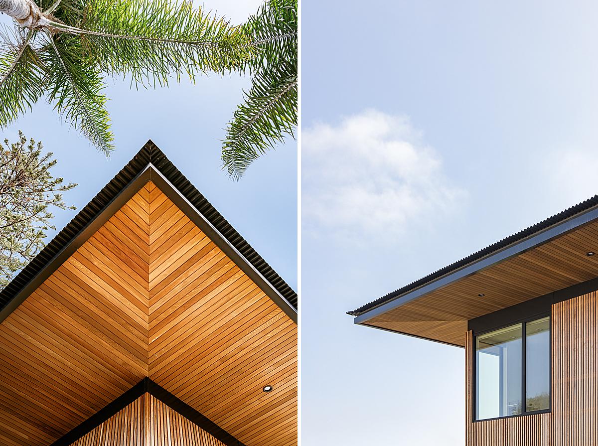
“I started in the morning and was there until sunset because we wanted to make sure to get the proper lighting on every side of the home,” he continues. “We wanted to make sure to get it with flat sun so the shadows weren’t too distracting on the structure or the wood accents. I also wanted to be able to get the golden glow of the sunset on the wood.”
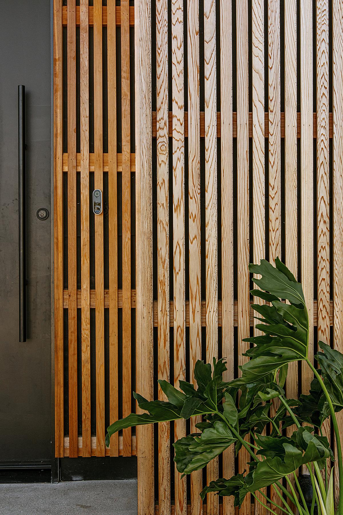
Seaside Reef’s facade is documented perfectly with this carefully planned light. Tim gives us a good sense for the shapeliness of the house, while allowing enough light to illuminate and pull the texture out of the wood slats. It feels balanced and natural, which is a theme you’ll see across the rest of his images.
“We didn’t have too many challenges on this one, except for some exterior plumbing and other home-owner added things; most of which I was able to retouch out,” mentions Tim. “However, there were a couple of shots where the shadows from plants and trees were getting in the way. But what can you do?”
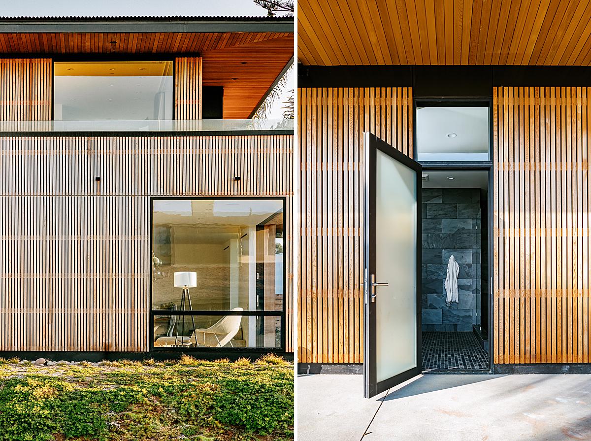
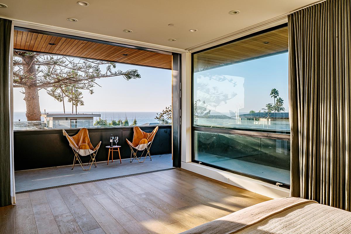
I appreciate how Tim break’s Seaside Reef down in to visual chunks that we can better understand. On the left, I love the layering of the foliage in the foreground, and how the window carves out a little peek into Seaside Reef’s interior among all the repeating lines, while keeping the scene feeling evenly weighted and balanced. The open door on the right creates a gorgeous line to lead us into the home’s interior.
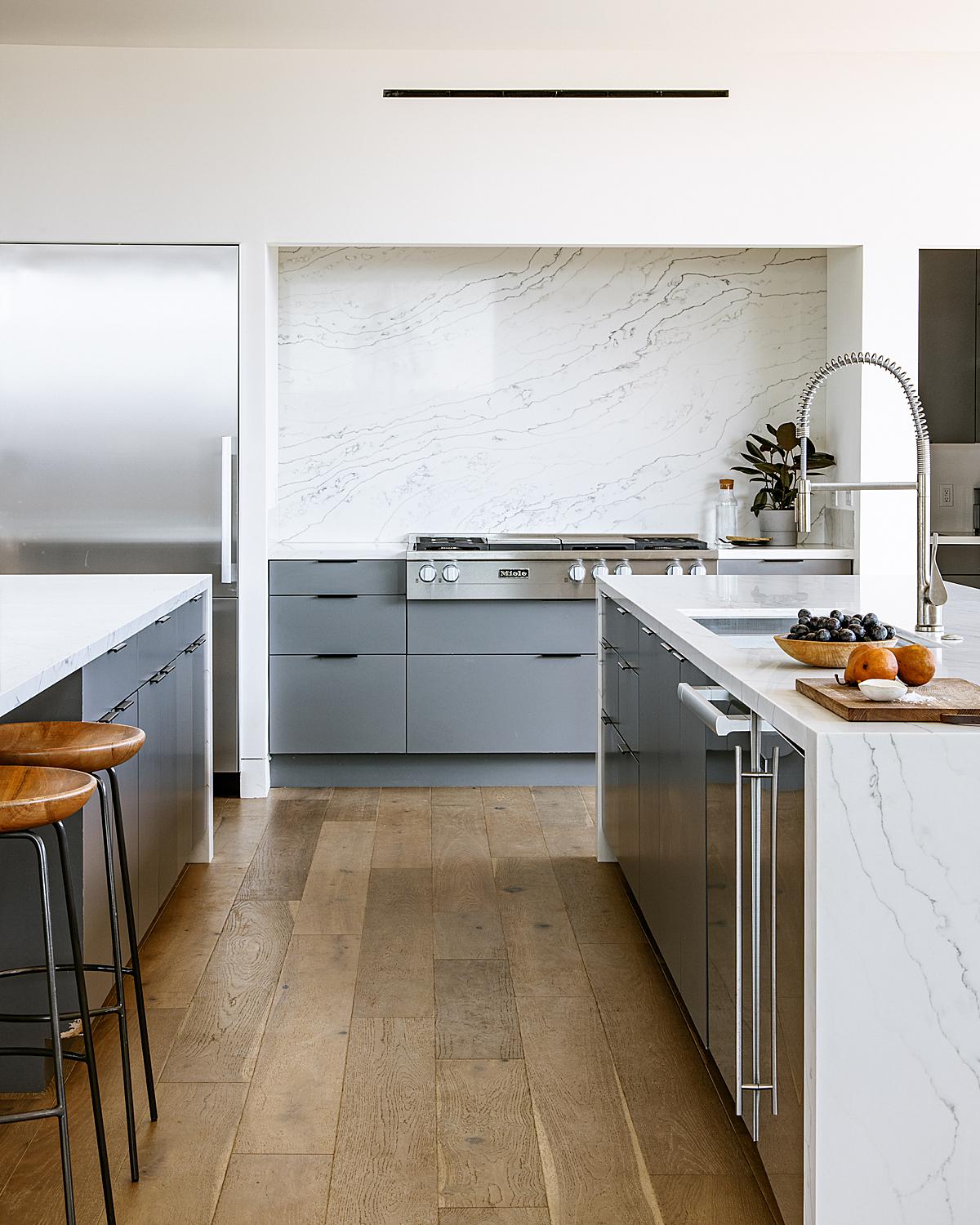
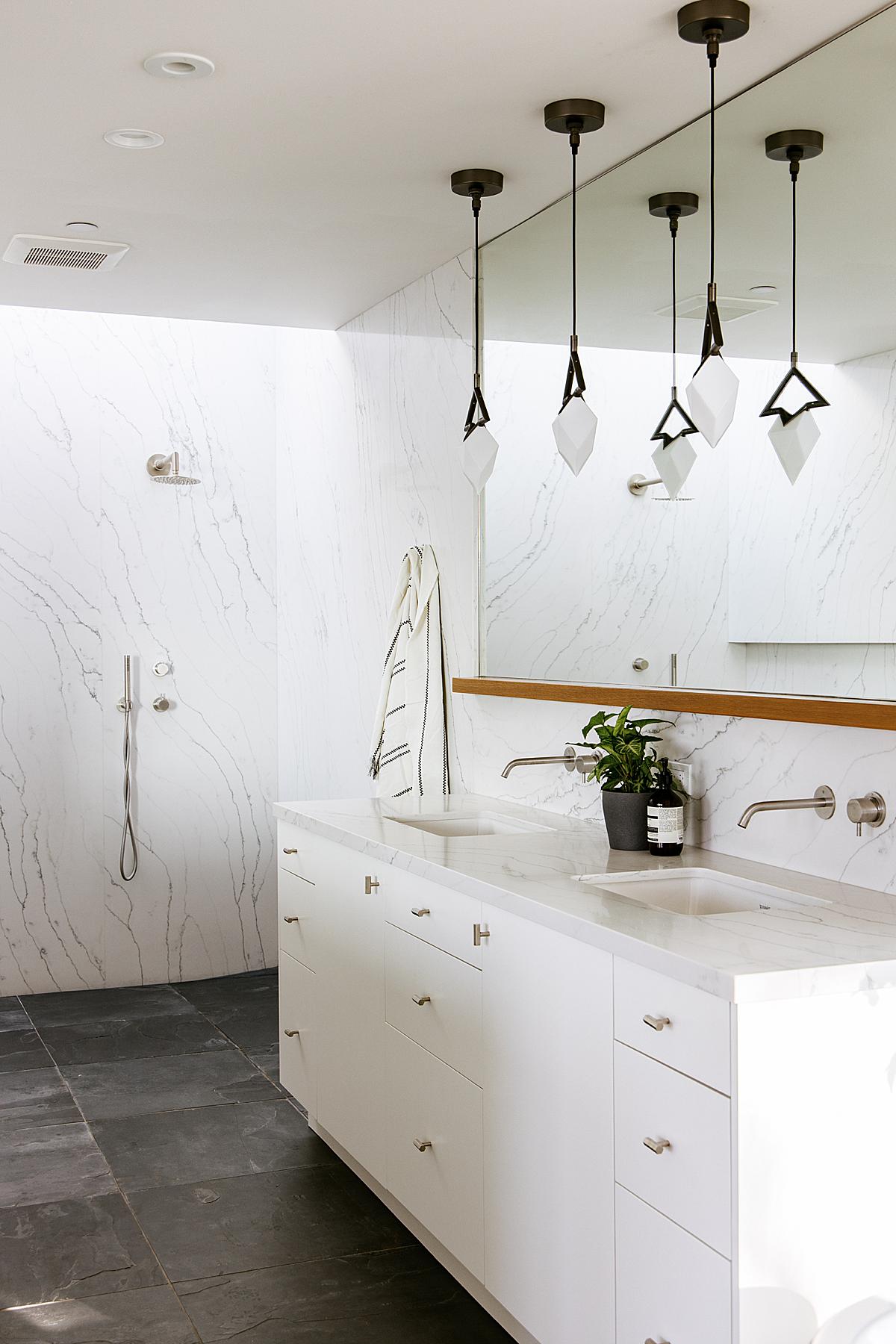
Inside, Tim crafts an image that feels both clean and natural. His composition gives our eyes the space they need to “walk” through the frame, but he keeps the scene pretty intimate feeling with little slices like that on the right side of the faucet that leave us wondering what’s just out of frame.
In regards to his process, Tim shares “Most of the time I show up to the location and I like to walk around and see all the desired angles and locations before I start shooting. Then I make a timeline of when and how I am going to shoot the entirety of the space. I don’t like going to a location before the day of shooting because then people (myself included) can get excited about the way it looks that day and the actual shoot day can present entirely different lighting or weather conditions. So I like to first see it and photograph it in the same day. Perhaps in different conditions I would have photographed different details and used different angles. When I set up a shot I look at how the light is affecting that particular space. I like playing with shadows, too, when it allows.”
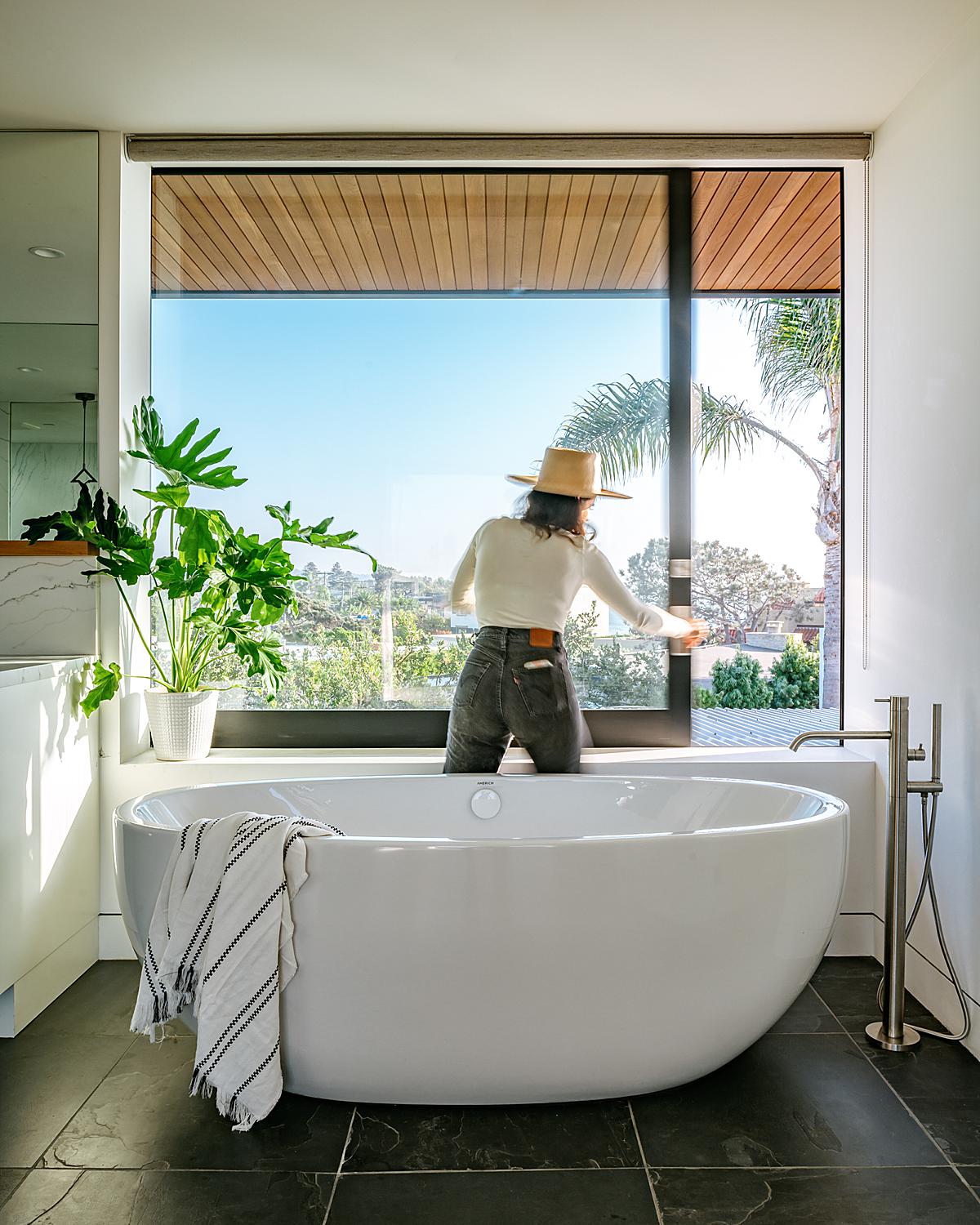
The human element here works perfectly! Here Tim is able to translate to us the massive functional window that allows the bathroom to have an open air feel. This also gives great scale and lends itself well to the laid back vibe of this project.
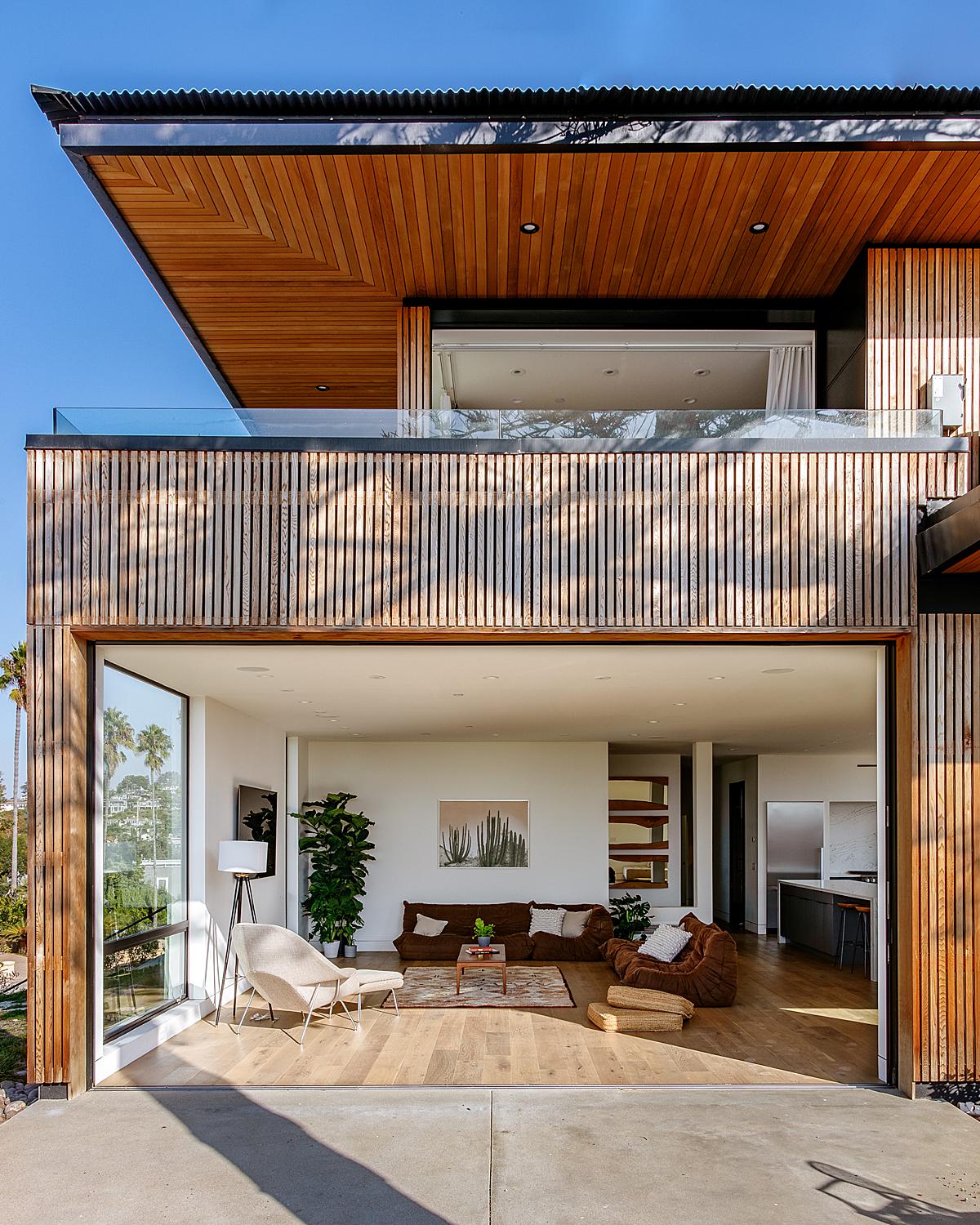
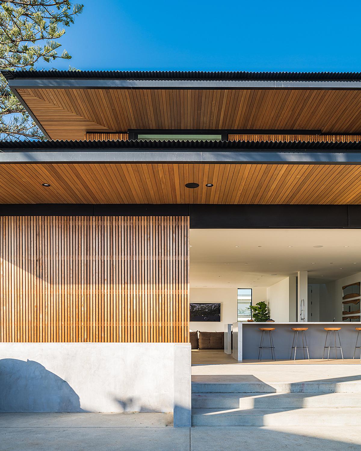
Next up is Tim’s favorite photograph from the shoot. He explains, “I really like the shot from outside with the living room because I love the way the shadows from the trees are hitting the wood accents on the house. I like that the shadows reference the wood and the natural source from which it came.”
I asked Tim a bit about his gear of choice and what he brings out to a shoot. He tells “Ironically on this shoot, I was using two cameras that I was deciding between — The Nikon Z7 and the Canon EOS R. I went through a couple of years of trying A BUNCH of different cameras after trying to upgrade my 5DIII and switching to mirrorless. This shoot gave me confidence in the Canon system and I went back to Canon after switching to the Z7 for a little over a year. I have now upgraded to the R5. I wish I didn’t sell all my Canon stuff, though. My setup is now R5, 24-105, 24-70, and 35. I’m looking forward to the tilt-shift lenses for the RF system too. I used to do a lot of lighting but I have since started mainly using natural light so the images look more true to life and less ‘this is a photo of a house that I was hired to photograph.’ So I’ve been using some handheld flashes if I absolutely need to add some light.”
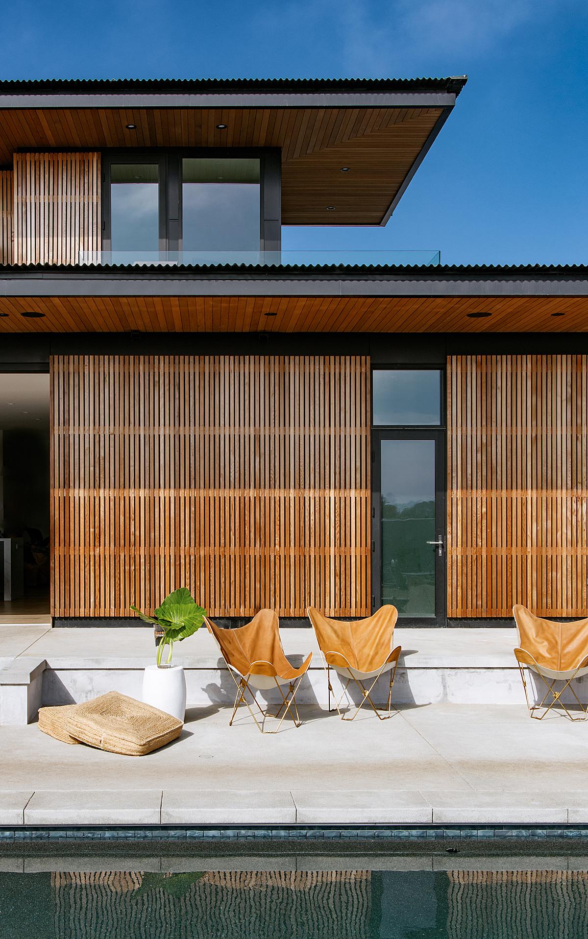
There are a ton of great shapes and layers here, accentuated by a tidy one point perspective. Our attention rolls up from the pool to the patio, and we catch a glimpse of the way the kitchen and living area open up into the outdoors. The upper deck is hinted at, and we can see just a little peek of the second story. Long shadows give us a sense of the time of day, while creating depth and showing off the way the cedar has a gorgeous warm and honey-like color when the sun streams over it.
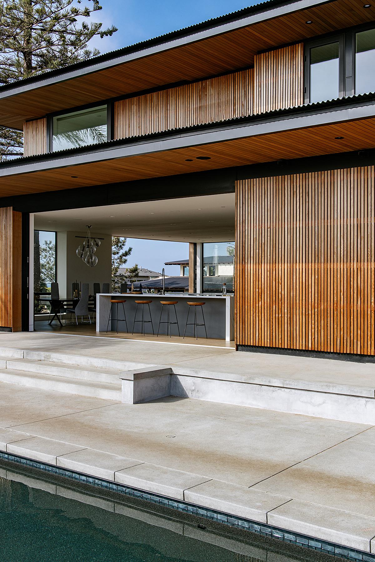
We’ll wrap up Project of the Week with this lovely image. Here we get a good look at those mammoth pocket doors that open the house’s living space up to the great outdoors. Tim’s composition showcases the shapeliness of Seaside Reef and all of those awesome and graphic lines that make up this dreamy house!
A huge giant thanks to Tim for sharing this project and his processes with us! What a guy! Head on over to Tim’s site, timmelideo.com or give him a follow on Instagram @timmelideo to see more of his work.
As always, If you have a project you’d like to be considered for Project of the Week, you can submit it here.
