Kris Provoost Recounts Photographing Hong Kong’s M+ Building Over the Years
Kris Provoost is an architectural and interiors photographer based in Hong Kong. With a wide range of clients, awards, and and published photographs, looking at Kris’s work, it’s easy to see why. From infrastructure projects to residences, and shiny complete structures, his work is infused with a sense of place and life. It is unfussy and focuses on how the architecture is used. It just feels special.
Today we’re taking a look at one particular example, M+. This shoot was commissioned by the architect Farrells, designed by Herzog & de Meuron and Farrells in cooperation with ARUP, and owned by West Kowloon Cultural District Authority.
Kris has so much great insight to share, I’ll let him take it away!
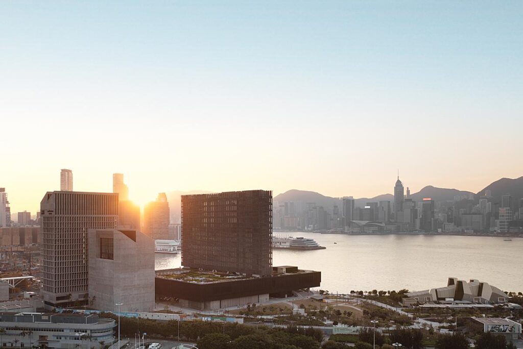
He starts, “I photographed the building over various occassions in the span of a year or so. The most difficult aspect was that the building completed during the COVID-19 pandemic. A time we all forgot (or trying to forget at least), but photographing during that time created quite some hassle (at least here in Hong Kong).
Hong Kong made it itself very difficult during the pandemic with changing restrictions almost on a weekly basis that any planning for the shoot was difficult. The shooting dates changed a few times, but I was patient because a building of this magnitude only comes once every few years in Hong Kong.
The shoot itself was unreal. Because I still feel as a kid in a candy store when entering a building of that magnitude.”
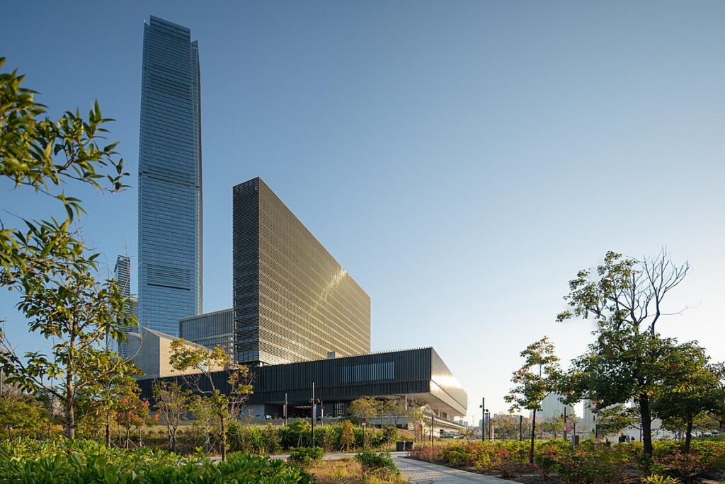
Kris continues, “To me, the project has a special place in my heart. I followed the project from its very beginnings. Back when I was still an architect and wasn’t really interested in photography back then) I remember visiting an exhbition of the selected shortlist design over 10 years ago, carefully looking at the potential of each design. When Herzog & de Meuron in collaboration with Farrells I was quite excited. I knew this building would become very important for Hong Kong.”
“Over the years when visiting Hong Kong (I was living in Shanghai back then) I would come to have a look a the construction progress and snap a few shots,” he explains. “Back then the whole surrounding (M+ is set in the West Kowloon Cultural District, an entirily manmade piece of land in front of HK’s tallest tower) was a complete construction site, weaving my way through ever changing paths to get a glimpse of the museum under construction.”
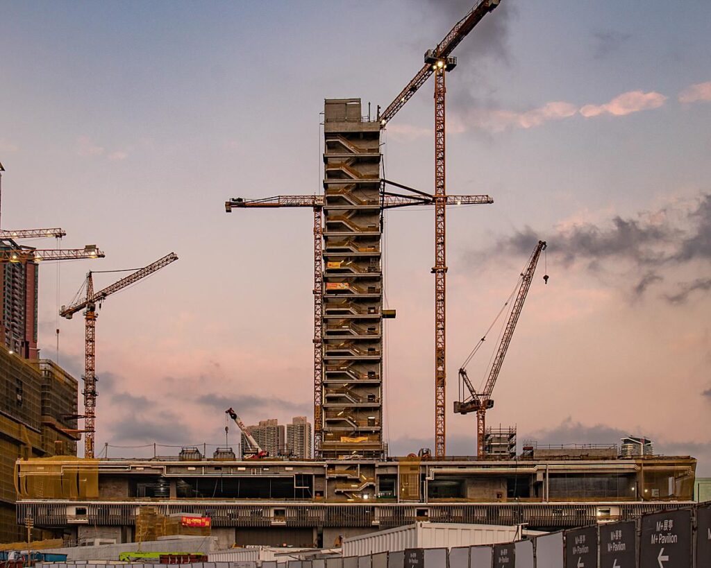
Kris tells, “To then years later be able to step inside, with camera in tow, was a special feeling. Roaming around alone through the different spaces and having free play on what or how I wanted to capture the space.”To then years later be able to step inside, with camera in tow, was a special feeling. Roaming around alone through the different spaces and having free play on what or how I wanted to capture the space.
I returned a few times to capture all the spaces, both during closing time, as well as when the museum was in operation to capture people curious about the building they have been waiting a decade for. You could feel a certain excitement when walking through the museum.”
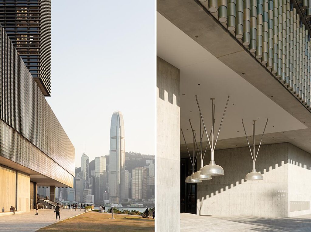
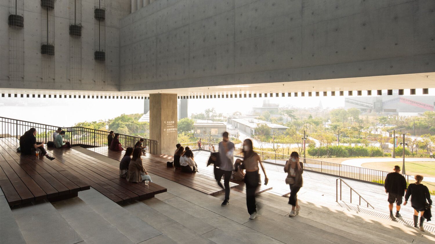
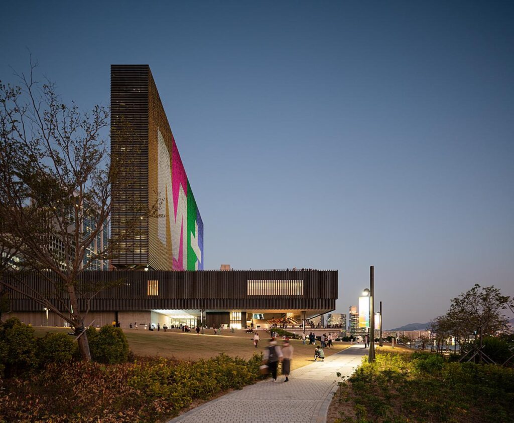
“A main focus of my photography was to capture the museum as more than just a building. It is above all a public space. With a roof garden, a grand outdoor stair, a big lawn and a culture plaza. For these photos I just wanted to observe. No staging, no coordinating, just observing. One morning I went there at 7 am, and it was great to see the building being used by people exercising. These moments brought me back to architecture school, when my tutor would hammer us by saying, architecture is when a building becomes more than its intended function.
These observational photos are also my favorite photos of the set,” he says.
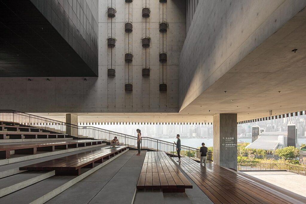
Kris speaks on his favorite photo, saying “As mentioned above it would be this one, early morning people doing yoga poses seemingly forgetting they are standing at one of the greatest buildings of the past 10 years. This is when architecture fades out and urban space takes the foreground.
I sometimes feel that we as architectural photographers make architecture feels as the hero, or the holy grail, making it look too perfect. Yet in fact, sometimes just seeing a building become part of the city is the real power of architecture and that should be reflected in the photography. I feel M+ does that well, and still continues to grow to do so.
Over the years that passed since I was commissioned to photograph M+, I return to the building often as a photographer but also a resident of Hong Kong and I continue to see M+ in different light and uses. I love how Hong Kong embraced this building and really uses it to be a lot more than a musuem.
The actual execution of the photo was easy. I didnt even use a tripod! What a sin. It was more to be in the right place, right time kind of thing. To me that has always been more important than any technical aspect of our profession. I still do feel more an architect than a photographer. An architect taking photographs, or a photographer of architecture.”
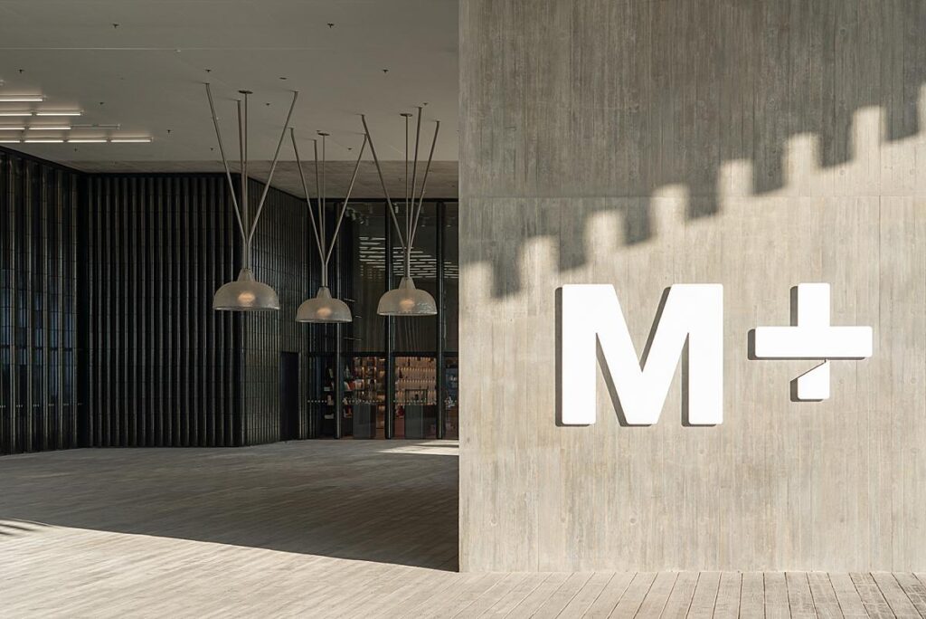
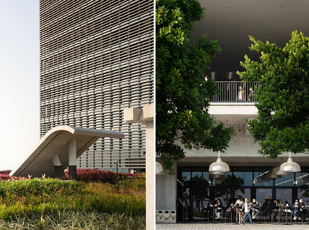
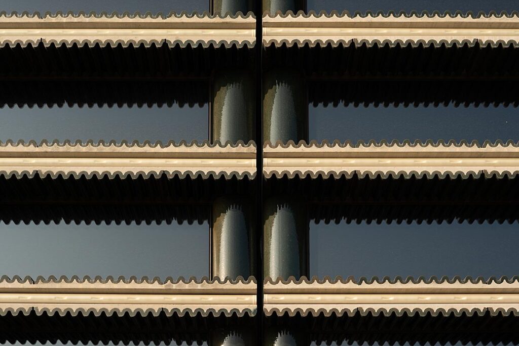
In addition to the “wide views” Kris also gives us close up details that help us understand the materiality of M+.
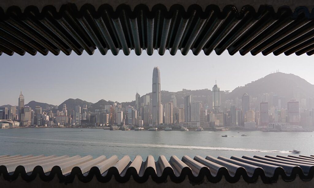
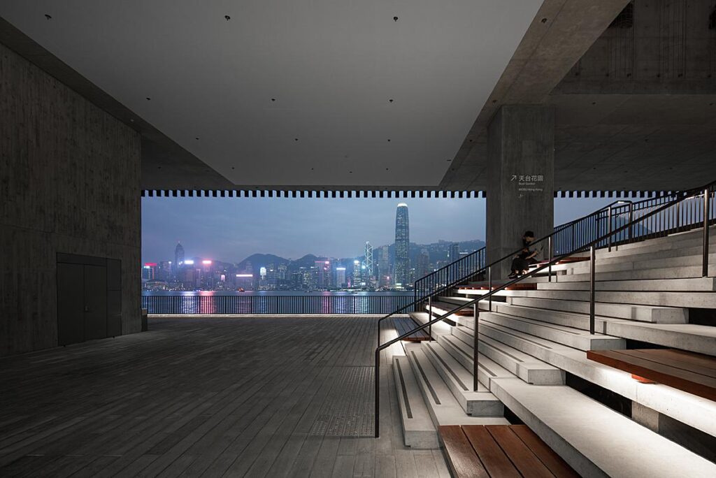
Kris’s photographs place us at M+ and make us feel as if we are spectators there. This next detail allows us to feel as though we are looking out of M+ toward the skyline. The slight haze, the wakes from the boat, and the directional lighting are just perfect.
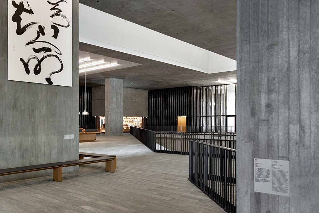
Inside the museum, Kris’s compositions turn our attention to the shapliness of M+ and its massive scale!

I asked Kris what advice he would give to a photographer shooting a similar project, and he shared “Take your time. It is very basic advice. But I, after photographing so many buildings, still struggle with it. I wish I would have approached this commission slightly different. I should have taken a day just walking around the building, sitting in the lawn and look at it. Truly look at it. Refuse to snap a quick photo, just capture it with my eyes.
And then return with my camera and go at it.”
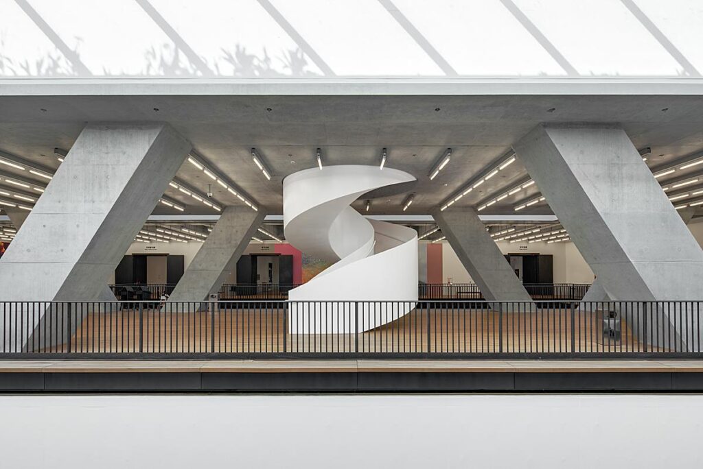
I adore this next shot. A one-point perspective heightens the power of the lines and bold shapes in the scene. In turn, these play nicely with the curvilinear shape of the staircase, and draw our attention to it immediately.
I appreciate how this next shot frames the view of the skyline beyond. Our eyes travel through the scene out to the grand view on the other side. Beautiful!
“Looking back at these photos, it made me promise myself to enjoy shooting these kind of projects more because they only come every few years,” Kris mused.
A warm thank you to Kris Provoost for sharing this project and all his insight about it!
Head over to www.krisprovoost.com to see more of Kris’s work, or pop over to Instagram @krisprovoost.
If you have a project you’d like to be considered for Project of the Week, you can submit it here.
