From Interior Designer to Global Magazine Founder; Suzy Annetta’s Career Inspires
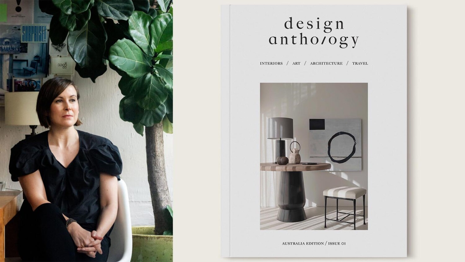
As soon as I started writing for APA, I immediately knew one of the people I wanted to interview was Suzy Annetta. Suzy is a fellow Melbournian and the founder of Design Anthology, Asia’s premier English-language interiors, design, and architecture magazine. After meeting Suzy at a talk she was chairing at Den Fair last June, I reached out for an interview after discovering she is launching an Australian edition of Design Anthology.
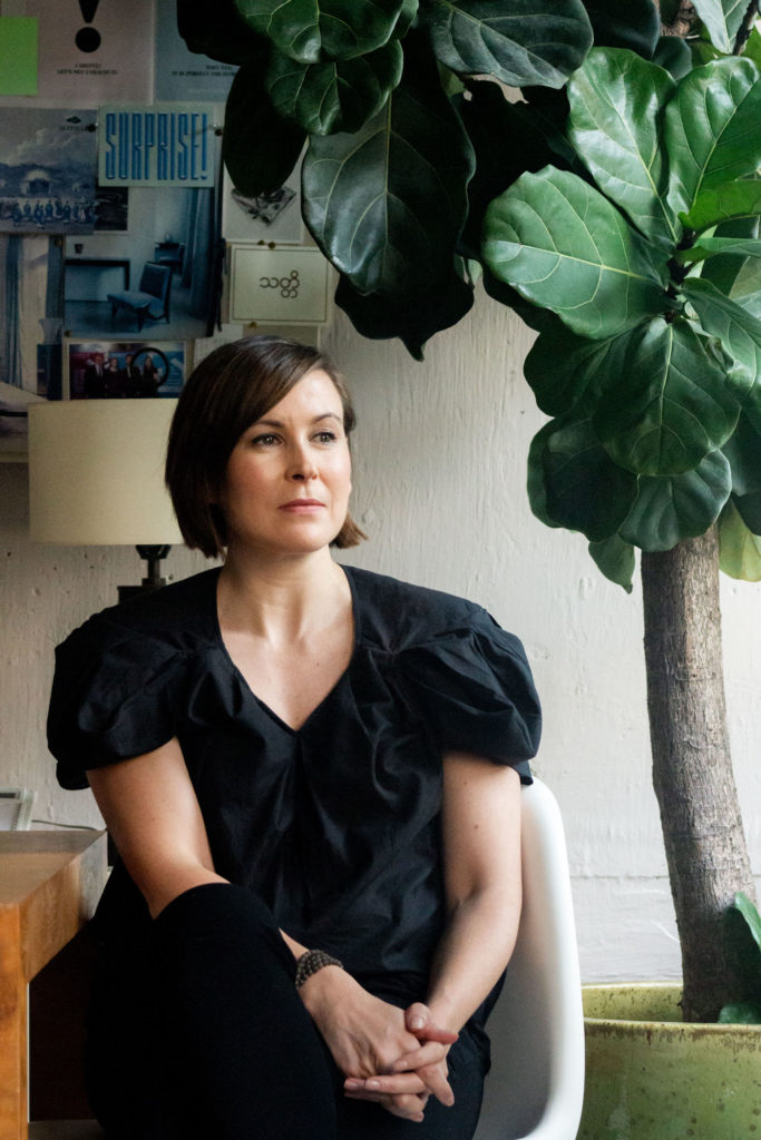
Thank you, Suzy, for taking the time for this interview. To start, can you tell us a bit about yourself? What made you pursue a career in interior design? Additionally, you have spent a lot of time living in Asia and now have been in Hong Kong for some time. How have you found the impact of Asian culture in terms of design?
Well, to start with I was always one of those kids inside drawing and reading, despite living near the beach. So I think a future in design or something creative was inevitable. I thought I wanted to be an architect at first but when they told me I’d have to drop my creative subjects and take on more math and science I realised that was not for me. I was obsessed with living spaces, maybe because we moved around a bit when I was younger and had amassed a huge collection of design magazines and books (this is all in the pre-internet days of course). It was a culmination of all those things that led to my interest in interior design.
I actually worked in textiles (for furnishings specifically) for about the first decade of my career though as interior design was still developing as a field of study and as a career path in Australia. It was really just architecture or “decorating”. This was the time that the Melbourne College of Decoration was merging with RMIT to become their built environment department. I’m showing my age now.
Anyway, long story short, I ended up in Tokyo for 3 years and worked for an American textile company while I was there. It was my first time outside of Australia and a massive culture shock. Growing up as a headstrong independent young woman I found the culture (then) quite confronting and a bit debilitating to be honest. It was via that job that I ended up in Hong Kong 14 years ago.
I think it’s hard for me to say what impact ‘Asian’ culture has had on design because the culture from this region varies so much. We’re talking about a region that hugely diverse in terms of ethnicity, language, culture, faith, and history (and colonial influence). We publish stories from countries as diverse and geographically separated as Japan to India. But within those unique countries, there is I think quite a lot of influence, but it may be more subtle, like material usage, than the obvious cultural references we’d be looking for. Climate dictates a lot in terms of architecture obviously, and I think the south-east Asian countries are taking the lead in terms of sustainability because they are able to easily incorporate aspects like natural lighting and natural ventilation into their buildings – and have done for centuries.
You have gone from being an interior designer to a publisher. What inspired you to make such a huge career shift?
In the meantime, I had been writing a blog – just as a way to put my thoughts out there about design and interiors that I liked. I wasn’t really writing it with an audience in mind but the following grew pretty steadily over the years and I realised that most of the subscribers were from big design firms internationally – firms whose work I really admired.
I had set up my own design studio about 7-8 years ago, right after becoming a permanent resident of Hong Kong (meaning I didn’t need a company to sponsor my visa anymore), but very quickly grew disillusioned with running my own practice. I took a bit of a break to think about what I wanted to do. I think I was confused because I was finally in the position I had been working towards my whole life but the reality didn’t match the dream.
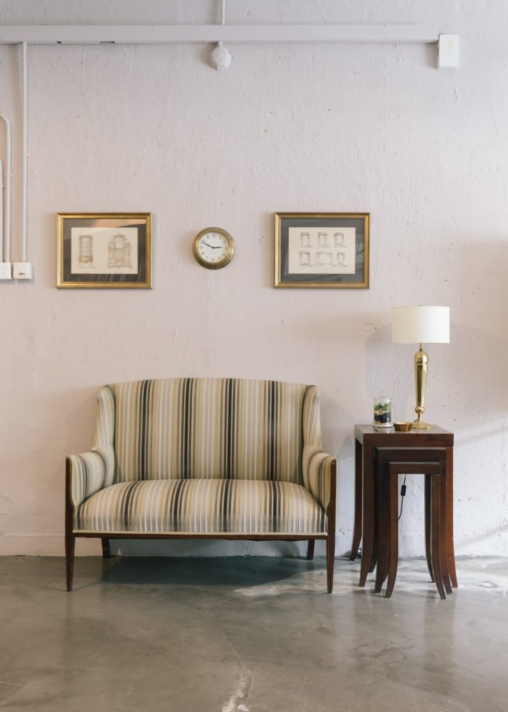
At the same time, I was really bored with the design magazines being published in Hong Kong. So the idea to create something new – in a different format that really showcases the imagery – but showcasing work in Asia came about.
We have always written and produced the magazine in print and online for a design-aware audience – our readers are designers or architects, or design-obsessed and this dictates everything from the paper we use, to the layout, imagery and language. So I guess in that sense we have positioned ourselves as a niche publication. We don’t strive to be all things to all people. And to be honest I think that’s the only way to survive these days. People say print is dead, but really the magazines and newspapers we see closing are the mainstream ones trying to cater to everyone, but the smaller niche titles are the ones not just surviving but thriving.
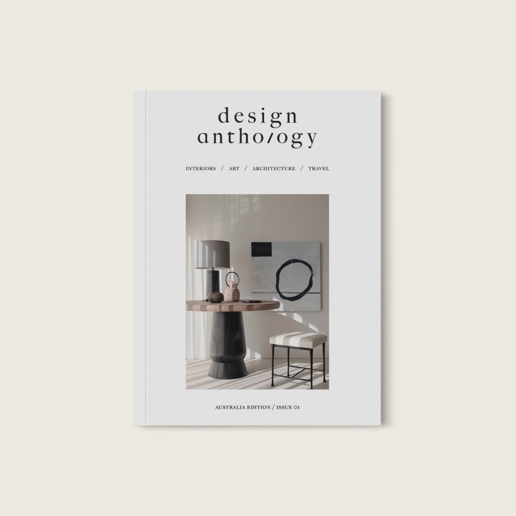
So when we first started I thought I was being a bit rebellious by not having “themed” issues because the whole idea of that really annoyed me, but I soon realised that it makes sense it a lot of ways to have some sense of structure, even loose, to the editorial. So each year we do four issues: March changes each year and has been a multi-disciplinary or small spaced issue. June is Summer so most homes and travel stories, in particular, are in places like Bali or Phuket. September is a country issue which changes each year. We started with the Philippines 5 years ago as I was quite surprised on my first visit to Manila by how much was happening there that no one else seemed to know about and it has since become an annual tradition, with issues featured since on Taiwan, Thailand, Indonesia and Korea. And then in December is the ‘international’ issue. There is always some sort of connection back to Asia in some way, either with the designer or the homeowner, but we have a bit more leeway to look at what the Asian diaspora are doing internationally.
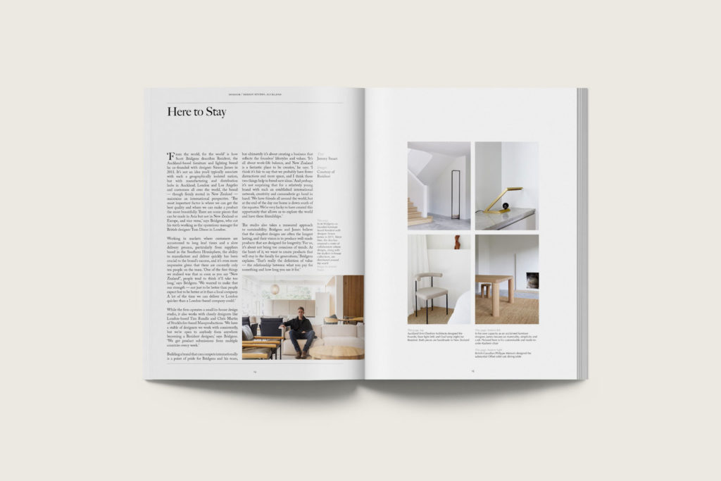
With the new Aus/NZ edition we plan to focus on the design scene ‘down under’. I feel like there is still space for something else in the media landscape there, and with 3 of our team being from Melbourne, it’s not entirely new to us. We noticed that existing magazines were looking at fashion or projects internationally or just featuring the same designers over and again and so we hope to remedy that. And since we’ve made the decision to forge ahead with this stories have been coming out of the woodwork, great stories, but stories no one else is telling, and so we’re excited to be able to share them.
So the two editions (or three, if you count the European edition which is published by Astrid Media in the UK) will each have their own voice and their own regional focus. But the DNA of the design and format will be there and recognisable to existing readers of the magazine.
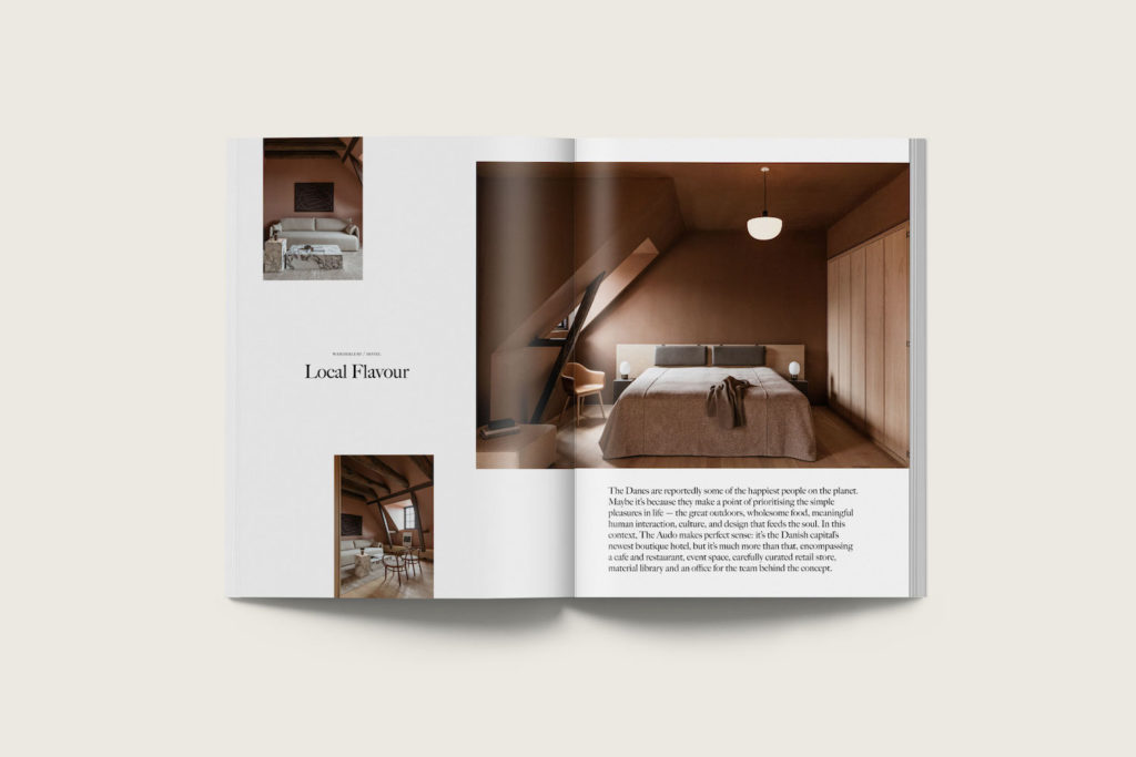
What has been your most favourite project you have published in DA from a photography perspective?
That’s really hard to answer as there have been so many great ones. But if I have to pick I’ll pick 2 – firstly the cover story from our first issue which was a residential project in Phuket by Hong Kong-based Interior Designer Deborah Oppenheimer and had collaborated with K+K Architects. Deborah hadn’t really published her work elsewhere, and the home is stunning. It was always our front cover choice, and being the first it really still holds a special place in my heart.
Secondly, the cover story from issue 23 Asia edition this year which is a residential project by Bangkok-based Albano Daminato who worked for Kerry Hill for a time. I’ve been a fan of his work since we discovered it and I’ve become friends with him over the years. The home in Como that made it to the cover (with images by Frederik Vercruysse) is stunning and we were so glad to be able to get the scoop on it.
We love photography that tells a story, that’s emotive, and not really a documentary style. I guess I still think like an interior designer and so our stories are laid out in a narrative format, in a sequence of spaces as you would experience them in real life. We’re aiming for the reader to feel a 3D space as best they can in a 2D format. So light is important, and context. No wide-angle shots and preferably natural lighting only.
It’s funny you say we’re a global magazine. I’m not sure I think of us that way. I feel we are very rooted in Asia, at least for this edition of the magazine. The Aus/NZ edition will be very different of course. We are distributed globally and perhaps globally known and recognised, but I still feel we are “local” in our situation but maybe “global” in our outlook.
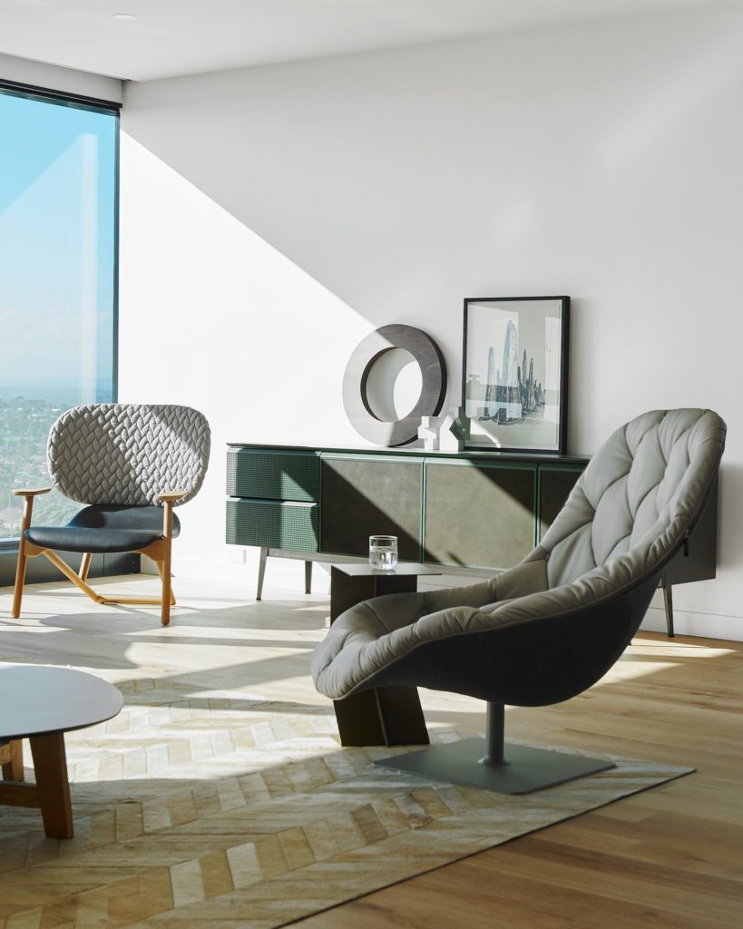
When it comes to deciding what we publish, it’s all instinct. I have no training. I’m not an art director. It’s a very visceral process. I look for spaces that are personal and lived in and don’t look like they were purchased from one place on the same day. I’m not interested in the magazine looking like a catalogue.
People have suggested we have a certain “look” in the homes we publish, and maybe it’s subconscious, so I’m not aware of it. We’ve published colourful maximalist homes and really monochrome minimalist spaces too. It’s an emotional response I’m looking for.
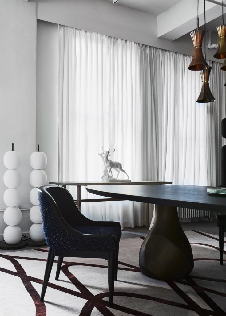
When it comes to looking at submissions we’re hoping for something either exclusive or something we can publish first. I think all media outlets are. It’s competitive out there, particularly for print. And I guess I want to provide our readers with value for money. If they buy the magazine I want them to see new images, new projects and products. This comes from many years of my own media consumption and the frustration and disappointment of realising I’d seen most of it already before or that the front cover was the best image in the whole magazine.
So first and foremost it’s the project I’m looking at – is it interesting, is it well-designed, is it beautiful? And then, of course, a major deciding factor is photography. It needs to be editorial, not marketing-driven or too documentary-like, as I said before. I don’t really mind what the previous portfolio is like, as long as this project is photographed in a way that suits the magazine. And again its all about the mood and lighting and if the personality of the homeowners are captured. And even better if some of the designers and architects details have been captured.
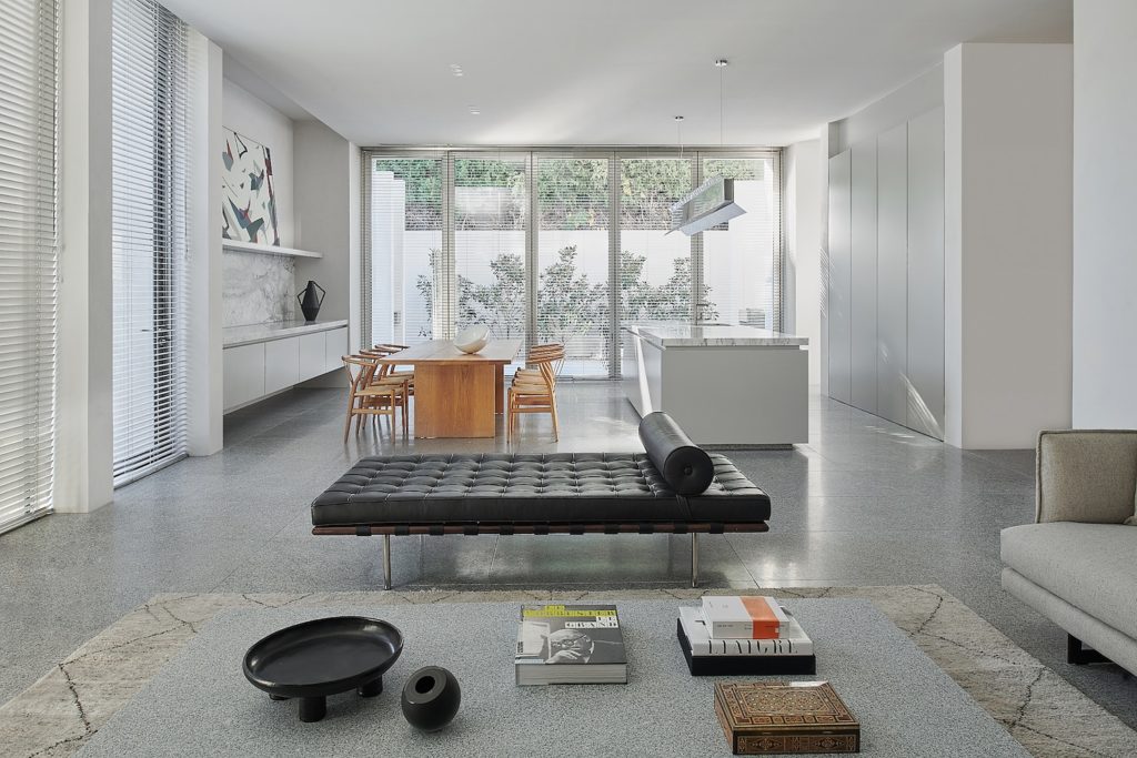
Are there any interior photographers work do you closely follow?
There are a couple internationally whose names I knew from my years of pouring over design magazines, Ricardo Labougle, Richard Powers etc, and then quite a few from Australia actually. There are a plethora of really talented interiors and architecture photographers down here that are amazing including (but not limited to) Sharyn Cairns, Ben Hosking, Nick Watts, Derek Swalwell and Shannon McGrath. And then a few in Asia we work with regularly including Jovian Lim, Edmon Leong and Davy Linggar.
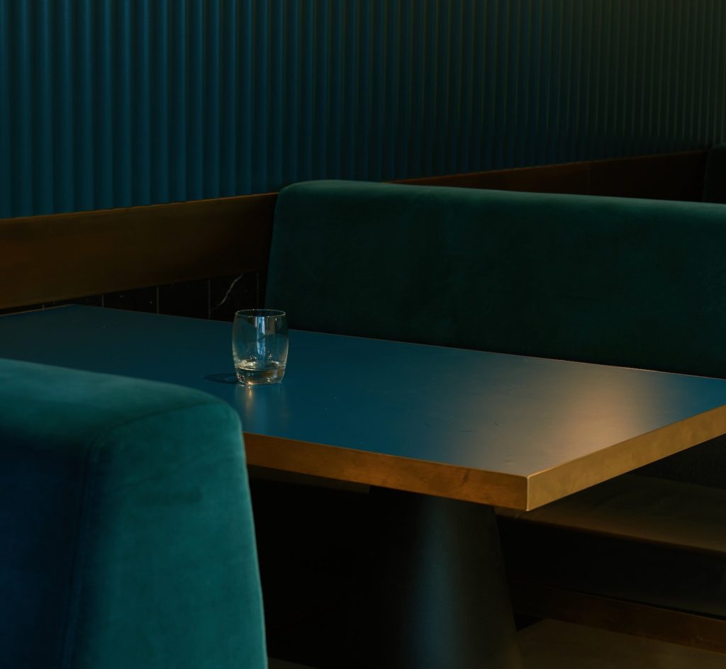
What are your thoughts on documenting interiors through film making? Do you feel that this medium has any viability for architects/interiors designers to stand out in the digital space?
Absolutely. I’ve already seen a few doing it with great success. Joyce Wang in Hong Kong has been documenting her spaces in video format for a while now and it suits her work as she’s highly influenced by film anyway. And it just makes sense to document spaces that way. I also saw a couple of short films earlier this year that Melbourne and Sydney based architect Rob Mills has produced for one of his projects and really loved them. They certainly cut through the fog when it comes to being exposed to as much content as we are these days.
Lastly, which architect’s project you would love to see published in Design Anthology in the future?
There are a number of established architects whose work I admire, and within that group, I’d love to see the work of Indian architect Bijoy Jain on our pages sometime soon. But I actually really love discovering the work of architects and designers who are less known outside their own countries – and those are the ones I look forward to sharing.
I would highly recommend adding Design Anthology to your bookmarks to read about their architectural and interiors projects they feature from around the world. Additionally, you can follow Design Anthology on Instagram as well.
