Francis Dreis Photographs A Restored Mid-Century Beauty in Encino
Francis Dreis is my newest architectural photography crush, and it’ll be easy for you to see why after checking out this stellar set of images he crafted for Woods + Dangaran Architecture of their Clear Oak Drive project. Here you’ll find rich warm tones, dynamic light, and a strong inclusion of human element. Francis gives us a rundown of the project by starting out:
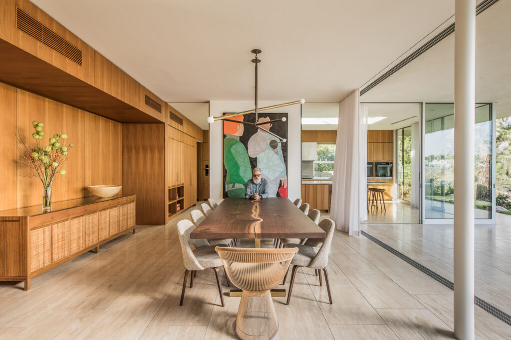
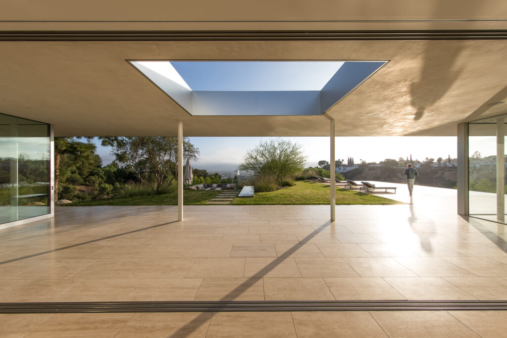
“I’ve been capturing Brett Woods and Joe Dangaran’s architecture projects since their first house perched above Broad Beach. We knew this was a special project since it had such a seamless interior/exterior flow along with high-quality building materials chosen throughout the house. So more or less that was the goal: to capture interior/exterior flow along with the ‘experiential spaces’ that the light presented over the course of a two day shoot.”
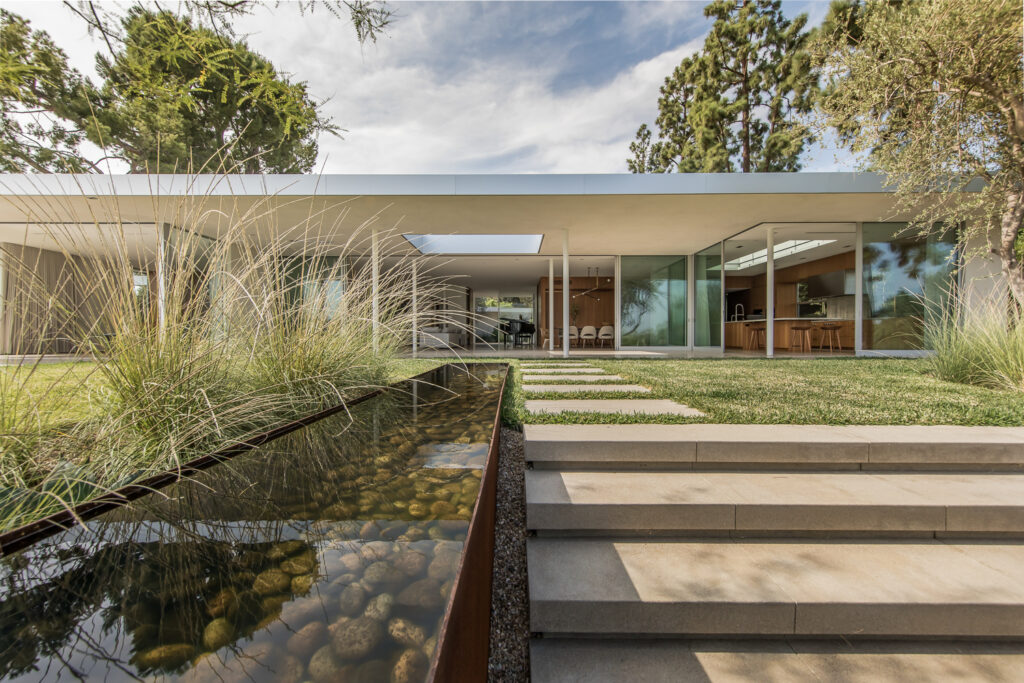
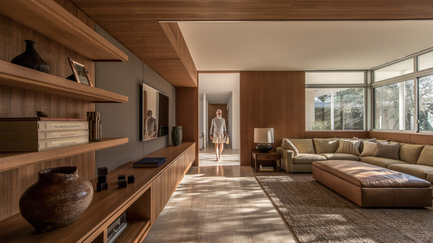
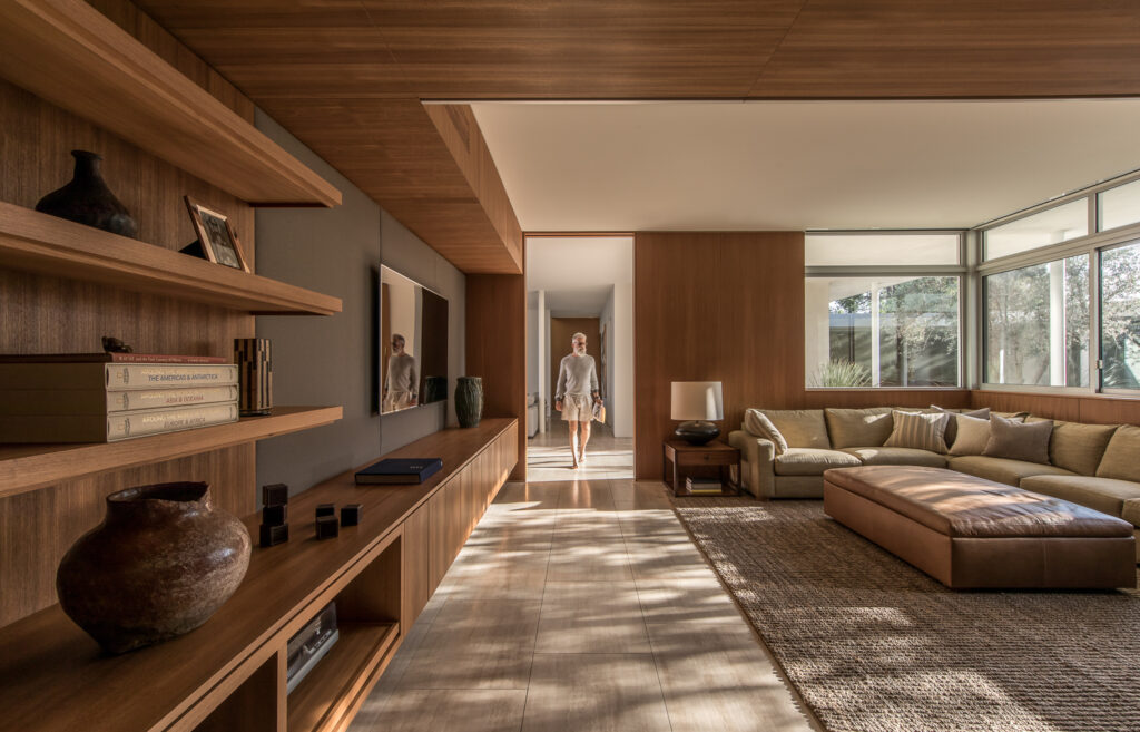
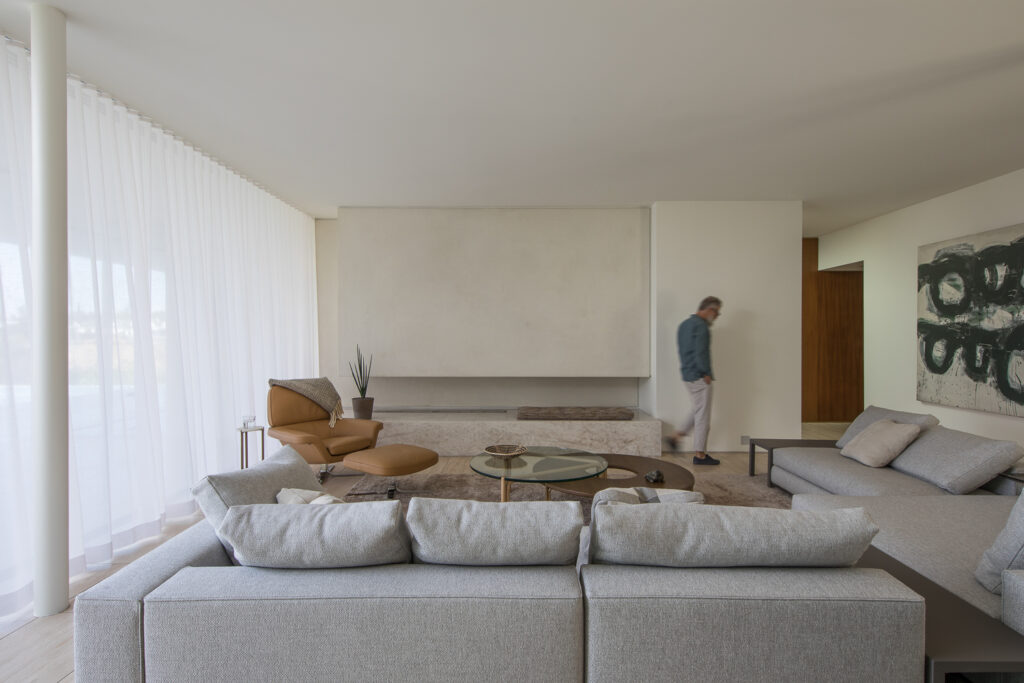
This next image is what initially piqued my interest in Francis’ photographs. The rich warm tones, the mood, the dappled light, and the tidy geometry he accentuates — everything is gorgeous. There is one additional thing that jumps out to me throughout all of Francis’ work though, and it’s the tactful way he includes people in his architectural photos. Francis shoots many gorgeous advertisements, and this feels reminiscent of them.
He explains, “We have hired talent for every project and this was a more refined approach – one person instead of a group or family. When deciding on talent, we have always imagined who might live in the house someday, sort of an aspirational approach much like advertising. When it’s done right, it elevates the moment, the emotion, the architecture and hopefully leaves an impression with the viewer. Also, my eye has a natural inclination towards balanced compositions. So in my mind, when elements of an image are balanced, it allows the viewer to scan the image over and over — in a sense to spend more time with it. Having people in focus helps with this engagement. Photographers usually blur people for scale and to keep the focus on the space or architecture, which is great! Playing with the scale of people in different spaces can be quite fun too.”
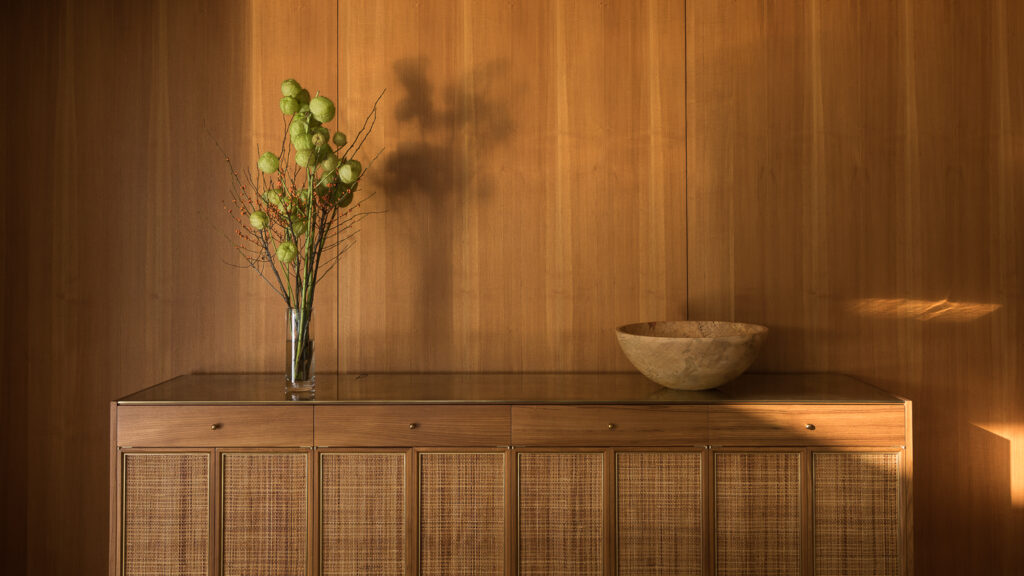
Another beautiful thing I noticed about this project is how Francis’ gorgeous neutral yet warm look carries through the entire shoot. Each photograph looks like how I imagine it would if I stepped into Clear Oak in real life, but with an extra little “something.”
While describing his color grading and processing, Francis noted “For Clear Oak, we wanted to desaturate things a bit and keep it on the warmer side. The goal was to make the images feel timeless and not overly glossy or following the latest photography trends.”
I asked Francis if he ran into any tough situations while on location. “One of the challenges was not wanting to leave the house after capturing it. I had felt such a huge sense of fulfillment over the two days of photography that I wanted to live there – like move in ASAP!”
How can you blame him? This place is incredible!
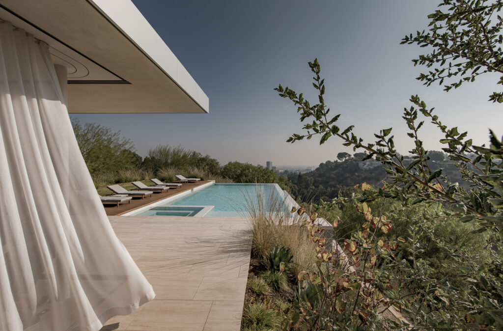
We see those sheers from the last image billowing in the breeze, teleports us right to that space. Not only can I see what it feels like to be there, but the flowing curtain softens the hard edges we find throughout the scene. Francis’ composition is compelling and lovely. The leading line down the center of the frame drives our eyes to the pool. The greenery edging in from the right gives us a sense of place and provides some context as far as the landscape goes while providing balance to the curtain, cantilever, and hardscaping on the left.
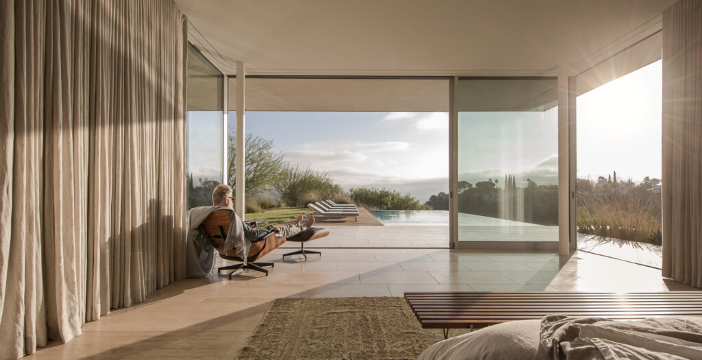
Behold, Francis’ favorite photograph from the shoot — “I really enjoy the feeling of the master bedroom shot with Fred (the model) lounging in the Eames chair enjoying the mid-morning sun over his pool. It really captures what the house felt like to me – ‘a personal sanctuary’ atop the urban sprawl.”
He is absolutely right. With the flaring sun and the sweeping shadows drenching the room in beautiful directional light, I can’t help but to be jealous of Fred myself.
“Lightroom and Photoshop are my go-to team. I’m old school in the sense that I like to capture as much ‘in camera’ as possible. Don’t get me wrong, I’ve done massively processed images like for the NFL, but usually, my post is cleaning up small distracting tidbits or replacing (burning) parts of the image with other bracketed exposures.
My process consists of picking my favorite image from the shoot and pouring all my inspiration from the shoot into finishing it first and foremost — as if it could be in a museum or gallery or on the side of a 30 story building in Times Square.
This image will inform all the other images in terms of post-processing. I will usually do several passes at each batch of photos until I feel they are ready to be presented – then off to school the kiddos go!”
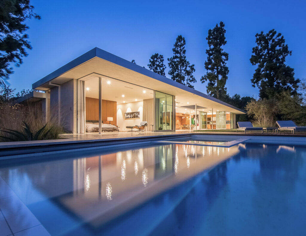
Looking across the still and soft water of the infinity pool, our eyes are drawn to the warm glow of the house interior. This perfect twilight shot enables us to make sense of the layout of the house and the placement of the rooms. We can hone in on the floor-to-ceiling glass doors, the open air entertainment deck, and the contiguous wood walls.
Many thanks to my new friend Francis Dreis for sharing his photographs and his process with us. Ready to drool over the rest of Francis’ work? Head over to his site francisdreis.com or head on over to Instagram @francisdreis
If you have a project you’d like to be considered for Project of the Week, you can submit it here.
