Bernat Tubau Photographs a New Take on a Bygone Nordic Church
In 2009, Våler Kirke (Vaaler Church for us English speaking folk) was lost to a fire. Mourned by the Norwegian town, a global competition was opened up for the church’s reconstruction. Architect Espen Surnevik was the victor and created the new design for the church which honors its heritage while putting a modern spin on the “rebirth” of the original structure from 1805.
Oslo based architectural photographer Bernat Tubau is our photographer of the week, showcasing the Våler Kirke with a delicate and honest portrayal. Moody monolithic exteriors and clean modern interiors await you on this edition of Project of the Week.
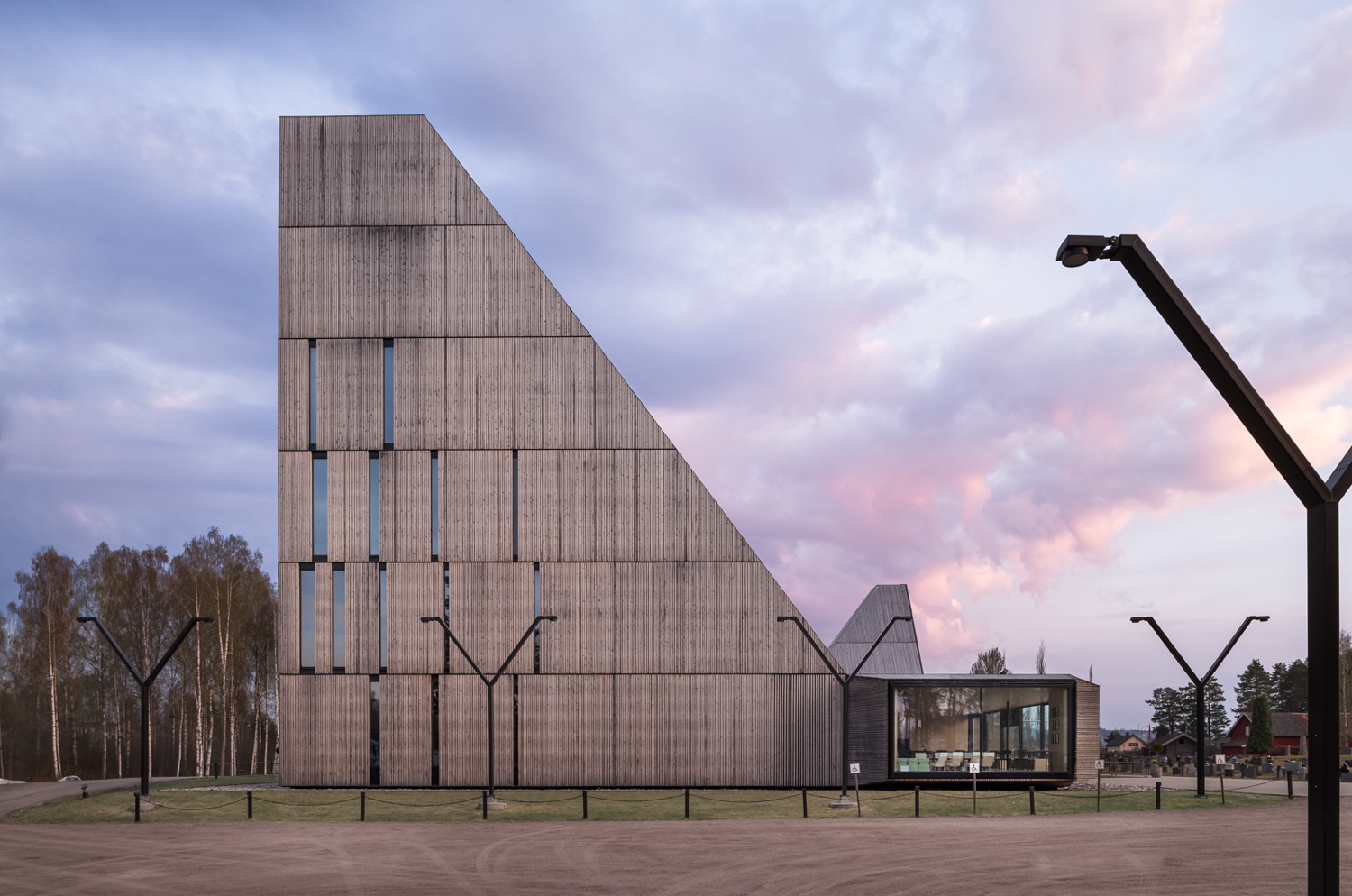
Bernat’s exterior image sets the scene for us with a delicate and beautiful color palette and soft light. The purple clouds give some visual interest without distracting too much from the church itself, allowing our focus to be on the building while hinting at the surrounding. Aside from the lovely sunset, the high point of this image for me is the way the light poles in the foreground frame the church, and how Bernat’s one-point perspective accentuates the way the massing of the church is mirrored by the shape of the light posts. This is a very cool little detail that he plays up here that could be easily overlooked!
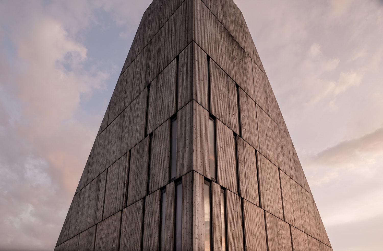
The pyramidal roofs are the focal point of Våler’s exterior design. This photograph serves as a hero shot of one of the towers, showing its shape and perfect symmetry. The light raking across the right side of the pyramid is extremely beautiful, and it pulls out both the texture and the color of the church’s facade. Tight(er) details like this are a perfect way to hint at the craftsmanship and more subtle details of a building!
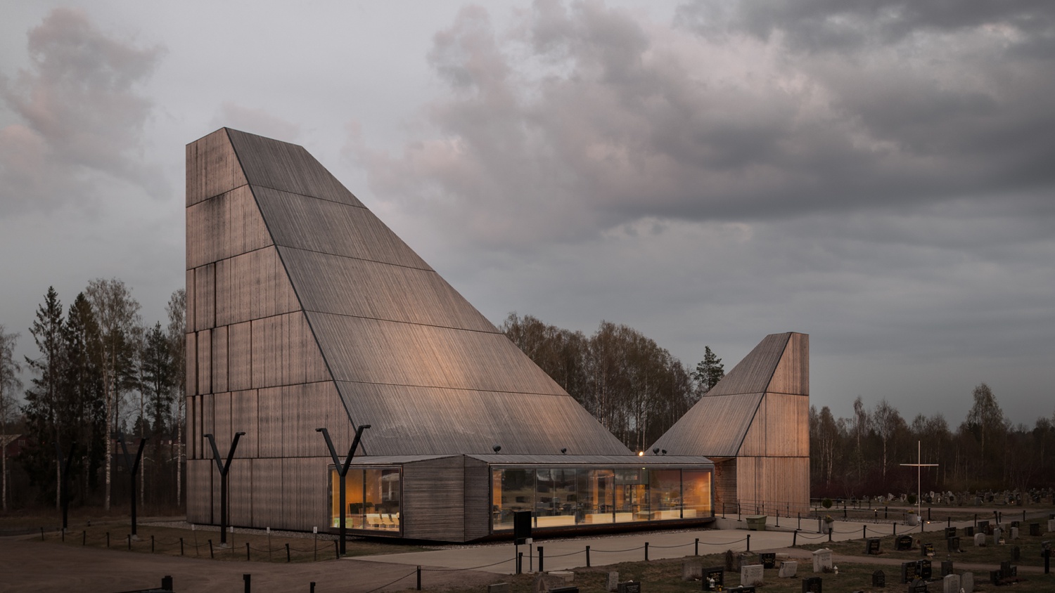
There’s big mood here, and I love it. Bernat’s dark and cloudy scene here allows Våler’s full shape to be observed unhindered. There is a hard and brutalist feeling to this structure, but capturing it with the delicate uplighting and the last faint glow of the sunset on the facade softens it up a bit.
Inside Våler Kirke, Bernat’s subtle and realistic post-processing style makes us feel as if we just stepped in through the door. The angle he chose here is great for a handful of reasons. This perspective showcases the shape of the pyramidal towers that make up the church. We can see the way the wall and ceiling panels converge to a point behind the pulpit. Shooting vertically shows the sheer scale of the room, and how the main hub of the church mirrors itself from floor to ceiling. There is so much repetition here, from the lights to the windows, the lines in the walls and the floor. It is perfectly symmetrical and that — as Marie Kondo would say — sparks joy!
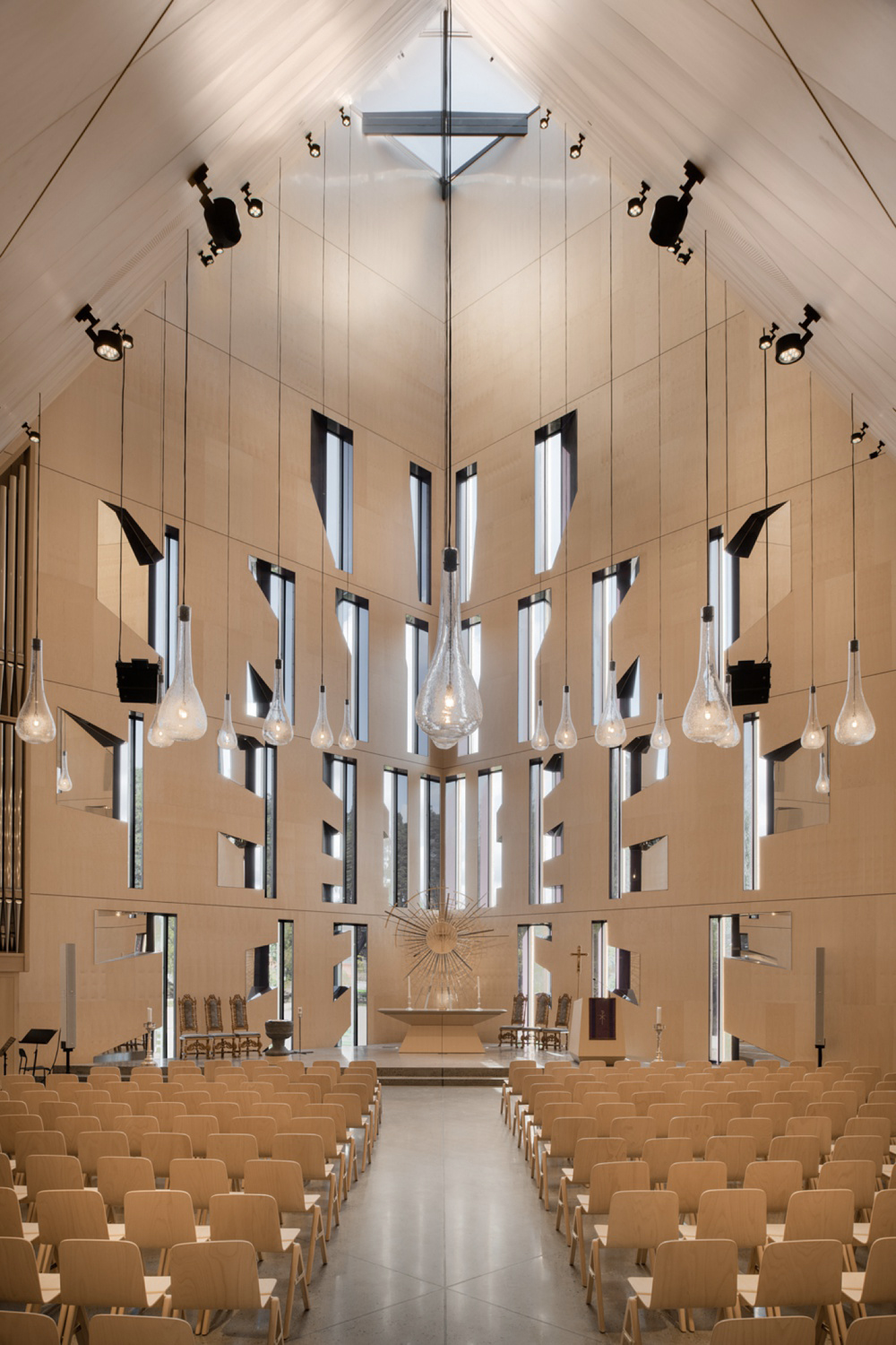
The shape and modern feel of this church is just gorgeous. My favorite bit though is the stream of bulbs cascading from the ceiling. What’s beautiful to our eyes though, usually tends to be cumbersome to photograph. Bernat confirmed that the crazy array of color temperatures was tough to handle:
“When I first went inside the church, I was actually surprised at how light it was. That made the process a little bit easier than I initially thought. On the other hand, the color cast coming from outside was a nightmare. The light was entering everywhere! Blue from the sky and sunlight, green from vegetation reflections, magenta and red from the window frames — it was difficult to match and be consistent.”
It looks like he sorted it out though because the coloration here feels very natural and mild! The monochromatic scheme lends itself to a tranquil and fresh feeling, fit for a space of worship.
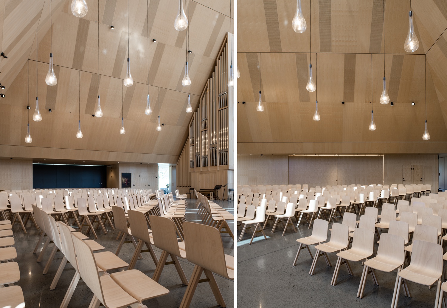
“Espen Surnevik, the architect, has a pretty clean and easy style in his designs. It is so beautiful to me. I just followed the structure lines, and the compositions came up easy” notes Bernat.
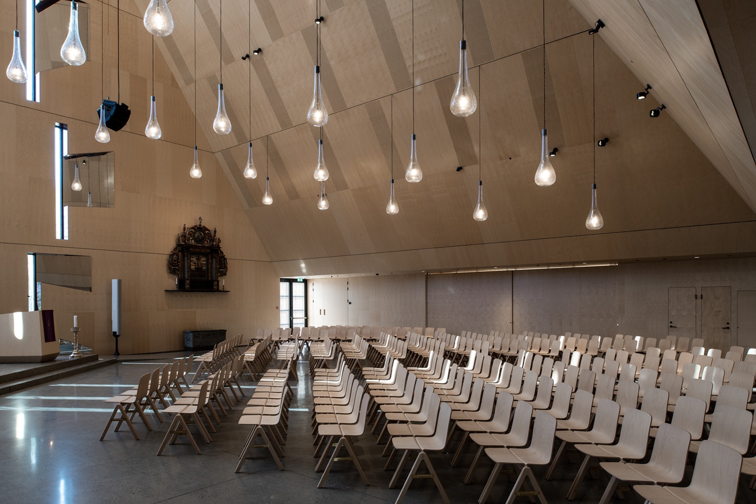
I love this particular scene for a few reasons. Despite being relatively low-key in terms of exposure (matching the mood of the exterior images), the sunlight streaming in from the wall of windows scatters across the chairs and creates some excitement. Although it’s a pretty wide shot, the bulkhead in the top right corner, the chairs at the bottom, and the bulbs above, all bump our eyes into the center of the frame, keeping it cozy feeling and alleviating too much dead space.
This was a very cool take on a modern Nordic church steeped in history throughout the ages. Many thanks to Bernat Tubau for sharing his project with us. You can see more examples of Nordic architecture by following along on his Instagram @bernattubauphotography and by checking out Bernat’s website at bernattubau.com
If you have a project you’d like to be considered for Project of the Week, you can submit it here.
