Architectural Photographer Garey Gomez Makes A Parking Deck Look Magical
Today’s top-notch POTW is a parking garage. Yep…a parking garage. This story is full of drama, with stray bullets delaying the shoot date and Garey and his assistant hauling gear all over the streets of Atlanta!
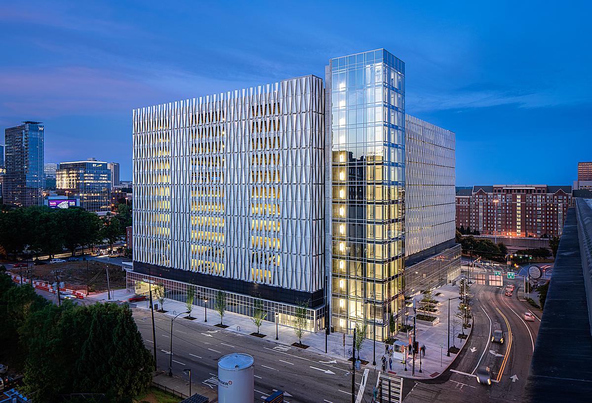
That’s right, today we are checking out the gorgeous work of Georiga-based architectural photographer Garey Gomez. Garey spent two days photographing — of all things — a parking deck in Midtown Atlanta. The parking deck, by Howell Rusk Dodson Architects (a 100+ year old firm specializing in healthcare), is clad with an iridescent metal facade that renders it an ever-changing work of art. It is very, very cool and Garey has so much insightful information on this project and his process, so I’ll just let him take it away!
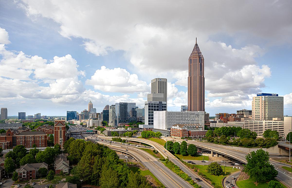
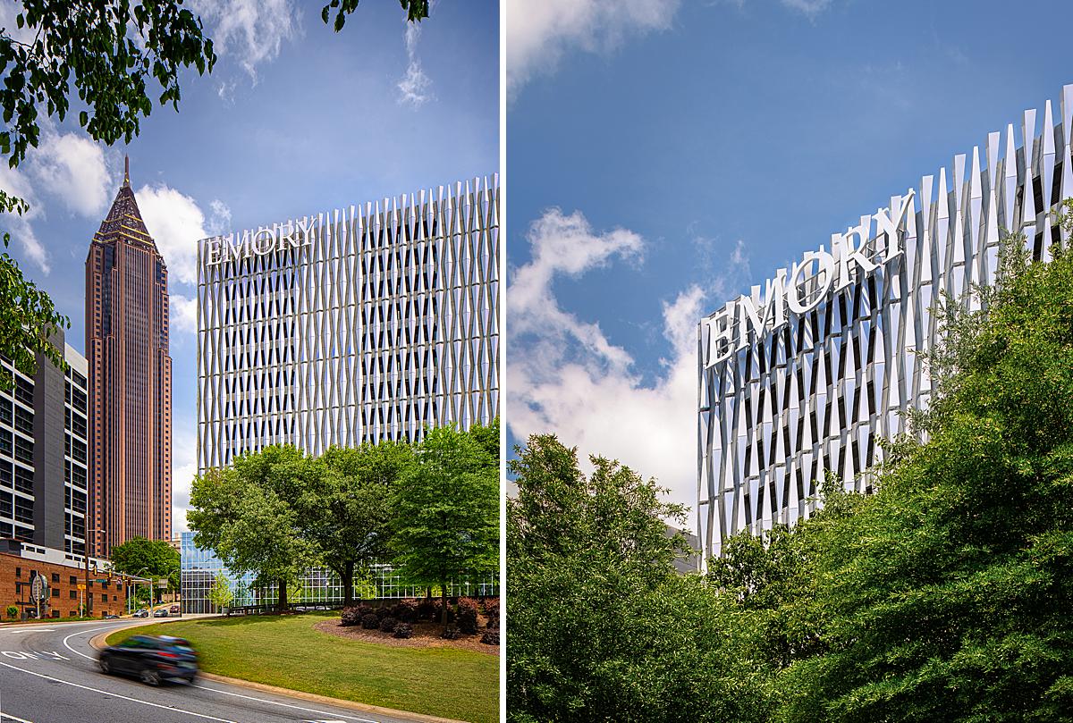
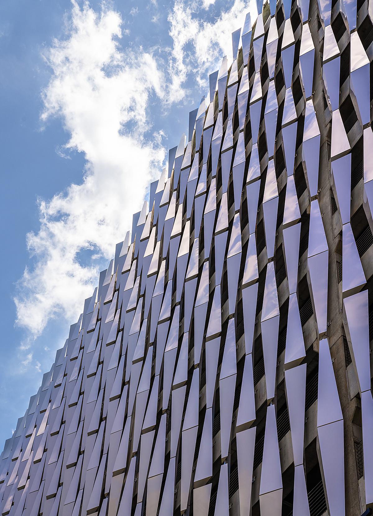
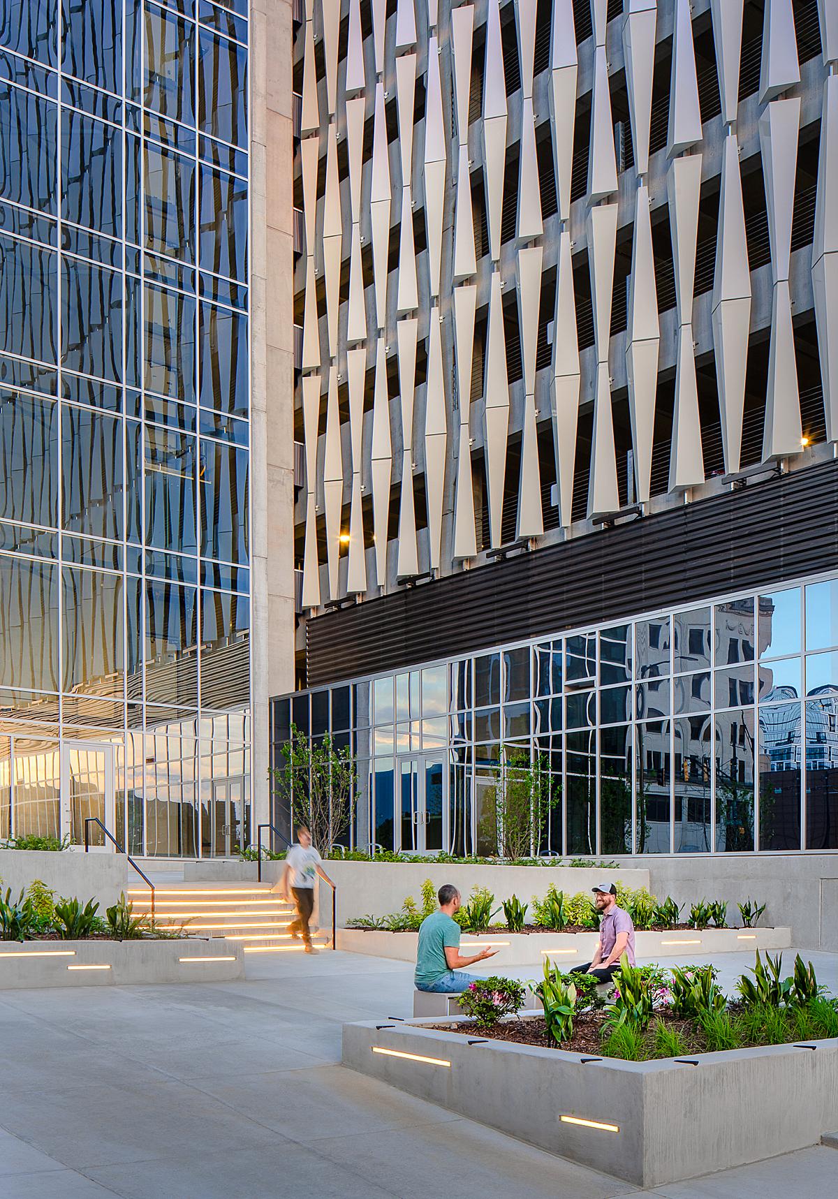
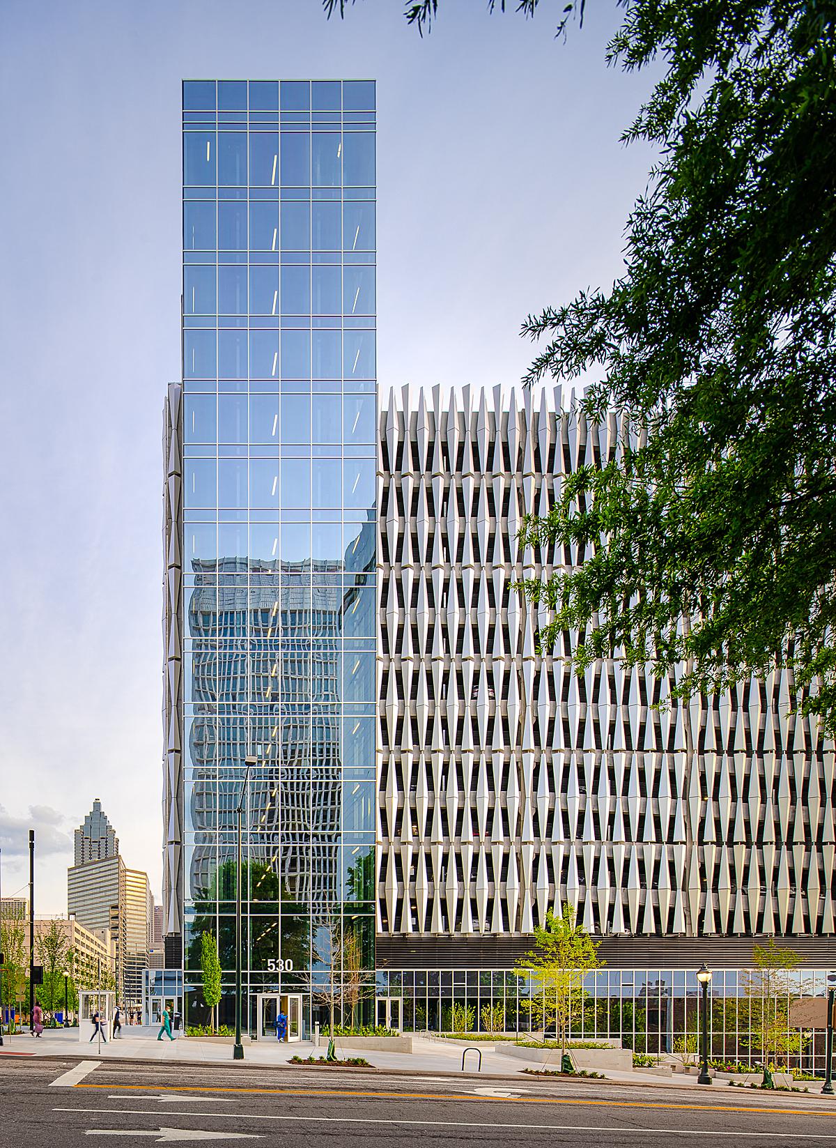
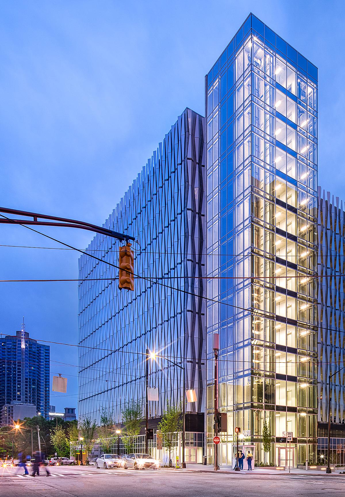
“I’ll admit that my first reaction to the prospect of shooting a parking deck wasn’t one full of excitement. The architect reached out to me by filling out a form on my website, and thankfully he was pretty detailed. By the time I read his summary of the project, I knew it was going to be interesting. This building is on a very prominent piece of land, right on the I-75/I-85 connector in Midtown Atlanta, and was built for Emory University Hospital’s Midtown campus as a parking structure for its massive staff. There’s a mixed-use element to it as well, with sidewalk-accessible storefronts wrapping 3 sides of the building. Right away, you can see it’s not like most parking decks. It has a glass base and a glass elevator tower on the northeast corner, and the site has a 30-foot elevation drop from east to west, which creates a really interesting wedge shape at the building’s base. The rest of the building is clad in a metal screen that is painted in an iridescent white finish that reflects just about any color around it. This was the most fun and interesting part of the building for me, and I knew it would be fun to shoot. The metal screen has lots of facets which creates an awesome texture, but the glossy and color-reflective finish was more challenging to capture in-camera than I expected.”
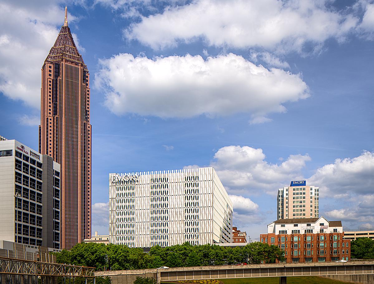
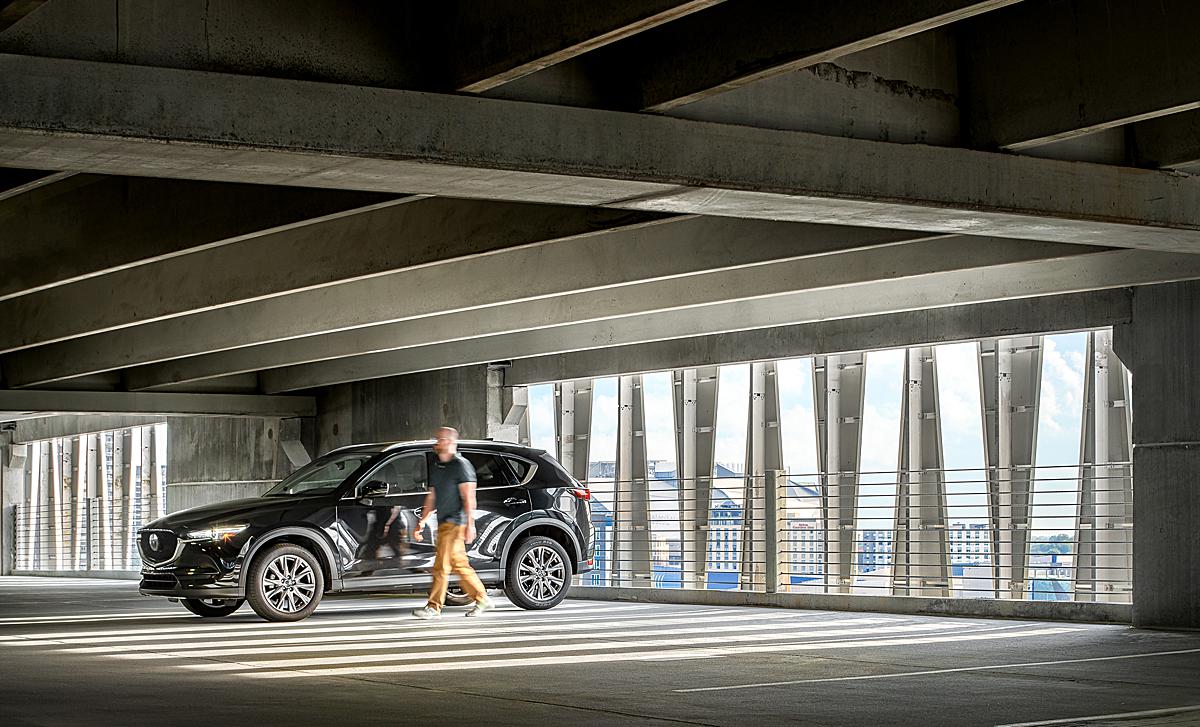
“My goals for the project were to highlight the interesting texture, the glass elevator tower, and to capture as much color in different lighting conditions as possible. My client was only interested in two interior photos — one of the elevator lobby, and the other of the parking deck interior — and the rest of the shot list was focused on the exterior. We needed a range of photos from macro to micro, including broader views that show the building’s context within its surroundings,” Garey continues.
“We booked two days of photography, which were initially delayed due to a stray bullet shattering a pane of glass right before opening day (oh, Atlanta…). The machinery and workers required to fix it would make shooting impossible. At first, this was a little frustrating because there was a lot of coordination that needed to be done over, but in the end it was a really good thing. The extra couple of weeks bought us an extra 30 minutes of golden-hour light on the northern façade, which is where so much of the action is. It really made the shoot,” he shares.
“During the scout I gained access to two neighboring rooftops for those context shots, and found lots of interesting angles to shoot from. From there, the selections were made and I got busy planning the final shot list. We had overcast conditions for the scout, but two perfectly sunny days for the shoot. I didn’t get to experience the sun on the metal panels in advance, so I’d say the most challenging thing I dealt with on the shoot days was the anxiety of not knowing how the materials would react to direct light from different angles. I used The Photographer’s Ephemeris and Sun Seeker to plan things out, and hoped for the best. *Note to future self, ‘Relax, Garey… it’ll be okay.'”
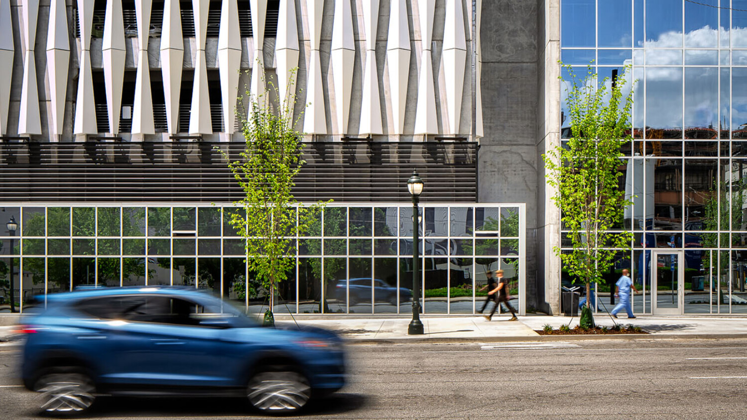
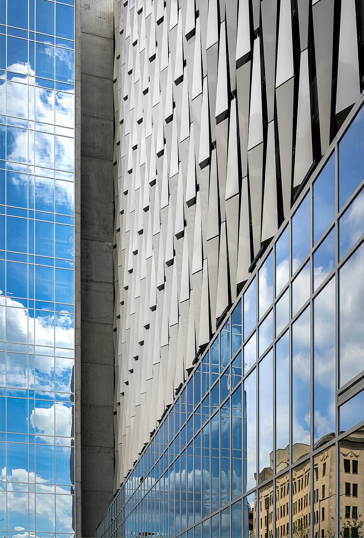
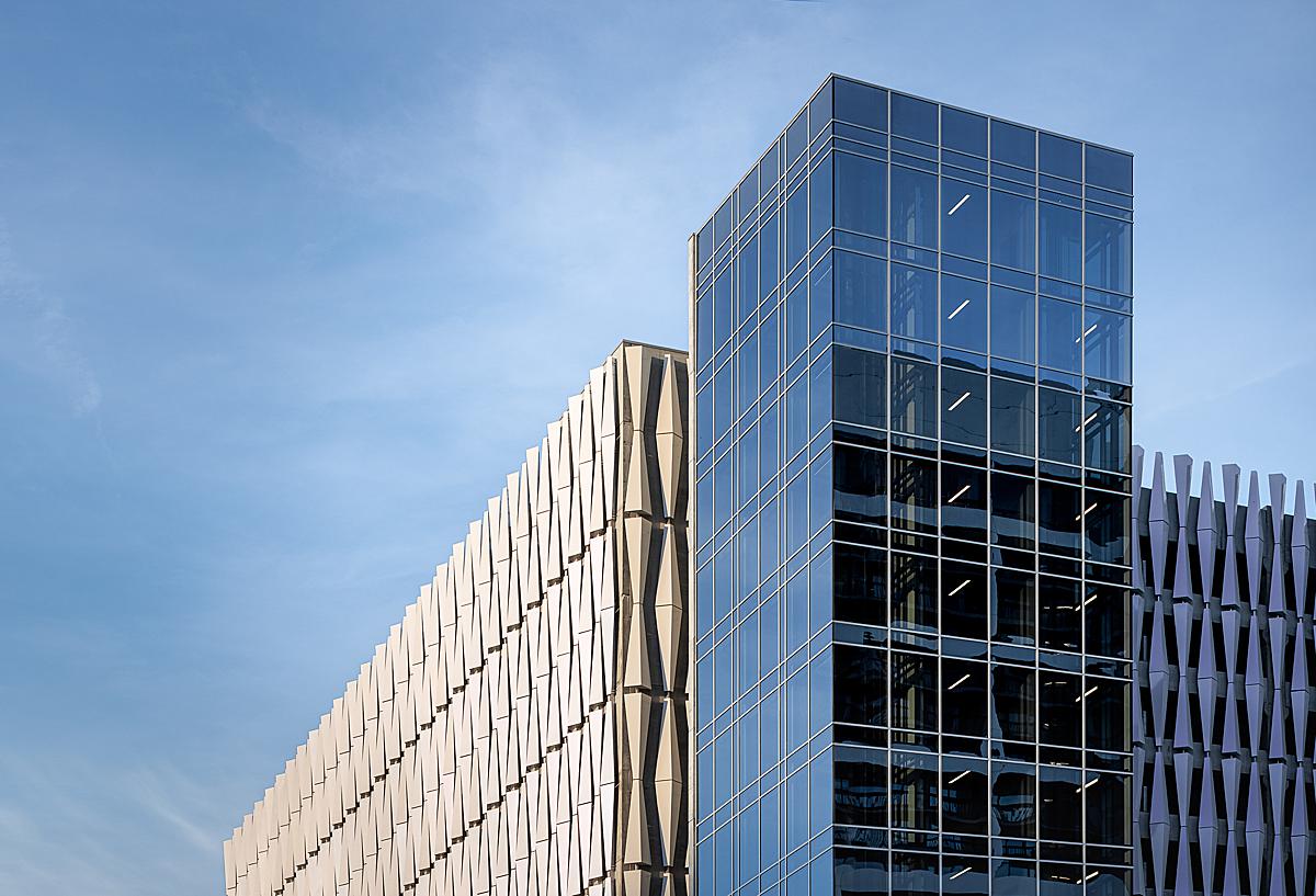
Look at that gorgeous facade. We can see the iridescent gradient of light on the metal panels and the way their complex shape and color are juxtaposed next to the grid of glazing, reflecting the blue sky and clouds.
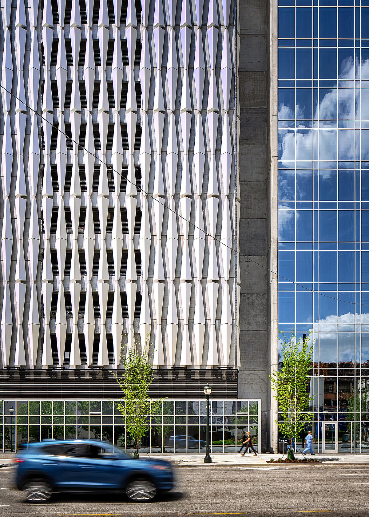
I love the texture of the metal panels here and the rhythm they create. Garey does a beautiful job of making more abstract vignettes to show us the tiny details and highlight the materials used in the project as well as giving us the big picture.
Garey speaks a bit about his shooting style, describing “My process was pretty straightforward on this project. Normally I shoot tethered to my laptop in Capture One, but on exterior shoots where I’m covering a lot of ground, that’s a bit much to deal with. I used my CamRanger 2 for this shoot and I really like it. Once the composition was dialed, I captured 5 brackets and a series of exposures to capture people/cars as needed. I had my assistant with me for both days, and I kept the kit as small as I could. It all fit into a big backpack that we took turns carrying. He was there to help move stuff when needed (garbage cans, orange cones, etc) and watch my back when I was under the sketchy overpass or standing on the interstate exit ramp. He also modeled as a pedestrian in a couple of the images.”
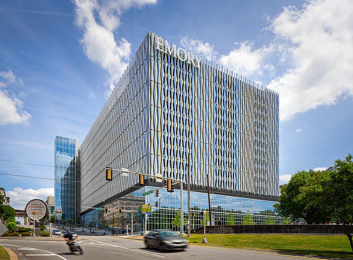
He continues “As for composition, I mostly looked for photos that were visually interesting and also really simple (…said every photographer ever). The building has so much going on with texture and color, that I really didn’t have to do much to help it look great. I leaned on the glass tower a lot for anchoring the composition when photographing the north and east sides of the building. It’s really striking in person, with its reflective blue panes of glass, and it contrasts really well with the metal screen. Likewise, from the west side of the building, the glass curtain wall at the base of the building is its tallest (thanks to the slope on the site), and the west side is where the prominent signage is on the building, which was important to showcase for my client. The wedge shape of the glass curtain wall, as well as the curve in the road along the north side of the building, offered plenty of options for leading lines. I guess I stuck to the basics.”
“[As far as post-processing goes], all of the images were a composite. For exposure, I mostly got what I needed in one or two brackets, and then added people and cars from other exposures as needed. I edit in Lightroom and Photoshop. One thing I learned a little too late at this shoot, is that the metal panels in shadow are the ones with the most color in them. I had to work a little harder than I planned to, to extract some of that color. The reality is that in person, when you are walking around the building, the colors shift with every step you take, so what you are seeing with your eyes is not just the color itself, but you are witnessing a shift in color as you are moving around. It’s wild… But with the tripod in place, you don’t see the color shift happening so it’s not nearly as mind-blowing of an experience (I bet a timelapse would look ridiculously cool on this building). I ended up leaning heavily on luminosity masks using Lumenzia to make selections of the highlights and shadows on the metal panels to selectively adjust (and sometimes add) colors to match when my eyes saw. It was kind of tricky, but I figured it out after a few photos.”
Garey explains, “I use Luminar to finish every photo. I like how it handles the color and contrast, and while you can probably get the identical results in Photoshop, with Luminar I have a couple of presets that I made and it really puts the finishing touches on a photo in just a few clicks. I do this on every photo, interior and exterior, and I love the results. A Luminar layer is my last step in Photoshop before saving back into Lightroom for cataloging.”
I asked Garey what his big take-aways from this shoot were, and what advice he would give to someone shooting a similar project. He thoughtfully replied “Honestly, I’m not sure the fact that it’s a parking deck makes a difference. But two things really jump out to me as being valuable — First is to get to know the architect and the building a little. It helped a lot to know his intentions and how the building was going to be used. A few weeks after the shoot, he referred to me as a partner, and that comment felt really good to hear. Second, I did place a really huge emphasis on scouting and planning. I ended up being in the right place at the right time for every shot, which really takes a lot of the stress out of things for me. There were some compositions I just wasn’t sure how they would look at the time of day I was planning to shoot them. For those, we remained flexible. But for the most part, a solid plan is very helpful for me on a building like this, and there weren’t really too many surprises, so I guess it works!”
It’s safe to say this is easily one of the coolest parking decks I’ve ever seen. Garey’s photographs do a perfect job of highlighting its best and most unique features as well as showing off how it sits in relation to its surroundings. What an awesome project!
A huge thank you to Garey for sharing this project and all of his insight with us! See more of Garey’s work at gareygomez.com and on Instagram @gareygomezphoto.
If you have a project you’d like to be considered for Project of the Week, you can submit it here.
