A Stately American Home With a Dark Surprise Photographed by Brian Wetzel
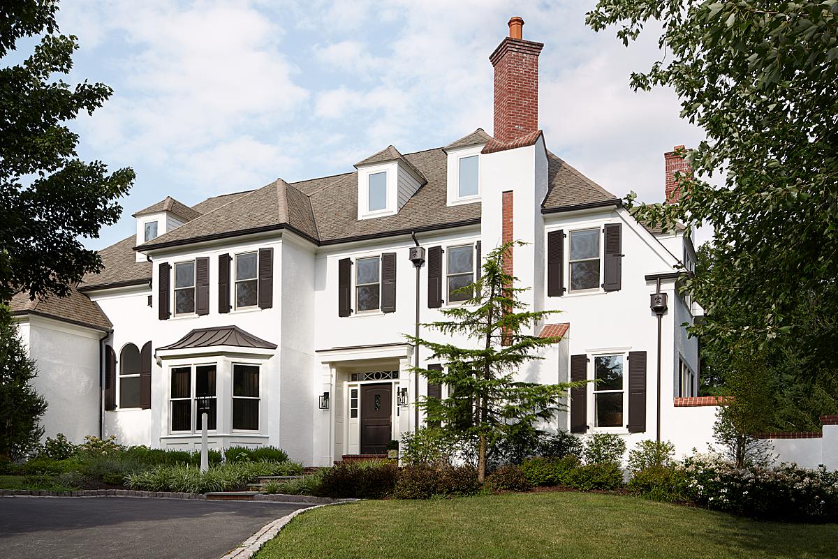
For this week’s featured project, we’re going to take a look at a big ‘ole classic American home in Pennsylvania, because it holds quite a colorful surprise! Architectural and interiors photographer Brian Wetzel has been kind enough to share heaps about this very cool project. I’m so excited to shake things up from the typical modern and contemporary shaped POTW buildings, and check out this stately home boasting craftsman details and a few fresh and funky design elements!
Brian kick’s things off by telling “This project was photographed for interior designer Far Studio, which is a talented husband and wife duo consisting of designer Brittany Hakimfar and her husband Ben Hakimfar. I had scouted the location on a rainy day and then shot the project over 2 days. I really connected with the design, how it felt upscale but not uptight, high-end but approachable and comfortable. I love the dichotomy of the dark and moody spaces versus the light and bright spaces.”
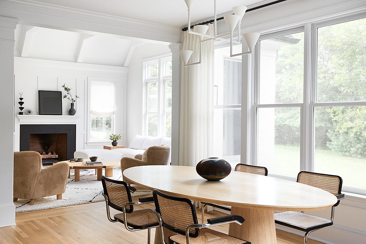
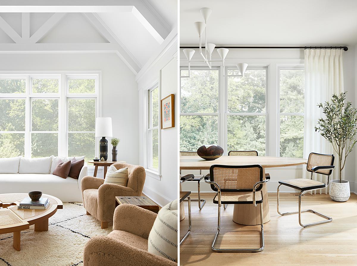
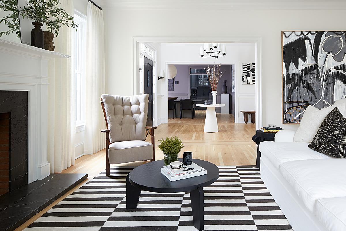
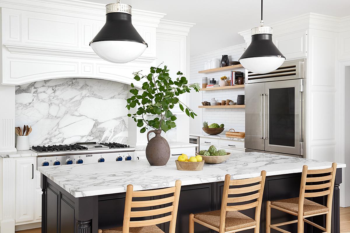
Ah yes. Light, airy, and full of thick craftsman era trim, casings, and rafters. Brian really captures a tranquil and soft quality in these images. There is a sense of peace and quiet. I’d be happy to plop down in any one of these chairs with a book and relax.
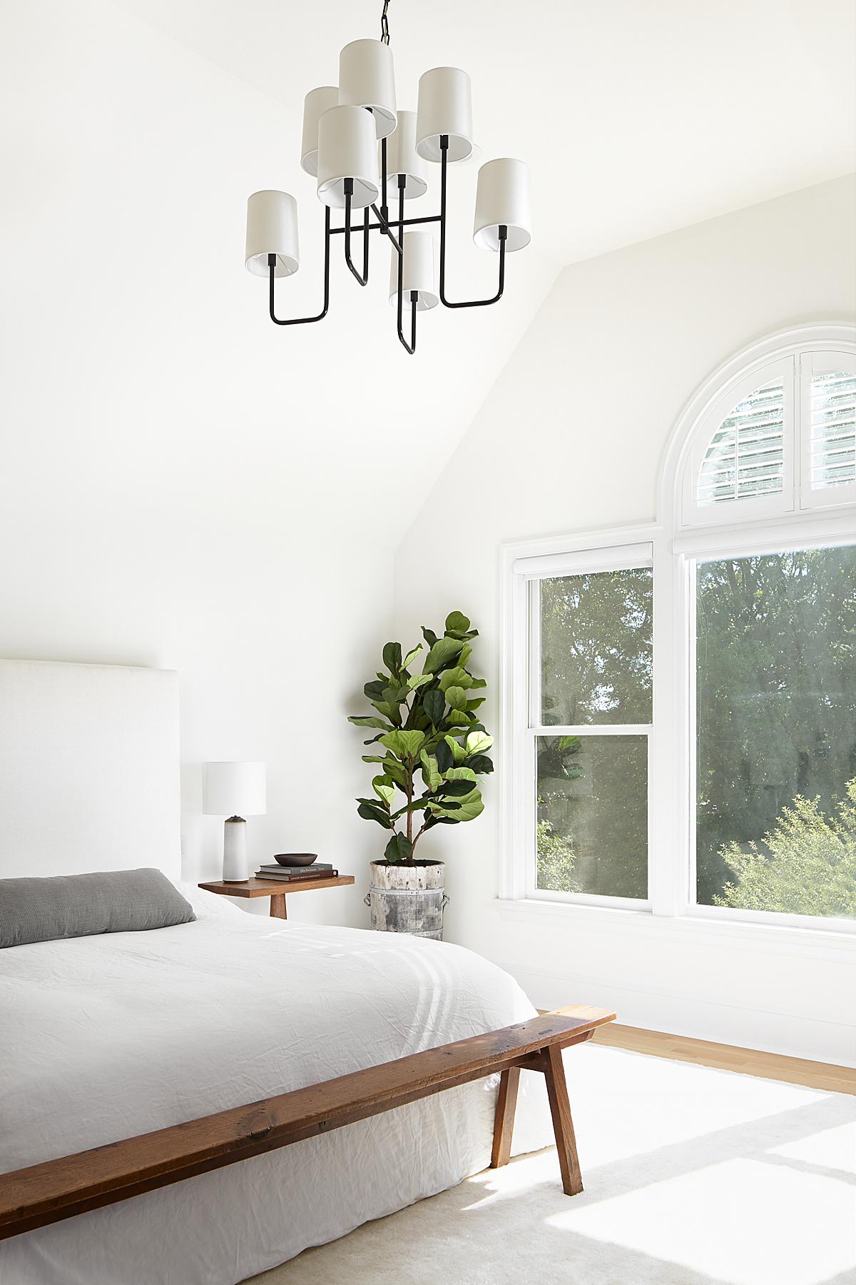
“The first shoot day was an early start with hopes of morning light streaming through the large east-facing windows, but we ended up with an overcast sky. The aesthetic ended up being more soft and calm,” Brian shares.
“I was really pleased the client gave me 2 days to shoot, as this alleviated some pressure and granted me the time to really craft each image. Scouting the space ahead of time was super helpful too because I walked in already knowing what many of the angles and shots were going to be, instead of spending time exploring and hunting for each shot. The amazing moment was just seeing the project finally coming together. After scouting, creating a gallery, and emailing back and forth with the client, it was nice to see it all come to life.”
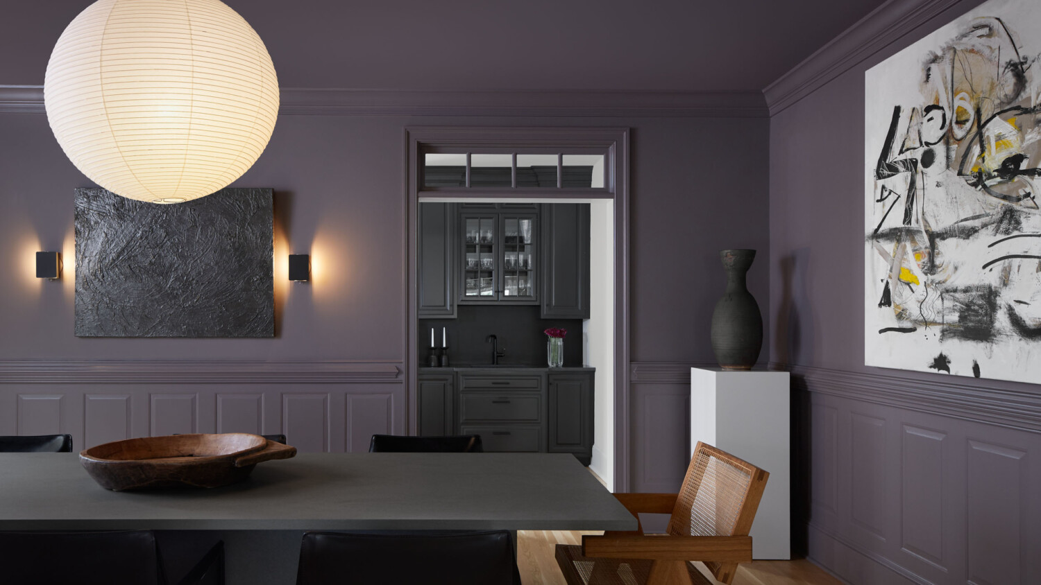
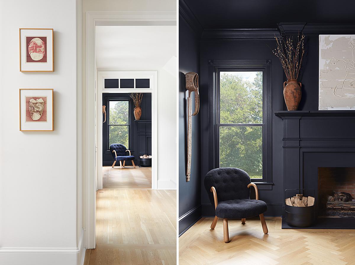
Here we catch our first glimpse of the purple room! Brian has tastefully and subtly lit the purple room, and the dark cabinets beyond. The directionality of the light convinces us it’s coming from a window in the room, and he bringtens those dark tones up enough for our eyes to be drawn in, all the way to the back of the frame.
But back to the light and bright;
He continues “I like to walk around the space and shoot handheld with a zoom lens first. This gives me an opportunity to audition some angles and get a sense of what focal lengths are best. Then I’ll pick a lens, go onto the tripod, and shoot tethered to Capture One. I carry a 24-70mm zoom and a variety of tilt-shifts. I usually shoot a bracket of ambient exposures first and then introduce artificial light that’s motivated by the natural light. I’m a Profoto guy so I use the A1’s and B1’s. In post-production, I’ll blend them together to ideally get the best of both worlds: the cleaner color and controlled dynamic range of flash shots blended with the natural shape and authentic feeling of the available light.”
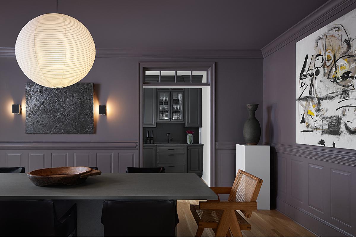
Now, back to that luscious deep purple dining room! Brian explains that this is his favorite shot from the whole series. “I like the bold one-point perspective and the balance in the asymmetry. To me, it also has a nice balance of warm tones in the wood and lights, contrasted by the cooler tone of the purple walls.”
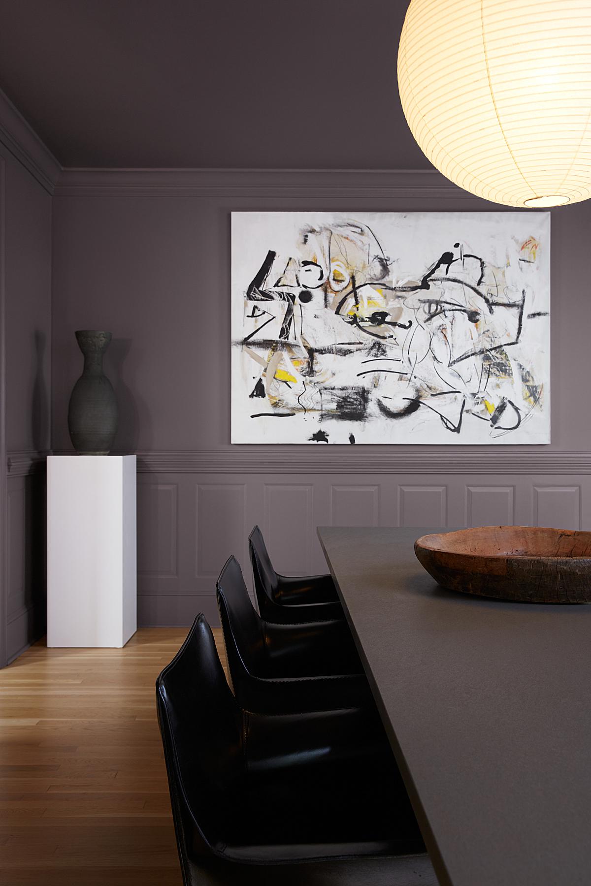
I was curious about his process for this dark room. I knew the purple paint and dark elements would sip up any available light. The paint appears a bit glossy as well, which is unforgiving when you break out your light kit. Brian did a tremendous job at lighting these rooms, keeping them moody and natural feeling. He explains
“The white and bright rooms were much more forgiving, while the dark rooms required me to be more deliberate about lighting them. I find very dark rooms tend to suck up a lot of light and often take on some murky color casts. A common lighting technique is to bounce light off the ceiling, which works great on a white ceiling but not so well on a dark ceiling. For the dark rooms, I often hung white diffusion by the windows and bounced light off them to mimic the natural light.”
Here’s another great juxtaposition of this house’s contrast-by-design. Brian handles the light and color perfectly!
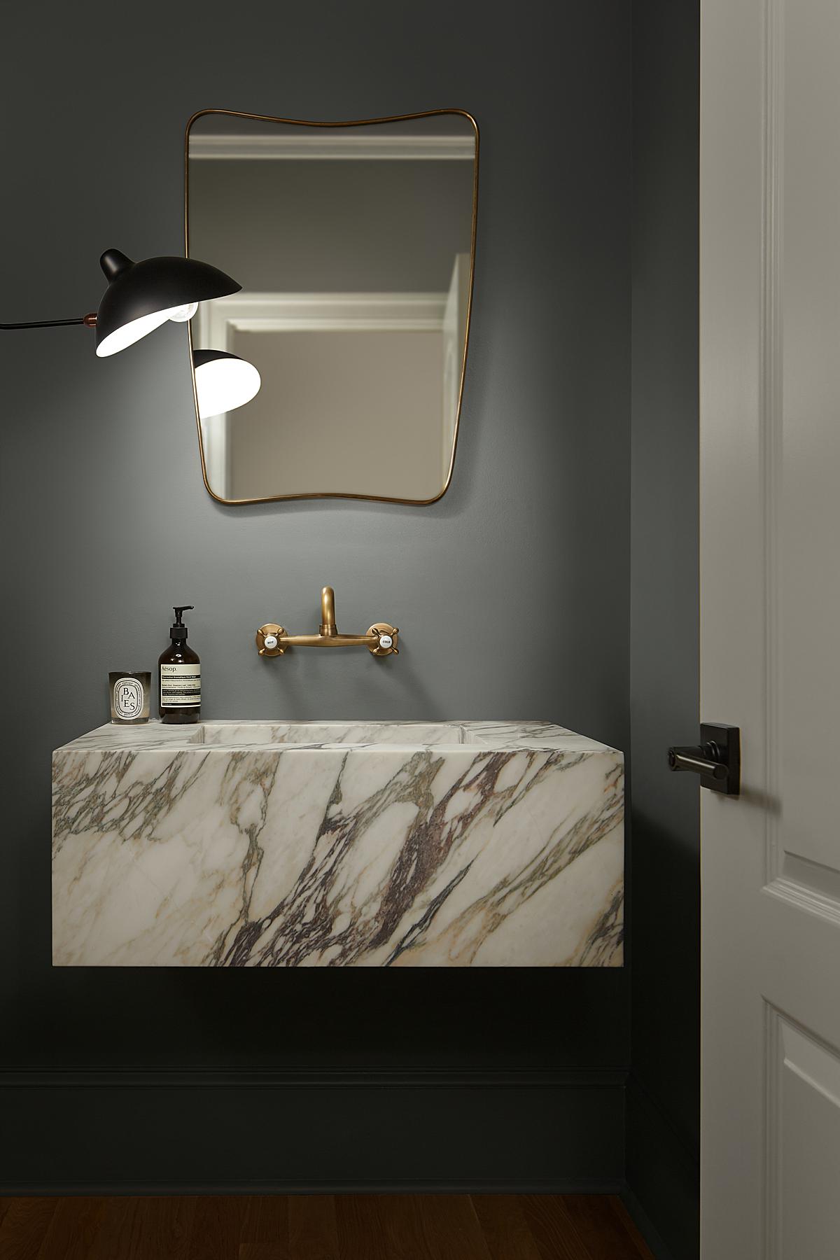
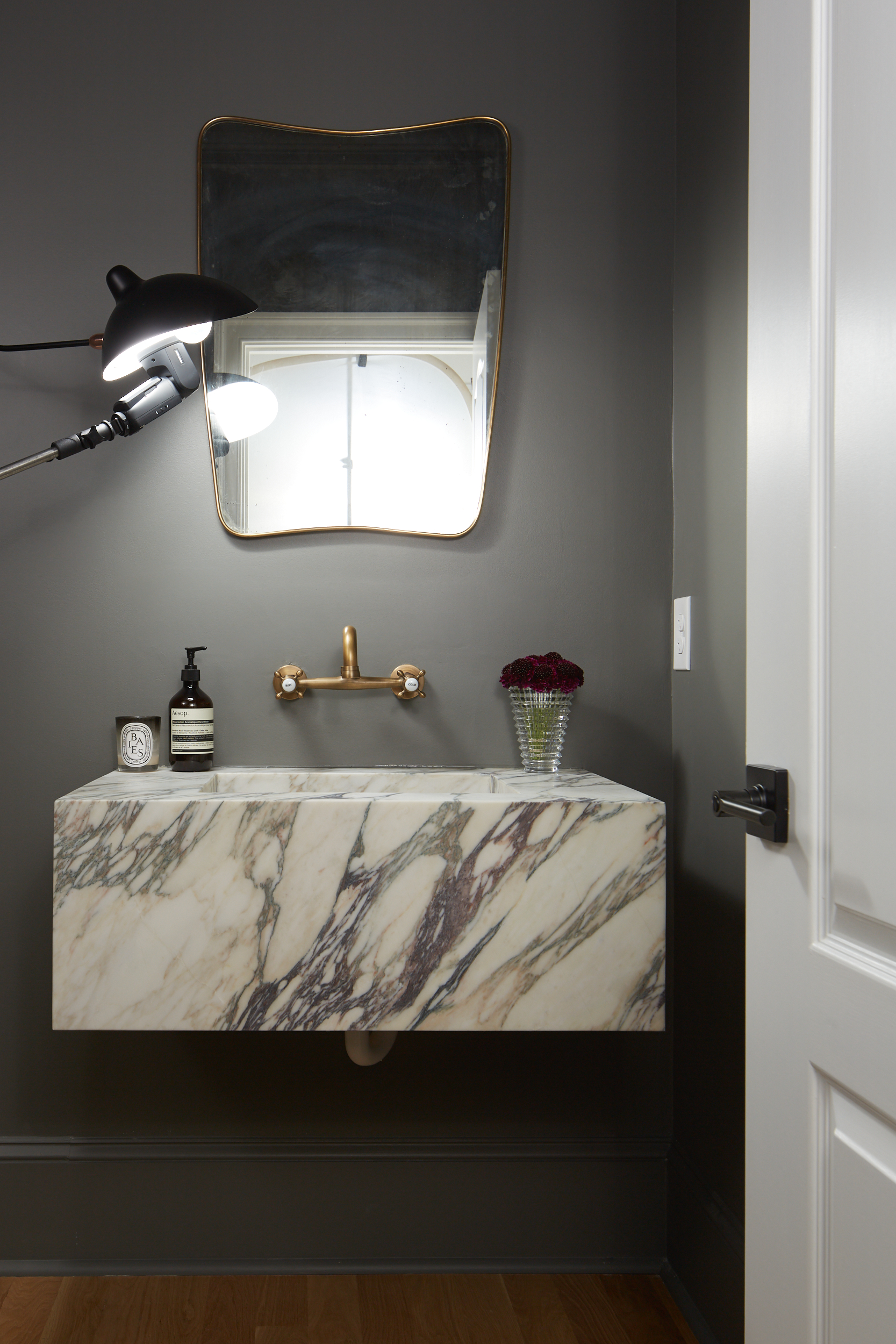
As we hop in to the next dark room, Brian shares a new trick. “Small powder rooms are always a bit challenging. I liked the idea of a moody vibe with the lamp as the main light source, but I didn’t really like the actual shape of the light it was creating,” he says.
“I experimented for a while and then ended up shooting a speedlight directly into the lamp to shape the light the way I envisioned it, and then retouched out the speedlight. I enjoy the process of shaping the light in moody scenes. Back when I got my first camera I remember being fascinated with light painting and long exposures in dark scenes. I still use some of those techniques today.”
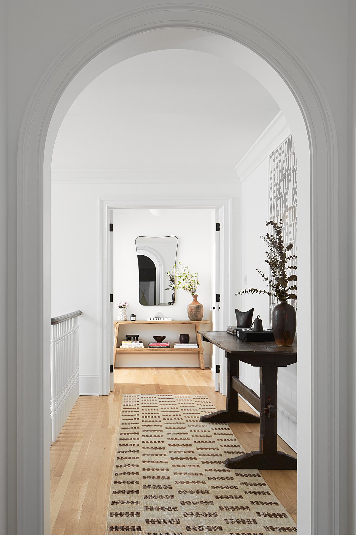
As we venture upstairs, the tranquil and delicate mood of the clean white paint is back. Brian’s composition here does a beautiful job of showing off the arch way and thick trim as our eyes are pulled to the light washing over the room at the end of the hall.
Here’s another soft and lovely image to close out this week’s featured project! I love the crisp wites and the way the highlights on the floor convey a sense for the time of day. Just beautiful!
We are so appreciative to Brian for sharing his project and process with us here at the Architectural Photography Almanac.
To close things out, Brian asked to share a few thank you’s himself:
“I love learning new techniques and seeing how other people work, and I’m so appreciative to everyone in the community for sharing their knowledge and offering a peek behind the curtain! There’s obviously Mike Kelley for creating this site and also his F-stopper videos. Barry Mackenzie has a great intro video series with ProEdu and also has the BAAM podcast with Andy Macpherson. During Covid Peter Molick started sharing some awesome post-production videos in his blog/YouTube. Arturo Sanchez is incredibly active on social media via @shiftercom curating all kinds of behind-the-scenes footage from the international community. Ema Peter and Tom Harris are both always sharing behind-the-scenes in their Instagram stories. And Lexi, thank you for all the time and effort you put into the site. We the readers really appreciate it.”
Shucks. I’m blushing. We have such a great community in our little niche of photography!
Don’t be shy, check out more of Brian’s work! Head on over to brianwetzelphoto.com and give him a follow on Instagram @brianwetzelphoto
If you have a project you’d like to be considered for Project of the Week, you can submit it here.
