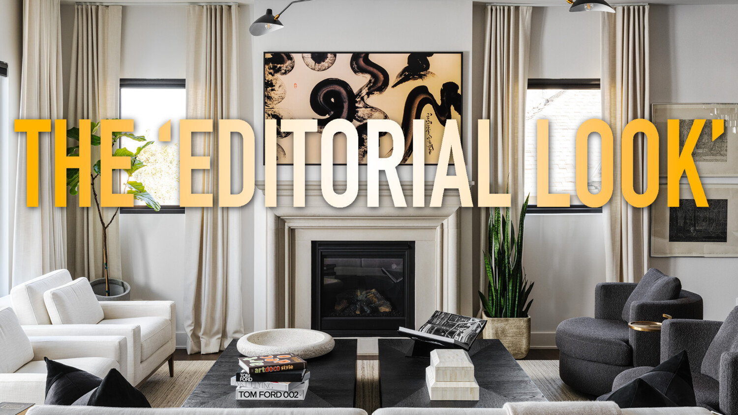
Achieving the Coveted “Editorial Look” – One Major Ingredient
Opinions will vary drastically on how to achieve (or even define what exactly is) that coveted “editorial look” in architecture & design photography. In fact, as I type out this paragraph, I’m not exactly sure if I could even define what it is (yes I understand the irony). That being said, over the years I have noticed one common thread within most “editorial” style images.
Now I can’t spoil the ending completely…obviously I’d love for you to click on the video. BUT, I think focal length has a lot to do with it.
When shooting the living room in the video below, I approached it with the intention of this project eventually being published in at least one of the local design magazines here in Kansas City. I go over the strategy behind the camera placement, focal length, and furniture position in order to achieve that magazine/editorial look.
