Adobe Lightroom or Capture One? A Subjective Comparison | Part One
I remember the first time I used Adobe Lightroom. It had to be around the year 2008. It was a shock to me back then. I mainly had used Photoshop before, which is a powerful tool, but especially at that time, it wasn’t well-suited for quickly editing a large number of photos. The aesthetic, minimalist interface of Lightroom was so intuitive, straightforward, and user-friendly that I immediately took to working in this program. On the other hand, Capture One has always been closely associated with working with Phase One digital backs files and tethering. I also started using it around 2008. Since I’ve been using both of these programs for many years, I’ve decided to gather my subjective thoughts on the differences between them. This is not an objective, comprehensive comparison! It’s more of a collection of observations derived from practice. Of course, I won’t describe all the features, but mainly those that are useful in architectural photography. Perhaps some of you will find some useful tips here. My intention isn’t to ultimately determine which program is better! Spoiler alert: I still use both and plan to continue using both! Why?
Because the topic is quite broad, I’ve decided to divide it into several articles. I’ll start with four general topics:
- types of licenses,
- the difference between a catalog and a session,
- interface,
- tethering.
In subsequent articles, I’ll cover more detailed subjects such as lens corrections, working with color, history panel, and others…
License
Adobe hasn’t been selling boxed versions of its software for 10 years now. The only way to purchase a license is through a monthly or yearly subscription. The price depends on promotions, but generally, the most cost-effective option is the photography plan, which includes both Lightroom and the powerhouse tool that is Photoshop.
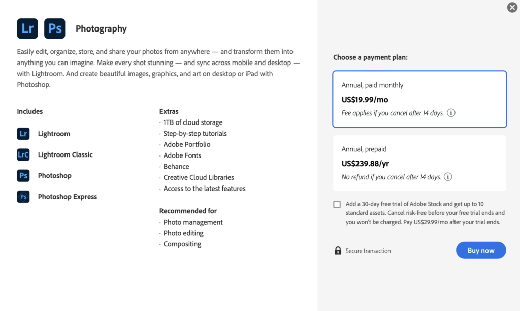
This represents a significant difference compared to Capture One. In this article, I’m comparing the programs without taking Photoshop’s features into account, but it’s important to keep in mind that in practice, by using the appropriate Adobe license, we also have access to Photoshop, which offers tools incomparable to Capture One. The first argument for why I have a Lightroom subscription and don’t plan to give it up? In my work, I can’t imagine not having Photoshop. So, Lightroom is, in a way, an added bonus. With Adobe’s cloud (depending on the chosen plan), we also receive disk space for file storage and synchronization, as well as the mobile version of Lightroom CC, allowing us to work on a phone or tablet.
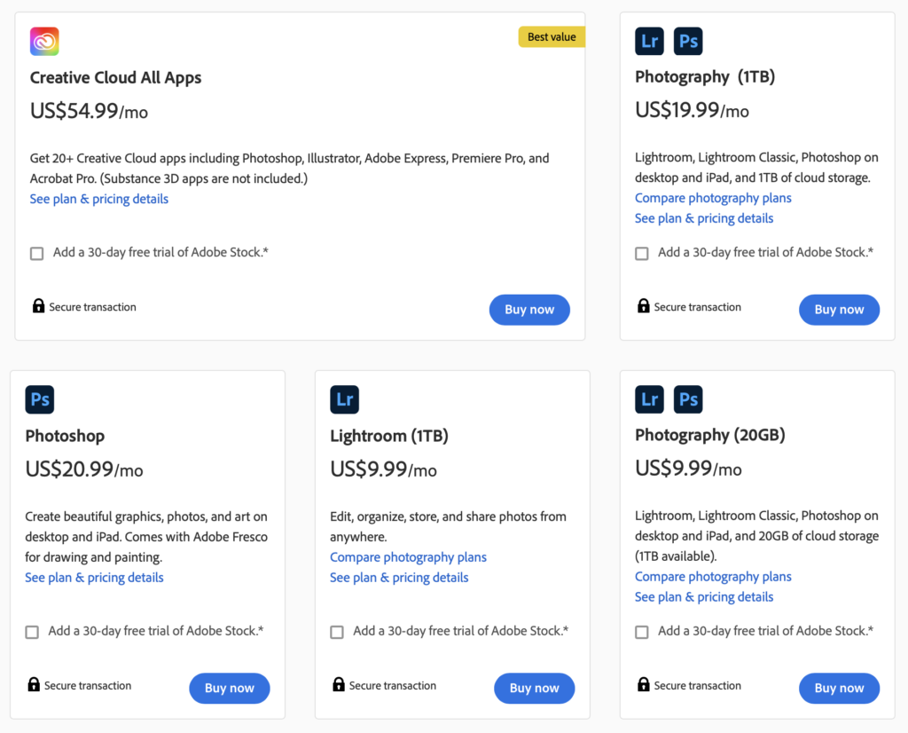
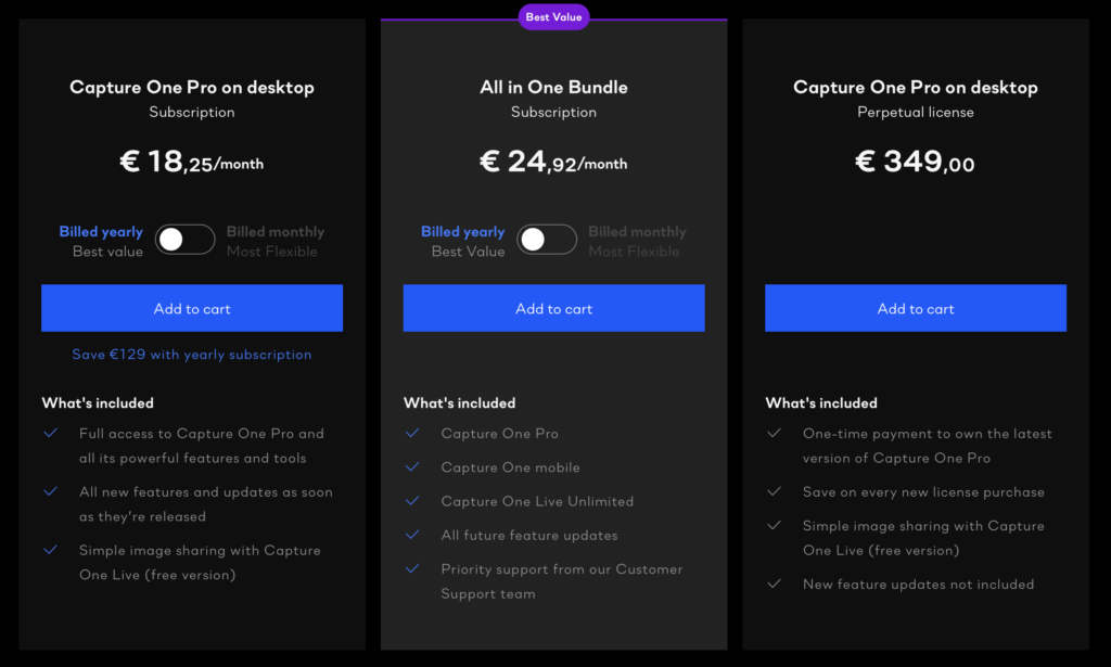
Capture One Pro is available in both a perpetual license version with paid updates and a subscription option, allowing us to continuously receive the latest program versions. In response to Lightroom CC, a mobile version of Capture One was also recently introduced. Unfortunately, it’s only available in a pricier subscription. More recently, we’ve gained the ability to share online galleries through the Capture One Live feature.
With the release of Capture One 20, the version previously known as Capture One DB has been rebranded as Capture One for Phase One. It’s worth mentioning that this version is free for Phase One camera users and allows working with files from Phase One cameras (digital backs). This is a convenient solution not only for owners of this high-end equipment but also in situations where we’re using rented gear. In such cases, we can work in real-time tethering on our computer during a session or edit the material later. The first reason why I can’t imagine working without Capture One: I shoot (less frequently) with Phase One equipment.
Catalog or Session?
Upon launching Lightroom, it requires the creation of a catalog. We can save it in any location, but by default, it ends up in the ‘Pictures’ folder (Mac OS). In the initial years of working with this program, I maintained a single, large catalog into which I imported subsequent assignments as separate folders. I never moved or copied images into the catalog; I simply left them where I had transferred them, usually onto an external drive.
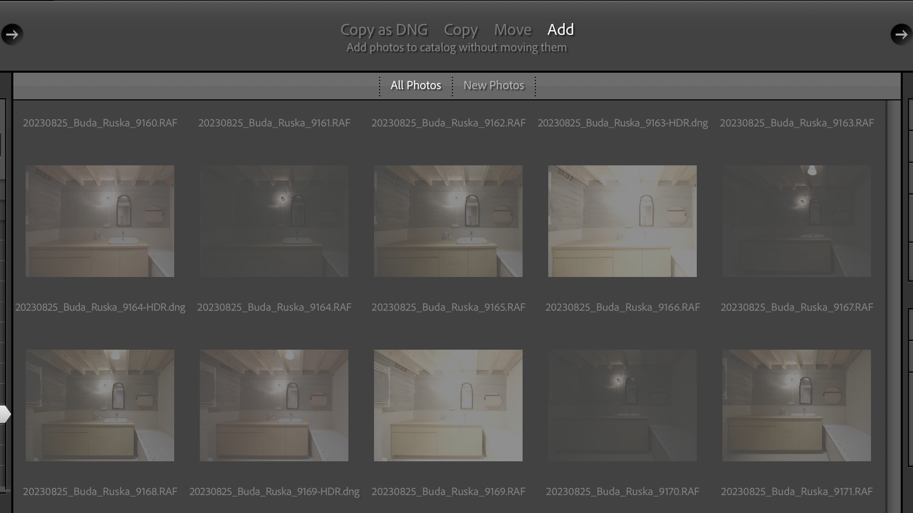
Quickly, I realized the downsides of this approach:
- The catalog file, stored on the computer’s boot drive, grew to substantial sizes, encroaching on valuable system disk space.
- The program began to slow down as it was burdened by the massive catalog file, despite my actual work involving only a small portion of it.
- I saved images on external drives and occasionally moved them from one drive to another. Lightroom would then lose connection to those images.
- When attempting to edit photos on another computer (since I had them on an external drive), I couldn’t access the Lightroom catalog with its settings.
That’s why I now employ this approach: For each session or assignment, I create a new Lightroom catalog and keep it in the same folder as the RAW files. This way, I can effortlessly move the photos (RAW files) along with the Lightroom catalog dedicated to those images.
What are the drawbacks of such an approach?
- We can’t browse the entire archive from within Lightroom, such as when we want to make a selection of photos for a portfolio or display all photos taken with a 24mm lens from 2012 to the present…
- We can’t have more than one catalog open simultaneously.
- We can’t open such a catalog over a network, meaning we can’t keep it on a NAS drive. To clarify: technically, we can, but to open it, we need to copy it to the system drive
Here is where another advantage of Capture One comes into play: session. In Capture One we have two options: catalogs like in Lightroom and sessions (for years, this second option was the only possibility in C1). Sessions are a significant advantage for me:
- Can be opened from network drives!
- They align with my workflow style. I can segment my work into assignments and keep the session file together with the RAW files.
- I can also simultaneously open several session files in separate windows and easily move (drag & drop) images between sessions.
- You have ability to browse any other folder on your computer without having to import.
A Session provides a simpler, folder-based workflow with a predefined structure of ready-to-use folders. This allows us to browse through the entire archive when, for instance, we’re working on our portfolio. Sessions are suitable for tethered shooting, individual jobs, etc.
Here’s a question for you, let us know in the comments: how do you organize your material in LR or C1? Separate catalog/session for each assignment or one large shared catalog, or perhaps a catalog for each year?
If you’re considering switching from Lightroom to Capture One and are concerned about the unfamiliar session structure, you can opt for a catalog that works similarly to Adobe’s program. Capture One even supports importing Lightroom catalogs!
Interface
Lightroom has a very well-designed interface. No arguments there. It’s clear, intuitive, and aesthetic. The division into modules is a fantastic concept! The starting point was the stages of working with photos, which still trace back to the days of analog photography (after all, ‘lightroom’ is a nod to the ‘darkroom’). In its standard Library view, it vividly resembles a lightbox with neatly arranged slides in gray frames. This association might be unclear for most users who began their photography journey in the digital age, but I’ve personally observed older professionals for whom Lightroom significantly eased the transition from analog photography, allowing them to part with their old Sinar view camera with a 120 film back for a digital camera. I have the impression that I work faster editing photos in LR, precisely because of the interface. On the other hand, this simple interface comes with significant limitations. We practically have no options to tailor it to our needs. Capture One offers complete customization. Every tool, window, or tab can be rearranged, removed, added, or even duplicated in multiple places.
The majority of features in Capture One can be rearranged, allowing you to freely shift them between Tool Tabs. You can even adjust their size when they’re detached from the Tool Tab by clicking on the Tool Title and dragging it. Certain elements of the interface can also be concealed. The tools can be divided between a scrollable section and a pinned section within the Tool Tabs. The pinned section is consistently placed at the top, facilitating the convenient pinning of tools that require immediate accessibility.
Capture One allows the creation and saving of personalized workspaces. This means we can create layouts of windows that are most convenient for our specific purposes. For instance, I use a simplified workspace tailored for tethering, containing only the essential functions so I don’t have to search through extensive menus. Additionally, it can be practical to prepare separate workspaces for distinct post-production stages.
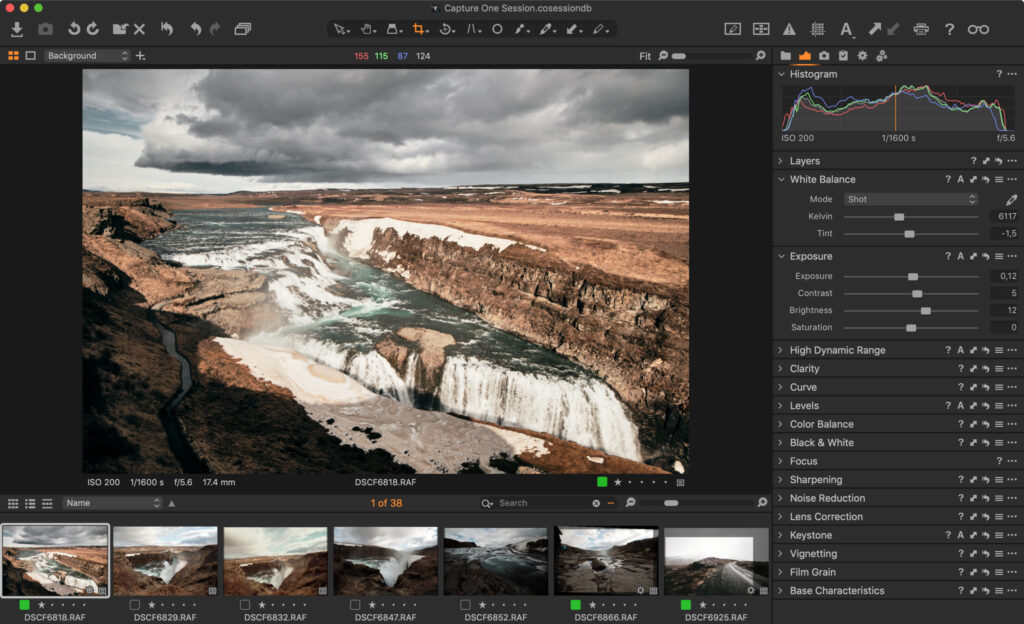
One of the most noticeable differences when transitioning from Lightroom to Capture One is that the default layout positions tools to the left and the browser to the right of the viewer. To opt for a layout more reminiscent of Lightroom’s, simply go to ‘Window > Workspace > Migration’. This will configure a workspace that more closely mirrors Lightroom’s arrangement.
In summary, I find Lightroom to be less demanding. Its operation is easier and quicker to learn. On the other hand, Capture One is a tool for the more advanced user, catering to those who know precisely what they desire from a photo editing program and who have a well-defined workflow.
Tethering
That’s perhaps the most significant difference. If you frequently engage in tethering, I can’t imagine working with any other program than Capture One. It operates with much more reliability and stability than Lightroom, offering a multitude of possibilities. The entire session folder mode is tailored for this purpose. For tethering, it’s Capture One all the way!

What I appreciate in Capture One:
- Swiftness and stability of file transfer (remember to use a good cable).
- Effective functioning of live view.
- The convenience of easily dividing images into capture folders. This feature is useful for organizing individual shots, photographed subjects, or rooms.
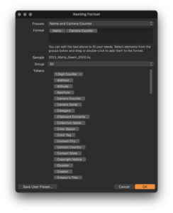
- The extensive and user-friendly auto-naming of files according to a schema. I often use the option to create filenames based on the capture folder’s name. For instance, in a portrait session involving multiple individuals, I create a new capture folder for each person with their surname, and the filename derives from the folder name. This greatly simplifies later work with clients. The same system is employed for real estate photography when capturing several apartments in a single building.
- Overlay and grid. It’s very useful when you want to capture an image that will match a specific layout.
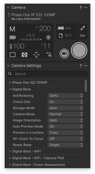
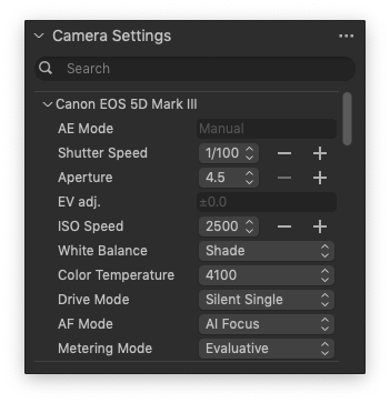
- Full access to the camera menu. One of my favorite features is the ability to search for menu options of the camera. I regret that there isn’t such a possibility in cameras themselves, which after all have very advanced functions. In Capture One, for example, you can start typing “delay” and the computer finds the menu items where you can set the capture delay.
Tethering in Lightroom:
The window always gets in the way, there’s no good place for it! In Lightroom, the tethering option is merely an add-on. This function seems to have been designed as if it were not essential. The entire interface and menu layout are well thought out and consistent (as I mentioned above), but the tethering panel appears as a floating window that obscures the rest of the program and doesn’t have a proper place. The configuration options are quite limited.
Summary
This article covers quite general topics, and I believe it’s already evident that the software programs differ from each other. In my opinion, everyone should answer the question of which one is better for them. A good example is tethering. I truly can’t imagine working in a photography studio with any other program than Capture One. On the other hand, if someone only edits photos imported from memory cards and doesn’t require advanced functionalities, the ease of use in Lightroom and its attractive subscription plans will be a significant advantage for them.
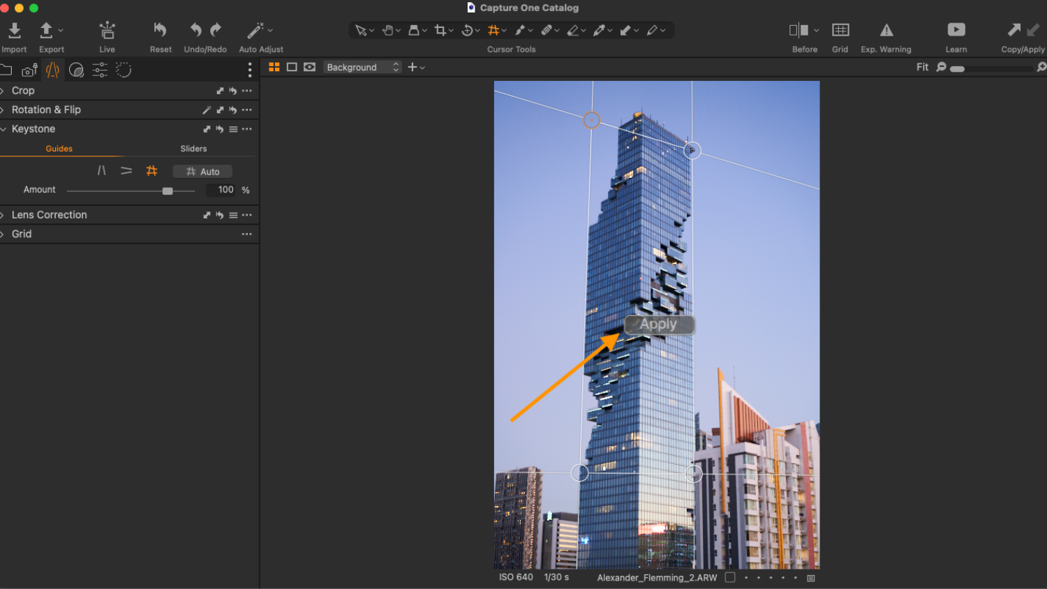
In the upcoming articles, I will explore functions that, in my opinion, are essential for architectural photographers, such as LCC and guides, crop settings etc.
What about you? What features do you consider indispensable in the software you use?
