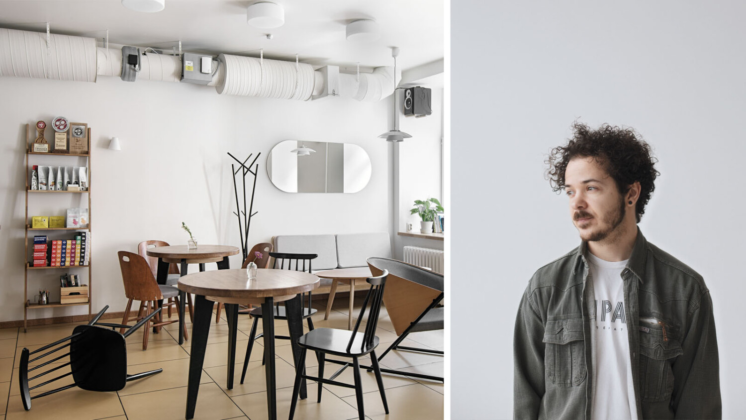
Perfecting Imperfection – Meet Photographer and Architectural Retoucher Anton Ivanov
The longer you look at Anton Ivanov’s work, the more things you’ll find to love. Full of life, restraint, mood, and character, each photograph is perfectly imperfect. The same can be said about Anton’s career. A short-lived stint in wedding photography because of his shyness actually allowed him to blossom as an architectural photographer. A mistake on a product shoot led him to what could be described as his signature style. Now, faced with leaving behind his life in Russia for the time being, Anton finds joy in post-processing for others.
Get to know Anton and you’ll learn a little bit about “dehancing” photos, the psychology behind imperfect images, knowing when a photo is just not working, and benefiting from accidents.
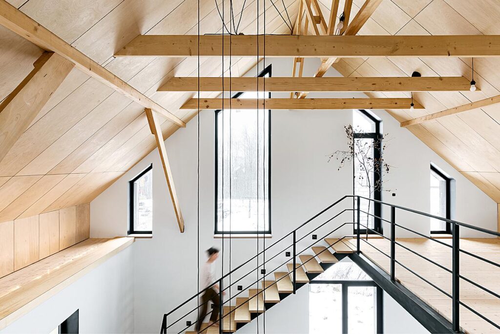
Designer: Pavel Hutskiy Decorator: Anna Koroleva Plywood furniture: Georgy Tolstoy
Lexi: Hey Anton, thanks so much for taking the time to chat with us over here at APALMANAC. To kick things off, can you introduce yourself to our readers, and tell a bit about how you got into photographing architecture?
Anton: Hi Lexi! My name is Anton Ivanov, I’m an interior photographer from Saint Petersburg, Russia.
My way into commercial photography started about ten years ago with reportage photography – mostly weddings and nightclubs. I quickly found myself too shy for those kinds of shoots.
Once, with the help of my friend, I managed to capture some photos during a play in a theatre. I loved it. It still was sort of reportage photography but more challenging and way more interesting. There was complex light, fast-moving actors, abstract and intriguing scenery, and theatre atmosphere in general… So for the next four years, I was mostly photographing theatre shows and actors’ portraits.
During my professional not-so-actor career, I stumbled across the local magazine heading “apartment of the week”. There were descriptions of how everything was built, something about decor and photos – A lot of stunning photos. Why? First of all – vertical verticals. Second – the photo series somehow managed to tell me a story and atmosphere of a place without people as main characters. In most cases, there were no people in the photos at all. I found it intriguing and decided that I also want to photograph apartments for magazines.
I got a photography job in a real estate agency. On my fifth photo shoot, I realised that ISO 3200 was not a good idea even for quick cheap work, and I need a tripod and a better understanding of how to shoot and post-produce my photos in general. Eventually, I got better and began to work with designers and architects, including shooting for magazines.
Now I have been photographing interiors for five years. The more I understand this genre, the more I love it. It has everything I like in photography: some art parts, sometimes abstract or tomfoolery. There is lots of technical stuff you have to think about during the shoot and post-process. The opportunity to spend an hour building a single frame. Chance to visit a lot of new people, see their houses, and listen to new stories, and many other pleasant things.
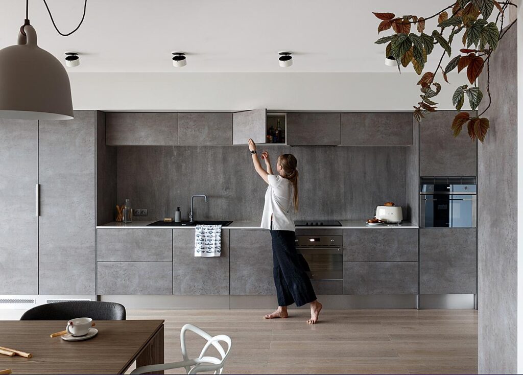
Designer: Olga Kulbachko
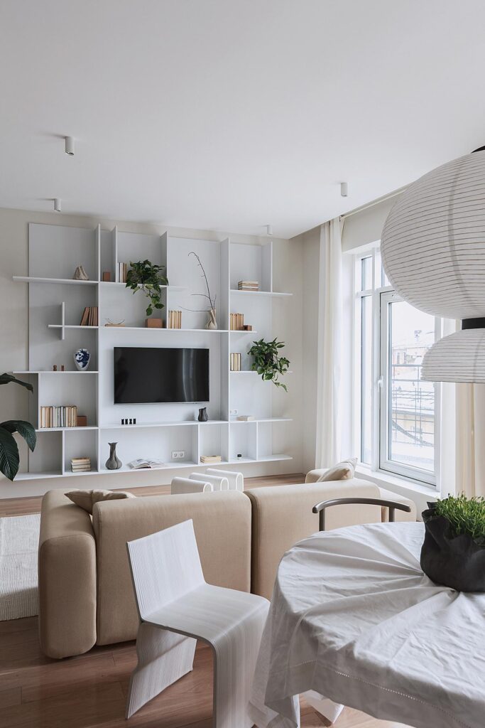
Designer: Katerina Kirillova Stylist: Anna Koroleva

You said to me that you’ve relocated to Turkey. What is it like moving to a new market and starting over in a sense? You mentioned to me that you can’t take on new jobs photographing projects, but instead are doing a bit of retouching. Can you tell us a little about that?
Well, it’s not a relocation in a way when you want to try a new market because your own is too small or not challenging enough. It’s a different story. My country has started an aggressive criminal war against Ukraine. Everything has changed in very little time, and it’s getting worse. I had not only lost interest in work but couldn’t feel safe anymore. My government literally wants me to be killed somewhere in the snowy trenches for some [insane] ideas. It’s not in my plan.
So for at least six months, I am in Turkey managing migration laws, looking for a place to live, and figuring out what to do next. I have chosen this place because some of my friends are here. It was easy to move from Russia and there is a lot of space for my second passion after interior photography – road biking. The local market could be interesting though. First, a lot of research has to be done. Right now I don’t have enough energy and curiosity to do that. It may sound strange but I just found editing someone else’s photographs in these circumstances more simple and understandable.
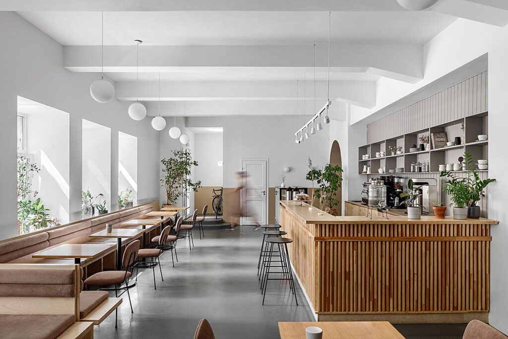
I noticed on your website that you have a whole section dedicated to photographing cafes. That is so cool! Ballpark, what percentage of your work comes from photographing cafe and restaurant spaces?
Thank you. It started at about ten percent and now, including offices and other public places, has increased to fifty. Actually, I also have a section dedicated to offices after updating my portfolio.
Working in public places, especially with cafes and restaurants is different from apartments. It’s more complicated and challenging because of scouting, preplanning, and the unique design of the spaces. In flats, you often can use standard angles for photos, but it doesn’t work so well for a tiny L-shaped coffee shop or large coworking spaces.
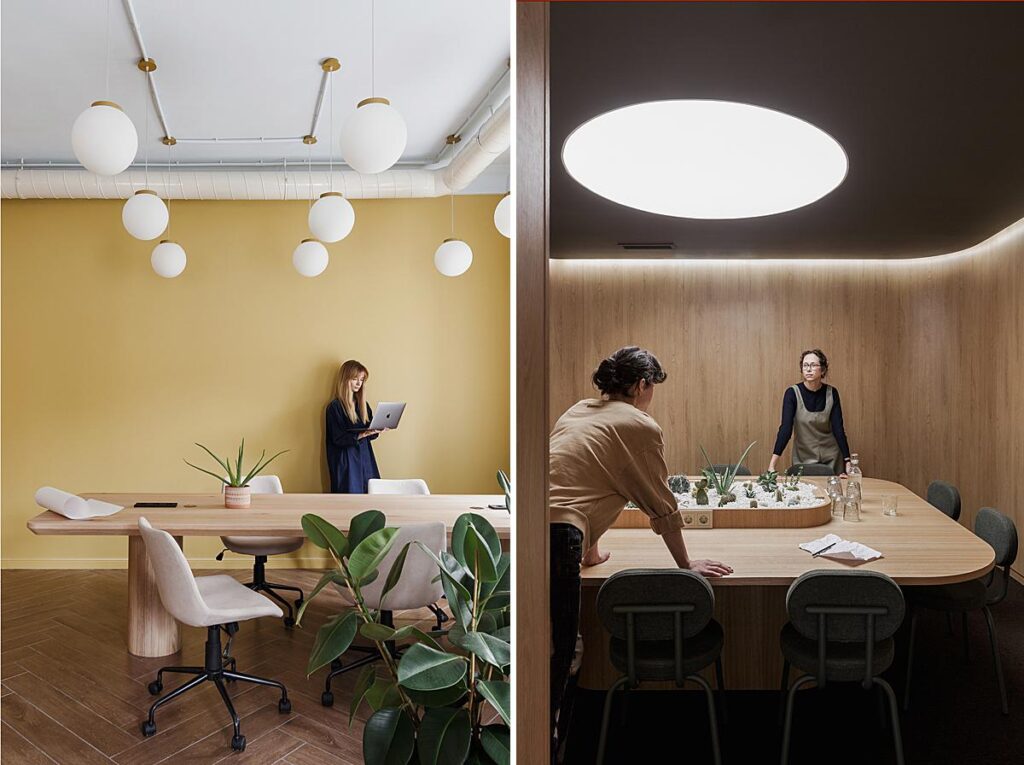
Stylist: Anna Koroleva
Speaking of your website, I love all of the work under your “things” category. You photograph furniture in such an interesting way. Some shots are playful, some feel like fine art – I’d love to know how you got into photographing furniture and how you feel it relates to (or differs from) typical architecture and interior photography.
I think that interior photography is like product photography except you are inside the product. For me, it’s the same work pace but with a different perspective. For example, instead of searching for a good spot for the camera, you build up a scene in front of it.
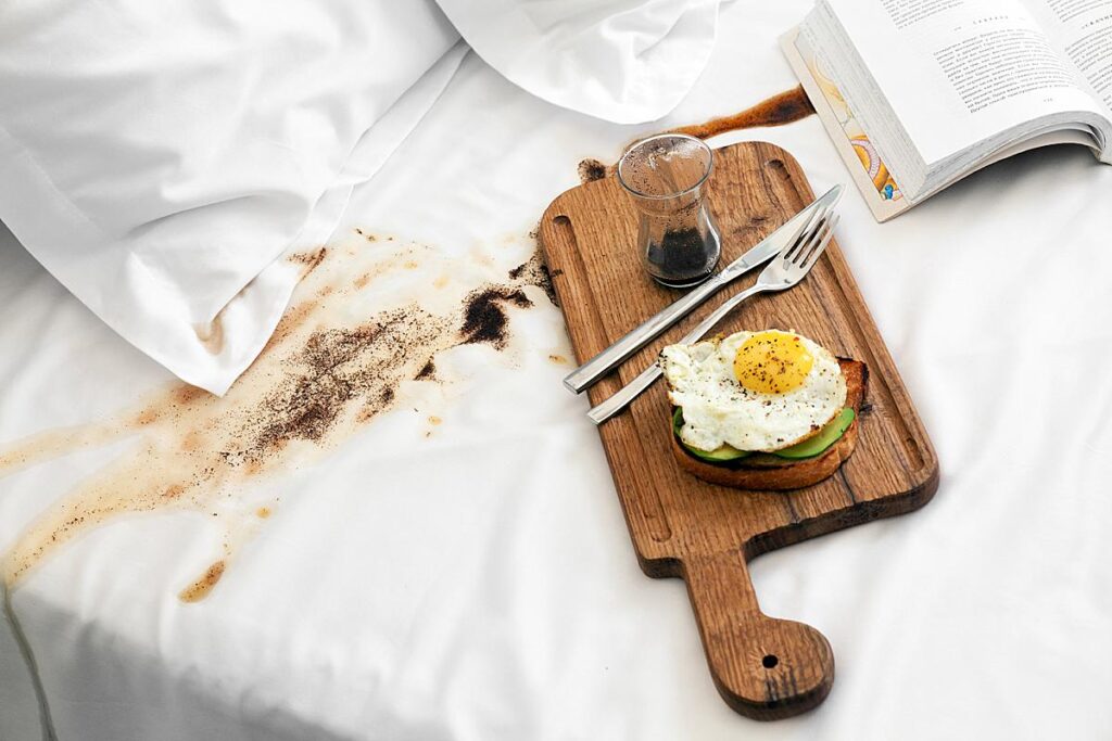
As far as I remember my very first photo shoot was one for a bedding brand. My friend and interior stylist Anna Koroleva asked me if I was interested in it. I was intrigued but also had no idea what kind of photos the customer wanted. Honestly, I had the same feelings during most of the photo shoot. Accidentally Anna spilled coffee on crisp white bedding. She was terrified. I found it funny and took a few photos with attractive breakfast and black spots. In my opinion, it is exactly what happens when you eat in bed. The customer was excited about the photos. She said they are the most aesthetic and unique shots from the series. I had a similar feeling. We kept working together for about three years.
My second big client was a guy who restored Scandinavian vintage furniture. They were passionate about it and they need content for Instagram and websites. Also, they had a million ideas for interesting photos but didn’t know how to make them. It was a pleasure for me to listen, take the most interesting (and realistic in execution) cases and help with framing and lighting. I found myself taking portraits again, but without a human (at least as the main character) in the frame it was way easier for me to create and not worry if the model was tired or felt uncomfortable.
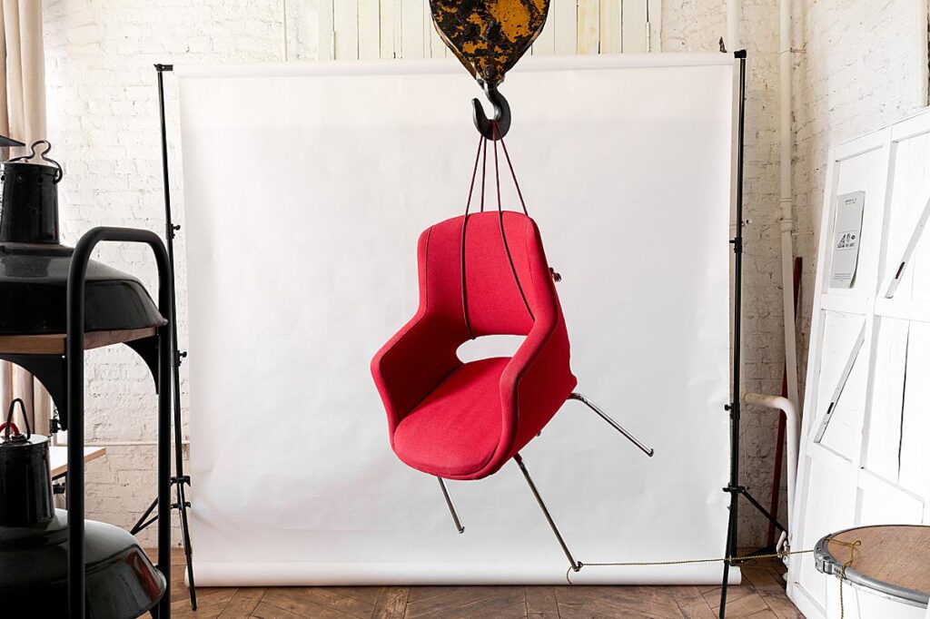
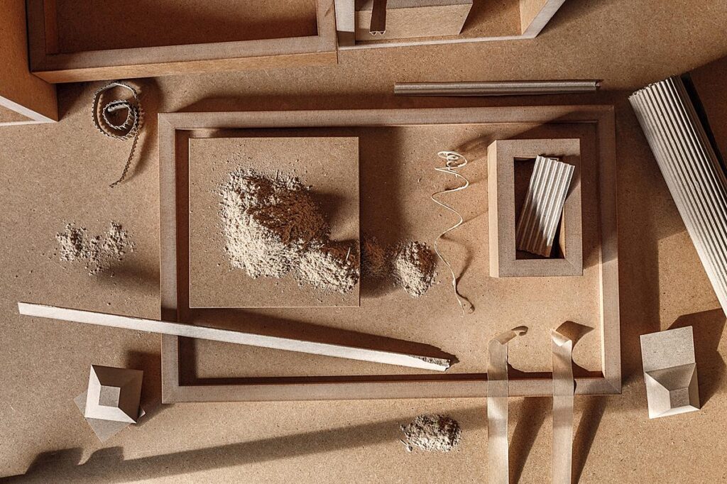
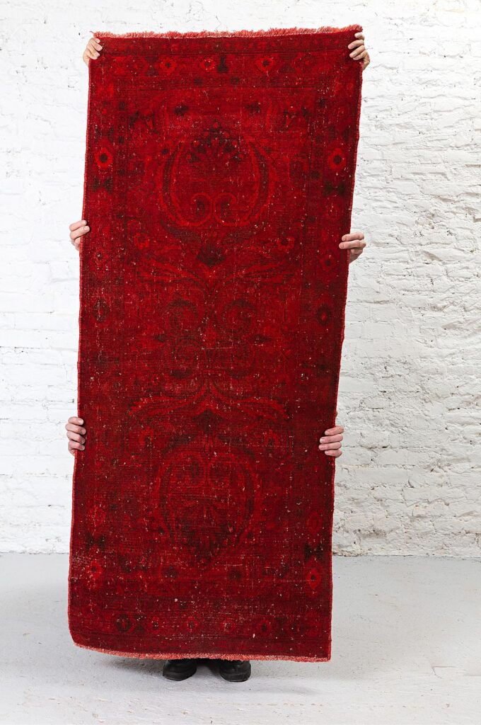
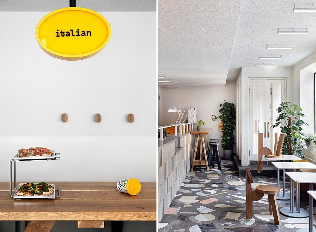
I love the life you bring into your photographs. In your project of the House Near St. Petersburg, you have the occasional orange on the floor and stools tumbled over. In your photo that you submitted for last year’s APALMANAC contest from Smena Cafe, you also included a tipped over chair. In the photos of Maestrello, you include a tipped over cup. How do you arrive at these playful moments? Are your clients usually on board with these shots?
I work with interior stylist Anna Koroleva quite often. We share the same passion for Scandinavian interiors and furniture, sense of humour, desire to fool around and a need to take a lunch break during a photoshoot. Also both of us don’t like perfect pictures when everything lines up to each other and perfectly matches. It feels artificial. I think my past as a reportage photographer just can’t assert that.
Smena Cafe was the first place with a tipped-over chair. It was a photo shoot for Anna’s blog and we were very short on the timeline before the cafe opened. We had already spent 20 minutes moving furniture in this photo and it still was crap. Anna got angry and just decided to lie one of the chairs down. The result was great. Also on this particular shoot, we didn’t need to worry if the client would like this shot or not – we were our clients. After publishing this photo in our portfolios and Instagrams, clients were often asking to do something similar.
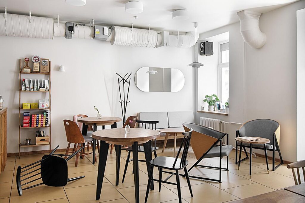
Decorator: Anna Koroleva for GINGER MADE BREAD
Designer: Arthur Lebsack Decorator: Anna Koroleva
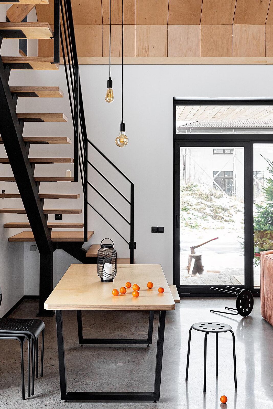
Designer: Pavel Hutskiy Decorator: Anna Koroleva Plywood furniture: Georgy Tolstoy
One thing in particular that is striking to me about your images is their quiet, natural appearance. What are you looking for when it comes to making a mood in your photographs?
I’m looking for a balance. On one side is a photo with no colour casts and reflections, perfect whites and greys, with every single scratch removed. On the other – camera jpeg with wrong white balance, clipping whites and so on. I don’t find the first option aesthetic and attractive to me personally. The Second one is not my option because as a commercial photographer, I have to do something with my shots.
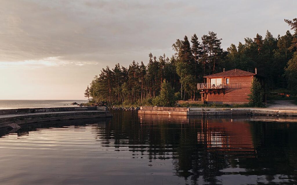
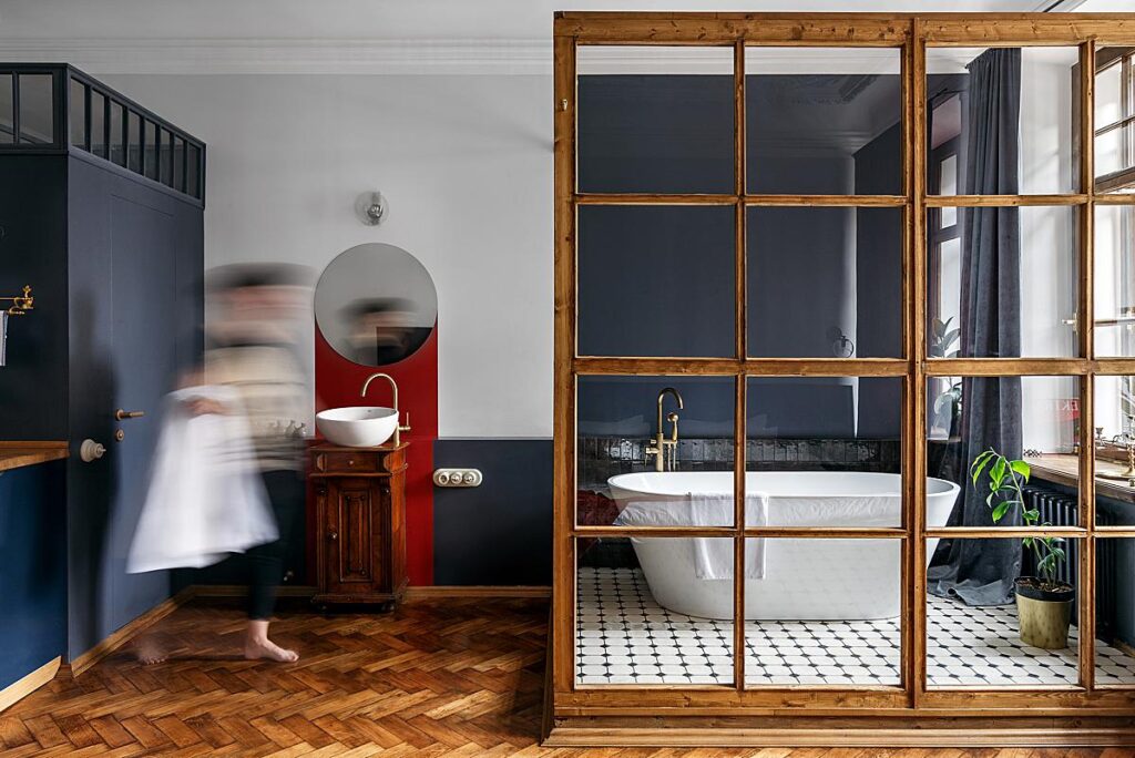
I’m really interested in how the human brain works. We balance colours, fixing perspective, and mask reflections subconsciously. I try to represent this filing when in general you see a clean image but still can find some real-world imperfections. They should be [subdued], but not completely vanished. Also, I think colour grading is very important. It is the most powerful atmosphere control tool.
As we talked about earlier, you’re doing more and more post-processing for other photographers these days. Walk us through your editing process! What are some techniques that you find yourself using again and again?
I start by importing photos into Lightroom, selecting, and sometimes making HDRs for further processing. Then I usually choose about four shots and completely edit them, to better understand the feeling of the photo shoot and to approve the general colour work with a client.
After that, I continue to work with all other photos in Lightroom. White balance, perspective, general brightness adjustments, nothing fancy. Next, I export to Photoshop. Sometimes I start by compositing if it is necessary and then my favourite part begins: colour grading. I prefer to use the “Dehancer Film” plugin. It is a powerful tool to grade your photos in a balanced and aesthetic way. It may look like some trash film plugins for Lightroom at first, except it’s not. The guys there have spent many years studying colour harmony, film, and how it behaves. They have built mathematical models of some negative and positive Kodak, Fuji and other films. It’s quite geeky stuff.
Next, I add some curves, masking if necessary, and dodge and burn. Much of it is written in my actions. After that, I move in to some light retouching. Then the photos go back to Lightroom, are exported, and delivered to clients. From there, they may ask for additional retouching.
Your images teeter on the line between appearing natural yet incredibly tidy and clean. What are your go-to methods for controlling color casts?
In previous years my main instrument after auto curves were masking and desaturating whites, highlighting local colors, and recoloring them manually. I still use it from time to time, but often it takes a lot of time to find a balance. For now, my main method is the Dehancer plugin. With the right profile, you can get good results in no time. Of course, it’s not a panacea but it works just fine in most cases.
What is your biggest pet-peeve while editing (for yourself or others)?
Erasing people holding paintings close to the wall so that in the photo it would seem that the picture has always been there. It happens quite often but I still hate doing that.
Do you lean on any pieces of gear that make your life easier, like a tablet, mouse, or monitor?
During the photo shoot, it’s a tablet, no doubt. As for the editing process, I was happy to switch from my desktop to notebook.
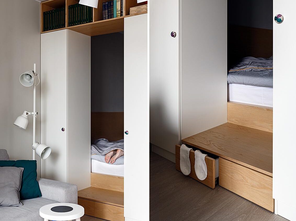
Designer: Malitskie Decorator: Anna Koroleva
What’s your approach to licensing images and protecting your work via copyright? Do you find that Russia/Turkey have good laws in effect protecting intellectual property?
I can’t say about Turkey yet but for Russia, these kinds of laws are still blurry. Technically they exist but not many people know about them and use them in their contracts.
If you’d like to see more of Anton’s work, or get in touch with him regarding retouching and post-processing, head over to antonivanovphoto.work. You can also follow him on Instagram @dtwirls.
