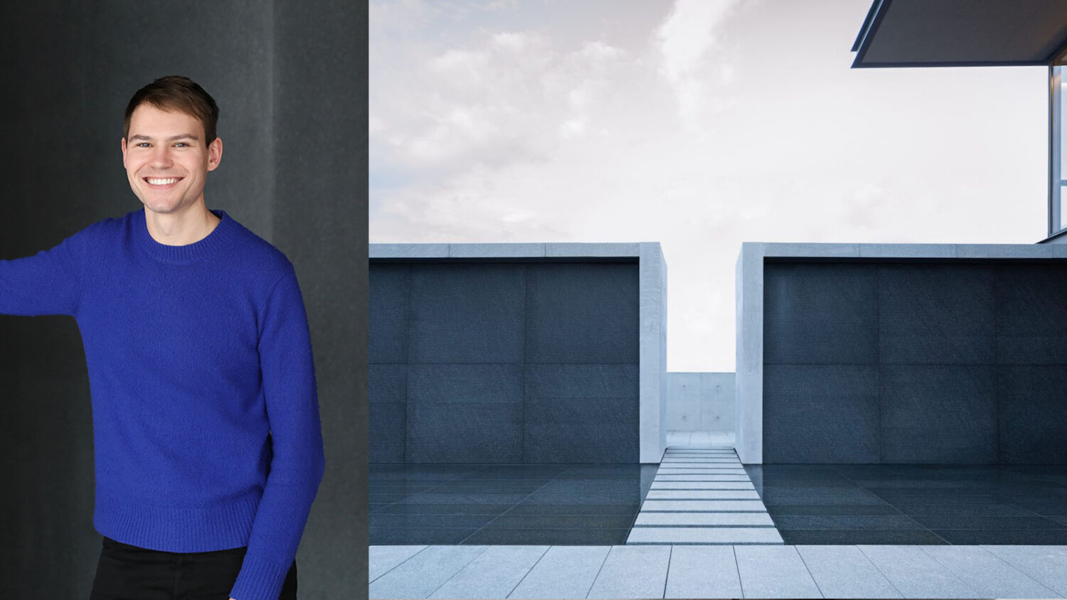
Eric Petschek Rides the Instagram Wave Into a Career Photographing Architecture
Initially only known by his Instagram pseudonym CB or CityBoy, Eric Petschek is a New York-based interiors & architectural photographer. Trained as an Interior Designer, Eric got on the Instagram game early and used the platform to chronicle his views on the spaces he had visited during his travels as an interior designer, which laid the foundation for Eric to transition into full time interior photographer.
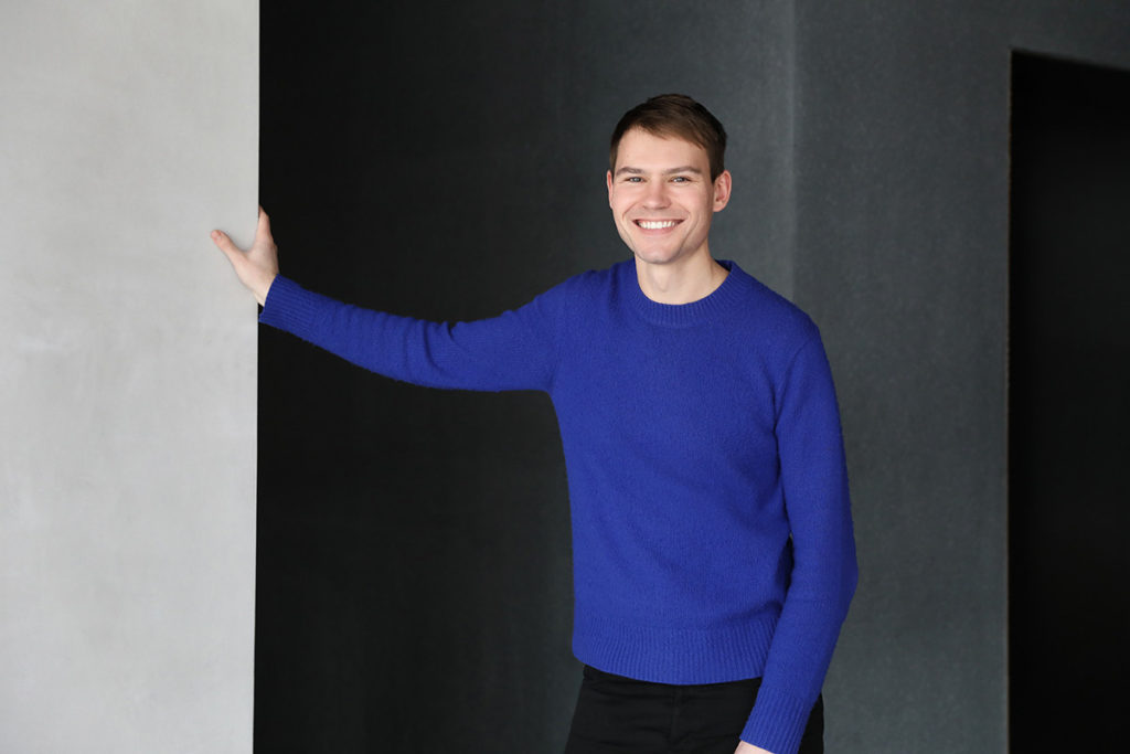
Hey Eric, thanks for taking the time for this interview. To kick off this interview, tell us a bit about yourself and how City Boy came to be.
Upon completing my interior architecture degree, I started working as an interior designer. It soon dawned on me that the reality of interior architecture is about spending a large proportion of the time working in front of a computer in AutoCAD. It is the polar opposite of what people think it is which is researching concepts, sourcing furniture and going to showrooms. Additionally, I wasn’t thrilled with the remuneration or the long hours.
My journey into architectural photography came through my background in interior architecture. I had finished completed an arts degree in Hispanic studies and I wasn’t convinced I wanted to use that degree. I decided to take a year off to reflect upon life. During this time, I discovered that I was drawn to designed experiences whenever I traveled. This involved going to museums, boutique stores, restaurants which all had the underlying theme of beautiful designs which made me realise I was interested in design. Prior to this, I was not exposed to design in any large amount. I decided at that point to enroll in an interior architecture program at Pratt.
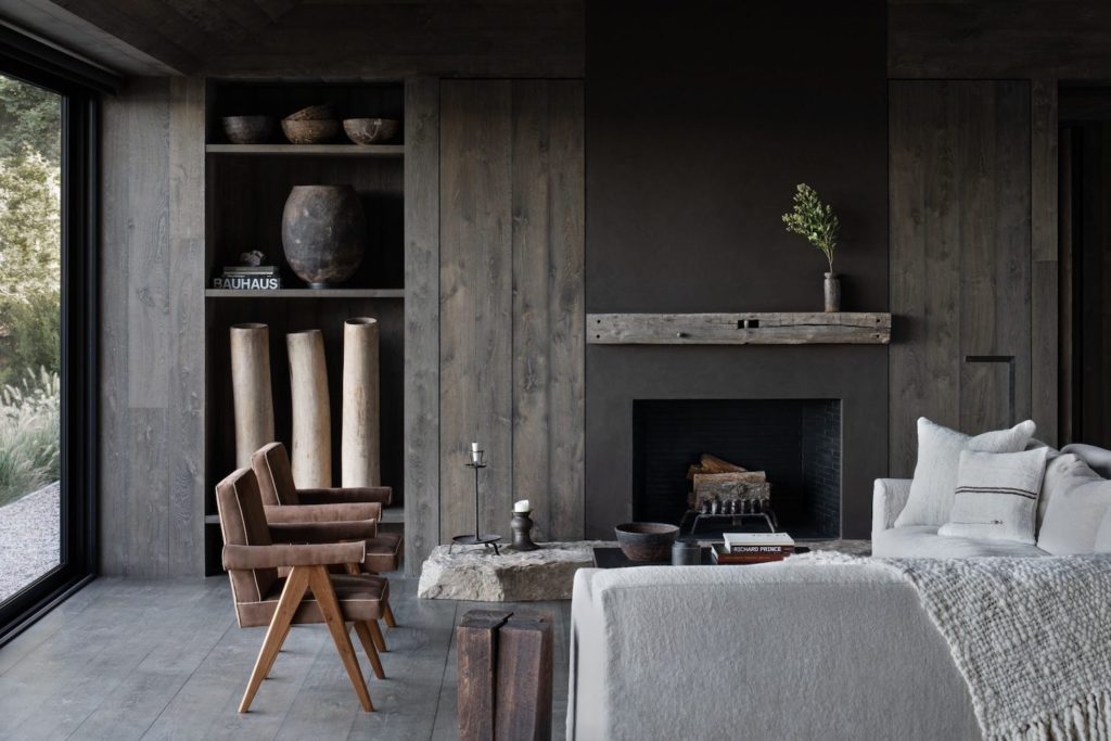
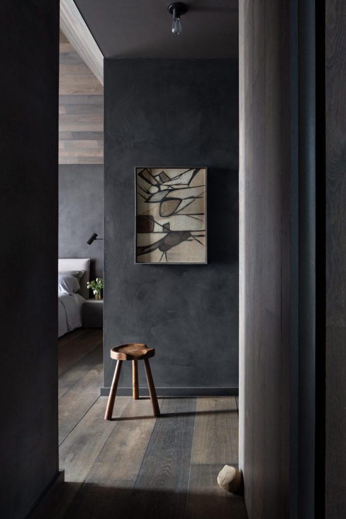
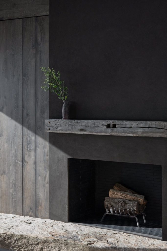
During my own time, I started documenting spaces more seriously on my phone and sharing these on Instagram. I got a lot of good feedback from peers and it pushed me into parlaying that interest into a profession which saw me make a gradual transition from designer to the photographer.
The brand City Boy (CB) was formed in collaboration with my best friend from Pratt Institute who was known as Country Girl (CG). As best friends we would travel together, and I liked visiting a lot of cities while she liked visiting a lot of rural areas and nature. More than that she is a Brooklynite and was very interested in craft and handy work resulting in a more textural and a different approach to design. Whereas my approach was much more about concept having a clean deliverable. One can use the head vs hand analogy where City Boy is the head and Country Girl is the hand. It started as a brand to showcase all sorts of design, some more cerebral, more conceptual and some more local and tactile and craft-oriented. The most interesting design, in the end, is hybrid of the two where the marries both the cleanliness and rigour with tactility and sensuality.
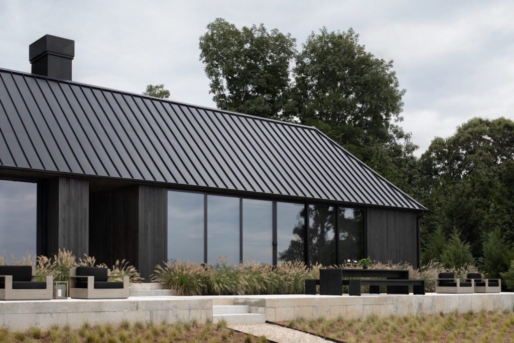
As a photographer, your Instagram stories are very informative from a design perspective and beautifully curated. What was the motivation behind approaching stories in this manner and what has been the feedback like?
My original intent with Instagram was to use it as a tool to inform the general public about good design or what in my opinion is good design. When Instagram introduced Stories, it was the perfect medium to do this in a narrative fashion that is engaging to teach people about design, how to better understand and appreciate it. Additionally, what to look for was the motivation behind explicating all these design experiences. Furthermore, due to my training in Interior Architecture, I understood what the major moves in the space and what the impressive details are, and I tend to hone in on that through my photography.
The feedback from my followers varies. I have a lot of designers who follow me, and I get a lot of praise from them for the inspiration because I am based in NYC. I have a lot of access to spaces and showrooms that not every designer does and I am able to share those places with a broader audience. On the contrary, I have a lot of followers who are outsiders to the design world and very design curious and want to understand more. For example, I was involved in a design and build project for a friend of mine and I had condensed the entire two-year process into three days of stories but people still wanted to know more.
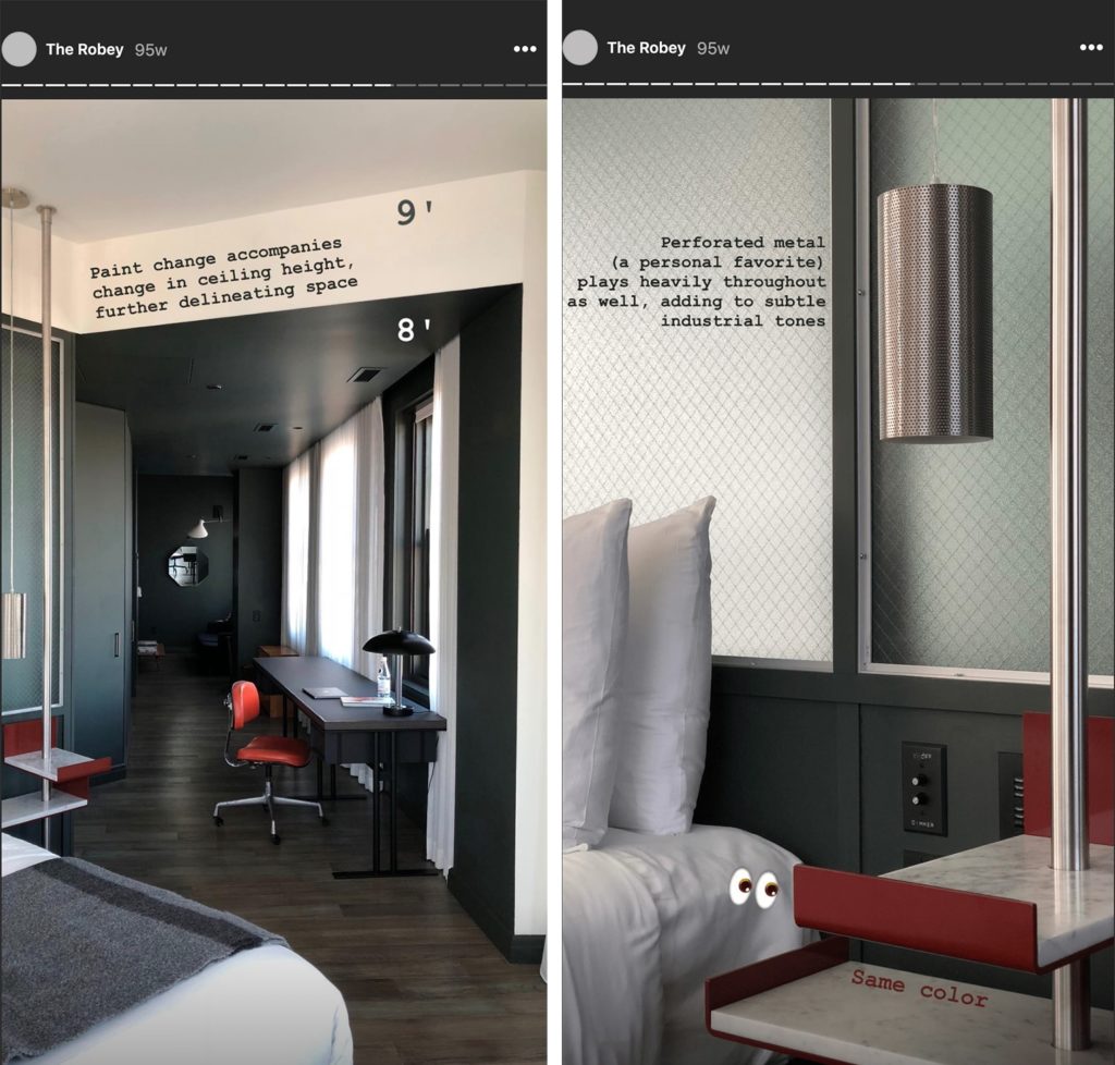
People are intrigued by understanding these experiences which is what drew me to design because I wanted to understand when I walked into a high-end store, I could tell the merchandise would cost hundreds of dollars without looking at the price tag. Space immediately conveys that and dissecting this signalling component is something I find fascinating.
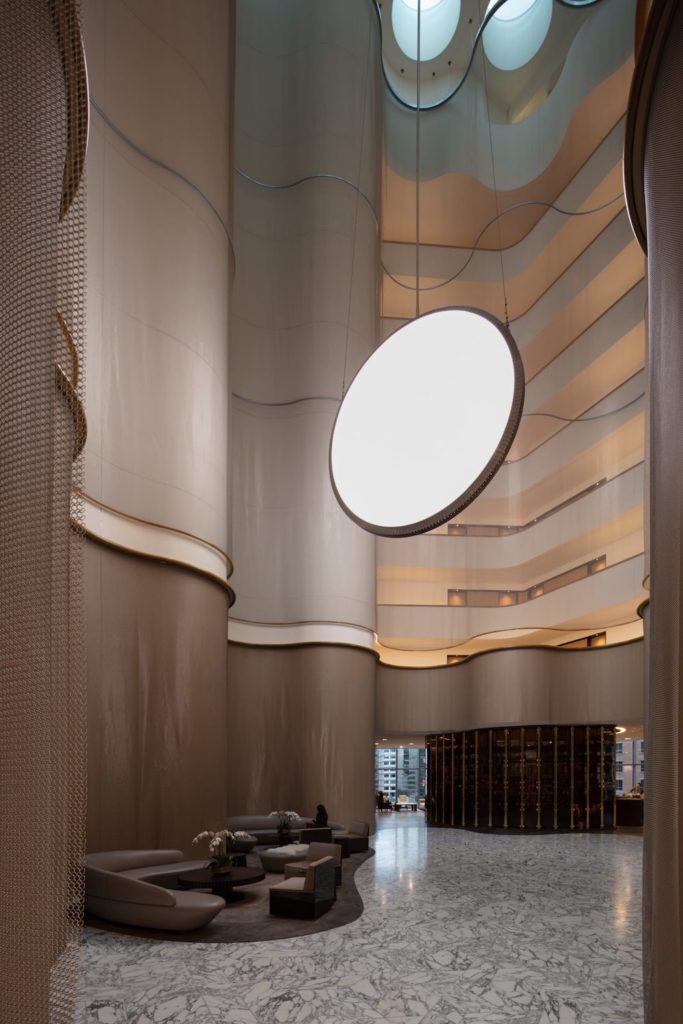
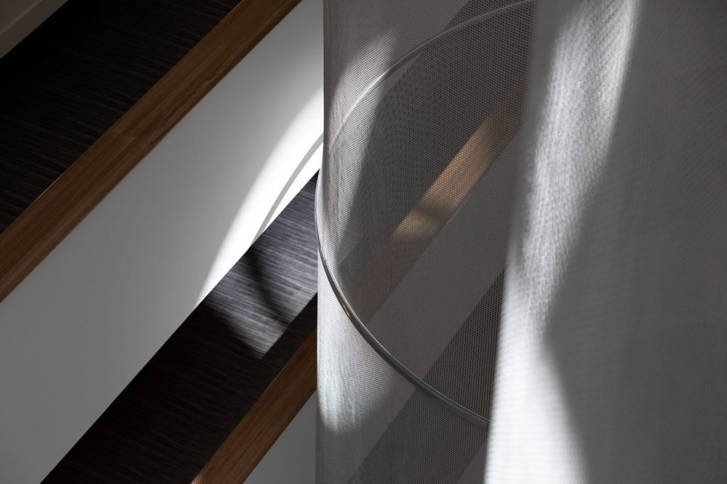
You have been commissioned by a few brands take over their Instagram accounts as a guest. How did some of these opportunities arise?
I wouldn’t consider myself a major influencer; I know of people where Instagram and sponsored content is the majority of their income which isn’t he case for me. I am very strategic with whom I am partner as it has to make sense from a brand point of view as well as for myself.
For major brands, you have to get prior approval for posts including captions and hashtags before posting and with the brands I work with, this is thankfully not the case. There is very little guidance from brands I collaborate wit, partially because their own social media strategy is not narrowly defined. They are open to whatever they want me to post and a lot has to do with trust. More specifically, they place a lot of trust in my vision and knowledge, therefore, these brands get the personality and brand that is CB thus resulting in a very organic collaboration.
For example, one of my earlier collaborations in this facet was with Avenue Road Furniture which is a luxurious Canadian furniture retailer that I was introduced to through a friend at one of Avenue Road’s events in NY. There was great synergy between the key stakeholders and myself, as a result, I’ve worked with them on a few projects. One of the projects was their Travel for Design in 2018 where they took some of their clients on a study tour across Europe to meet some of the brands Avenue Road carries in their showrooms. During this trip, I was creating daily stories and posts highlighting the study tour.
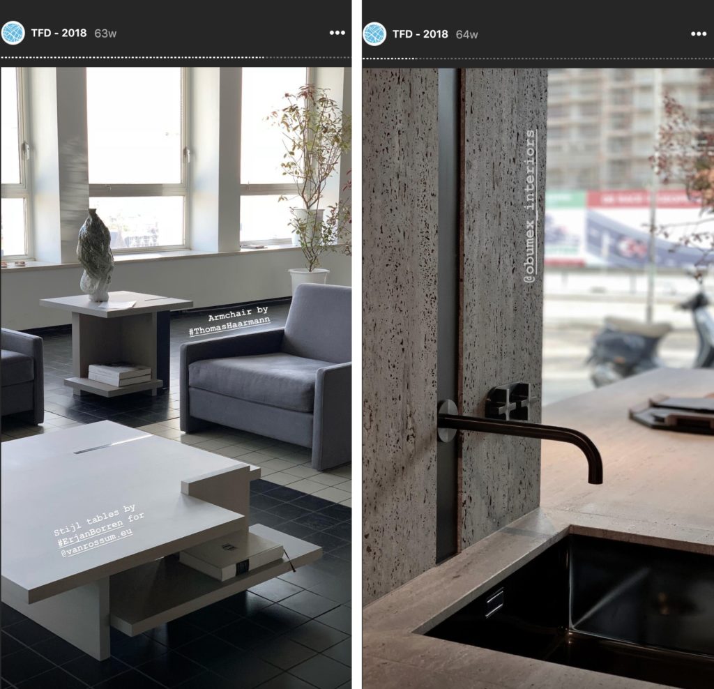
During the 2019 Salone De Mobile (Milan Design Week), I was doing live Instagram stories for an Australian Interior Designer, Fiona Lynch. I met Fiona back in 2017 at the New York Design Week and we got along really well. In 2019, I let her know that I was going to Milan for the Salone de Mobile and she wasn’t able to attend so she asked if I was interested in being her representative hence I was a guest poster on the Fiona Lynch’s Instagram account. During the Milan Design Week, I posted the content that would make sense of Fiona’s brand due to her design aesthetics.
As a former interior architect, what tips can you share on your approach to photographing interiors?
People have different styles of paragraphing interiors. My advice, in general, would be to figure out what why are you trying to make a living photographing interiors, and what is it about photography you are drawn to. Hone in on that, which admittedly can be a long process. My style has evolved over the years, in fact, my iPhone/Instagram photography is actually significantly different from my DSLR photography and my portfolio online.
A general piece of advice that is universally applicable to photographing interiors would be to figure out what grounds a photo. That is usually something in the vertical elevation. I would set up my lens to that vertical composition and centre my lens on millwork or a beam. Playing off that and improvising with that in mind is a great start to figuring out how to photographing interiors.
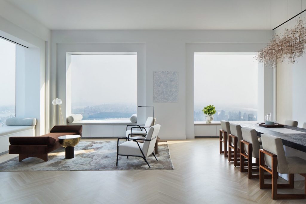
One of the other topics, Instagrammable Moments, frequently comes with clients. I am very much of the opinion that good design is photogenic because I think one of the things is appealing to humans innately is symmetry, repetition and naturally lend themselves to photographed. An Instagrammable moment is a different way of saying photogenic. The only time Instagram comes into play is when I can compose the shot vertically or horizontally. The platform lets itself to vertical photos. Sometimes I will compose a shot vertically because it makes sense for Instagram.
The other benefit of Instagram has been that it expands my network and I definitely consider it to be an effective marketing tool, reminding people in my network that I am alive and photographing. Looking back, my Instagram account has opened some doors earlier on in my career, however, before I even had a substantial portfolio of projects, my Instagram feed acted as a mini portfolio that people would respond to either positively or negatively. It also gave people an idea of my passion for beautiful spaces. It is through my network that I have landed some of my best commissions.
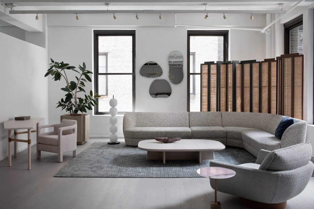
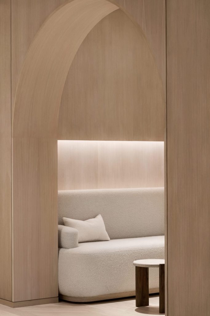
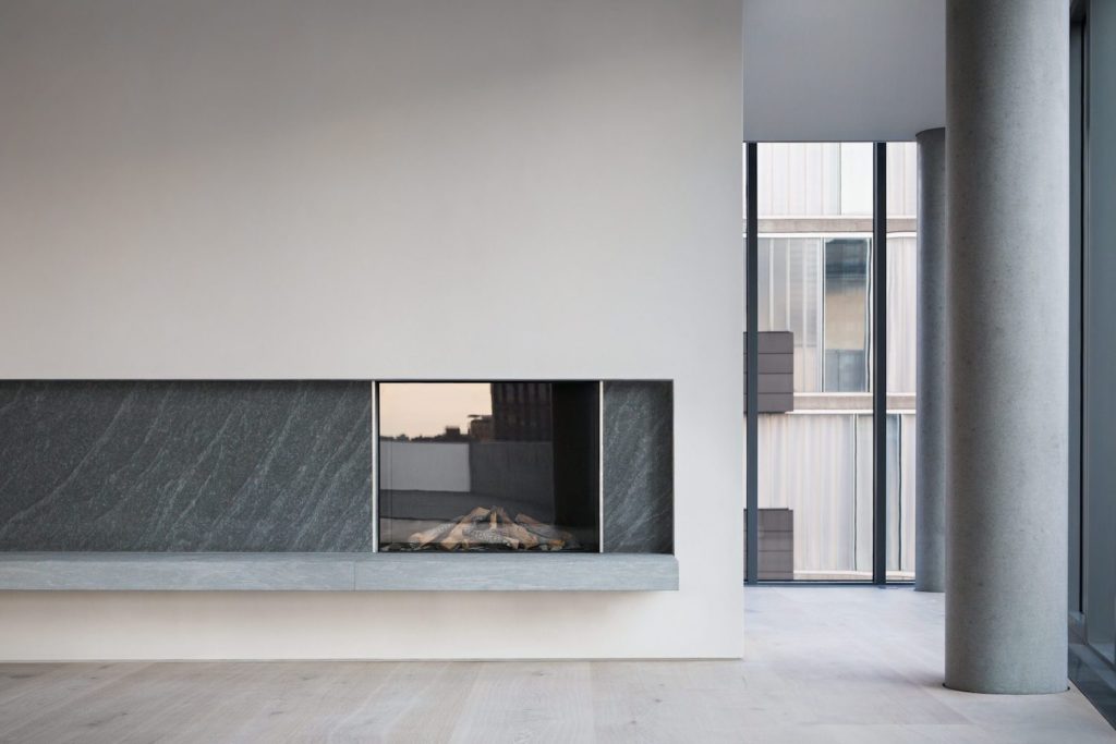
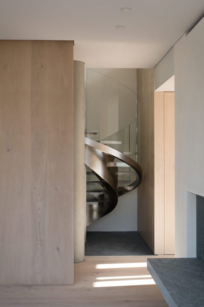
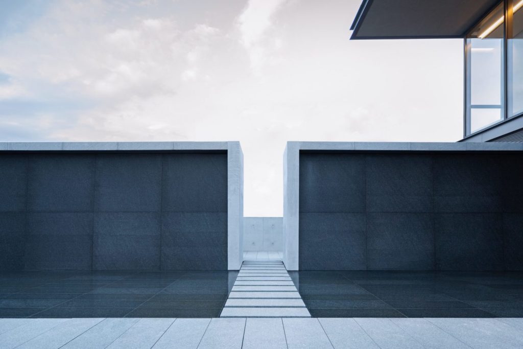
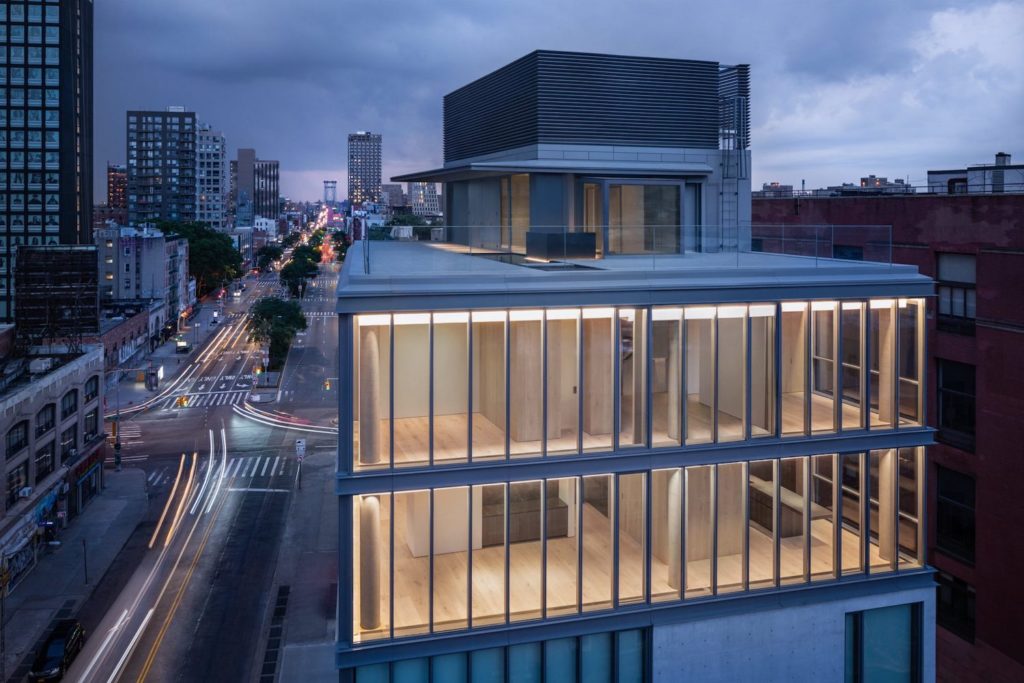
You had the opportunity to photograph Tadao Ando’s first project, 152 Elizabeth, in NYC. How did that opportunity come about? What was your approach considering that there was no furniture in the penthouse apartment?
The opportunity came up through the marketing agency, Noë Associates, as I have done some work for them previously. My approach to photographing the penthouse was to accentuate the extremely beautiful raw materials in the space. This entailed capturing the material using the changing light to highlight raw beauty and using light to create drama in an empty space. Considering the meticulous attention detail Gabellini Sheppard Associates had paid with material selection as well as how the materials met and how they treated the materials. For example, at times they would hone a stone and then you would see a flamed version of the same stone on a different surface. I tried to pick up some of those details through my photography.
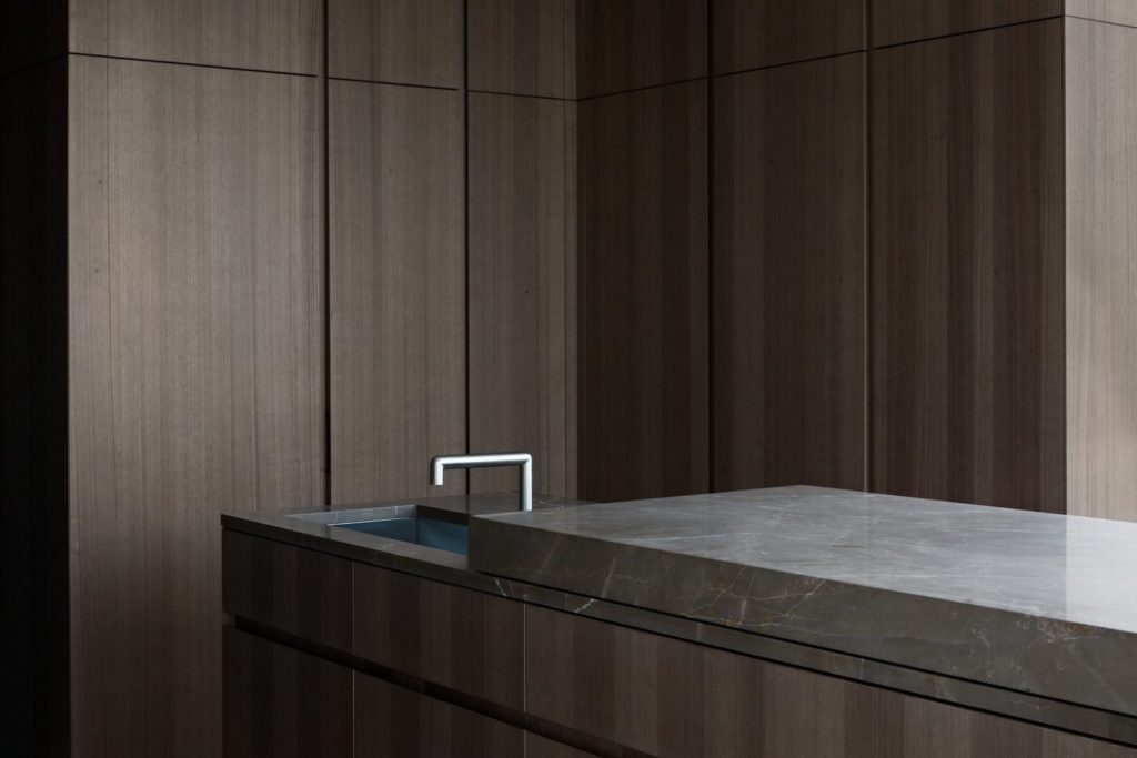
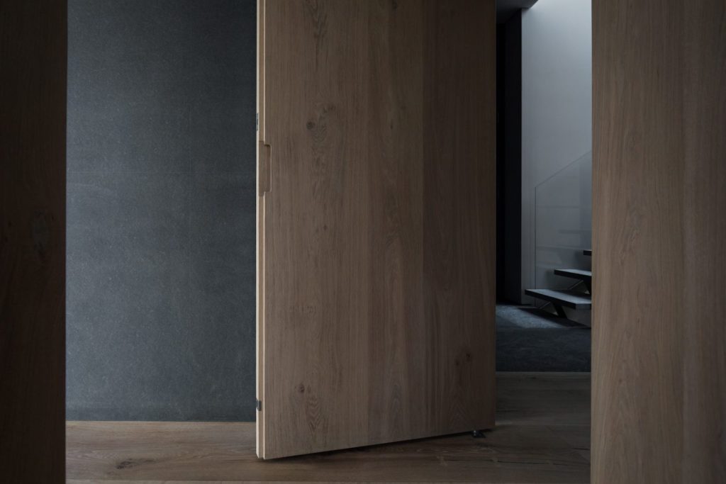
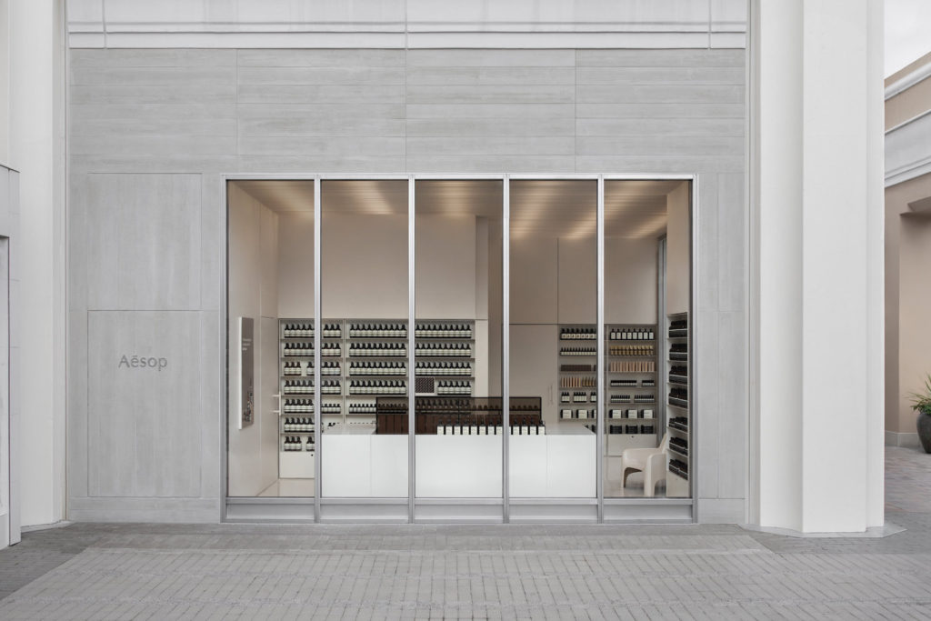
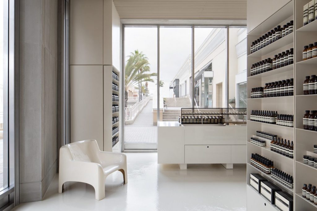
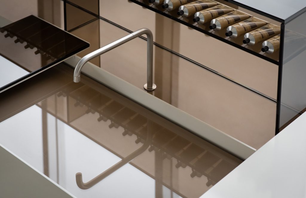
One of your recent projects was with photographing the Aesop Fashion Valley store in San Diego whose interiors was inspired by Louis Kahn’s Salk Institute building. How did you approach photographing the interiors and did you have to follow any internal brand guidelines?
Aesop always provides photographers with their photography guidelines. This was the eighth store I had photographed for them so I was very familiar with their guidelines. They are always evolving their guidelines as well and the direction was slightly different. They basically left me to my own devices. So much of photography as to do with responding to the space and the design of the space and the light throughout the course of the day. That’s what largely informed that shoot. Where the shoot was and what time and because it was a corner store with two exposures which was a big factor.
Like with most clients, there was some dialogue but it was mostly left up to me.
What has been your favourite architectural/interiors shoot to date? What were your favourite aspects or elements of the shoot?
To call out my favourite shoot is hard and is a hard title to bestow upon but photographing 152 Elizabeth Street by Tadao Ando and Gabelini Sheppard Associates would have to be a favourite. As it was very self-directed shoot and the client (Noe Associates) was very hands-off thereby I had a lot of creative freedom. I was very passionate about the project and photographing the project was very much a labour of love.
Lastly, what would be your dream project to photograph and which architect in the world you would like to work with and why?
I would love to photograph the new Drawing Institute at the MENIL which was designed by Johnston Marklee. It is up there when it was open but I think it still would be far up there.
In the near future, I would love to collaborate with Thomas Phifer, Vincent Van Duysen, Nicolas Schuybroek and a lot of European architects especially Belgian.
Many thanks to Eric for taking the time to give us an amazingly insightful interview! I would highly recommend that you follow Eric Petschek on Instagram for a daily dose of inspiration to and check out his portfolio for an understanding of his approach and style.
