Take a Trip to a Beautiful Home in Charlevoix With Architectural Photographer James Brittain
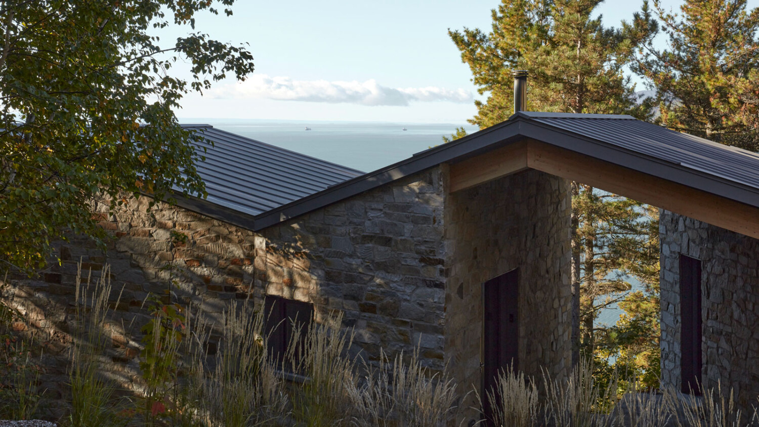
James Brittain is an architectural photographer working from studios in Montreal, Canada, and London, UK. Today we’ll be taking a look at James’s gorgeous photos of Atelier Carle’s CAPO.
We’re mixing things up for today’s POTW format and sharing what James and I talked about regarding this shoot in Q&A format. Let’s get started:
Lexi: James, can you tell me a little bit about this project as well as your client? Is this your first shoot together, or have you worked with each other before?
James: CAPO is a family house located in Charlevoix, a beautiful part of Quebec on the northern shores of the Saint Lawrence River, about an hour or so from Quebec City.
The house is designed by Atelier Carle, an architecture studio based in Montreal. Atelier Carle is known for making highly creative, thoughtful and site sensitive architecture throughout Quebec, Canada and internationally.
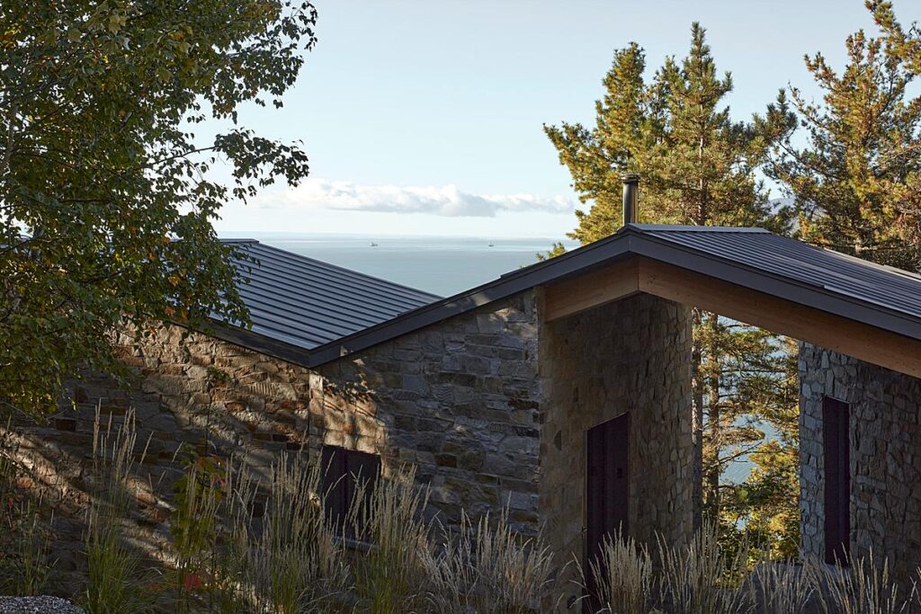
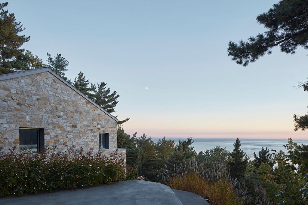
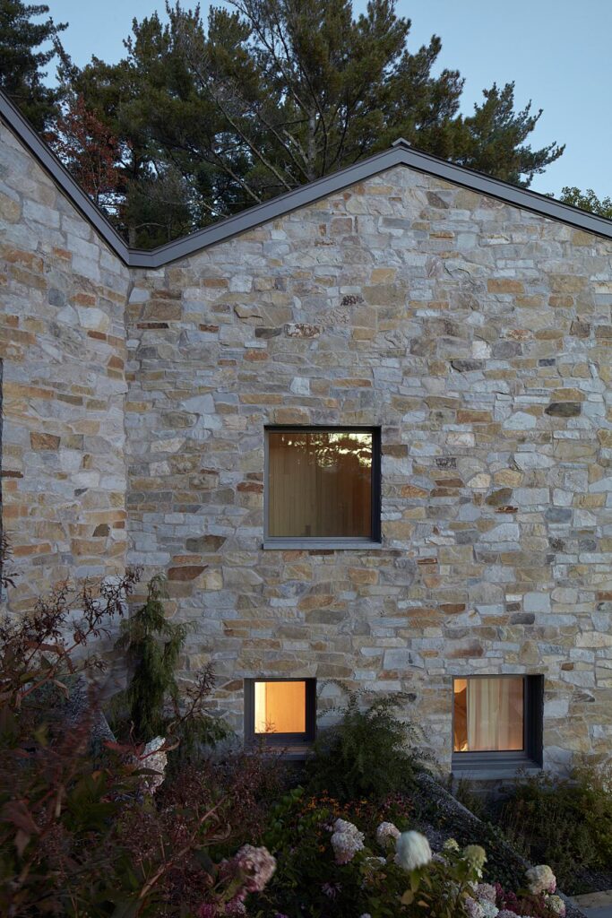
CAPO is set on a steep wooded site over-looking the river. The house is essentially a poetic response to the landscape found there. A series of stone volumes and terraces step quietly down the cliff – the interior is restrained in concrete, plaster and wood with simple windows and balconies framing the views. It’s a fabulous project and was a great pleasure to photograph.
Photography with Atelier Carle is always thought provoking and a lot of fun. I particularly like their openness to how their work is captured.
I’ve been collaborating with the studio for a few years, and have photographed projects here in Montreal, as well as in New York and in London, UK.
Alain Carle, the studio’s founding architect, is a wonderful cook! There have also been several excellent dinners.
What was the shoot day like? Did you run into any challenges that you had to overcome?
I shot the house over 2 days. I work slowly – this is often to do with responding to light. The light at CAPO is special, particularly in the late fall. The sun is lower in the sky at that time of year there, and the colour in the evening and morning was particular throughout the shoot.
One thing that sometimes comes up with photographing private houses is a restriction on how much time is available. This was not the case at CAPO. The house is lived in and loved by the owner, who was with us throughout the shoot.
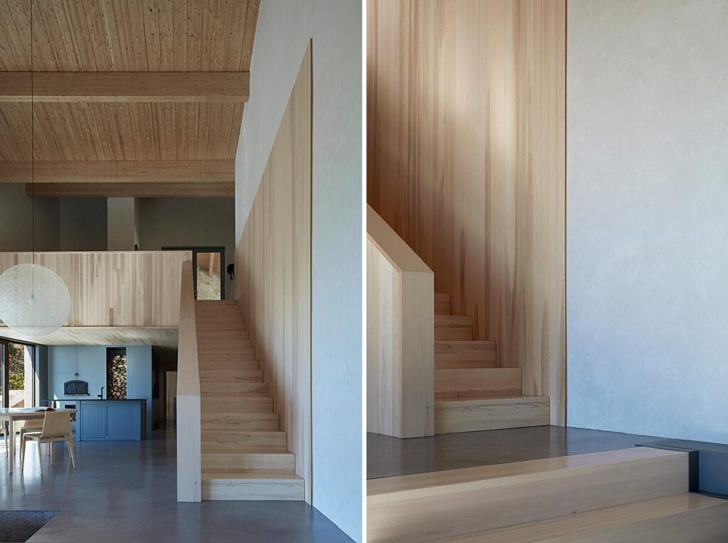
Talk to me a bit about your process in general. Do you scout before hand? Do you work with any supplemental lighting or light shaping tools? What is in your gear bag?
For the first few years of my life as a commissioned architectural photographer in London I worked with a large-format view camera shooting transparency film. That was what was regularly expected by British architects then.
Exposing film accurately for light and colour was a tricky discipline to learn and remains an amazing resource for me. I shoot digitally today, but my way of seeing, shooting habits and work-flow come from there.
It generally means a slower pace – not for the sake of it, but from a conviction about looking carefully and making images that are responsive and specific.
I sometimes scout a project before shooting but this often isn’t possible due to travel distances involved.
I work with natural and available light wherever possible. On a shoot like at CAPO, I carry a basic set of Profoto flash heads, though they mainly stay in the box.
I shoot with an Arca-Swiss view camera with a digital back, as well as a small format Canon.
I don’t have any particular surprises in my gear bag – though I still use a 4x loupe for focusing, and a dark cloth.
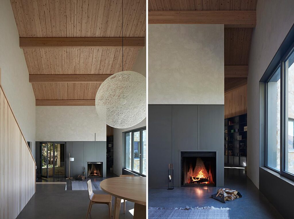
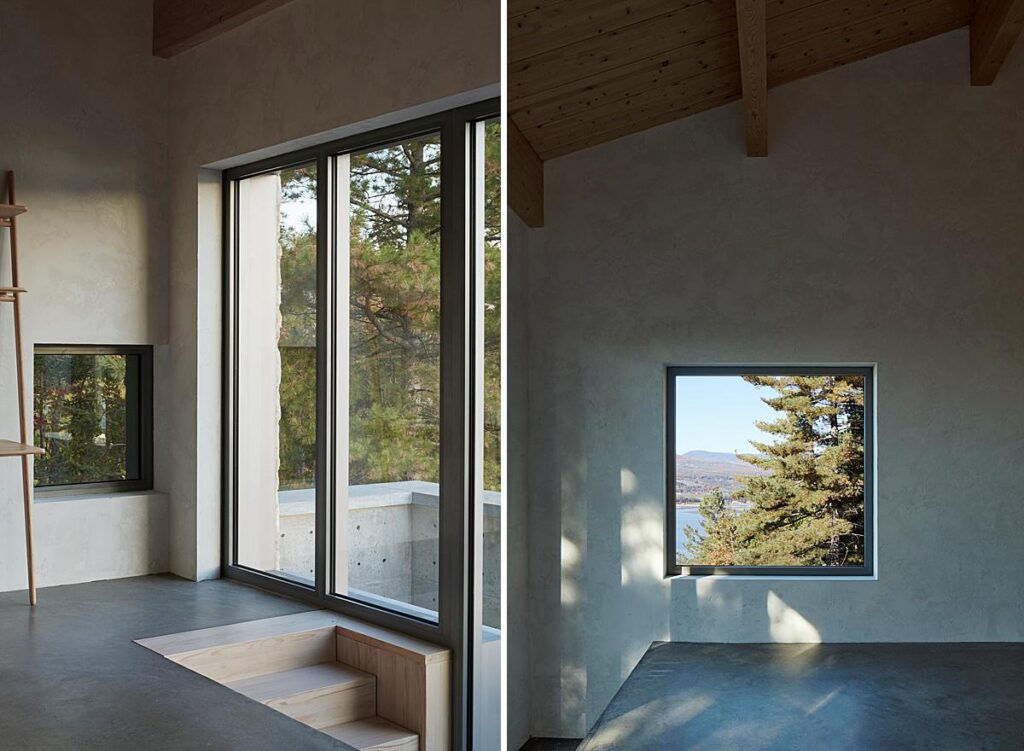
One thing in particular I love about these photographs is your very clean but natural editing style. Can you share a bit about your post-processing workflow?
Light touch in all respects. I use Capture One for raw capture conversion, and Photoshop for further adjustments. For me, the fun and magic of photography is at the capture. Most of the editing I do in post-production is to bring my images as close as I can to a faithful memory of what I originally saw.
One thing is – I aim to shoot full frame. The final question I ask myself before committing to a picture is whether there’s a way to make the frame tighter without diluting anything.
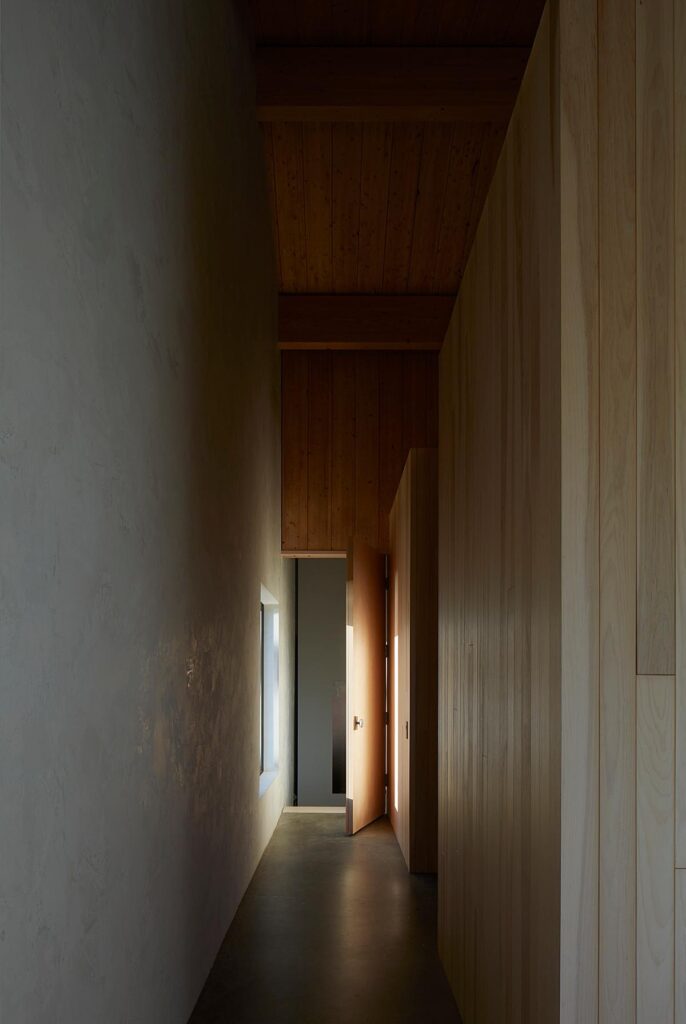
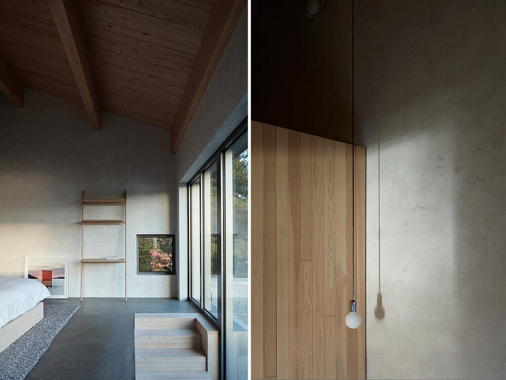
Which photograph from this series ended up being your favorite? Can you elaborate on how you made it?
I like the elevation view of the interior pitched roof because of the way the light is falling behind in the corridor. The picture feels resolved to me.
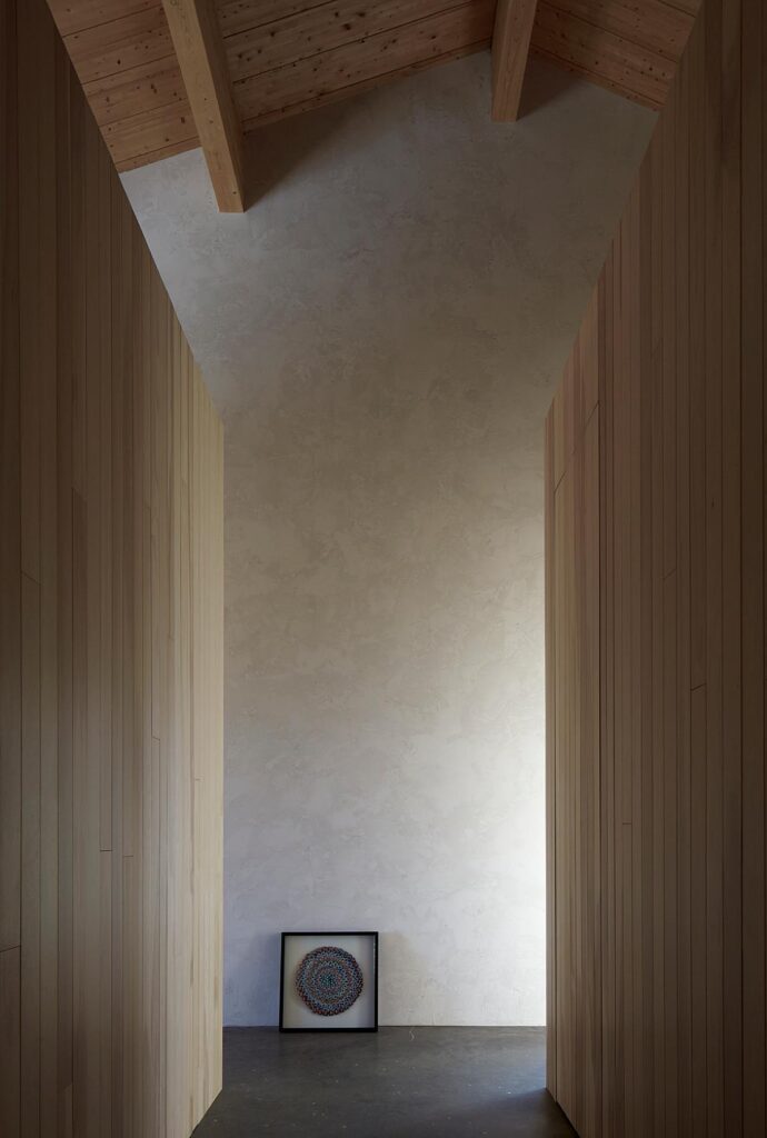
I’d like to thank James for sharing his images and a look behind the scenes into making them. You can see more of James’s work on the web at james-brittain.com and on Instagram @jamesbrittainphotographs.
If you have a project you’d like to be considered for Project of the Week, you can submit it here.
