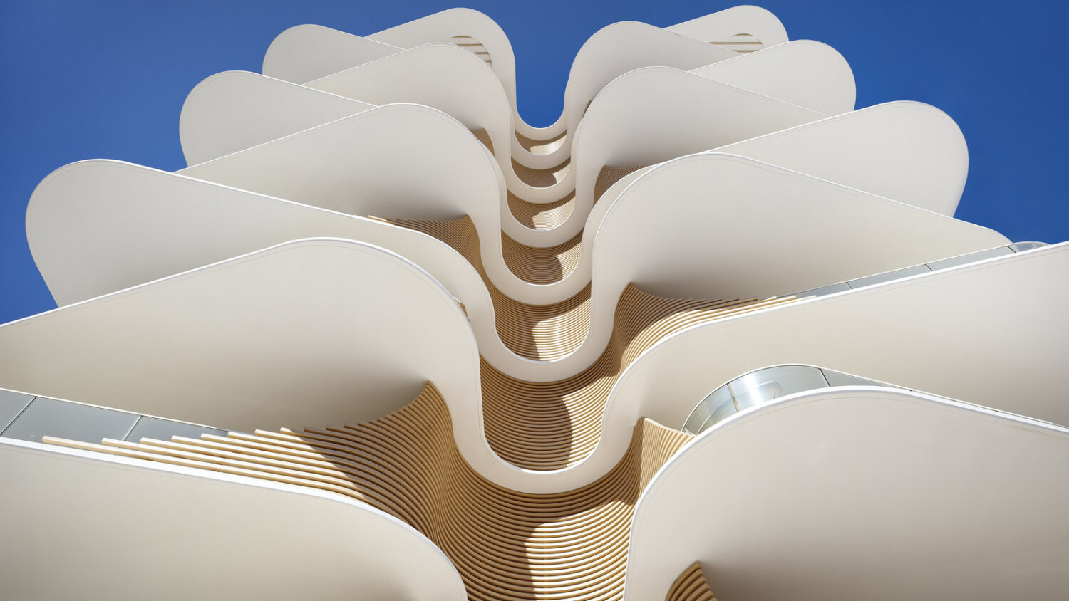
Scott Burrows Walks Us Through Photographing A Perfect Gold Coast Beach Apartment
Today’s featured project has been masterfully shot by Australian architectural photographer Scott Burrows. The Norfolk is a multi-residential apartment in Queensland, Australia. It was designed by Koichi Takada Architects and features gorgeous use of organic shapes. The Norfolk sits adjacent to one of the Gold Coast’s southern beach strips – Burleigh Heads.
Scott was briefed with an overarching goal to showcase the way The Norfolk interacts with its environment – namely the beach. It was important to the team at Koichi Takada that Scott “capture the natural forms of the building reflected in the local flora of Norfolk Island pine trees and document the building in an aesthetic way depicting the design intent of bringing the outside in and allowing its inhabitants to experience the environment from inside to out.”
Let’s check out how he masterfully achieved that goal:
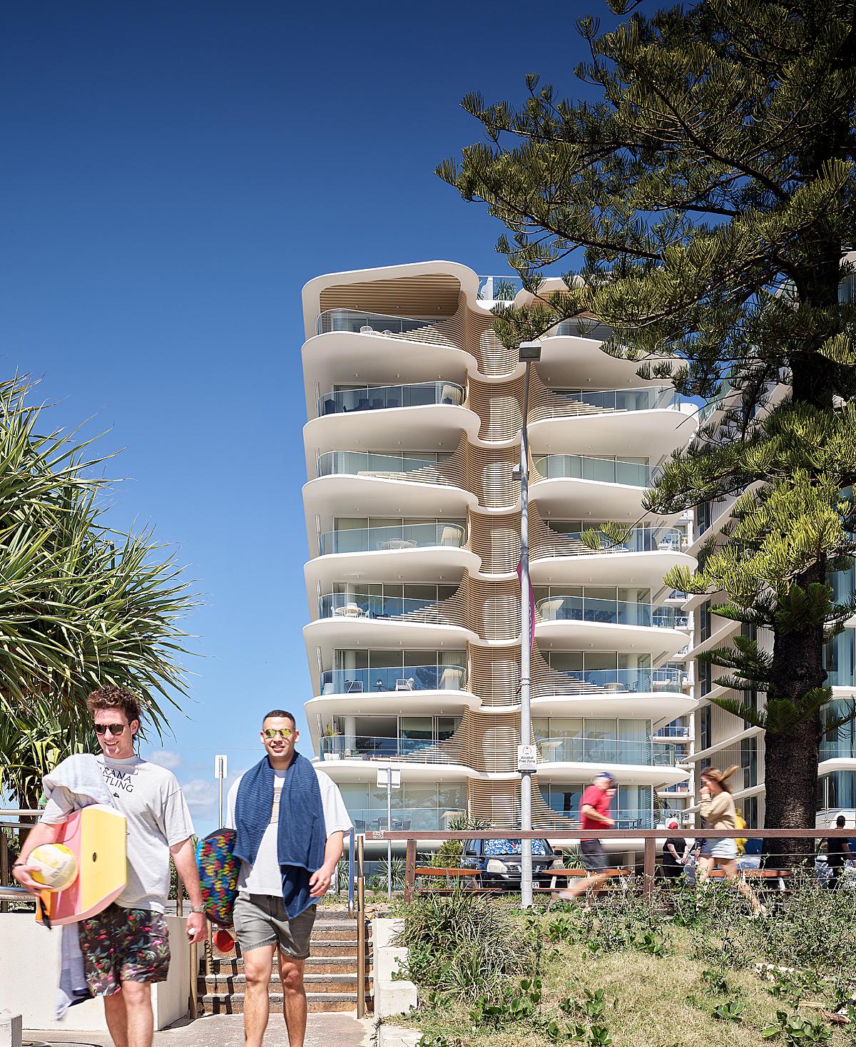
Scott shares “The most iconic form of this building is the sculptural facade that reflects the inner structural workings of the Norfolk Island pine. Throughout various parts of the day the facade changes with light so it was important to establish key moments of time to assist in documenting this properly. I generally have anywhere from 3-10 alarms set on my iPhone to help keep me on track as to where I need to be and at what time in order to get the right types of shots I want to create.”
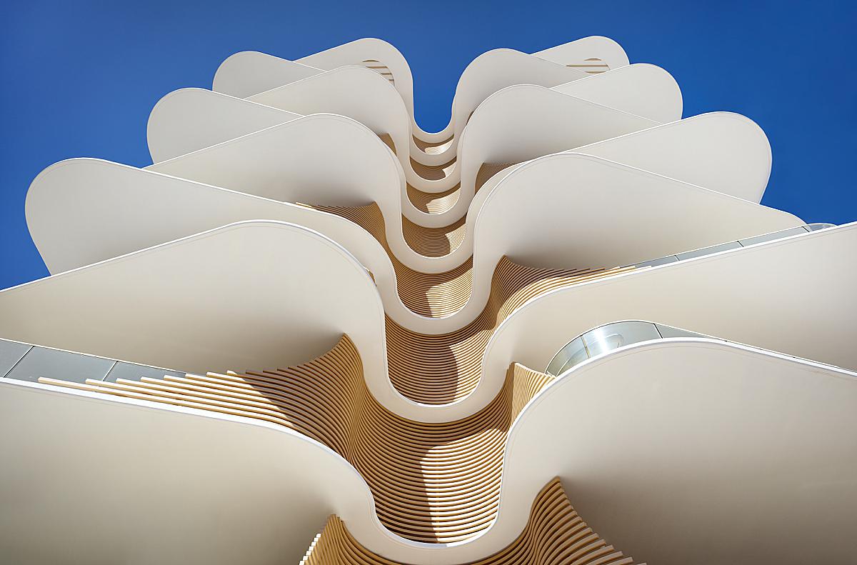
One of those particular alarms was set to make this stunning image, which is Scott’s favorite from the set.
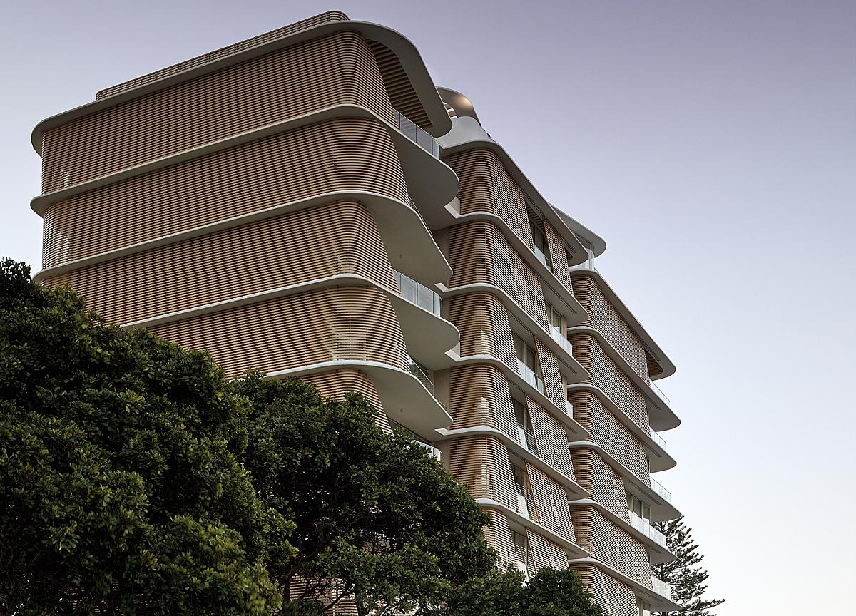
He goes on, “The shot not only works aesthetically but also demonstrates the design intent of having overlapping balconies to provide shade for the balconies below and references back to nature, a signature element of Koichi’s Takada’s work. It’s also the view that pedestrians experience most as they walk past the building and one that would give them a visual clue should they ever see the building in print somewhere.
I shoot all my architectural work on a Cambo technical camera with a Phase One Digital capture back. This particular image was shot using a 32mm Rodenstock lens at f11, ISO 50, 1/15th sec.”
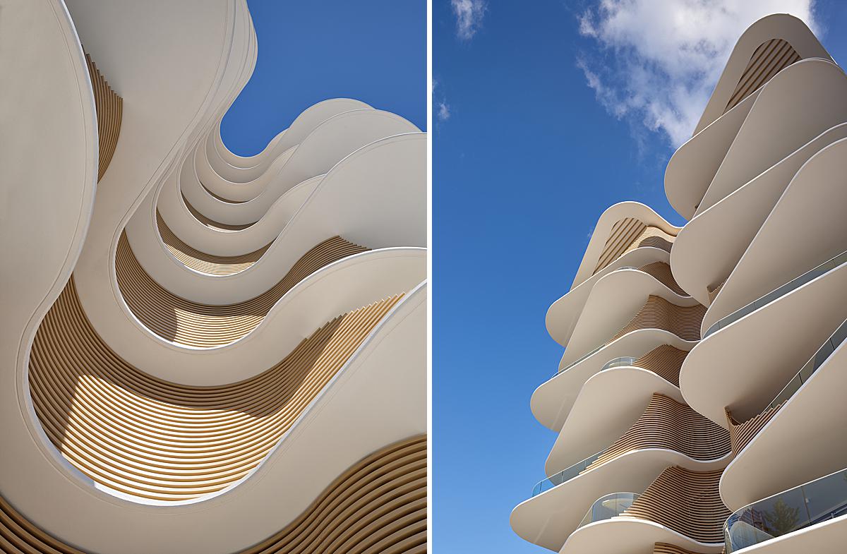
He expands on the upward view with these two detailed shots. Harnessing great lighting and thoughtful compositions, we are able to note the materials used by Koichi and really hone in on the form and rhythm of the overlapping balconies.
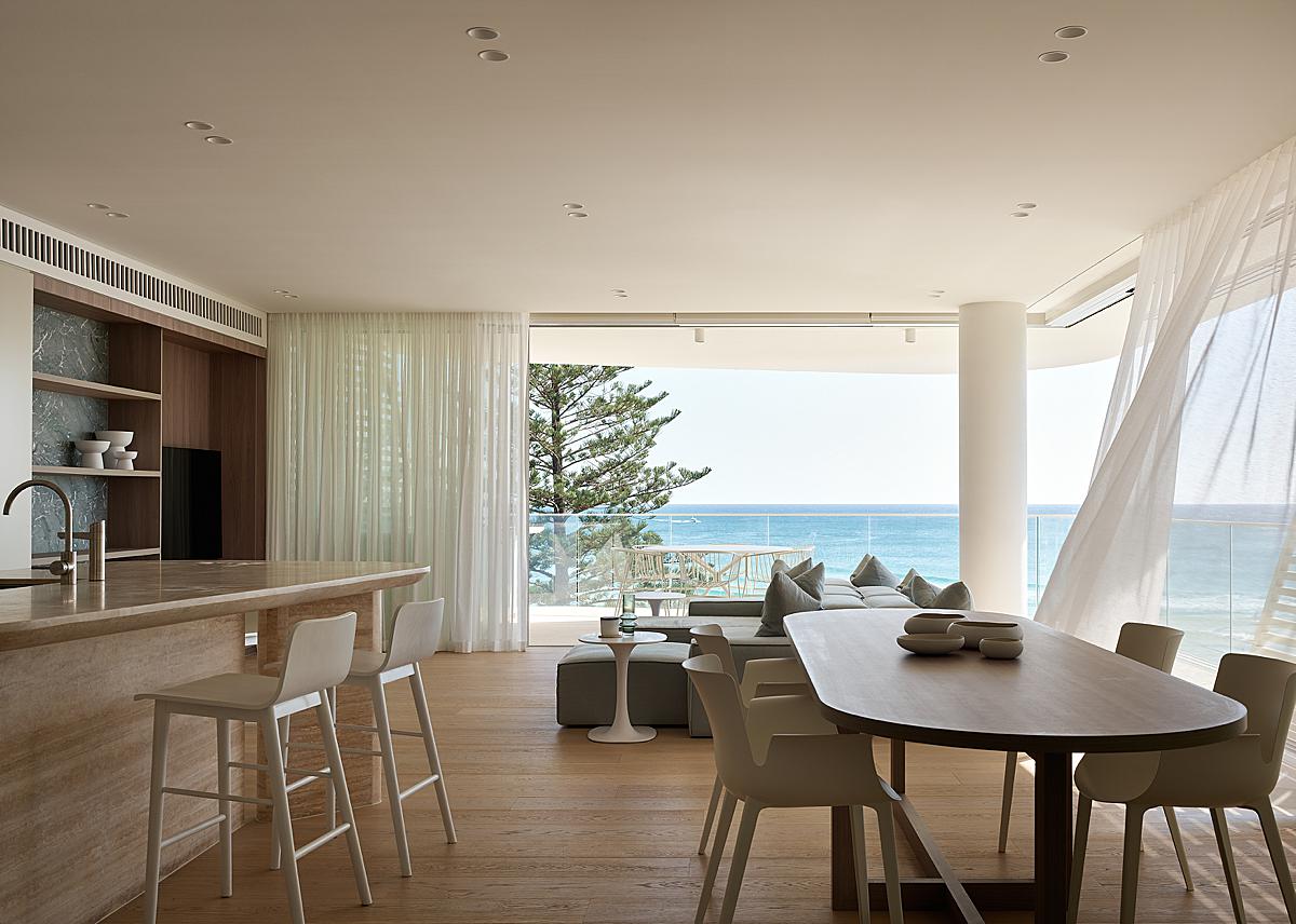
As we move inside, the image feels sublimely peaceful. A fluttering curtain allows us to feel the sea breeze through our screens. We see a peek of the iconic pine, as our eyes settle on the gorgeous paradisaic ocean view. I love Scott’s restrained post-processing and natural balance in an exposure.
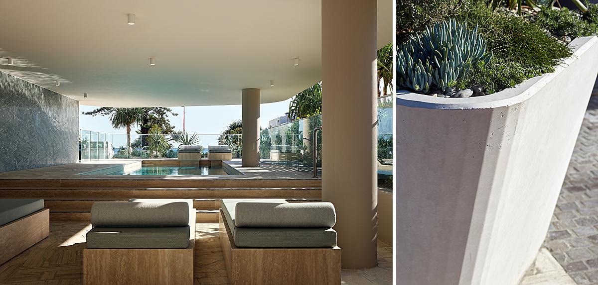
As we look at The Norfolk’s amenities and details, Scott echoes that same soft and tranquil feeling from the shot inside the living area. He explains “The transparency of the pool precinct allows residents using the pool to feel connected back to the beach as well.” In addition “Close-up details are important, particularly in establishing the quality and refinement that has gone into a project.”
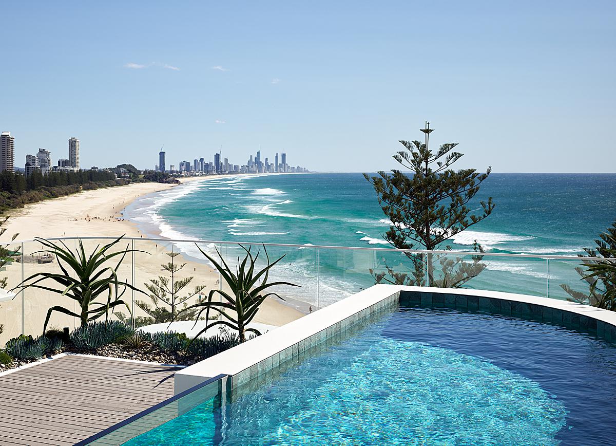
Up on the penthouse pool deck we see the Gold Coast skyline and gorgeous beach frontage. Scott noted to me that “the edge detailing reflects the serpentine shapes created on the beaches below.” I really appreciate the way Scott truly understands his subject matter, which allows him to create powerful images, even if they are just of the pool deck.
“Adjustable sliding screen elements to the eastern facade allow apartment dwellers to manipulate their own individual living environments,” Scott shares. In this image, we see the functionality of the screens and their differing placements. This view creates a lovely rhythm and sense of movement through the myriad of lines.
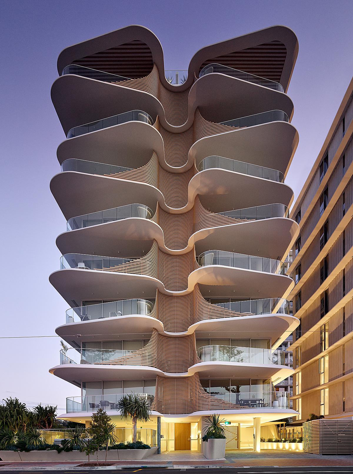
We’ll wrap up this Project of the Week with a shot of The Norfolk at dusk. Scott shows off the gradient in the lighting design that carries our eyes from the entrance up to the penthouse. The tones are just perfect and the building draws us in. Great job Scott, and thanks for sharing this beautiful project with us!
Pop over to Scott’s website scottburrowsphotographer.com to see more of his work or on Instagram @scottburrowsphotographer.
If you have a project you’d like to be considered for Project of the Week, you can submit it here.
