Rafael Soldi on Showing The Relationship Between a Home and Its Inhabitants
This week’s featured project is a real beauty by Seattle-based architectural photographer Rafael Soldi. We’ll be checking out his dreamy photographs of Beach Drive by Revolve Development. Rafael has been kind enough to share so much about his process and this lovely shoot, and I’m excited to share his intel and work with you all. Let’s check it out!
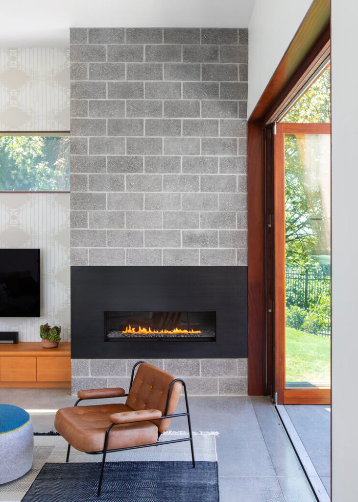
“Shooting Beach Drive was really fun because the clients had clearly poured so much love into designing their own home,” Rafael explains. “Denise and John Schack were so invested in both the architecture and the interiors and furnishings—this is a family home, first and foremost, so although everything was beautiful, it felt unpretentious. Nothing felt precious.”
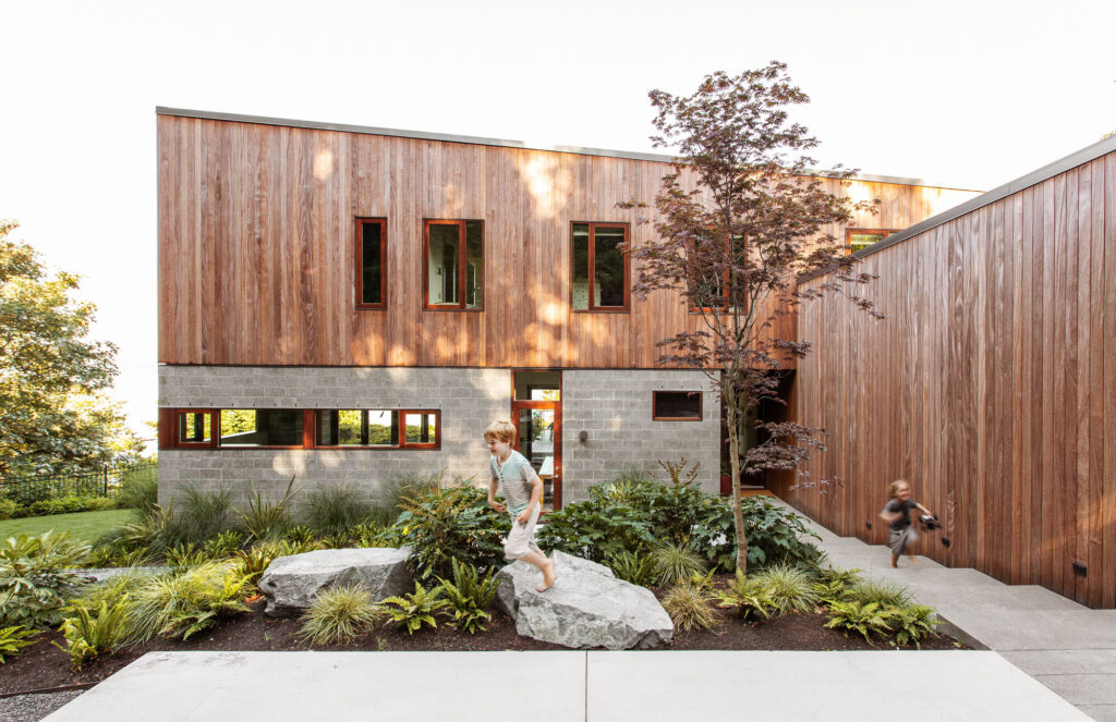
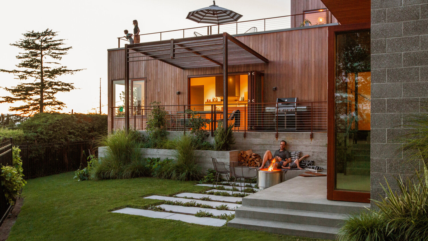
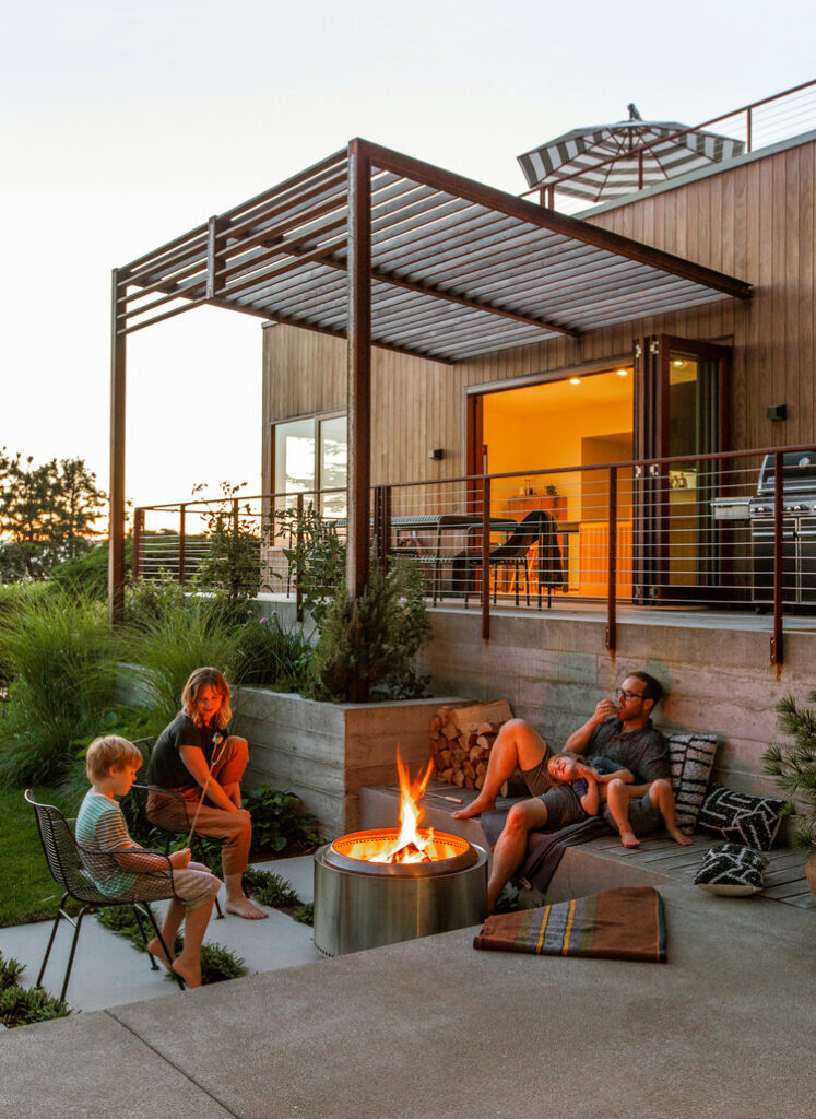
And that sentiment is evident throughout Rafael’s images. With the children playing, and some sort of human element in almost every frame, there is a whimsical and unfussy air about these photographs that gives us a good sense of how it feels to be a guest at this home.
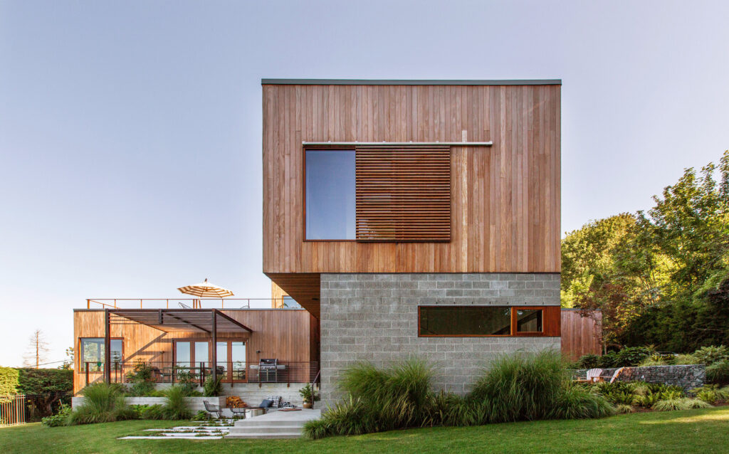
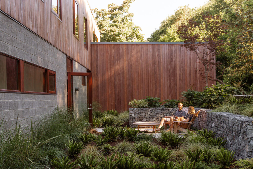
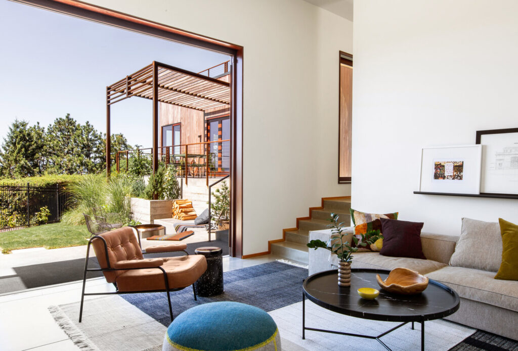
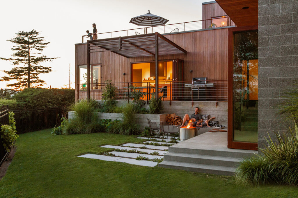
“It was a long summer day—here in Seattle, in the height of summer we have light until 10pm, which allows for these long days that tend to be a little less rushed than when we’re racing the light. We started around 10am and went home around 9:30pm I believe. The main goal was to capture the distinct areas of the home and their connectedness to the exterior patio/garden. The home is an ‘L’ shape, so the spaces feel separate from one another, but once you open all the sliding doors, they all look into the same garden and the house becomes one big room. I think that transition is pretty key and we wanted to show that.”
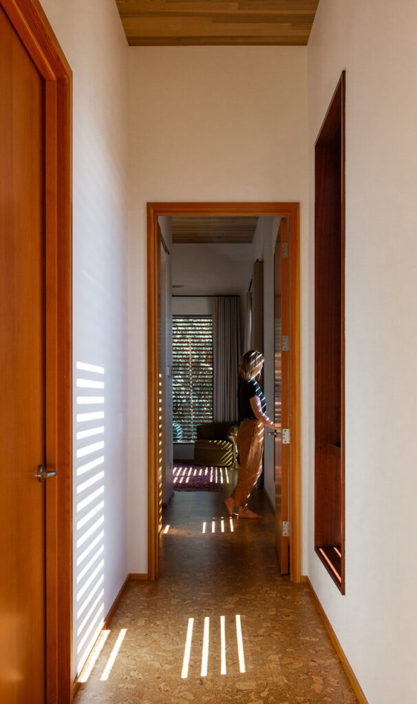
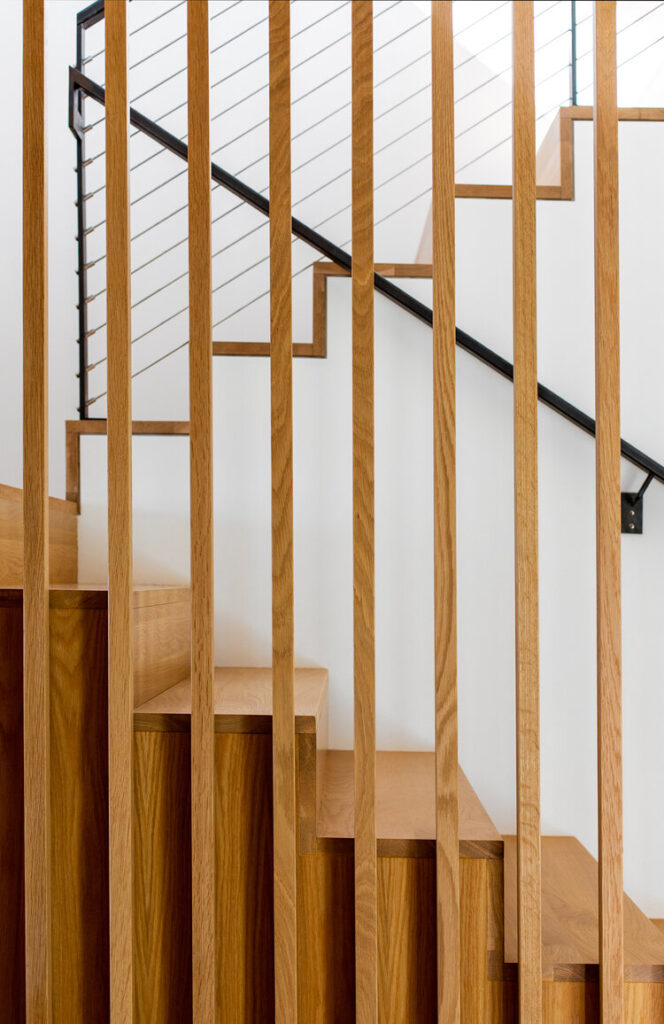
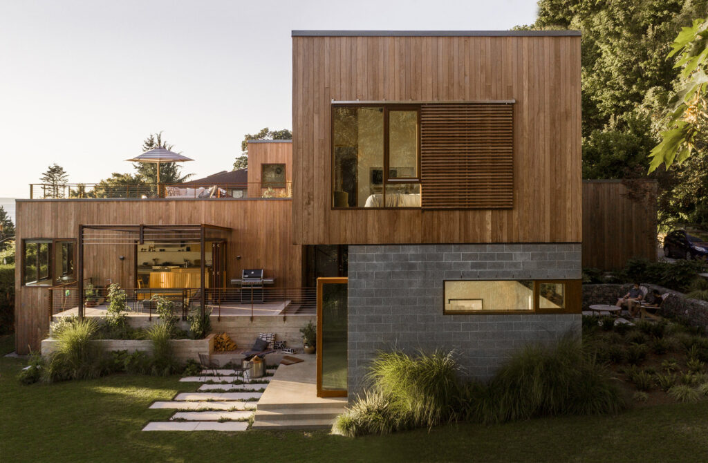
“The house also has a series of sliding slatted screens over the second-story windows that act as a passive heating and cooling method, while also adding to the design. So we wanted to capture those from the inside and the outside. Overall, because there are important elements of the house facing almost every direction, we sort of danced around the whole structure throughout the day following the light. The main challenge here was that it is a large structure perched up on a hill/ledge overlooking the water. And the only way to truly get a comprehensive view of the structure was to do so with a drone—so we had a drone operator join us as the sun lowered to capture that view.”
Rafael’s compositions employ a strong use of geometry and perfectly sublime light. They are perfectly dynamic yet gentle a serene scenes which offer us a sense of place — and a feeling of being at-home.
He gives us a glimpse into his process by sharing “”I come from an art background and continue to prioritize my art career. I never intended to do commercial work and am the opposite of a gearhead. My least favorite part of my job is managing gear and technology—I hate it. So my approach really reflects this tendency—I don’t think you need the fanciest equipment or techniques to make a great picture.
I work primarily with natural light, and always bring a basic travel strobe set for fill. I always capture multiple exposures if necessary, but try to keep it as simple as possible. I’m not really trained on technical lighting, so my approach is always to try things until I land on something I like. I’m always bouncing light and trying to honor/follow the existing natural light.”
“With post processing, I’m pretty particular about distractions such as light switches, can lights, smoke detectors, etc. I know they’re a very real part of daily life, but I’m in the business of making a good picture, and they just add visual noise. I’m a stickler for perspective/alignment and pay close attention to my whites, blacks and grays to make sure they’re as neutral as possible, which involves a lot of masking. I often prefer to remove vibrance and saturation from neutral tones and then add warmth manually after—of course, this is case by case.”
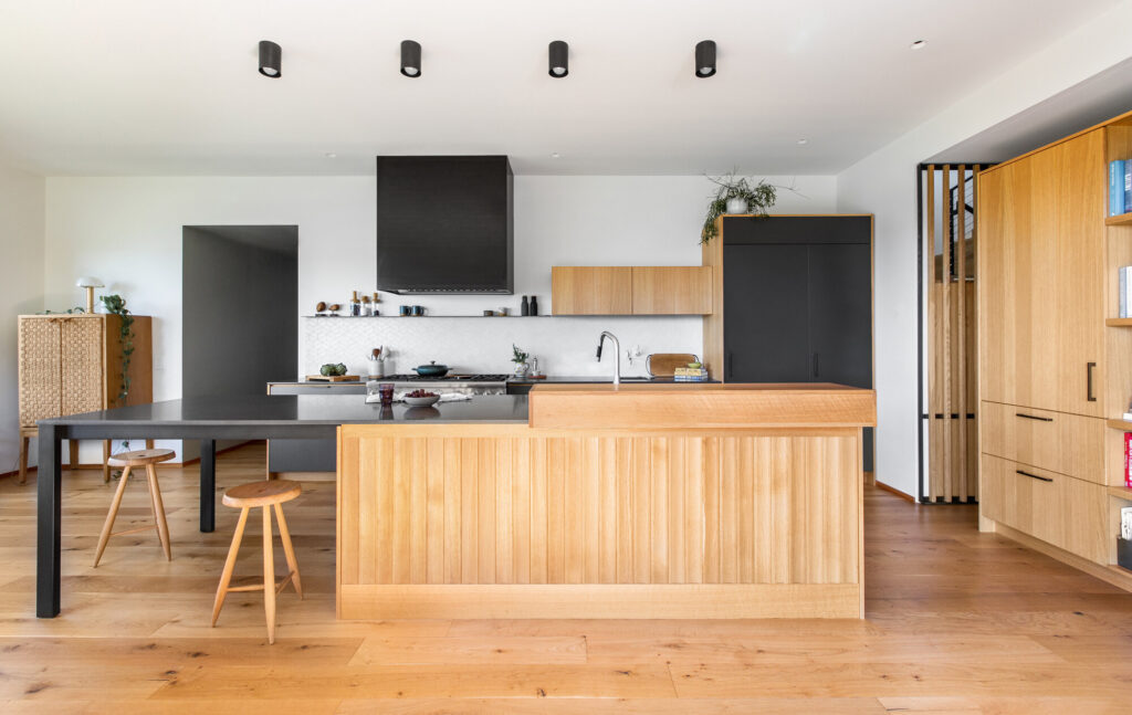
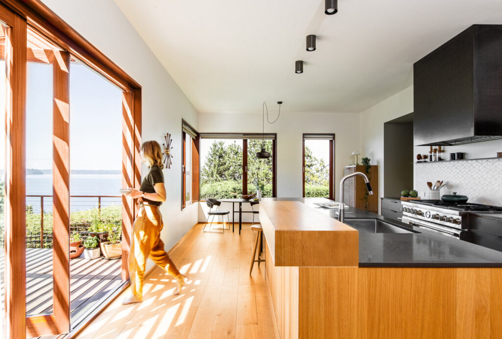
Here we get a good dose of that warmth and natural yet crisp color grading. The countertop and range hood are nice and black. The balance in exposure between the view out the windows and the interior is perfectly realistic. The bright highlights streaming in the door convey a sense of heat and add excitement to the scene.
Rafael continues “On set, collaboration with the client is critical. It’s important to me that the client is involved in making the decisions about styling and framing. Our relationships to the space are very different. I also like to ask the client, ‘how do you want this space to feel?’, because recording the concrete qualities of a space is not the same as recording the ethereal qualities of a space. If the room feels sunny and bright and airy, then maybe we go with more blown-out windows and a sun-drenched feel. If the room is meant to feel intimate and cozy, then maybe we do a vertical vignette instead of a horizontal full-room shot. If it’s important to understand how a person can navigate the space from one room to the next, then we should include a figure to illustrate that transition. And so on.”
“The last thing is open mindedness. A shoot in which the decisions have already been made will not go well. I’m always open to any idea, even the crazy ones, because you just never know what’s going to look like through the lens,” Rafael tells. “I also ask my clients to remain open minded about suggestions I make—if it looks bad, I’ll be the first to say it. I always suggest to not overstyle until we’re feeling confident about our framing. You can spend hours styling a beautiful room, but it doesn’t mean it’s going to photograph well.”
What awesome advice!
I just love this photograph of Beach Drive. There are so many great things happening — like the directional lighting sweeping over the scene, adding lovely highlights to the landscaping and drawing our eyes through the windows and into the interior rooms. I really appreciate that Rafael kept the massive sliding door open to add another rectilinear shape into the mix. There is an outstanding shapeliness and quality of depth here that is so beautiful.
I asked Rafael if he had any sage advice for photographers shooting similar styled projects. “Planning is key,” he says. “I try not to overplan, because I like feeling like things can flow in unexpected ways, but you must be prepared. Always tour the space ahead of time and keep an eye on weather. I’m not always great at following the sun trajectories with apps, and thinking about positions and times of day and what not. I find it simpler and more accurate to ask the homeowners how the sun behaves in their home. They know better than anyone which rooms get hot when, and when the shades need to be drawn, and when the sun hits certain spots of the house. So I follow their information.
I can’t tell you how many times I’ve changed my plan because the homeowner tells me ‘At 3pm the sun hits my neighbor’s house and bounces back into this room with a big blue cast’ or ‘At 2pm the sun hits that skylight, sending a beam of light across the whole kitchen’. This goes both ways, for avoiding tricky situations, and embracing dramatic ones. In this case, we also included the kids and the parents in the photos, so being personable and engaging and patient is important. When working with kids, always ask parents when is the best time to catch them in a good mood, and don’t invite them until you’re fully set up and ready to shoot.”
A giant thank you to Rafael for sharing his photographs of Beach Drive with us here at APA. They are a perfect example of showing the relationship between the design of a home and the people who inhabit it!
You can see more of Rafael’s lovely work at rafaelsoldiphotography.com and on Instagram @rafaelsoldiphotography.
If you have a project you’d like to be considered for Project of the Week, you can submit it here.
