Project of the Week: James Florio / Cazú Zegers
Patagonia is one of the most extreme and beautiful places on this planet. It’s a place I’ve always wanted to visit, so lucky for me, the masterful James Florio is taking us on a visual adventure to an incredible hotel there.
This week’s featured project takes place at architect Cazú Zegers Hotel Tierra Patagonia.
When speaking with James about this epic project, he told me that this wasn’t his first Patagonian architecture photography endeavor:
I’ve been lucky to shoot about 7 or 8 projects down the Chilean side of Patagonia and I think the extremes of Patagonia are always a major factor in any shoot there. The isolation and logistics in arriving are a challenge as well, it is about a full day’s travel to and from. The weather changes quickly and constantly, and of course, is pretty much unpredictable. There can be days and days of pure sun that shift instantly to days and days of rain and clouds – which means you have to be super prepared and work fast when the good weather comes…and don’t forget about the wind…where even a tripod can’t help you! We were getting some collateral location shots on a beautiful sunny afternoon when the wind just started up and began shaking the truck violently. Rocks began flying through the air and one ended up completely shattering and blowing out the back window.
James Florio
That’s pretty insane! Let’s jump into the project of the week so you can see for your self!
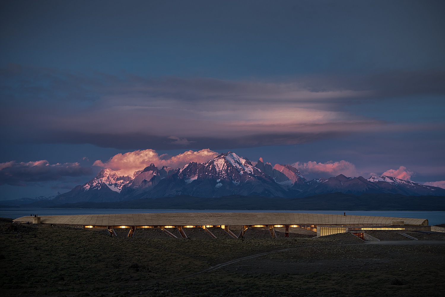
Patagonia at sunrise: what a way to start a shoot. In addition to the obvious epic mountain range being hit by the pink morning sun, there are so many small details to love about this image. Notice the ever so faint road weaving through the foreground, which subtly pulls you into the structure itself. I appreciate that each portion of this scene is given its own space. There is a distinct separation between the grassy foreground, the building, the sliver of lake, the mountains, and the sky. While this is an enormous amount of content to get into one photograph, it doesn’t feel crowded. It gives us a good sense of how the Hotel Tierra Patagonia is placed in its environment.
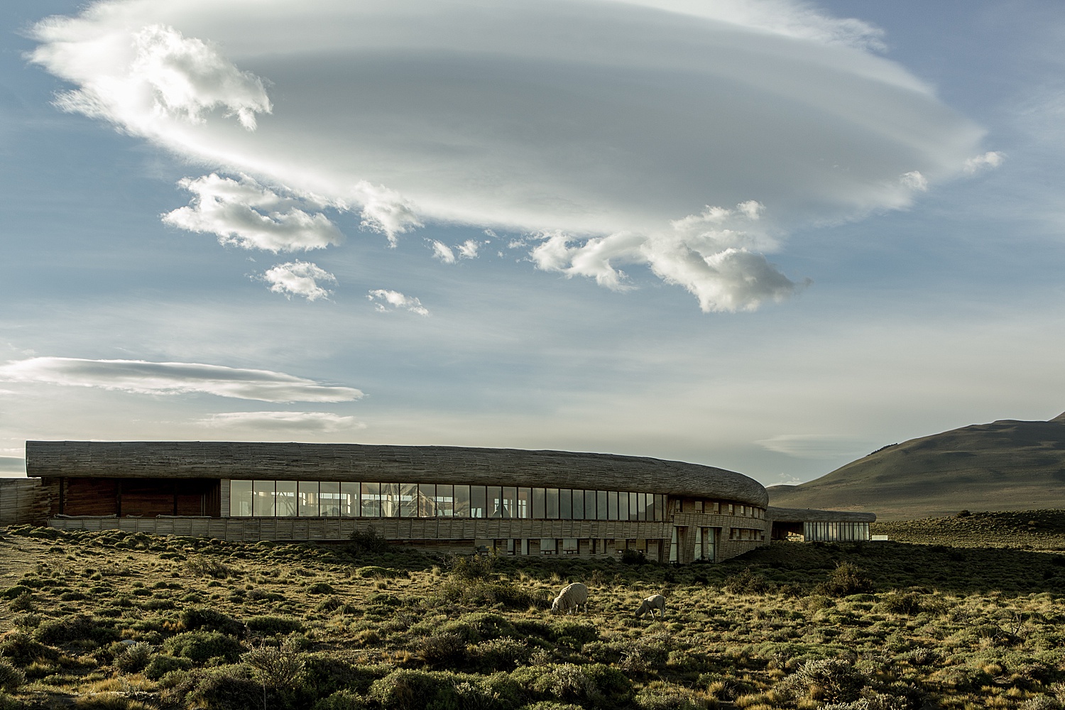
In the daylight, we are able to appreciate more of the surroundings and the structure itself. This is a great angle of the hotel. Look at how the curvature of the building carries your eye over to the curvature of the mountain. It feels equally weighted, both horizontally and vertically. I love the shadows cast by the cloud, creating depth and interest. Speaking of interesting, check out those Patagonian sheep grazing!
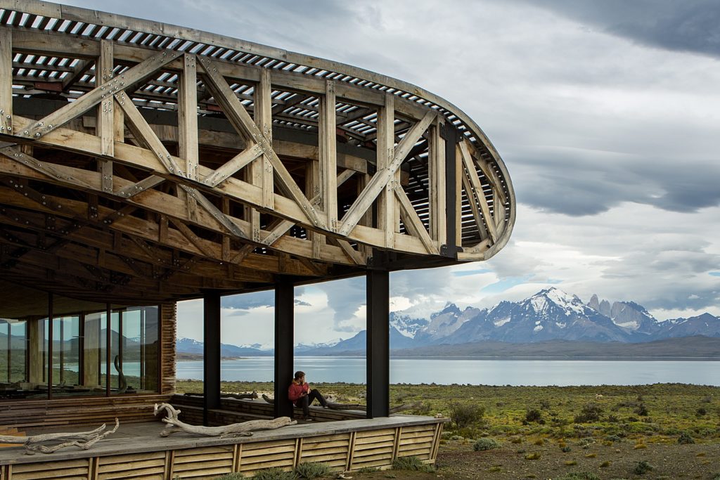
As we continue our journey around the exterior of the hotel, we get to this outdoor observation area. James did an awesome job of capturing the dimensionality of the roof trusses and the louvered wooden slats. This perspective was a great way to show off the complex design of Tierra Patagonia while showing off the view of Torres Del Paine in the background. Two birds. One stone.
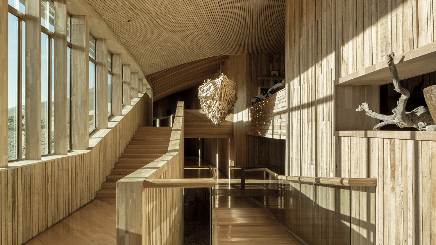
Here, James introduces us to the incredible interior of the Hotel Tierra Patagonia. I’ve never seen such an elaborate space look so peaceful. The one point perspective helps navigate our eyes around the image, noting the different spaces throughout the hotel. The repetition in the wood creates a nice rhythm. The real show stopper here though, is the beautiful sunlight pouring in through those windows and onto the opposite wall.
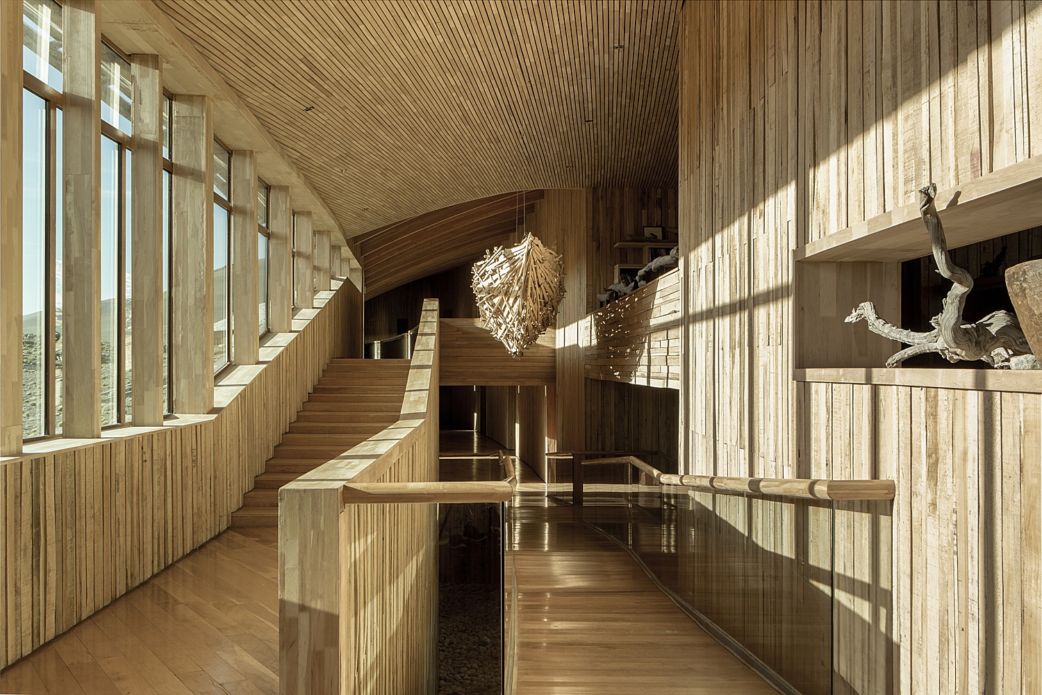
I actually love the reflections in the windows here. They are perfect mirrors of the pillars, and it creates a realness about the image, and a fun flow that pulls my attention from left to right. Throughout this entire project, James Florio shows such a mastery of using light and shadow to show the shape of the hotel.
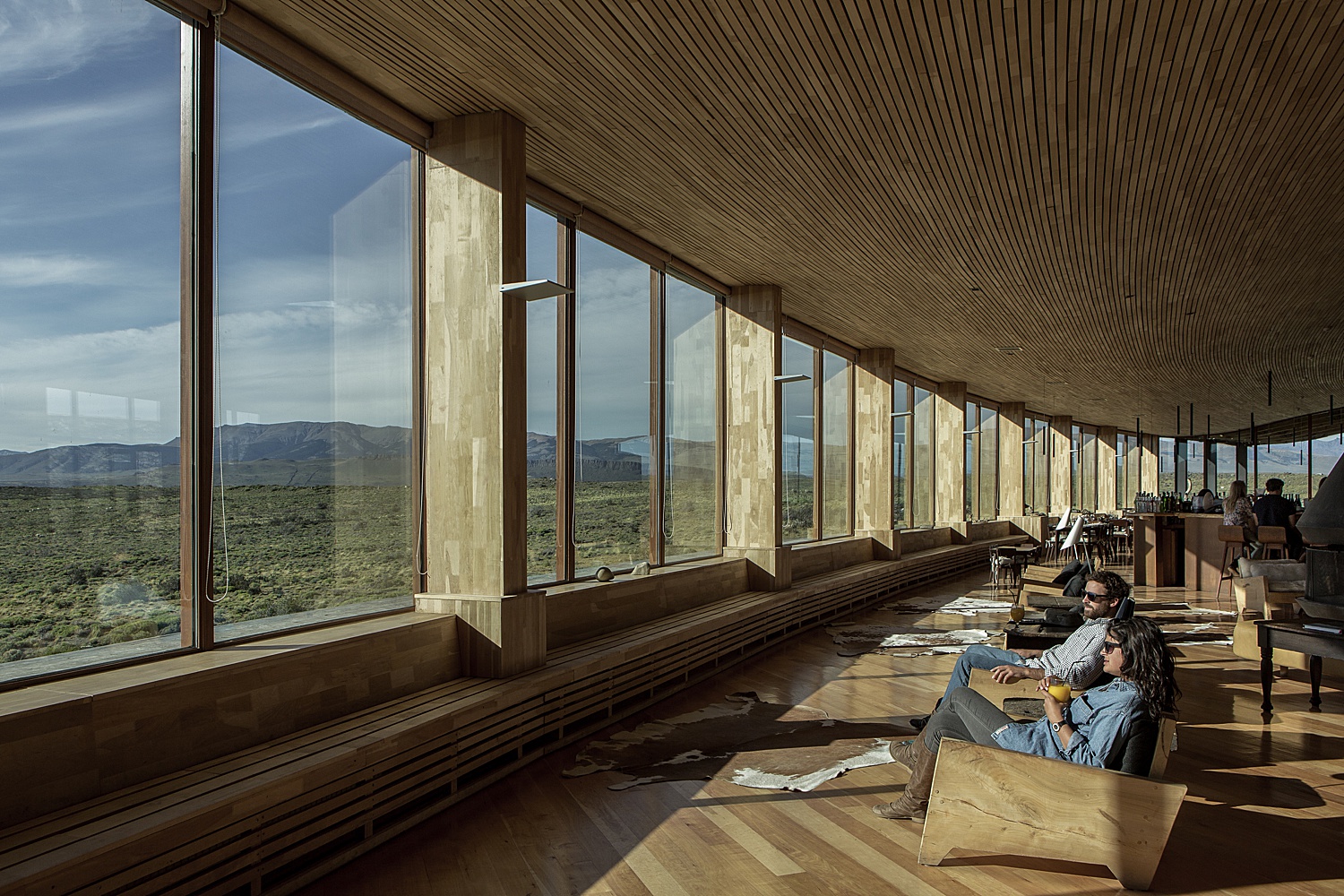
The landscape around Tierra Patagonia is obviously incredible. Ultimately, that is the destination. James’ positioning of this shot transports us there. It’s like we’re standing in the passageway looking out the windows. He did a great job balancing the difference in the outdoor exposure with the beams along the windows. They are dark enough to not be distracting, while still retaining some detail. I love the long shadows in the grass and how the sunlight brings out the texture of the hotel’s facade.
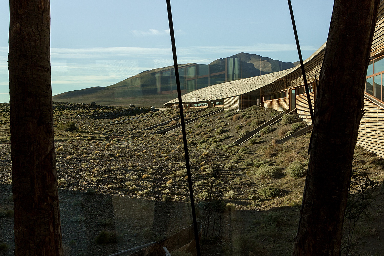
The oposing view of a scene we saw earlier, this photograph is pretty wide, and gives us the scope of the hotel’s interior. The exposure feels perfect and I’d imagine is exactly how you’d see the Tierra Patagonia if you were there in person. Again, James knocks it out of the park giving dimension to an interior with a monochrome color-way.
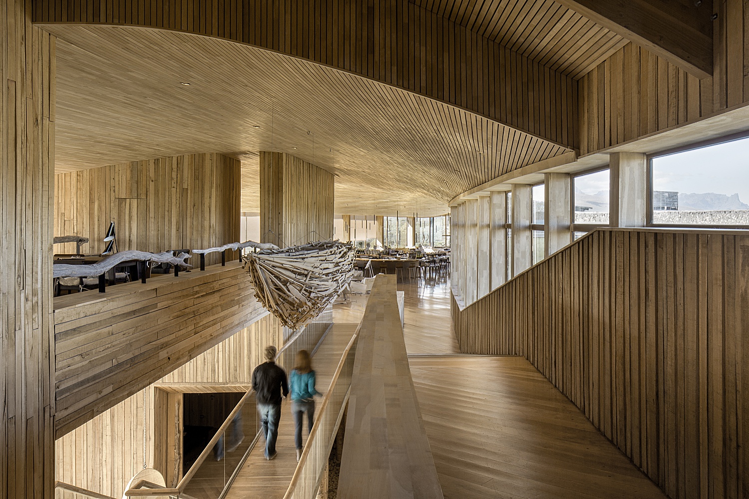
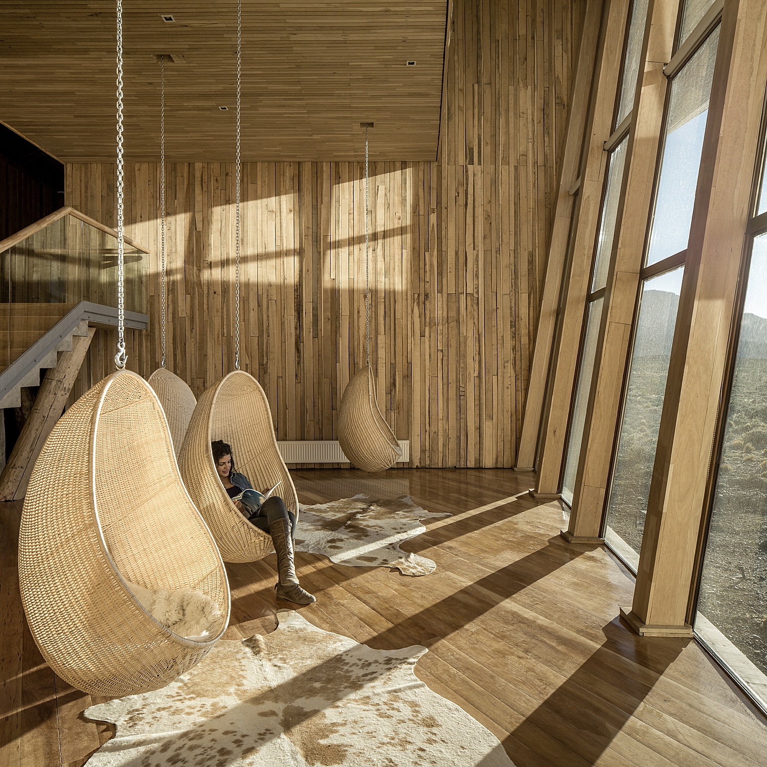
This is hands down my favorite image from the series. The diagonal lines created by the light streaming in through the windows creates a warm and pleasant mood. The monochrome color palette contributes to the soft feel. I love that James had a person sit in the hanging chair. It gives scale to the chairs and lends itself to the cozy and comfortable vibe. The angle he chose to shoot at is very strong. We are shown the space in its entirety without any crucial design points or objects in the room stacking. All in all it’s a really well thought out scene.
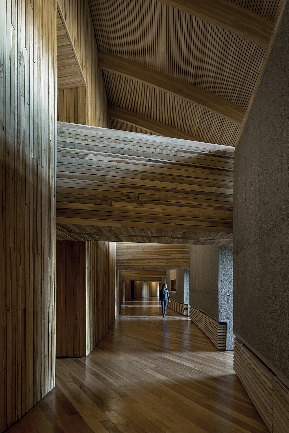
Contrasting the airy feel of the previous image, the next is moody in a dark and cold way. Still, it meshes with the rest of this project and doesn’t feel out of place at all. I appreciate how James was able to balance the different color temperatures coming in here while keeping it pretty neutral. The warm light on the ceiling is well complimented by the cool light coming in through the windows.
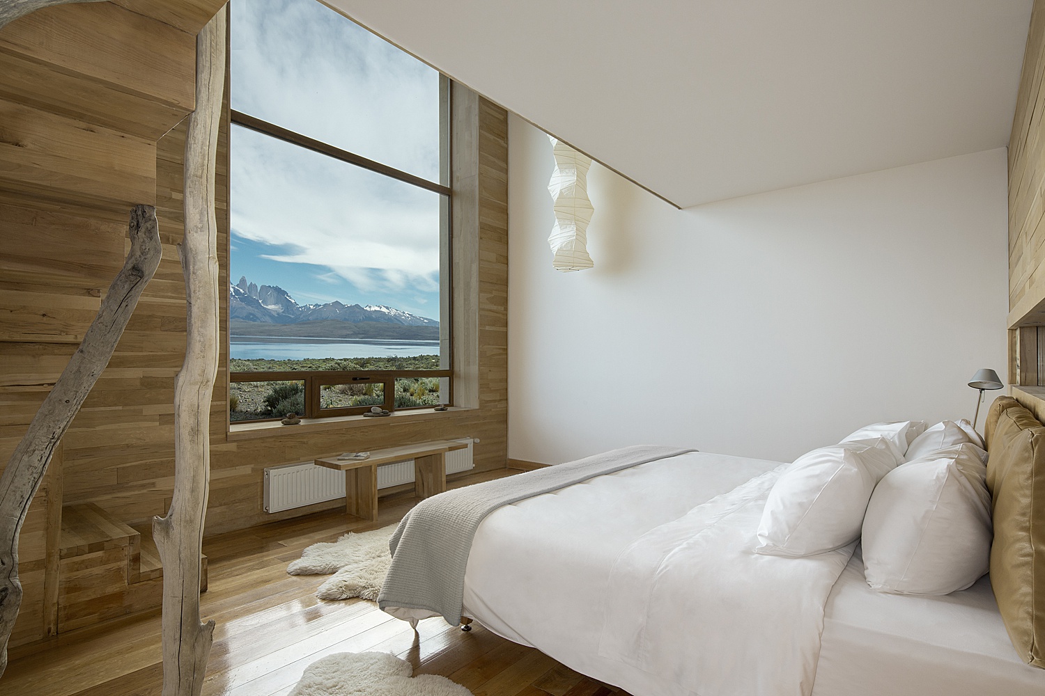
Hotel Tierra Patagonia looks so idyllic. James preserves the great view in the window, keeps crisp whites on the wall and bed, and creates a soft light throughout the room, as evident by the gentle shadows present.
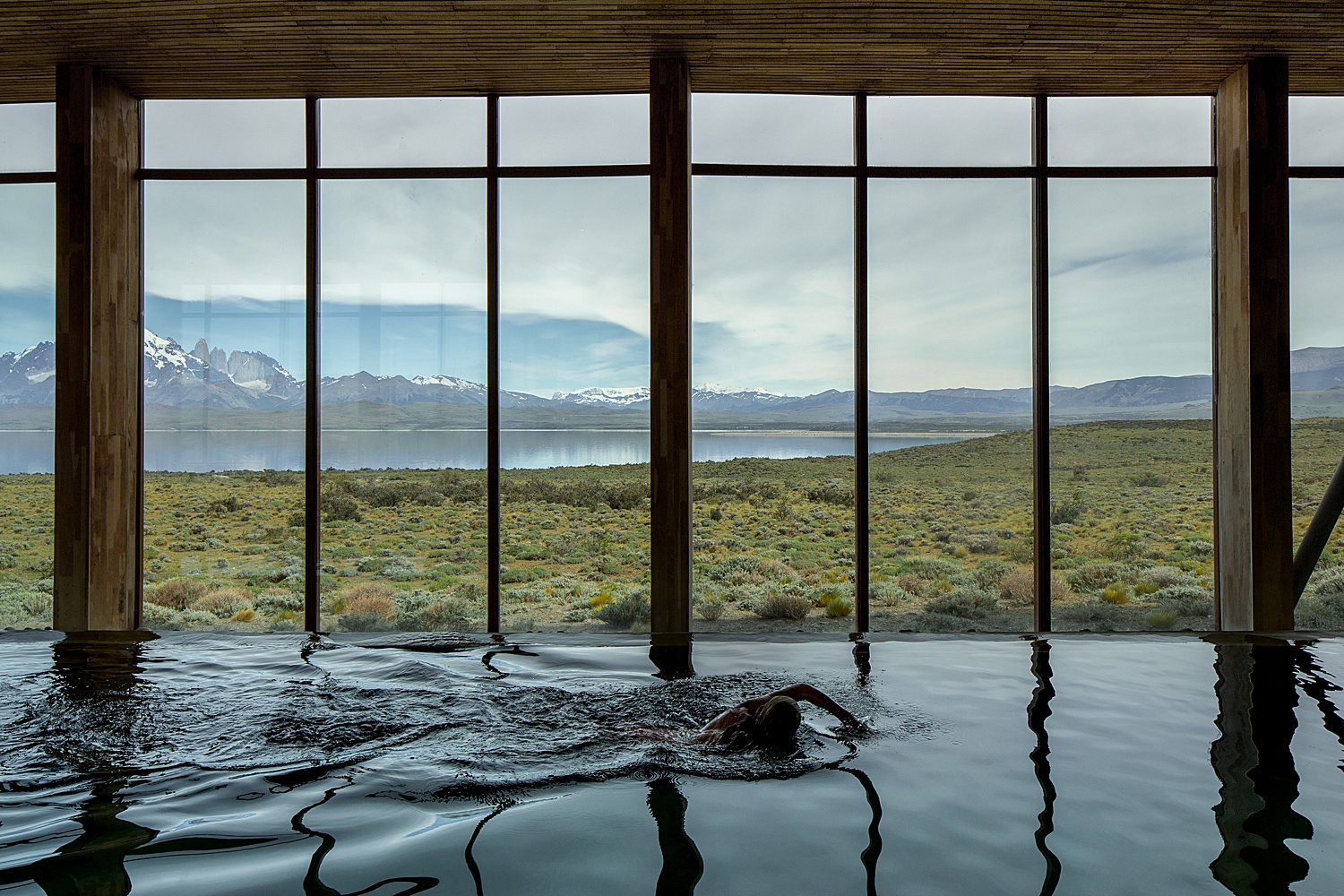
There are so many things to love about this image. I, for one, enjoy how different this shot is from the more traditional hotel pool photos that you typically see. The water is inky and rippled – not the glassy bright blue we’re used to. The image as a whole trends pretty dark, but it feels right considering the cloudy and dramatic sky outside. This photograph beautifully indicates to us what it’s like to swim laps in front of Torres del Paine.
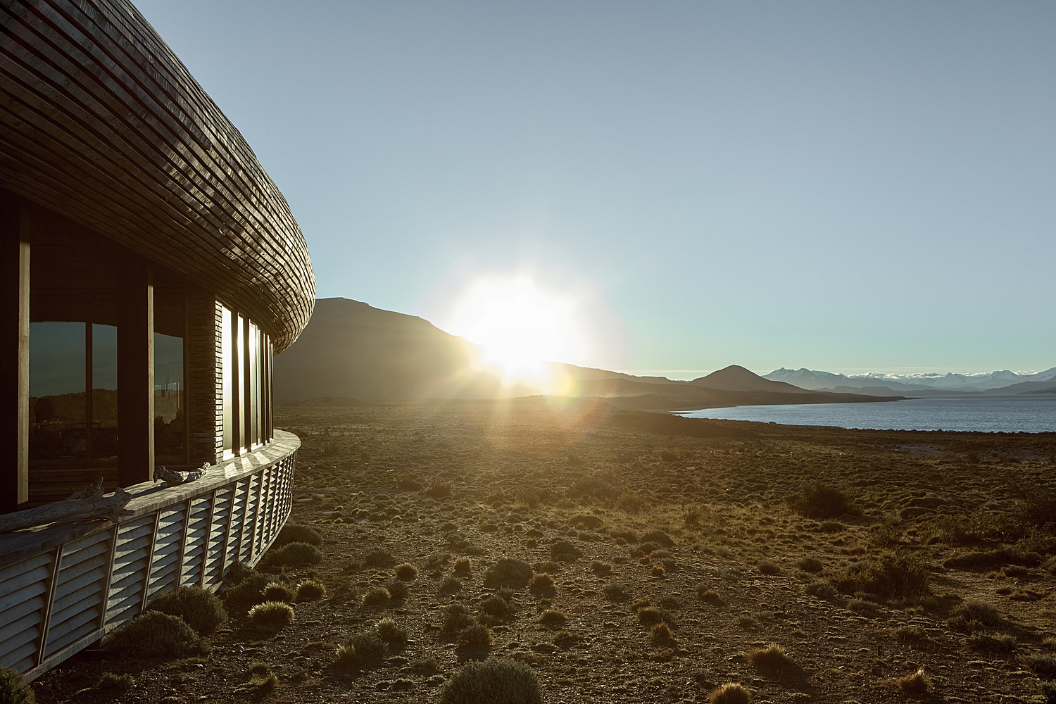
I’ll leave you with this great image from James. The sun spilling over the Patagonian mountains, backlighting the foliage and shooting warm specular highlights onto Hotel Tierra Patagonia and the lake beyond.
A million thank yous to James Florio for sharing his work of Tierra Patagonia with us and making us feel like we were transported there. You can (and should) view more of his showstoppingly moody work on his website and Instagram!
Instagram: @jamesfloriophotography
