Check Out Chase Daniel’s Photographs of a 1920s Hotel in the Hills of West Virginia
Chase Daniel is one of my very favorite architectural photographers. You might remember him from a past Project of the Week featuring Turkel Design’s Axiom Desert House. There is something about his work that just puts me over the moon!
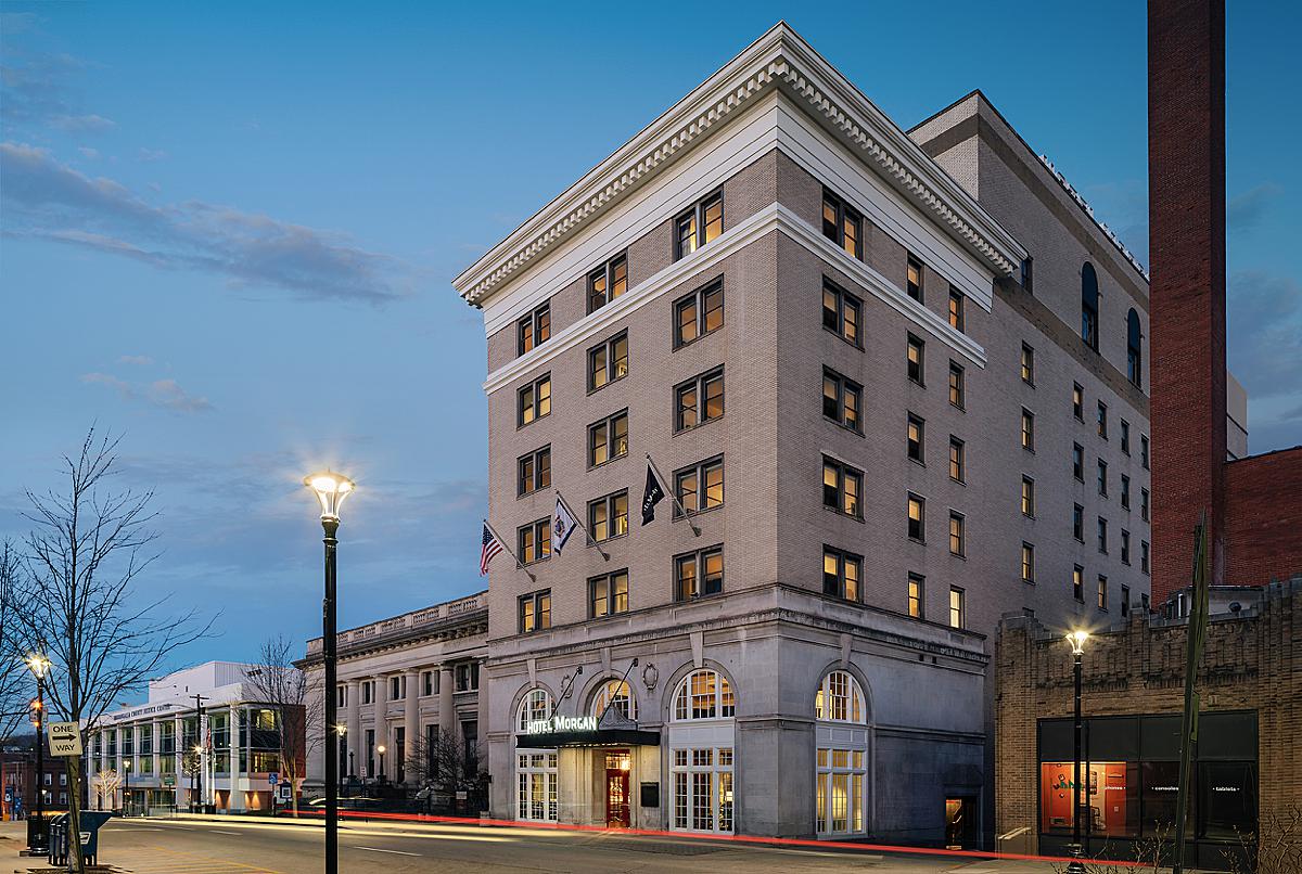
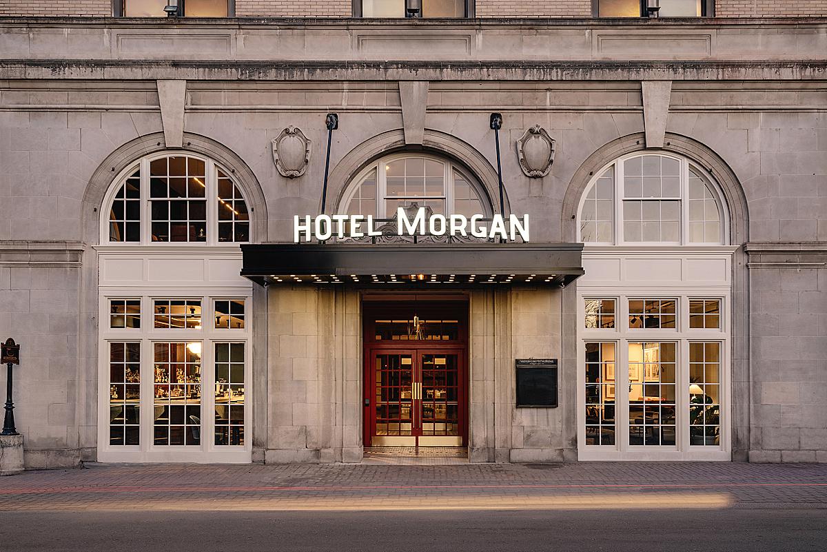
Today we’re taking a gander at one of his newest projects, Hotel Morgan. Hotel Morgan is a historic hotel dating back to 1925. It is nestled in the hills of Morgantown West Virginia (cue Take Me Home, Country Roads by John Denver). Chase’s photographs of the hotel create such an inviting air and do a perfect job at showing off the historic grandeur of the place while also conveying its modern amenities and refreshed design.
Chase kicks things off by telling us “The goal during most of my shoots is to listen to the client and to document what they want captured. In this case, a hospitality group hired me and not an architect, so the photos were tackled a bit differently. There will always be more photogenic moments that I lean towards, but that doesn’t mean it’s in the best interest of the project. Of course, there is a back and forth about compositions and what looks best, but at the end of the day I want to please my client who has hired me for the shoot.”
He continues, “It was a two-day shoot and 90% of the shoot was interiors, so the weather didn’t play too much of a factor. The major challenge with any hotel project is navigating the room shots. They are always smaller than you’d like and it can be tricky getting some key areas in the frame!”
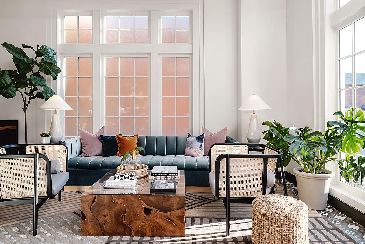
I love the light streaming in through the windows and the pattern it makes on the seating area. Chase does a beautiful job of piquing our interest in the rest of the hotel’s common areas by showing little slices of them. Our eyes cruise through the different layers of this image and back toward that swanky bar. One thing in particular I admire is the balance in exposure in each different area of the hotel. It feels true to real life and nothing looks out of place. Solid job, Chase!
I asked our featured photographer a bit about the techniques he uses – and for you gear nerds, what is in his kit. Chase was kind enough to divulge that on this particular project he used his Sony A7R IV equipped with Canon’s 24mm TSE lens, all resting atop a Leofoto LN-324CH Tripod.
He shares “My general process is to blend natural ambient light with strobe lights to shape and define the space I’m shooting. I take a bracketed set of images with no lights on, then a few frames with decorative lights only to blend in. I never shoot with overhead or can lighting as this causes shadows and burn spots in the images.”
Chase tethers to an iPad mini using a Camranger, which allows him to walk through the frame with a Profoto B10 Plus and light the room from at least two different areas, which he blends together in the final image.
A powerful room demands a powerful composition, and Chase delivers with a perfect one-point perspective that drives our attention through this massive space, right to the fireplace. We are able to understand the scale, depth, and grandeur of this 3,200 square foot grand ballroom.
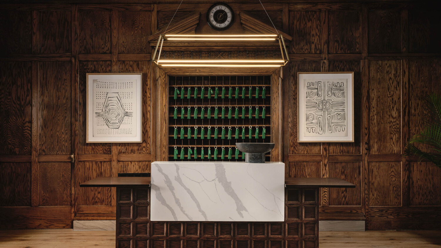
Up next is both Chase and I’s favorite image. He shares, “Straight out of camera it screamed Wes Anderson.
I think the mix of the historic wood paneling with the new reception touches made the image pop. The location of this space is actually pretty deep in the building with no natural light, so it took quite a bit of work to get some directional light to bring out the textures of the wood without it looking overly bright and fake. I still wanted it to read as a warm, dark image, so I shaped the light to keep the edges of the frame like a vignette.”
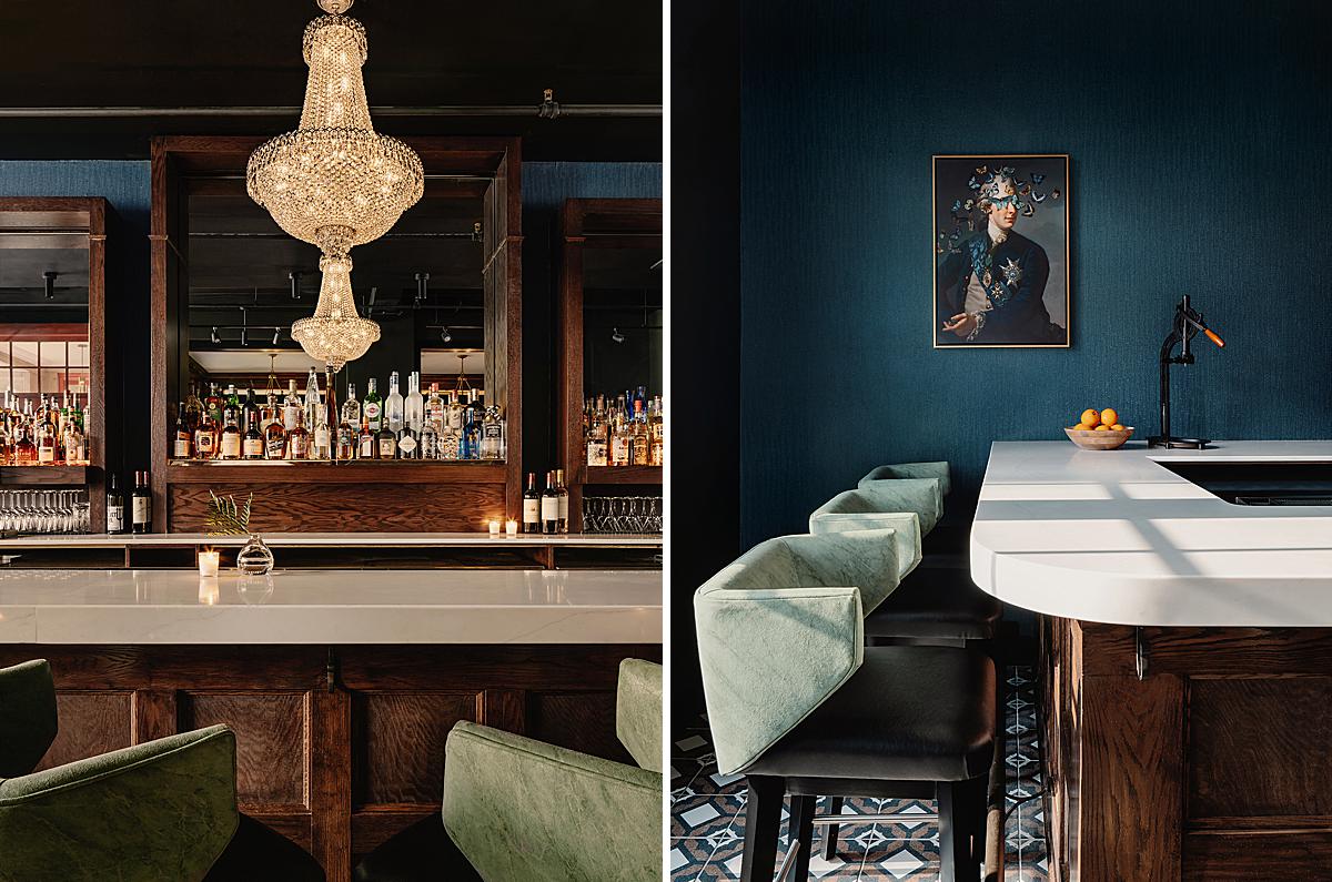
Two vignettes of the bar make us feel as if we could reach through the screen and grab a cocktail. The mood that Chase is able to deliver through these photographs is just stellar. I appreciate the way he lets certain elements fall dark while still including beautiful patterns of natural and practical light. Old Fashions anyone?
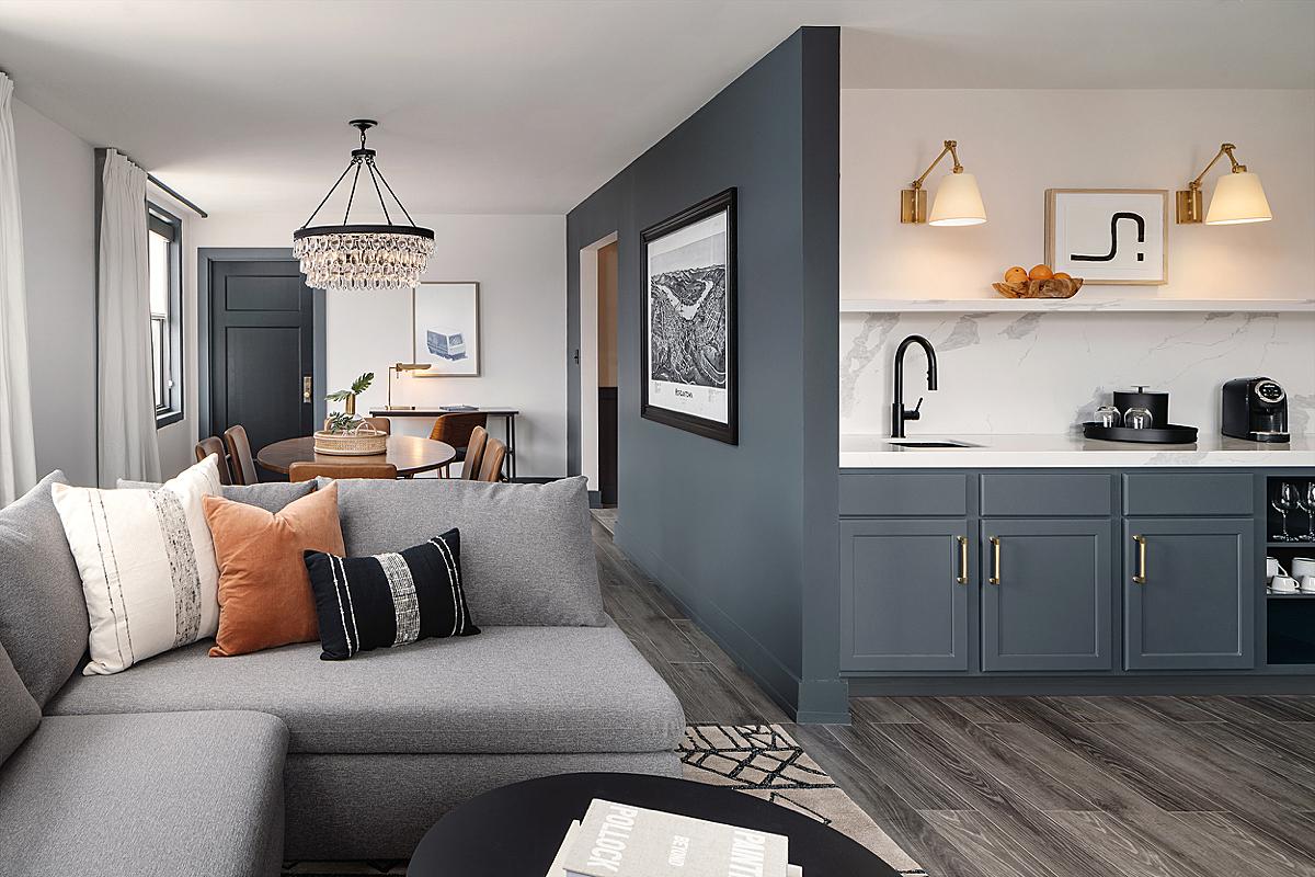
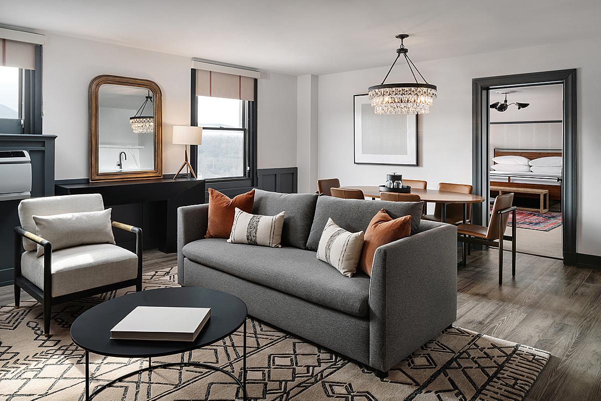
Up to the rooms! I don’t know about you folks, but I’m ready to book my stay at the Hotel Morgan. Chase gives us a wide, encompassing shot that shows us the lay of the land. His perspective allows us to denote the different room dividers and doorways into other areas. He keeps things crisp and well-lit, creating a hospitable feeling.
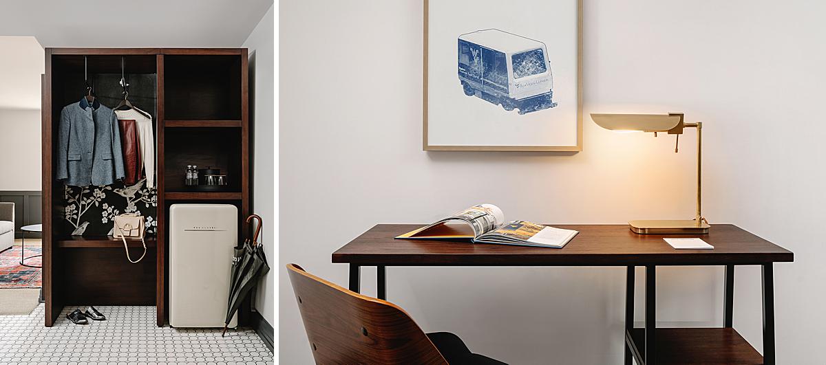
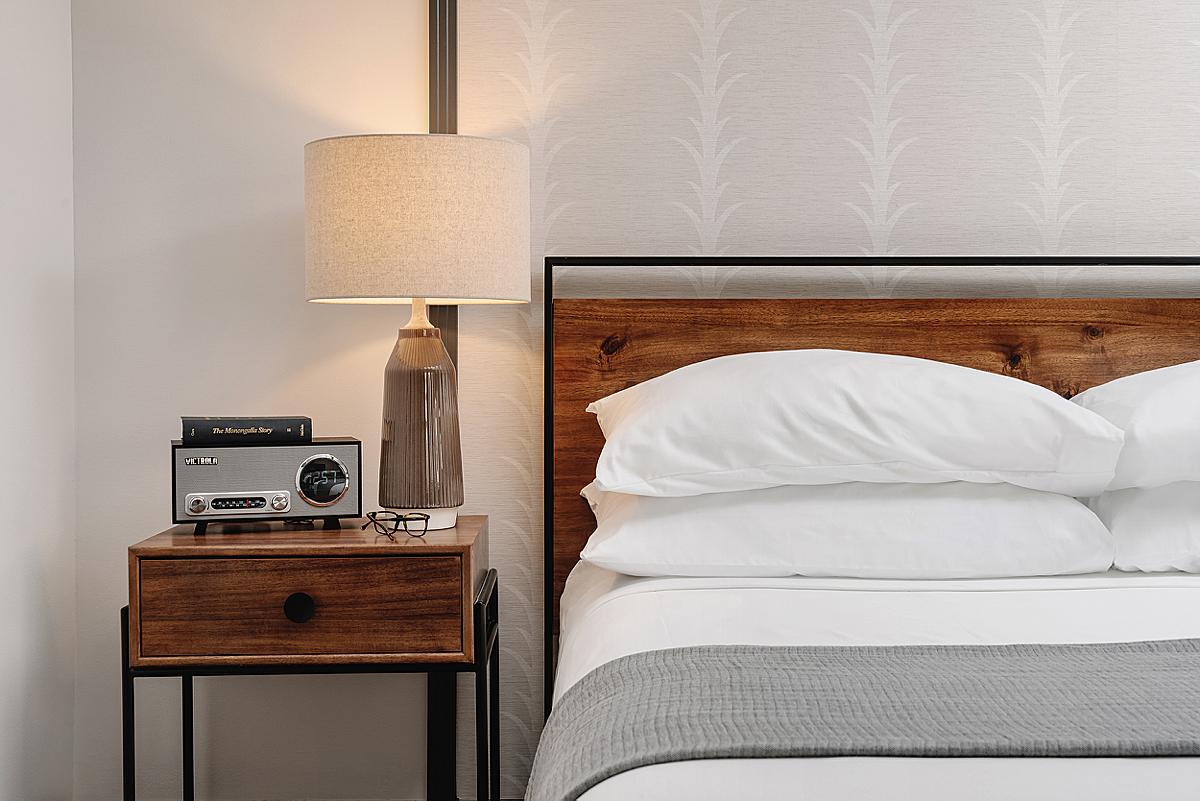
These details showcase the boutique nature of Hotel Morgan. I can just envision myself hanging up my coat and sitting down at the desk to jot down a quick note.
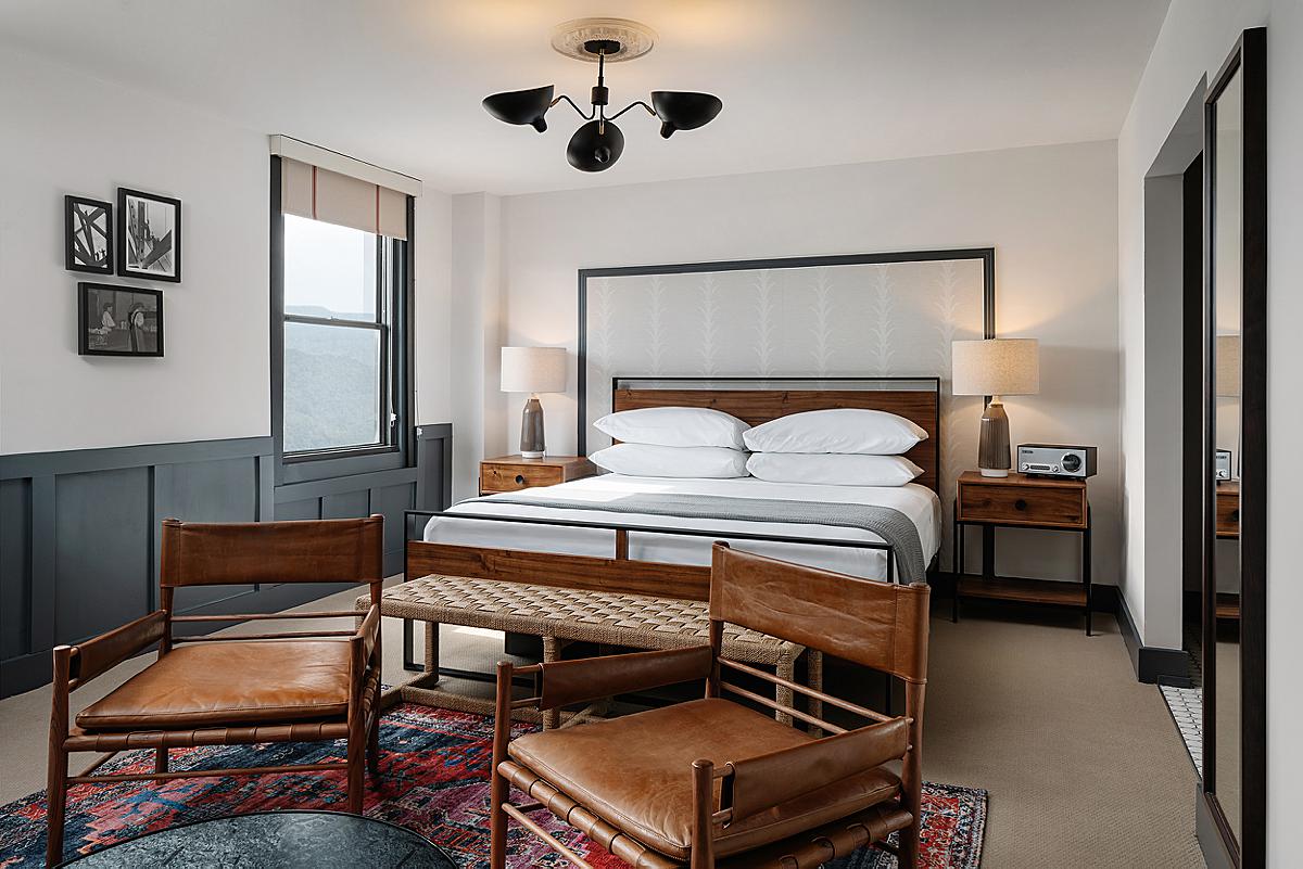
Here we see another room configuration. Chase’s image feels congruent with the other room shots we’ve seen. I love how we can see a faint glimpse of the mountains and stretch of trees outside the window. The balance in exposure is perfect, and we are able to place ourselves in this scene.
So what is Chase’s piece of advice to a photographer shooting a similar project? He shares “Keep your images simple.”
He continues, “I will almost never look back on an image with natural light and be embarrassed about the final product, but I have most definitely looked back on some old work where I over-edited or over-flashed and it looked too fake and like I was trying too hard. Start small with post-processing and artificial lighting—I still have much to learn but feel like I’ve come a long way since beginning.”
Infinite thank you’s to Chase for sharing this unique project with us. It is such a beautiful example of a boutique hotel. As someone who visits West Virginia regularly, his photographs have made me add Hotel Morgan to my list of places to stay. Advertising at its finest!
Chase’s work is just off the hook. See more at chasedaniel.co and give him a follow on Instagram at @thevuvobandit!
If you have a project you’d like to be considered for Project of the Week, you can submit it here.
