Inside San Diego’s Brunch Mecca Morning Glory with Zack Benson
This is probably the hippest thing I’ll ever say in my life, but if you’re into the San Diego brunch scene AND an architectural photographer, this Project of the Week by Zack Benson is your Holy Grail.
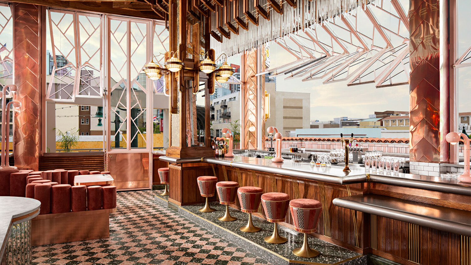
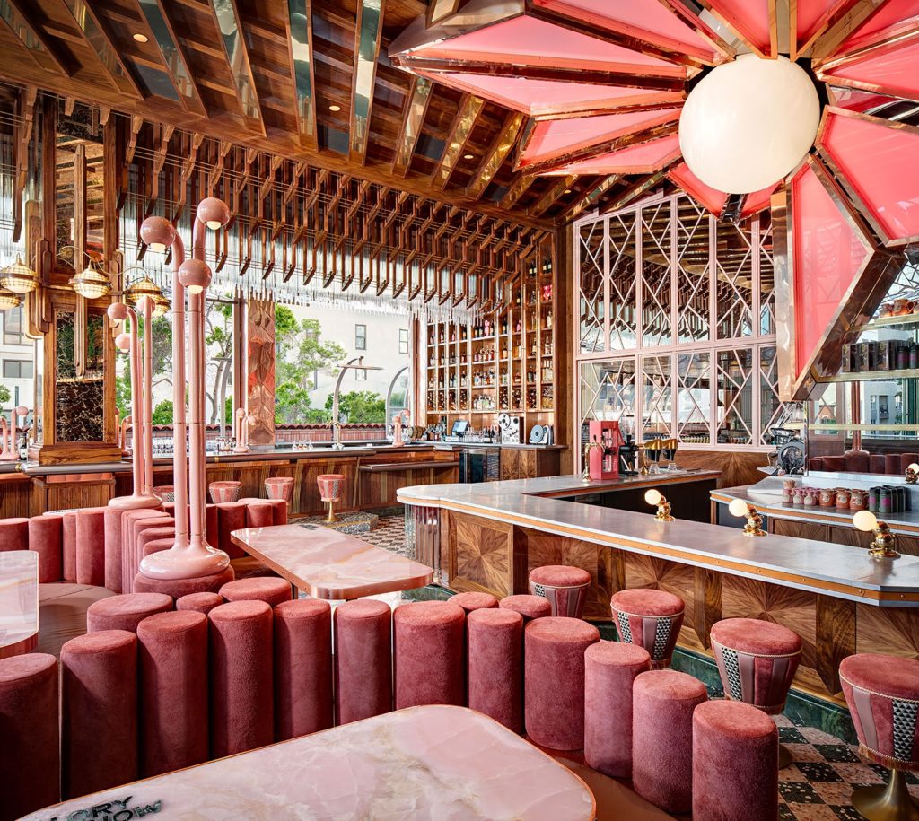
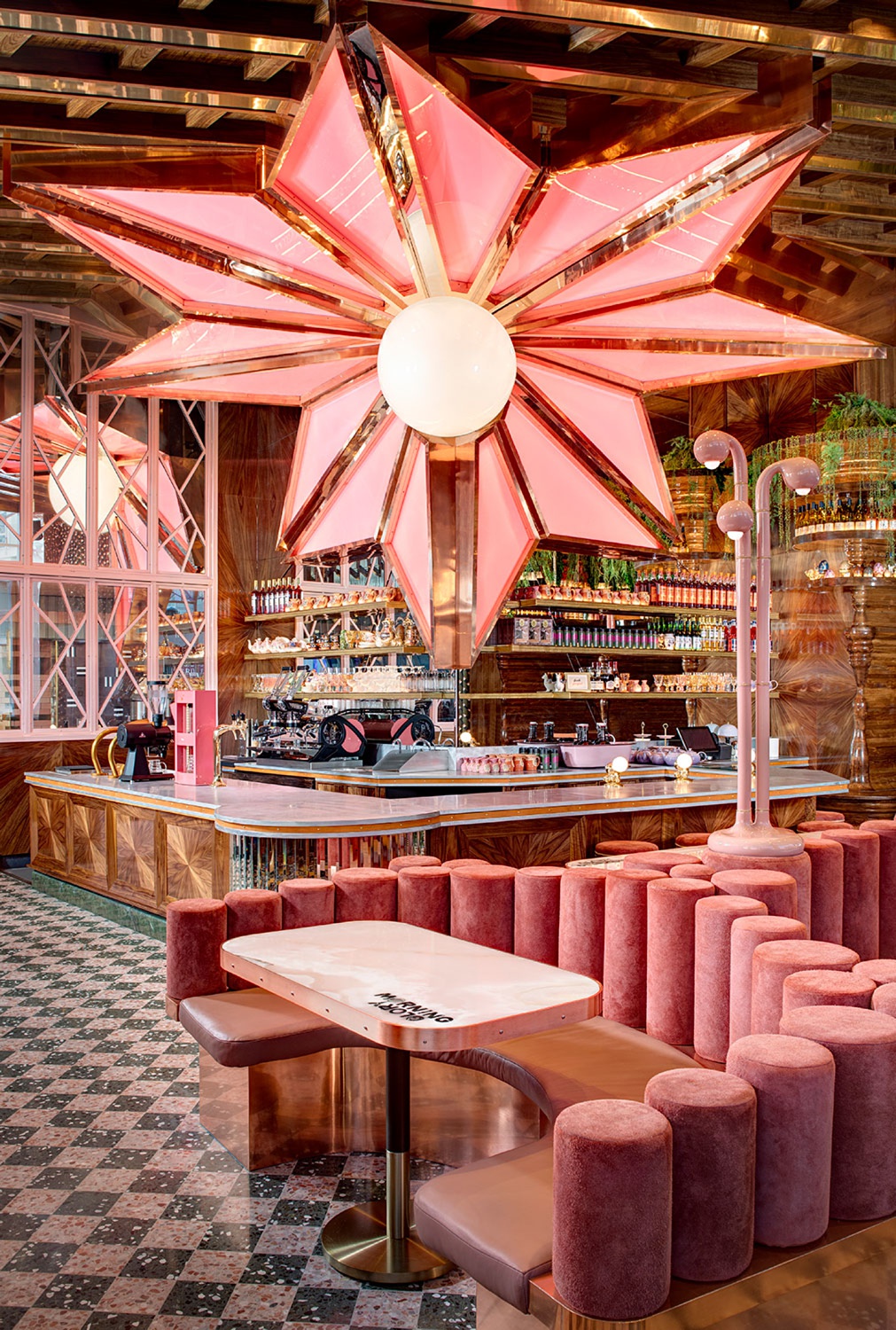
In San Diego’s Little Italy sits Consortium Holdings’ Morning Glory built and designed by BASILE Studio. Morning Glory is ludicrously cool, clad in copper, with it’s mirrored ceilings, pink starburst, tables, and velvet seats, and wrapped in articulating windows that open and change throughout the day. You and I are no dummies though, and know that where we see cool, inevitably the architectural photographer had their work cut out for them.
Let’s jump on in and marvel at how Zack documented this insane space — and did a gorgeous job at that.
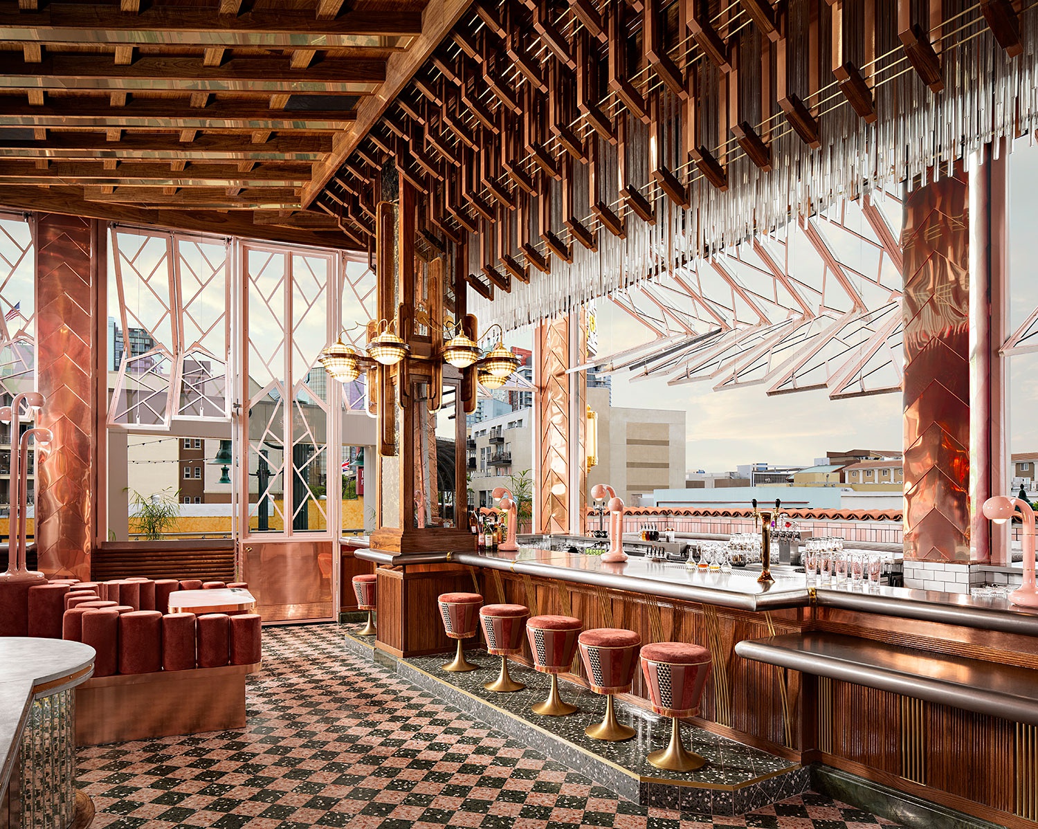
Zach’s first two images set the stage for us in Morning Glory, showing off the scope of the design and mixed bag of materials used to make this mind-bending place. He hones in on the literal star of the show here, shooting from a perspective that allows us to see the shapeliness of the fixture, and it’s massive size. Zack does an awesome job of positioning himself so that none of the major design elements stack up with each other, and despite being a room with A LOT going on, his careful attention to detail helps us navigate the space and take everything in.
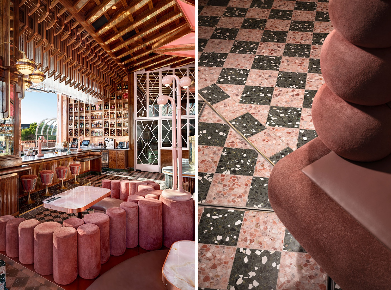
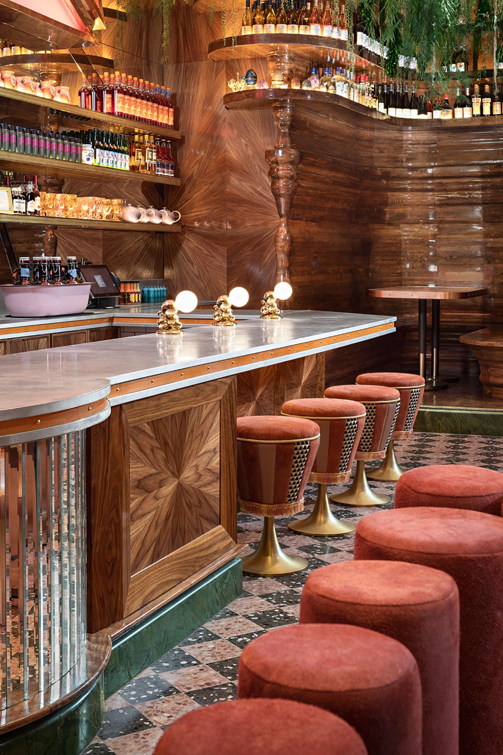
On the left, we get a good view of the bar space with the articulating windows open, letting some fresh West Coast air into the space. Zack allows the star and the light posts to inch into the frame, familiarizing us with the layout of the space. By shooting vertically, he is able to show off everything from the pink and black terrazzo floor to the copper ceiling shingles. On the right, a tight vignette relays the custom details and rich textures found all throughout the restaurant. Zack keeps the light directional, which heightens the texture in the fabric on the booths.
With all of the competing color temperatures, reflective surfaces, and bold colors, I’m so impressed with Zack’s ability to keep this space looking clean, sexy, and full of mood. I love the light raking across the room here. It emphasizes the shapes and lines we see, and brings warmth into the scene. Check out the way Zack has the windows in staggered positions, which helps us understand their functionality while rhythmically drawing our eyes through the room.
A more sung composition allows us to pick up smaller details that we may have missed in the full room shots. Here we note the copper edging on the tables and bar. We can now see the details on the side of the barstools match up with the floor, and likewise the wood on the face of the bar and the back wall has a starburst pattern that is a nod to the massive star light that looms of the restaurant.
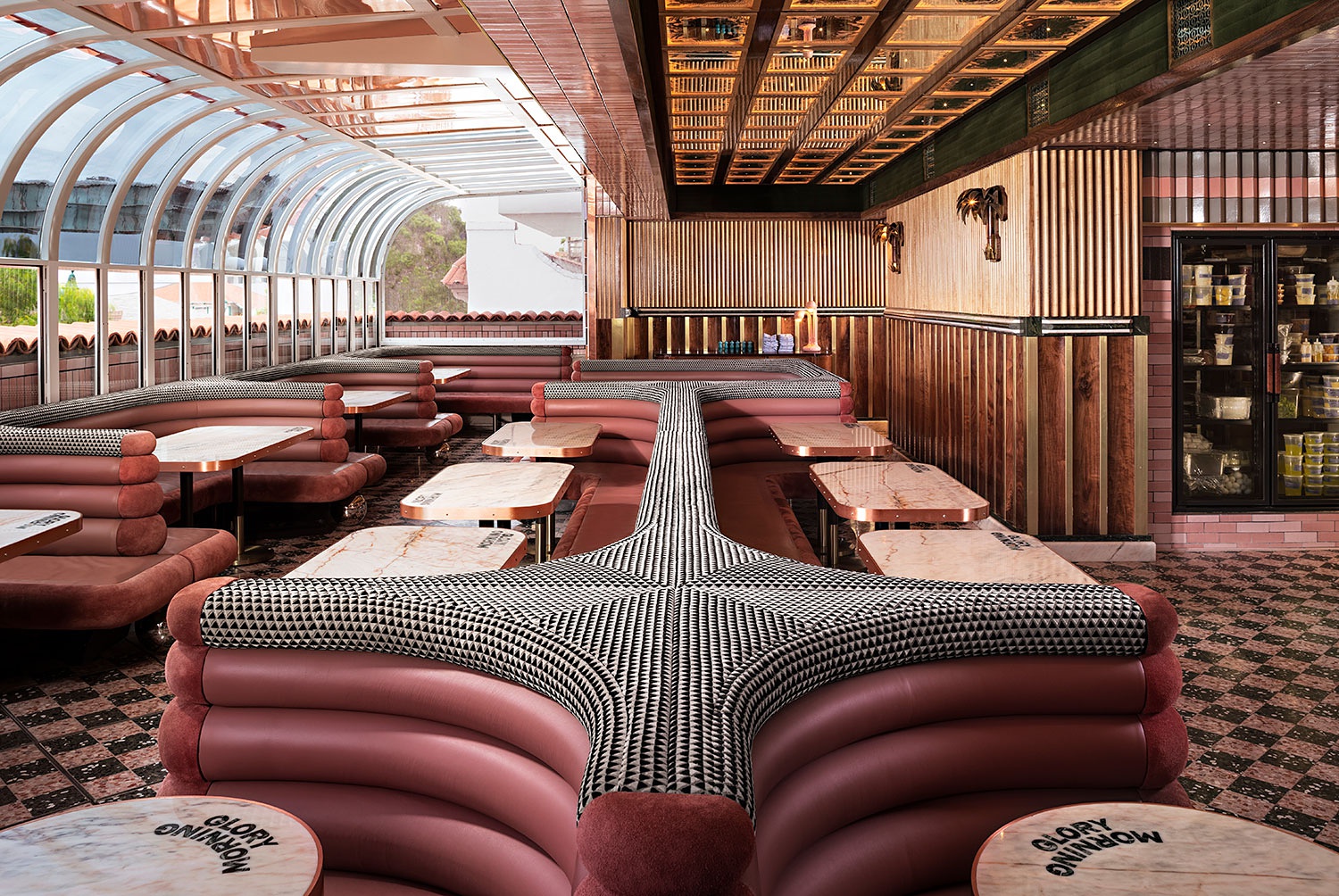
A tidy one-point perspective in the seating area makes use of the lines from the booth backs, which pulls our eyes right through the center of the scene.
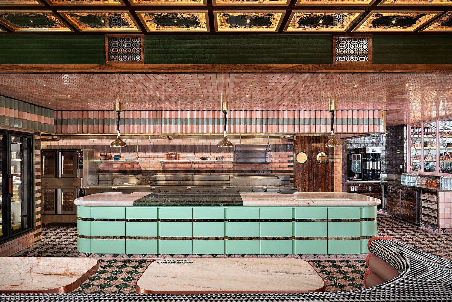
A different angle of this space masterfully connects the dining space and the kitchen area for us. By leaving in a slice of the booth, we have a visual anchor that allows us to understand where we are standing.
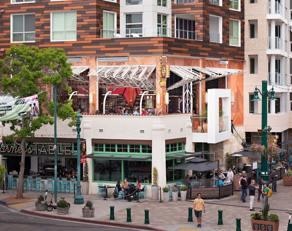
Outside, Zack relays to us that Morning Glory sits on the second story above Farmer’s Table. We are able to see those awesome articulating windows in full effect, and note that the restaurant has an outdoor seating area.
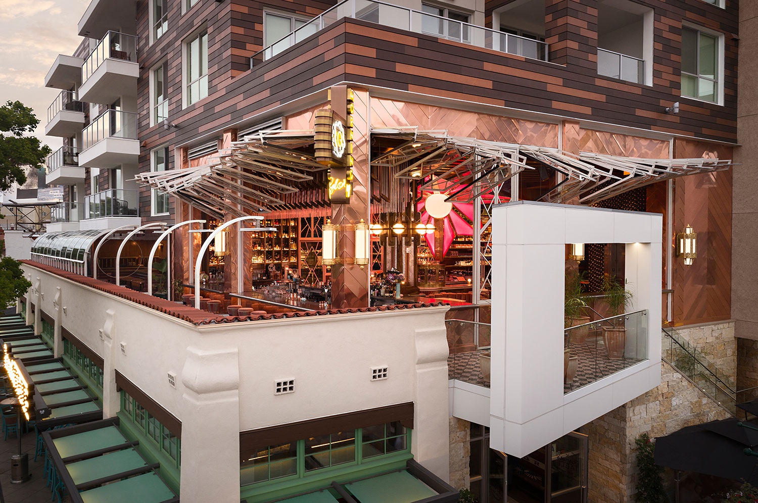
One last look at Morning Glory from the exterior lets us see the massive starburst and the copper shingles that make this space so stunning. A tall camera height makes this possible, while implying the restaurant’s second-story location. Awesome job Zack. This was a great project!
Many thanks to Zack for submitting this awesome project to us. You can check out more of Zack’s work on his site zackbenson.com or his Instagram @zackbensonphoto
If you have a project you’d like to be considered for Project of the Week, you can submit it here.
