Photographing A Former Post-Office- Turned-Sushi-Spot With Interiors Photographer Felix Speller
In an unassuming late-modernist building in Saint John’s Wood near the legendary Abbey Road crossing, sits Maido Sushi. Once an old post office, this architectural gem was given quite the facelift by Child Studio. Careful to preserve the original modernist charm, but introduce “a subtle blend of European and Japanese design influences” to the interior, Child Studio crafted a perfectly balanced space.
Who better to photograph it than London-based photographer Felix Speller?! Felix’s work is delightfully moody, tastefully lit, and radiates a great sense of place. Let’s check it out!
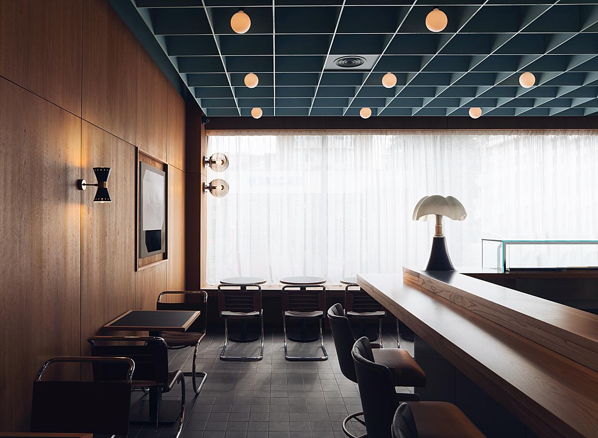
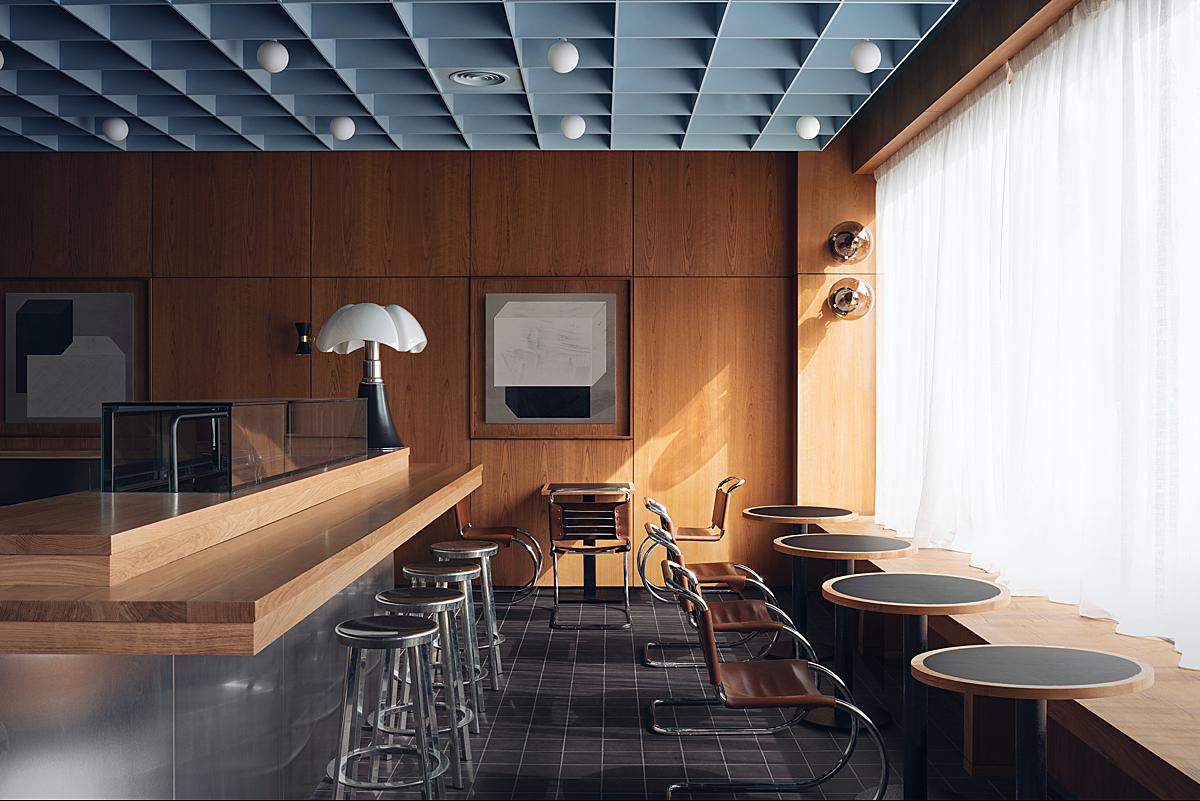
Felix shares “Working with Child Studio is always a pleasure, they approach their interior projects with sublime attention to detail, and this project was no different. Maido Sushi was an incredible space to shoot — the long window running down the front of this 1960s post office building brings beautiful light into the front of the restaurant, with a smooth gradient of light trailing off towards the back of the space, where Child Studio have created a cozier dining nook made from glass blocks.
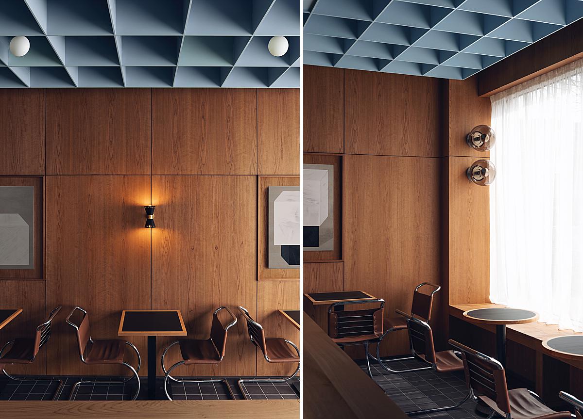
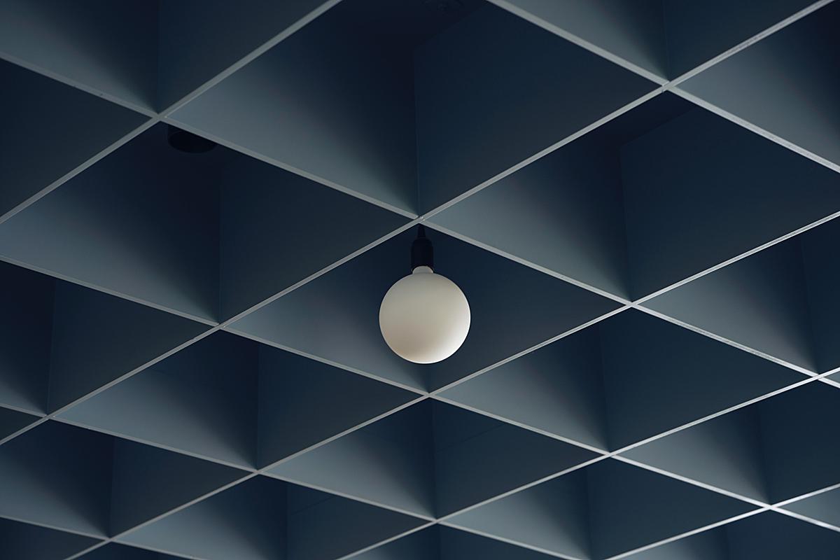
To me, the blue coffered ceiling combined with the rich wood paneling is what makes this space unique, it’s like stepping into a different time, you don’t often see interiors like this.
The shoot itself was two days, we knew we needed to capture the key shot of the light cascading down the wall, so a large part of day two was spent waiting for the afternoon sun to peek through the clouds and cast the amazing light you see in these images. “
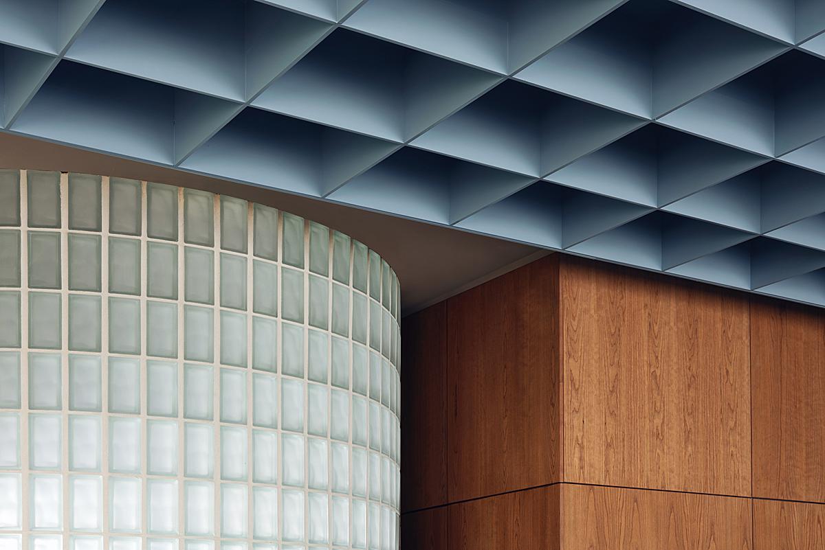
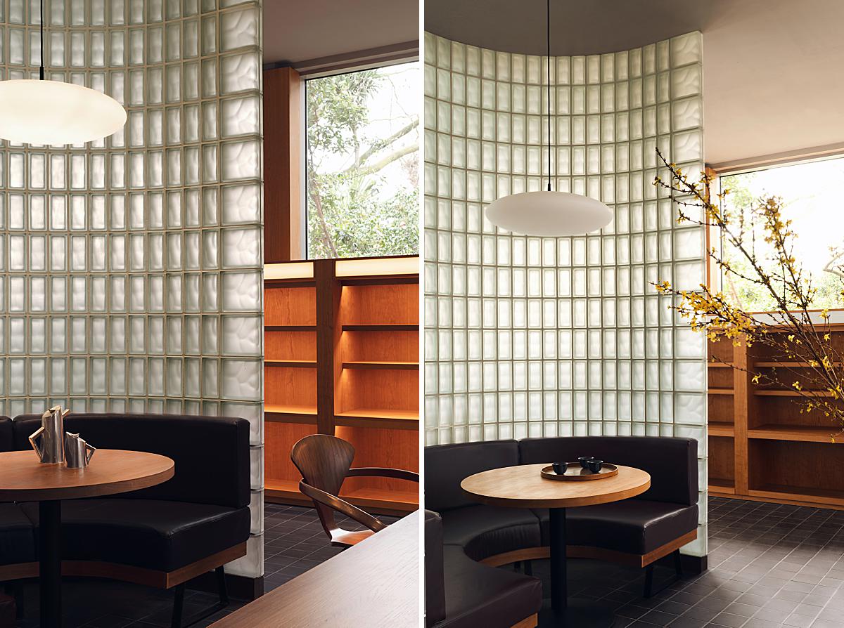
Felix speaks a bit about his process, telling “I tend to try and only use natural light in my images, but sometimes a small pop of flash is needed to illuminate a dark corridor or bring out a detail that would otherwise be missed. On this occasion, we wanted to really emphasis the aforementioned glass block dining nook that Child Studio created at the back of the restaurant. To do this, we used a small amount of flash to illuminate the glass nook from within, allowing the light to emanate into the rest of the restaurant.”
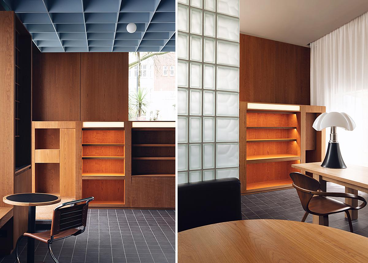
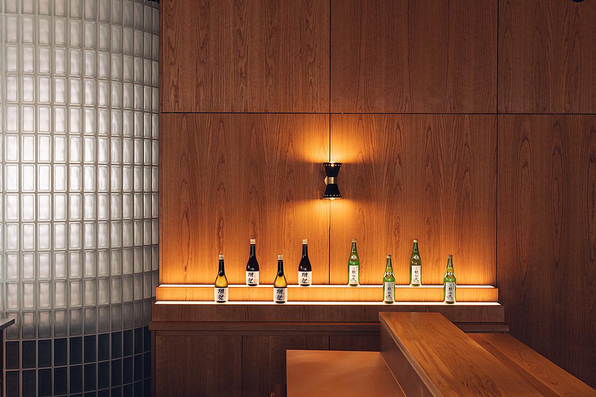
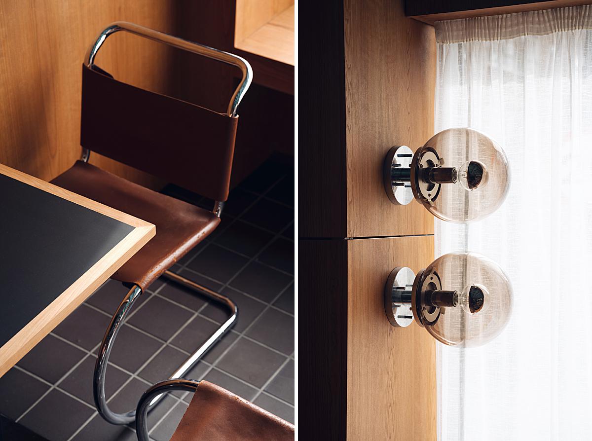
Aside from the gorgeous interplay of light and sweeping shadows, I just love Felix’s careful attention to Child Studio’s use of texture and materials. He has created a series of vignettes that give us a close look at the way the cherry wood paneling, coffered ceiling, and glass block all tie together cohesively. There is a playful geometric feeling and Felix translates that beautifully to us.
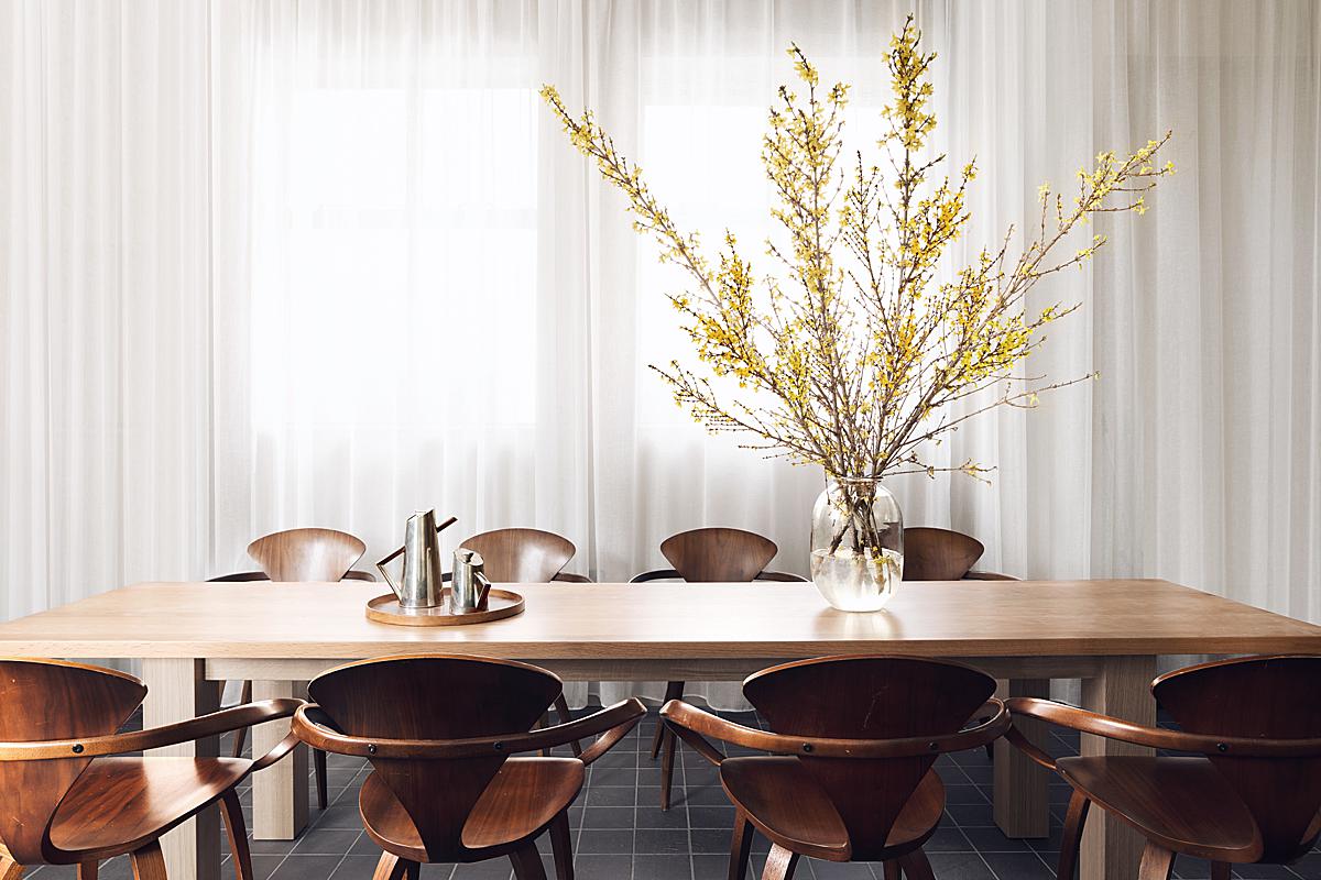
Just look at that symmetry mixed with the gradient of light! Gorgeous!
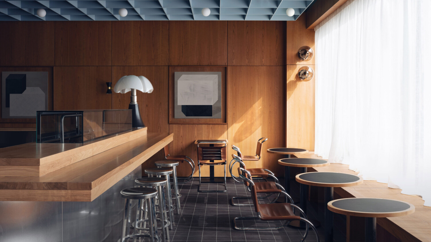
Ah, the hero shot of Maido Sushi — and it’s easy to see why. Felix recounts “[This is one of my favorites] due to the fact we waited so long to capture it. There are two versions of this image, one we shot on day one with soft light coming through the diffused curtains, and a second version from day two, that required an hour and half wait for the specific light that we needed. This cascade of light has become somewhat of a signature of Child Studios images, so I knew the importance of capturing this for them.”
That angular highlight streaming in was worth the wait. It brings a sense of heat and draws our eyes to the back of the image. We can place ourselves at that table, sitting in the sun, and the joy we would feel as we wait for our meal.
He continues to share “As far as post processing goes, I’m someone that uses a lot of masked layers to build up a final image, it’s extremely rare for me to capture a final image in one shot. Sometimes masking is needed to create more even light, other times I use it to hide or change details. This particular project was edited in house by Child Studio themselves, but we discussed the editing process they wished to use whilst we were shooting, to ensure they had all the information they needed to create exactly what they envisioned.”
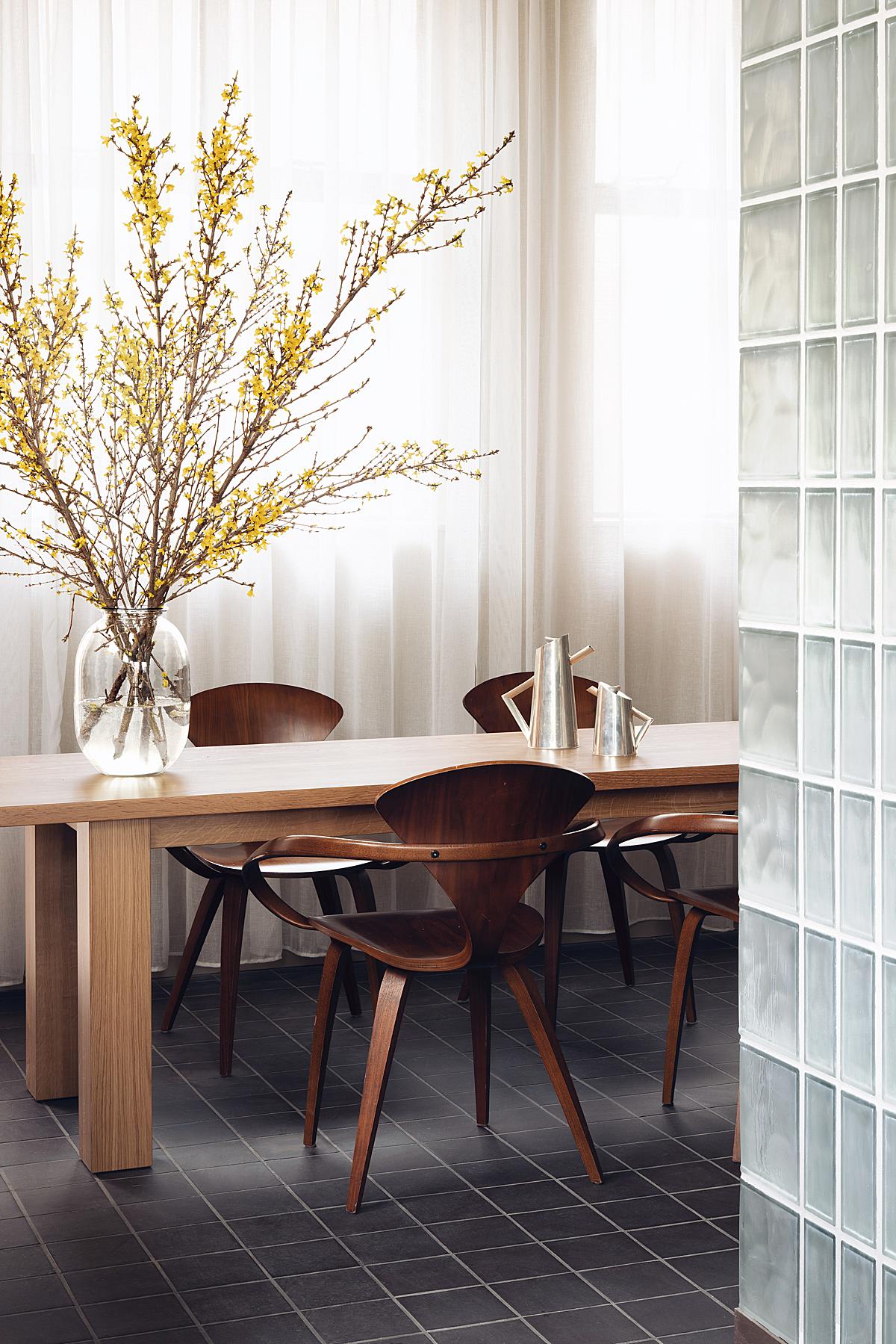
The mood shifts completely as we turn our attention to this private dining area, another favorite image of Felix (and myself, too). He explains “[I love it,] not for any technical reason, but simply because I think it shows the narrative of the restaurant beautifully, journeying from the main section of the restaurant into the more private dining area tucked at the back of the space. I also love the way to light is bouncing off the chairs and down onto the floor below.”
I agree. This scene is perfectly sublime, bringing a soft and delicate mood.
I asked Felix what advice he would give to anyone shooting a similar project. He thoughtfully shares “It’s very easy to disregard the importance that shadows have when it comes to creating atmosphere. With a project like this that uses such beautiful rich tones, it would be sacrilegious to use only flash lighting. It’s important to take into account how the space feels when you step into it, with this project, I wanted to bring this moody atmosphere to my images, taking full advantage of the incredible natural light gradients offered by the space. Another factor to consider is that the designers themselves have a very strong idea of how they want the project to be portrayed, so work collaboratively as much as possible to ensure you and the designers are happy with the outcome.”
Many, many Thank You’s to Felix Speller for sharing this beautiful project with us! Head over to felixspeller.xyz and give a follow to @felixspeller to see more of his gorgeous work!
If you have a project you’d like to be considered for Project of the Week, you can submit it here.
